
By the end of Part 1, one thing became pretty obvious.
America has dozens of wildfire problems.
We measure them as if they’re unrelated.
One agency tracks drought, another tracks active fires, another monitors smoke, another measures air quality, another records fire perimeters, another studies vegetation, another tracks weather, another studies public health, another pays suppression costs, another studies insurance losses, another manages forests.
Agencies are doing the job.
The problem is the architecture.
What happens when all of these systems are viewed together?
Figure 1. Wildfire Dataset (WFIGS)
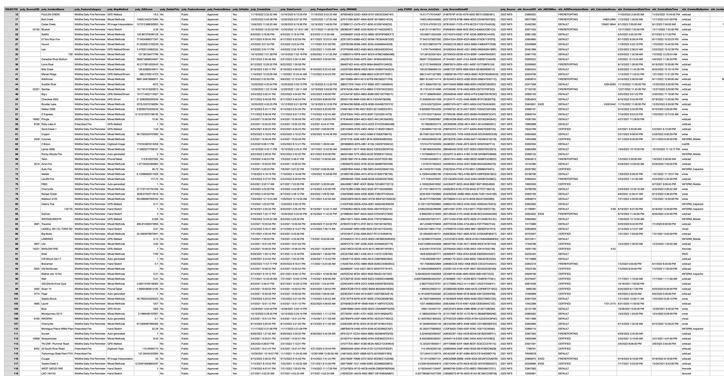
*Public wildfire records from the National Interagency Fire Center's Wildland Fire Incident Geospatial System (WFIGS). Each row represents a recorded wildfire incident containing dozens of variables, including discovery date, location, acreage, cause, containment, jurisdiction, fire management strategy, and other operational data used throughout this investigation.
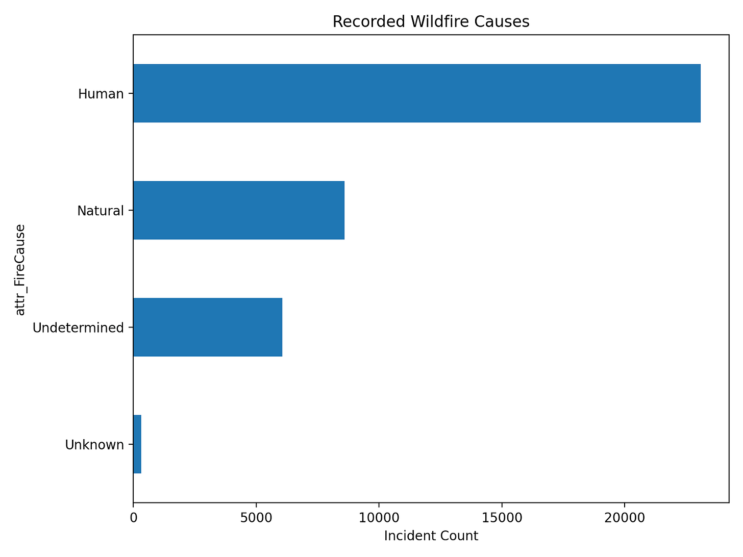
Questions:
What do you notice?
Which causes appeared repeatedly?
Which one’s surprise you the most?
Which ones require different prevention strategies?
Figure 3. Fire Discovery Month
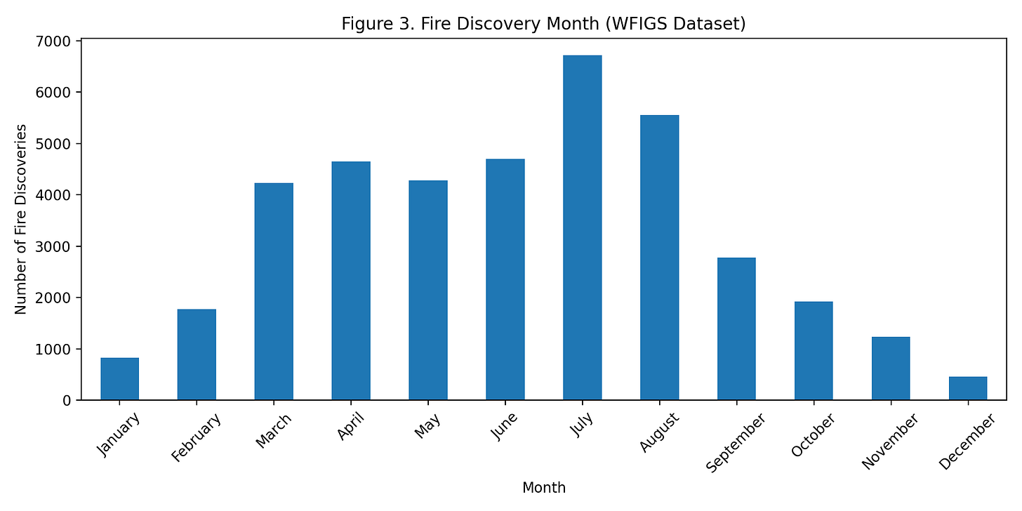
Questions:
When do most fires begin?
Why then?
What conditions already existed before they ignited?
Figure 4. Fire Management Strategy
Among wildfire records containing management strategy information, Full Suppression was by far the dominant response. Many smaller incidents do not contain strategy fields, so this figure reflects documented management decisions rather than every fire in the dataset.
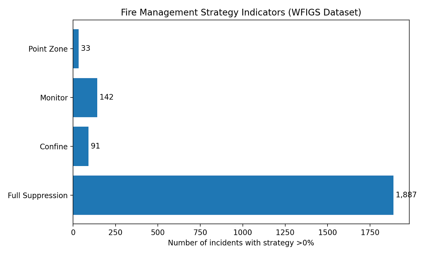
Questions:
How often are fires fully suppressed?
How often are they managed?
How often are they monitored?
What could those choices tell us?
Figure 5. Cost vs. Acres Burned
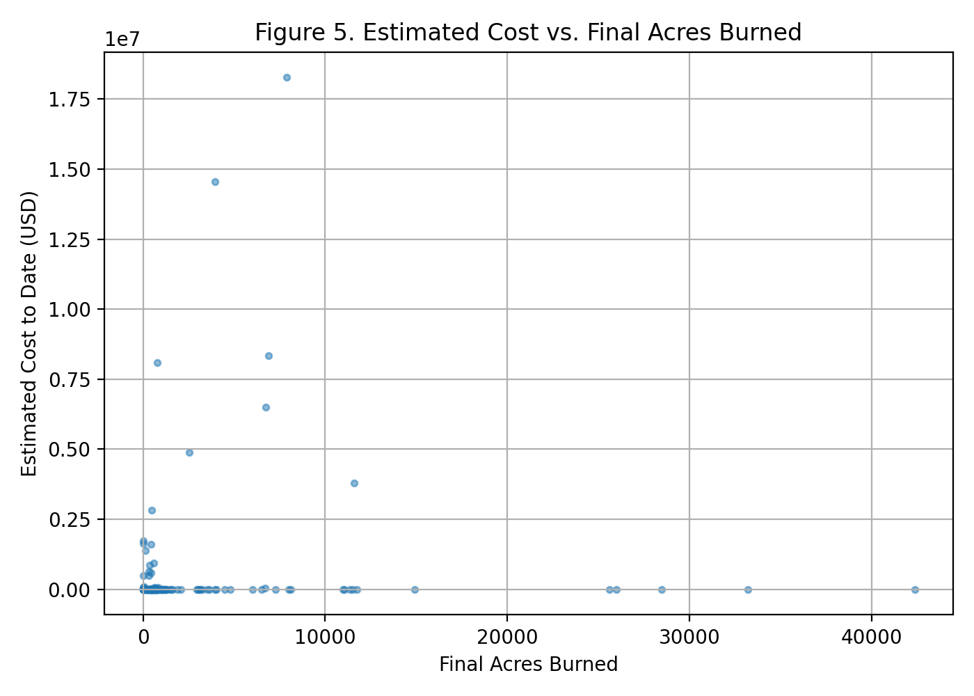
Questions:
Does a larger fire always cost more?
If not…
What else is driving the cost?
Homes? Terrain? Infrastructure? Aircraft? Duration? Smoke? Evacuations?
Figure 6. Example Wildfire Incident Record (WFIGS Dataset)
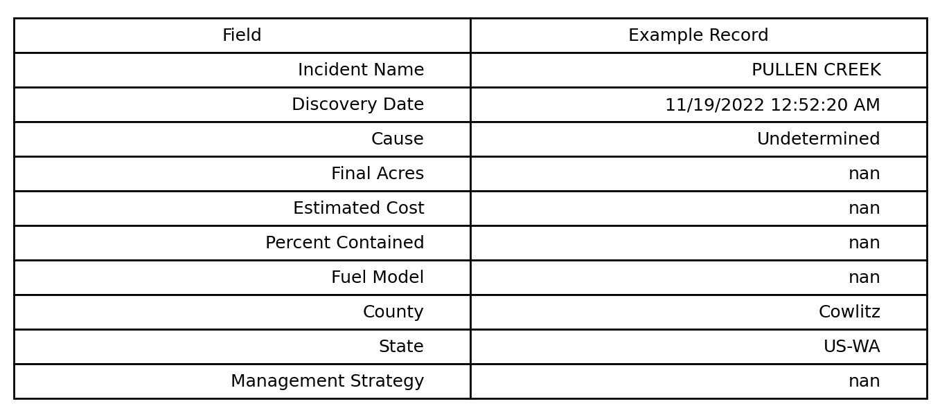
Every wildfire examined in this series will be evaluated using the same categories of evidence. Consistent methods make it possible to compare incidents and identify patterns that might otherwise be missed.
Figure 7. Average Airborne Lead Concentrations (2010–2024)
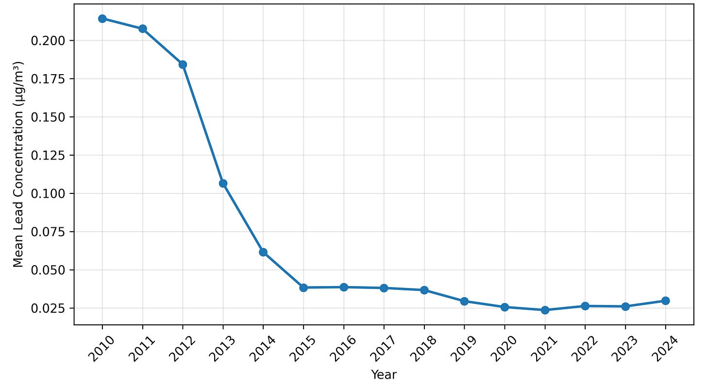
EPA monitoring shows that average airborne lead concentrations declined substantially between 2010 and 2024.
That changes the question.
If background airborne lead continues declining nationally...
How should short term air quality be evaluated after major wildfires that burned homes, vehicles, businesses, and other human built environments?
The average airborne lead concentrations in the United States has fallen aggressively according to EPA monitoring.
Don’t look for answers yet.
Look for patterns.
Ask yourself:
Why do the same regions appear repeatedly?
Why are certain landscapes experiencing fire over and over again?
What variables are recorded for every wildfire?
Which important variables aren’t recorded?
What information lives in other government databases instead of here?
If you wanted to prevent fires instead of documenting them, what additional information would you want?
Which agencies collect parts of this story?
Has anyone assembled all of the pieces into one investigation?
What does the dataset tell us?
What isn’t it telling us?
If civilization problems are interconnected, why do we keep measuring them separately?
During the next two investigations, we’ll begin combining wildfire history, drought, smoke, infrastructure, suppression spending, public health, environmental monitoring, and technological capability to see what patterns emerge.
Sometimes the most important pattern isn’t hidden inside one’s dataset, but in the distance between them.
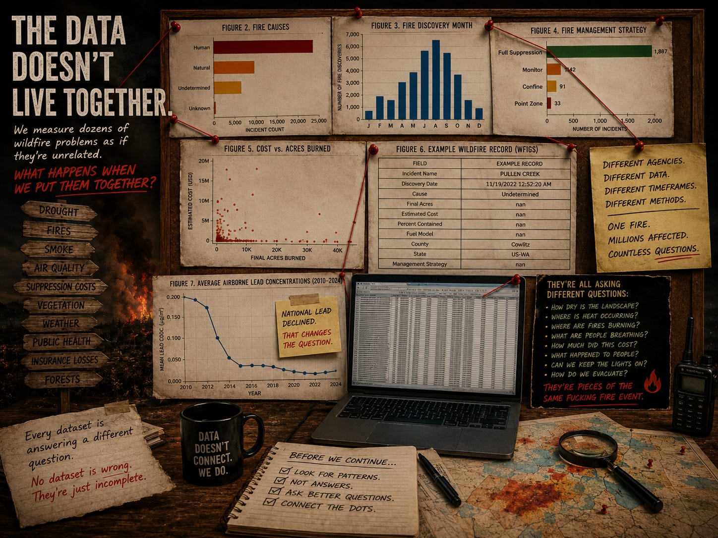
Every column represents another question, and every row represents another fire.
Patterns don’t emerge from one incident, but from thousands.
While comparing datasets, I realized…
Wildfires stop looking like isolated events, and begin looking like connected systems.
A wildfire isn’t just a fire, it’s also a drought event, an infrastructure event, an insurance event, a housing event, a public health event, an ecological event, an economic event, a labor event, a water management event, eventually becoming a political event.
Almost every dataset examines only one piece of that reality.
No dataset is wrong, but they’re not complete either.
This investigation isn’t trying to prove a predetermined conclusion.
It’s trying to determine whether we’re asking the right questions.
The fastest ways to lose the public is pretending every wildfire has only one explanation.
They don’t.
Some begin with lightning, power lines, equipment failures, accidentally, intentionally set.
Some spread because fuels accumulated, and others spread because of wind, or because communities expanded into fire prone terrains.
The evidence finger points toward interacting systems.
Exactly what makes them difficult.
Complexity shouldn’t stop investigation, it should improve it.
The drought monitor asks:
How dry is the landscape?
NASA asks:
Where is heat occurring right now?
The National Interagency Fire Center asks:
Where are fires burning?
The EPA asks:
What are people breathing?
Insurance companies ask:
How much did this cost?
Public health researchers ask:
What happened to people afterward?
Utilities ask:
Can we keep the lights on?
Emergency managers ask:
How do we evacuate everyone safely?
These don’t compete.
They’re pieces of the same fucking fire event.
While I was researching, I realized wildfires are not the only system gathering information.
The EPA has spent years measuring airborne pollutants across the United States.
That includes lead.
I was surprised to see that national airborne lead concentrations have declined fucking suddenly over the past decade and a half.
According to EPA trend data, average airborne lead concentrations fell approximately 86% between 2010 and 2024.
That doesn’t weaken this investigation.
It ended up changing the question.
The question is no longer, “Is airborne lead generally increasing?”
The data provided to us says no.
The better question is:
What happens during major wildfires, especially when homes, vehicles, and infrastructure burn?
National averages and individual disasters are measuring different things.
The United States has built extraordinary systems for measuring disaster.
We know where fires are, we know where smoke is moving, we know where drought is developing, we know which landscapes burn repeatedly, we know which communities are repeatedly evacuated, we know an extraordinary amount, and yet every summer millions of Americans prepare for another smokey season.
Has our ability to observe the problem grown faster than our ability to reduce it?
Civilizations often become excellent at documenting the consequences of recurring failures.
The question becomes whether they’re investing enough in preventing them.
The deeper I dig, the less interested I become in finding a cause.
Instead, I’m more interested in the, “why do we keep measuring wildfire one agency at a time?”
Wildfires are where multiple systems collide, and maybe that's why it keeps feeling impossible to solve as one problem.
Which dataset surprised you the most?
What information do you think is missing?
If you were leading this investigation, what would you measure next?
Which two datasets would you combine first?
What recurring patterns do you notice?
If this were your home, what questions would you want answered before the next fire season?
What are we measuring after disasters that we should have been measuring before them?
The greatest obstacle to understanding complex systems isn’t a lack of information. It’s that it lives in different places.
The Fire Doesn’t End at the Flame Front
Wildfires don’t stop where the flames stop.
Smoke, fine particles, ash all travels.
When homes, vehicles, businesses, and infrastructure burn, the atmosphere changes.
The next investigation follows what leaves the fires.
A wildfire doesn’t end when the flames go out.
No posts
Comments
Nothing yet. Say the first thing.
Sign in to join the conversation.