
This edition is particularly rich in photographs and commentary, so your email provider may shorten or cut off part of it. If that happens, simply choose “View entire message” or open the article in the app or on the website to enjoy the complete gallery.
The Red Pen is not about declaring a photograph right or wrong. Think of it as sitting together over a collection of prints, tracing the lines that guide our eyes, noticing the light, gestures and small decisions that give an image its voice. The red marks are invitations to look again—and perhaps to discover something we missed the first time.
Photograph by Daniela Bishop
A child runs through the shallows of Lake Ontario, caught somewhere between one step and the next. The open arms, flying droplets and completely unguarded smile give the photograph its energy, while the pale horizon and generous sky create a beautiful sense of freedom around her.
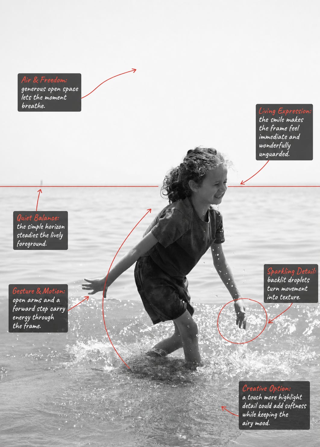
The great strength of this photograph is its spontaneity. Nothing feels directed or overly controlled. Daniela has captured the instant when movement, expression and water all come alive together.
The black-and-white treatment helps us concentrate on gesture rather than colour. Our attention goes directly to the child’s expression, the shape of her body and the sparkling trail of water around her. The quiet horizon provides just enough structure to hold all that movement in place.
I particularly like the amount of open space above the figure. It gives the moment room to breathe and makes the child appear to be moving through a much larger world. That space is not empty; it is part of the emotional language of the photograph.
The brightest areas are very close to pure white, especially in the sky and on the water. This contributes to the dreamy, high-key feeling, so I would not want to lose it. However, recovering a small amount of highlight detail might introduce a little more softness and tonal texture. The key word here is small—too much recovery could take away the luminous atmosphere that makes the photograph distinctive.
A little selective work around the face could also help. Gently lifting the shadows or adding subtle local contrast around the eyes and smile would guide us toward the expression without making the adjustment visible. The hair and droplets could receive a similar touch of restrained contrast to make their textures sparkle.
It might also be interesting to test two different crops. The original, with its generous sky, feels poetic and expansive. A second, slightly tighter version could place more emphasis on the physical movement and the interaction between the child and the water. Neither would be more “correct”; they would simply tell different versions of the same story.
For future photographs of this kind, experimenting with shutter speed could produce fascinating variations. A faster shutter would freeze each droplet into a tiny point of light. A slightly slower one would allow the hands, feet and water to carry a trace of motion, creating an even more impressionistic feeling.
Technical perfection is not what gives this photograph its life. Its real value lies in recognising the moment and responding quickly enough to preserve it. Exposure, cropping and tonal balance can all be reconsidered afterwards. The expression cannot.
Daniela has captured something wonderfully difficult to manufacture: the feeling of a person who has momentarily forgotten the camera is there.
Photograph by David Lassiter
At first glance, this appears to be a photograph of a staircase. Stay with it a little longer, however, and the structure begins to behave like something else entirely: a fan opening, a deck of cards being spread across a table, or a sequence of wings preparing to move.
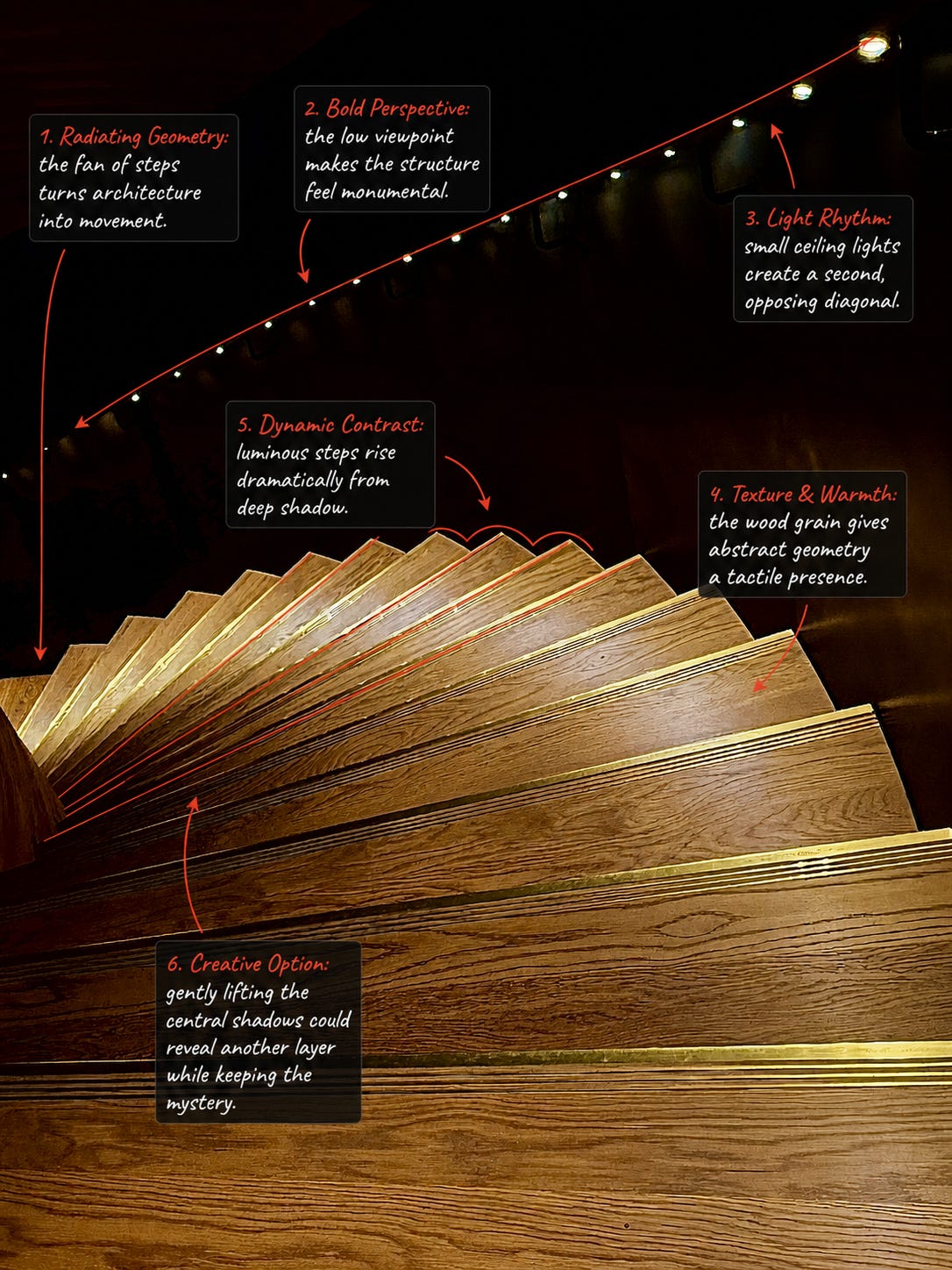
David’s low viewpoint transforms a functional architectural feature into an abstract composition. The steps radiate from the lower-left corner, growing larger as they travel across the frame. That repeated geometry creates a powerful visual rhythm and gives the still structure an unexpected feeling of motion.
A second diagonal runs above it. The small ceiling lights recede into the distance, pulling the eye in the opposite direction. These two systems—the solid, luminous steps below and the delicate trail of lights above—hold the composition together.
The warmth of the wood is equally important. Without its grain and amber colour, the image might feel purely mathematical. The visible texture makes it tactile; we can almost imagine running a hand across the surface. Deep surrounding shadows isolate the staircase and allow its edges to appear almost illuminated.
The central darkness contributes greatly to the photograph’s drama and mystery. Even so, selectively lifting a small amount of shadow detail could reveal more of the surrounding structure and add another layer of depth. This would work best as a local adjustment rather than a general brightening—the darkest areas should remain dark enough to preserve the theatrical atmosphere.
The brightest stair edges are visually compelling, but a slight reduction in their highlights could allow more of the wood texture to remain visible. A little restrained dodging and burning might help guide the eye from the lower-left origin through the expanding fan of steps.
The green cast around the ceiling lights creates an interesting contrast with the warm wood. David could choose either to preserve that colour tension or reduce the green slightly for a more unified palette. Both are valid interpretations: one emphasizes the artificial lighting of the space, while the other makes the composition feel more sculptural.
A black-and-white version would also make an interesting companion—not as a replacement, but as an experiment. Removing the amber and green would leave us with pure line, repetition, light and shadow. Comparing the two versions could reveal how much of the photograph’s effect comes from geometry and how much comes from colour.
Architecture does not need to be photographed as a complete building. Sometimes its character is found in a fragment, an unusual viewpoint or the relationship between two lines.
David’s photograph reminds us to change our physical position before pressing the shutter. Looking upward from close to the ground has turned an ordinary passage through a space into something monumental, rhythmic and mysterious.
Photograph by @Douglas Long
There is an immediate sense of theatre in this portrait. The rock becomes a natural pedestal, the tropical foliage forms part of the set, and the enormous blue sky gives the figure room to command the frame.

Douglas’s low viewpoint is the foundation of the photograph. By placing the camera beneath the model, he gives the pose stature and confidence. The result feels closer to a fashion campaign than a conventional environmental portrait.
The pose itself is carefully constructed. The supporting arm, rising torso and bent legs form a strong triangular shape. Triangles bring stability to a composition, but here the asymmetry prevents that stability from becoming static. The raised arm and tilted head continue the movement upward into the sky.
Colour is another major strength. The floral garment connects naturally with the surrounding vegetation, while the brilliant red shoes separate themselves from the greens and blues. Those shoes do more than complete the wardrobe: they act as a visual full stop. Their colour is echoed by smaller warm accents throughout the fabric, making the palette feel connected rather than accidental.
The photograph also succeeds through texture. Smooth fabric, glossy shoes, sharp foliage, soft clouds and weathered stone each respond differently to the light. That variety gives the image a physical, tactile quality.
The large rock establishes the low viewpoint and makes the figure feel elevated. A slightly tighter crop from the bottom could create an alternative version with a more immediate fashion emphasis. The original feels monumental and environmental; the tighter interpretation would place greater attention on the pose, garment and shoes.
Because the raised arm shades part of the face, a very subtle local lift around the eyes and cheek could give the expression a little more presence. This should remain restrained—the sculptural shadow is part of the pose and should not be removed entirely.
The foliage behind the dress shares some similar greens and floral shapes with the garment. A small reduction in background clarity, saturation or brightness could create a touch more separation while preserving the tropical setting. If recreating the image on location, a wider aperture or slightly greater distance between the model and foliage could achieve a similar effect optically.
The red shoes are deliberately bold. Selectively controlling their brightest highlights could retain more surface detail without diminishing their role as the image’s strongest colour accent.
It would also be interesting to experiment with the balance between ambient light and fill light. Slightly softer fill could maintain detail in the clothing while producing gentler transitions across the face and skin.
A successful environmental portrait does not merely place someone in a location. It creates a relationship between the figure and that location.
Douglas has used viewpoint, pose, colour and texture to make the landscape participate in the fashion story. The sky becomes a backdrop, the rock becomes a stage, and the foliage becomes an extension of the garment. That transformation is where the photograph finds its confidence.
Photograph by Joan Mikkelsen
A game of pétanque beside the Mediterranean becomes a small study of concentration, companionship and ritual. Nothing here feels arranged, yet every figure seems to have found a natural place within the frame.
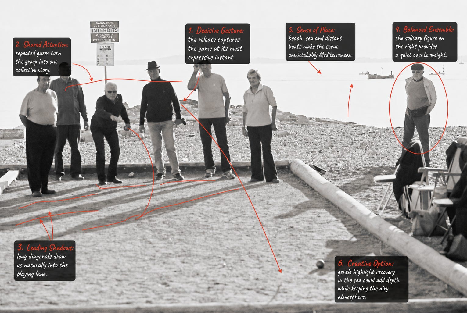
The expressive release gesture gives the image its centre of gravity. Around it, the other players become a chorus of attention. Their gazes, stances and small differences in posture tell us that everyone is participating—even those who remain completely still.
This is where Joan’s photograph moves beyond simple documentation. It is not merely a picture of someone throwing a boule; it is a picture of a group sharing the same suspended moment.
The figures form an irregular line across the middle of the frame. Their hats, clothing and spacing give each person a distinct visual identity, while the solitary figure on the right provides an important counterweight. He is separated from the main group but remains connected through his attention to the game.
The long foreground shadows are another gift. They extend the players’ presence into the empty lane and draw us toward the action. The low curb on the right creates a second strong diagonal, quietly directing the eye toward the boule.
Behind everything, the pale beach, sea and distant boats establish a wonderfully specific sense of place. The high-key treatment makes the background feel almost weightless, allowing the human activity to carry the photograph.
The luminous sea contributes greatly to the airy Mediterranean atmosphere. Recovering a small amount of highlight detail could reveal a little more separation between water, horizon and sky. The adjustment should be gentle; allowing the background to remain bright is part of what gives the image its distinctive mood.
A subtle increase in local contrast around the active player and the boule could strengthen the visual connection between gesture and destination. Selective dodging and burning would be preferable to increasing contrast across the entire photograph, which might make the beach and foreground feel unnecessarily heavy.
The chairs and coats on the right add social context: they suggest that this is a familiar gathering place rather than an isolated sporting event. An alternative crop could remove a small amount from that edge for a cleaner, more classical composition. The original tells a broader environmental story, while the tighter version would concentrate more strongly on the players.
If returning to a similar scene, it could be rewarding to photograph a short sequence rather than a single frame. One exposure might capture the throwing gesture; another the group’s reaction; and a third the moment everyone walks forward to inspect the result. Street photography often becomes richer when we stay after the apparent climax.
The decisive moment is not always a dramatic event. Sometimes it is a small gesture surrounded by several quiet reactions.
Joan has recognised that the real subject is not only the player or the boule—it is the network of attention connecting everyone in the scene. That shared attention is what turns an ordinary afternoon game into a human story.
Photograph by johnny d
The street appears almost empty, but it does not feel abandoned. Two walkers and a dog move through the pools of lamplight, surrounded by old facades, reflective stone and the deep silence of the night.
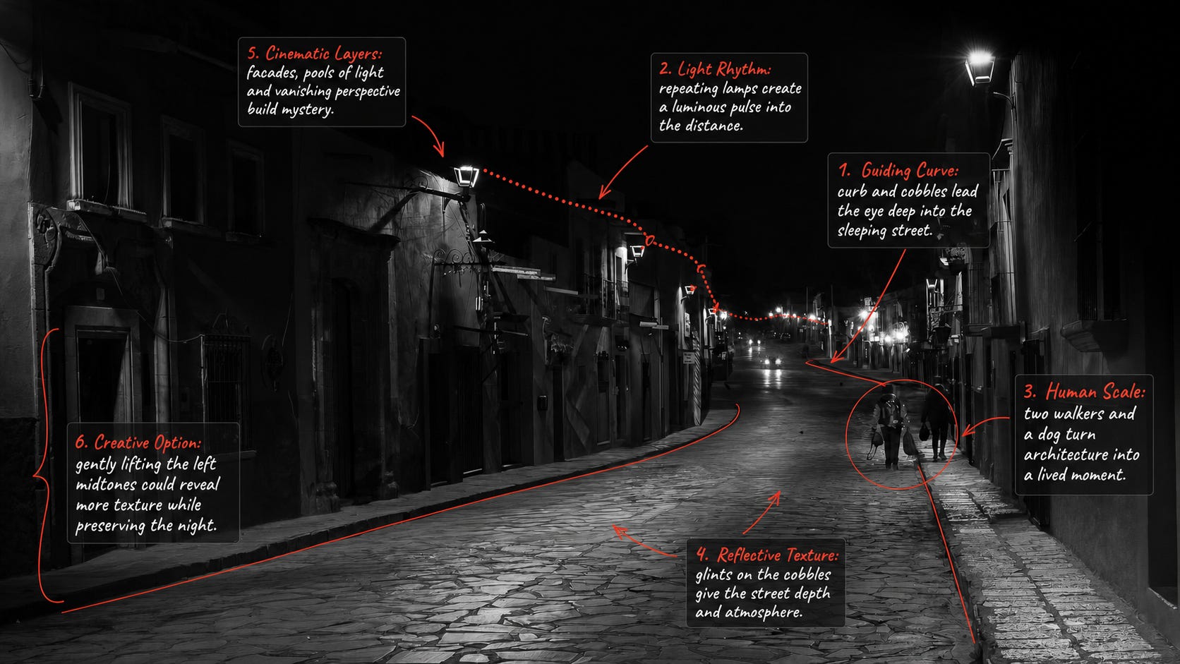
John has built the composition around a beautiful guiding curve. The left curb begins near the bottom of the frame and travels steadily toward the distant lights. On the opposite side, the narrow pavement creates a second boundary. Together, these lines turn the street into a visual corridor.
The lamps provide rhythm. Each pool of light repeats the one before it, becoming smaller and closer together as the street recedes. This repetition gives the image a pulse and strengthens the illusion of depth.
The figures arrive at exactly the right scale. They are small enough to allow the architecture to remain powerful, yet large enough to introduce narrative. Without them, this would be an atmospheric architectural study. With them—and especially with the dog—it becomes a lived moment. We begin to wonder where they have been, where they are going and why they are out at this hour.
The cobblestones are another essential part of the picture. Their irregular surfaces catch fragments of light, preventing the lower half of the frame from becoming a single dark mass. Those reflections give the street texture and make the night feel almost tangible.
Black and white is particularly effective here. Colour might have separated the various lamps and facades, but monochrome brings them into one visual world of light, shadow and form.
The deep shadows are central to the photograph’s mystery. A gentle local lift in the left-side midtones could reveal slightly more architectural texture without making the scene appear brighter overall. The goal would be to suggest what is hidden, not explain everything.
The nearest lamp at the upper right is considerably brighter than the others. Selectively reducing its highlight could keep the eye from lingering there and encourage a smoother journey toward the distant vanishing point.
A small amount of dodging along selected cobblestone reflections could reinforce the curve of the road. Burning a few less important bright patches might also simplify the rhythm. These should remain invisible adjustments—the street must still feel naturally illuminated.
When photographing similar night scenes, it can be useful to establish the architectural composition first and then wait for a human element to enter the right pool of light. Several frames may be required. The ideal moment often occurs when the figures are separated from one another and their silhouettes remain distinct, as they do here.
Bracketing one darker and one lighter exposure can also provide useful options. The darker frame protects the lamps, while the lighter one records facade detail. Even if the final photograph uses only one exposure, the comparison helps identify the most expressive tonal balance.
Night photography is not about making darkness disappear. It is about deciding how much darkness the story needs.
John has allowed the shadows to remain mysterious while using curves, repetition and small reflections to guide us through them. The result feels less like a record of a street and more like a scene remembered after walking home.
Photograph by Maurice Goldberger
This is the kind of photograph that refuses to reveal itself all at once. At first, we see a crowd. Then individual gestures begin to emerge: someone eating, someone checking a phone, two people leaning toward one another, a face caught in reflection—and one man looking directly back at us.
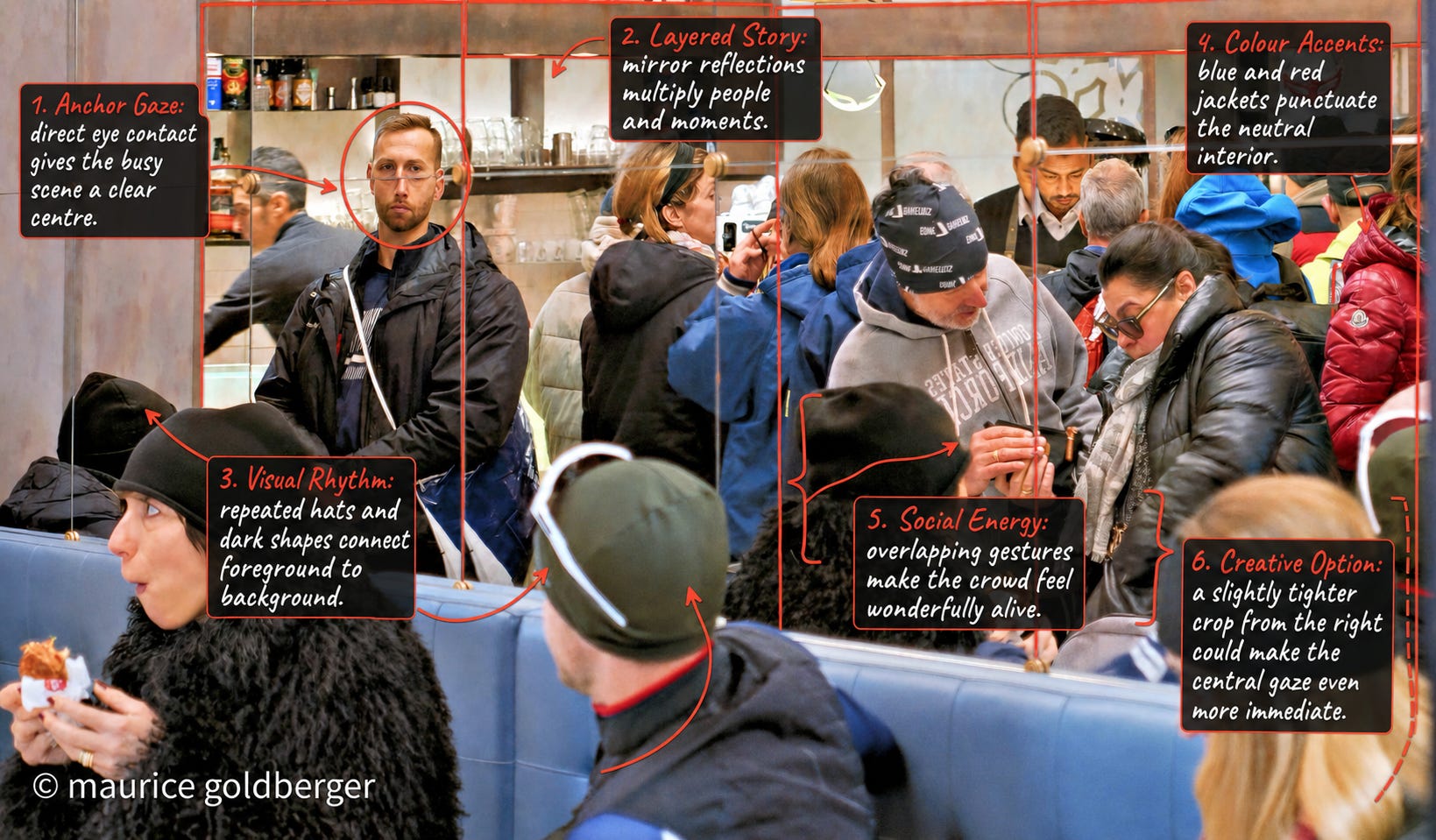
The direct gaze is the image’s anchor. In a scene filled with movement, colour and overlapping bodies, that moment of eye contact gives us somewhere to begin. The man is not positioned in the geometric centre, but he becomes the psychological centre of the frame.
From there, the mirrors send the eye in several directions. They divide the space into panels, repeat figures and allow foreground and background to occupy the same visual plane. The result has an almost Cubist quality: several viewpoints and moments appear to coexist.
Repeated dark hats help organize the complexity. One appears at the lower left, another dominates the centre foreground, and others are distributed through the reflected crowd. These recurring shapes create rhythm and quietly stitch the different layers together.
Colour performs a similar function. The blue garments move through the middle of the composition, while red jackets and smaller warm details punctuate the right side. Those accents prevent the neutral interior and dark clothing from blending into an undifferentiated mass.
Most importantly, the frame feels alive. Each person appears absorbed in a separate activity. No single gesture explains the whole scene, yet together they create a convincing portrait of public life.
A slightly tighter crop from the right could make the direct gaze even more immediate and reduce the visual weight of the partially seen figure at the edge. The original preserves the full density of the room; the tighter version would give the photograph a clearer central hierarchy.
A small amount of selective contrast around the anchor face could strengthen the eye contact without making it look artificially emphasized. Slightly reducing contrast or clarity in the nearest foreground figures might create additional separation between the viewer, the foreground and the reflected scene.
The bright blue and red garments are useful compositional accents. If they begin to compete with the faces, a modest reduction in saturation—applied selectively rather than globally—could keep their structural role while allowing the human expressions to remain primary.
Busy photographs reward careful attention to the edges. Before pressing the shutter, or when selecting between similar frames, it helps to check whether partial figures and bright shapes at the borders contribute energy or pull attention away. The goal is not necessarily to remove complexity, but to make every piece of complexity feel intentional.
When working with mirrors, a tiny change in camera position can transform the entire arrangement. Moving a few centimetres left, right, higher or lower can separate overlapping heads, reveal a new gesture or place a reflection inside a cleaner panel.
A crowded scene does not need to be simplified into emptiness. It needs an anchor.
Maurice has found that anchor in a single gaze and allowed the rest of the room to remain wonderfully complicated. The photograph succeeds because it reflects the experience of being inside a crowd: many lives unfolding at once, with one brief moment of recognition passing between photographer and subject.
Photograph by Nick Delany
Everything in this portrait is elaborate—the feathered hat, flowers, jewellery, patterned fabric and gloves—yet the moment itself feels remarkably quiet. The model’s lowered gaze pulls the image inward, creating a compelling contrast between theatrical appearance and private expression.
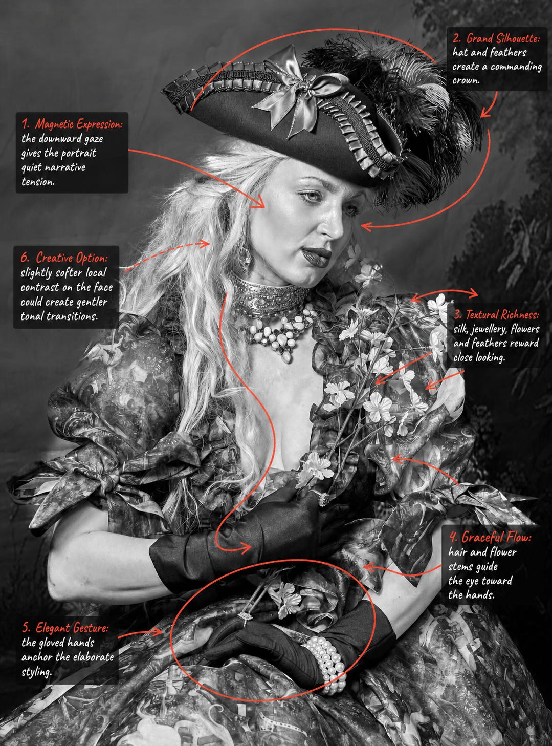
The expression is the emotional centre of the photograph. Rather than presenting the costume directly to us, the model seems momentarily absorbed in another thought. That downward gaze introduces ambiguity and gives the portrait its narrative tension.
Above the face, the hat and feathers create a commanding silhouette. Their scale gives the composition grandeur, while the sweeping curve of the feathers prevents the upper half from feeling rigid. The dark hat also provides essential tonal separation from the light hair and face.
From there, the eye follows a graceful path. The hair descends along the left side of the face, the flower stems continue the movement through the centre, and the gloved hands bring it to rest near the bottom of the frame. This creates an elegant S-shaped flow through an otherwise extremely detailed composition.
The hands are particularly important. Their calm placement anchors the styling and gives the flowers a believable physical presence. Without that gesture, the costume might dominate the person. With it, the flowers become part of a private action.
Black and white allows the many materials to speak through texture rather than colour. Silk, feathers, hair, pearls, flowers and patterned fabric each reflect light differently. The photograph rewards close looking because another detail seems to appear every few seconds.
The strong local contrast brings extraordinary definition to the costume and accessories. On the face, however, a slightly gentler treatment could create smoother tonal transitions while retaining the portrait’s dramatic character. This could be achieved selectively by reducing clarity or texture on the skin rather than applying general smoothing.
The brightest strands of hair and jewellery compete slightly with the eyes. Subtle burning in a few of those highlights could preserve their texture while returning attention to the expression.
The flowers sit against a similarly detailed section of the garment. A small local adjustment—perhaps lifting the flowers by a fraction or darkening the fabric immediately behind them—could create clearer separation without making the lighting appear artificial.
The textured area near the right edge contributes atmosphere, but gently reducing its contrast could help the feather silhouette remain cleaner. This is another adjustment best made locally; the portrait benefits from retaining some environmental texture.
For photographers working with elaborate styling, it helps to establish a visual hierarchy before shooting. Decide what viewers should notice first, second and third. Here, the ideal sequence is expression, silhouette, hands and then costume detail. Lighting and post-production can support that sequence by giving the highest local contrast to the most important elements.
When a portrait contains many beautiful details, the solution is not necessarily to simplify the styling. It is to give the eye a path through it.
Nick has found that path through expression, flowing lines and gesture. The costume creates spectacle, but the lowered gaze gives the photograph its soul.
Photograph by Paul van den Hooven
At first glance, this is a straightforward photograph of a neighbourhood bar. Look a little longer, however, and the facade begins to resemble a carefully arranged stage: an empty bench on the left, a glowing serving window at the centre and two men seated in conversation on the right.
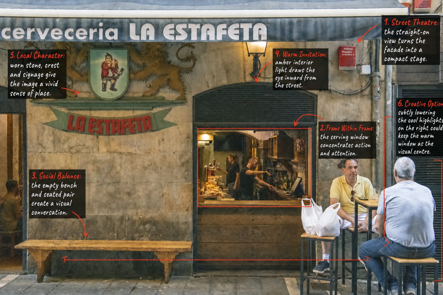
Paul’s straight-on viewpoint is essential to the image. By photographing the facade almost squarely, he allows its horizontal and vertical lines to create a stable framework. Against that structure, the people and their gestures provide the life.
The serving window acts as a frame within the frame. Its dark border isolates the warm interior, drawing us toward the workers, food, bottles and small movements taking place inside. The window becomes a miniature theatre set into the larger facade.
There is also a lovely balance between absence and presence. The long empty bench occupies the left side, while the seated pair fills the right. The bench suggests that people have been there before—or may arrive at any moment. It gives the photograph a quiet sense of time beyond the instant recorded.
The two men introduce a second story. One faces us while the other turns away, allowing their conversation to remain private. Their placement keeps the scene observational rather than intrusive.
The worn stone, crest, painted sign and large lettering across the canopy establish a vivid sense of place. These details are not merely decoration; they tell us about the age, personality and daily use of the building.
The warm serving window is the natural visual centre. Slightly lowering the cooler highlights around the seated figure on the right could strengthen that hierarchy and encourage the eye to return more quickly to the interior activity.
The white shopping bags are bright and prominent. A restrained reduction in their highlights could preserve their role in the everyday story without allowing them to compete with the faces and serving window.
The image contains several different colour temperatures: warm amber light inside, muted green and stone across the facade, and cooler light on the right. These contrasts contribute to the documentary feeling. Selective colour balancing could make the palette more unified, but it should remain gentle enough to preserve the difference between interior warmth and exterior daylight.
A small amount of local contrast inside the serving window could clarify the workers’ gestures and strengthen the sense of activity. Increasing contrast across the entire photograph would be less effective because the worn facade benefits from its soft, weathered tonality.
It might also be interesting to return at different times of day. Early morning could emphasise preparation and solitude, while evening light might make the window glow more strongly and bring additional customers into the scene. Revisiting one facade can reveal how architecture becomes a container for changing human stories.
A good street photograph does not always depend on a dramatic gesture. Sometimes it comes from recognising balance within an ordinary place.
Paul has allowed the facade to provide the structure and waited for everyday life to complete it. The empty bench, busy window and seated pair give us three different states—waiting, working and talking—contained within a single frame.
Photograph by Stephen Parvaresh
A solitary figure pauses beneath a translucent umbrella, caught between the bright, rain-washed street and the dark wooden facade. We do not know what has attracted their attention, but that uncertainty is precisely what gives the photograph its quiet pull.
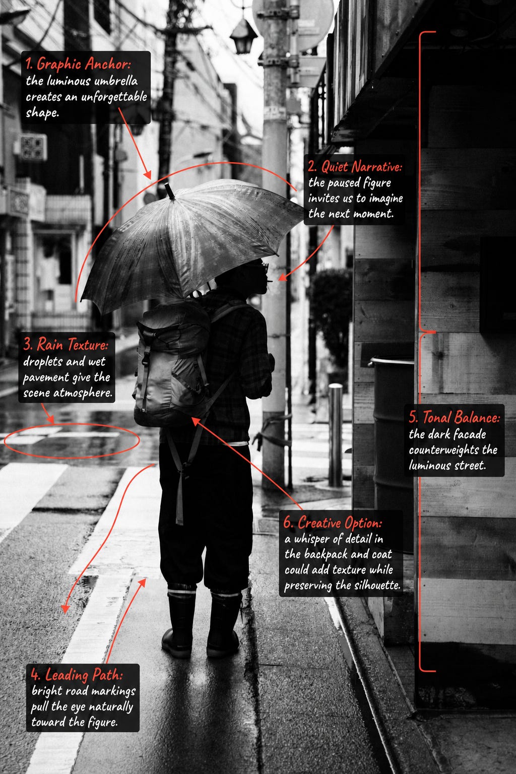
The umbrella is the immediate visual anchor. Its luminous curved form emerges from the complicated urban background with remarkable clarity. Droplets and streaks across its surface tell us about the weather before we even notice the reflections on the road.
Beneath it, the figure becomes a strong silhouette. The profile, backpack and still posture give us enough information to imagine a story without explaining it completely. Perhaps the person is reading something, looking through a window or simply deciding where to go next. The photograph leaves that question open.
The bright road markings provide a natural path into the frame. They begin near the bottom edge and travel directly toward the figure, while the narrow curb continues beyond them into the street. These lines give the vertical composition depth and prevent the subject from feeling isolated against a flat background.
On the right, the dark wooden facade occupies a substantial part of the image. Far from being empty or excessive, it acts as a tonal counterweight to the luminous street. The figure stands at the boundary between those two worlds: light and darkness, movement and stillness, public street and private interior.
Black and white brings these relationships together. Colour might have introduced additional information, but monochrome allows shape, light, texture and atmosphere to carry the story.
The silhouette is one of the photograph’s strengths. Recovering only a whisper of detail in the backpack and coat could add tactile information while preserving the graphic shape. A local shadow adjustment would work better than lifting the overall exposure.
The upper background contains some very bright areas. Gently recovering those highlights could reveal slightly more architectural detail and help the umbrella retain its position as the brightest meaningful element.
A small amount of selective contrast on the umbrella’s droplets could emphasize the rain texture. Care would be needed around its outer edge, where too much sharpening might create an artificial halo.
The dark facade is compositionally valuable, but there may be several possible tonal interpretations. Keeping it almost black produces the strongest graphic contrast. Lifting its wooden texture slightly would create a more descriptive, environmental version. Comparing both treatments could help determine whether mystery or place should dominate.
Rainy scenes often change from one second to the next. When photographing a similar situation, it can be worth holding the composition and waiting for subtle variations: a turn of the head, a raised hand, a passing reflection or a gust changing the umbrella’s angle. Small gestures can create very different narratives within the same frame.
Atmosphere is not created by weather alone. It comes from the relationship between weather, light, setting and human behaviour.
Stephen has recognised that the most interesting moment is not the person walking through the rain, but the moment they stop. That pause transforms a familiar street scene into a question—and gives the viewer space to supply the answer.
by Marco Secchi :-)
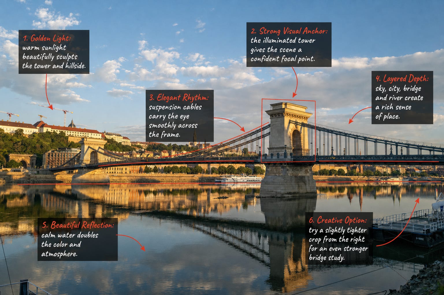
What draws me into this frame is the way the evening light gives the bridge both strength and warmth. The illuminated tower becomes a natural anchor, while the suspension cables carry the eye gracefully across the city.
Below, the calm Danube repeats the architecture and golden colour, creating a quieter version of the scene above. Sky, city, bridge and reflection work together in layers, giving the photograph depth and a powerful sense of place.
Thank you to every photographer who trusted me with an image, and to everyone who paused long enough to look, consider and join the conversation.
The Red Pen will be back very shortly. In fact, it will return in a new form as part of our upcoming Holiday Photography series, where we will explore how to find stronger light, more meaningful moments and better stories in the photographs we make while travelling.
Until then, keep looking beyond the obvious, and keep chasing the photograph that only you can see.
Comments
Nothing yet. Say the first thing.
Sign in to join the conversation.