
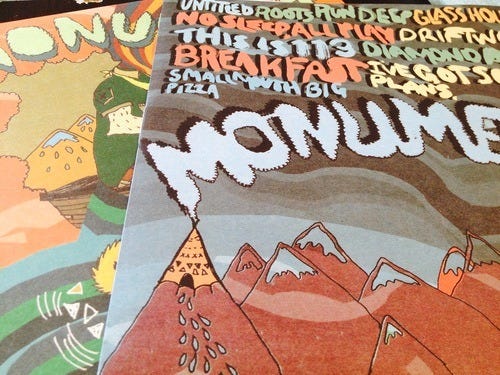
Interview with Chuck Daley
Tiny Engines is one of a few indie labels that are doing interesting printing treatments on the LP jackets, was this something that you set out to do from the first release?
Definitely. For me, the appeal of vinyl was not only the sound of an expertly cut slab of wax, but also the potential for going the extra mile with packaging and artwork. There’s some creativity involved with CD packaging, but less so because of size constraints … and a digital release is completely lacking in that regard. An LP simply has the ability to draw you in on so many levels and I always figured that if we were going to be releasing amazing music from amazing bands that the packaging should reflect that.
Beside, I’ve always appreciated other labels who devote a hefty chunk of their resources into artwork and design. Give me an exquisite gatefold jacket and a simple black LP over colored vinyl any day.
I know that kids love to collect the different color variants, but I could care less about that. I just want the record to sound great, and if a label has put a lot of effort into the packaging, it’s a big plus.
Who comes up with the ideas for how each LP jacket is going to be finished? Do the bands ever come to you with ideas?
Sometimes bands have a concept of what they’re going for, but normally I’m the one who is suggesting different packaging ideas to them. Hopefully they don’t mind me butting in, but I think everyone has been really happy with how their records have turned out. And I would never push a band to do something that they didn’t want to do. Sometimes it’s just a case of, “Hey, the art looks great … but I think if we did this it could look even better.”
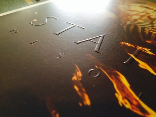
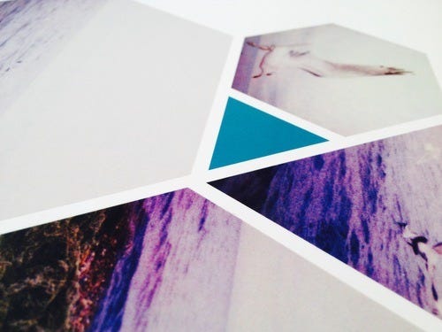
For each release, do you have an idea in mind before the artwork is submitted or are the printing treatments discussed and added in afterwards?
If a band has a solid concept of what they’re trying to do with the artwork and packaging, then usually it’s before. More times than not it’s a matter of me seeing the finished (or nearly finished) art and making suggestions.
How much preparation goes into the artwork and printing for each release?
Depends on who you ask. Quite frankly, we’re usually hands-off when it comes to artwork, so if you ask the bands, they’d probably say “a lot!” Once they submit something to us, that’s when our work begins … but it’s more about discussing ideas, keeping everything organized and making sure everyone follows through so we’re not running behind. Obviously there’s plenty of behind-the-scenes work that goes into making a finished product look the way it does, but it’s all part of the job.
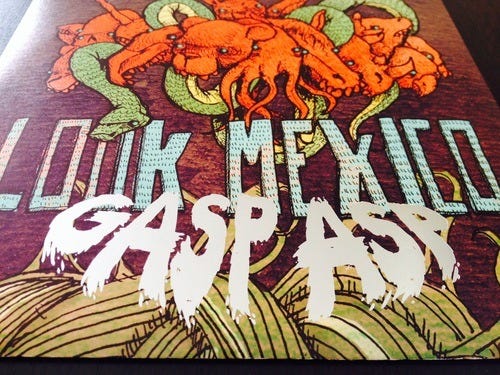
Is the artwork taken into consideration when choosing which colors to press the vinyl on?
Some bands really want the vinyl to reflect the colors in the artwork; other bands don’t care. Personal preference, I suppose.
Is there a lot of extra cost involved when doing things like the foil stamping, UV coatings, and printing on sleeves?
Dear god, yes. All that fun stuff costs money! This is probably the biggest reason why more labels don’t do it, and it might be the trickiest part of my job when it comes to packaging ideas. How do we make this record look as good as we possibly can for xxx amount of money? We have a set budget for every release, so if a band really wants to do foil stamping, a die-cut jacket or something like that, we may have to cut back in other areas. Maybe we’ll print the inserts in black and white, or we’ll skip the expensive “starburst” variant for the vinyl. It’s all about compromise when you run a small indie label.
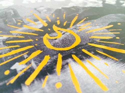
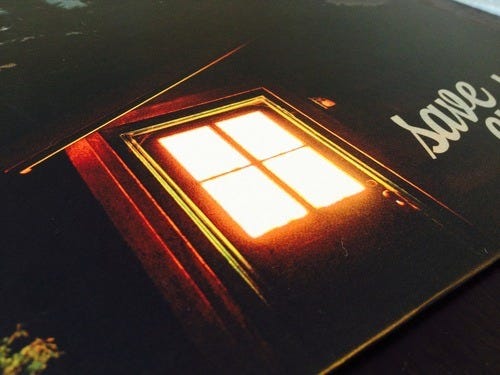
Does it add on to the production time of the jackets having the extra stuff done to them?
Maybe a little. Not much though. Vinyl takes a long-ass time to press. We can have jackets and inserts back within 3-4 weeks of submitting the artwork. Sometimes even sooner. Here’s where I give a shout out to Imprint Printing for being so awesome!
What have you learned from working with printers on the artwork and has there been any mistakes you’ve made in the process?
The biggest thing I’ve learned is to ask a lot of questions and explore all your options. It definitely helps to have a printer who is patient and willing to hold your hand throughout the process. I’ve made plenty of mistakes, but I’m usually well-prepared, detail oriented and meticulous when it comes to this stuff. I’m trying to think of an example of a big screw up with artwork, but nothing is coming to mind. The CSTVT jackets weren’t screwed up, but the spot gloss / matte coating didn’t come out as nice as I thought it would. Maybe that’s not the best way to put it. I’m really happy with the jackets, but they don’t “pop” as much as I thought they would. Because the jacket is mostly white, there just wasn’t enough contrast with the photos to make it that noticeable. It doesn’t look bad by any means - the art itself is terrific - but it wasn’t the success I thought it would be. On the other hand, we tried the same thing later on with Dikembe’s Broad Shoulders and Run Forever’s Settling and it turned out much better.
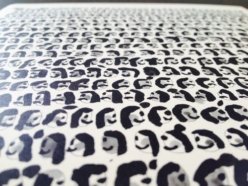
It seems a lot of times, people will buy a release because of the color of vinyl it’s pressed on and not what the artwork looks like, why do you think artwork takes a back seat to the color of the vinyl when ordering?
I have no idea. As I mentioned before, I’m much more likely to shell over extra cash for deluxe packaging then I am for a rare color variant. Maybe it’s because there’s a collectibility / limited-edition aspect to colored vinyl. I would love to do limited-edition packaging for some of our releases, but that would definitely be an added cost. Maybe someday.
This may seem like a lame question to people who don’t know a lot about paper, but how do you choose which type of cover stock you’re going to use, uncoated or coated finish, and do you have a personal preference?
Again, this is one of those “depends” responses. It’s really based on the artwork. Personally, I think that matte coating works really well with photos. With illustrations, I tend to prefer uncoated stock. I’ve never been that into glossy, but if the artwork called for it, that’s what we’d use.
We’ve also used some rougher, cardboard-like stock for a few releases: the Restorations, Tigers Jaw and Dikembe 7-inches, to name a few. Again, we just felt like the artwork lent to that particular stock.
For the test presses of each release, you sell the test press vinyl with a limited custom print by different artists. What inspired you to offer these custom prints with the test presses?
It was just an opportunity to do something creative and a little different. I also liked the idea of working with awesome artists that I had always respected. Plus, I always kinda hated when a test pressing ended up on eBay for a ridiculous price, especially since it’s simply a record pressed on black vinyl that costs the label a dollar to make. Why not put a little extra effort into making the test pressings really unique and much more fun? On top of that, we could sell a bunch on our website for a very reasonable price and our fans could get something truly collectable. Do some of those test pressings / prints eventually end up on eBay? Of course, but at least we give all the hardcore fans an opportunity to buy one directly from the label for no more than $25 or $30.
Maybe a better way to look at it is this: if someone is going to spend a big chunk of cash on a test pressing, I want them to get their money’s worth. Doing limited-edition prints helps to justify the higher cost.
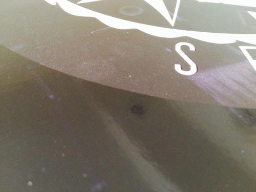
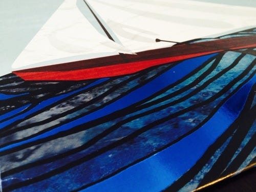
Knowing what you know now about the printing processes, are there any past releases you’ve done, where you’d go back to now and update the artwork?
I mentioned CSTVT before. I don’t know if I’d change it because again, it still looks pretty cool, but maybe I’d switch the gloss / matte? I don’t know … make the photos matte and the white parts gloss? Or embossing the photos might be cool too.
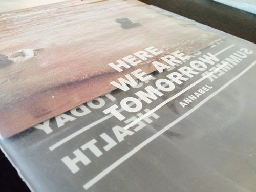
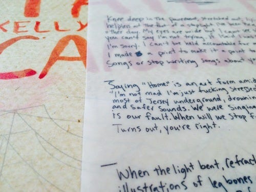
For the first pressing of the Annabel 7” we did printed polybags. It was an great idea, but really expensive and the printing had a tendency to scratch off if it was handled too roughly. For the 2nd pressing, we did a clear sticker and just slapped them on the bags. I think it looks just as cool - maybe a little more so - and it was much cheaper too.
The Dikembe Chicago Bowls 7” is another that I’d rethink. Again, I love the concept and the end result is very cool, but the silver metallic printing doesn’t show up as well on the brown cardstock. I think that a metallic red or something darker would have come out better.
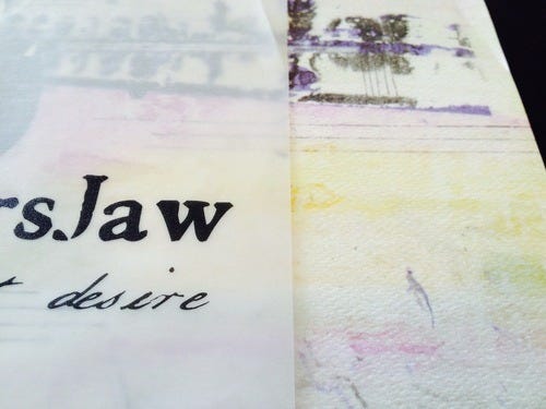
Is there any printing treatment that you want to do, but is too expensive?
Ugh…there’s something I inquired about in the past year and I was shocked at the price, but now I can’t remember what it was. Most of the stuff we’ve done, embossing, spot gloss, die-cutting, foil stamping, is about the same cost, give or take a few bucks.
It would be nice to do some special printing treatment on a gatefold jacket, but the gatefold by itself is very expensive.
If ever given the opportunity to put out a release where money wasn’t a factor and you could do whatever you wanted, what would the artwork include and how would the vinyl look?
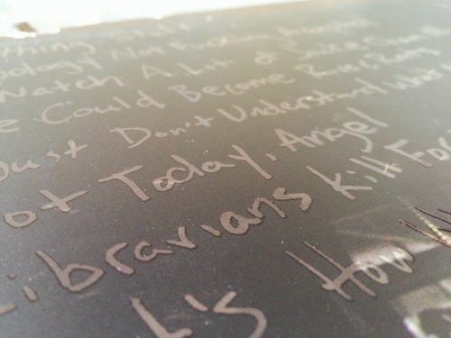
Gawd, that’s almost impossible to answer, but I promise you that I would go absolutely nuts. Have you ever seen the original packaging for Torche’s Meanderthal? Something like that. Something that is completely unique and makes people stop and say “holy fuckballs.” And I don’t really care about vinyl colors, but I do like the starburst effect we’ve been using for some of our new releases. I’d love to try a B-side etching as well. Basically, if I had the resources to blow my wad on packaging, I totally would.
No posts
Comments
Nothing yet. Say the first thing.
Sign in to join the conversation.