
Brian Danaher
Minneapolis, MN
Brian Danaher is a Minnesota based art director, designer, illustrator, chronic doodler, coffee drinker and music addict. In addition to poster design, he has also created illustrations for brands like Cherrios, The Wall Street Journal and PCWorld.
To view more of Brian’s work, check out: briandanaher.com
Junip
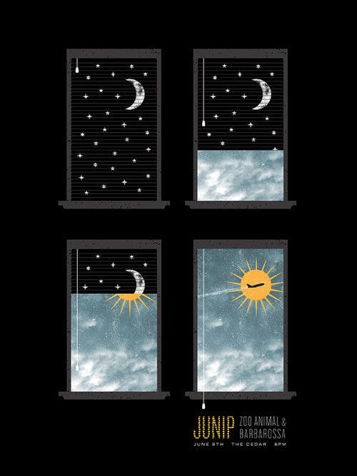
Many of the songs on Junip’s new record deal with recognizing things in your life that need changing and having the courage to shift perspective and forge a new path. I came across an interview with José Gonzalez in which he described the new album as, “…ultimately about how the grass will grow after snow melts away: finding that hopeful feeling between the lines, that’s what the whole record is about.” I wanted the design to speak to that - one little tweak or flip and the scene completely changes. One of my kids has a nightlight that projects stars on the ceiling and as I was laying on the floor reading a bedtime story one night, I had the idea of using the moon, stars and window blinds as a metaphor for changing darkness into light. The plane in the last window pane adds further dimension to the idea that change is happening - that a new day brings new possibilities.
Jeremy Messersmith
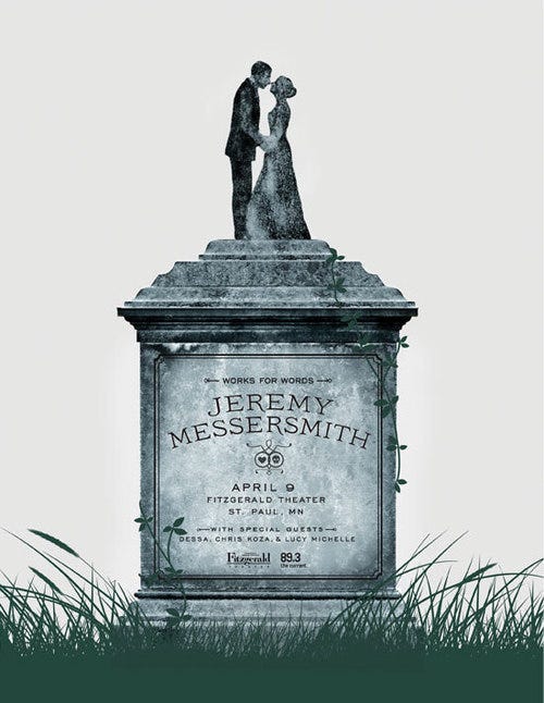
This poster was heavily influenced by Jeremy’s album, The Reluctant Graveyard, where themes of death, love and loss run throughout. I took cues from the song titles and cover artwork, but the biggest inspiration were the lyrics, in particular the songs, “ A Girl, A Boy, and A Graveyard” and “Deathbed Salesmen”, the latter has a line that really stuck with me: “This is how it has to end/so love somebody while you can” All of this lead to the idea of using a wedding cake topper as a head stone. The posture of the couple adds some tenderness to the subject matter, preventing the design from becoming too somber while still speaking to the overall themes of the album.
Nada Surf
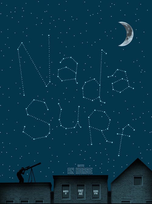
I originally had this idea for another band’s poster but never made it past sketch stage, mainly because that band’s name was too long to pull it off. With Nada Surf’s new album, The Stars are Indifferent to Astronomy, this idea seemed like a perfect fit, not to mention that the band’s name is only 8 characters. It was also an opportunity to try working with hand drawn letterforms, which was something I hadn’t really done before. I toyed around with having the guy with the telescope in a field, but the band’s songs seem more at home in an urban setting, so I opted for a cityscape. The type treatment on the buildings were influenced by the signage for a coffee shop and tattoo parlor in South Minneapolis, across the street from where I work.
The Walkmen
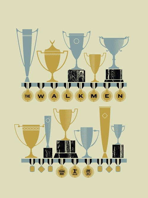
The Walkmen’s album, Heaven, is a positive, confident record heavily influenced by the lessons and experiences of the band’s 10 years together. I wanted this feeling to be reflected in the design; an upbeat/positive nod to the past. Old keepsakes and mementos: photo albums, yearbooks, ticket stubs, and other personal souvenirs that one might keep to remember past accomplishments and important personal experiences seemed to be an interesting area to explore. After tons of dead-end sketching, the deadline was approaching and I was nervously racking my brain for a solution. I found myself at my in-laws house one afternoon. Their basement is full of old things - books, photo albums, taxidermy, guns, old appliances, computers, etc. As I was looking through it all I came to the idea that old trophies and medals could be the thing that tied the idea together. It didn’t strike me until I was halfway done with the design that the image also had a nice conceptual tie-in to the title of the first song on the record, “We Can’t Be Beat”.
Unknown Mortal Orchestra
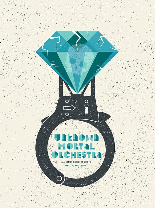
When concepting this poster I came across a video interview where Ruban Nielson talked at length about how his marital trouble, infidelity, a brutal touring schedule and doing too many drugs influenced the band’s new record. In another interview, he described the album as “…mainly about love affairs and how impossible it is to connect with people sometimes, and losing people.” These interviews coupled with the line, “so good at being in trouble/ so bad at being in love” from the song “So Good at Being in Trouble” were the main inspiration for the design. The cracked diamond speaks to relationship troubles while the ring/handcuff suggests being stuck in difficult circumstances from which both are difficult to break free.
No posts
Comments
Nothing yet. Say the first thing.
Sign in to join the conversation.