
Lately I’ve been toying with the idea of migrating from Jekyll to GatsbyJS (more on that in a future post). Initial tests look promising, but there are some issues I’m still working through.
In the meantime I’ve taken visual cues from React components I built in a repo where I was playing around with Gatsby, and adapted them here as standard HTML/CSS.
Design changes
In Made Mistakes v12 text and image where large and readible, but didn’t exactly fill the canvas elegantly. I wanted to change that with this design refresh.

Since majority of the visitors to my site use modern browsers, I had a good excuse to play with display: grid. I’ve removed the Susy mixins and most of the float based columns, which cut the amount of CSS I had to write considerably.

To my eye this new layout breaks up the page better. Content comes into view earlier on the page, and there’s plenty of room for ancillary information on the right. With a little position: sticky sprinkled on the aside column, internal skip links stay fixed in view — when space allows.
Accessibility improvements
This refresh prompted me to test how accessible the site is and fix any glaring issues.
Buttons have an accessible name
When a button doesn’t have an accessible name, screen readers announce it as “button”, making it unusable for users who rely on screen readers.
Digging in, I discovered bigfoot.js1 didn’t name <button> elements that it created. Thankfully the button markup is configurable so I was able replace a set of presentational-only <svg> elements with unique names instead.
var bigfoot = $.bigfoot({
  actionOriginalFN: 'delete',
  buttonMarkup: (
    '<div class="bigfoot-footnote__container">' +
    ' <button href="#" class="bigfoot-footnote__button" rel="footnote"' +
    ' id="{{SUP:data-footnote-backlink-ref}}"' +
    ' data-footnote-number="{{FOOTNOTENUM}}"' +
    ' data-footnote-identifier="{{FOOTNOTEID}}"' +
    ' alt="See Footnote {{FOOTNOTENUM}}"' +
    ' data-bigfoot-footnote="{{FOOTNOTECONTENT}}">' +
    ' <span class="visually-hidden">{{FOOTNOTENUM}}</span>' +
    ' </button>' +
    '</div>'
  )
});
Color contrast is satisfactory
The color of elements like captions and footer text were too light, so I darkened them. I did the same for links by giving them a contrast ratio of 4.77.
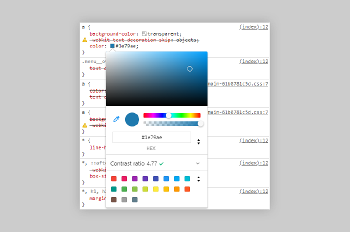
The Color Picker in Chrome’s DevTools will show you the contrast ratio of text elements to help make your site more accessible to users with low-vision impairments or color-vision deficiencies.
Performance improvements
Optimizations with the biggest impact (minifying, concatenating, inlining critical CSS) I was already doing, but there was still room for improvement.
Defer offscreen images
Consider lazy-loading offscreen and hidden images after all critical resources have finished loading to lower time to interactive.
Large feature images were already lazy-loaded and served responsively using srcset and a handful of sized images. Images found in the body {{ content }} of my Markdown files were not.
Taking a cue from gatsby-remark-images’ playbook, I wrote a small plugin to convert Markdown image syntax into an <img> element with synatactically sugar for lazy-loading. To my surprise this actually worked.
# Description: Jekyll plugin to replace Markdown image syntax with lazy-load HTML markup

Jekyll::Hooks.register :posts, :pre_render do |post, payload|
  docExt = post.extname.tr('.', '')
  # only process Markdown files
  if payload['site']['markdown_ext'].include? docExt
    newContent = post.content.gsub(/(?:!\[(.*?)\]\((.*?)\))/, '<noscript><img src="\2"></noscript><img src="data:image/gif;base64,R0lGODlhAQABAAAAACH5BAEKAAEALAAAAAABAAEAAAICTAEAOw==" data-src="\2" alt="\1" class="lazyload fade-in">')
    post.content = newContent
  end
end
Avoids an excessive DOM size
Browser engineers recommend pages contain fewer than ~1,500 DOM nodes. The sweet spot is a tree depth < 32 elements and fewer than 60 children/parent element. A large DOM can increase memory usage, cause longer style calculations, and produce costly layout reflows.
Trimming <div> fat where I could helped cut page weight down. Some hefty pages remain (I’m looking at your PaperFaces gallery, but most fall under the 1,500 DOM node threshold. In the future I hope to fix this issue with a gallery pagination component when switching to Gatsby.
Lighthouse audits comparison
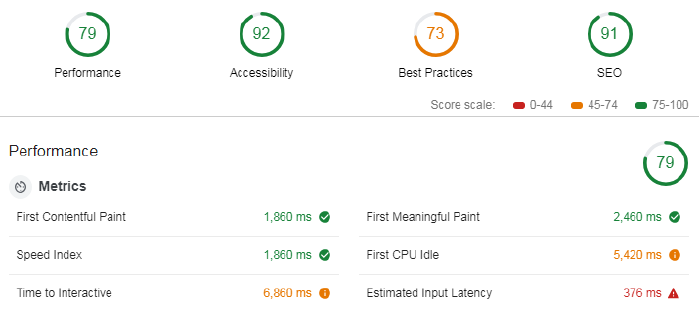
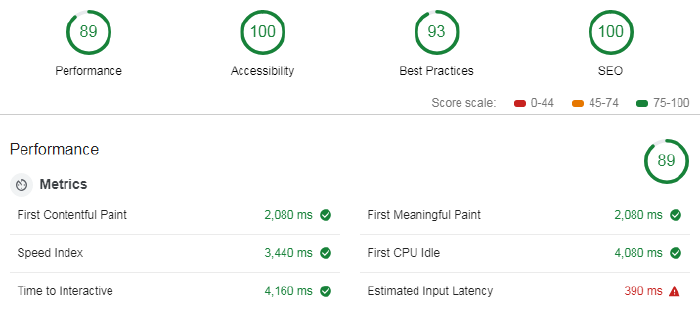
Not sure why metrics like Speed Index increased. But Time to Interactive, First Meaningful Paint, and First CPI Idle all show improvements, so I guess that’s why the site went from a 79 in performance, to an 89.
Build and deploy
And if all of this wasn’t enough, I also made the switch away from Travis CI, to Netlify. Instead of a 48 line .travis.yml file I now have a three line netlify.toml.
The Netlify builds are about 2-4 minutes faster than those with Travis CI. And look to be even quicker if I leverage undocumented Netlify cache folders that persists between builds. Using these to store the thousands of images I pipe through resizing tasks could shave another 6-8 minutes off my build.
A jQuery plugin used to make footnotes less visually distracting. ↩︎

Just another tattooed, bearded, vinyl-collecting designer, front-end developer, and illustrator calling Buffalo, New York, home.
Comments
Nothing yet. Say the first thing.
Sign in to join the conversation.