
Hi, friends! July has come to an end, and as per usual, it’s time for me to wrap up the month. I’ve observed that each month tends to pivot around a specific topic. Most of the time, this is not intentional :)) At the beginning of the month, I came across the Marie-Noëlle Wurm Skillshare class about colors, and I felt it arrived just at the right moment.
*If you're new to Skillshare and want to try it out, you can use my code MADALINA725 and get a one month free trial on the platform.
I don't usually look for color palettes when I draw. I start by choosing one and then add others that go well with it. But this has kept me in my comfort zone for way too long! And I also rarely choose colors that don't match reality. So taking this course was a jumping-off point for me to look for new ways to find color palettes.
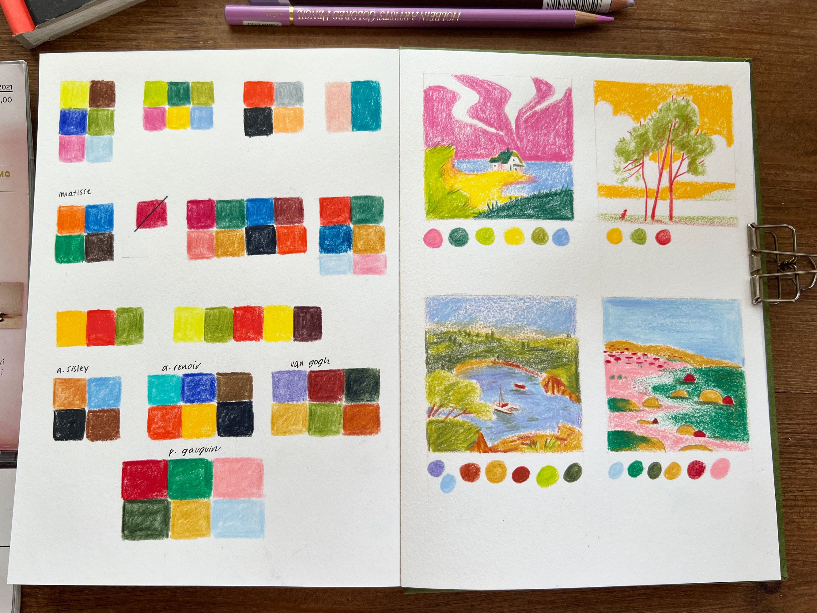
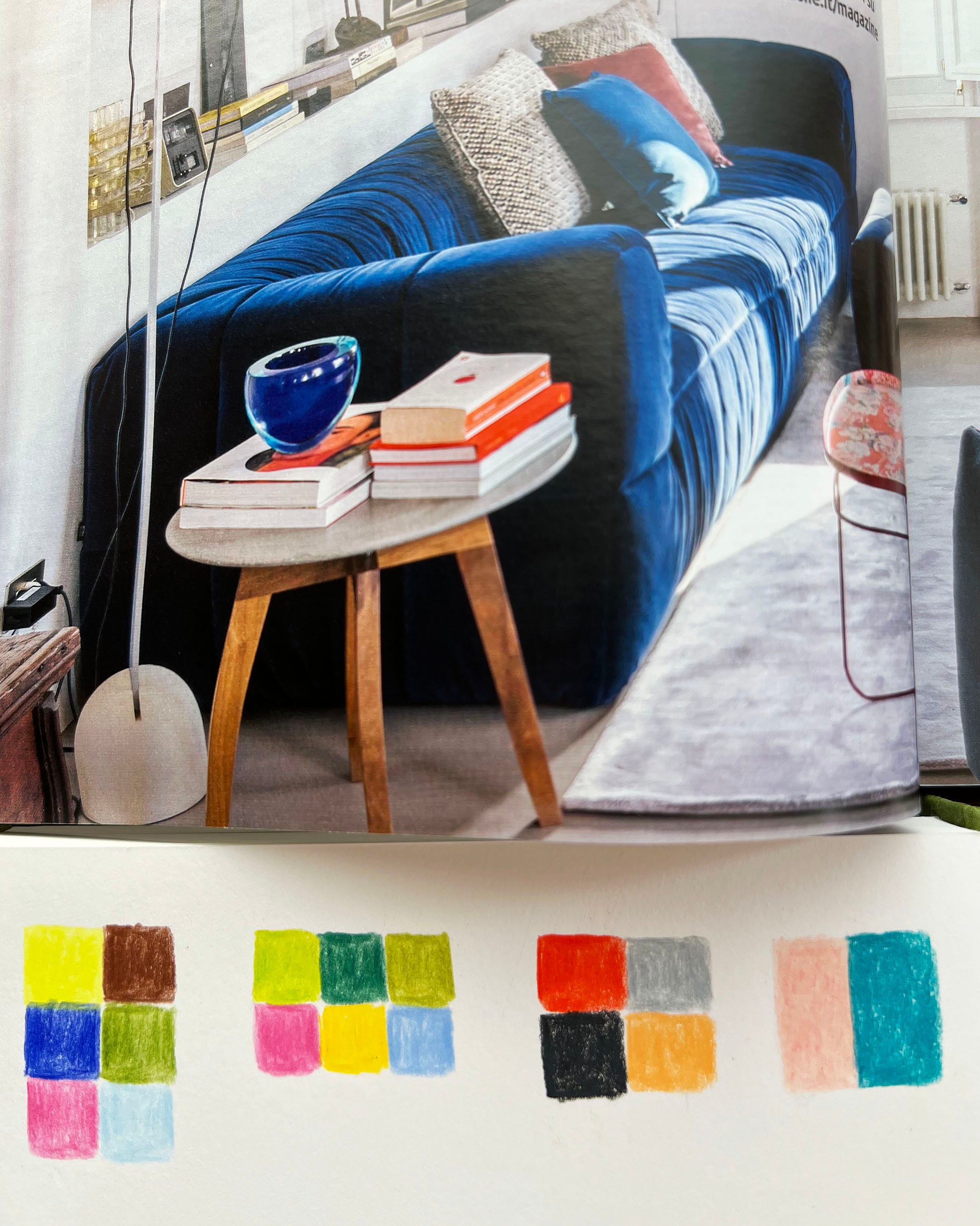
I think everything related to graphic design can be a great source of inspiration for colors. Designers choose their colors carefully. Their goal is to communicate effectively rather than remain faithful to reality. So I started flipping through some interior design magazines I had in my library and analyzing the photos and how the objects were arranged based on their colors.
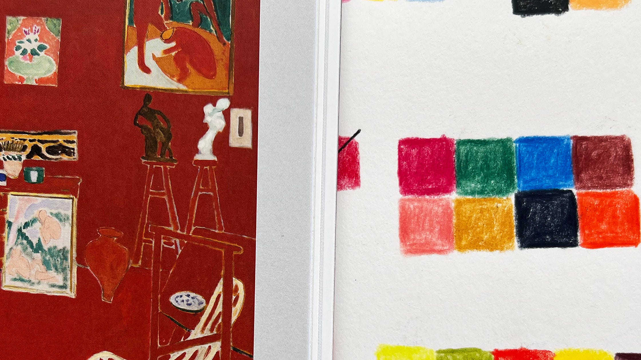
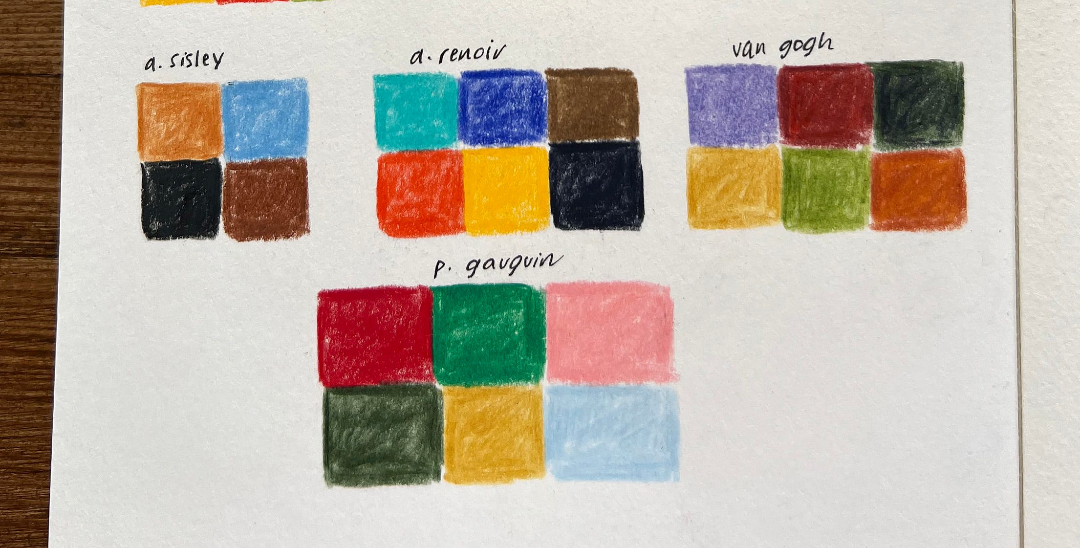
Another source of good color combinations is other artists’ art, especially old masters’ art. In this case, I looked at Matisse work. Trying to match colors has helped me better understand his choices and preferences. He definitely preferred bold complementary colors!
This is also related to design, but it's more fun to gather references by looking at supermarket shelves than in books. In practice, you could collect hundreds of color combinations just by shopping. It would also be great to do the same exercise on vacation, in another country, and see if the colors reflect that country's culture. I bet that in Mexico, food packaging has very warm colors, mostly red and orange (let me know if you live there).
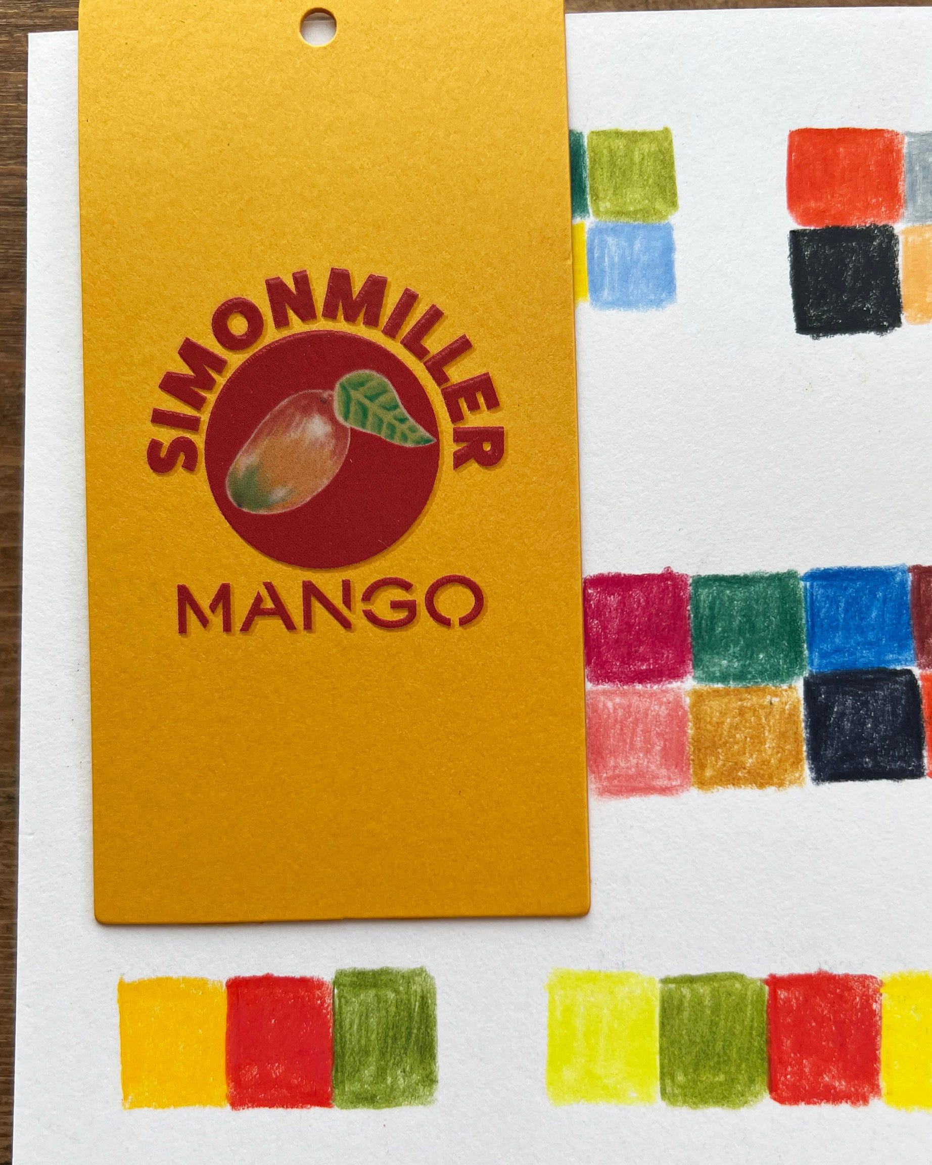
In addition to choosing colors based on observation, we need to think about their role in the drawing. Since each color conveys a certain feeling, which color will be the dominant one that will convey the message? This is where the importance of thumbnails comes into play.
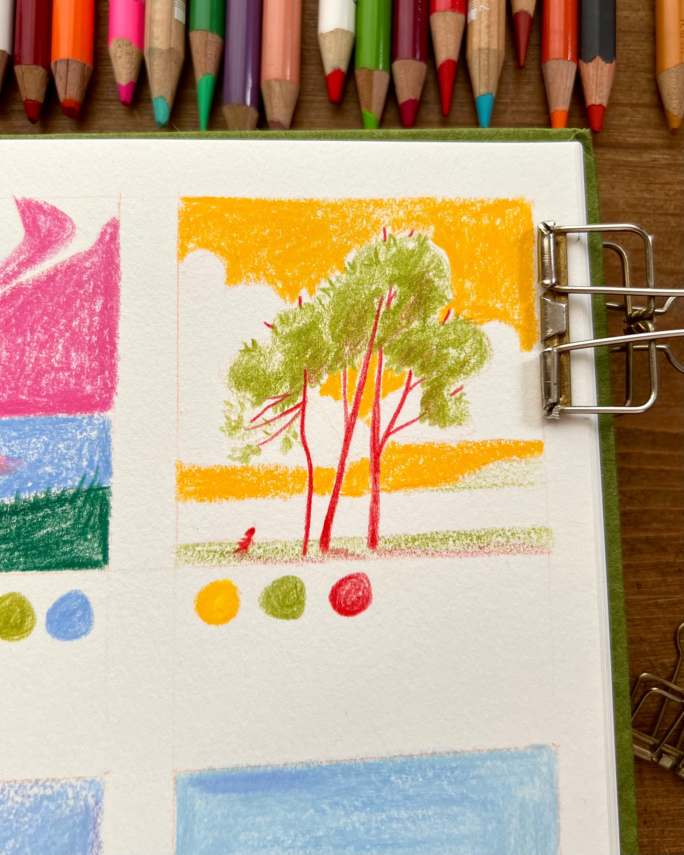
In this case, I decided that yellow would play the main role. I wanted the atmosphere to be warm and sunny, almost blinding. So, even though it may seem unusual, I colored the sky yellow. It was so liberating to use an unrealistic color!
Here I used pink for the beach and red for the rocks. Why not, after all?
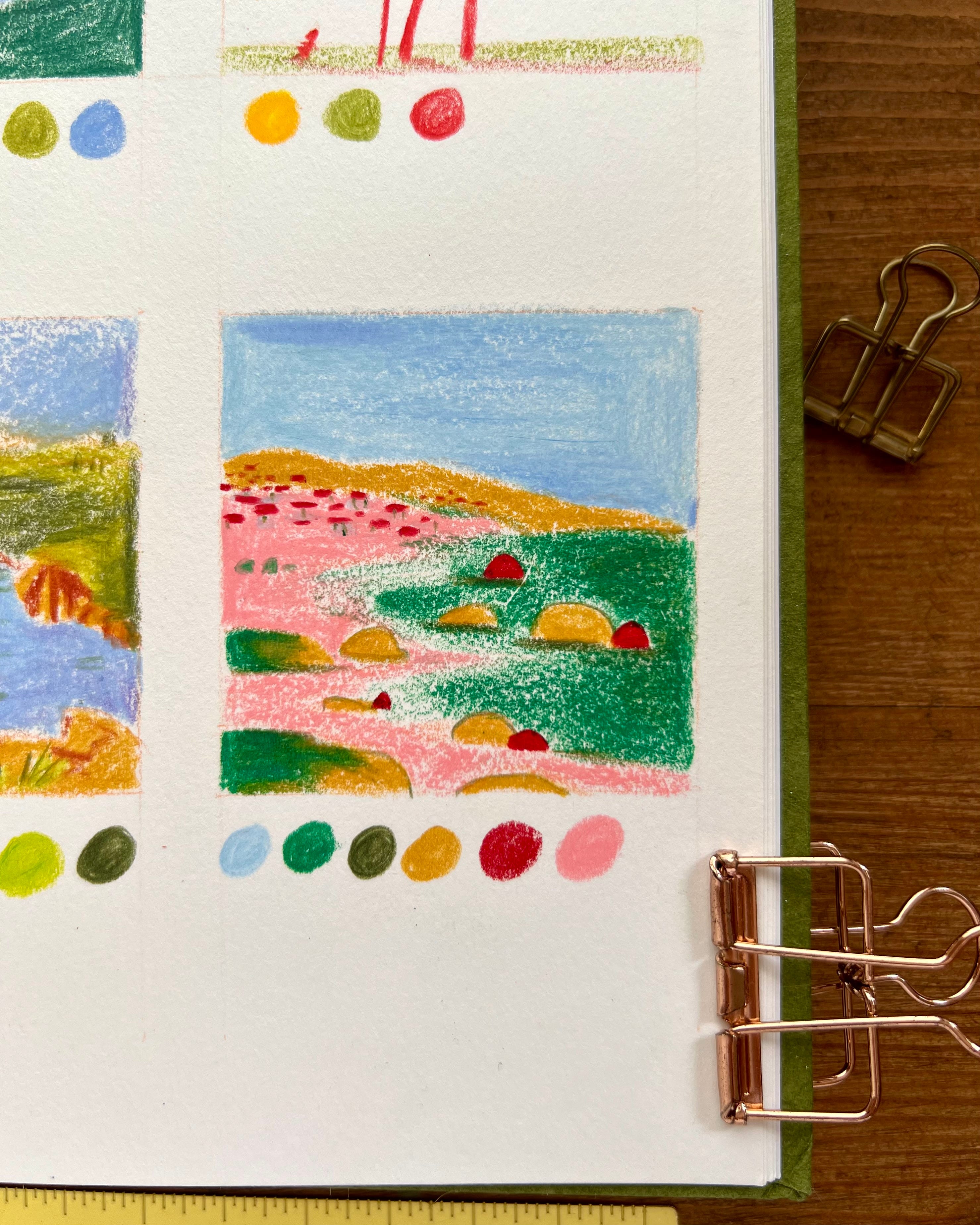
You can have fun playing with different color proportions and combinations and see which one you like best.
It's not the colors that define us, but the way we use and combine them.
If you want to see the entire process of creating these pages, check out my latest video on YouTube↓
I'm going to take part in the Three materials challenge that I discovered thanks to Charlotte Durance. I had the chance to interview her on my for ARTISTS page! Find out more about her and this August challenge here.
Wish you the most wonderful summer break! See you in August!
-Madalina
No posts
Comments
Nothing yet. Say the first thing.
Sign in to join the conversation.