


Dear Investors,
Eight charts have been pinned to the wall beside my desk since Wednesday, and I have spent the week trying to make one of them argue with the others.
I could not do it.
That bothers me more than a contradiction would.
Five of them you could have assembled yourself off the tape. An intervention eaten alive in a day and a half. A money supply and a debt stock climbing the same staircase under every president since Carter.
One of the finest equity decades in a century. Gold up 10.89% in 13 sessions. And a liquidity proxy sitting at a record, still leading the S&P by 11 weeks.
Stop after those and you close this email in a decent mood.
The last 3 are the reason I’m writing at all.
They don’t contradict the first 5. They explain them.
Laid end to end they describe a machine. 3 levers, all already being pulled, not one called by its real name. And the machine is not new: it has run twice before, once in America and once in Japan, and both times we know what it paid and what it took, down to the currency cross.
Let me be honest: the value doesn’t sit in the first half.
It sits in the second. In why the smallness of yesterday’s failure argues for something far larger rather than for surrender. In an asset class that returned 350% during the worst equity decade in 70 years and has just cleared a base 17 years wide.
And in a single correlation that has changed sign twice in modern history - once in London in September 2022, once in Tokyo - which tells you, on the afternoon it happens, that you have stopped trading a rate story and started trading a credit story.
It has not happened yet.
We are close enough that I would rather you recognised it in advance than read about it afterwards.
5 charts in the open. The 3 that change what you own are past the break.
Watch the shape, not the level.
On Thursday the 30-year closed at 5.26%, 7 basis points higher, handing back every inch of the decline that followed Secretary Bessent’s buyback announcement.
The drop had been vertical - 10 basis points in 90 minutes, 5.29% into the 5.18% area. The recovery came back in small change, over a day and a half, and nobody wrote a word about it.
That is how a market tells you it has quietly stopped believing something.
The 10-year did the same, climbing to 4.71%.
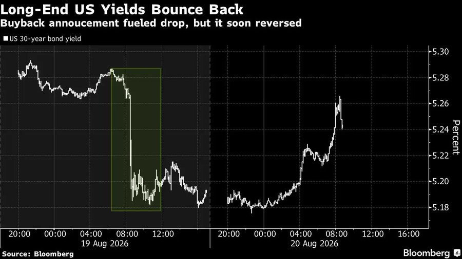
Doubling the buybacks sounds decisive until you stand it next to supply. The Treasury still issues north of $35 billion a month at 20 and 30 years alone. Retiring a few billion a quarter against that is a gesture toward duration removal, and the market priced the gesture for 6 hours before it got round to the arithmetic.
The receipt for a long-end repricing is only 4 years old.
In 2022 the 10-year real yield travelled from -1.0% to +1.7% and nothing was spared: S&P -19.4%, Nasdaq 100 -33%, the Agg -13.0% in its worst calendar year on record, a 60/40 book -17%.
Earnings grew that year. Every bit of the decline was multiple compression, forward P/E from 22.5 to 15.2. And in currency the dollar gained 8.2%, the euro broke parity at 0.9536, USD/JPY reached 151.95.
Then 1994, the last purely supply-driven shock: the 30-year ran to 8.16% while USD/JPY fell 112 to 96.
Rates up, dollar down. Hold that pairing - it returns after the break as the most important thing on my screen.
One number changed underneath all this, quietly. From 2010 to 2019 the correlation between S&P returns and changes in the 10-year ran near +0.3: higher yields meant growth, and equities took it as a compliment.
Since 2022 it sits near -0.4.
We are at 4.71%.
Step back until the weekly noise disappears, because this chart is why the first one happened.
M2 has walked from $1.6 trillion at the end of Carter to $23.2 trillion. The debt has walked from $1.2 trillion to $39.9 trillion.
9 administrations. Both parties. One direction.
The levels are not the insight. The ratio between them is.
In January 1981 every dollar of M2 supported $0.75 of federal debt. By 2001, $1.16. By January 2017, $1.50. By January 2025, $1.68.
Today, $1.72.
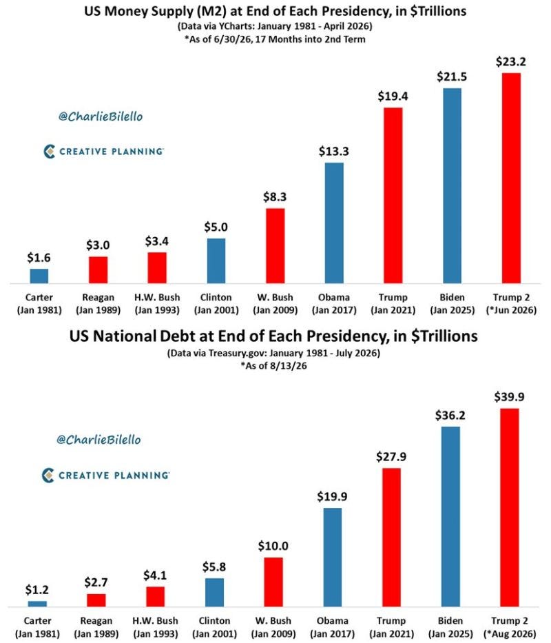
Since January 2025 the debt has grown $3.7 trillion - roughly $6.4 billion a day - while M2 added $1.7 trillion. Borrowing is compounding at twice the speed of money creation.
A gap like that has 3 exits.
The debt stops growing, and nobody in Washington is walking toward that one.
Yields rise until the private sector is paid enough to swallow the paper - the door that swung open yesterday at 5.26%. Or the money catches up: restoring the 1.20 ratio of 2001-2009 needs M2 at $33.3 trillion, +43% from here.
Which exit gets taken is drawn, literally, in my 8th chart.
Look at what the staircase has paid. Since 1981 the S&P is up roughly 57x in price, M2 14.5x, debt 33x, gold about 9x - and on 3-year changes the debt to M2 ratio and gold move together at around +0.5.
Gold, which everybody files under debasement trade, has been trailing the debasement rather than front-running it.
And what it costs a currency. The last time America ran twin deficits this openly, DXY fell from 164.7 in February 1985 to 85.4 by December 1987, -48%, with USD/JPY collapsing 260 to 121.
Yields fell through most of it. The bond was fine.
The currency was not.
This one looks like unambiguous good news, and for 2 days I let it feel that way.
The S&P is up +141.0% since the end of 2019. Hold the pace and the decade finishes near +277%, behind only +315.7% in 1989-1999, ahead of +257.2% postwar and +189.7% after the financial crisis, against a median decade of roughly +122%.
Taking the crown outright needs about 13,430 by December 2029, 17.6% annualized. Merely holding the pace implies 12,180, or 14.2% a year.
Then the discipline.
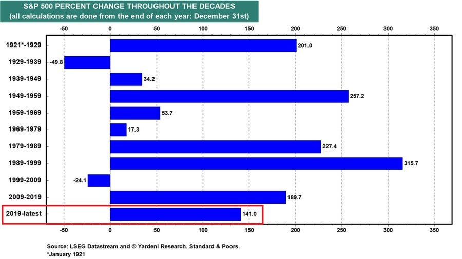
Of the 4 decades that finished above 200%, the one that followed returned -49.8%, +53.7%, +315.7% and -24.1%. Two out of four is not a law, but the bill for a great decade usually arrives in the next one.
In the losing decades, something else was quietly winning.
Across 2000-2009 the S&P delivered roughly -0.95% annualized while the Agg returned around +6.3% - bonds beating stocks by 7 points a year for 10 straight years - and DXY fell 120.9 to 71.3, -41%, with EAFE beating the S&P 6 years running and gold walking $256 to $1,011.
The 1969-1979 version was crueller still: +17.3% in price against inflation near 103%, so roughly -42% real, the dollar losing 52% to the mark.
And one adjustment I cannot stop making. M2 is up +50% since January 2020, so this decade’s +141% becomes nearer +60% measured in money. The same arithmetic across 1989-1999 gives +150% to +180%.
The 1990s were a productivity decade that happened to have money behind it. The 2020s are a money decade that happens to have productivity inside it.
Both make you rich in nominal terms. Only one survives a change of monetary regime.
And with the dollar’s correlation to non-US outperformance near -0.6, what rescued people in both losing decades was never a bond allocation.
It was a currency decision - the subject of my final chart.
One asset in this letter has already stopped debating.
Gold traded $4,486.89, up $152.39 on the session and +$440.74 - +10.89% - across the 13 sessions since 3 August.
Now look at what it responded to. Not growth. Not earnings.
It accelerated into the buyback announcement, then kept going after the announcement failed, adding more than 3% on the very day the long end reversed.
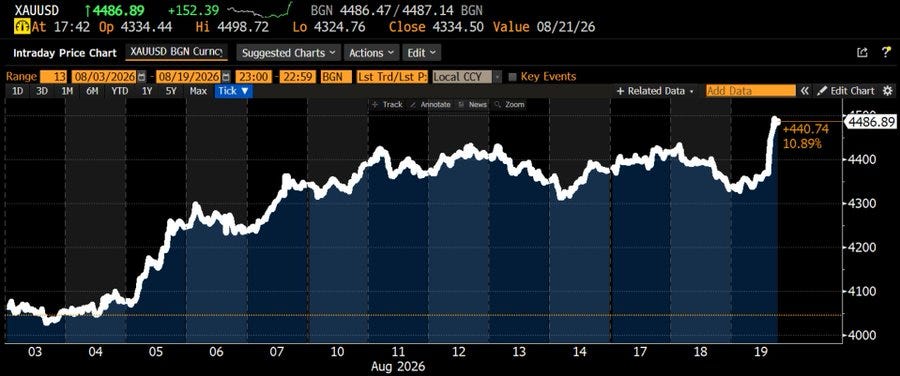
That is not an inflation hedge doing its job. That is gold marking down an intervention while it was still being applauded.
The full version is on record twice.
From 1971 to 1980 gold went $35 to $850, +2,329%, while the S&P added 77% in price and lost money in real terms and USD/CHF collapsed 4.30 to 1.62, the dollar down 62%. From 2001 to 2011 gold went $256 to $1,921, +650%, as DXY lost 41%.
Neither time did gold win because equities collapsed. It won because the unit of account did.
And by the only measure I trust, it is still behind: since 1981 debt is up 33x, M2 14.5x, gold 9x.
Who gets hurt here and who gets paid: gold to the 10-year real yield near -0.8, gold to the dollar near -0.7, long-duration equities to real yields near -0.6, bank equities positive.
But gold is not trading the announcement it has seen. It is trading the one it expects - and I name that one past the break.
This is why I’m not defensive on equities this morning, in spite of everything above.
M2 proxy, advanced by 11 weeks, sits at 113.2, at its record and flat on the week, with the dollar flat alongside it.
Tested twice in 24 months, it held twice: the index dislocated to 4,900 in April 2025 and closed the gap inside a quarter; in April 2026 it fell to 6,300 against a line near 105, then ran +24% to here.
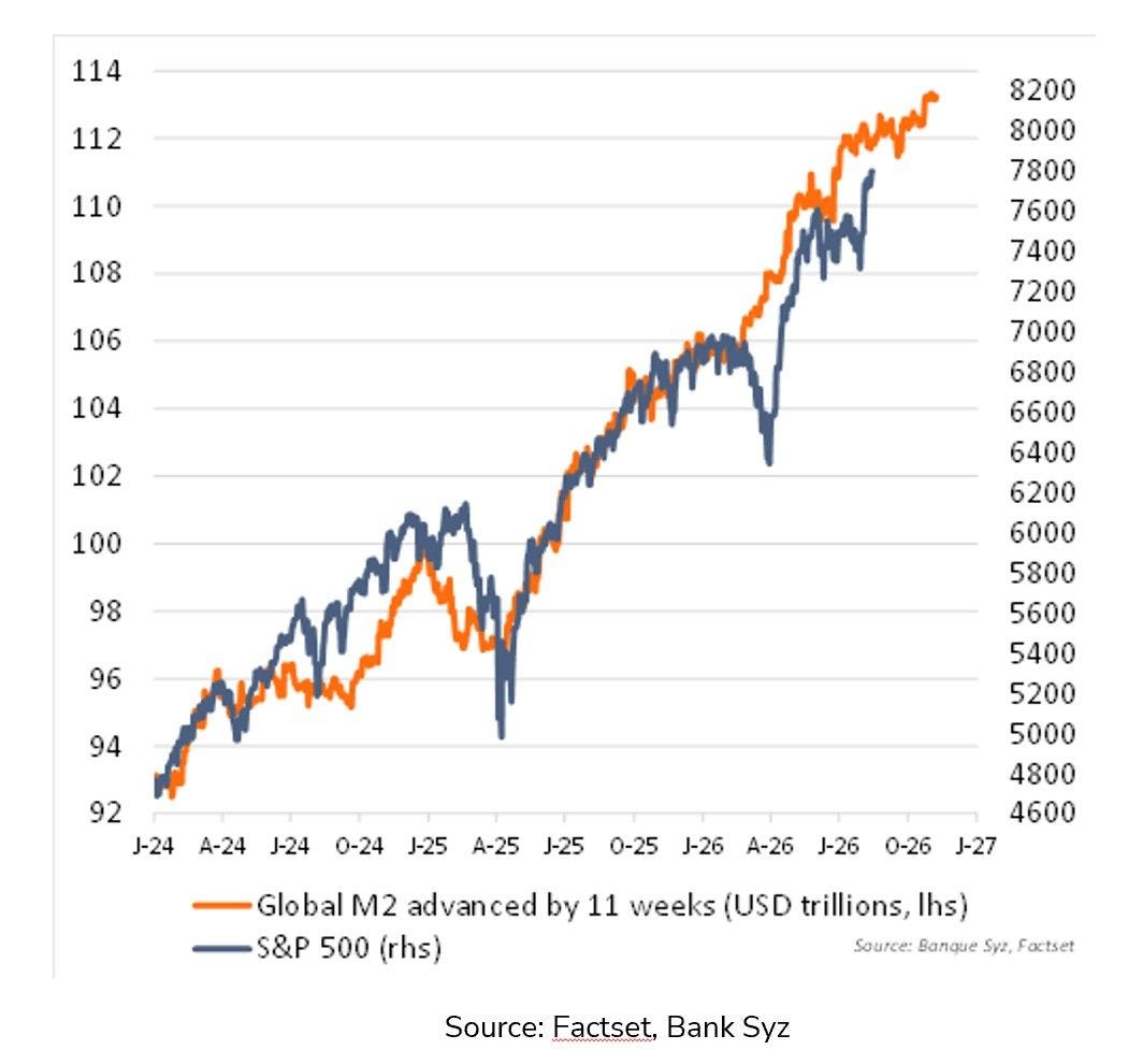
Let me be precise about what the lead buys, because this indicator is oversold. It forecasts nothing.
It means the liquidity conditions mapping onto early November 2026 have already printed - and they are at a record. Knowledge rather than prediction, and the strongest argument for staying invested this quarter.
The mechanism is arithmetic, which is why I trust it: global money in dollars is partly a dollar trade, and the two run near -0.8.
In 2017 the dollar fell 9.9%, the S&P returned +21.8% and emerging markets +37.3%. In 2022 the film ran backwards: DXY +8.2%, S&P -19.4%, EM -20.1%, the Agg -13.0%.
On 13-week changes with the lead applied, the proxy and the index have tracked near +0.7 since 2023 - but it broke in 2018 and again in 2022.
It works until the dollar decides otherwise.
So the backdrop is written through early November. What this chart cannot tell me is what happens to the dollar - and therefore to the line itself - the moment the Treasury runs out of small gestures and reaches for a large one.
Which is where the second half begins: the 24 hours you already lived through, this time with the timestamps.
The first is the autopsy, minute by minute, alongside the 2 occasions when one correlation changed sign - the flip that tells you a rate story has become a credit story.
The second is the asset class whose currency crosses paid more than its equities did.
The third is the machine itself, with 2 precedents stating exactly what it pays and what it destroys. In one of them, 55% of the equity gain turned out to be an illusion.
PRO subscribers, the rest is below. It is where this letter earns its keep.
Two simple paths below - Yearly to begin, Lifetime to never look back.
[🎁 #7 BONUS if you become a PRO today]


Comments
Nothing yet. Say the first thing.
Sign in to join the conversation.