


Dear Investors,
I have a rule I’ve never managed to break.
When something happens that I don’t understand, I don’t reach for the commentary. I open the intraday charts and I watch the tape tick - the way a doctor watches a monitor instead of listening to the patient tell him how he feels.
So on Wednesday, while everyone else was busy grading Kevin Warsh’s press conference on a hawkish to dovish scale, I had two lines on my screen and nothing else. The 30-year Treasury yield. And the dollar.
Around two o’clock they did something they are not supposed to do together.
Something I have watched happen in Britain in 2022. In India and Brazil in 2013. And in a long list of countries that don’t print the world’s reserve currency.
It lasted about 90 minutes. It made no headline I could find on Thursday morning. And I have thought about almost nothing else since.
That moment is the eleventh chart of this letter.
The five above the line - a fiscal comparison, a GDP miss, a dollar trendline, a cycle chart, a midterm seasonal - will be in your feed all week. Every one of them is being read as a story about policy. September. The trendline. A choppy October.
I don’t think any of them is.
I think all five are symptoms of the same illness, and the illness only becomes visible in the sixth chart.
So I’ll walk you through them honestly, dropping threads as I go and stubbornly refusing to pull them. Keep hold of all five. Below the line, I pull them at once.
I don’t often think the second half of one of these letters matters more than the first. This morning I do.
Warsh had a very good Wednesday, theatrically speaking.
Rates held at 3.50-3.75% for a fifth straight meeting. A 9-3 vote, with 3 colleagues dissenting in favour of a hike. The 2% target called non-negotiable. And afterwards, the line about having asked for a good family fight and got one.
4 different people have told me since that America finally has a real central banker. It’s the Volcker costume, worn beautifully.
But a central banker isn’t a temperament. He is a temperament inside a balance sheet - and the balance sheet has changed beyond recognition.
In 1980, federal debt was 31% of GDP. Today, around 120%. Interest ate 10% of tax receipts. Today, 21%. The deficit was 2.6% of output. Today, 6.3%.
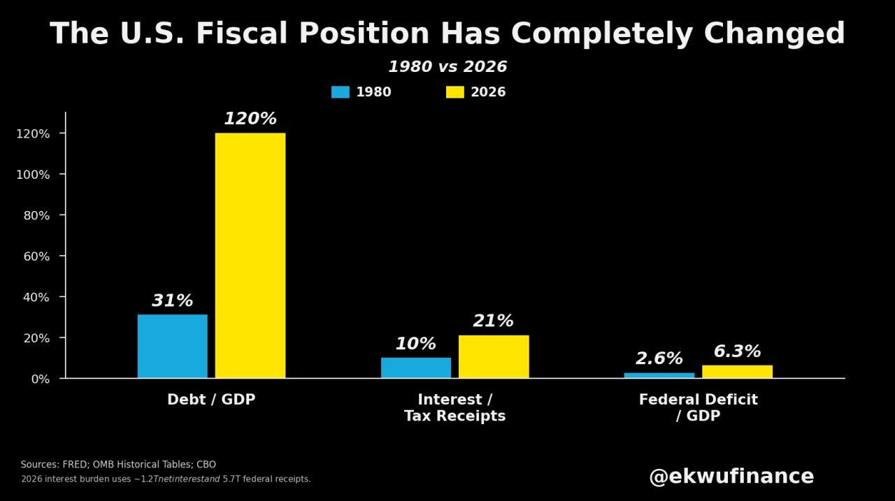
Volcker took the funds rate to 20% in June 1981 and engineered two recessions to do it. The reason he could is that first number: a sovereign owing a third of one year’s output can inflict enormous pain on households and firms without ever threatening its own solvency.
And markets paid the bill. The S&P fell from 140.52 in November 1980 to 102.42 in August 1982 - a -27% bear market - with the 10-year peaking near 15.8%.
Then, when he finally relented, the release was violent. Long Treasuries returned +40.4% in 1982, still the best year ever recorded. The S&P gained roughly +58% in the 12 months off the low. And the dollar ran from around 85 to 164.72 by February 1985.
First thread, dropped on purpose: through that entire episode, stocks and bonds fell together. Their rolling correlation stayed positive for the whole inflationary era from 1970 to 1990.
Diversification wasn’t on the menu. Remember that at the tenth chart.
Today, interest expense runs around $1.2 trillion against roughly $5.7 trillion of receipts, much of it repricing inside 12 months. Every 100bp across the curve adds on the order of $120 billion in year one alone.
Raise aggressively, and you destabilise the Treasury market. Prioritise stability, and the pressure has to go somewhere else.
There is no third door - and where it goes is the whole second half of this letter.
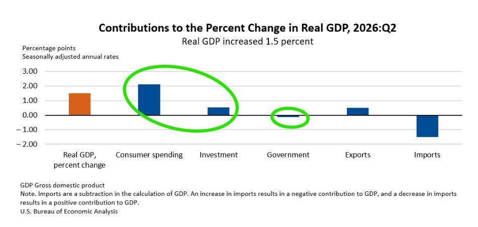
Q2 GDP printed +1.5% against expectations of +2.1%, and the headlines wrote themselves before lunch.
Look underneath and you find a different economy.
Consumer spending contributed roughly +2.1pp. Investment +0.5pp. Exports another +0.5pp. Government was negative. Imports subtracted about -1.5pp - an accounting artefact of strong domestic demand, not evidence of weakness.
And real final sales to private domestic purchasers, the cleanest read on the private economy, rose +3.9% from +1.7% in Q1. It more than doubled its pace while the public sector shrank.
The closest rhyme I know is 1994. Private demand accelerating, a Fed turning hawkish, the funds rate doubled from 3% to 6% in 12 months, the 10-year from 5.79% to 8.03%.
The Bloomberg Aggregate returned -2.92%, its worst year until 2022. The S&P managed +1.3% total return - flat, in price.
Second thread. That same year, with 300bp of hikes and rate differentials swinging sharply in America’s favour, the dollar index fell about 9% and USD/JPY dropped from 112.7 to 99.7.
The correlation between differentials and the currency, normally strongly positive, collapsed to roughly zero. The twin deficit simply swamped the carry.
I’m putting 1994 down here. It comes back twice below the line - and the second time, it stops being a rhyme.
The dollar index sits at 101.47.
Draw a line from the 2011 low through the 2021 low and it lands, almost to the tick, on the floor of this year’s range. 3 touches, 3 defences - and every dollar bull I follow has posted it this week with the same caption: the trendline cannot be defeated.
I’d rather ask what the previous two touches paid.
From the May 2011 low near 72.7, the index rallied +43% to 103.8 by January 2017, with EUR/USD falling from 1.4940 to 1.0341.
From the January 2021 low at 89.2, it rallied +29% to 114.8 by September 2022, EUR/USD going 1.2350 to 0.9536 and USD/JPY 102 to 151.9.
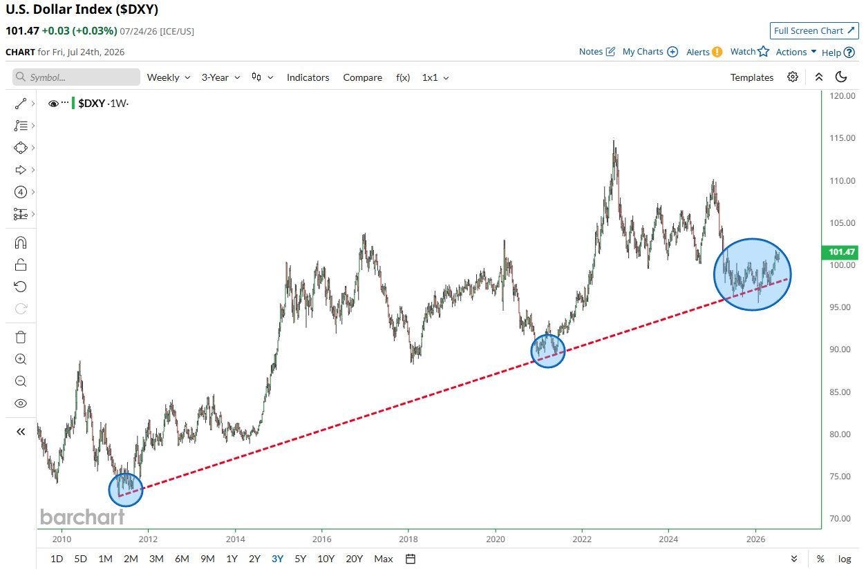
Two touches. Two multi-year bull markets.
And here is what nags at me.
In 2026 the dollar sits on that same line with 5.20% long-end yields, a hawkish chair, and 3 voting members openly demanding tighter policy - and it still can’t get off the ground.
The 2-year US versus G4 spread and the index have historically run at a rolling correlation around +0.7 to +0.8. This year it has broken toward zero.
Third thread: a level that needs this much help to hold isn’t strength. I’ll tell you what it actually is at the eighth chart.
The 10-year rolling change in the dollar index has crossed below zero, at -0.61 - the first time since 2010-2014.
In the modern era it has done this exactly twice. Both times it marked a beginning, not an end.
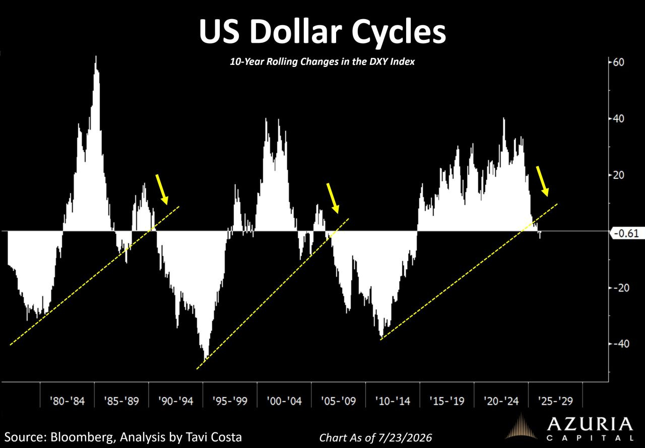
1985. From the February peak of 164.72, the index fell to around 85 by December 1987 - a -48% collapse. USD/JPY went 260 to 121. USD/DEM 3.47 to 1.58.
The rotation was extraordinary: MSCI EAFE returned roughly +56% in 1985 and +69% in 1986 in dollar terms, humiliating US equities, while gold rose from about $285 to $485.
2002. The same crossover. The index fell from 121.0 to 70.7 by March 2008, -42%, while gold went from $256 to $1,011, up +295%.
Emerging market equities roughly quintupled between 2002 and 2007. EAFE beat the S&P six years running. Oil went from $20 to $147.
Across these cycles, the rolling 3-year correlation between the dollar and gold has averaged around -0.7, and between the dollar and non-US equity outperformance around -0.6.
That’s the point most people miss. A dollar cycle turn isn’t a currency event. It decides where returns get earned for the next half-decade.
Fourth thread, and it’s the heavy one. I’m not forecasting -40% - I’ve been wrong on the dollar before, and I’ll be wrong again.
I’m noting that it has twice preceded exactly that, that positioning was heavily long both times, and that below the line I’ll show you why this turn looks worse.
Midterms fall on 3 November. The useful thing about Goldman’s seasonal work is that it survives adjustment for the economic cycle - the step most people skip.
Policy uncertainty in midterm years runs near 115 in August and 120 in September, against roughly 70-73 normally. A premium of 60-70%, building precisely in the weeks we are walking into.
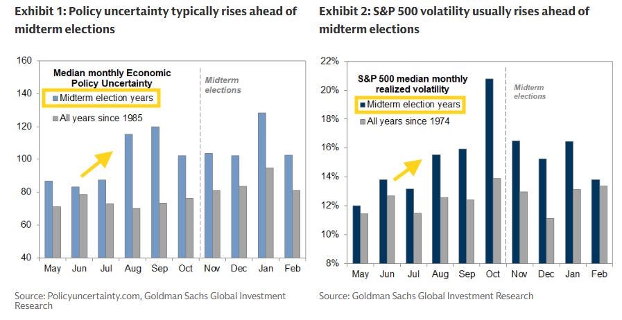
Realised S&P volatility does the same, peaking near 20.8% in October versus 13.9% across all years since 1974, and near 16.4% in November and January.
The record runs both ways, which is why I keep it on the desk rather than in the panic drawer.
The average intra-year drawdown in a midterm year is roughly -19%, against about -13% for all years. In 2018 the S&P fell -19.8% between 20 September and Christmas Eve, with VIX peaking at 36.1.
But it has also posted a positive 12-month return after every midterm since 1942, averaging around +15% - +29% in 2019, roughly +24% after October 2022.
With VIX and the S&P running at a daily correlation near -0.75, what this really describes is a drawdown then recovery shape. On its own, a position-sizing observation rather than a directional one.
Fifth thread. On its own. That little qualifier is doing enormous work, and it’s the last thing I’ll say up here.
Five charts. Five threads.
An expensive market, a hawkish Fed, a dollar that’s holding, a bumpy autumn. Uncomfortable but ordinary - the version most people will close the tab on this week, feeling roughly reassured.
I don’t think reassured is the right feeling.
A yield back at a 2007 level, where the comparison done properly turns frightening. A 20-year correlation broken toward zero, with a buyer behind it who should change how you think about reserves. The number separating Volcker’s stance from Warsh’s - 8.5 percentage points wide.
And then Wednesday afternoon, minute by minute.
Every thread above ties to the same knot. The knot is down here.
Two simple paths below - Yearly to begin, Lifetime to never look back.
[🎁 #7 BONUS if you become a PRO today]


Comments
Nothing yet. Say the first thing.
Sign in to join the conversation.