


Dear Investors,
On Tuesday night I printed 9 charts, cleared the floor of my study, and laid them out in the order they had arrived that week.
Not by importance. Not by asset class. By the order they arrived - because the sequence in which the market tells you things is itself information, and almost everybody sweeps that piece up and throws it away.
I got to the 5th and stopped.
Not because it frightened me. None of these 9 frightens me alone. Record cash, wealth, earnings, beats, flows, each posted with an exclamation mark. Read separately, they describe the healthiest market any of us has traded.
I stopped because these weren’t 9 stories.
They were one mechanism photographed from 9 angles, and it stays invisible until the 6th and 7th photographs.
There is a number in the 7th chart that has been negative for 23 years. It turned positive this summer, in grey, near the bottom of a research page, and I hunted all week for commentary and found almost none.
It quietly repeals the one assumption underneath every balanced portfolio built since 2003. All 5 charts above run straight through it without knowing.
So I’ll walk you through those 5 with the full numbers, dropping a thread at each and stubbornly refusing to pull it.
Then I’ll draw a line. Below it sit the 4 charts nobody sent me, the assumption that just expired, and what all this pays.
I rarely think the second half of a letter matters more than the first.
This morning it isn’t close.
$8,289,569 million in US money market funds. Up $99 billion on the month, +1.21%, an all-time high.
Every caption said the same thing: sidelined cash, dry powder, fuel for the next leg.
My team has a name for what I do next, and it isn’t affectionate. I ask: a percentage of what?
Against the $70 trillion the S&P is now worth, $8.3 trillion is 11.8%.
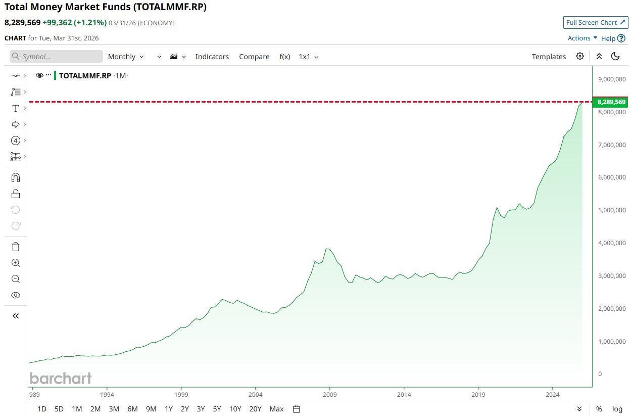
In March 2009, money funds held $3.9 trillion against an index worth $5.9 trillion at the low. That’s 66% - and the S&P then rose 95% over 3 years.
In October 2002 the ratio was near 31%, and the next 3 years paid +58%.
And at the top of the dot-com bubble, $1.8 trillion against $12.5 trillion of index, it was ~14%. The next 3 years cost -45%.
Relative to the thing it might one day buy, today’s pile is thinner than at the peak of the most famous bubble in living memory. The relationship runs the wrong way for everyone posting it.
And the cash isn’t cowering. It’s working.
At a funds rate of 3.50-3.75%, a money fund pays 3.6% against an S&P earnings yield of 4.10%. Those 50bp are your whole compensation for swapping a zero-duration government bill for the most concentrated index in history.
$8.3 trillion has looked at that offer and walked away from it.
When denominators break, that pays. From March 2000 to October 2002 the S&P fell -49.1%, 1,527.46 to 776.76, while 3-month bills compounded roughly +11%.
Cash beat equities by 60 points in 31 months without producing one interesting day.
First thread, dropped on purpose. If the record cash isn’t the buyer, somebody is. That identity is the 8th chart, below the line.
American households hold $74 trillion of corporate equity. Up $48 trillion since 2020, +185%, against $13 trillion in 2000.
Then the denominator, where the celebration stops.
As a share of GDP, ownership is ~232%, against a 2009 trough near 66% and a March 2000 peak of ~140%.
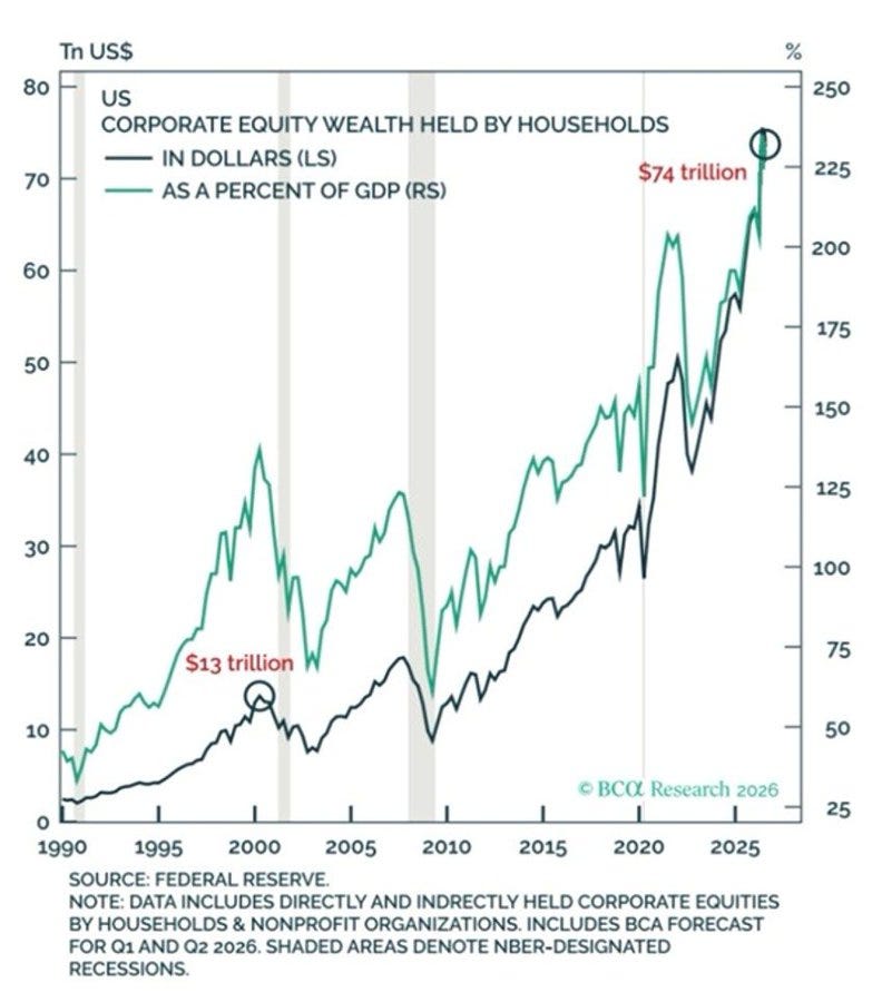
We aren’t nearing the dot-com extreme. We are 66% above it.
This isn’t one indicator among many. It’s the one I’d keep if you took the rest away: household equity allocation carries an R² of roughly 0.9 against subsequent 10-year S&P total returns. Nothing comes close - not CAPE, not dividend yield.
After the 1968 peak, the next decade delivered +3.1% a year nominal, roughly -3% real.
After March 2000, -0.95% annually - the lost decade, on the nose.
The 2007 peak eventually paid +7.1% a year, but only after the index fell -56.8%, 1,565.15 to 676.53. And 2000 took the Nasdaq -78.4%, 5,048.62 to 1,114.11, with 14 years to the old high.
Then the effect nobody prices, and the part that keeps me up.
The Fed puts the marginal propensity to consume out of equity wealth at 3-5 cents on the dollar. At 232% of GDP, an unremarkable -20% destroys $14.8 trillion, or 46% of GDP in paper wealth, removing 1.4-2.3% from consumption.
At March 2000 levels the same -20% was 28% of GDP. Half the impulse.
In 2008-09 the savings rate went 2.5% to 6.5% and real consumption fell for the first time since 1980. The top decile owns nearly 87% of all equities and is roughly half of US consumer spending.
Second thread. The economy sits downstream of the index now, not upstream - which is why a dull services survey, the 6th chart, is the most dangerous piece of paper on my desk.
The S&P crossed $70 trillion this week. 500 companies worth more than double the economy housing them, on the loudest earnings season in decades.
Goldman’s Ioannis Blekos put the number where anyone could find it, which is why I trust him: EPS growth is tracking at 26% year-on-year excluding the “other income” from mega-cap tech’s appreciating equity stakes, and 45% including it.
45 headline. 26 operating. The median constituent: 12.
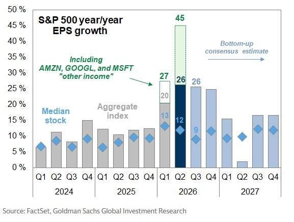
Sit with that spread, because I had to. The aggregate is growing 33 points faster than its own median stock.
In Q1 2024 that gap was 6 points. A 6-fold widening in 8 quarters.
Since the 2018 accounting change, unrealised gains on equity investments run straight through the income statement. When a mega-cap’s stake in a private AI lab is marked up at the next round, the markup doesn’t sit quietly in comprehensive income.
It becomes net income. It becomes EPS. It becomes the denominator of the multiple you’re being shown.
I’ve watched this film twice and it ends the same way.
In 2001, operating earnings printed $38.85 against reported $24.69 - a 57% gap, a record then - and the index fell -49%.
In 2006-08, financials were around 30% of index earnings and reported EPS collapsed $84.92 to $14.88, -82%, with the index down -56.8%.
Neither market fell because earnings missed. Both fell because the market re-learned which earnings had been real. The P/E did the work, not the E.
And consensus already concedes it: 26% in Q3, 25% in Q4, then 15, 2, 16, 16 across 2027.
That +2% next spring isn’t a recession forecast. It’s the quarter the marks lap themselves.
Third thread, and hold it tightly: remember 24.4. It’s the multiple the market trades on, and it’s calculated on this E. The 7th chart does the arithmetic.
For Q2, S&P 500 companies beat by an aggregate +27%. The Nasdaq 100 by +55%. The Bloomberg AI Value Chain by +71%.
The long-run average surprise runs 4-5%; post-2020, around 7%. So this is 5-6x normal, with no precedent in the series.
It took me embarrassingly long to see that the ordering of those bars gives the game away.
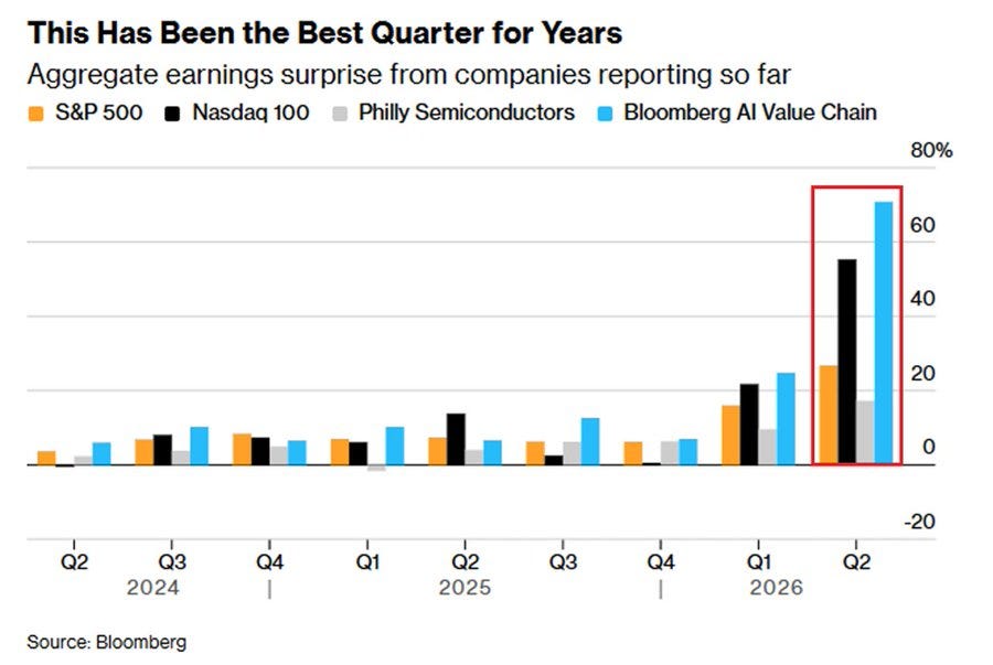
The beat is largest where mark to market exposure is largest: the AI value chain, then the Nasdaq. And smallest at the Philadelphia Semiconductor index, at +15% - the most operationally pure of the 4, firms that make physical product and book revenue on delivery.
An analyst models wafer starts, capex, gross margin, backlog. No analyst alive models the quarterly revaluation of a private venture stake.
So the beat doesn’t measure how far reality beat expectation. It measures how much of reality the model was never built to contain.
Beats last went vertical in 2021, at roughly +19% aggregate, the record until now.
That year the S&P returned +28.7%, the Nasdaq 100 +27.5%, the Aggregate lost 1.5%, long Treasuries 4.6%, a 60/40 made +15.9%, the 10-year drifted 0.92% to 1.51%, dollar-yen 103.2 to 115.1.
Everything worked, and everyone felt clever.
The following year: S&P -18.1%. Nasdaq 100 -32.6%. Bloomberg Aggregate -13.0%, its worst on record. Long Treasuries -29.3%. A 60/40 at -17.5%, worst since 1937.
The 10-year went 1.51% to 3.88%, touching 4.34%. Dollar-yen, 115.1 to 151.9, +32%.
The correlation between the size of a beat and the next year’s return is roughly zero, and negative at the extremes. A record beat measures how far the models had fallen behind. It has never once been a forecast.
Fourth thread. “The strongest earnings season in decades” and “the most expensive market in history” aren’t 2 facts. They’re one fact, counted twice.
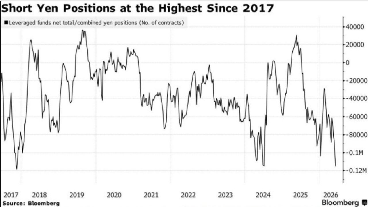
Leveraged funds run their largest net yen short since 2017: roughly 118,000 contracts, about ¥1.5 quadrillion notional.
That position is a thermometer, not the patient. The real carry trade - borrow in yen at nearly nothing, buy something yielding more - runs into the hundreds of billions, and for 3 years its destination has been US technology.
Which is why I stopped reading the yen as a currency chart. It is the wiring in the wall behind the same stocks that throw off the “other income” in the 3rd chart.
In carry regimes the rolling correlation between dollar-yen and the Nasdaq 100 runs +0.6 to +0.8. They stop being 2 markets.
I keep 3 photographs of the reverse.
October 1998, LTCM: dollar-yen 136 to 111 in 3 sessions, -13%, the S&P -19.3% from July, the Nasdaq -29.5%.
June 2007 to December 2008: 124.14 to 87.13, -30%, MSCI World -54%.
And 3 July to 5 August 2024: the yen +14.3%, 161.95 to 141.70, in 5 weeks. The Nikkei -12.4% in one session, worst since October 1987. The VIX at 65.73. The S&P -6.1% in 3 sessions. Roughly $6.4 trillion gone in 3 weeks.
It runs forwards too: January 2005 to June 2007, dollar-yen 101.7 to 124.14, MSCI Emerging Markets roughly +160%.
This is a leverage cycle wearing a currency’s clothes.
2 adjustments to that memory, both pointing the wrong way. Positioning today is more extreme. And the S&P was worth $45 trillion in July 2024 against $70 trillion now.
The same percentage unwind is 56% larger in dollars, landing on a balance sheet with 42% of itself in the asset.
Fifth thread, and the last one I’ll drop up here.
5 charts. 5 threads. Record cash, wealth, earnings, beats, leverage.
Uncomfortable but ordinary. The version most people will close the tab on this week, feeling broadly reassured.
I don’t think reassured is the right feeling, and I don’t think it’s close.
Below: the survey nobody read past line one. The 23-year number that turned this summer. The buyer, who is not the $8.3 trillion. And what it all pays.
Every thread ties to the same knot.
The knot is down here.
Two simple paths below - Yearly to begin, Lifetime to never look back.
[🎁 #7 BONUS if you become a PRO today]


Comments
Nothing yet. Say the first thing.
Sign in to join the conversation.