
Well, well, well - if it isn’t a humble return to my favorite passion project (as promised). I’ve been very busy, and on the nights I promised myself I’d sit on the sofa and write, I somehow ended up watching The Pitt instead. But here we are. Enjoy a glimpse into my current creative state - chaotic as usual! Thank you for reading. See you again very soon. xx
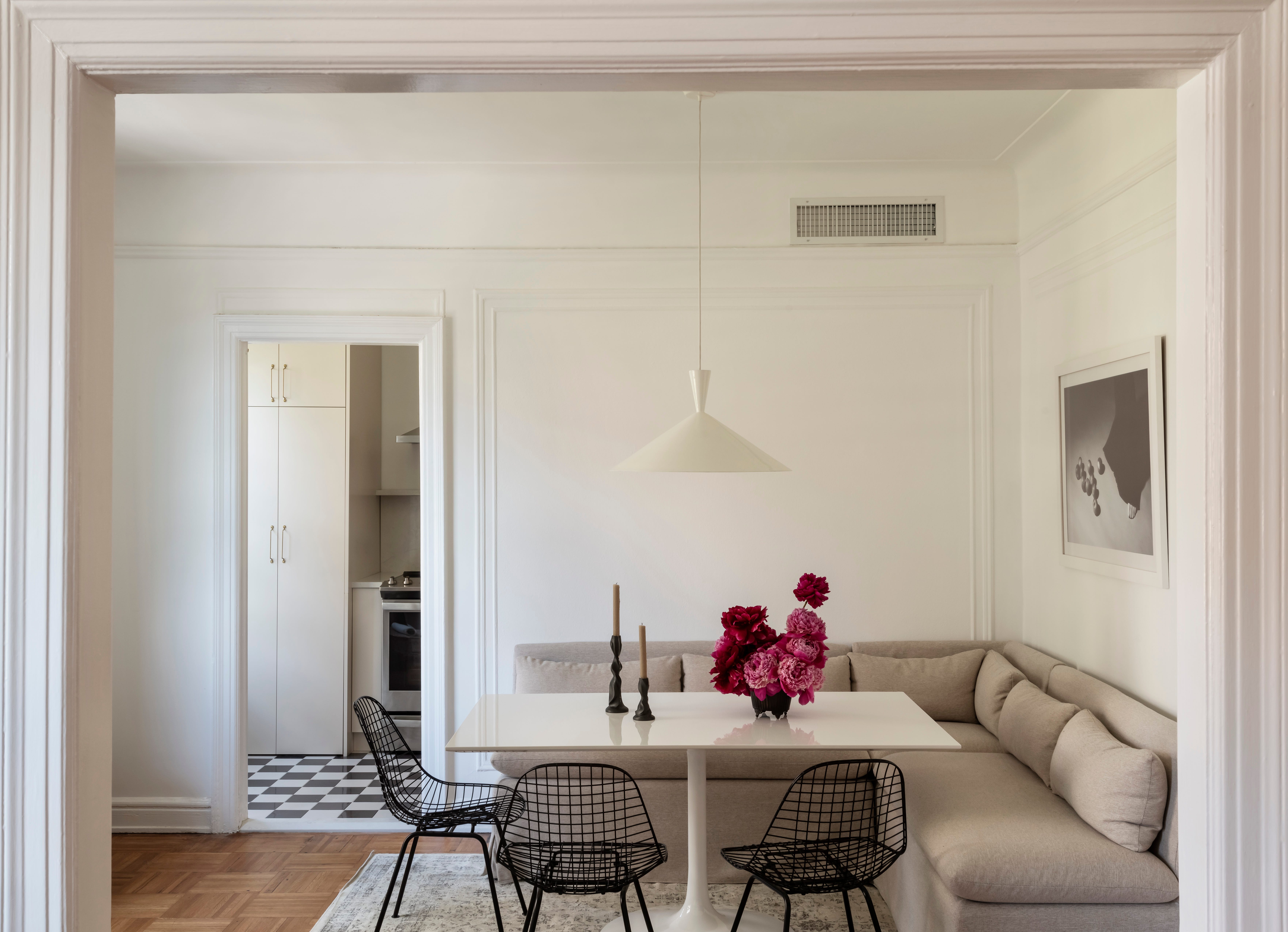
I’m often asked how high artwork should be hung, and a simple rule of thumb I follow is to place the center of the piece 56 inches from the floor. This height is roughly eye level and is standard in galleries and museums, which typically ranges from 56 to 60 inches.
The 56” rule is a starting point - not law:
Above furniture (sofa, bed, console):
Hang art 6-10 inches above the furniture (unless within a panel), even if that’s lower than 56”Tall ceilings:
You can go slightly higher, but don’t drift too far or it’ll feel disconnectedLarge pieces:
Still center at eye level - the size doesn’t change the rule much
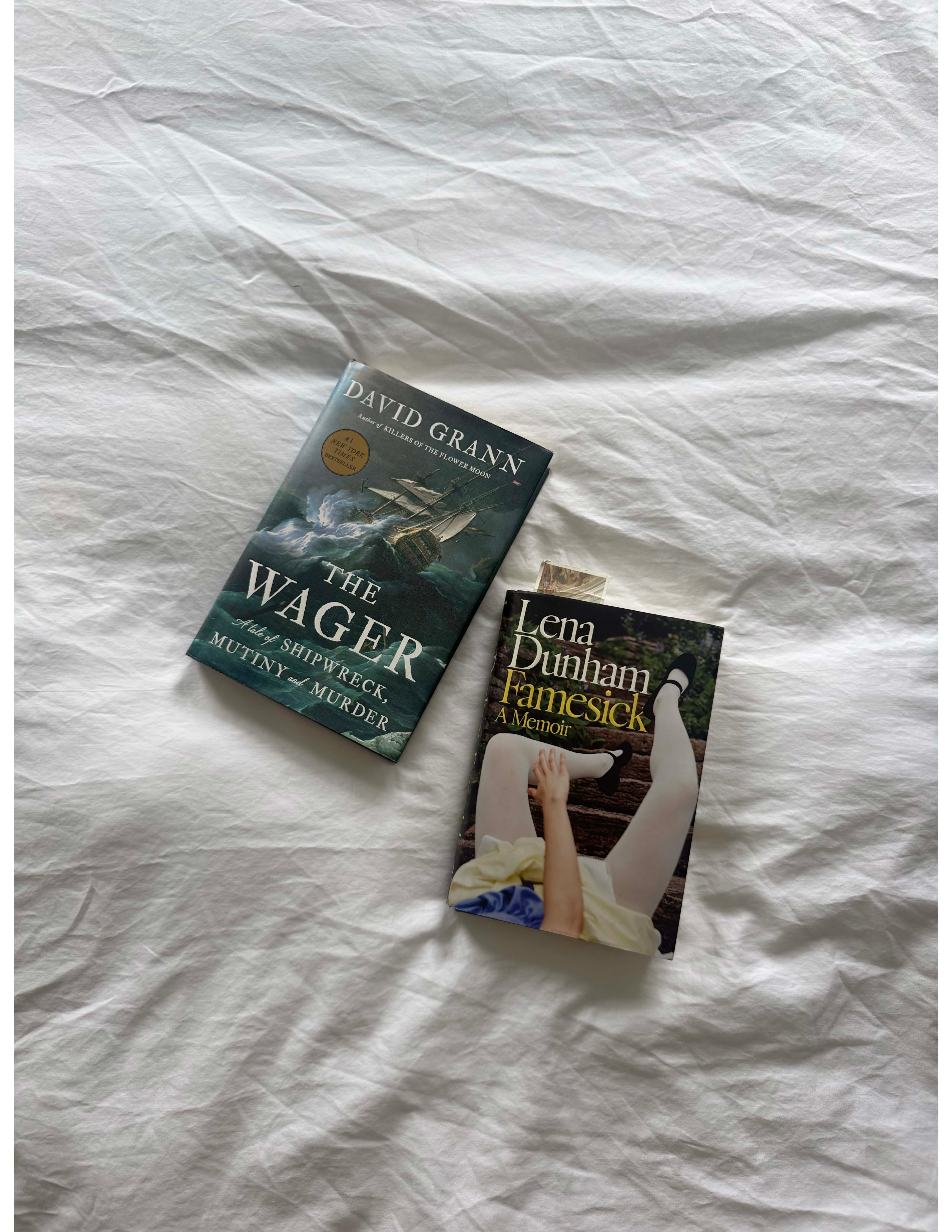
Two book recommendations - and although both are non-fiction, very different animals. What can I say? I contain multitudes. The first is The Wager: A Tale of Shipwreck, Mutiny, and Murder by David Grann, which chronicles the 1740 shipwreck of a British naval expedition. It reads like a thriller, and the account of the abject misery these men endured was enough to make me never complain about an economy redeye again. And it was an amazing surprise to see the work of my late grandmother cited in it.
The second is Famesick, Lena Dunham’s new memoir, which I finished this week. Only she could capture the millennial woman’s experience - equal parts self-mythologizing and self-dismantling. I found myself moving between recognition and retreat - alternating between nodding along and wanting to hide.
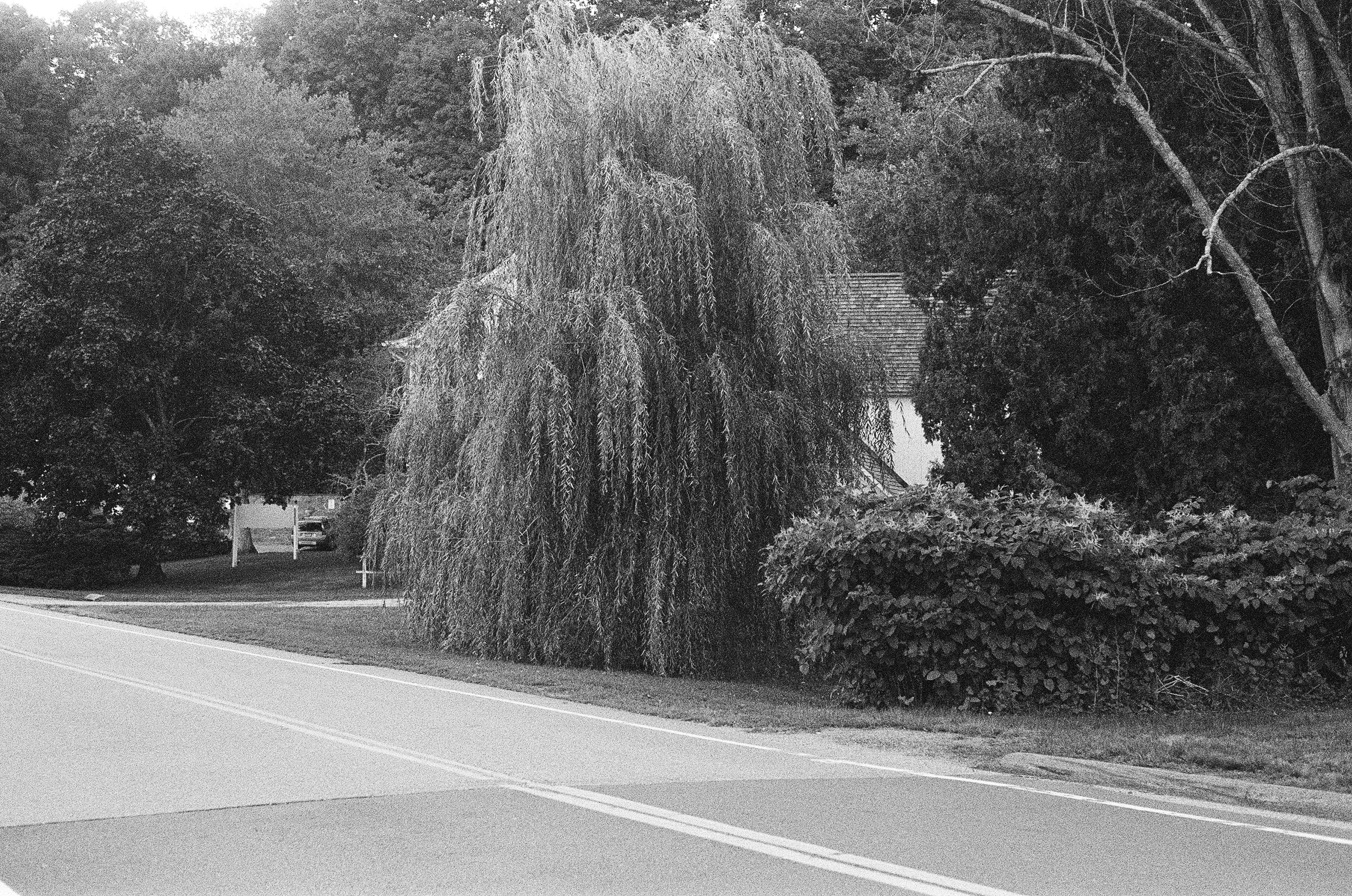
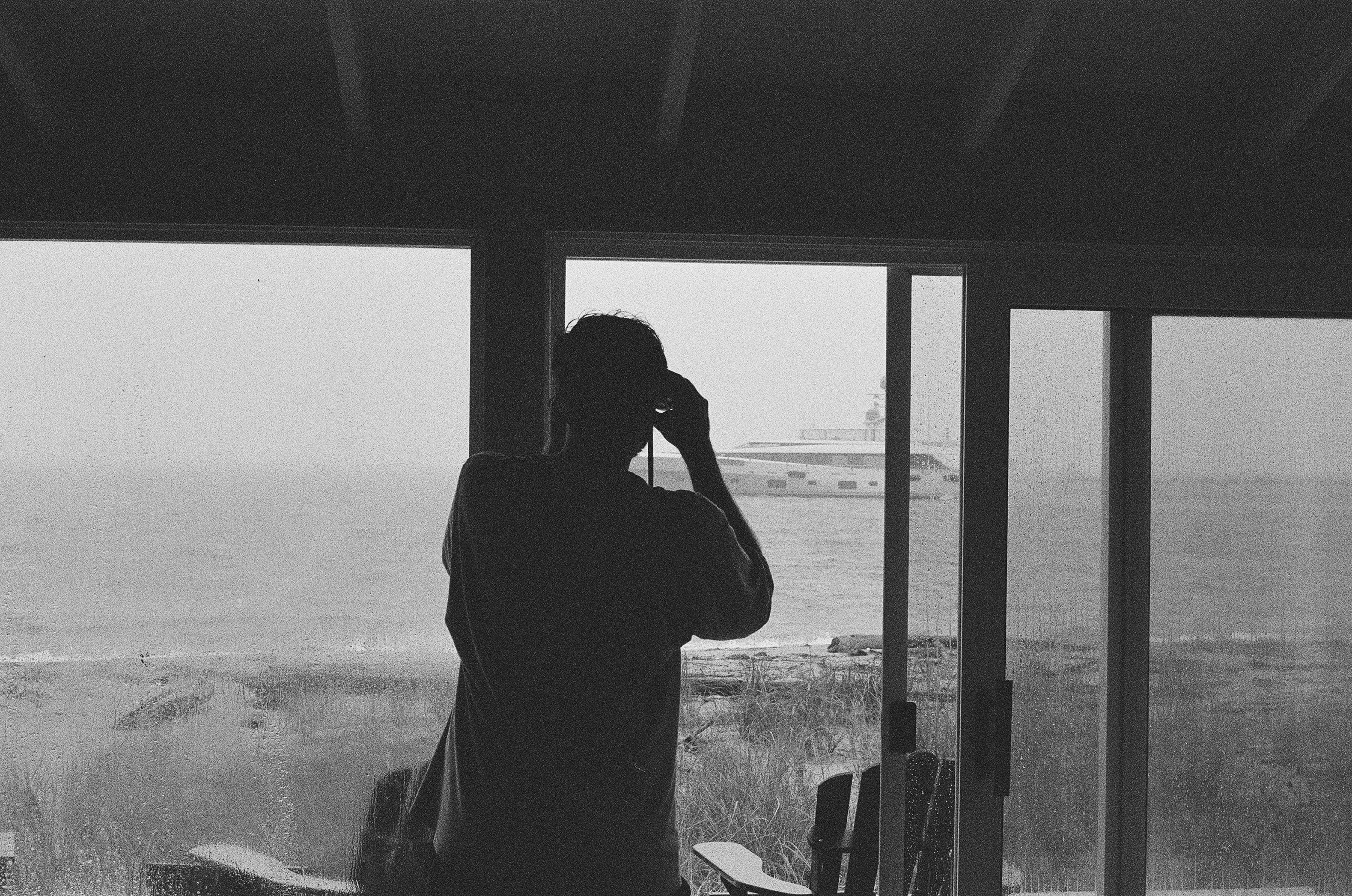
I recently developed an unmarked roll of film, and to both my horror and delight, it was shot in the late summer of 2020. The images feel oddly poetic, but isn’t that just the nature of nostalgia?
The discovery has inspired me to shoot more film this summer (I love my vintage Pentax K1000, which I bought on eBay a week before COVID hit and taught myself to use on YouTube) - a hobby I’ve loved experimenting with since I was a kid, running around with my dad’s old camcorder in one hand and a disposable camera in the other, finding beauty and interest all around and aching to capture it. The summer energy I want!

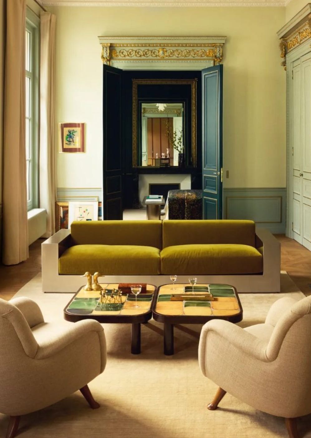
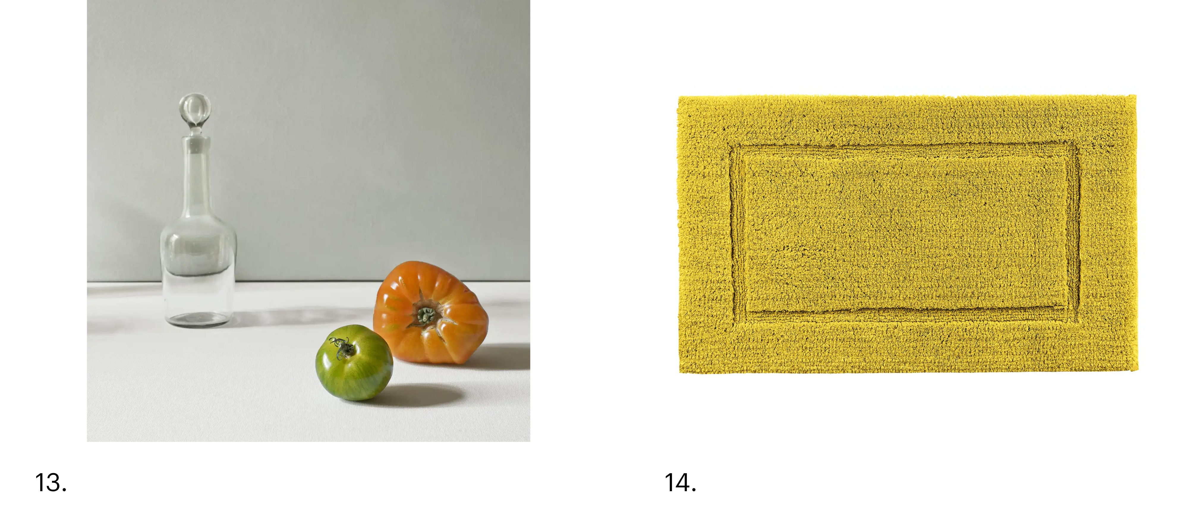
I’m drawn to neutral bases - white, creams, oatmeals, browns - but I like to layer in color. Lately, I’m intrigued by chartreuse. It’s unexpectedly chic - not loud, not precious - just quietly cheeky and a touch zesty. Even a hint can shift the mood of a space entirely. A vase, a pillow, a wash of it in art - it brings a freshness that feels modern without trying too hard.
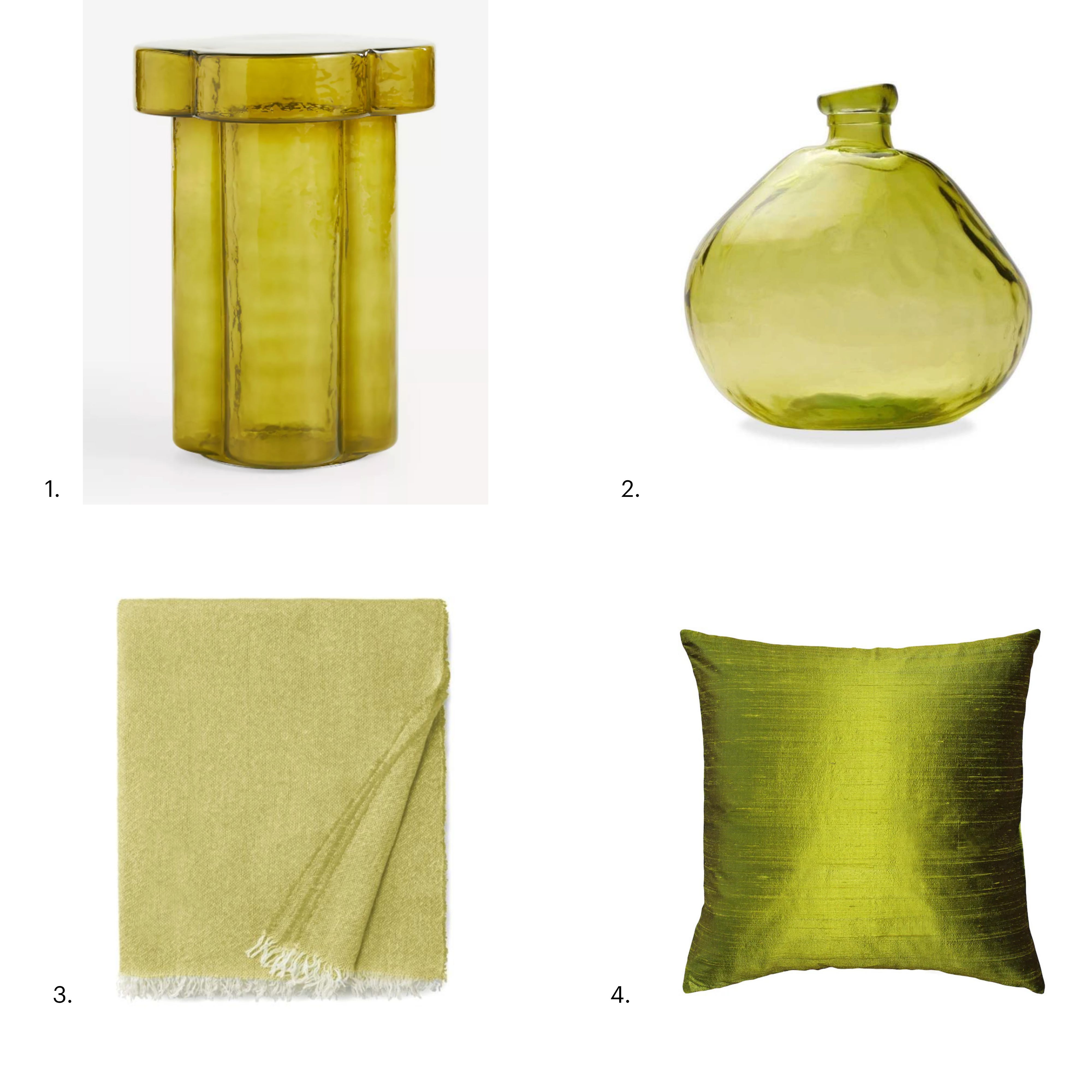
Anthropologie, Manor Glass Side Table, $298
Vivaterra, 13” Recycled Round Glass Balloon Vase, $69
SFERRA, Ciarra Throw, $255
Overstock, Sankara Silk 18x18 Throw Pillow, $50
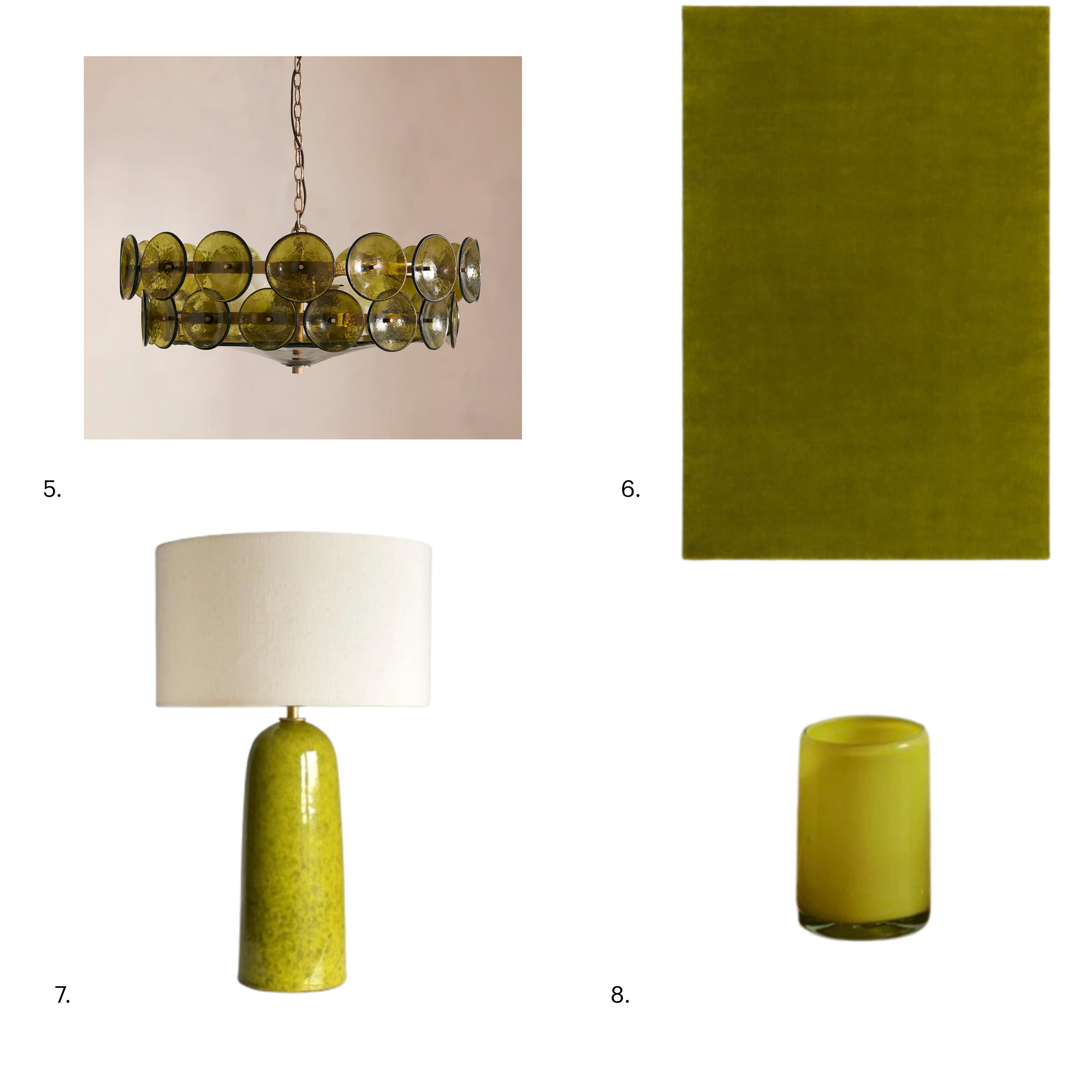
Soho Home, Lorenzo Chandelier, $2,295
Nordic Knots, Grand Rug, $1,895
Etsy, Handmade Ceramic Table Lamp, $430
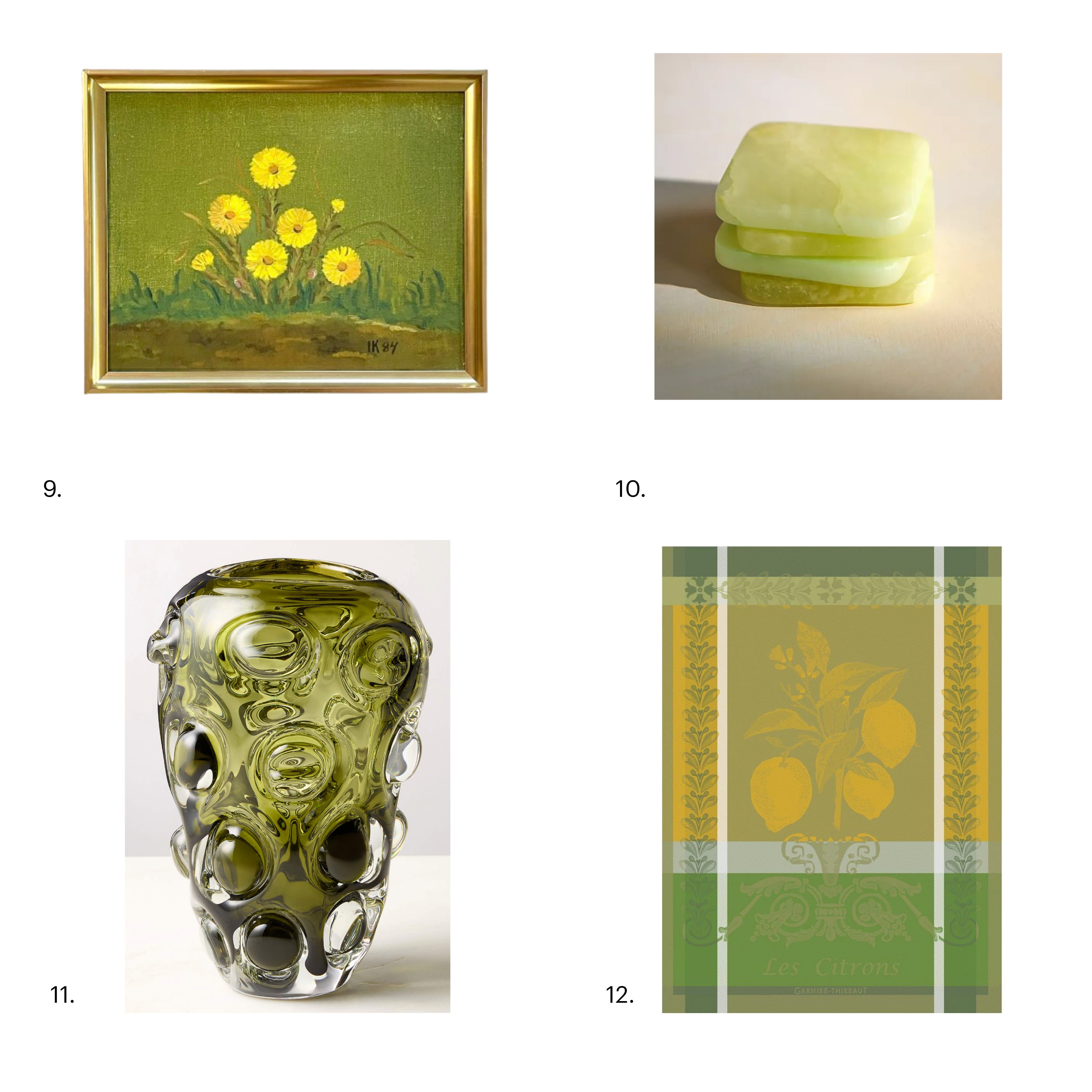
Etsy, Vintage Danish Oil Painting, $260
Garnier Thiebaut, Citron Zeste French Kitchen Towel, $32
Terrain, Dyed Alabaster Square Coasters Set of 4, $35
Nickey Kehoe, Yellow Straight Medium Glass, $15
CB2, Clio Bubble Green Glass Vase, $129
1stDibs, "Deux tomates", photography by Thierry Genay, 2016, $1,650
Graccioza, Prestige Bath Rug, $140
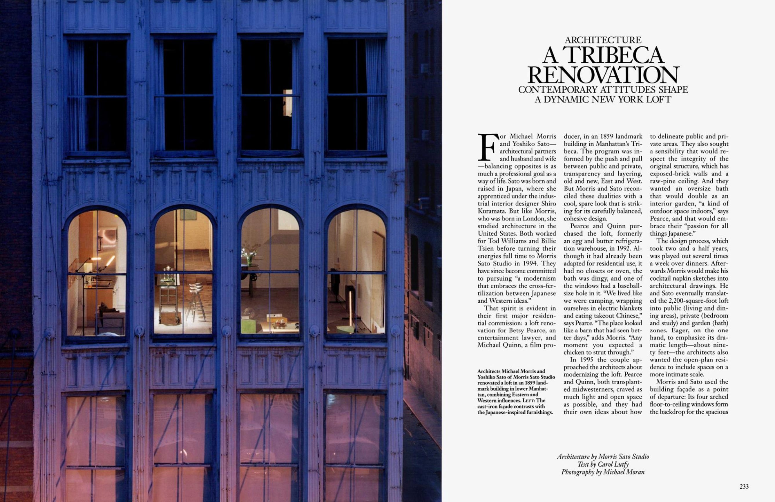
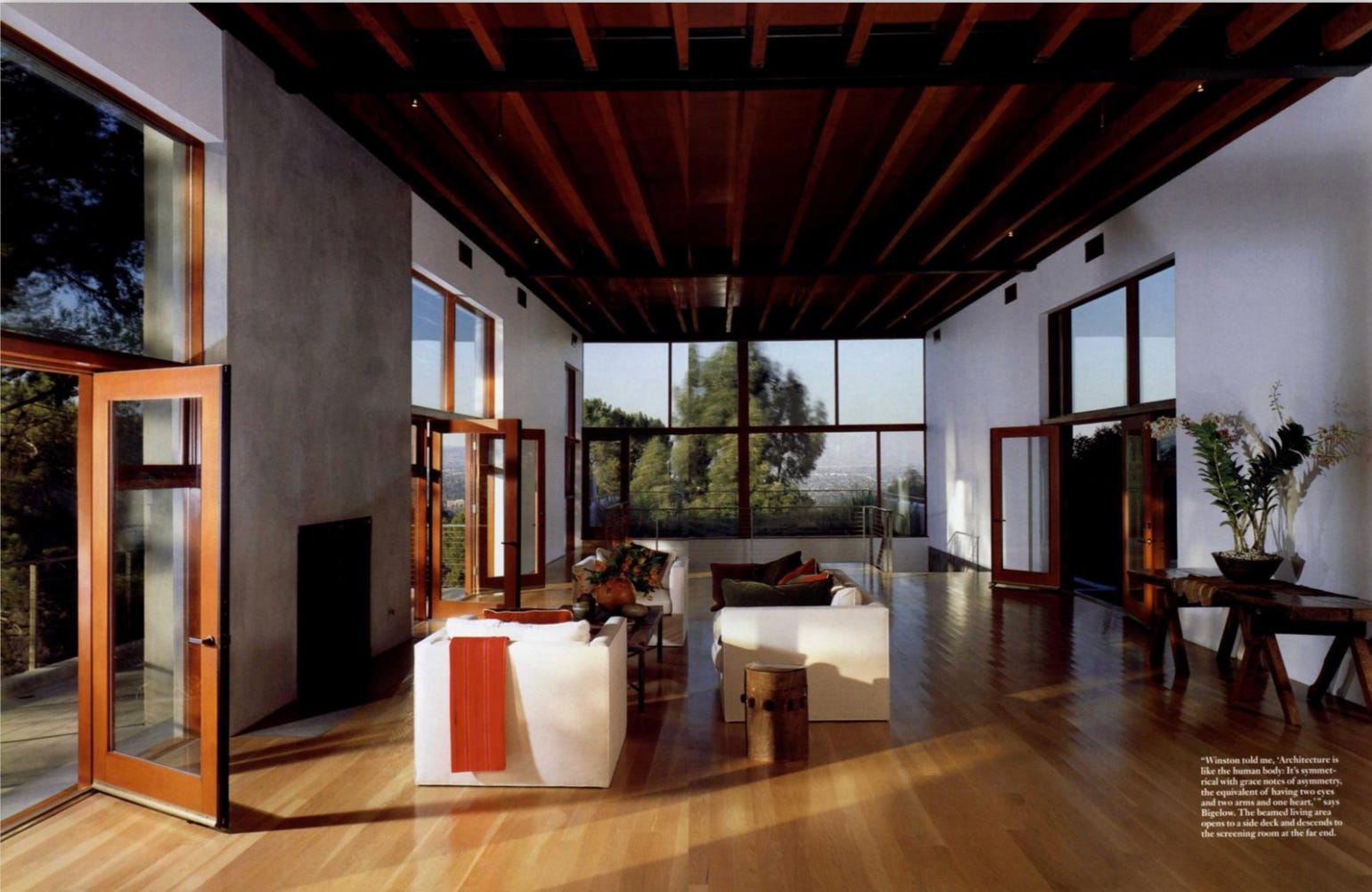
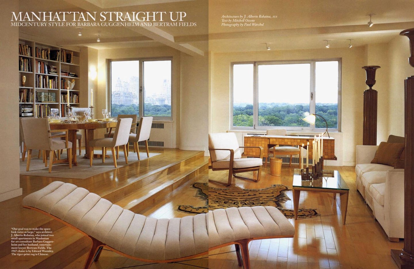
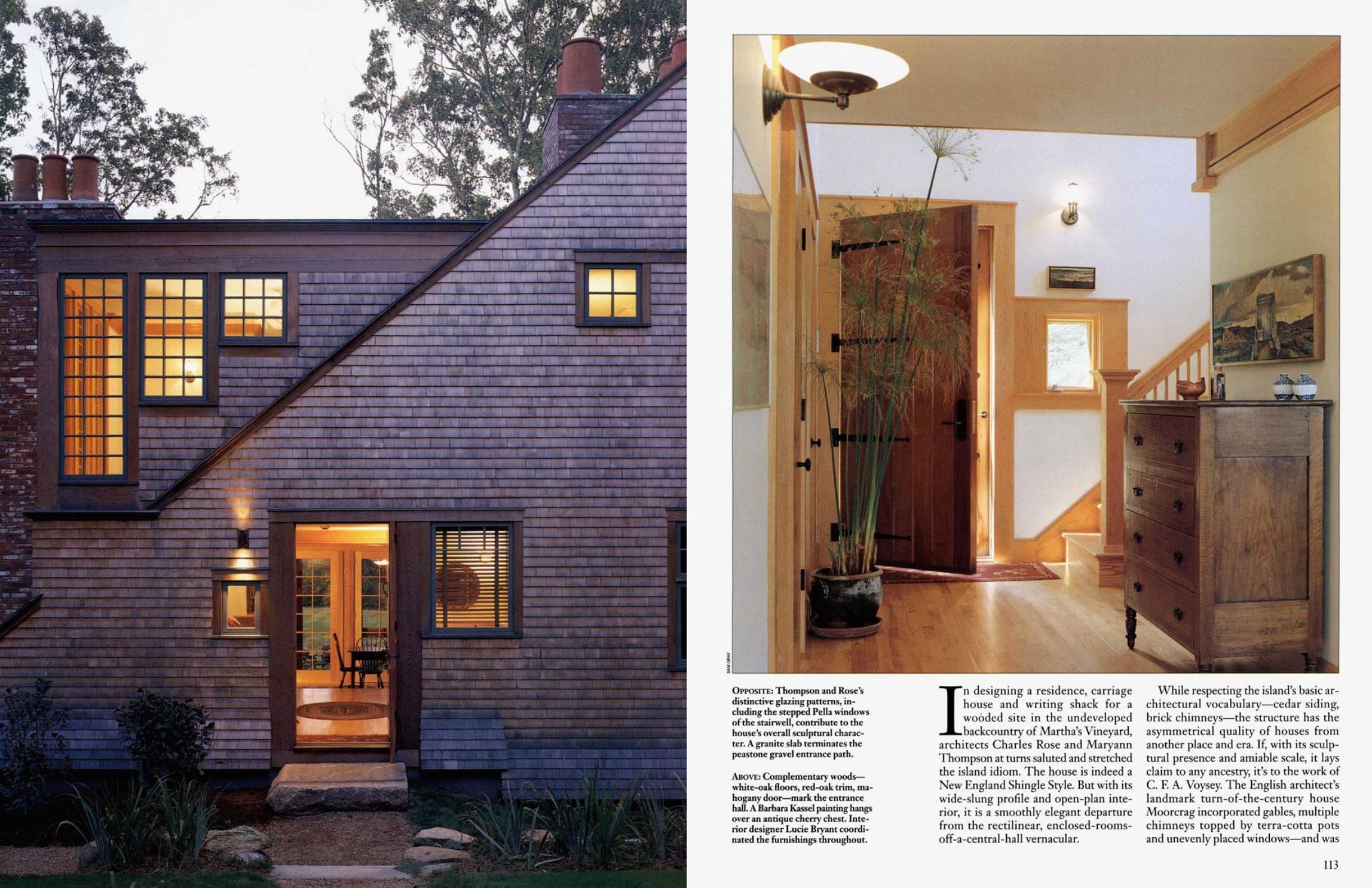
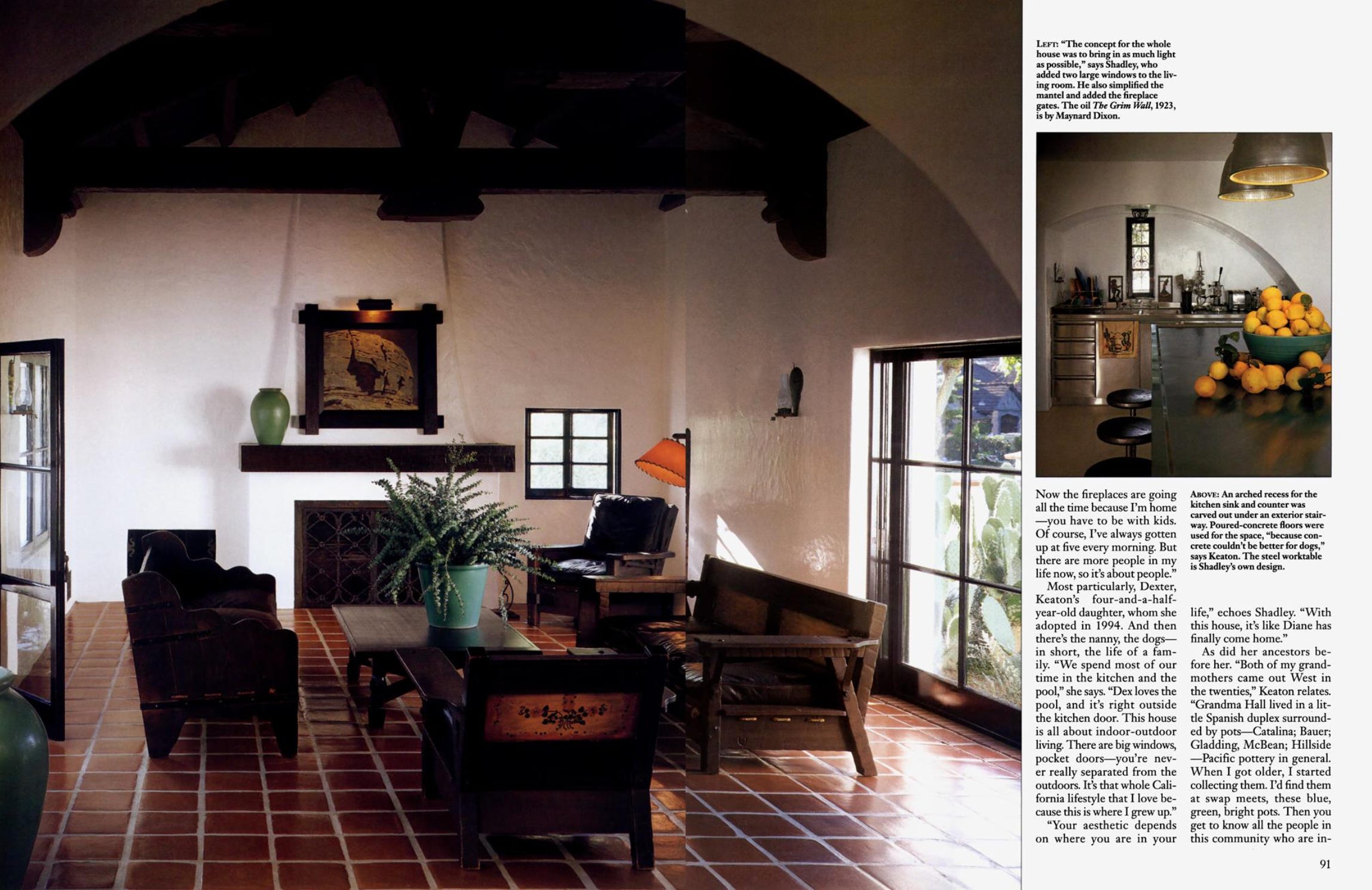
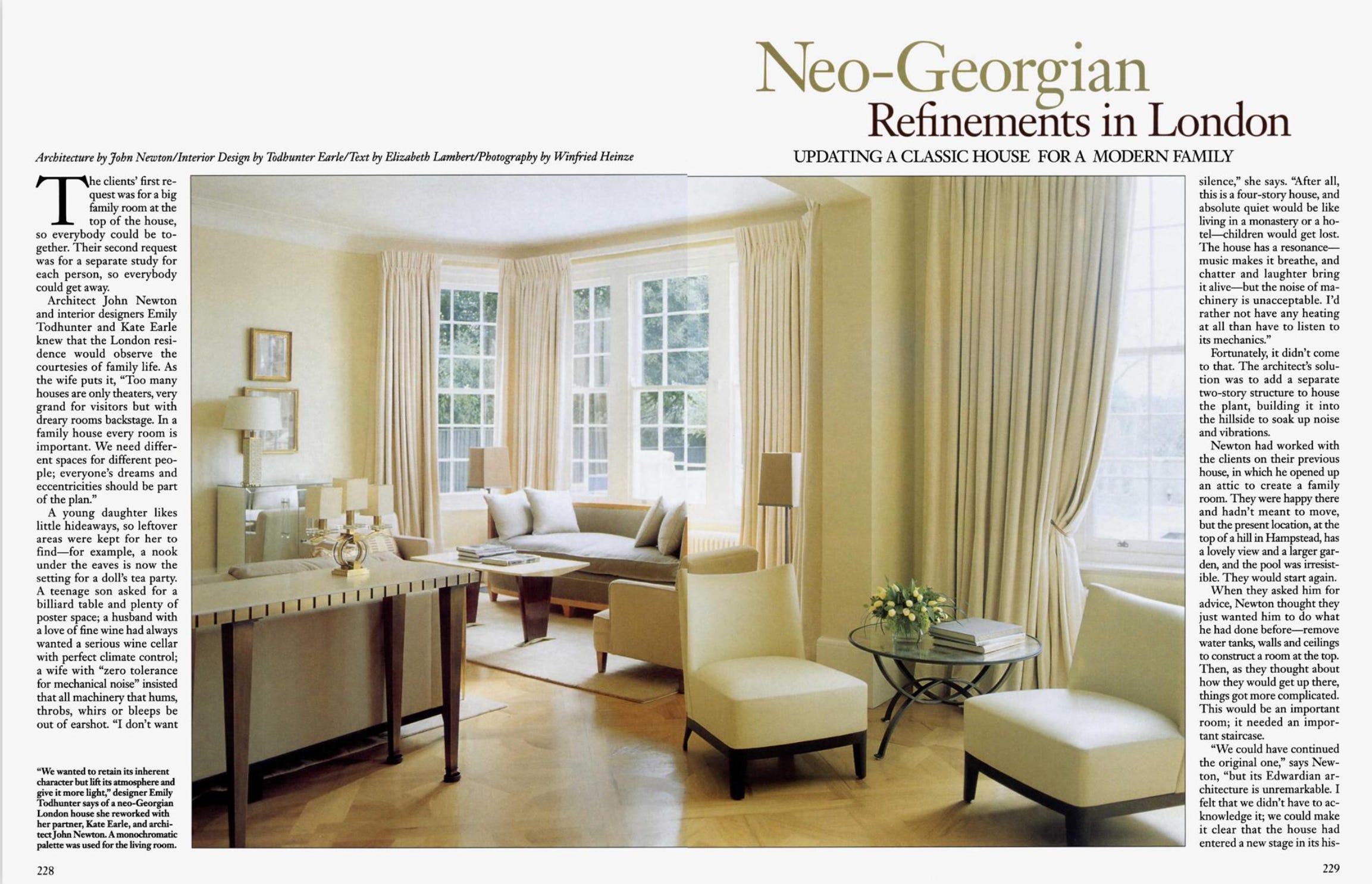
Lately, I’ve been slipping into the Architectural Digest Archive (which is free to access with a subscription) - somewhere between Love Story fever, having grown up in the time, and my own insatiable appetite for the past (lest we forget, I was a History major), I can’t seem to ransack this treasure chest enough for late 90s / early aughts design inspiration. Here are a few favorite editorials:
But I’m here to give you it to you - my three favorite beauty suggestions for spring. I started my career in beauty, and have stayed closely connected to the industry since - I find it economically fascinating, culturally revealing, and, well, fun - so I remain the go-to for friends and family looking for product recommendations.
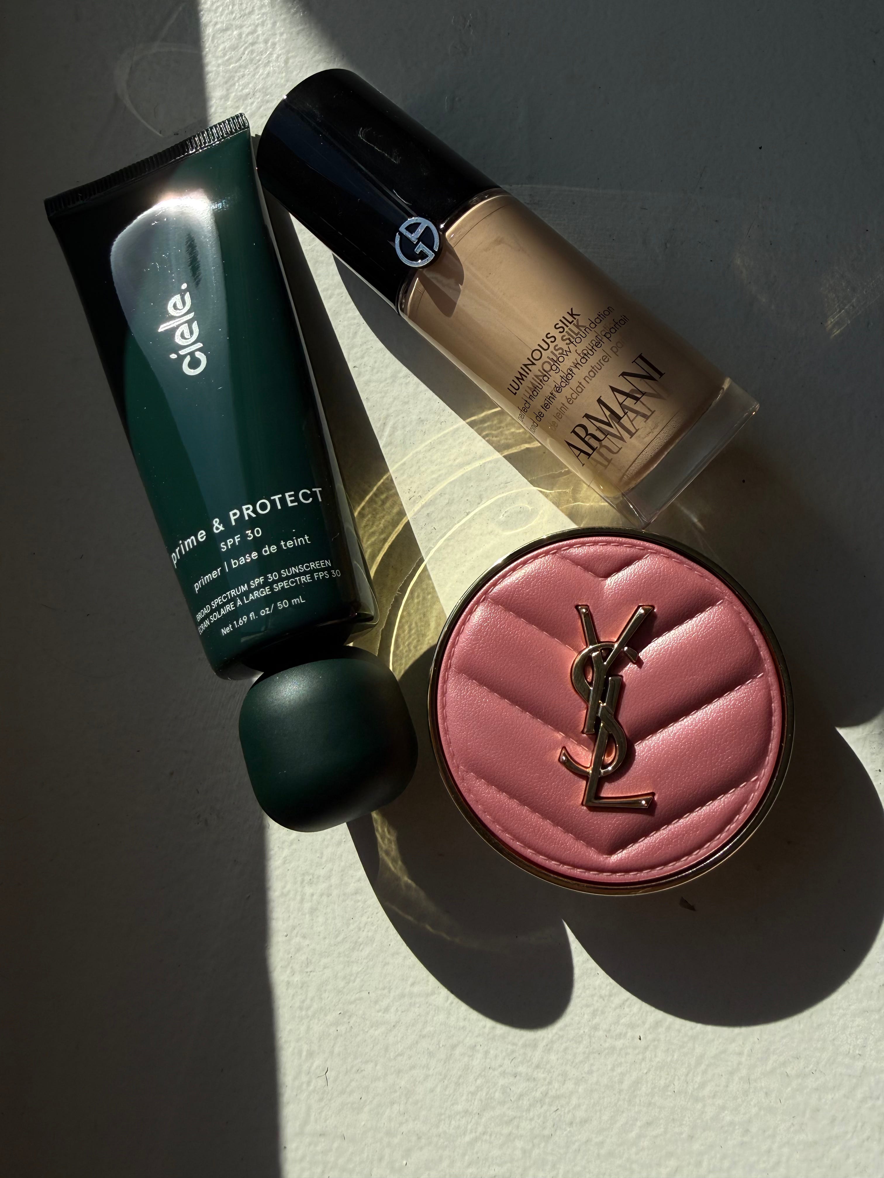
ciele. prime & PROTECT SPF 30+ Smoothing Primer
This SPF 30 primer is a unicorn: it’s fragrance-free, not tacky and so weightless that I sometimes forget I’m even wearing it - a tall order for its product type. I still love Charlotte Tilbury’s Lightweight Invisible UV Flawless Primer SPF 50 as well, but the last few times I ordered it the expiration date was very close. :(
Armani Beauty Luminous Silk Natural Glow Blurring Liquid Foundation with 24 Hour Wear
Armani Beauty recently reformulated what was considered one of the best foundations on the market, and beauty fanatics across the globe collectively held our breathes... they somehow managed to pull it off - the new version is somehow even BETTER. The shades are vast and beautiful, the coverage is perfectly medium, and the formula sits / blends beautifully. It’s not thick, which is a nice as we enter summertime. If you are in the market for a new foundation to try this is it!!
Yves Saint Laurent Make Me Blush 24H Buildable Powder Blush
This blush has made quite the splash in the beauty world - I’d read all the rave reviews and decided to see if it lived up to the hype (especially since I’ve been loving stick blushes the past few years). I chose shade 44 Nude Lavalliere because, well, Dua - and it’s beyond gorgeous!! No notes.
No posts
Comments
Nothing yet. Say the first thing.
Sign in to join the conversation.