
Thought I'd share a bit about my latest pattern design. Meet “Thistle”, a collection inspired by berries and brought to life through countless sketches and espressos.
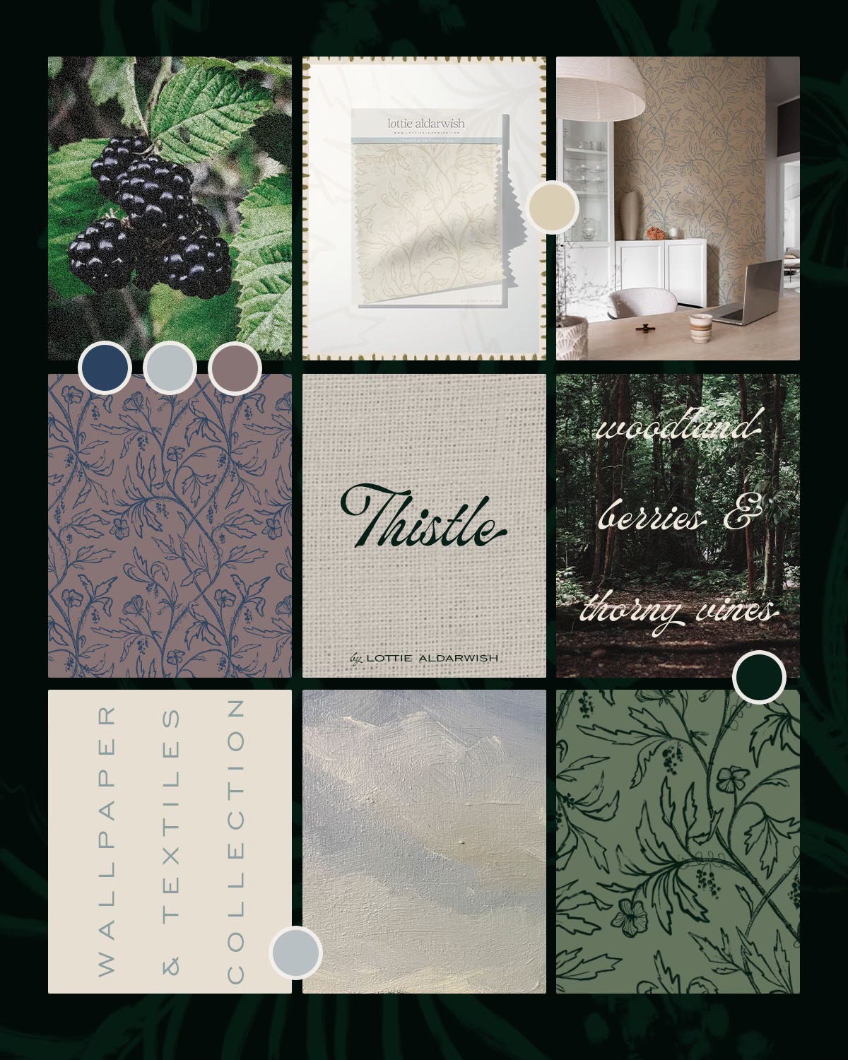
It all started during that strange period between winter and spring: when the garden looks rather defeated but miraculously begins showing signs of life. I found myself drawn to the most spiky plants I have brambles and thistles: probably because I have such fond memories of going berry picking in the dunes in North Holland with my family growing up.
Turns out that thistles, blackberry brambles and wild roses (all those prickly things that sensible people avoid) are rather fascinating to watch grow up close. There's something rather philosophical about them, don’t you think? All defensive on the outside, but hiding something rather wonderful if you're willing to brave a few battle-scratches.
With the inspiration firmly in place, then comes the actual work:
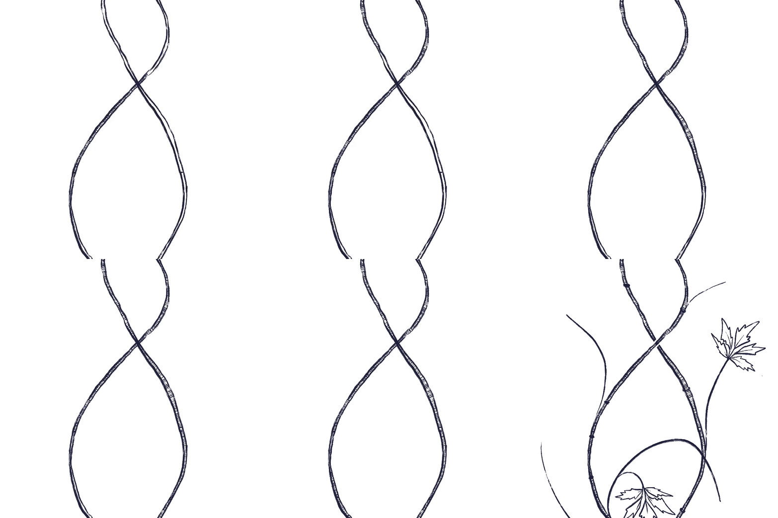
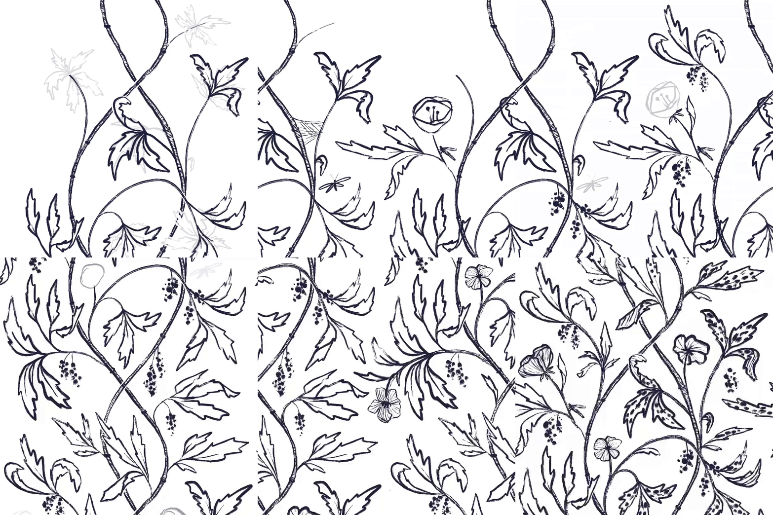
Creating patterns for me starts with a sketch.
Then comes making the pattern repeat technically allowing me to create a tile rather than a massive design.
And finally comes the actual drawing in the details.
Along the way I had a bit of a hard time trying to capture the somewhat chaotic nature of these plants without turning the designs into a botanical Where's Wally.
The line work went through countless iterations. Too detailed and I hated how fussy it became; too simplified and it lost its character. I wanted something that felt real but still had that elegant quality that works in actual homes where people live with actual furniture.
And let me tell you, I struggled so much with that balance that I just needed a few weeks away from it before picking it up again and applying colours with fresh eyes.
The most tedious part was setting up the files in Photoshop to be able to apply color to different sections. But once that technical groundwork was laid, I finally got to the fun bit: playing around with colors. This is honestly my favourite part of the entire process.
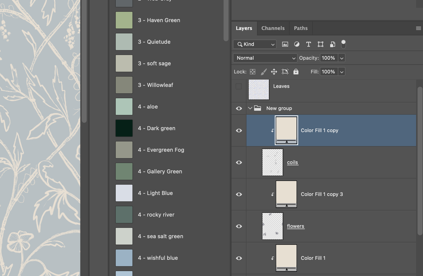
I settled on 20 variations, including:
A moody navy that feels like twilight in a forest (perfect for those who want their reading nook to have Agatha Christie energy)
A sage green that brings a bit of outdoors in without being too obvious
A surprisingly versatile red that works great with antique furniture and rooms that need a bit of extra personality
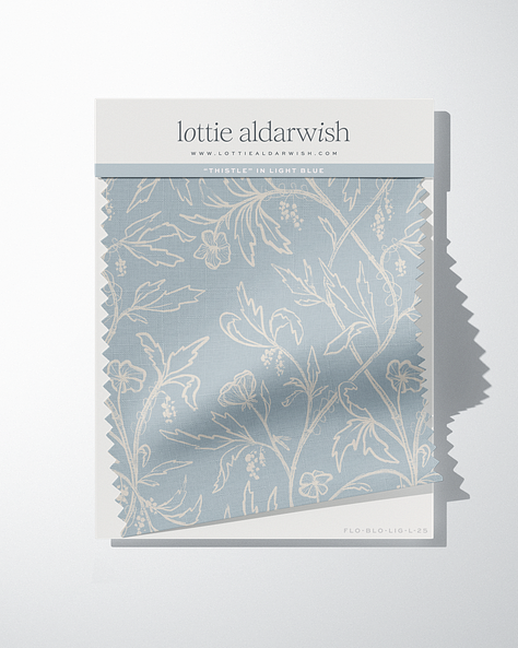
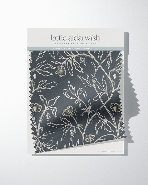
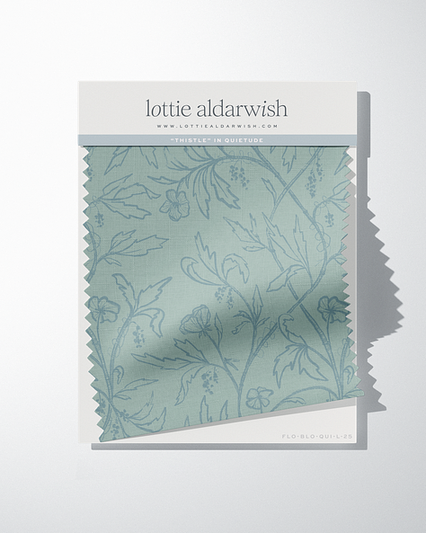
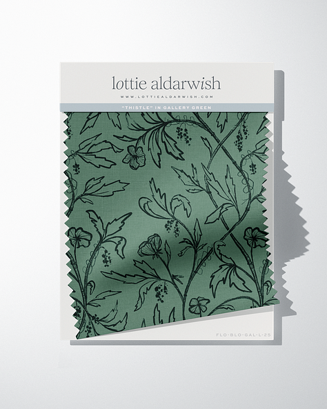
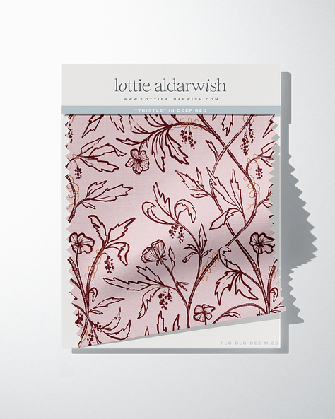
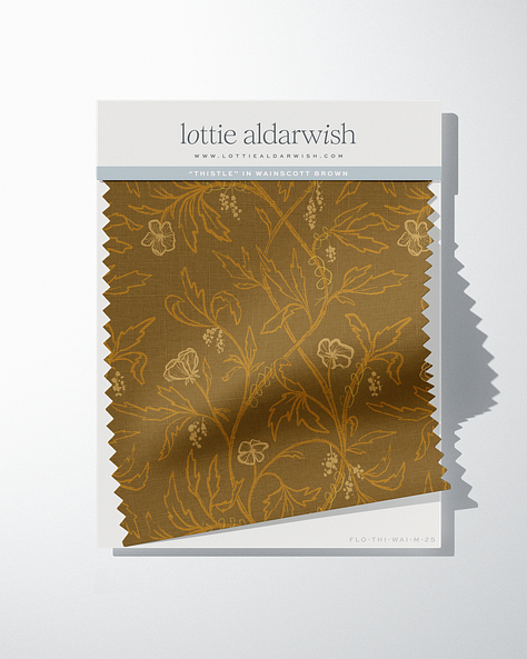
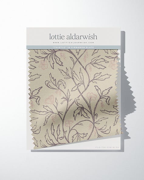
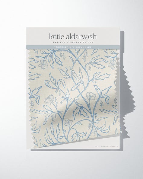
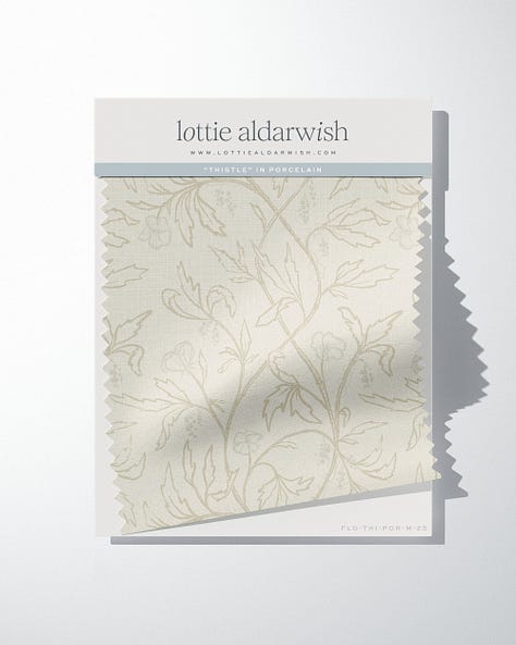
I wanted a large-scale pattern (24" x 32" repeat) that could really show off the detail but still work in most rooms without overwhelming them. This required many adjustments and lots of tweaks that I'm fairly certain worsened my eyesight by 50%. But worth it.
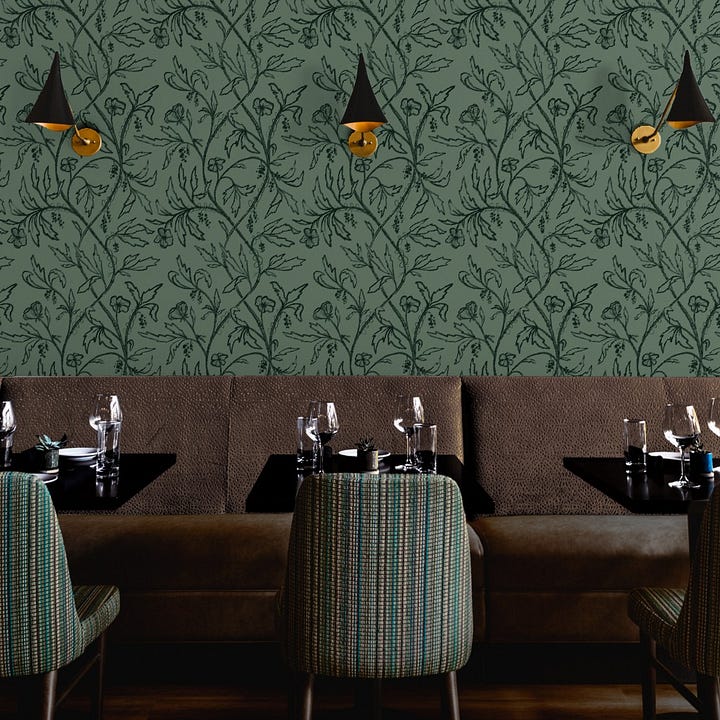
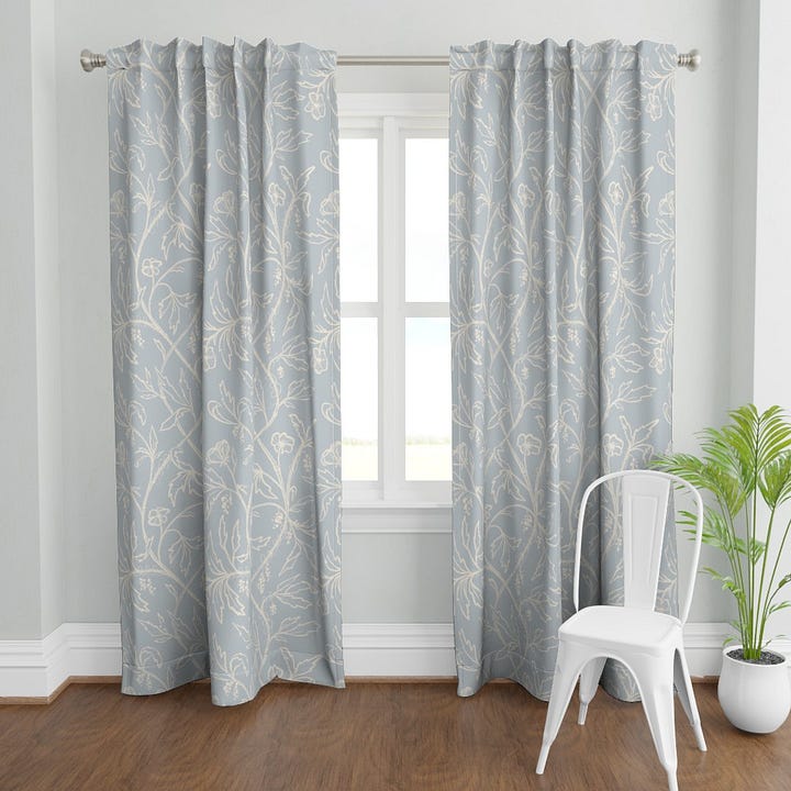
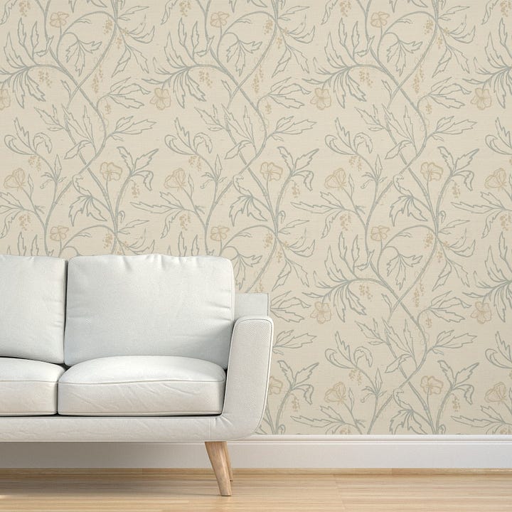
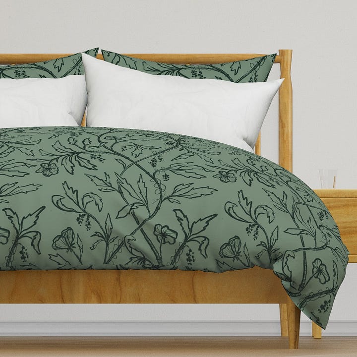
I think there's something rather poetic about celebrating these overlooked plants. True, they aren't the stunning dahlias and Iceland poppies, they aren't the stars of garden centers or floral bouquets, but they're important for butterflies, birds, hedgehogs and dormice.
I wanted to create something that honored that resilience while still being, you know, actually nice to look at in your living room. Something with a bit of British heritage and hand drawn character, but without getting into the stuffy side of life.
I love painting and drawing the underdogs of nature so these prickly plants seemed fitting!
The Thistle Collection launches on my website next week, it's always a little scary and wonderful to release a new creative product into the world. I've poured time and love into these patterns, and now they're off into the world to fend for themselves.
If you've enjoyed going behind the scenes with me, thank you for reading! Let me know in the comments if you have any questions about the process! I love talking shop.
I'd also love to hear which color way speaks to you, or if you've got a soft spot for these prickly garden rebels too.
Text within this block will maintain its original spacing when published
Until next time,

Comments
Nothing yet. Say the first thing.
Sign in to join the conversation.