
My landscapes have a second life I'll never know about.
Just not in the day-time drama sense of the word.
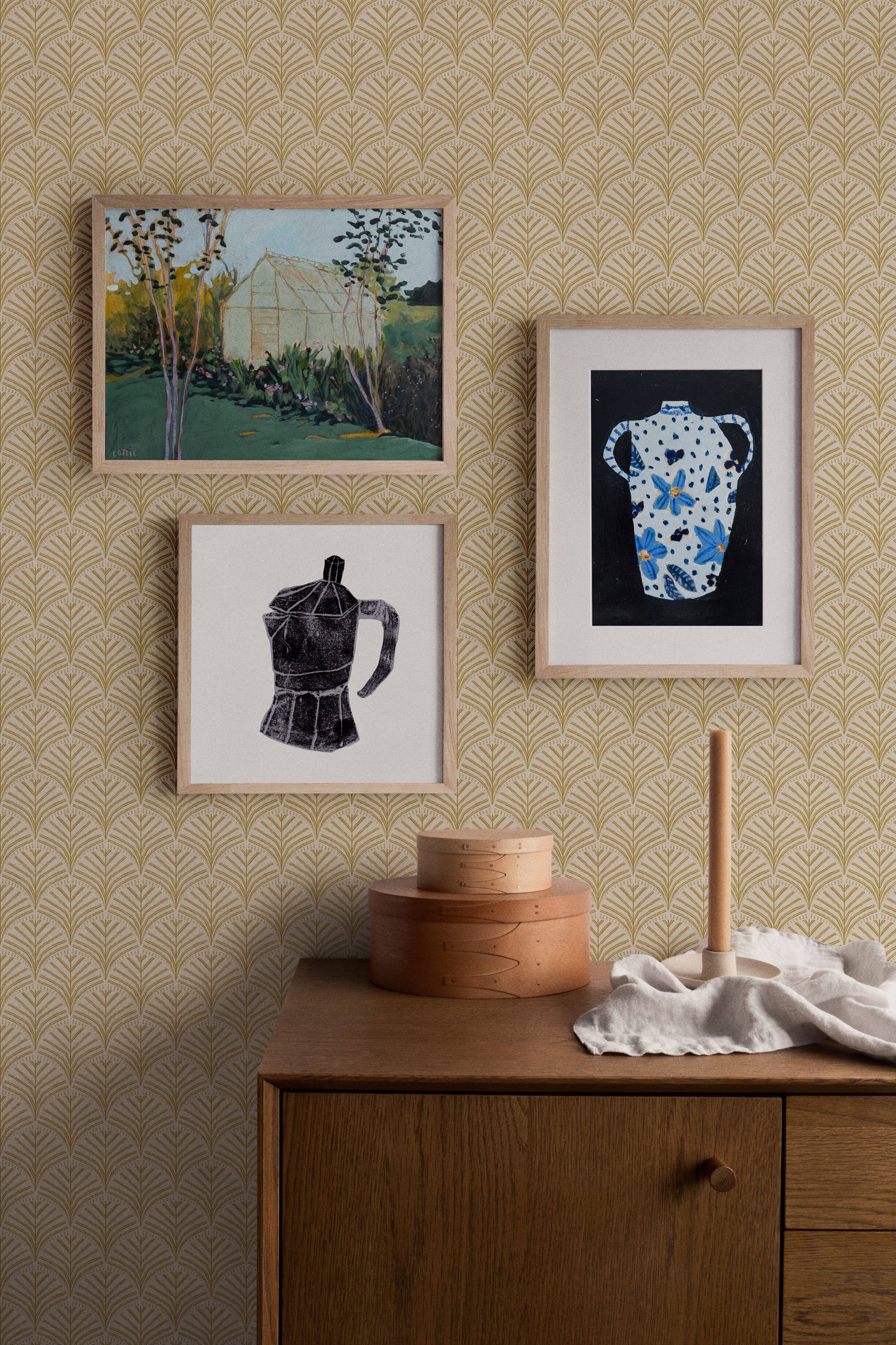
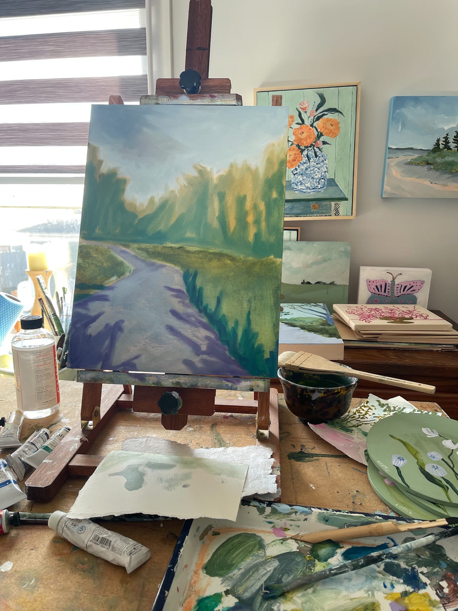
My paintings and I grow together, they live next to other unfinished pieces a while and then one day they're just... done, sold, wrapped up, handed over to UPS, and they begin entirely new relationships without me.
I won’t lie, however grateful I am to sell a piece, sometimes it is very hard letting go of a painting I really liked how it turned out.
That Indian Yellow marigolds painting goes on to hang next to someone's grandma's antique cupboard and not mine. It finds itself making nice with wedding photos, patterned wallpaper and those shells kids picked up on holiday – and they look good hanging out (ha!) together in ways I couldn't have imagined.
As I was pondering this (and thus effectively avoiding doing the bookkeeping) it led me to wonder about collections of art and how we display art as our gallery walls. How this tradition of hanging diverse artworks together begin? Where did this idea of gallery walls come from if they weren't invented by Pinterest? And how can we make these walls reflect who we are through the things we collect and love
Naturally, Google followed my curiosity (and my rather effective procrastination attempt) and this one search led to 23.7 others. Suddenly I had enough insights to write an epistle. Now, I'll spare you that epistle, but I think you might find it interesting to find the highlights of where gallery walls came from, how they adapted over the years to fit the ideas of the time, and how different designers approach them. Plus some ideas for creating yours.
Gallery Walls began as Salon Walls in 17th-century Paris when the Royal Academy needed to display hundreds of paintings with limited wall space. They weren’t nearly as picky as modern day galleries it would seem.
The solution? Stack ‘em from floor to ceiling. The place of honour were the works hung at eye level, while the less favoured were moved up near the ceiling, with a distinct ‘consolation prize’ feel.
British aristocracy thought that was a rather clever idea and adopted this approach in their country houses, but with a British touch of chaos and less planning.
Victorians then scaled it down to fit middle-class homes with densely packed arrangements of family portraits and botanical prints.
Then came the modernist rebellion and by mid-century, the maximalism on steroids style of the Victorians was abandoned for clean, precise grids with generous white space to fit works like Mondriaan’s and the more streamlined style of mid-century modern furniture.
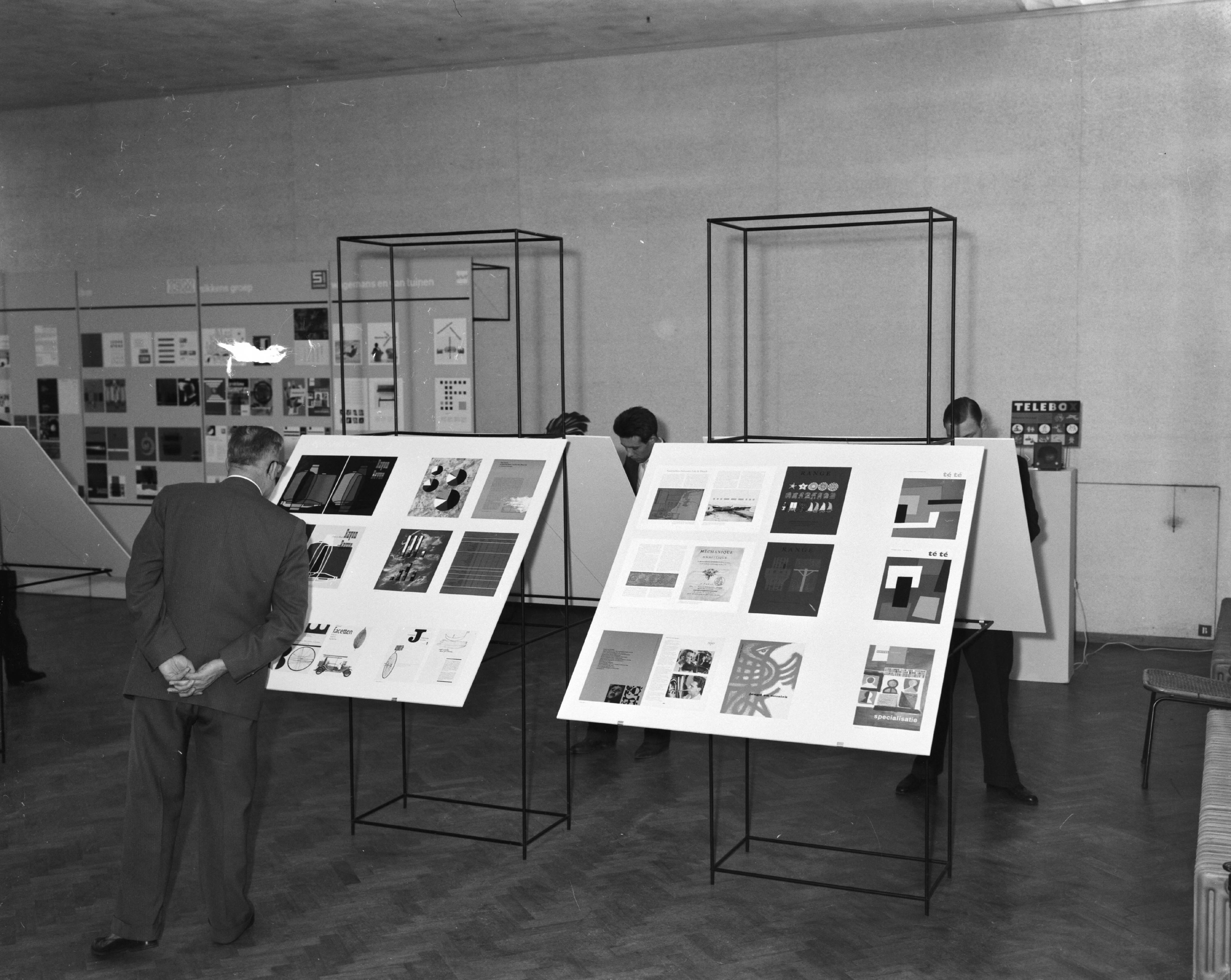
The gallery wall also evolved in the different continents…
British Approach: Evolved rather than designed. Comfortable disregard for spacing. Often includes oddities like butterfly collections alongside paintings and plates.
American Style: More deliberate. Matching frames, consistent spacing, well thought out colour ideas.
Scandinavian Take: Simpler, fewer pieces, more breathing space. Limited palette. Actually looks like someone thought about it and picked only their favourite pieces.
As you’re reading all this, is there an approach to hanging art that appeals to you? Are you a floor to ceiling kind of art hanger? Or more of a mid-century modern Scandinavian with clean lines and lots of white space?
Now, knowing your Parisian salon from your Victorian parlour is all well and good, but eventually you've got to pick up a hammer and make some decisions.
Whole room view - the gallery wall doesn't exist in isolation but as part of a complete room. The surrounding elements play crucial roles in how your collection will be perceived and enjoyed.
Pattern Scale Matters: If you have wallpaper consider that bold, large-scale patterns can overwhelm smaller artworks. Instead…
Victorian Wisdom: Small, tight patterns create a textural effect that allows pieces to live their best life.
Fabric Relationships: Let the gallery wall interact with textiles in the room—landscape greens picking up a motif in the curtains, portrait backgrounds in the same colours as the upholstery.
Materials: Finally, consider texture combinations: velvet upholstery complements watercolour on textured, handmade paper, or thick sherpa works well with a smoother acrylic painting.
Looking at how different interior designers approach the artful wall, here are some of my favourites:
Creates "castellated" edges instead of perfect alignments for a collected-over-time look
Places artwork against boldly patterned wallpapers for dramatic contrast
Mixes texts with unexpected art selections for striking displays
Creates playful gallery arrangements that reflect the personalities of the inhabitants, believing "a home should make it possible to take in all of these things"
Incorporates unusual objects like a collection of mirrors as art elements
Uses globally-inspired patterns in both artwork selections and surrounding textiles
Arranges asymmetrical groupings that follow furniture lines rather than grid patterns
Incorporates folk art and artisanal crafts alongside traditional framed pieces
Uses vibrantly colored and/or mismatched frames as design elements themselves
Incorporates oversized statement art pieces for theatrical impact
Uses dark and/or richly patterned wallpapers as backdrops to create drama
Selects art with bold color palettes that pop against wall treatments
Hangs pieces on reflective surfaces for interesting effect
wrote Austin Kleon in his brilliant "Steal Like an Artist." I think it's the same for our walls - each room gets to be a mashup of what you choose to let into it. Every painting, photograph, or object admitted to your gallery wall adds another ingredient to that deeply personal visual recipe.
Or as Mark Twain puts it:
I suppose that each time a painting finds a new home, it's another turn of that kaleidoscope, creating a new pattern and meaning.
My view? Your gallery wall exists within an interior landscape. The British genius lies in a comfortable and seemingly effortless integration of art with surroundings - a collection of things you chose because you loved and that now get to be part of something even bigger.
Different designers arrange art in unique ways, we are free to do the same. So why not..
Tell your own story, not someone else's Pinterest board
Start with pieces that genuinely speak to you (and end with them, too)
Allow space for organic growth
Throw in pieces that aren’t necessarily art (mirrors, kids drawings, writings, recipes, polaroids, that cracked plate you loved, and everything in between)
If you’re feeling bold, why not go Salon style and cover the wall from floor to ceiling?
Text within this block will maintain its original spacing when published
Till next time,

www.lottiemade.com
Comments
Nothing yet. Say the first thing.
Sign in to join the conversation.