
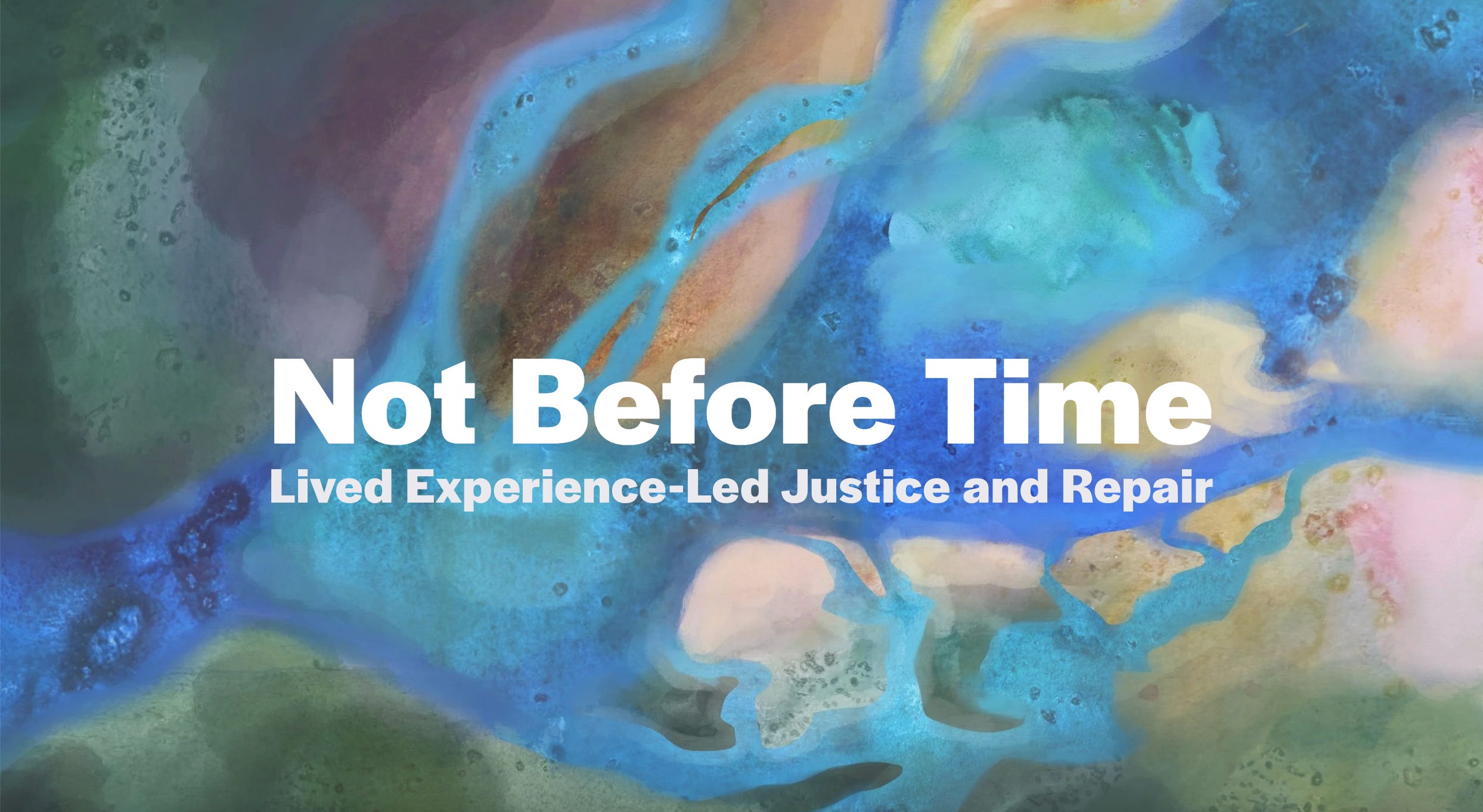
In Victoria, Australia, a royal commission into the mental health system in 2021 looked into the current state of mental health services and the prevalence of mental illness and suicide. The royal commission handed down 74 policy recommendations to repair the ‘broken’ system, however these recommendations didn’t address the trauma and harm that had already been experienced.
The Department of Health commissioned advice on how to address and formally acknowledge the harms caused by the system, which became the State acknowledgement of harm project.
I was approached by the team putting the report together to assist with illustrations that would help to visually guide the reader through the report and website.
The team wanted an image that brought to mind the land and the flow of rivers for the front cover. We spoke about aerial and Google Earth images which formed the inspiration for the shape and style.
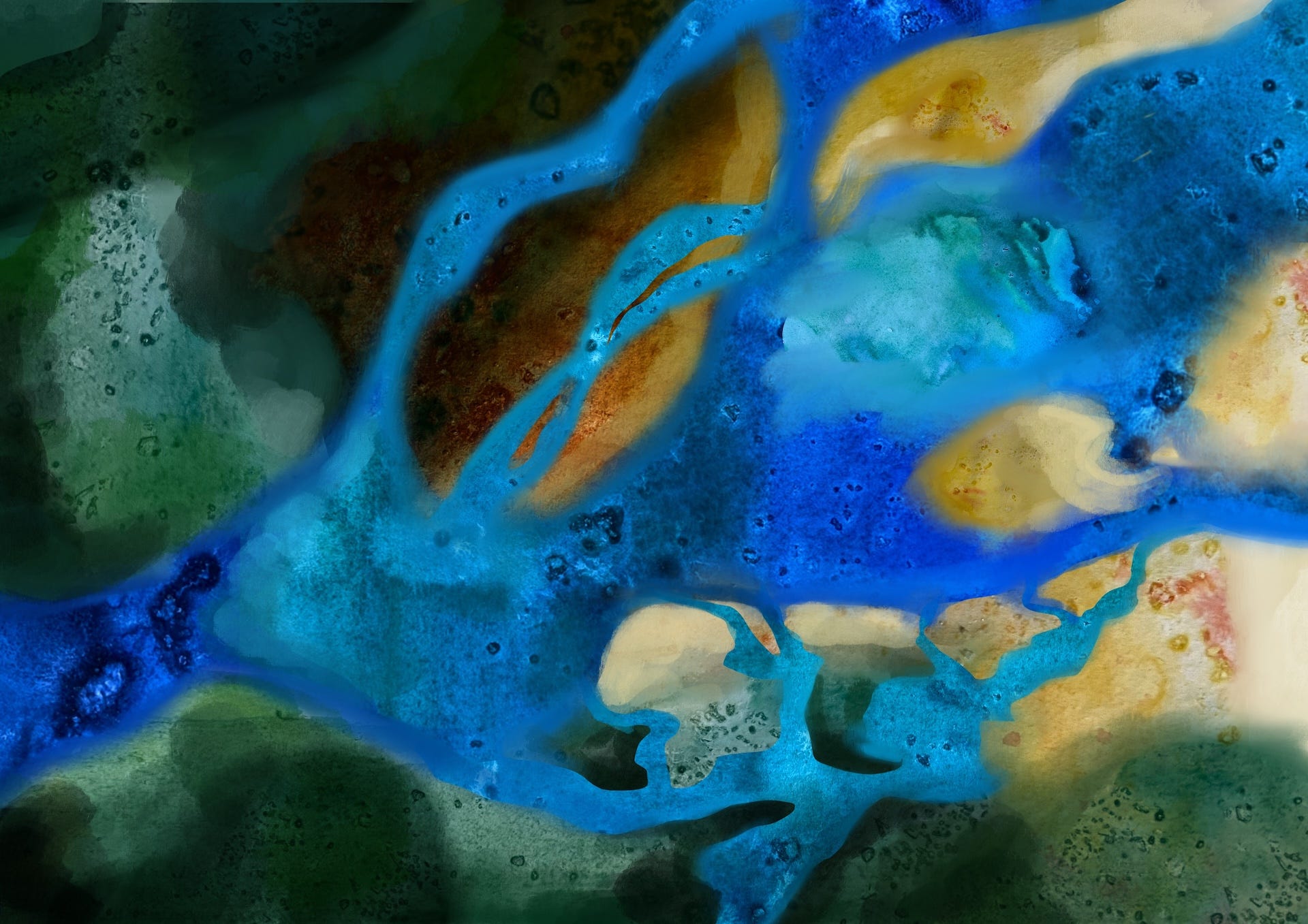
I approached this as a mixed-media collage, using wet-on-wet watercolour with grains of coarse salt to create texture. Coarse salt absorbs water as the watercolour dries and creates these beautiful dots you can see above. I photographed the watercolour pages and digitally cut out different shapes to create layers, using Procreate to soften edges and add more colours here and there.
The result looked like an estuary, the eddies and currents and little sandbanks forming in the flowing water.
The main challenge with this project was the sensitive nature of the subject matter. We needed to find creative metaphors that spoke to the different sections and themes without risking re-traumatisation of a reader or being too explicit about the types of harm experienced.
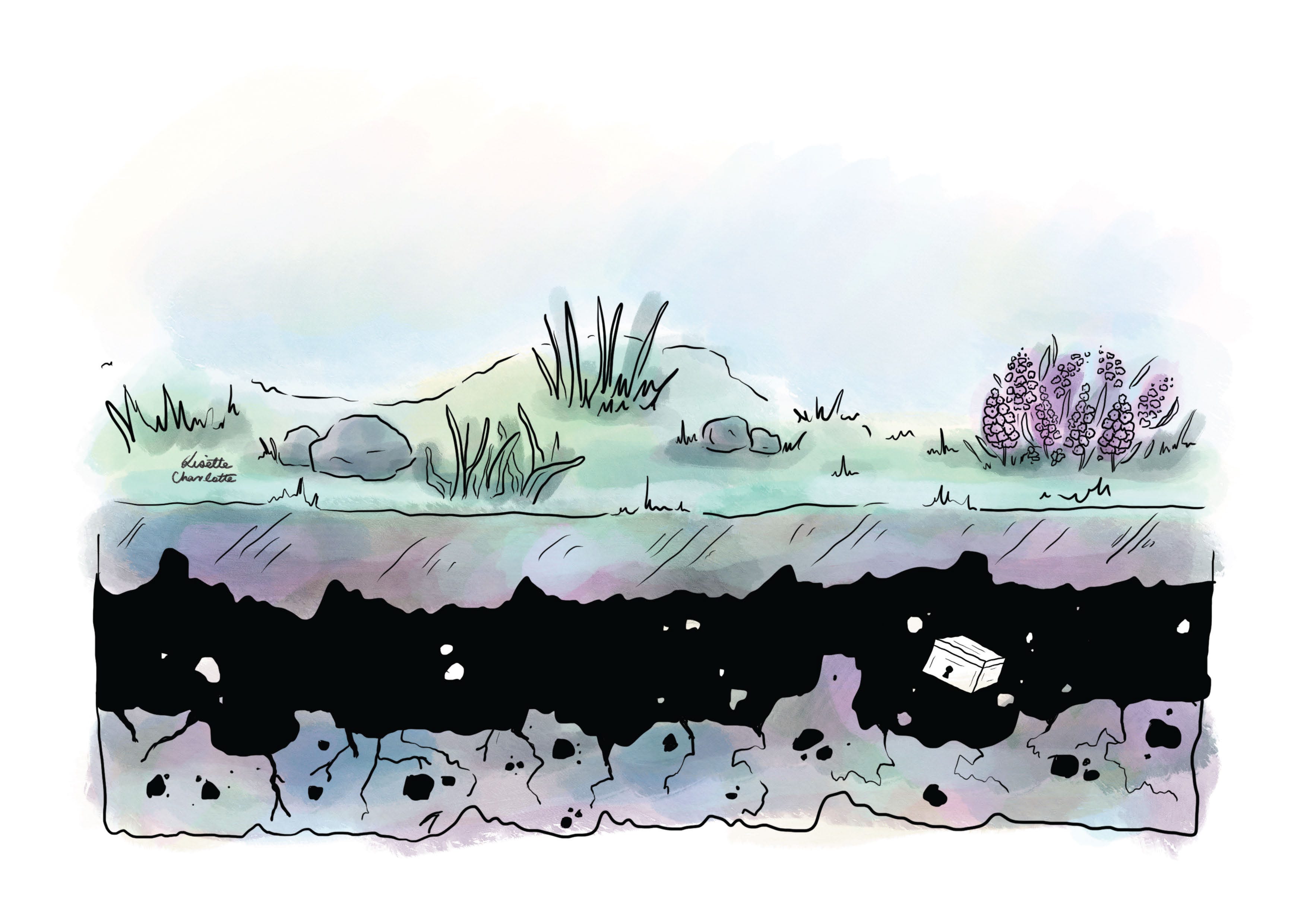
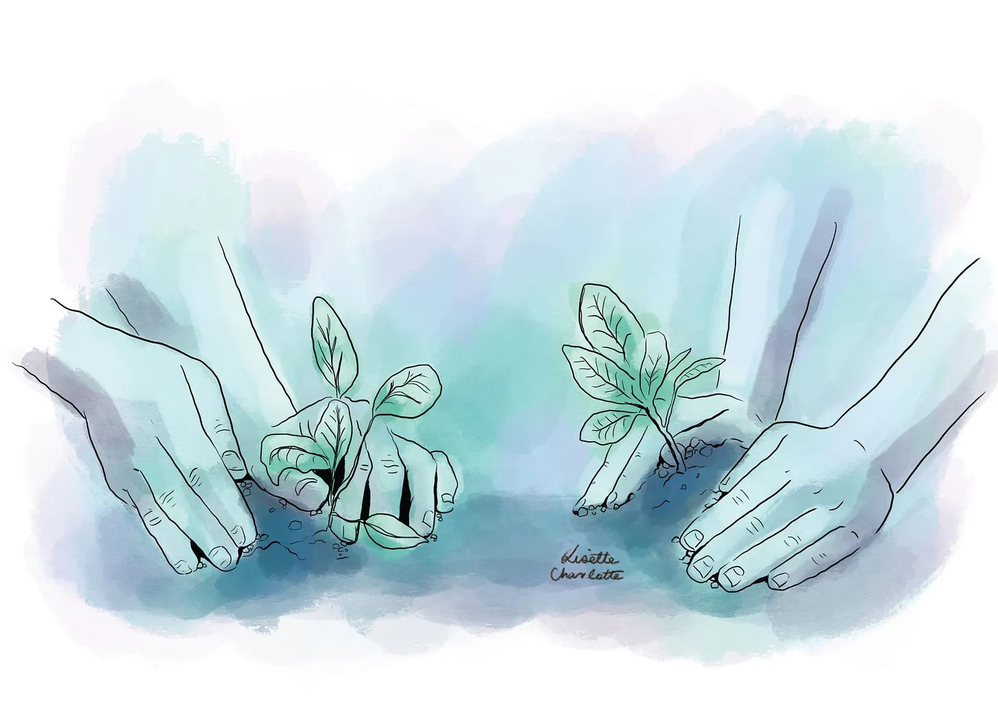
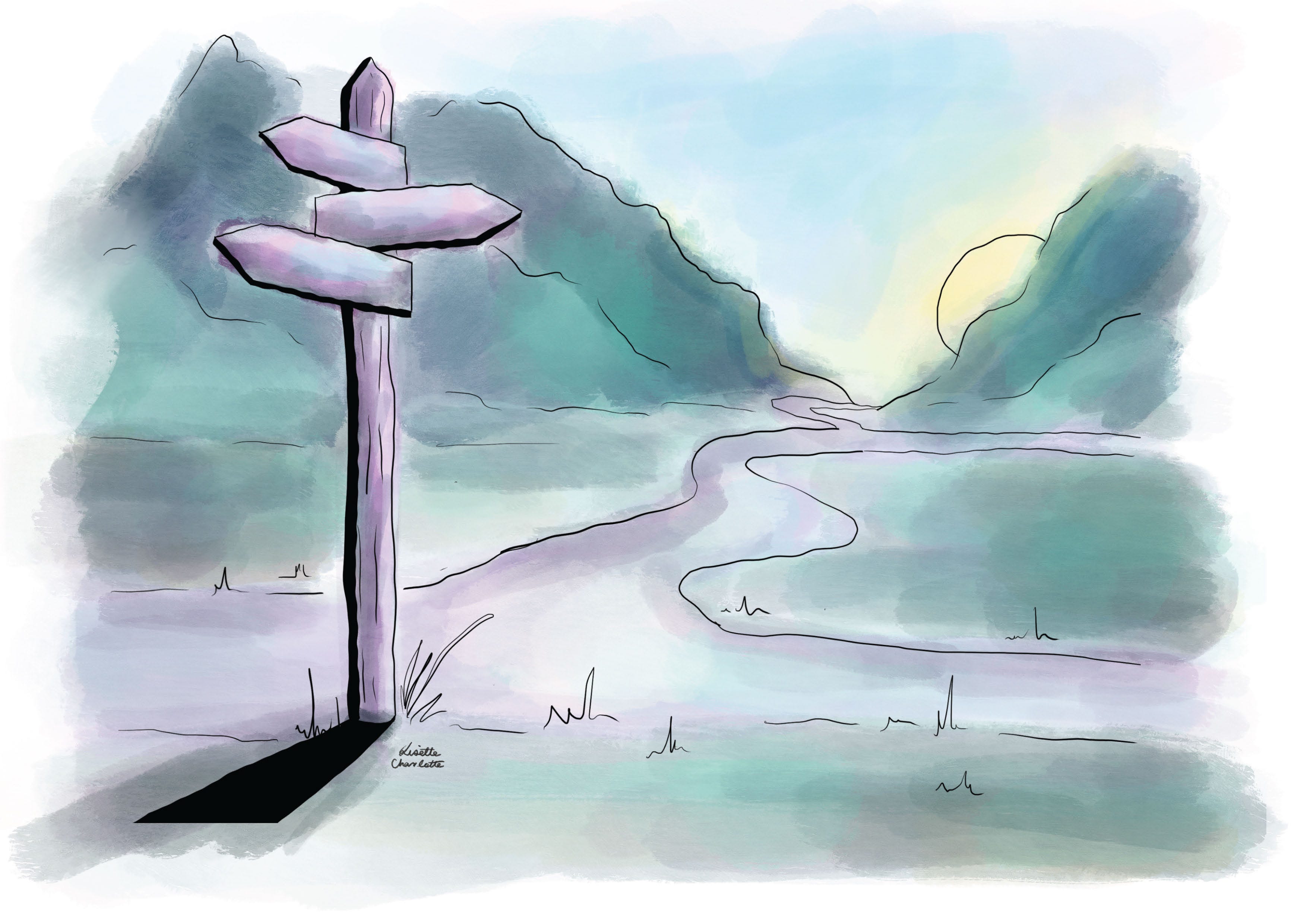
We workshopped a number of different scenes for the report sections. ‘Defining harm’ became a locked box long buried in the ground. ‘International research’ became a desk with a globe and office paraphernalia. ‘Restorative justice’ became digging in the dirt, and ‘public apology’ was planting something new that could symbolise future growth, as people were able to move forward towards healing.
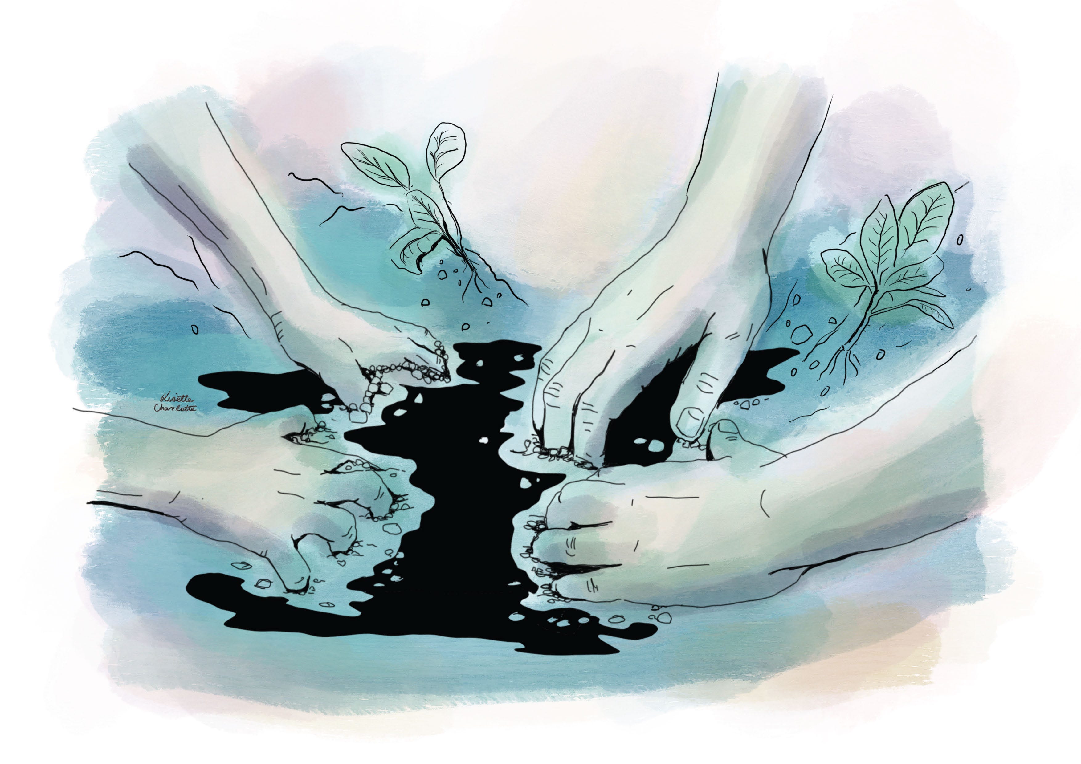
I kept the line work deliberately shaky and hand-drawn to give a sense of unsteadiness, with sections of deep black to reference the pain and trauma of those that the project sought to help.
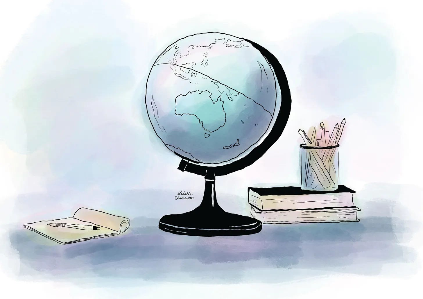
I took the colour palette from the original abstract landscape cover image. The blues, purples, teals and yellows combined to form this dreamy, almost bruise-like colour palette. Looking back, I’m not sure if I’d go in this direction again, but instead limit the colour palette to make the results a bit punchier.
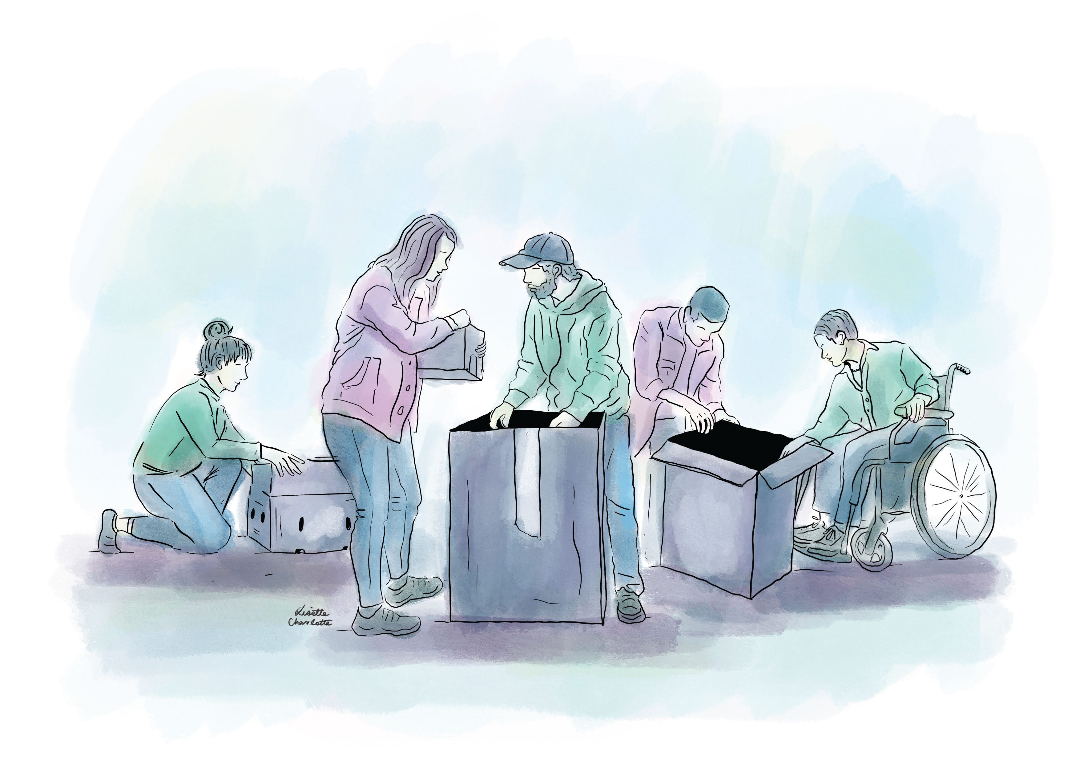
The final part of the project was depicting the working team in a number of illustrated portraits. I’ve written previously about how portraits can be really hard but these ones were fairly easy to pull together with great reference images.
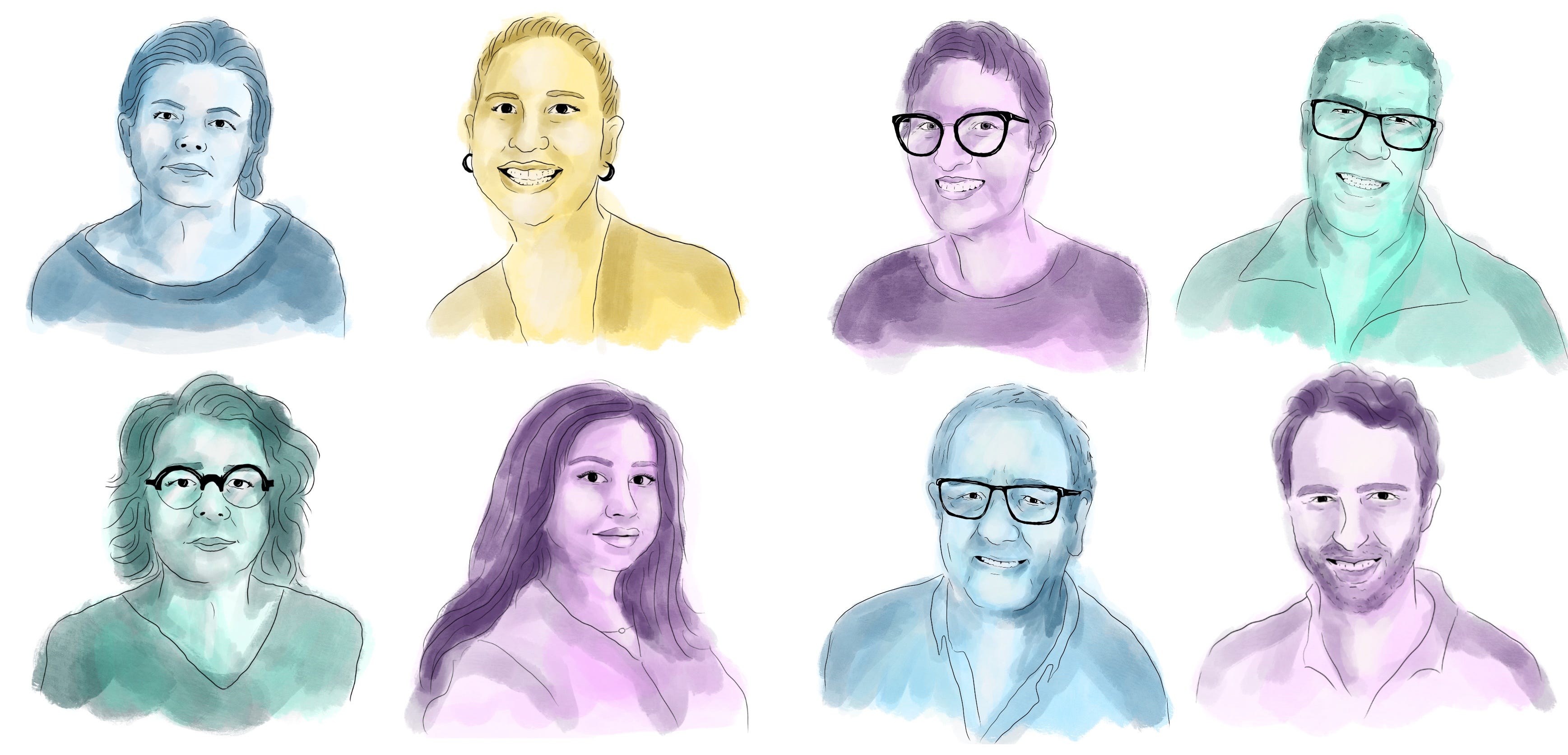
This project was an interesting one, and I certainly felt the gravity of helping to bring to life such important work. It’s definitely something that I’d like to do more of in the future.
If you’ve got a report or project that could benefit from custom illustrations, get in touch!

Project brief: Lonely Times
·
February 12, 2025
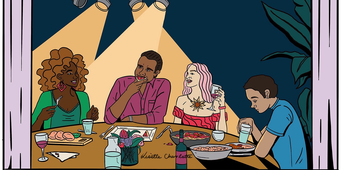
Are we going through an epidemic of loneliness? What causes loneliness? What alleviates it?
Project brief: RMIT Centre for Innovative Justice
·
October 13, 2025
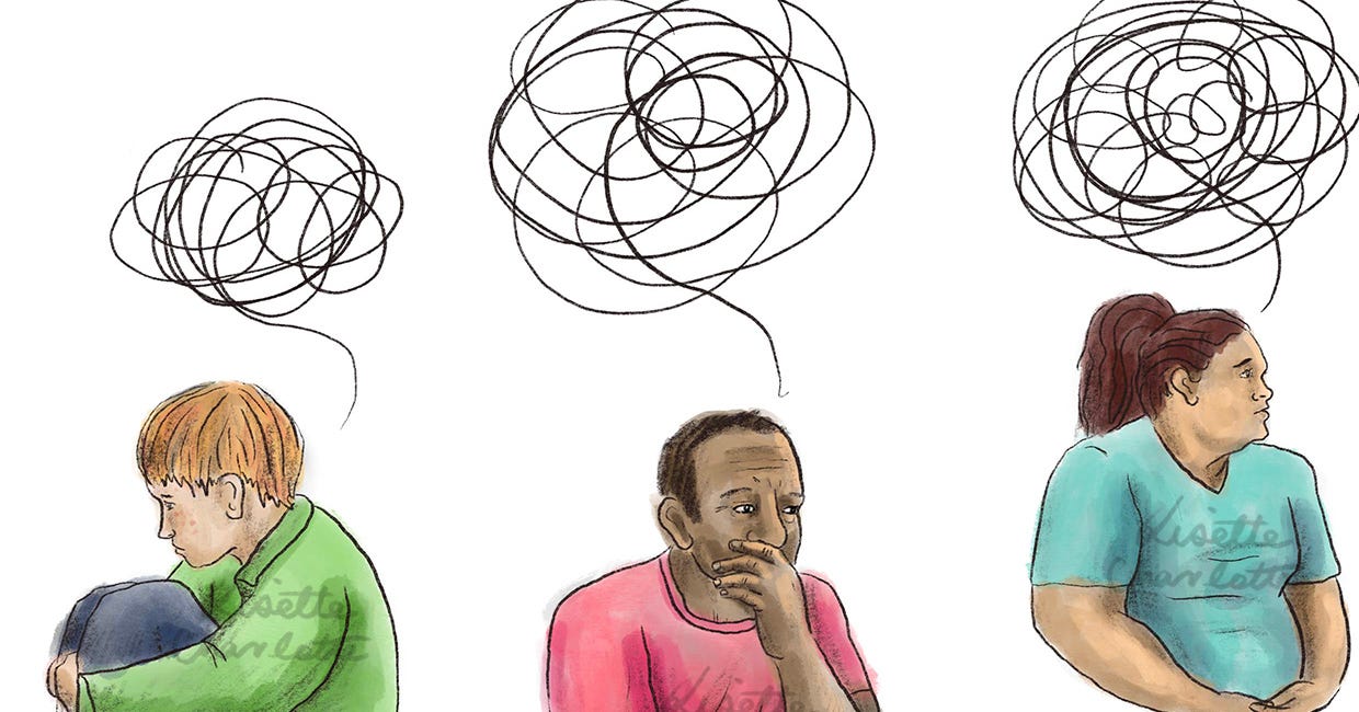
Occasionally my Squarespace website pays for itself by sending someone my way for an illustration project. In this instance, it was the RMIT Centre for Innovative Justice who were looking to commission some illustrations to be used across the website and reports.
Comments
Nothing yet. Say the first thing.
Sign in to join the conversation.