
Everyone has a dashboard. Almost nobody learns from it. I spent the last 30 days staring at Singular’s Creative IQ dashboard for Robot Breaker, my own game where I use Singular as an MMP. Not because it’s pretty (it is, kind of), but because it answers the only question that matters in UA right now: which creative direction deserves the next production cycle?
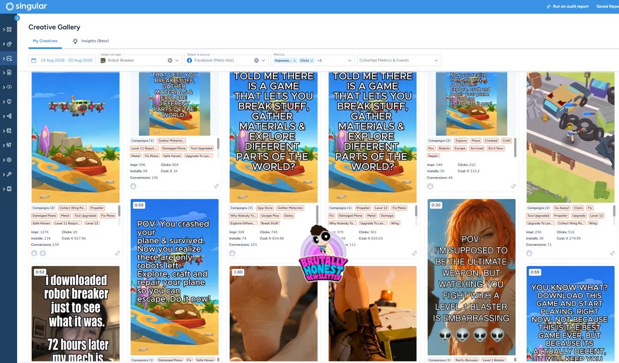
Let’s dive in.
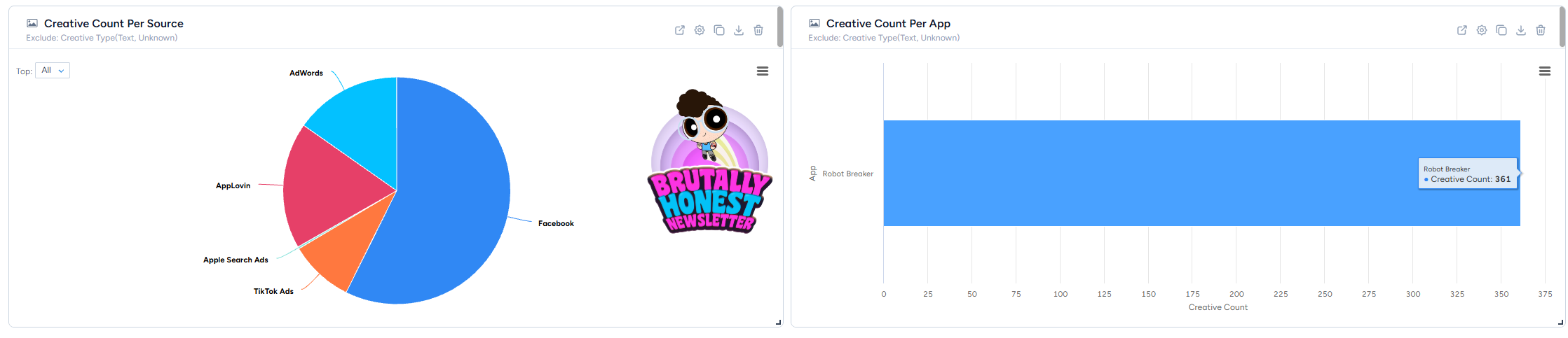
Last 30 days, one game, four networks. Roughly 1.67M impressions, 6,342 installs, €41k spend, blended IPM of 3.80. About 360 creatives ran during the period, mostly on Facebook, then AppLovin, then Google, with TikTok and Apple Search Ads as rounding errors.
360 CREATIVES = 90% by myself, 10% by my team!

The dashboard splits everything by creative type, source, duration, and (the interesting part) AI-tagged dimensions like animated vs. real footage and the dominant visual element in each ad. You don’t tag anything manually. It watches your creatives and labels them for you.
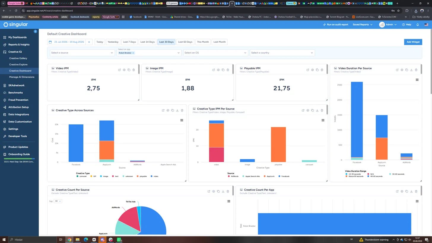
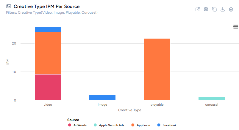
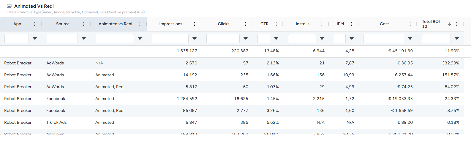
Look at the IPM by creative type. Within each network’s own auction, video sits at 2.75, image at 1.88, playables at 21.75.
If you stopped reading there, the conclusion is clear: make more playables, they convert 8x better than video. And on AppLovin, where playables actually run, that’s true.
But then you flip to the ROI columns and the story changes. On Facebook, my Character-led creatives have a higher IPM than the Plane-led ones (1.95 vs 1.79). The Plane creatives have the better actual ROI (46% vs 36% - and when I say ROI in this piece, I mean cohort D1 return on spend: revenue from a cohort’s first day divided by what I paid to acquire them, straight from the tracker below)
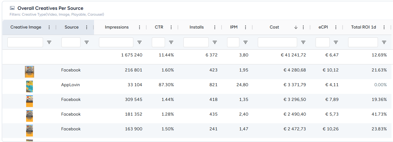
The creative that converts more efficiently is not the creative that pays back better. Different users, different intent, different value.
One honest comments: creative-level revenue on self-attributing networks is still messy. AppLovin reports performance per creative, but a chunk of tracker revenue lands at the source level without a creative attached - in my account, most AppLovin revenue sits in that unattributed bucket. So for AppLovin, I trust IPM and cost per creative in Singular and then match it with Applovin Creative SET ROAS numbers. Then, I judge revenue at the channel level. Facebook and Google map revenue to creatives much more cleanly.
And the funniest one: AdWords Plane creatives. €224 spend. Tiny. Actual ROI above 250%. A concept that is a super tiny on my biggest channels is the most profitable thing in the account. Too bad it's irrelevant. Who gives a f&ck about 250 spend?
That is the lesson. IPM tells you what the algorithm loves. ROI tells you what your business loves. A creative dashboard that shows you both, side by side, per concept, per element, is the difference between chasing installs and building a game that pays for itself.
Let me make it brutally concrete. Last 30 days, 361 creatives and €41k, here are the winners, per channel, straight from the dashboard:
AppLovin: animated playables with the character front and center. Playable IPM of 21.75 overall, my best ones pulling 22-38.
The top spender, “Nohy + game playables,” converted 842 installs at a 23 IPM, with “REMAKE+INDplayable” right behind it at a 24.7 IPM.
Character-led creatives take the biggest spend share on the channel at a 19.9 IPM, well ahead of Plane at 13.8. Pure animated beats the animated-real mix by almost double (19.5 vs 11.8 IPM). The formula on this channel is no longer a mystery.
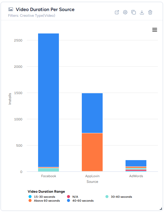
Facebook: animated video, 40-60 seconds, plane-led. Not the highest IPM (Character edges it 1.95 vs 1.79), but the best actual ROI at 46%, with 40-60 second videos driving the bulk of installs.
The single biggest creative in the account is “RB_NOBODY_REMAKE” shown above: €5k spend, 814 installs, and €1.4k back in the first 7 days, which for my payback curve is exactly where a winner should sit. “RB_YOUKNOW_REMAKE” shown below runs the same play one step behind it.
Plane concepts also carry the biggest spend share on the channel, so this is a winner at scale, not a small-sample fluke. Honorable mention: text-heavy hook videos at 43% ROI, quietly solid.
AdWords: plane concepts, full stop. Tiny spend, 250%+ actual ROI. The clearest “feed it more budget and watch what happens” signal in the whole account.
What is not great: the animated-real blends (underperform everywhere they run), and high-IPM concepts with no revenue behind them, like “REMAKE+puzzle playable” on AppLovin, €1.4k back in the first 7 days, which is ahead of the 50-60% D7 recoup I need to hit my 30-day payback target. Converting is not the same as working. And yes, the FeetRemake family exists in this account.
This is the FeetRemake video and “Feet family” concepts. It converts. It does not pay back on Facebook. But it pays back on Applovin. We move on.
This is the whole point of the dashboard. The winners above are not a report card, they are next month’s production plan. Here’s mine:
1. More character-led playables for AppLovin. “Nohy + game playables” and “REMAKE+INDplayable” get iterations. Lots of feet iterations.
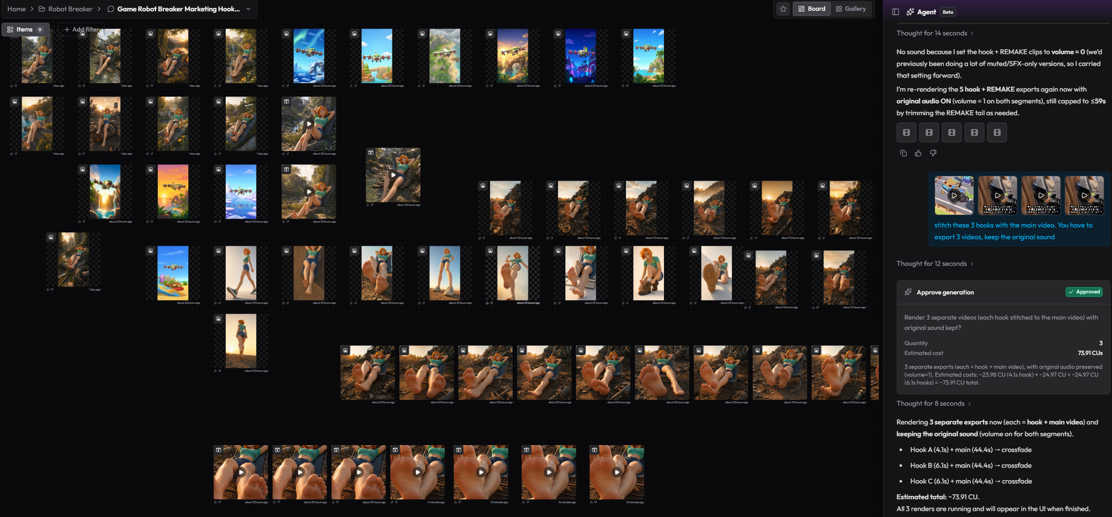
Different opening scenes, different difficulty curves, same character-first framing. This is where the biggest chunk of production effort goes because it’s where the biggest chunk of profitable spend lives.
2. Character-meets-plane hybrids. My two best elements have never properly shared a creative. Character leads AppLovin, Plane leads Facebook payback. So the obvious test: the character crash-lands, repairs, and flies the plane, cut as a 40-60s animated video for Facebook and as a playable for AppLovin. Recombining proven winners beats inventing from zero.
3. Scale the AdWords plane concept before touching anything else there. At 250%+ ROI on €224, the first move is not new creatives; it’s budget. Push spend until the ROI bends, then produce plane variations to hold it.
4. Three more 40-60s animated videos for Facebook, plane-led. Direct descendants of “RB_NOBODY_REMAKE” and “RB_YOUKNOW_REMAKE”: same structure, new hooks, new first three seconds. The winning duration and the winning element, in the format the channel actually rewards. Plus one more text-hook variant, because 43% ROI earned it a seat.
5. Kill the animated-real blends. Or give the concept exactly one more radically different execution before the 3-iteration rule ends the discussion. No more production cycles on a hunch the data already voted against.
Notice what’s NOT on the list: twenty random new concepts. The dashboard’s job is to shrink the brainstorm. Five directions, all tied to winners, all testable in a month. Well, in a week, to be honest.
My list above is one month, one game. The bigger point is the dimensions themselves, because these are the axes you get for free at every brainstorm:
Animated vs real. One toggle that can kill (or validate) an entire production direction like “let’s blend UGC with gameplay” before you spend a cycle on it.
Singular also auto-tags how each video opens: Curiosity, Cinematic Visual, Shock/Surprise, Relatable Fail, and so on. Mine surfaced something I would not have guessed: on Facebook, Curiosity hooks outspend Cinematic Visual hooks by a wide margin on 7-day ROI, even when the gameplay footage behind them is identical.
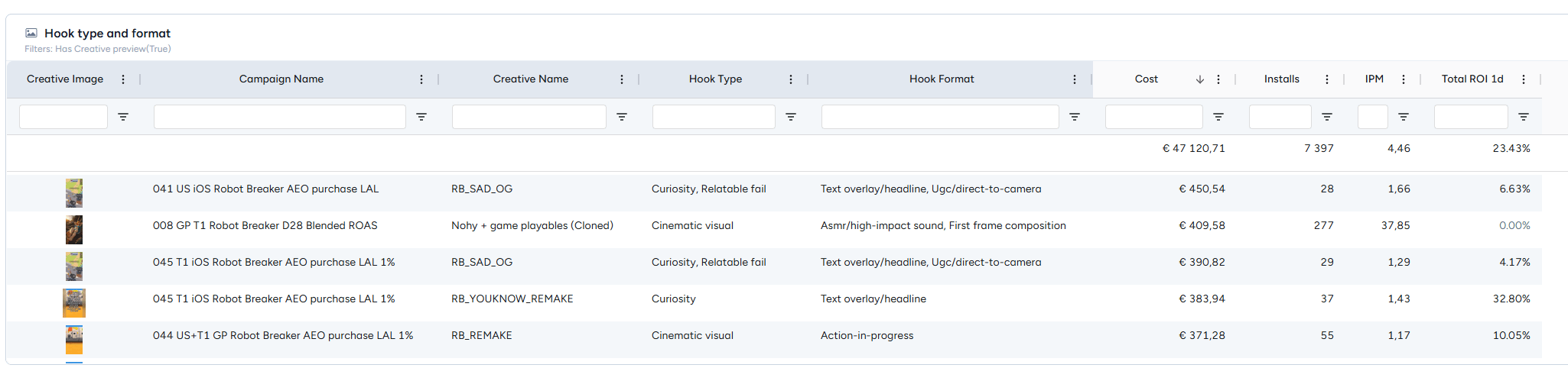
Dominant element. Character, Plane, Puzzle, Text, whatever the AI finds in your ads. Every tag is a brainstorming axis, and crossing two winning tags is the cheapest new concept you’ll ever generate.
Video duration. Most of my Facebook installs come from 40-60 second videos, AppLovin skews longer - well, mostly closer to 60sec.
Day over day per channel. Fatigue curves, per creative, per source. You see the decay before the ROAS report screams at you.
Because a dashboard is only as good as the skepticism you bring to it. Three rules I follow with mine:
Compare within a network, never across. AppLovin counts engagement clicks, so its “CTR” next to Facebook’s means nothing head-to-head. The per-source splits exist for a reason. Use it.
Respect sample size. My Island element shows a 35 IPM. On €40 of spend and 10 installs. That’s not a signal; that’s a joke. The dashboard shows you everything, big and small. Your job is to know which numbers have earned your trust. No shit, Sherlock!
And always click through to the actual creatives before building a strategy. The AI dimensions point you to the pattern. Watching the top three creatives behind the pattern tells you why it works. That combination, label plus eyeballs, is where the real briefs come from.

One more thing. Singular has an MCP server. Translation for the non-nerds: I can connect my AI assistant directly to my Singular data and just ask questions in plain language. “Top creatives for Robot Breaker by cost, last 30 days, with names, installs, and revenue.” Ten seconds later, I have the exact table, real creative names included, no dashboard clicking, no CSV exports, no copy-paste gymnastics.
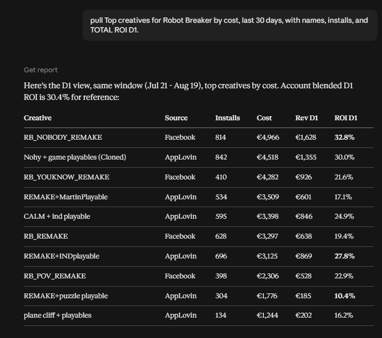
Every creative name came out of that pipe. The dashboard is where I explore and spot patterns. The MCP is where I spend the most time: pull this cohort, compare these two concepts, give me the losers under €100 spend. It turns your attribution data into something you can talk to, and honestly, once you’ve written a weekly report this way, going back to manual exports feels like jumping out of the window!
Volume without judgment is noise. I’ve said it before, and the data keeps proving it. The value of a creative dashboard like this isn’t that it makes more creatives possible. It’s that it makes fewer, better-aimed creatives possible. Every tag, every split, every IPM-vs-ROI mismatch is a question your next brainstorm can start from.
That’s it.
Give me some love (or hate) & subscribe.
Comments
Nothing yet. Say the first thing.
Sign in to join the conversation.