
Regular readers will know that from time to time I branch out from World War II memory and history, and write about something entirely different. Today I want to share an article I wrote for Englesberg Ideas six months ago, about another obsession of mine: signs and symbols. I thought you might enjoy it. Because it’s summer. And the sun is shining. And this world of ours is endlessly amazing!
From ancient times, people have always tried to pass on messages to others by drawing pictures. Sometimes these pictures are self-explanatory, like the drawings of mountains or trees on a map. But sometimes they represent quite complex ideas that need to be learned. Egyptian hieroglyphs are just one example. Mathematical symbols are another.
Until recently, very few of these picture languages have passed from one culture to another. But at the end of the nineteenth century something extraordinary happened: a movement began to create pictograms that would be recognisable everywhere, regardless of culture. It was a revolutionary idea: by using standardised pictures instead of words, we might be able to transcend language altogether.
One of the first experiments in creating a universal picture language occurred in the Alpine regions of Italy and Switzerland, during the cycling craze of the 1890s. Cyclists’ touring clubs began to put up signs warning their members of upcoming hazards, such as sharp bends or steep hills. Picture symbols were chosen rather than words, partly because in these Alpine regions you could never be sure what language a cyclist might speak, and partly because those cyclists had to be able to take in the information quickly. Where words did appear they were short, bold and to the point: Stop, Danger, Slow Down.
By 1900 there was such a plethora of different systems that the International League of Tourist Groups decided to hold a conference in Paris to try to standardise them all. Nine years later, various national governments around Europe held another conference, this time to create standard signs for the growing number of motor vehicles on the roads. By 1928 the League of Nations had become involved, and the internationally standardised road signs we all know today began to take shape.
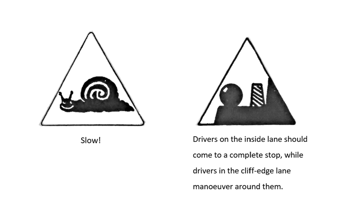
To appreciate the sheer amount of thought that has been put into road signs and symbols over the years, one needs only to look at some of those that failed to make the grade. In the 1920s, readers of the Swiss magazine, Automobil Revue, proposed a whole series of new traffic signs, few of which ever got made. Some were simply comical, such as the picture of a snail with a big grin on its face that was supposed to warn drivers to slow down. Others were so obscure that they were impossible to understand. For example, there was a convention in Switzerland that when two drivers met on one of the winding mountain roads, the driver on the inside lane that hugged the hillside would stop completely to allow the driver on the more dangerous cliff-side lane to manoeuvre around them safely. How on earth could one convey all of this information in a single symbol? Some of the attempts to do so are truly baffling.
The task of creating an international system of road signs was therefore much more difficult than it seems. In order to work, these signs have to be clear, simple and easily understood at a single glance. And they must be standardised, so that there is no room for misinterpretation. Getting hundreds of different groups and nationalities to agree on a single image is no mean feat.
Road signs were just the beginning. In the 1920s a far more ambitious idea began to take shape: what if symbols could be used in the communication of information other than just the rules of the road? What if they could become a language in their own right, negating the need for words altogether?
This was the plan of Austrian philosopher and sociologist Otto Neurath, one of most influential thinkers of the twentieth century. Neurath was the founder of the Museum of Society and Economy in Vienna, which he set up after the First World War. His mission was to educate ordinary men and women about the great economic forces of the day that were shaping their lives.
When setting up his museum, Neurath immediately faced a major problem: that of communication. In the wrong hands, economics can be not only a complicated subject but also a very boring one. It is impossible to understand in any depth without referring to detailed sets of statistics – but few people really want to spend endless hours poring over tables of numbers.
His solution was to reinvent the bar chart using pictures of the subjects he was measuring. If his statistics were about automobiles, he would use pictures of automobiles. If they were about birth rates, he would use pictures of babies: the more babies on the chart, the higher the birth rate. It sounds rather obvious today, but before Neurath no-one had given this idea much thought.
Gradually, Neurath began to establish a set of rules for all his diagrams. He decreed that, just like road signs, every chart must be able to communicate its information at a single glance. His pictograms all had to represent instantly recognisable archetypes – the worker, the farmer, the soldier, the school child. Each had to be drawn to a standard size and shape. Each had to convey the maximum amount of information in the simplest form possible.
Had Neurath stopped there, his system might have ended up being remembered as just one small innovation in the history of graphic design. But he went a step further. Over the course of almost twenty years, he and his team accumulated a whole library of standardised symbols representing everything from chickens and horses to factories and hospitals. What if these symbols could be taken out of the museum, and put to work in the wider world? What if they could become a new kind of language – an international language of pictures?
In a flash of inspiration, he named his library of pictures the ‘International System of Typographic Picture Education’, or ISOTYPE for short. He wrote a book about it, and began proselytising his system to the rest of the world.
As he observed in 1935, the applications for ISOTYPE were seemingly endless – particularly in an era when international travel was becoming increasingly normal. ‘A man coming into a strange country without a knowledge of the language is uncertain where to get his ticket at the station or the harbour, where to put his boxes, how to make use of the telephone in the telephone box, where to go in the post office. But if he sees pictures by the side of the strange words, they will put him on the right way.’
Neurath’s ambitions went much further than merely helping tourists for find a telephone. He saw his images as something pure and clear. They could convey complex information far more efficiently than words, and without all the historical and metaphorical baggage. But most importantly, they could be understood by people of all cultures, regardless of what language they spoke. One of Neurath’s favourite catchphrases was, ‘Words divide – pictures unite.’ What he hoped to achieve was not only a global language, but a global way of thinking.
Otto Neurath died in 1945, but the principles he established have since become the bedrock of pictogram design throughout the world. There have been several waves of innovation in the postwar period. At the Tokyo Olympics in 1964, new icons were created to represent different sports. In 1968, the Association of German Airports developed a standardised system of pictograms for international travel, which have since been adopted across the world. Standardised pictures are now used everywhere, from laundry symbols to the assembly instructions for flat-packed furniture.
In recent decades they have even spread to our emotional lives. Back in 1982, computer scientist Scott Fahlman noted that written attempts at humour on his company bulletin board were often being misunderstood. He suggested that his work colleagues should give emotional cues whenever they were trying to be funny. The formula he proposed was to type the characters :-) after every joke, because when turned on their side they looked like a smiling face. Likewise, when conveying serious or sad information, they should use the combination :-(.
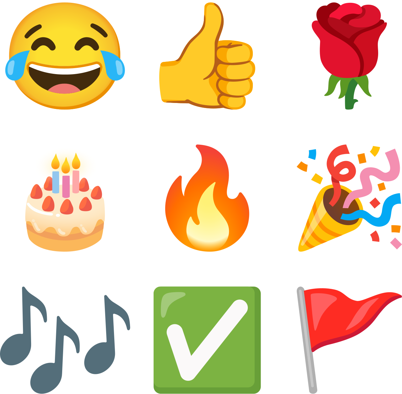
This idea quickly caught on, and spread. Soon various computer software companies in America and Japan began incorporating actual icons of smiley faces and sad faces in their lists of fonts. Things were then taken a step further with a whole set of emoticons expressing everything from disapproval to desire. Today every smartphone has a whole library of pictograms, which includes not only standardised pictures of people and objects, much like those Otto Neurath imagined, and emotional cues such as hearts and smiley faces. Nowadays we often send each other messages without any written words at all.
So have we finally achieved the dream of a universal picture language? Can we throw away our dictionaries, and rely on symbols from now on?
Not so fast. There is still vast scope for problems and misunderstandings in even the most widely recognised systems of symbols.
Take road signs, for example. The goal of all those international conferences held by the League of Nations and then the U.N. was to establish a single system that would be the same wherever you went in the world. Unfortunately, at exactly the same time that the Europeans were creating their standardised road signs back in the 1920s, the Americans were developing a completely different scheme, with different colours, different shapes and different pictures. Despite repeated attempts to reconcile these two systems over the past 100 years, the dream of a single language of the road has still never been realised.
Then there is the issue of whether standardisation of images is possible, or even desirable. In 1931, the French historian Lucien Febvre argued that Otto Neurath’s quest for universal images drowned out the unique voices of the local and the individual. Rudolf Modley, a one-time protégé of Neurath, and the founder of the American design company Pictorial Statistics Inc. concurred. Modley said in 1937 that Neurath’s attempts to avoid a pictorial ‘Tower of Babel’ were hopelessly Utopian. An American picture of, say, a farmer must necessarily look different from a Chinese picture of a farmer: ‘Obviously, such symbols must be prepared with their specific audience in mind.’
This has real world implications. When the United Nations tried to agree a universal symbol for ‘pedestrian’ in 1949, the picture they came up with was the silhouette of a little man wearing a suit and Homburg hat. Even at the time there were many who complained that this little man didn’t look like the pedestrians in their countries, who didn’t all wear suits and hats. In recent years there have been other concerns: why is this pedestrian automatically assumed to be a man? Why are there no women on our street signs? The consequence of all this dissent is that, while an international symbol has been agreed on paper, in reality the pedestrian symbols that appear around the world are all different. Some wear trousers, some wear skirts. Some are angular, some are curvy. If this is an international language, it is one with an infinite number of dialects.
The emojis we use on our phones can also sometimes be ambiguous. According to Naomi Baron, professor of linguistics at American University, Washington D.C., there is no guarantee that the pictures we send one another can convey what we intend them to. ‘If I send you a message that just shows a person in a bed, am I saying that I’m going to bed? That you should? That I’m about to buy a bed? That I’m in the hospital? It turns out that pictures rely on context for correct interpretation, just as words do.’
Different users also use emojis in different ways. Your grandmother might have a completely different interpretation of the aubergine/eggplant emoji from the one that you have: she’s talking about cooking, you’re talking about sex. Likewise, the peach emoji has been so often used to represent buttocks that in 2016 Apple redesigned it so that it would look less like someone’s bottom. It made no difference. Even the language of emojis has its own slang.
It is difficult to know whether to be disappointed by our inability to agree a common system, or proud of our seemingly infinite capacity for variety and reinvention. But either way, it seems that our search for a universal picture language is doomed never to be quite so universal as its earliest pioneers once hoped.
This post is public so feel free to share it.
No posts
Comments
Nothing yet. Say the first thing.
Sign in to join the conversation.