
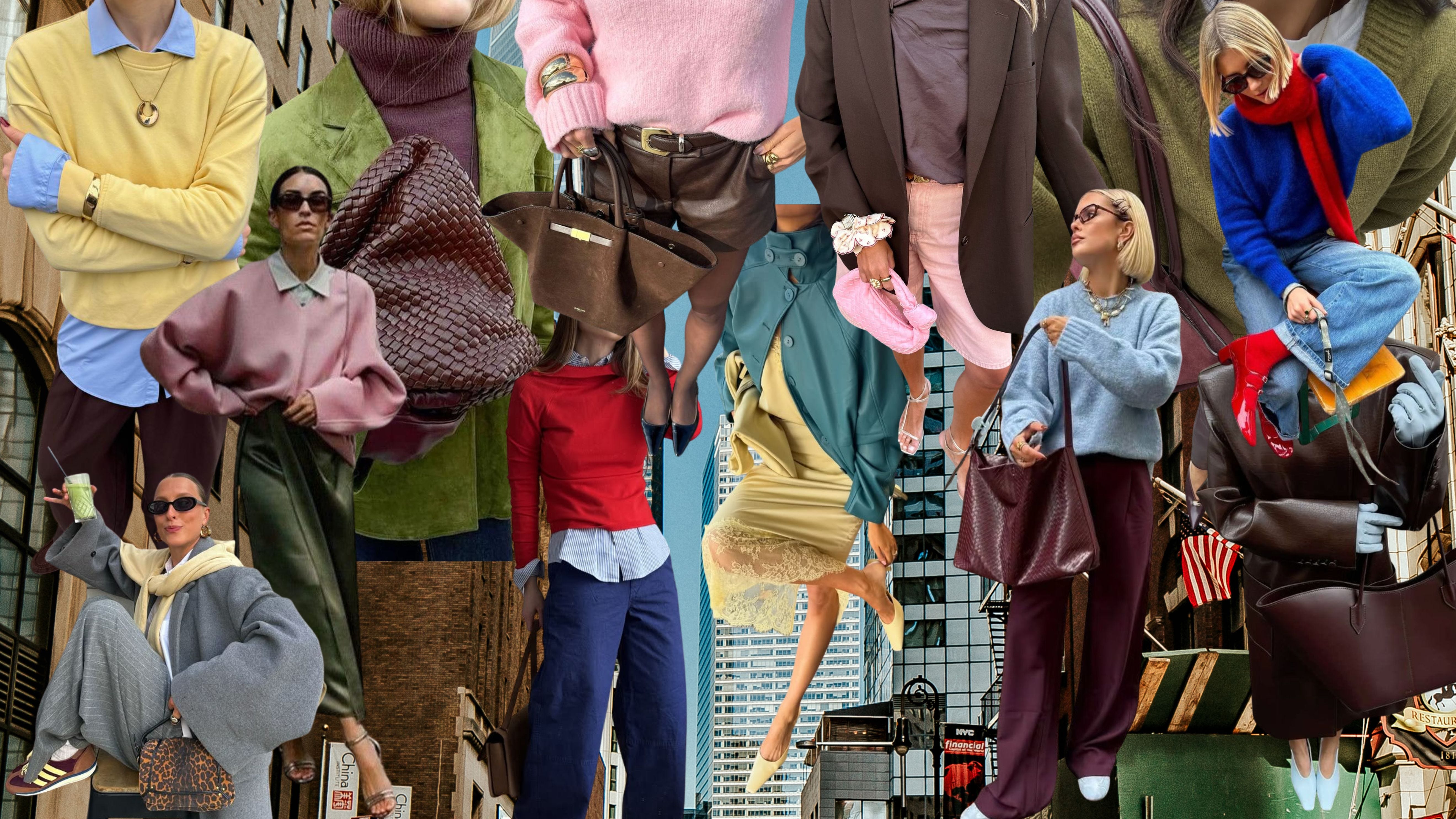
Guys, I have a new favorite corner of the internet… and it is people telling me to put together colors I would have never thought to wear together. I’m usually pretty good at looking at individual pieces and knowing what I like, but color combinations are a completely different skill set. Navy and cream? Sure. Black and white? Groundbreaking. But chocolate brown, powder blue and butter yellow? Burgundy, baby blue and chocolate? Apparently I have been severely underutilizing the color wheel.
The inspiration for this article came from creator Katya Klema, whose color-combination videos on TikTok immediately sent me down a rabbit hole. (Her Substack is: Visual Logic by Kate Klem) She has a background in software engineering, which makes her approach to fashion especially interesting: there’s a logic and almost analytical way she breaks down why certain colors, trends and styling choices work. I LOVE when someone on the internet gives you an idea that actually changes the way you look at the clothes already hanging in your closet.
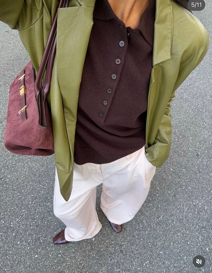
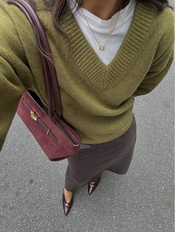
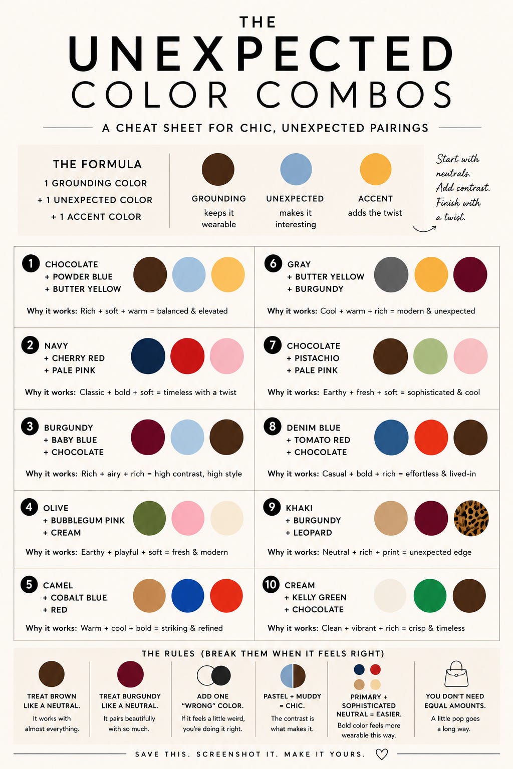
So naturally, I started experimenting. And what I realized is that the outfits I tend to save aren’t necessarily using more color… they’re just using color BETTER. There is usually a grounding shade that makes everything feel wearable, something slightly unexpected that makes the outfit interesting and then a third color that feels almost a little wrong. Which brings me to my VERY unofficial formula:
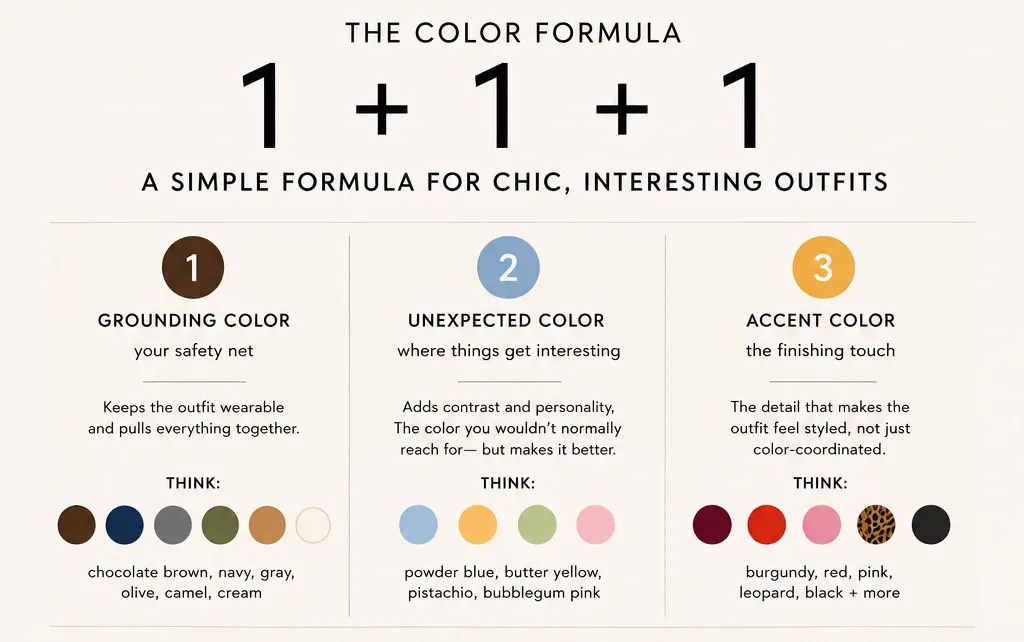
The grounding color is your safety net. Think chocolate brown, navy, gray, olive, camel, cream. The unexpected color is where things get more interesting: powder blue, butter yellow, pistachio, bubblegum pink. And then the accent is the thing that makes the whole outfit feel styled rather than just color-coordinated.
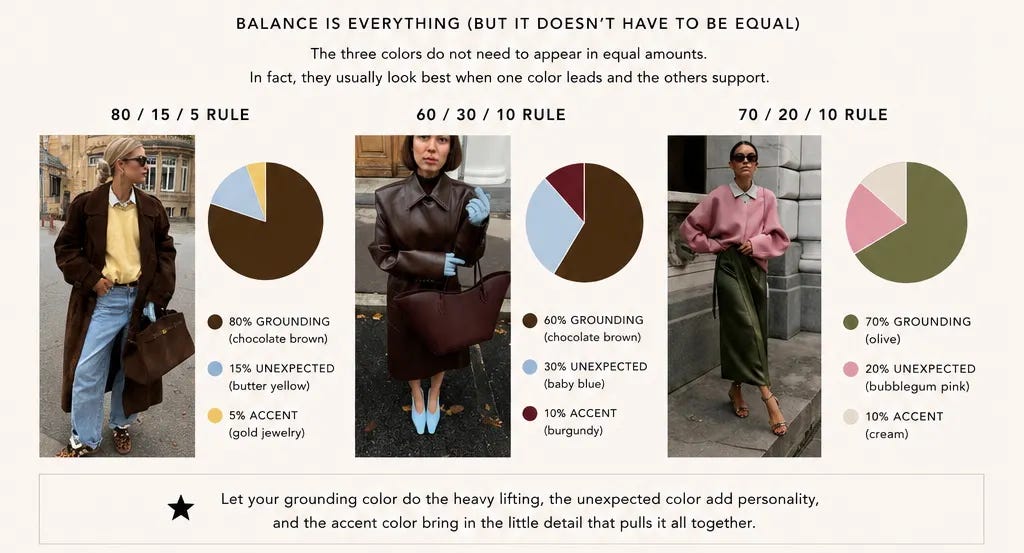
The best part is that the three colors do not need to appear in equal amounts. In fact, I think they usually look better when they don’t. Your third color could be a ballet flat, a bag, a sock peeking out from a loafer, sunglasses, a sweater tied around your shoulders or even just a tiny bit of print.
Okay, now for the fun part. I pulled together ten combinations I’m currently obsessed with, plus exactly how I’d wear each one. Starting with the combination that sent me down this entire rabbit hole...
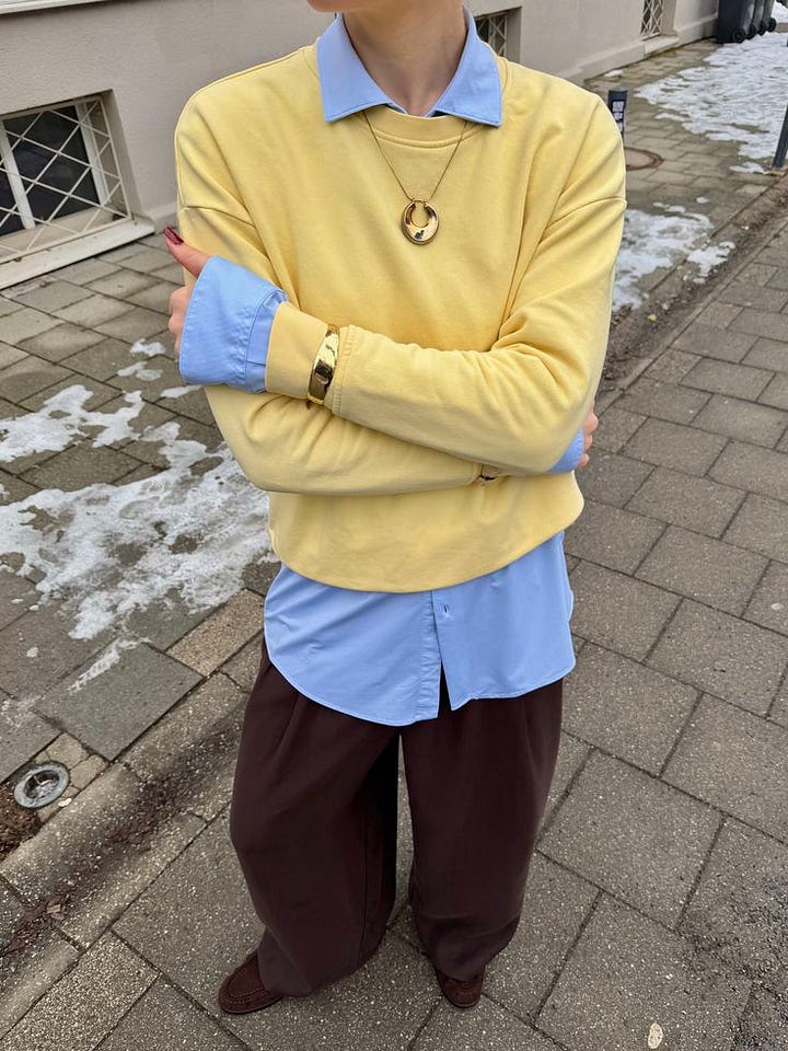
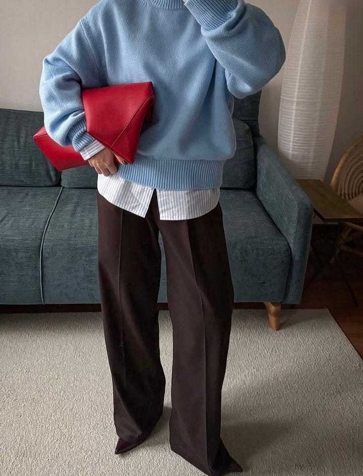
This might be the combination that sold me on this entire concept. Chocolate brown has become such a staple in my closet that I basically treat it like black at this point, but powder blue makes it feel so much softer. Then you add the butter yellow and suddenly three colors I wouldn’t necessarily group together feel incredibly expensive.
The easiest version: chocolate trousers, a powder-blue button-down and butter-yellow flats or a bag.
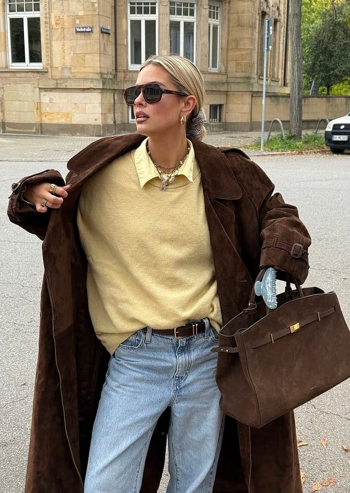
Navy and red obviously aren’t revolutionary on their own, but adding pale pink completely changes the equation. The pink softens the red while the navy keeps the whole thing from becoming too sweet. It feels classic without feeling predictable—which is basically the goal here.
I’d do a navy sweater or blazer, cherry-red shoe and pale-pink bag. Or flip it: pink shirt, navy pants, tiny red accessory.
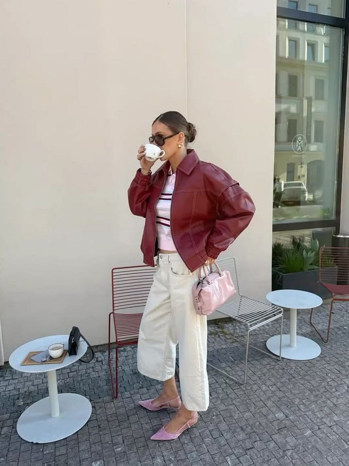
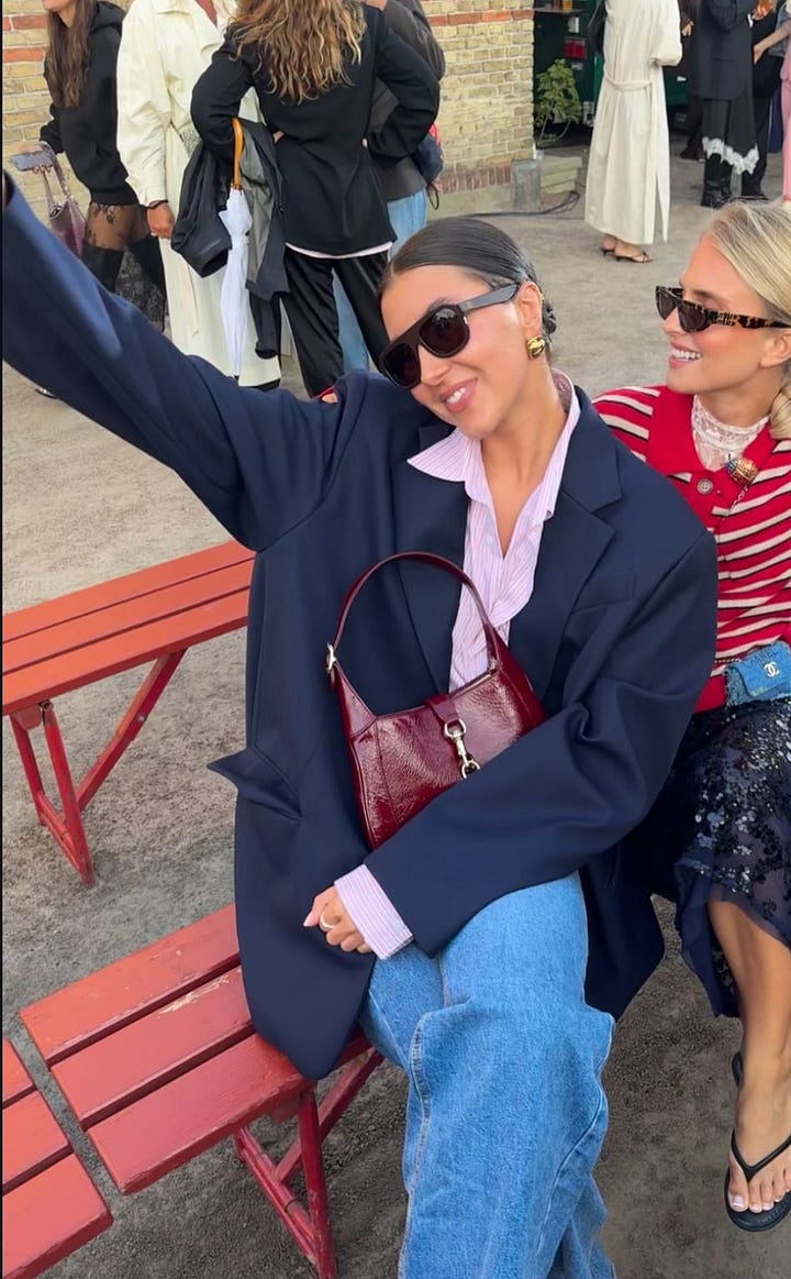
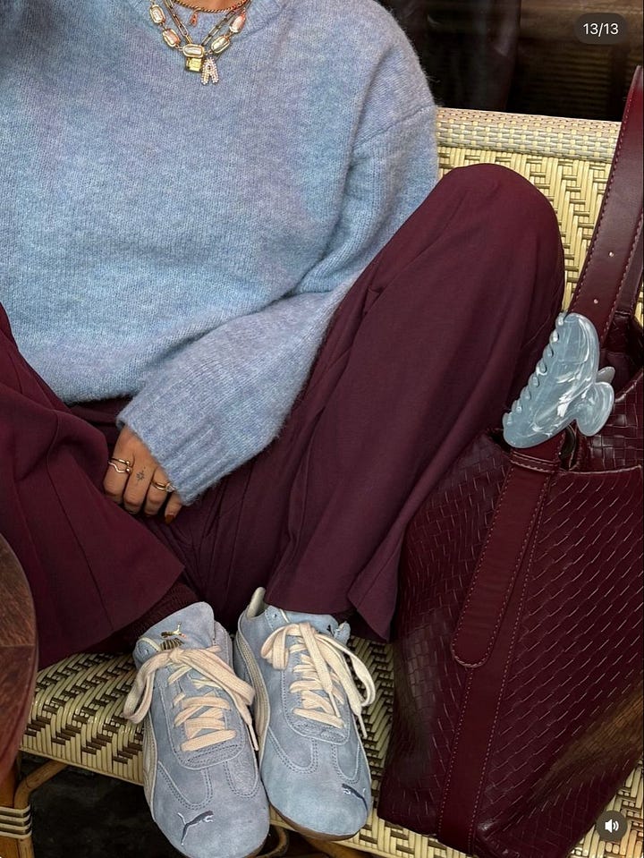
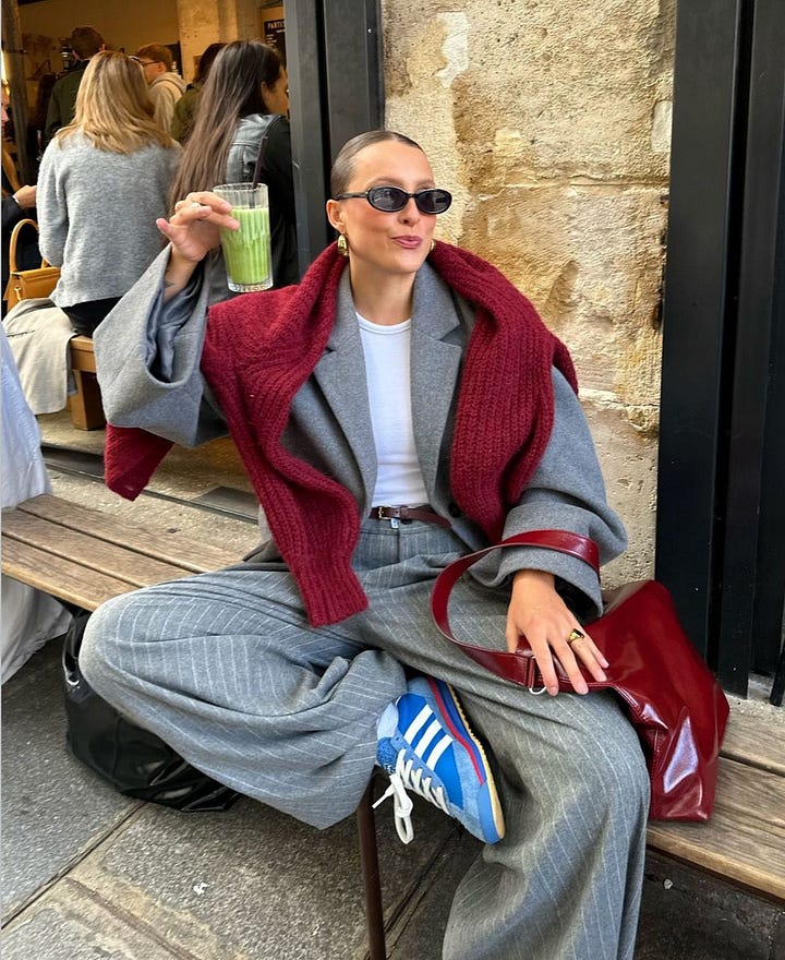
Consider this my official campaign to make everyone treat burgundy as a neutral. It is so good with brown, gray, khaki, pink AND especially baby blue. The blue gives all that richness some air, while the chocolate keeps it grounded.
Also, if you’re staring at something burgundy in your closet and automatically reaching for black, this is your sign to try literally anything else first.
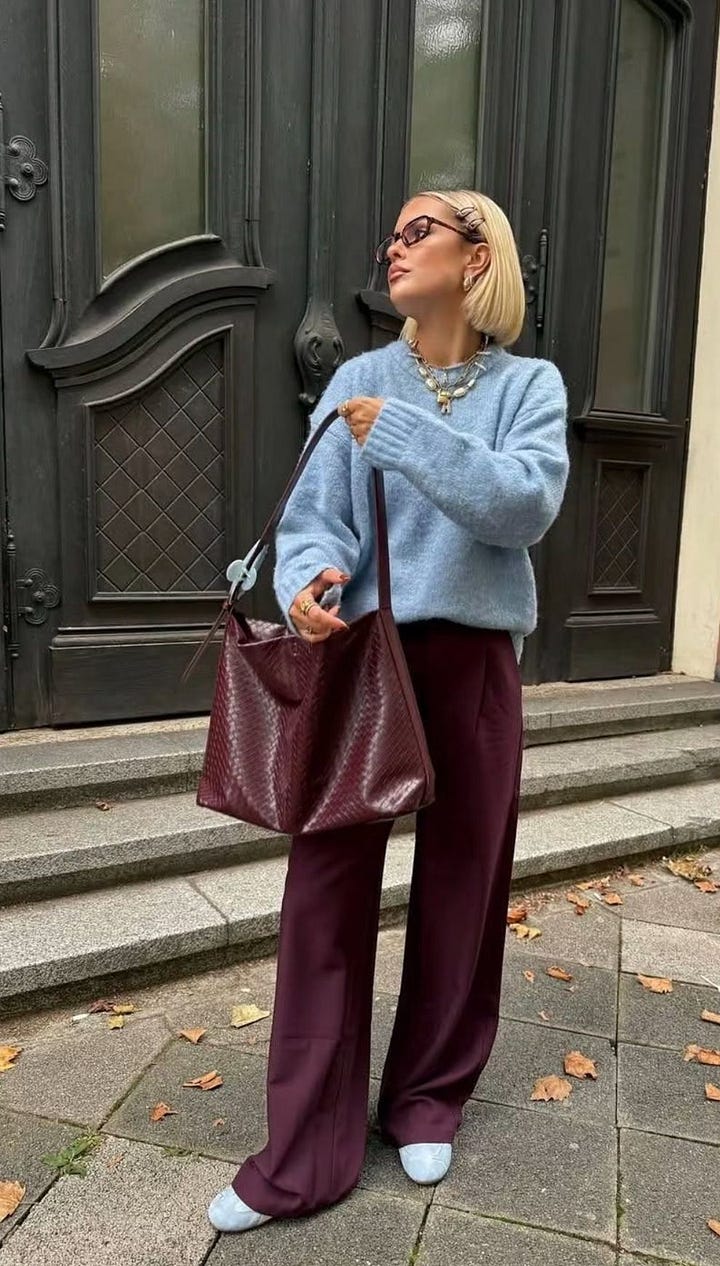
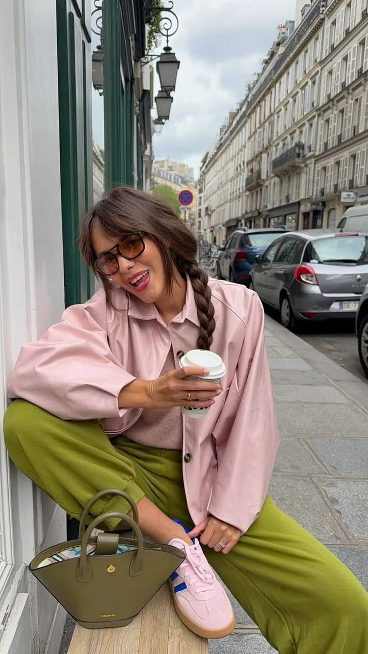
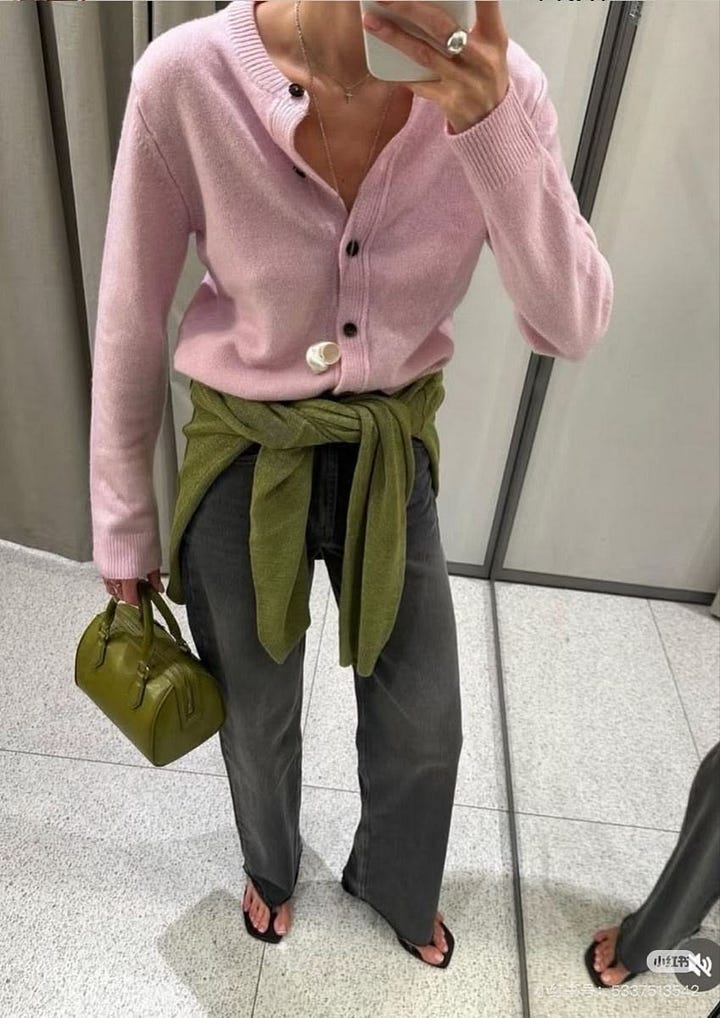
This combination should be much louder than it actually is. Olive is earthy, bubblegum pink is playful and cream sits quietly in the middle making everyone get along. It’s also an easy one to try if you’re someone who generally considers olive pants and a white T-shirt to be “wearing color.”
Keep your usual olive-and-cream outfit. Just add the pink shoe.
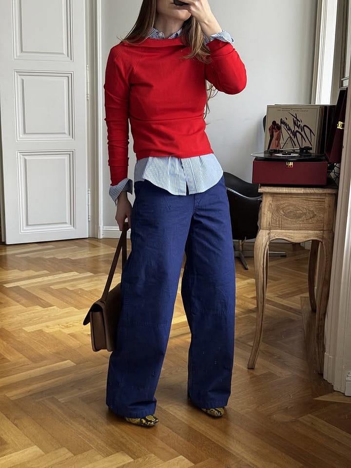
I know. Blue AND red? Stay with me. Camel is what makes this work. It gives two very bold colors somewhere sophisticated to land, and because the camel takes up most of the outfit, the blue and red can show up in much smaller doses. Think camel coat, denim or cobalt knit and a red ballet flat. Suddenly you’re a person who understands color theory.

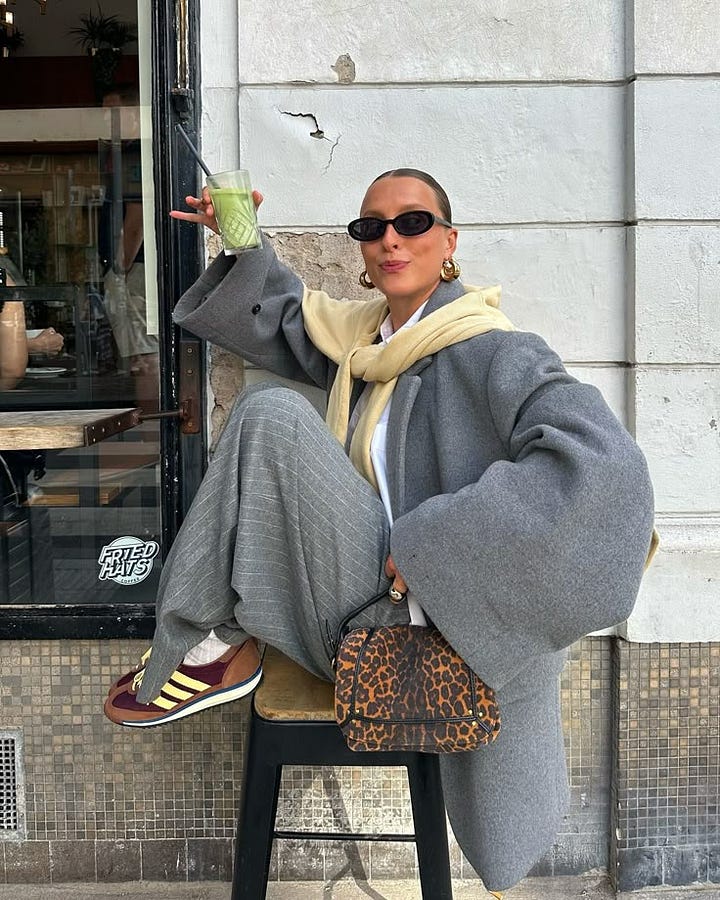
Gray is another color I historically treated as something to wear with white, black or more gray. Turns out it was just waiting for better friends. Butter yellow warms it up, burgundy gives it depth, and somehow the combination feels modern without being overly trendy.
A gray trouser, pale-yellow knit and burgundy bag is probably where I’d start.
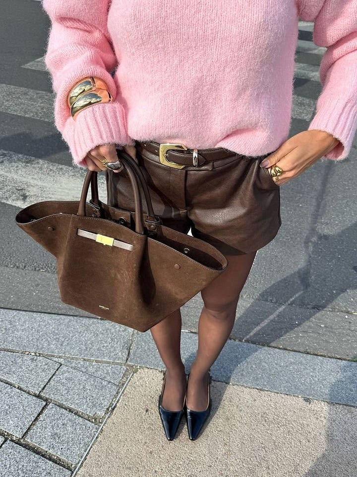
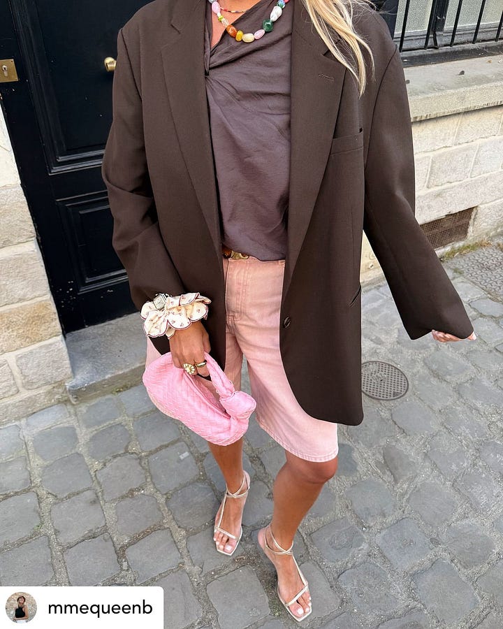
If chocolate and powder blue is the sophisticated older sister, chocolate, pistachio and pale pink is the slightly more fun younger one. The brown prevents the two pastels from feeling overly precious, which I think is the trick whenever you’re mixing softer colors.
I’d probably let chocolate dominate here (brown pants and shoes, pistachio top, tiny pale-pink bag) and call it a day.
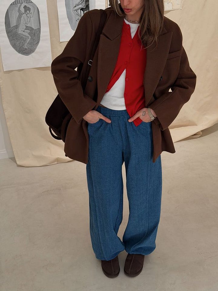
Possibly the easiest combination on this entire list because you probably already own all three colors. Denim is doing the heavy lifting, tomato red provides the punch, and chocolate makes the whole thing feel a little richer than if you automatically paired it with black.
Jeans + white tee + chocolate belt + red sweater over your shoulders. Done.
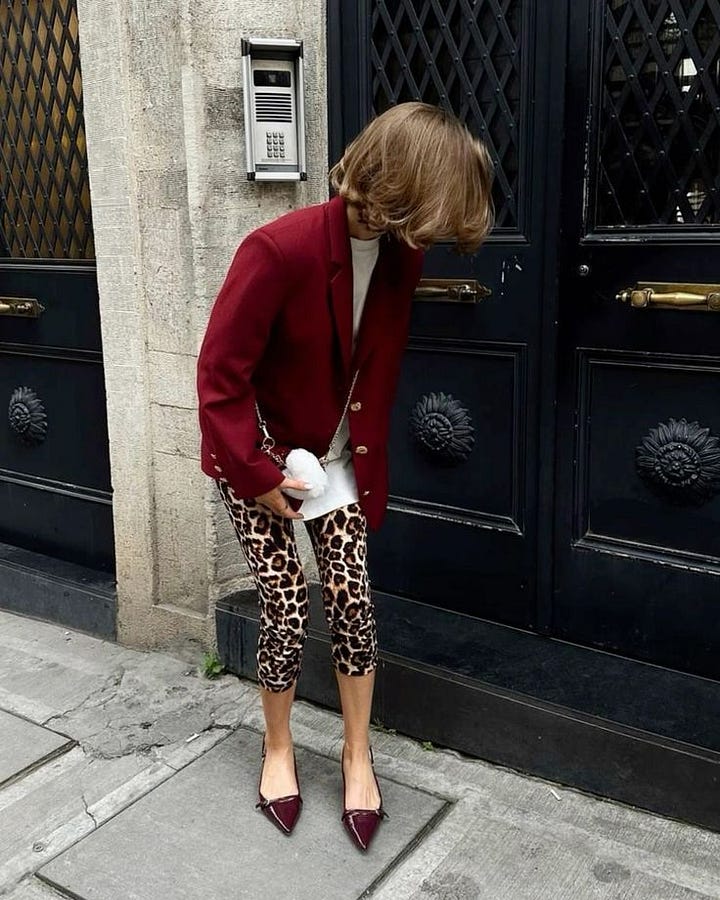
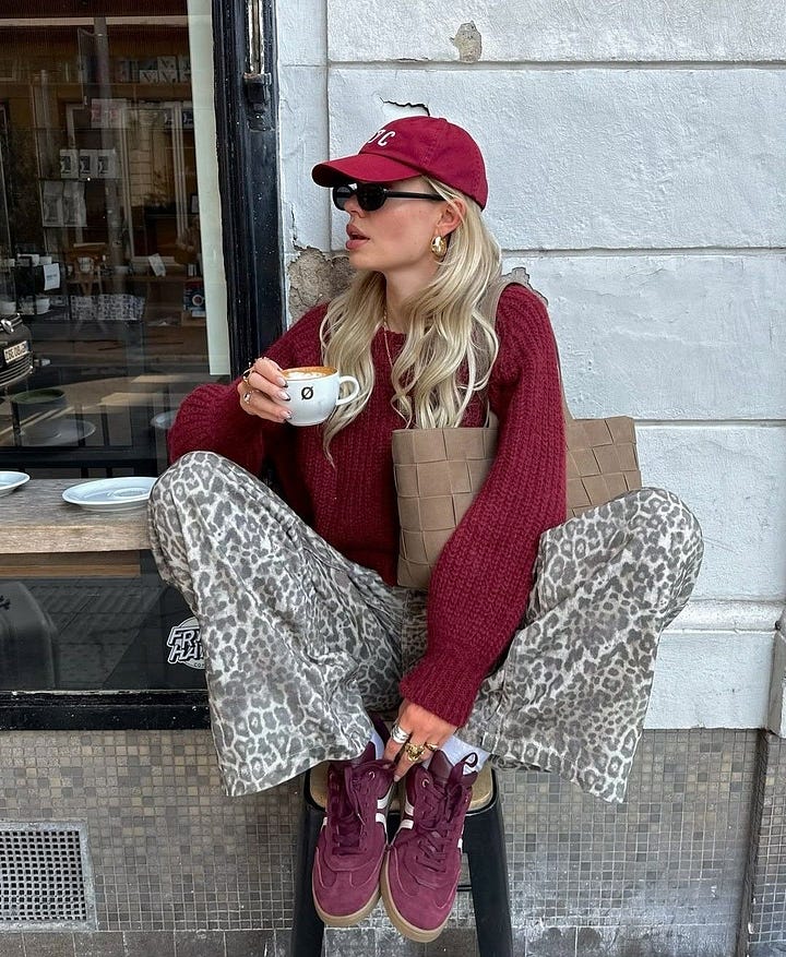
This one is for anyone who still needs convincing that leopard is a neutral.
Khaki and burgundy already feel sophisticated together, but the leopard is the thing that makes the outfit feel personal. And you need very, very little of it: a leopard flat, belt or bag is enough. I especially love this one because nothing about the individual pieces needs to be particularly exciting. The combination is doing all the work.
Cream and chocolate are already an elite combination, so Kelly green basically gets to crash the party. It’s clean, rich and bright at the same time, and it’s another perfect example of why the accent color doesn’t need to take up much real estate.
Cream jeans, chocolate sweater, green shoe. I would wear this tomorrow.
I use the word “rules” very loosely because getting dressed should not require an instruction manual, but there are a few things that make experimenting with color significantly easier.
Treat brown like black. Seriously. Before automatically reaching for black shoes, a black belt or a black bag, try chocolate brown. It works with almost everything and can make brighter colors feel much softer.
Treat burgundy like a neutral, too. This may be my biggest takeaway. Pale blue, pink, khaki, gray, butter yellow, chocolate—burgundy plays very nicely with all of them.
Add one “wrong” color. This is the fun part. If your outfit feels like it makes perfect sense, try adding one color that feels slightly off. Sometimes that’s exactly what it needs.
Pastel + muddy = chic. Powder blue with chocolate. Pale pink with olive. Butter yellow with gray. I don’t know the scientific explanation for this, but the contrast is what makes it good.
Pair a primary color with a sophisticated neutral. Red with camel. Cobalt with chocolate. Kelly green with cream. The neutral takes some of the volume down and makes a bold color infinitely easier to wear.
And most importantly, you don’t need equal amounts of every color. If the idea of leaving the house in three colors makes you feel like a box of Crayolas, don’t. Wear your normal outfit and introduce the unexpected color through one small accessory. It still counts!!
I think that’s ultimately why I’ve become so obsessed with this exercise. It scratches the same itch as shopping without actually requiring me to buy anything. Sometimes when you’re bored with your closet, you don’t need new clothes; you just need to make your clothes meet some new friends.
Comments
Nothing yet. Say the first thing.
Sign in to join the conversation.