
It was Charles Eames who said: “The details are not the details. They make the design.”
That’s the famous part, but the rest of the sentence goes on: “It will, in the end, be these details that give the product its life.”
Now he was a maker, which is why he was referring specifically to “the product”. I’m going to substitute the word “room”, because he was absolutely right.
Who among us hasn’t thrilled to the touch of a great door handle, admired a great bathroom tile, an unexpected colour combination, or felt a compulsion to stroke the fringing on a cushion?

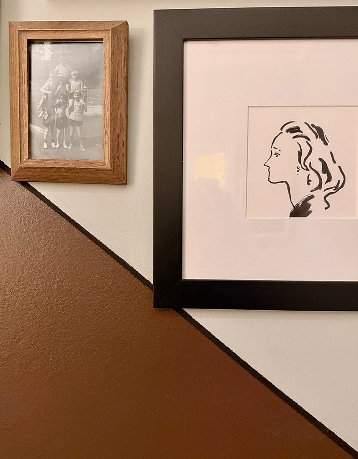
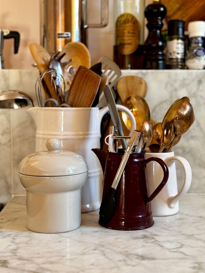

I mentioned on Notes the other day that I had recently begun the mammoth task of categorising some 59,000 photos on my camera roll. I started with basic colour folders - red, pink, green, gold and blue. Then I started adding rooms - again mostly mine - but I plan to do the same thing on Instagram (where I already have some broad categories) so I can more easily tag the creators.
Finally I realised that I had hundreds of images of odd details - where a rug meets a tile, a corner of a radiator that pleased me and an interesting door handle - and that those details are what inspire so much of, not only my own house, but the work I do for other people on theirs.

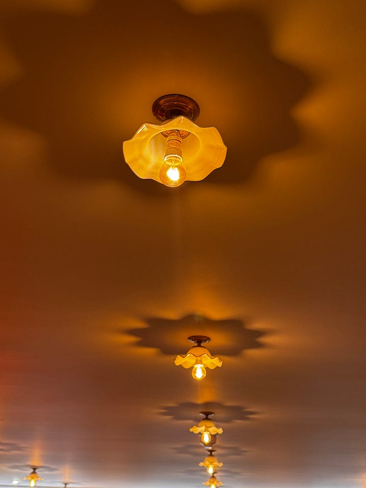
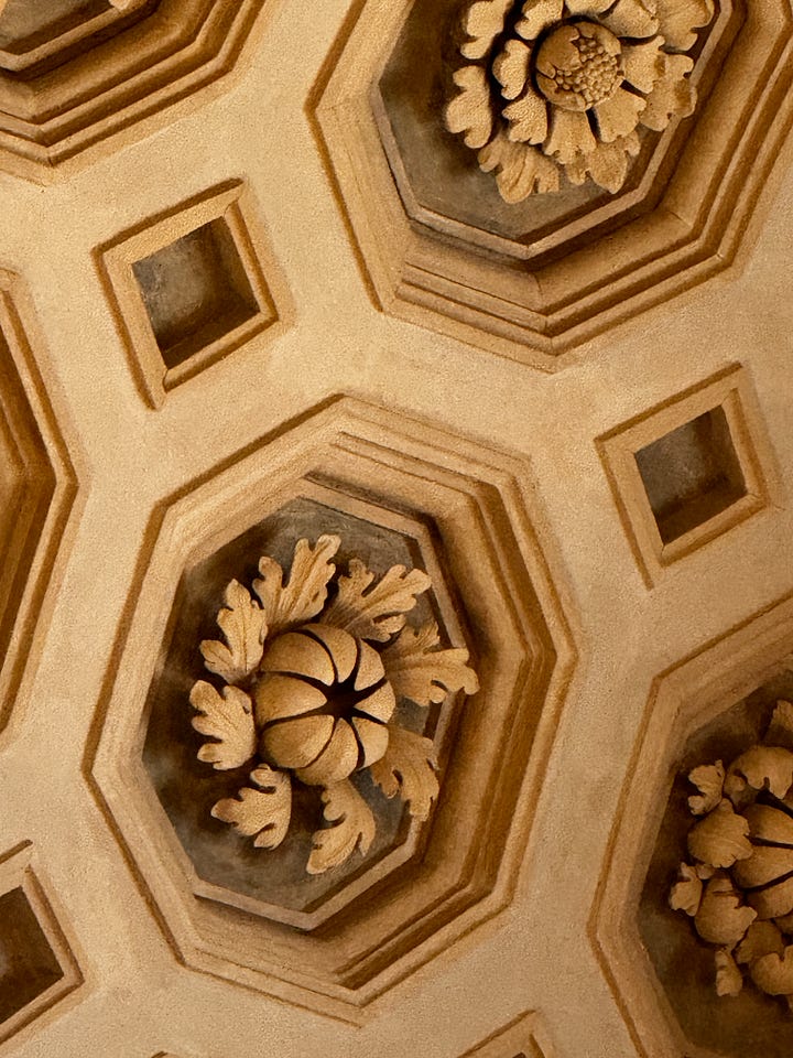
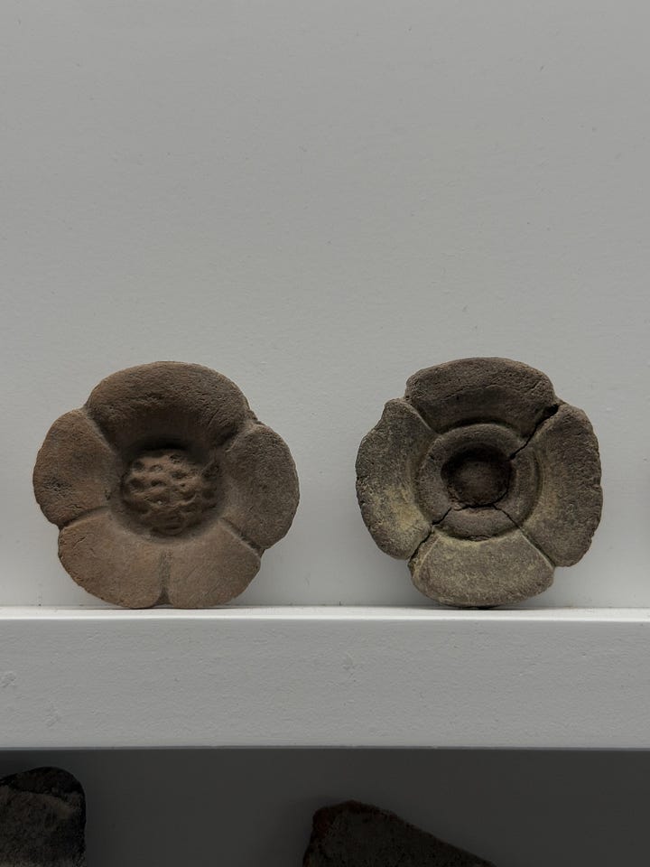
I also realised that categorising images this way allows you very quickly to come to an understanding of your own taste and style.
In my case I have built of a photographic Rolodex of things I love and that I have mentally stored away for future reference. They sit there quietly in the background until called upon.





And for one such image that moment arrived a couple of weeks ago when I went to visit Bianca Hall, who is about to embark on a massive renovation project. We were standing in a sort of lobby area between the end of her hall and the kitchen. On one side will be a the door to the downstairs loo and on the other a large cupboard for coat storage.
As I looked at the space, generous for storage but dark, I was struck by the fact that once you opened the doors to access the coats you might be blocking the entrance to the kitchen or the hallway. And I remembered that one of my favourite local restaurants in Italy has a fabulous wood and glass concertina door that takes up no space when open but allows the light to flow between two dining rooms.
I suggested to Bianca that she could do that and either use coloured glass or foxed mirror to bounce any available light around.
And then I had to find the image… and despite the fact that there is a search function on an iPhone, it’s rubbish. I had to try and remember not only when I had last been for dinner (I go most months), but on which occasion I had been sitting close enough to the door to take a picture.
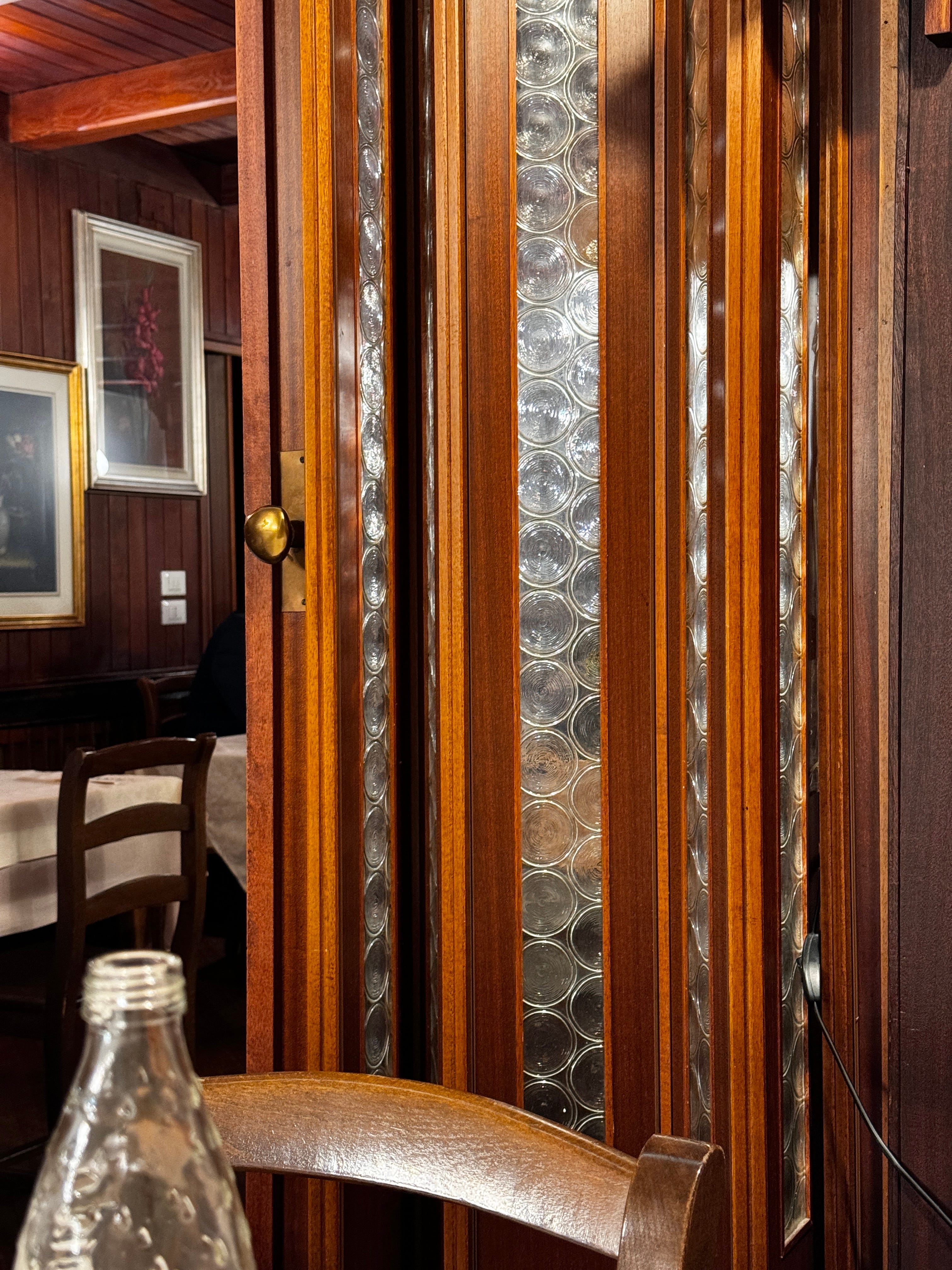
I did eventually find it, but it made me think about how often I’m inspired to take a picture of a detail that pleases me - knowing I will never post it as it’s just a random thing (although the Substack Notes function is very useful for that sort of thing) - and, having taken it, I stop thinking about it.
This obsessive photo-taking came in handy on another occasion, for the hotel in Mallorca I’m working on. There’s an annexe to the main hotel with three additional suites. The owner wanted a free-standing bath, and we had to fit in a kitchen, a wardrobe, a sitting area, and a bed.
The bath was going to be placed near the window, with the kitchen at the other end, and we needed to make a feature of the bed, which was going to be in the middle of the room. A couple of months previously I had taken some photos of details in my room at the latest Philippe Starck-designed hotel, in Metz (I wrote about it here), so I knew exactly what we needed to do. The headboard would act as a low wall with a dressing table/desk facing you as you enter the room, and lights set on the top that can be angled depending on whether you are reading in bed or working late. This arrangement also means that the bed isn’t the first thing you see when you come in.
There are professional shots on the website and then there’s the one I grabbed as we left when I didn’t straighten the pillows properly. And that’s also the point. This wasn’t a shot for Instagram, but more of a note to self. As an aside, notice the positioning of the integrated electrics on the side of the headboard. That’s a neat touch.

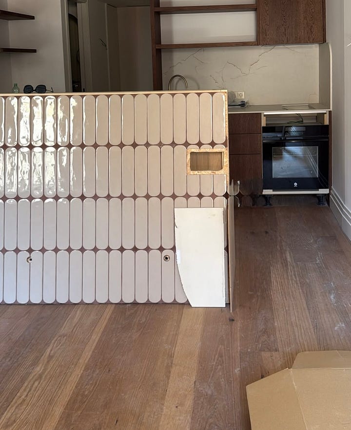
Our headboard (which isn’t finished yet) is going to be slightly higher to create more of a division between the zones. The kitchen, shower and a bar area will be behind the bed. The bath, a couple of chairs and the view are to the front. As an extra detail I insisted the outside of the bath be painted in a deep red/burgundy to make it look more like a piece of furniture and less like a piece of sanitaryware. It was an expensive decision but I know it will make all the difference. The inspiration came from a screenshot I made on Instagram and was buried deep in our WhatsApp chat of some 2,000 images.


These shots that are taken on the go are where the potential lies for your own home. A photo of a wall whose colour combinations were particularly pleasing. Or the details of how someone edged their tiles, an old door handle, or a vintage doorbell.
So as the summer holiday season starts, I urge you not just to record your dinner dates and sunsets for social media, but to take pictures of the details around you, too. The things that please you enough to get your phone out of your pocket because you know you’ll want to remember them in the future.
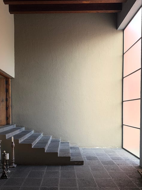
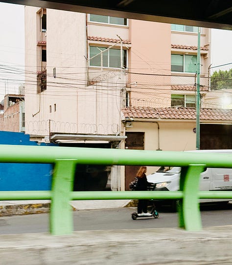
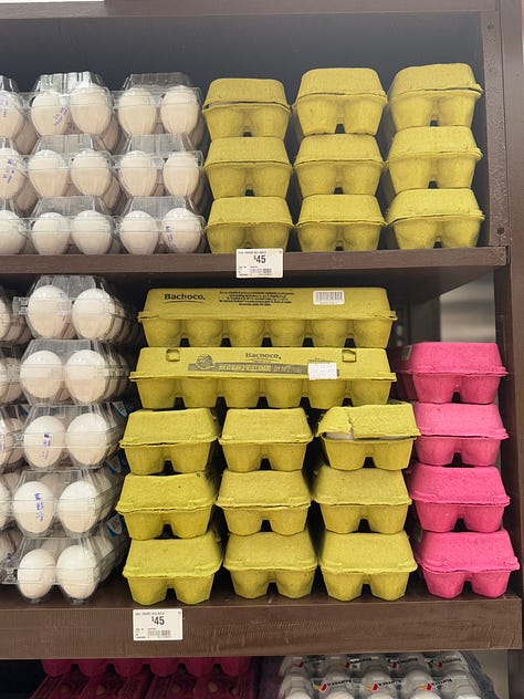
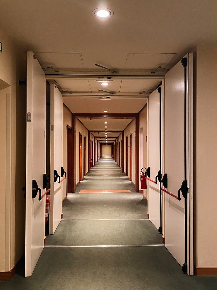
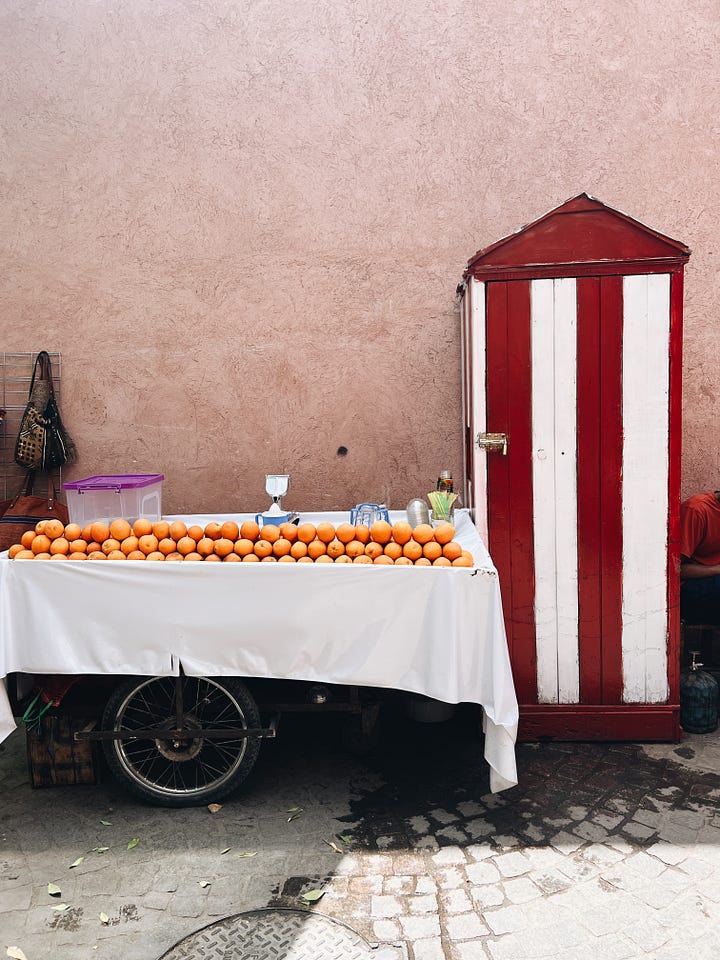
It could be for colour combinations, or material juxtapositions, or architectural details. Do for all of those reasons - but, mostly, do it for you. It’s about using your own eyes, to see things your own way - and your phone camera to capture them and tuck them away for the future. These images below are all in my colour palette folder.



And now for something different. As many of you know, I organise design retreats at my house in Turin and also in Milan. Next year we will visit Milan in May (nearly sold out - so let me know quickly if you want to come). There are a few places remaining for this September in Turin (with an updated and expanded programme) and I have been asked about creating one of these special itineraries in Venice. Do you fancy it? Planning is in the early stages but it will be three nights in March at a gorgeous and very central hotel. The dates are 14-17 March (that’s Sunday arrival and checking out Wednesday). It will cost around £3,500 (Venice is expensive) but that will include everything except flights and transfers. We will do a factory tour, visit a textile archive and a glass blowing studio, dine in some of the best places in the city, and I’m working on a great house tour as well - so before I move from outlining to confirming I’d like to get a sense of who might be in!
Thank you so much for being a subscriber either free or paid. I am hugely grateful for your support. There are nearly 25,000 of you now and this newsletter is rated 6 in the global design category and is the No 1 British entrant. This is one of two free posts a month. Paid subscribers receive a post every week in addition as well as a standing invite to my Drop-in Design Clinic which takes place every month over Zoom. The invite to the next one on Monday 20 July at 2pm (UK time) is below the paywall. You can join for a single month or on a rolling basis or take out an annual membership:
Comments
Nothing yet. Say the first thing.
Sign in to join the conversation.