Karo (Product with Attitude) · Product with Attitude
11 ways to design the same newsletter hero. Built with Kimi K3 from essentially the same UX copy and subscription structure. Read the article to learn how to copy and adapt every asset, prompt, and codebase.
After my Claude Design review, four PwA members have independently asked about design styles that don’t look blatantly AI-ish.
Or, more precisely: how to brief AI when the visual is clear in your head but not on your tongue.
I’ll know it when I see it, I just don’t have the words to describe what I really want.
I can picture exactly how I want it to look, but I struggle to translate that vision. I eventually adapted an existing design, and while the result is fine, it doesn’t feel like something I’m particularly proud of.
— PwA Reader
We usually learn to like before we learn to explain why. And that's okay.
Don’t ever let it make you feel like you’re not ready to start experimenting. None of us were born with a design vocabulary.
We are not covering centuries of visual design in one Substack post. Instead: hero sections with prompts and code, plus a workflow for translating every possible I’ll know it when I see it into design direction for your AI.
We’ll do that 11 times, using the exact same website in 11 different design styles.
You’ll also enjoy this article if you’re curious what Kimi K3 can do while the internet continues its Claude-and-GPT hype cycle.
Or, if your brain likes looking at beautiful things.
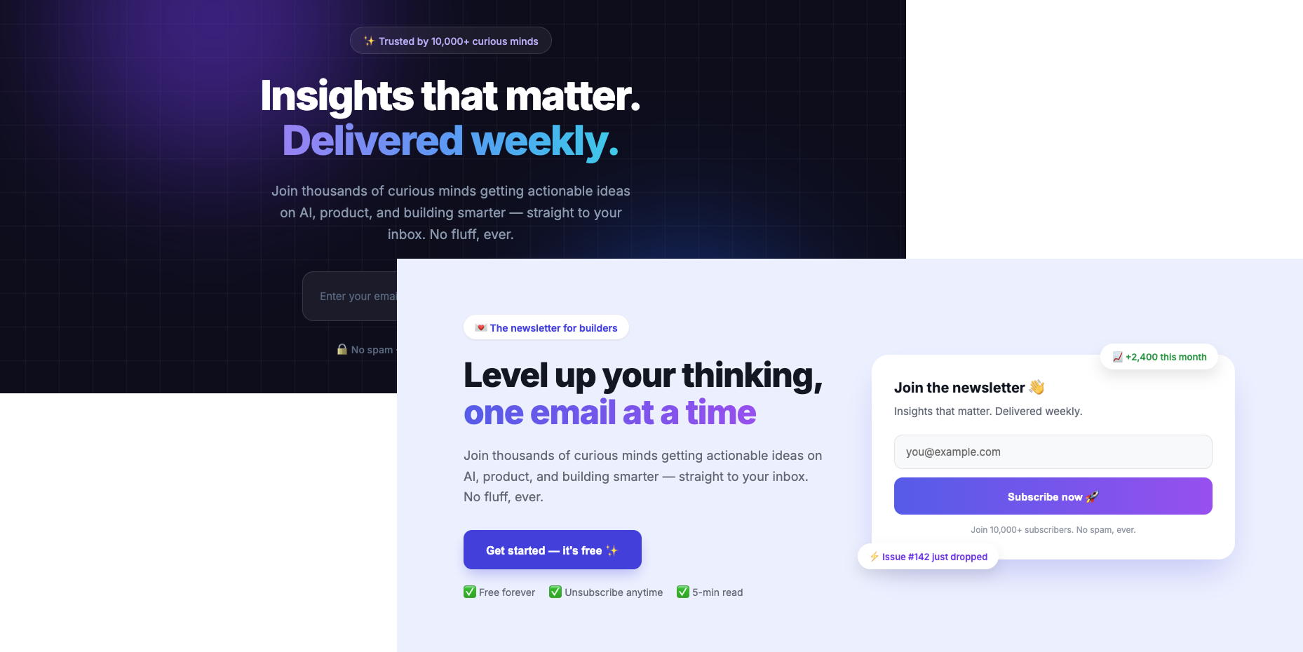
AI-ish design (also: Claude-ish design) is the readily identifiable default aesthetic of interfaces generated by AI coding tools without clear human art direction.
Side-by-side comparison of two AI-ish newsletter landing page designs showing the recognizable default aesthetic of AI-generated websites.
Some telltales: the indigo-to-purple gradient style that Claude is terribly fond of. Identically rounded cards with soft shadows. Badge pills everywhere. Tailwind, Tailwind, Tailwind.
But I think that definition misses its most important tell: we look at it and feel nothing. Annoyance, maybe. But mostly nothing.
I saw far more indigo websites in 2025 than I do now. So: progress. But plenty still leave you with that same blank feeling.
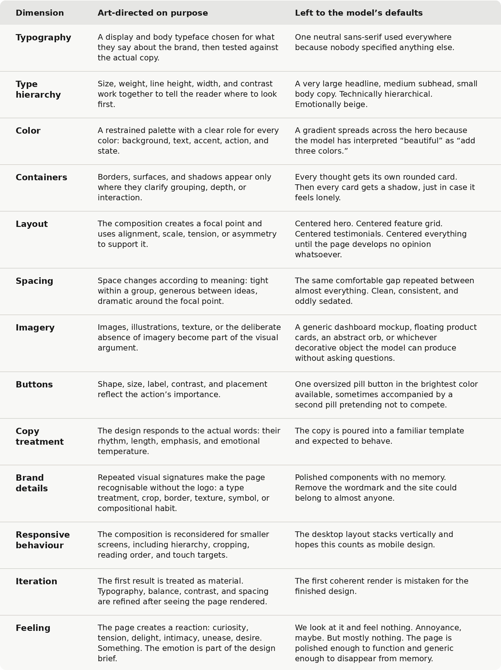
The table below shows what changes when we guard our taste like a hawk:
AI-assisted craft vs AI model defaults comparison table: 13 dimensions from typography to feeling, and why intentional art direction wins.
Because Kimi K3 is shockingly good at design even before you give it a single Skill. That’s because it can see its own work.
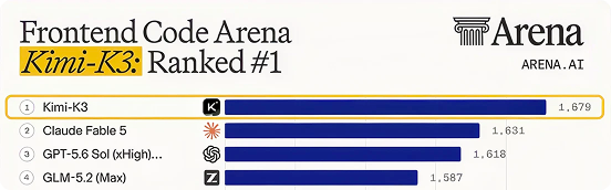
It runs an agentic visual loop. Which basically means it iterates between code and live screenshots. On July 17, that capability helped put it at #1 on Arena’s Frontend Code Arena, ahead of Claude Fable 5.
Yes. Fable 5 got beaten at frontend design by a Chinese open-weight model.
July 2026 Arena Frontend Code leaderboard snapshot showing Kimi K3 at #1, ahead of Claude Fable 5, GPT-5.6 Sol and GLM-5.2.
Hey, I’m Karo Zieminski 🤗.
AI PM and builder. I write Product with Attitude, an AI newsletter for tens of thousands of readers across 146 countries, helping them develop critical AI literacy the only way it sticks: through practice.
Welcome to the 399 of you who have joined us since last week! Here’s what you might have missed:
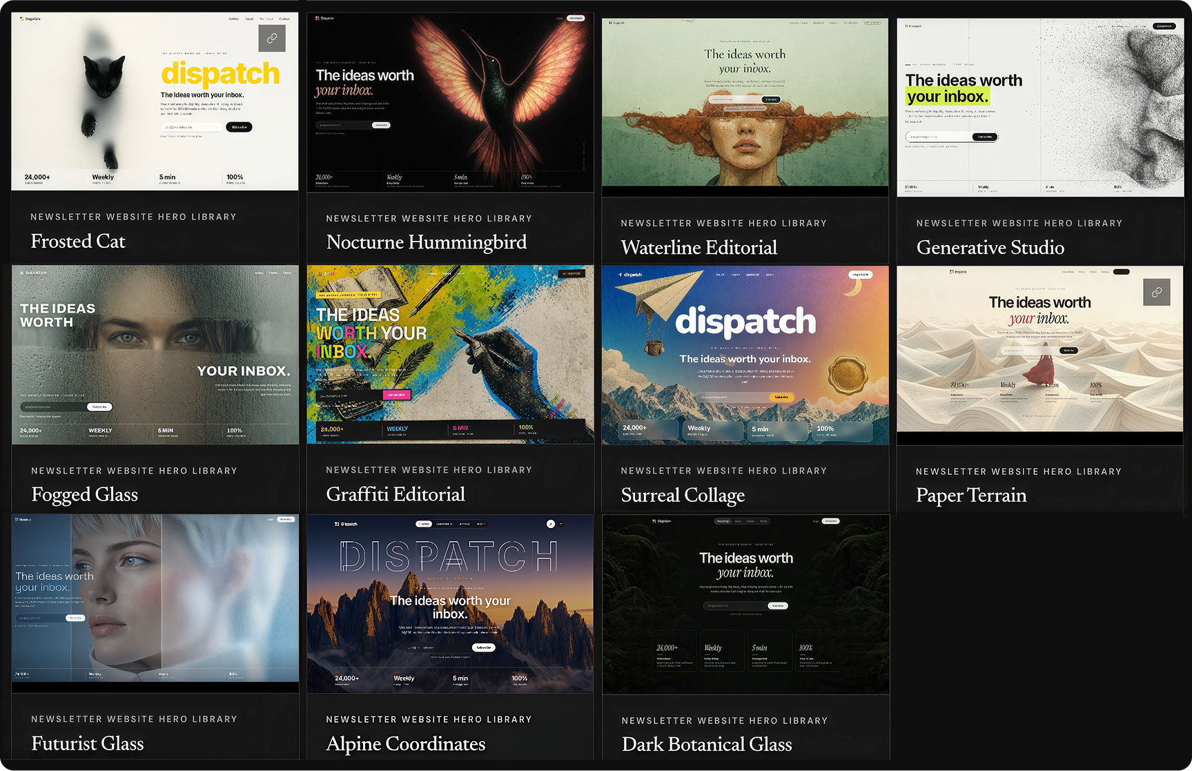
Eleven hero sections, one newsletter website, identical copy and subscription structure, built 11 times in 11 different design styles. I wanted the visuals (and textures!), not the words, to do all the talking.
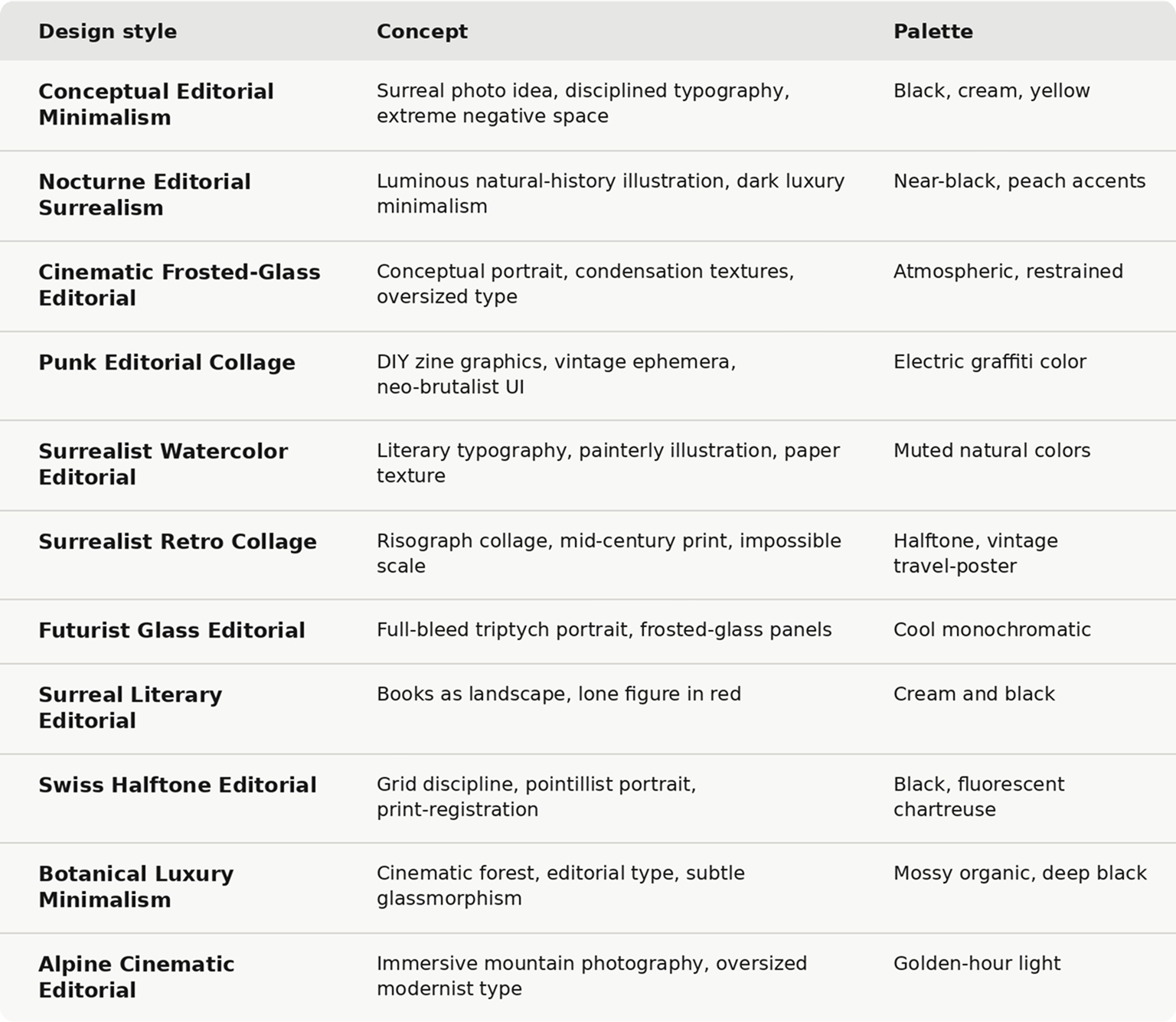
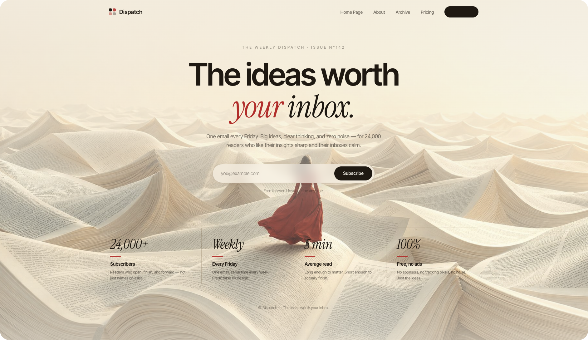
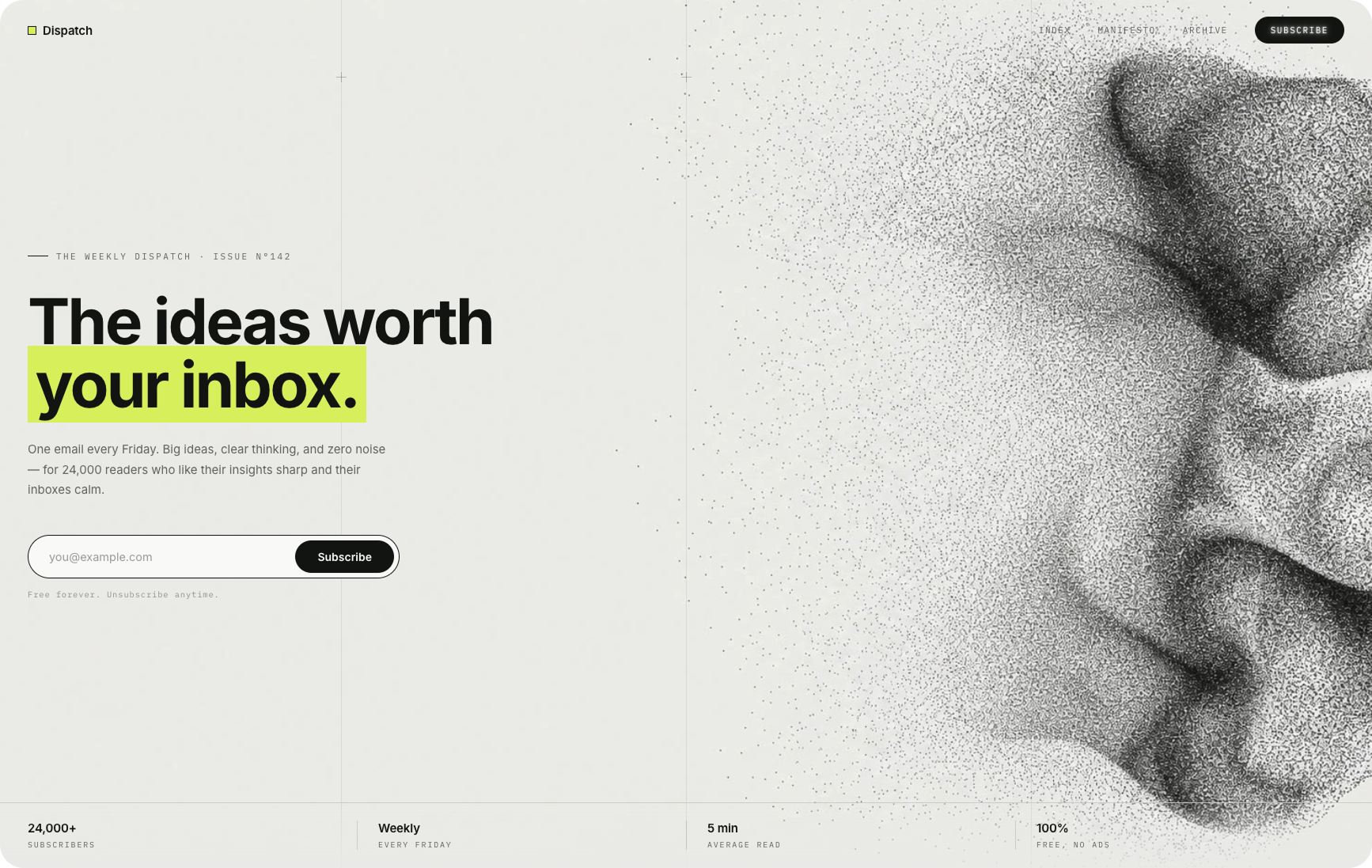
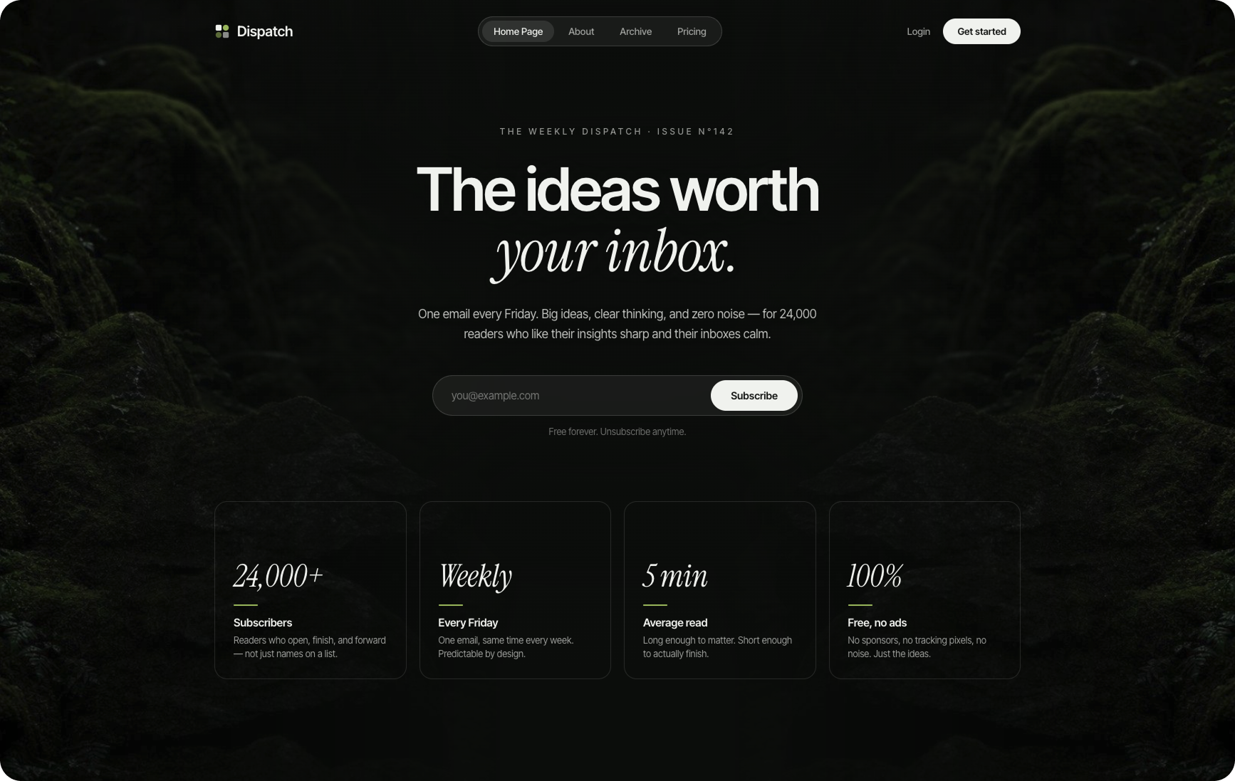
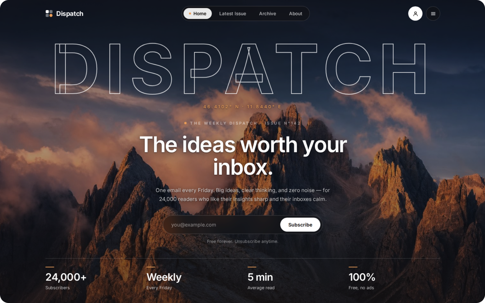
Eleven visual directions for designing the same newsletter hero section with AI, from Conceptual Editorial Minimalism and Punk Editorial Collage to Botanical Luxury Minimalism and Alpine Cinematic Editorial. Each design style is defined by a distinct concept, typography treatment, image language, texture, composition, and color palette. Proof that better AI website design starts with specific art direction.
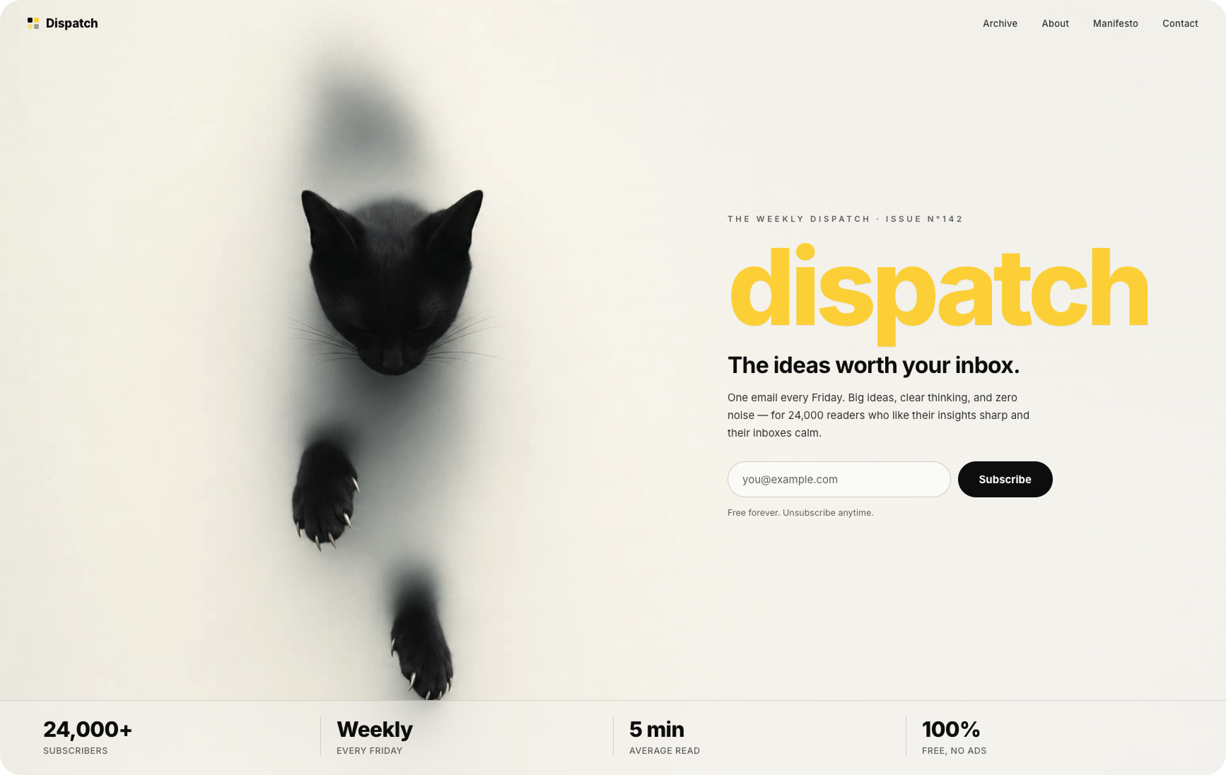
Conceptual Editorial Minimalism. Combines one surreal photographic idea with disciplined typography, extreme negative space, and a restrained black, cream, and yellow palette. Built with Kimi K3, the hero uses a black cat seemingly emerging through a frosted surface as the focal concept, pairing Swiss-inspired editorial structure with contemporary art direction.
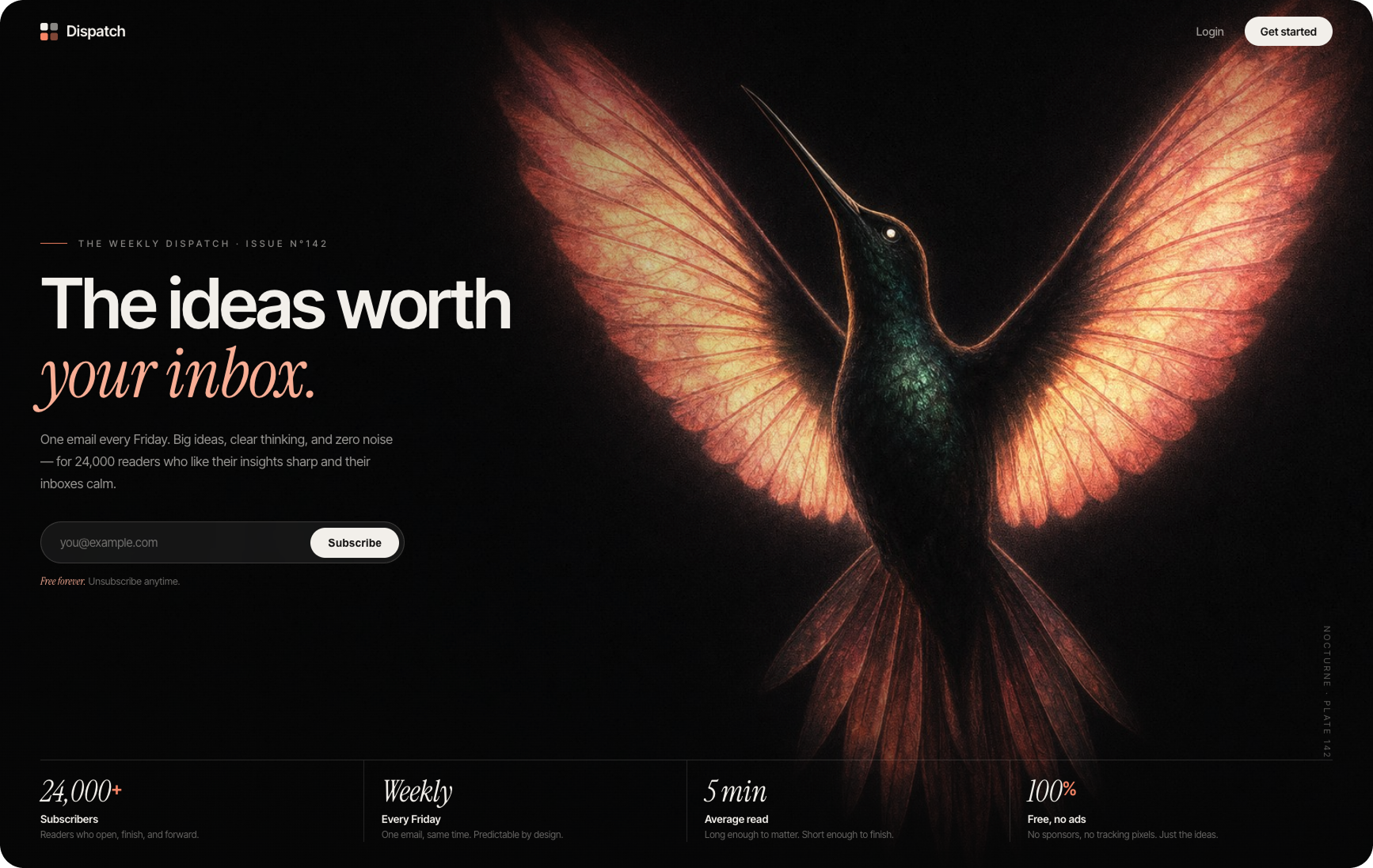
Nocturne Editorial Surrealism combines luminous natural-history illustration with dark luxury minimalism and cinematic editorial composition. An oversized glowing hummingbird, near-black negative space, peach serif accents, and restrained UI combine to create a website that feels like a nocturnal museum plate turned into a contemporary digital publication. Built with Kimi K3.
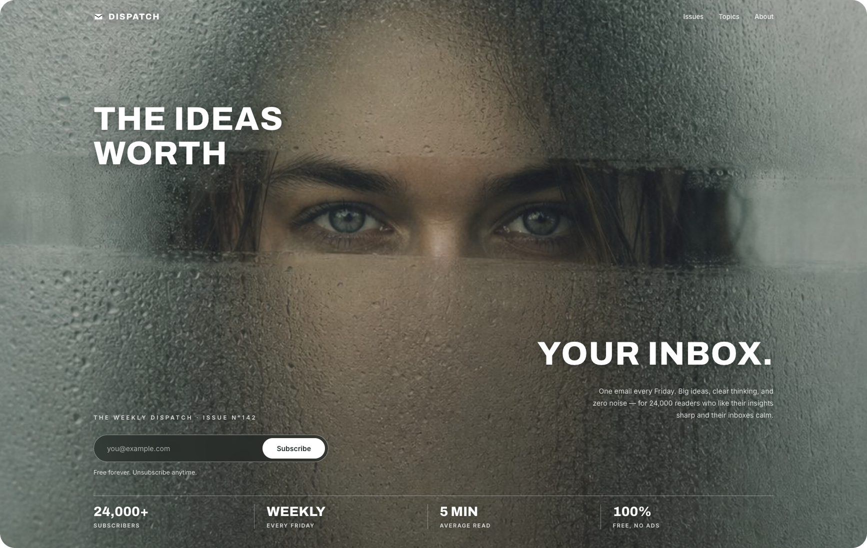
Cinematic Frosted-Glass Editorial combines conceptual portrait photography, condensation textures, oversized typography, and atmospheric minimalism. The hero reveals only the subject’s eyes through a strip of frosted glass, turning concealment itself into the composition while keeping the surrounding newsletter UI deliberately restrained. Built with Kimi K3.
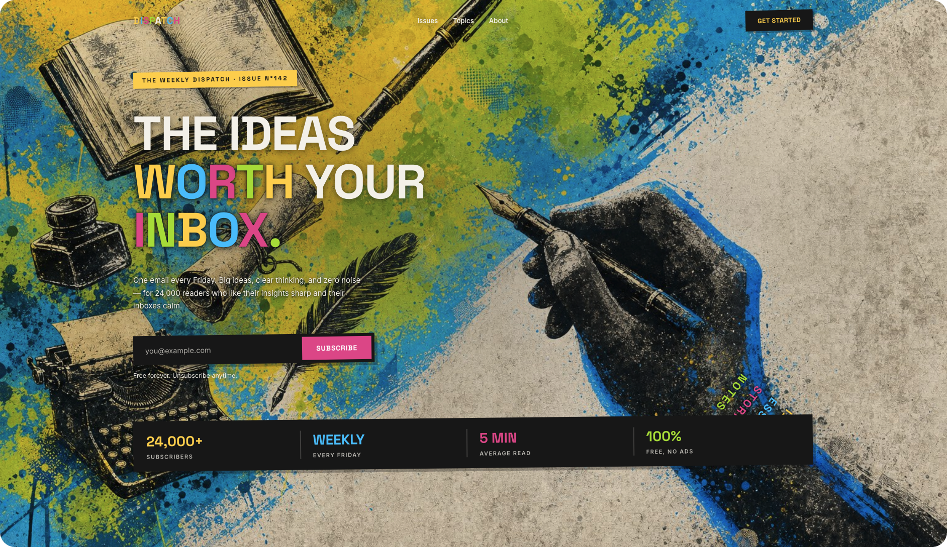
Punk Editorial Collage. DIY zine graphics, vintage publishing ephemera, neo-brutalist UI, and graffiti-inspired color. Built with Kimi K3, the hero layers typewriters, ink, books, pens, distressed print textures, and electric color into a deliberately chaotic editorial composition that feels closer to a punk poster or independent magazine than a conventional landing page.
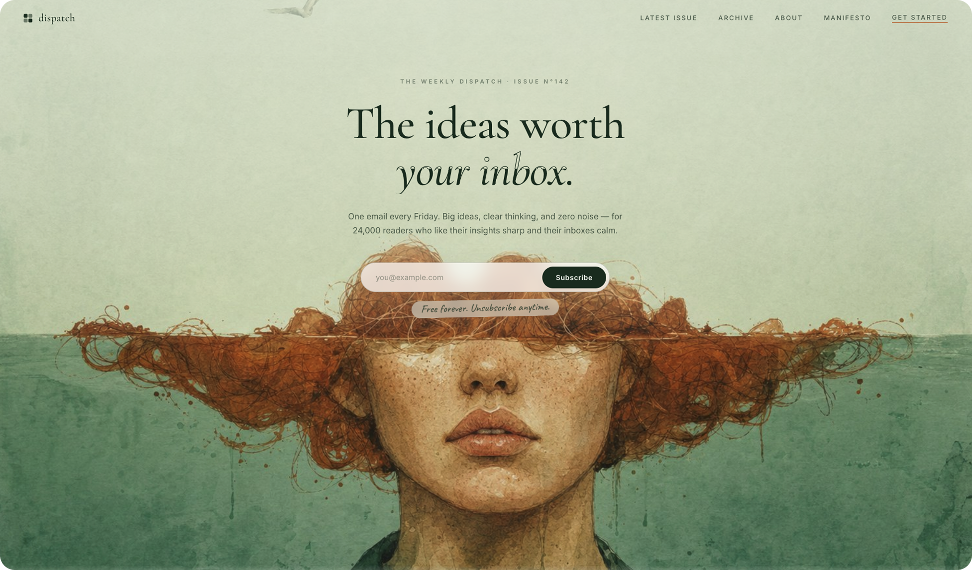
Surrealist Watercolor Editorial. Combines literary magazine typography with painterly illustration, muted natural colors, paper-like texture, and restrained interface design. The style pairs elegant serif type and minimal UI with expressive analog artwork, creating a website that feels closer to an art book or independent magazine than a typical AI-generated landing page. Built with Kimi K3.
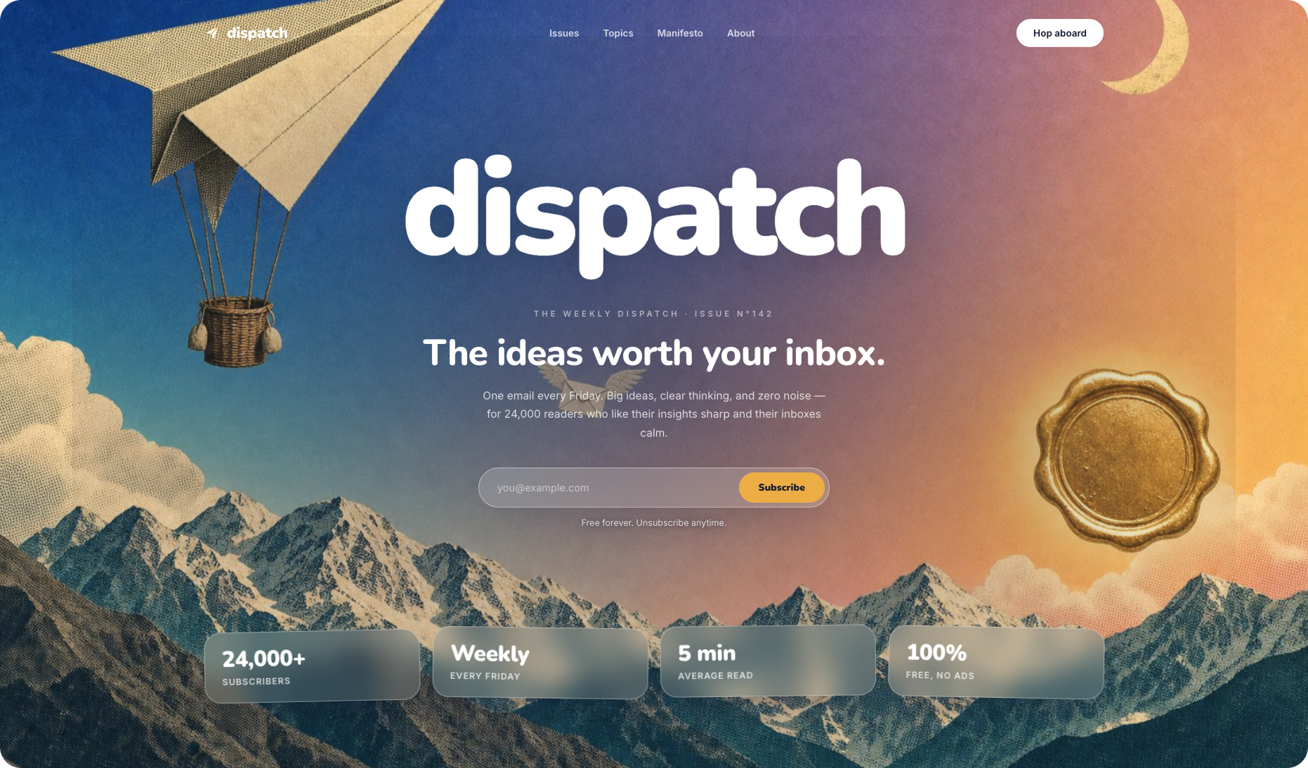
Surrealist Retro Collage. Built like a dreamy risograph collage. Combines mid-century print textures, vintage travel-poster imagery, impossible scale, and analog ephemera with contemporary web UI. Halftone mountains, paper cutouts, celestial motifs, bold rounded typography, and translucent interface elements create a dreamlike editorial website that feels both nostalgic and strangely futuristic. Built with Kimi K3.
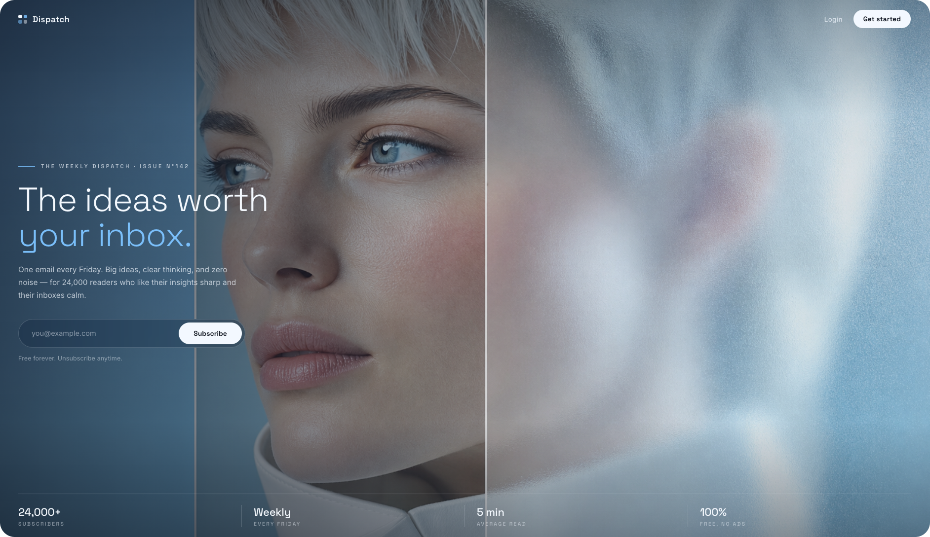
Futurist Glass Editorial. A full-bleed triptych portrait combines cinematic photography, frosted-glass panels, cool monochromatic colors, and restrained typography with a minimal luxury interface. Transparency, blur, asymmetric composition, and large-scale photography create a near-future editorial website that sits somewhere between a fashion campaign and a premium technology launch. Built with Kimi K3.
Surreal Literary Editorial turns books into the landscape itself. An endless terrain of open pages, a lone figure in red, restrained cream-and-black typography, and elegant editorial UI create a conceptual website about ideas, reading, and getting lost inside them. Built with Kimi K3.
Swiss Halftone Editorial. Grid discipline with pointillist portrait photography, hard black typography, and one fluorescent chartreuse accent. Built with Kimi K3, the hero uses print-registration details, halftone texture, asymmetric composition, and stripped-back UI to create a website that feels like an experimental Swiss poster translated into a digital editorial interface.
Botanical Luxury Minimalism. Combines cinematic forest imagery, restrained interface design, editorial typography, and subtle glassmorphism. Mossy organic textures, deep black space, translucent cards, and refined serif-sans contrast create a premium website aesthetic that feels calm, elegant, and art-directed. Built with Kimi K3.
Alpine Cinematic Editorial. Combines immersive mountain photography, oversized modernist typography, subtle cartographic details, and restrained luxury UI. Dramatic alpine peaks, golden-hour light, atmospheric shadows, and layered type make the website feel like a premium outdoor journal crossed with a contemporary magazine. Built with Kimi K3.
Visual prompt engineering is the practice of pairing images with written instructions to give AI clearer context and guide its output.
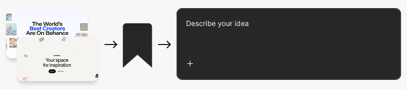
The visual prompt engineering workflow: find a design reference, save it while you still remember why it caught your eye, then pair it with written instructions in your AI design or coding tool.
First rule: if the design vocabulary isn’t coming, don’t force it. Switch to visual language instead.
The visual reference-to-prompt workflow turns an 'I'll know it when I see it' into design direction your AI can execute.
Browse sites like Cosmos or Behance and scroll until you see something that, well, stops the scroll. Save it for later. I mean it, I’ve made this mistake often enough to know better: save that thing immediately (that’s rule number 2). You can use tools like Cluing, bookmark it, anything.
If one of the saves feels close to what you want for your homepage, use it as a visual reference in the prompt. I’ve seen people paste it into ChatGPT first and asking it to describe the design in precise language. They were happy with the results. But in my tests, giving Kimi K3 the image AND the prompt worked even better.
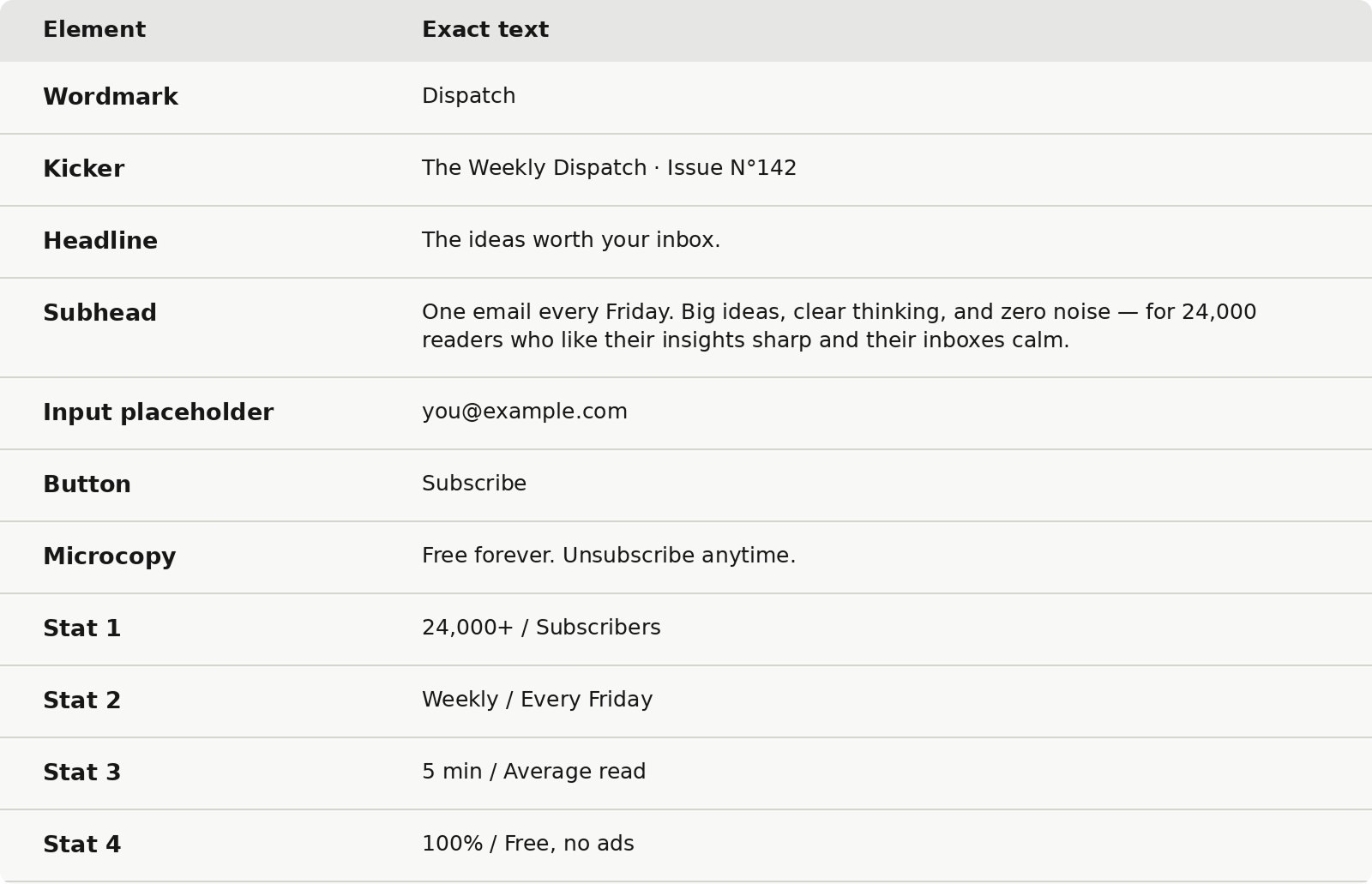
Rule #3: prepare your UX copy (the words people see on your site) before you prompt.
Using today’s example, this is the copy I gave Kimi K3:
UX copy specification table for a newsletter hero section, showing the exact wordmark, kicker, headline, subhead, email field, subscribe CTA, microcopy, and credibility stats used in the design.
Now hand it over to your AI. Just don’t paste in one of those giant “ultimate web design prompts” from the internet. Instead, ask the agent to interview you, one question at a time, until it has enough context to understand what you want. Until you both do.
You are a team of senior product designers, art directors, UX experts, and design engineers. Interview me one question at a time until you are at least 95% confident you understand my requirements.
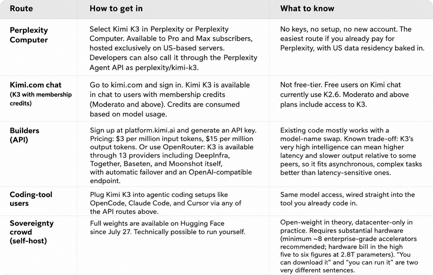
If you choose to use Kimi K3, I accessed it via Perplexity Computer. Here are some other options:
5 ways to access Kimi K3 in 2026. A comparison table with Kimi K3 access routes: Perplexity Pro and Max, Kimi.com membership credits, the official Moonshot/Kimi API or OpenRouter, Kimi Code integrations for Claude Code, OpenCode, Codex and Roo Code, and self-hosting the 2.8T-parameter open weights from Hugging Face.




Comments
Nothing yet. Say the first thing.
Sign in to join the conversation.