
We have to stop playing by “their” flawed rules, and reframe the boundary conditions for honest and truthful argumentation.
Full (data) transparency, in any context, but especially wherever there is government involvement, must be a non-negotiable. Period. I can’t emphasize this enough. (You can stop reading here and you won’t miss out on anything of substance.)
Transparency is a fundamental pre-condition to Trust. It is a necessary (but not sufficient) condition.
In other words, if transparency is missing there can be no trust.
It beggars belief that such a simple fundamental concept is so hard for government officials to grasp.
Furthermore, governments that are not fully transparent must be considered guilty of concealing evidence. Period. This must be a non-negotiable moving forward.
Those who have nothing to hide, hide nothing.
It is completely within a government’s purview and ability to compile a complete data set of anonymized vaccine related data for an entire population, and release it to the public for anyone to analyze.
In truth, if the data supported their claims they would only be too happy to oblige, and would revel in “rubbing the noses” of those pesky “conspiracy theorist” with hard evidence.
Actions speak much louder than words, and acts of omission are often more telling than acts of commission.
Their actions clearly demonstrate that such hard evidence simply does not exist… (and strongly suggests the contrary).
The lack of data transparency is not isolated to mandated “health” interventions. In fact the lack of transparency and verifiable chains of custody is even WORSE when it comes to election integrity. Many counties, especially the largest ones, refuse to hand over ballot images, tabulator CVR data and logs, poll tapes, pool book logs etc… for people to double check.
This is simply unacceptable and can not be tolerated.
Full transparency is a non-negotiable. Elected officials AND bureaucrats who can not grasp this concept should be removed from office immediately.
There can be no real trust without full transparency.
It’s a non-negotiable.
Those who have data and refuse to hand it over must be presumed guilty.
The plots below are for the curious. Only proceed if you fully grasp that the main issue is solely (data) transparency (or the lack thereof).
Here is the plot that Steve provides in his spreadsheet and contains the results from the non-anonymous whistleblower data. (To be clear these are just bucket results that were derived from the whistleblower data. Non of this data can be used to identify individuals. It is simply raw numbers used to produce the plots below.)

Note: the results obtained from the anonymous data that was released to the public looks slightly different. See below:

We re-wrote Steve’s approach in a different programming language in order to learn the intricacies of this approach. We were able to perfectly match Steve’s results (at the underlying fine-grained “bucket” level), give-or-take some floating point precision differences between the runtimes.
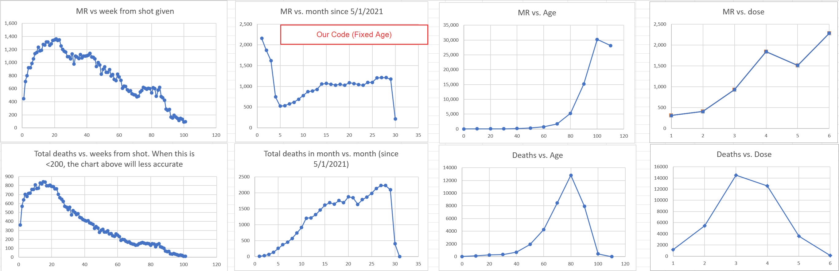
Steve’s code presets the age of each person in the cohort from the start, and never updates a person’s age as they move through the time horizon. The time horizon nearly covers 3 years, so to be more accurate, the age for each person should be calculated for each day they are assessed, which we have done for the plot below. (Note: this did not result in a noticeable difference in the main plots because the data is subsequently aggregated. The only visible difference can be seen in the “MR vs. Age” plot, where the mortality rate is much higher with the “dynamic” age calculation).

We reproduced all of Igor’s results.
John’s main plot is shown below:

Here is the plot we reproduced. It’s very similar. (The difference are most certainly due to the age calculation).

Note: The MR goes well above 6,000 in November in our plot.
Now that we have reproduced the plot we can look at other plots.
John mentioned in his article he would be interested to see the MR for the cohort that has dose number 1 only:

Here is the MR for the 70 to 90 age group for the entire horizon (Note: we expanded the age group to include 2 decades):

The signal is very strong here… (Especially through 2022. The positive slope in 2023 could be due to the diminishing size of the cohort.)
It beggars belief such large signals are not being picked up on by authorities.
To put things into perspective here is the MR for the 0 to 60 age group for the entire horizon:

The MR line is pretty flat after November 2021 for the entire horizon.
This is similar to Steve’s “MR vs month” plot:
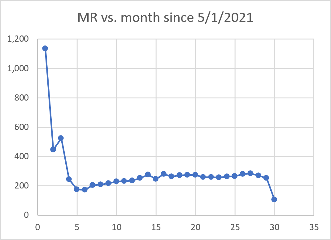
In both cases there is a signal at the beginning of the horizon. (Steve’s approach normalizes the MR results more effectively and produces less noise.)
Some people may argue that seasonality may be a confounder, so we ran the analysis and took out all the people who died in July, August and September. (I.e. we are making absolutely sure (absurdly so) that the winter months are not confounding the results).
This is for the 70 to 90 year old cohort for the full time horizon:

The highlighted rows in the bottom right corner clearly indicate that there are no recorded deaths during the winter months of July, August and September, yet we still have a massive signal…
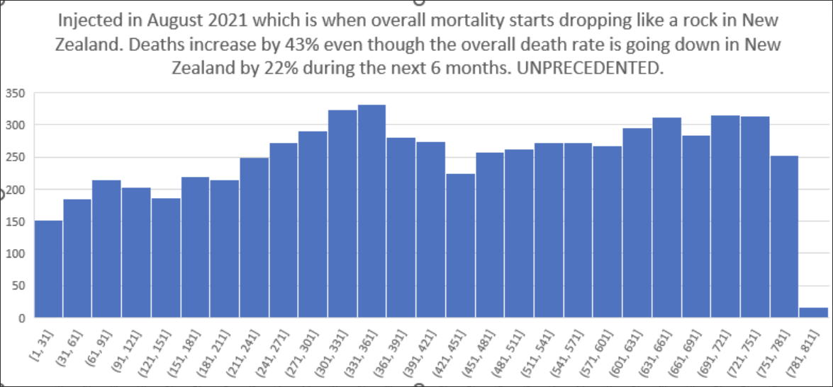
We used a standard month as 30.5 days, and reproduced the same shape (The numbers are a bit different, but the overall assertion is valid. Steve’s data is slightly different to the anonymous data):

I’m sure the rebuttal will be that most of these people (supposedly) died from Omicron… But wasn’t the vaccine supposed to protect them? (or did it make things worse?)
Either way these vaccines are a monumental failure.
Here is the age stratified results:

It’s clear the injections negatively affected the older age groups the most… i.e. the most vulnerable… the very age group it was meant to protect… (Saving “Grandma” and all that…).
The 40 to 50 age group (number 5, light blue line) looks surprisingly high. It’s much higher than the 30 to 40 age group (yellow line). Will need to compare it to standard mortality rates for this age group.
We have found (strong) signals using a completely different approach which we may document in a subsequent post.
This post is already too long and the main emphasis is really all about full (data) transparency.
These are all the links I have come across that discuss the New Zealand vaccination data:
No posts
Comments
Nothing yet. Say the first thing.
Sign in to join the conversation.