
Since the start of this project, we’ve had the backing of some excellent creators, editors and publishers. Their feedback and input have culminated in some designs we love. So we’re sharing a bit about the book’s design process, from early inspirations to final design.
No author knows what a book will be like when it’s done. Books don’t emerge as fully-formed ideas. They reveal themselves as you write, rewrite, debate, and compromise. Just Evil Enough is no exception: It really did take on a voice of its own, at times witty and contrarian, sometimes playful, and always authoritative. We wanted to create something grounded in practical information readers could put to work immediately, but that was elevated by storytelling.
As one early reviewer put it, “more fun than any serious marketing book has a right to be.”
We also wanted a book that was timeless, pragmatic, and sharp. One that wasn’t afraid to have opinions.
It would need a cover design to match.
A title like Just Evil Enough is practically its own design brief—but any good creative work begins with deep context, clarity and direction. So we started by identifying its genres and sub-genres. Sellers need this backstory to figure out where the book fits into the world, define target stores, position it in the market and on the shelf, and orient the style and layout. A fiction book, for example, offers very different signposts to a non-fiction one.
We made a list of books that we knew it would sit well with, including Rory Sutherland’s Alchemy (an absolute must-read); Chip & Dan Heath’s Made to Stick, and plenty of others. We even threw in The Anarchist Cookbook, Ray Dalio’s Principles, and Ian Flemming’s The Man with the Golden Gun.
We wrote down who the book was for, how we wanted it to grow, and our core positioning. In our case, this meant three main groups: Startup founders and early-stage entrepreneurs; marketers and brand managers in enterprise; and creatives working at agencies. We also wanted to be sure that some of the frameworks in the book would be at home in business teaching environments.
We wanted the book to be Provocative. Powerful. Subversive. Rebellious. Fascinating. And of course, witty, acerbic, and sharp.
Our book is about subverting the world, and publishing is long overdue for some disruption. There are few industries as ancient, Byzantine, and full of rent-taking and tradition. We have a few tricks up our sleeves—after all, why would you buy a book on subversiveness from people who weren’t following their own advice? So we’re spending much more time on the details than most authors do.
Earlier this year, we met with the London-based publishers of our English editions at a meeting in London. We carried in Stripe Press’ Scaling People, which we both adored for its superb typography, consistent style, and beautiful design.
Our publishers winced in unison.
We have expensive tastes.
First, the fundamentals: Hardback first or later? British English or US English? Would it be okay to use thinner paper to save on shipping costs? Can we trim a hundred or so pages so it’s cheaper to print?
Dear reader, we were unswayed.
The book is longer than normal. It’s not only hardback, it’s clothbound. Printed with the nicest paper we could find, and more finishes than a high-end knocking shop.
Because why the hell not? In a world of fast and easy, let’s make something gorgeous that stands the test of time.
To our publishers’ chagrin, we set aside the excellent designers they proffered, and instead, opted to work with an extraordinary designer we already knew and trusted: Rhona Ryan.
Rhona is Lead Creative and Producer at Maverick International. Emily worked with her on multiple award-winning projects. Rhona is one of those creatives who can read between the lines of a brief. She knows more about what you want than you do—and her work is always more beautiful than you could have hoped. Her background in print and her love of finishes (the paper kind) made her the perfect partner. Luckily for us, she agreed to take on the project.
Rhona’s first step was a mood board. This stage of the design process is a visual collage of the concepts and feelings we’ve shared. Done right, the ley lines of the finished product begin to emerge.
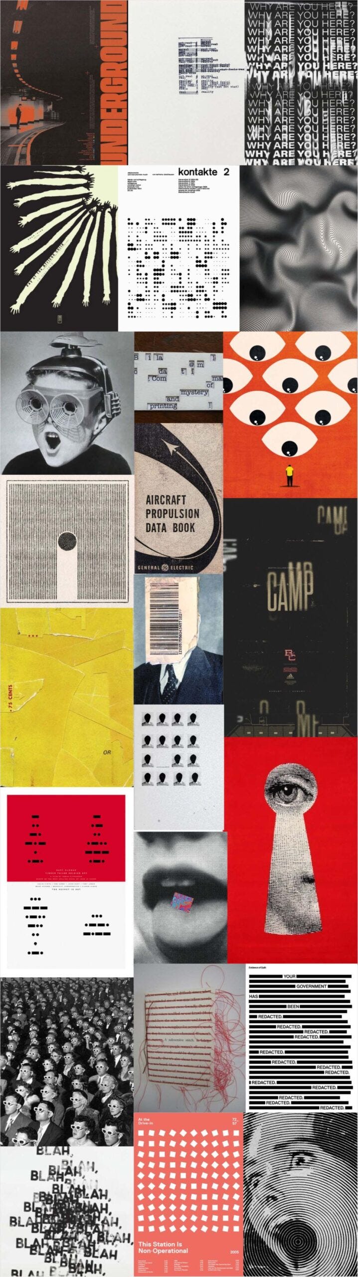
Her triangulation highlighted the elements of our brand voice: Subversiveness, codes and secrets, and a retro-futuristic defiance of norms. We loved the use of redacted text and codified signals; the vintage vibes, sinister, slightly bureaucratic overtones, and the bar codes, hidden messages, and subtle impression of tunneling beneath the battlements. We knew that red was going to be a core colour. We debated whether we should use the evil eye that has long been a placeholder for the project. And we talked about bleed (of ink and margins, not adversaries.)
Rhona took this feedback and spun up a wide range of designs that might suit, all orbiting codification, subversiveness and the concept of looking beneath or below. Here are just a few of the covers that we opted not to use, but that led us closer to our final cover design.
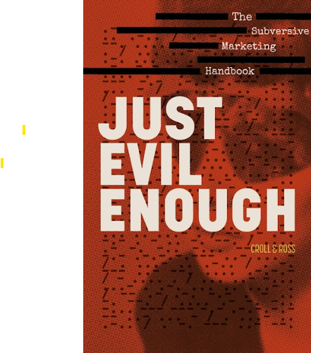
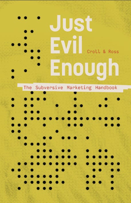
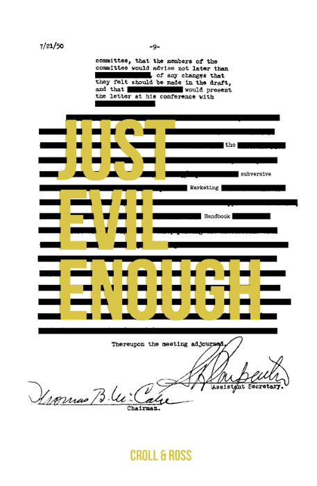
A book cover is such an interesting design space, one that requires deep domain expertise and a delicate balance of form and function. It’s also a fantastic opportunity to experiment and learn. We’re very grateful to Rhona for coming on this journey with us and for letting our imagination run wild.
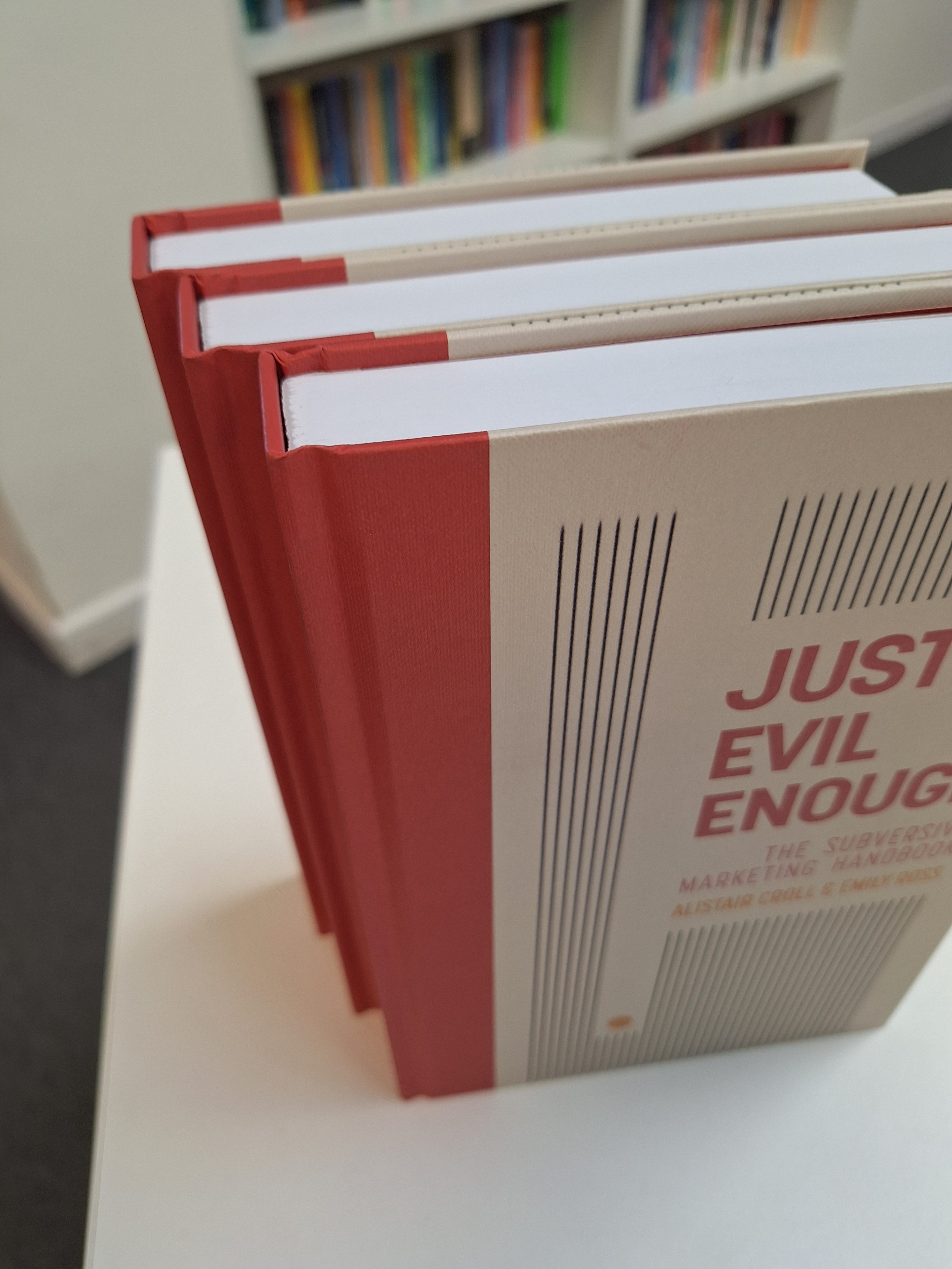
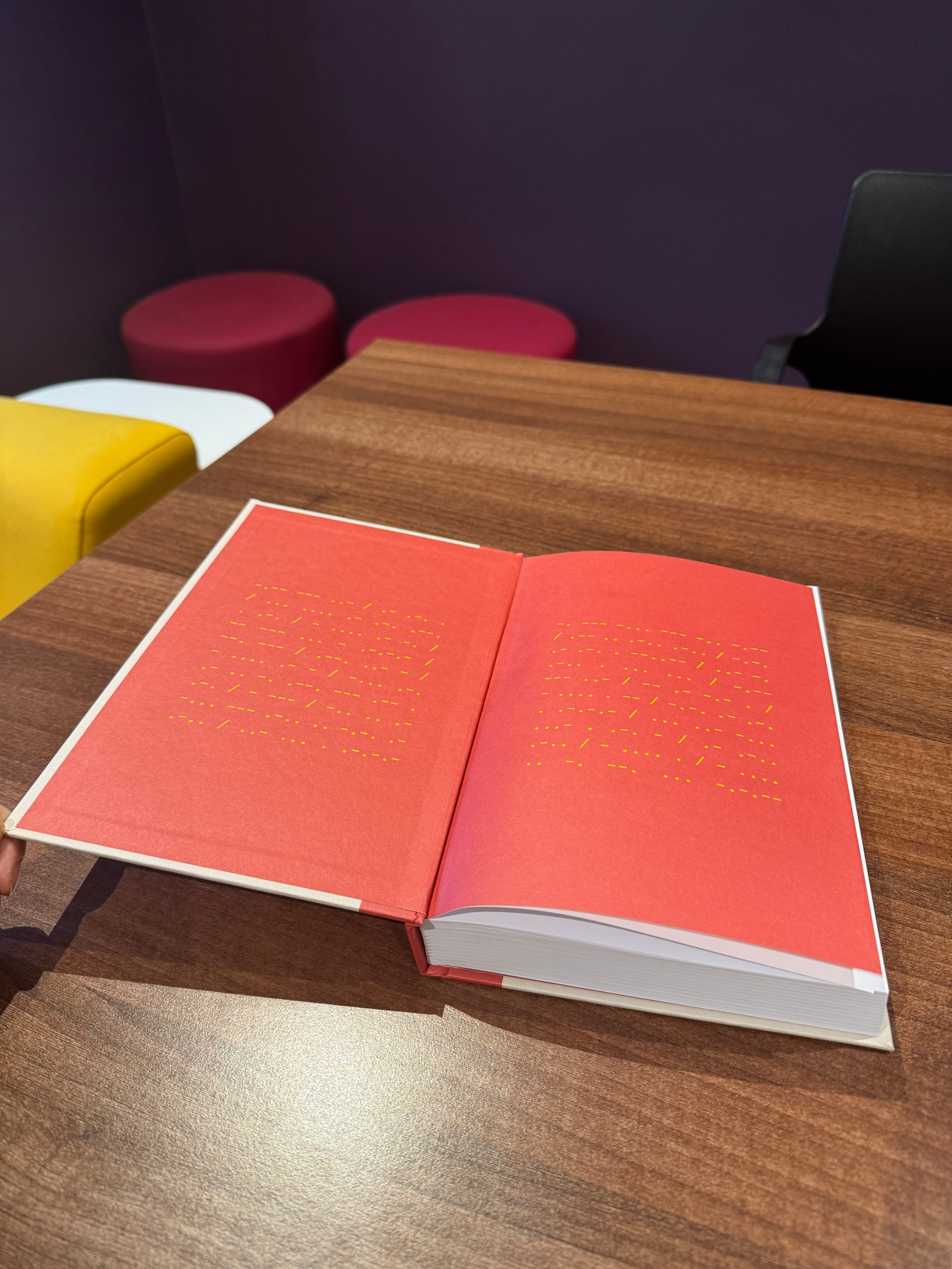
Here’s the finished product, as we first glimpsed it in shots from our printer. You can see some of the details, including a properly woven binding, textured cover, and the inleaf with one of many hidden messages buried throughout the text.
Comments
Nothing yet. Say the first thing.
Sign in to join the conversation.