
Today is both the first anniversary of my first Substack article and is also an April Fools joke on our most successful - productive Canadians, who will enjoy an increase of 60 % in the price they pay for natural gas (relative to Alberta AECO pricing), all in the name of saving the climate.
I started this journey on Substack in 2025, following a month long shutdown of my LinkedIn account over allegations of who-knows-what. A shout-out to my many Followers who bombarded the LinkedIn Help-Desk with regular demands that they reinstate my account!
In this year-end-beginning article, I will not be kind to nor mince words about those who lie to us and routinely conduct gentle psychological operations on us in the name of saving the climate.
My parents taught me that the end rarely justifies the means.
Unfortunately today, many who knowingly lie to us, do so because they sincerely believe that they are smarter than us and that if they can convince us to swallow hook-line-and-sinker their narrative and the promised utopia that would arise would justify the lie shoved down our throats.
Repetition does not transform a lie into a truth - Franklin D. Roosevelt
The specific repeated lie that inspires this article is the unprecedented rise in the Earth’s Energy Imbalance (EEI), as reported with much fan fare by the World Meteorological Organization (WMO) in their annual State of the Climate report.
This same message was parroted by the United Nations.
I am sure that many of you, who frequent social media, similarly noted that the past week has seen an “unprecedented rise” in alarmism about energy imbalances, climate tipping points and a decade of unparalleled growth in air temperatures.
AI bots, graduate students, ESG specialists and solar panel salesmen, together with their AI generated memes, pumped up the hype as everyone worked collectively to fan the flames of paranoia generated by the WMO State of the Climate year-end report.
So what is the Earth Energy Imbalance (EEI) and why is both the UN and the WMO focusing on this particular parameter in their 2025 State of the Climate report?
First, I will state that the reason for the alarmist enthusiasm is simply because many environmental indexes show a clear warming signal, especially over the past decade. Figure 1 is a plot from the Potsdam Institute for Climate Impact Research that shows that since 2010, we have seen a step change increase in the global average air temperature anomaly - also called global warming among purveyors of what I call routinely call climate porn.
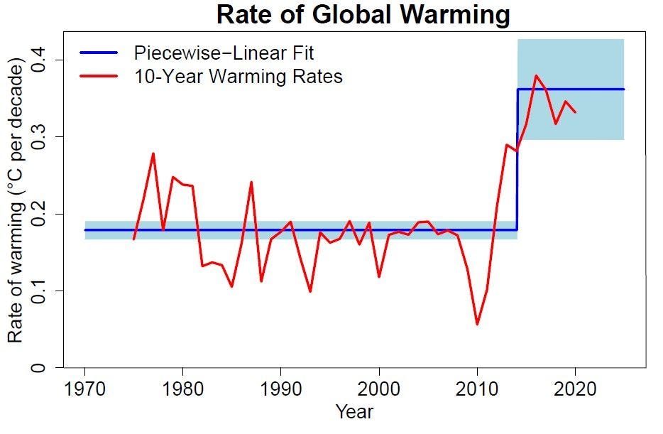
Figure 1. Potsdam Institute for Climate Impact Research rate of global average air temperature warming (C per decade).
While the WMO and United Nations declare with no uncertainty that the attribution in the large rapid rise in the rate of warming after 2010 is eating beef and taking our children to soccer practice, I will show the following:
Global Warming over the past +decade is more correctly called Global Brightening.
The Earth Energy Imbalance (EEI) is driven by large rapid growth in sunshine.
The global average air temperature anomaly is not a function of the EEI.
First, let us defined the Earth Energy Imbalance.
EEI = Absorbed Solar Radiation (ASR) - Outgoing longwavelength Radiation (OLR)
Absorbed Solar Radiation (ASR) - is the fraction of incoming solar radiation from space that is NOT reflected by clouds back into space and is itself, quantified by changes in reflected incoming solar radiation off the tops of clouds.
Outgoing longwavelength Radiation (OLR) - is the result of surface & atmospheric emissivity or the heat flux released from the Earth and into space.
Note that both of these parameters are measured relative to the top of the atmosphere and have units of Watts per square meter.
Now that we have established these basic definitions, let us examine satellite data for ourselves using public available information from NASA’s Clouds and the Earth’s Radiant Energy System (CERES).
The starting point that I so often prefer in my studies of Earth Science, begins with examining a value’s monthly average trend over the Orbital (Seasonal) Cycle. This approach establishes context on the magnitude of natural variability (aka climate change) and aids in understanding the most relevant physics at play as the Earth transits its orbital path and as summer gives way to winter in either hemisphere.
Figure 2 shows how the Earth Energy Imbalance varies over the Orbital (Seasonal) Cycle.
Note the following features in this plot:
Peak +EEI coincides with the Fall Equinox.
Peak -EEI coincides with the Spring Equinox.
The EEI is only briefly balanced (ASR = OLR) as summer migrates between hemispheres.
The annual amplitude varies by ~ 20 Watts per square meter.
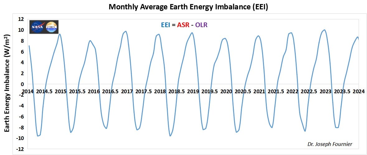
Figure 2. CERES derived Earth Energy Imbalance (EEI) as a function of the Orbital Cycle (2014 to 2024).
Recall that the two equinox events in Earth’s orbital cycle occurs when the Sun is directly above the equator or where the Sun’s declination is 0° — it lies directly in line with Earth’s equatorial plane - and neither pole is tilted toward or away from the Sun.
This is the geometric definition of equinox events in Earth’s orbital cycle.
Equinox events are the opposite of Solstice events.
Now let’s examine the WMO and United Nation’s argument that the global air temperature is a function of the Earth Energy Imbalance.
When we examine the monthly average global air temperature, as shown in Figure 3 using NCEP reanalysis, versus the extra-tropical (ET) northern and southern hemisphere air temperatures, we find most peculiar story that is rarely if ever told.
Notice how, just as expected, the peak near surface air temperatures in either ET zone, occurs shortly following the respective summer solstice event - January in the ET southern hemisphere and July in the ET northern hemisphere.
Now, look at the month wherein the global average achieves it peak value - in July.
Something very fundamental is causing the global average to be dominated by the ET northern hemisphere’s summer and winter solstice events.
It is as if, the tropical equinox events and ET southern hemisphere’s seasonal variation is muted by the ET northern hemisphere when constructing the global average air temperature - a statistical construct.
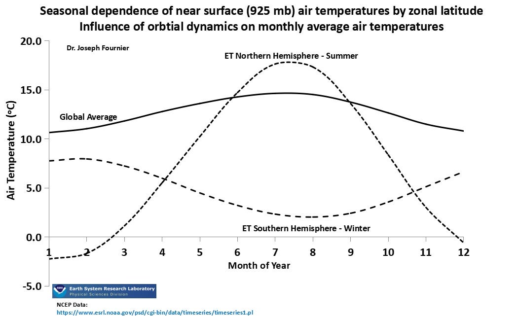
Figure 3. NCEP reanalysis showing the monthly global average air temperature versus the average air temperatures in either extra-tropical (ET) hemisphere over the Orbital Cycle.
Comparing Figures 2 and 3 shows us that global average air temperature peaks after the summer solstice in the ET northern hemisphere (June 2st), while the positive peak EEI occurs around the fall equinox (September 23rd).
Furthermore, EEI is negative while the ET southern hemisphere is experiencing its non-winter season and temperatures are the warmest over the Seasonal Cycle.
Nowhere in these relationships do we find a basis to argue that a positively growing EEI is causative of an increasing global average air temperature.
Now that we have examined the fundamentals of both the EEI and the statistical construct that we call the global average air temperature, it is time to examine them in their seasonally detrended format, which shows the underlying interannual variability (i.e., year-over-year variance).
To seasonally detrend a monthly average time series, one need simply apply a 12-month rolling average.
Figure 4 shows the seasonally detrended ASR and OLR time series relative to January 2000 - making them both difference plots, relative to the start of the 21st century. As discussed in my recent article titled Clouds 850% Stronger Than CO₂: Unmasking the True Driver of Changes in Global Average Air Temperatures, seasonal detrending allows one to examine patterns of variability occurring naturally according to the pace of the El Nino Southern Oscillation or Walker Circulation dynamics.
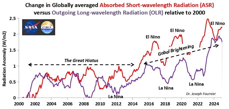
Figure 4. Seasonally detrended difference plots of the global absorbed solar radiation (ASR) and outgoing longwavelength radiation (OLR) over the 21st century - satellite measures relative to the top of the atmosphere.
Remember, as the Earth Energy Imbalance (EEI) is simply the difference between ASR and OLR, Figure 4 aids the mind’s eye by showing us that during The Great Hiatus, there were numerous years where OLR exceeded ASR or both were in fairly balanced state.
Likewise, since 2014, we have witnessed the emergence of a state that rightfully can be called a decade plus of Global Brightening, where ASR is has been consistently larger than OLR.
Thus, when we convert Figure 4 into an EEI plot (Figure 5) and compare against the University of Alabama at Huntsville (UAH) satellite measured lower tropospheric global air temperature anomaly, we find a most damning lack of statistical correlation.
In fact, the R-square value in Figure 5 is shown to be a mere 0.01 - meaning there is no statistical (physical) correlation.
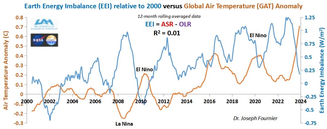
Figure 5. Comparison plot of the Earth Energy Imbalance versus the satellite measured lower tropospheric global air temperature.
Furthermore, Figure 5 shows that indeed the EEI went negative between 2001 to 2003 and again during 2009 to 2011 - if indeed human CO₂ emissions are solely responsible for a positive EEI state, these multi-year events during The Great Hiatus should not have been able to enter negative imbalance territory.
Of course, in view of the amplitude of EEI variability over the Orbital Cycle (+/- 20 Watts per square meter), these near zero values are likely statistically insignificant.
The reason EEI is able to achieve significantly positive values during the last decade plus of Global Brightening, without seeing a strongly correlated rise in lower tropospheric global air temperatures is simply due to the fact that said sunshine (ASR) is being absorbed by deeper ocean water and not the atmosphere.
This absorption of sunshine by deeper ocean water is why OLR does not rise in lock-step-fashion with increasing ASR shown in Figure 4.
Even the WMO and the United Nations argue that 90% of sunshine is absorbed by the oceans.
However, neither the WMO or United Nations acknowledges that visible light, because of its minimal absorption by liquid water, is able to penetrate well over 100 meters into deep water, while IR radiation is only able to directly penetrate a mere micron or two.
That is the physical chemistry of liquid water - electromagnetic radiation interactions.
Instead, the WMO and other alarmist agencies like Potsdam, rely on heavily smoothed ocean heat content (OHC) data to argue that the near linear rise in the global average OHC over the past few decades is correlated with a similar rise in our use of hydrocarbons and emitted CO₂.
The mechanism they suggest is that back-reflected IR radiation from slowly rising tropospheric CO₂ is responsible for the near linear growth in OHC (Figure 6).
I will dive deeper into these arguments in a latter article, but for now, I will simply argue that these claims ignore observation.
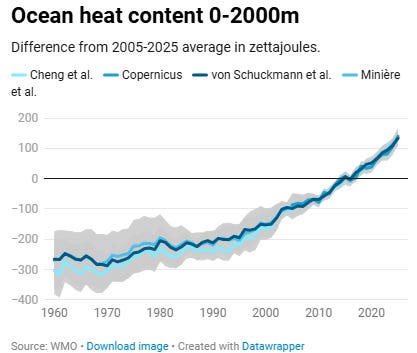
Figure 6. World Meteorological Organization (WMO) generated global average ocean heat content (OHC) since 1960.
The lowest hanging fruit to draw from in demonstrating why the WMO and United Nations are wrong in their human centric causation narrative is that this claim crumbles the moment we examine the geographic basis of OHC variability.
Figure 7 shows an example of a study published in 2015, where the authors quantify both the rate of change in the global average OHC and the OHC as a function of oceanic basin (e.g., Atlantic, Pacific) over two distinct periods (i.e, 1971 - 2000 vs. 2003 - 2012).
Note from the embedded table that the late 20th century rate of change in the global average OHC was estimated at 2.8x10^22 Joules per decade and 2.9x10^22 Joules per decade during the first decade of the 21st century.
However, the authors also show that while 3 out of 4 oceans experienced increasing OHC pre-2000, only 2 out of 4 showed increasing OHC during The Great Hiatus.
The authors attribute the sudden change the rate of change in OHC in both the Indian, Pacific and Southern Oceans around the turn of the century to a very large intensification of Walker Circulation in the Pacific tropics, which pushed great volumes of hot surface water out of the Western Pacific Warm Pool and into the Indian and Southern Oceans.
Nothing to do with human use of hydrocarbons.
In fact, in the 1990s, alarmist climate scientists were arguing that Walker Circulation was expected to continue to decelerate well into the early 21st century - yet the opposite occurred - a topic for another article.
This yet again highlights the inherent flaw and danger in an over-reliance on global averages, as it can hide relevant facts that can have a marked influence on the merit of a hypothesis.
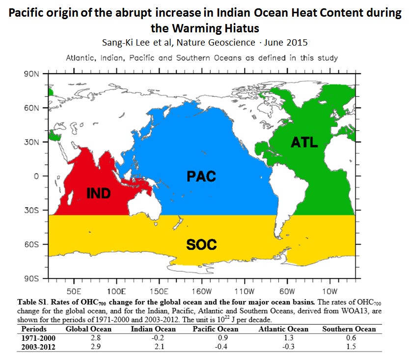
Figure 7. Evidence showing major flaw in arguing human attribution for changes in the rate of ocean heat content.
While this brief criticism of the WMO and United Nations claim that the growth in the global average OHC is the smoking gun proof of human causation, is hardly comprehensive, this critique definitely shows that recent growth in OHC is hardly coherent on a global scale
While IR back-reflection from tropospheric CO₂ is largely coherent in terms of geographic extent and is increasing at approximately 0.2 Watts per square meter per decade, we have observed vast expanses of the World’s greatest oceans (e.g., Pacific) switch between warming at depth to cooling.
If our CO₂ emissions are indeed first order in driving the growth in OHC (EEI), then surely the largest ocean on planet Earth wouldn’t suddenly switch to a declining OHC simply because the Trade Winds experienced a sustained period of acceleration relative to their sluggish pace during the late 20th century.
A natural mechanism is perfectly capable of explaining this natural tipping point
Thus, the claim that a rising OHC is indicative of human CO₂ emissions is of extremely low merit.
However, this claim is not nearly as erroneous as framing a positive EEI in purely anthropocentric terms, while ignoring the obvious role of Global Brightening and the absolute lack of a statistical correlation between a +EEI and the global air temperature anomaly (R² = 0.01).
Conclusion
One year into this Substack journey, launched amid LinkedIn censorship and sustained by loyal readers who refused to stay silent, the pattern remains unmistakable: climate alarmism thrives not on robust evidence, but on deliberate repetition of convenient narratives and outright lies.
Today’s 60% effective increase in natural gas costs for Canada’s most productive citizens — disguised as climate salvation — perfectly embodies this disconnect.
While hardworking Canadians face higher energy bills from policies like the industrial carbon tax, institutions like the WMO and UN trumpet an “unprecedented” rise in Earth’s Energy Imbalance (EEI) as proof of human catastrophe.
The near-zero correlation (R² = 0.01) between EEI and satellite-measured lower tropospheric temperatures further undermines any anthropocentric causation claims. Likewise, ocean heat content changes, far from being a smoking gun of a globally coherent CO₂ emissions, show basin-specific shifts driven by natural circulation patterns like intensified Walker Circulation during The Great Hiatus.
Repetition does not transform a lie into truth, as Roosevelt warned.
My parents were right: the end rarely justifies the means.
Canadians deserve honest science and transparent policy, not psychological operations that punish productivity in the name of a narrative increasingly detached from satellite observations and physical reality. The climate debate must return to rigorous metrology and causal evidence — not hype, rent-seeking, or April Fools jokes played on the productive backbone of the nation.
No posts
Comments
Nothing yet. Say the first thing.
Sign in to join the conversation.