

Welcome to the eighth post in my “Master Data Storytelling” series! If you want the full overview of the course, the main course website has everything you need!
A short summary on why am I writing this series
Over the past decade, across teams and industries, I kept seeing the same pattern:
smart analysts producing charts that buried the message under visual noise. The problem was never the numbers: it was the design.
That’s where this series comes in — I’ll be sharing how to transform charts into sleek, professional-grade charts that meet data journalism standards.
And for those who enjoy code, every improved chart can be recreated in Plotly, so the story survives beyond a screenshot.
When someone thinks about bar charts, they often picture clear and easily distinguishable bars that effectively present data.. But what happens if there is a bar that is so big that is dwarfs all the other bars? Bars encode value by height, and when one value is absurdly large, the chart has no room left to breathe.
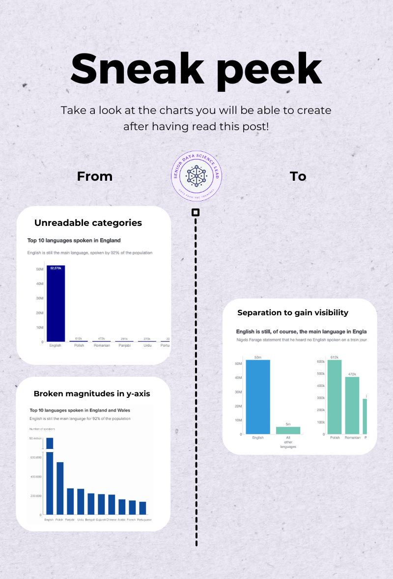
This module teaches you how to handle bar charts where one category is so large that it crushes every other value into insignificance. You will work through three scenarios — two “what not to do” designs, and one correct fix that preserves both integrity and readability.
Scenario 1 (🔓 free): The skyscraper problem — when one bar destroys the comparison.
We begin with the honest, default bar chart: everything starts at zero, nothing is manipulated…and yet the chart is useless. The dominant category becomes a monolith, and every other bar collapses into a barely visible stump. We examine why this happens and why the default design fails as a comparison tool.Scenario 2 (🔓 free): The broken-bar illusion — the tempting shortcut that makes things worse.
This is the classic school-taught “fix”: cut the tall bar in half using a jagged break. It feels clever. It is not. You will see why broken bars violate the geometry of bar charts, distort magnitude perception, and hijack attention in all the wrong ways.Scenario 3 (🔓 free): The real solution — separating the stories with subplots.
When one value dwarfs the rest, you are no longer telling one story — you are telling two. The only reliable fix is to separate them. You will build a clean two-panel design: one subplot showing the dominant category, the other revealing the meaningful variation among the remaining values. Different y-axes, consistent colour logic, and clear spacing allow both stories to be read without distortion.
By the end of this module, you will know how to preserve truthful magnitude and make small differences visible.
Imagine you are presenting data on the most commonly spoken languages in England. The goal is straightforward: focus on the non-English languages, while still giving the audience a sense of how overwhelmingly dominant English is.
The dataset looks something like this:
English: ~52 million speakers
Polish: ~600k
Panjabi, Urdu, Portuguese, Spanish: all hovering in the few-hundred-thousand range
As shown in the table the difference is absurd — English is roughly 86× larger than the next category. If you were to plot this information through a bar chart, without really considering what would happen to the languages which are not English, then you would find yourself staring at the plot below.

Three things collapse immediately:
The smaller bars disappear. Panjabi, Urdu, Portuguese, and Spanish are technically in the chart, but visually indistinguishable. Everything below English becomes geological sediment.
All variation evaporates. Polish is three times larger than Spanish — but good luck seeing that. The difference is real; the chart deletes it.
Labels cannot rescue you. Even if you label everything with “k”, what do you do with the 52 million bar? Put “52,000k”? Congratulations — you have confused everyone.

This is what happens when geometry wins. A bar chart encodes value through height, and when one value is enormous, there is no canvas big enough to let the others breathe.
When comparing multiple categories, the brain relies on top-aligned height comparisons. That only works when the bars exist in the same perceptual zone.
Here, 52 million lives in the stratosphere; the rest live in the basement.
Even if the chart is technically honest, the comparison becomes cognitively impossible. To recover from this mess, we need structure — not hacks. And definitely not the cursed trick in Scenario 2.
My first encounter with a ‘broken bar chart’ was at school, and it’s a method I quickly learned to avoid in professional data visualisation. It made perfect sense at age thirteen. It makes absolutely none now.
The infamous broken bar chart is the one with the two diagonal lines sawn through the tallest bar to “save space”. The idea is to compress a chart so that 2 different ranges can co-exist together. Check the chart below.
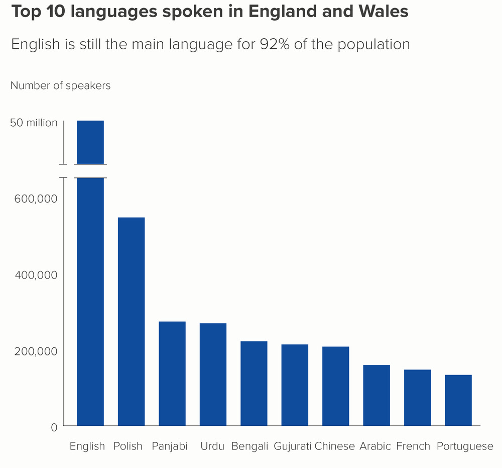
They break the contract between geometry and value. A bar’s entire purpose is to encode value through the continuous height of a rectangle. Cutting that rectangle destroys the encoding. How big is the missing piece you just removed? You know it, but your audience has no idea. They are meant to “imagine” the missing section.
The break becomes the most salient element Our visual system is hard-wired for contrast. The jagged break — a giant chunk of white space framed by bold diagonal lines — screams for attention. It completely hijacks the reader’s attention before they even register the categories.
It creates accidental ambiguity. The break can imply:
missing data
sensor failure
deliberate suppression
interrupted timelines
two bars stacked incorrectly
If your chart requires this much mental investigation, the chart has failed.
Broken bars are visually clever but cognitively disastrous. They distort magnitude, hijack attention, and create confusion where there should be clarity.
They also avoid the real issue: You are trying to show two stories in one plot — and the chart refuses.
The fix is not to mutilate the bar. The fix is to separate the stories. That is where Scenario 3 comes in.
When faced with this kind of story, it’s much better to go back to the data and work out what we need to chart and why. Remember, we wanted to:
Show the difference amongst the non-English languages.
Provide the view of how English is still vastly dominating.
Trying to compress two stories into one bar chart is like trying to print War and Peace on a Post-it note. You can do it, but you will not enjoy the result.
The only clean fix is to separate the stories into two different views; and the most natural way to do that is with subplots. Below, you can see my proposed chart.

Each y-axis fits its own story. The dominant category gets the scale it needs.
The smaller categories get the breathing room they deserve. This avoids the geometric distortion that crushed Scenario 1 and the logical distortion that poisoned Scenario 2.Colour carries the narrative across panels. Using consistent colour logic — for example, English in blue, non-English languages in green — creates continuity across the two subplots. The viewer instantly understands that the small subplot is a zoomed-in continuation of the large one.
Layout reinforces importance. Give the dominant-category subplot a narrower width. Give the smaller-category subplot the wider space. This creates a subtle but helpful priority cue: “The detailed analysis lives in the left plot”, while still preserving the headline scale on the left.
You avoid lying. Nothing is manipulated. Nothing is cut. You present the full range honestly, and then you present the internal variation clearly.
from plotly.subplots import make_subplots
import plotly.graph_objects as go
fig = make_subplots(
    rows=1,
    cols=2,
    column_widths=[0.35, 0.65]
)
# Left subplot: English vs others
fig.add_trace(
    go.Bar(
        x=first_chart_data[’language_group_text’],
        y=first_chart_data[’Observation’],
        text=[f”{obs/1e6:.0f}m” for obs in first_chart_data[’Observation’]],
        textposition=”outside”,
        marker_color=[
            “rgb(52, 152, 219)” if lang == “English” else “rgb(115, 198, 182)”
            for lang in first_chart_data[’language_group_text’]
        ],
        showlegend=False
    ),
    row=1, col=1
)
# Right subplot: non-English languages
fig.add_trace(
    go.Bar(
        x=second_chart_data[’language’],
        y=second_chart_data[’Observation’],
        text=[f”{obs/1e3:.0f}k” for obs in second_chart_data[’Observation’]],
        textposition=”outside”,
        marker_color=”rgb(115, 198, 182)”,
        showlegend=False
    ),
    row=1, col=2
)
# Light axis styling for both panels
fig.update_layout(
    yaxis1=dict(showline=True, linecolor=”lightgrey”, linewidth=1),
    yaxis2=dict(showline=True, linecolor=”lightgrey”, linewidth=1),
    xaxis1=dict(showline=True, linecolor=”lightgrey”, linewidth=1),
    xaxis2=dict(showline=True, linecolor=”lightgrey”, linewidth=1),
    margin=dict(t=100),
    height=450,
    width=800
)
In this module you learned how to handle bar charts where a single category overwhelms the rest:
A default zero-baseline bar chart collapses when one value is vastly larger than the others. The dominant bar becomes the entire plot, and every smaller category disappears into noise.
Broken bars — the classic diagonal-slice hack — do not fix the problem. They violate the geometry of bar charts, distort perceived magnitude and drag attention to the visual break rather than the data.
The only reliable solution is to split the story. Use subplots: one view for the dominant category, another for the detailed comparison among the smaller ones, each with its own appropriate y-axis.
Together, these techniques let you present both the big picture and the fine detail without misleading scale tricks. A well-structured pair of subplots preserves truth, reveals patterns and gives every category the space it deserves.
In my repo and the live Streamlit app:
When have you seen a chart where one category completely bulldozed the rest?
Have you ever opened a dashboard where a single colossal bar turned everything else into decorative gravel… or worse, where someone tried to “fix” it with a broken-bar slice that only made the chart look injured?
Or a scenario where the real story lived in the smaller categories, but the default scale buried all meaningful differences and forced you to squint at microscopic bars?
What is your view — do you prefer splitting the story with subplots, switching to alternative chart types, or avoiding bar charts entirely when one value goes full skyscraper?
Share your examples, questions or counterpoints in the comments. I would love to hear how you handle dominant categories, skewed distributions and scale integrity in your own work 👇
And see you in the next module. 👋
If you are interested in more content, here is an article capturing it and organising it all by topics!
No posts
Comments
Nothing yet. Say the first thing.
Sign in to join the conversation.