

Welcome to the seventh post in my “Master Data Storytelling” series! If you want the full overview of the course, the main course website has everything you need!
A short summary on why am I writing this series
Over the past decade, across teams and industries, I kept seeing the same pattern:
smart analysts producing charts that buried the message under visual noise. The problem was never the numbers: it was the design.
That’s where this series comes in — I’ll be sharing how to transform charts into sleek, professional-grade charts that meet data journalism standards.
And for those who enjoy code, every improved chart can be recreated in Plotly, so the story survives beyond a screenshot.
If you have ever seen the infamous Fox News “Obamacare enrollment” graphic, you already know where this is going. The chart compared 6,000,000 against 7,066,000, but the bars were scaled so aggressively that the second looked more like seven times the first.
The problem was not the numbers. The problem was the y-axis.

Fox manually cropped the scale to inflate the visual difference — a wonderfully effective (and wonderfully dishonest) way to manipulate the viewer’s perception.
Bars encode quantity through length. If you cut away the baseline, the viewer loses context. You remove the natural “zero” that tells us whether a bar is tall, short, or barely different. Once that anchor disappears, any story can be exaggerated, softened, or flipped on its head.
And yet, there a valid exceptions for bars chart to not start at zero.
This module shows you how y-axis choices can sharpen or completely distort the message in a bar chart — and why the “start at zero” rule is both essential and occasionally the wrong tool for the job. You will work through three transformation scenarios:
Scenario 1 (🔓 free): When a correct zero-baseline hides the story — and the first structural fix.
We begin with a perfectly honest bar chart that starts at zero… and yet hides all meaningful differences. You will rebuild it using a deviation baseline (the “flagpole” approach), revealing the relative differences that the default chart quietly buries.Scenario 2 (🔐 paid): Turning deviation bars into cleaner, sharper deviation dot plots.
Bars still carry the visual weight of “height equals magnitude”. When that weight gets in the way, dots do a better job. You will convert the deviation chart into a dot-based design that makes small contrasts obvious without bending any rules.Scenario 3 (🔐 paid): When the real fix is changing the chart type — zoomed line charts for subtle declines.
Some stories cannot be told honestly with bars at all. Using the NHS waiting-times dataset, you will replace a wall of blue bars with a focused line chart that zooms into the relevant range. This preserves integrity, avoids misleading scale effects, and exposes trends the bar chart hides.Scenario 4 (🔐 paid): The rare cases where bars may start above or below zero — and how to do it safely.
There are a few chart types where a non-zero baseline is not only acceptable but expected. You will learn when this is legitimate (waterfall charts and charts anchored on natural baselines such as sea level), how these designs avoid the usual distortions, and what conditions must be met to keep the visual truthful.
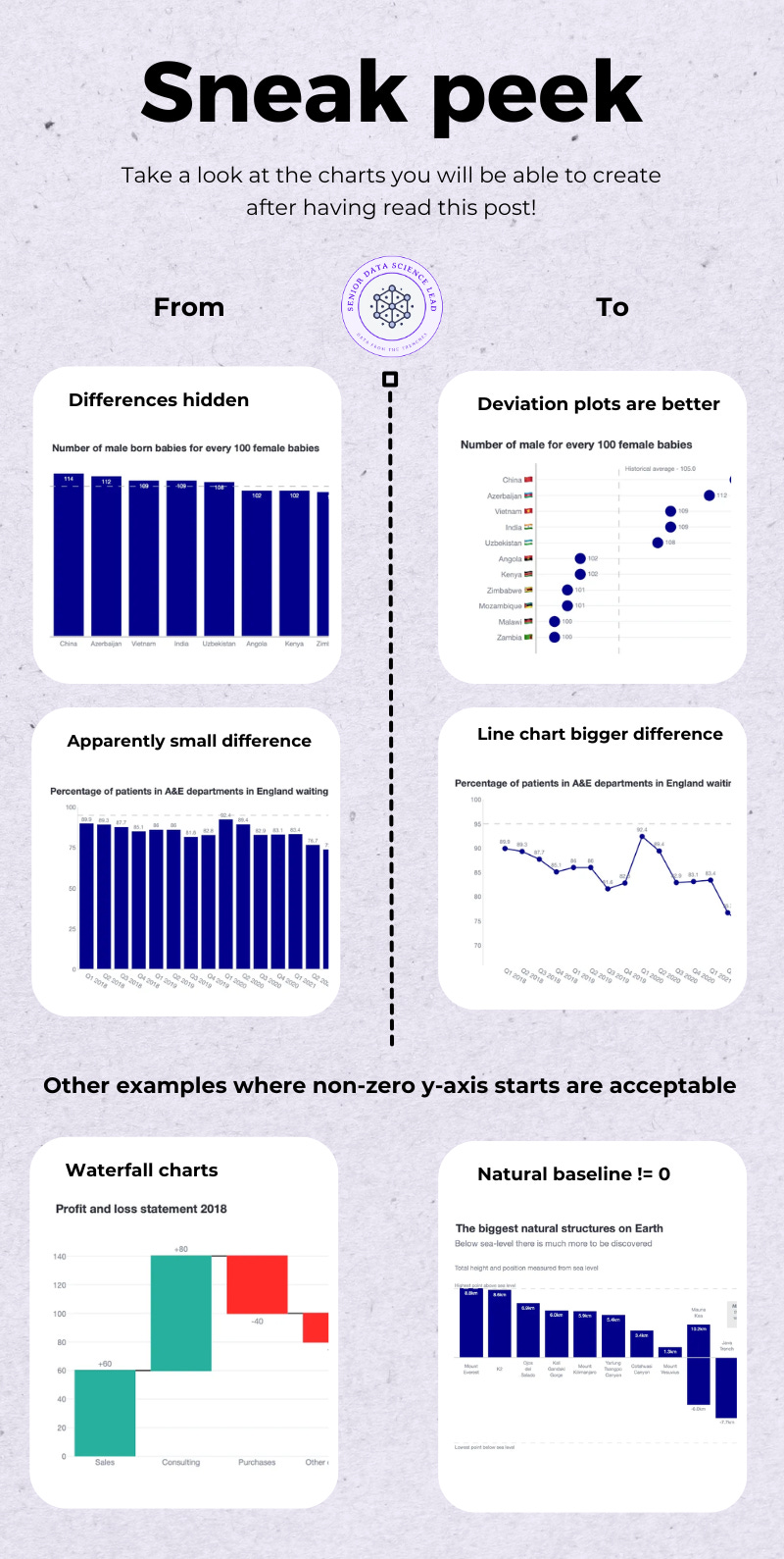
By the end, you will know when zero is and when zero isn’t your friend, and how to choose the chart that tells the truth rather than stretching it.
Bar charts should start at zero.
This is a golden rule in data visualisation. Bars encode value through length, and length only makes sense when measured from a clear baseline. But, sometimes the rule does its job so well that it smothers the message entirely.
Take this simple dataset showing the number of male babies born for every 100 female babies in a set of countries. The values sit somewhere between 100 and 114. Perfectly ordinary figures, and perfectly easy to compare.
Now, check the default bar chart below. At first glance, nothing looks broken.
The bars start at zero (good).
The data is displayed truthfully (also good).
And yet… the chart communicates almost nothing.

Because the y-axis stretches from 0 to 114, every bar becomes a skyscraper. The differences we care about — the 4-point gap between Country A and Country B — dissolve into the noise of an unnecessarily tall scale.
The chart is technically honest but visually useless.
Our brains read bar charts using length judgement — one of the fastest pre-attentive skills we have. We compare shapes instinctively, by eye, without needing to read numbers.
However:
When the baseline is far away from the relevant variation, length loses meaning.
Small differences become imperceptible.
Everything looks equally tall, equally important, equally forgettable.
Instead of using 0 as the baseline, we use the historical average as the anchor. Every bar becomes a deviation: above or below the reference line.

This instantly compresses the meaningful range and makes the differences visible.
Added a vertical reference line at the historical average
Created a deviation value for each country
Plotted bars from that baseline rather than from zero
Replaced skyscraper-bars with proportionate signal
Added numeric labels for clarity
The chart now tells a story instead of hiding one.
# Compute the historical average
hist_avg = df[”ratio”].mean().round(0)
# Create a deviation column
df[”deviation”] = df[”ratio”] - hist_avg
# Build the deviation bar chart
fig = go.Figure()
# Reference line
fig.add_vline(
    x=0,
    line_color=”darkgrey”,
    line_width=3,
    annotation_text=f”Historical average – {hist_avg}”,
    annotation_position=”bottom right”
)
# Bars showing deviations
fig.add_trace(
    go.Bar(
        y=df[”Entity_text”],
        x=df[”deviation”],
        orientation=”h”,
        marker_color=”darkblue”,
        text=df[”ratio”],
        textposition=”outside”,
        showlegend=False
    )
)
fig.update_layout(
    title=”Number of male born babies for every 100 female babies”,
    font=dict(family=”Helvetica Neue”),
    xaxis_title=”Deviation from historical average”,
    yaxis_title=”“,
    margin=dict(t=80, l=40, r=40, b=40),
    height=550
)
By now, you can:
recognise when a zero-baseline hides the signal
understand why length comparisons fall apart across huge scales
rebuild a chart using meaningful baselines instead of mechanical rules
produce a clear deviation bar chart in Plotly GO
Next, we refine the idea further. Bars work… but they are still heavy. If you want maximum clarity with minimum ink, dots will serve you better.
Comments
Nothing yet. Say the first thing.
Sign in to join the conversation.