
I have a confession that will surprise absolutely no one who has ever worked with me or indeed followed me for a while: I have a genuine, borderline unreasonable distaste for the common downlight. Not lighting in general. I love light, I admittedly obsess over it, I will happily spend an entire client meeting talking about nothing else. What I can’t stand is the default. The flat grid of recessed spots that gets specified because it’s easy, because an electrician can lay it out in ten minutes, because nobody in the room stopped to ask what the room actually needs. So it ends up looking like an airport runway.
Good lighting doesn’t announce itself. Bad lighting does, usually by making every room in a house look like the inside of a supermarket at 2pm.
We recently finished a project with nearly 200 individual light fittings. Not 200 identical downlights, but close to 100 distinct designs across the house, many of them specified as pairs where the room called for symmetry: wall lights either side of a bed, matching pendants over an island, sconces flanking a fireplace, or two lights either side of a mirror in a hallway. Pendants. Chandeliers. Wall lights. Picture lights. Surface-mounted spots. Flush mounts. Semi-flush mounts. Swan neck fittings, upright fittings. It sounds excessive written down like that. It didn’t feel excessive walking through the finished house. It felt like the house had been lit the way a face is lit for a portrait, not the way a car park is lit for safety.
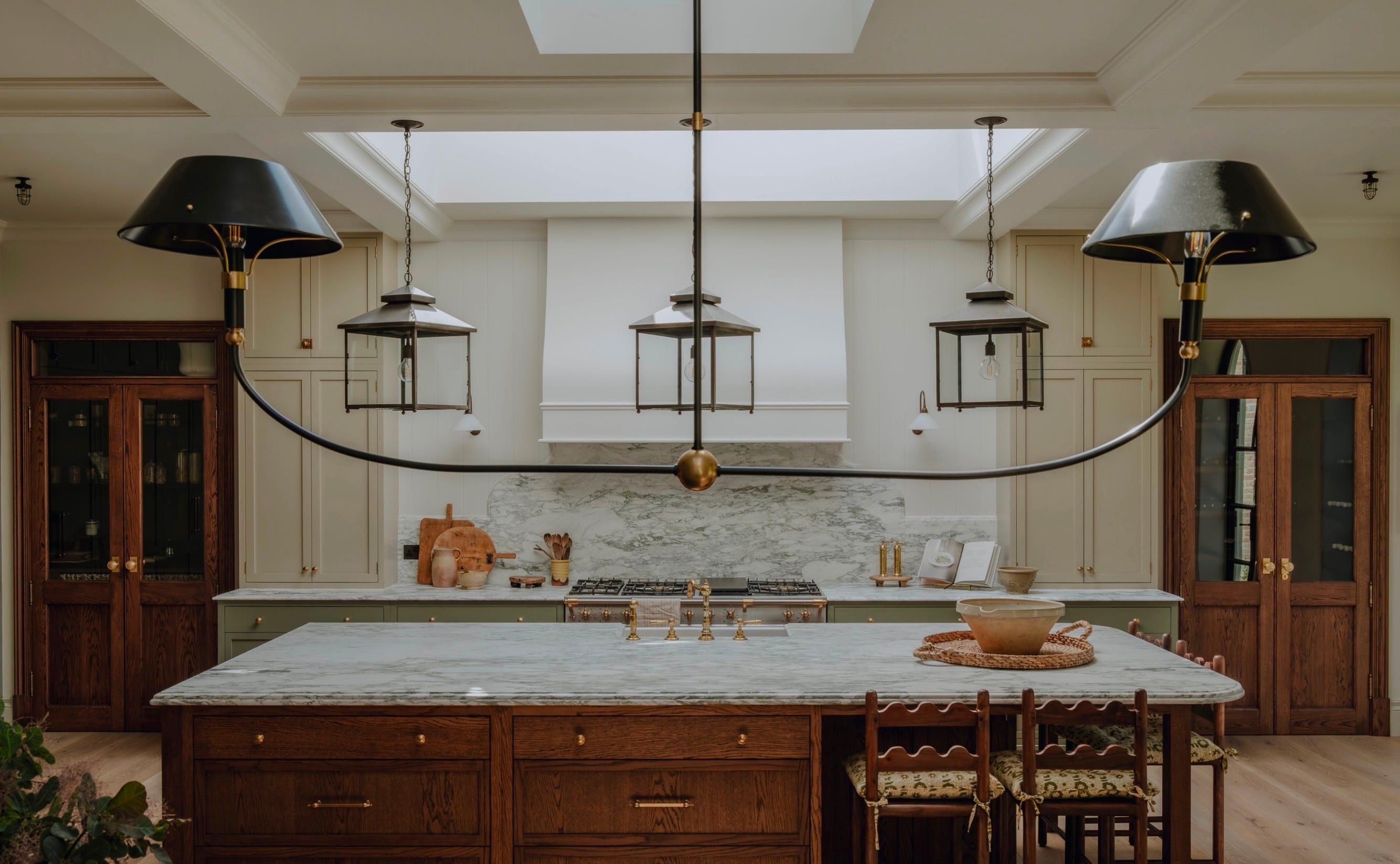
That project is the best case study I have for why layered lighting matters, so I want to use it to walk through how I actually think about lighting a home.
I will admit there is no quick lesson here in how to achieve this so that the lights will talk to each other. It’s taken years of learning and sourcing and mistakes to master the ability to mix so many light forms. But I can give some tips to guide you on your enlightened way.
The mistake most lighting schemes make is starting with the fitting. Someone falls in love with a pendant on Pinterest and works backwards from there. I start with function, and function in a home breaks into three layers:
Ambient light: the general wash that lets you exist in a room without bumping into furniture.
Task light: light aimed at what you’re actually doing: reading, cooking, doing makeup, working.
Accent light: light that does nothing practical at all. It exists purely to make a room feel considered. A picture light, a shadow gap, a lit alcove.
A downlight grid tries to do all three jobs at once with one blunt tool, and it does all three badly. It flattens faces, kills shadow, and makes a beautifully finished room look like a display suite. The fix isn’t “no downlights ever.” It’s using them sparingly, in the right locations, as one layer among several, rather than as the entire lighting strategy for a house.
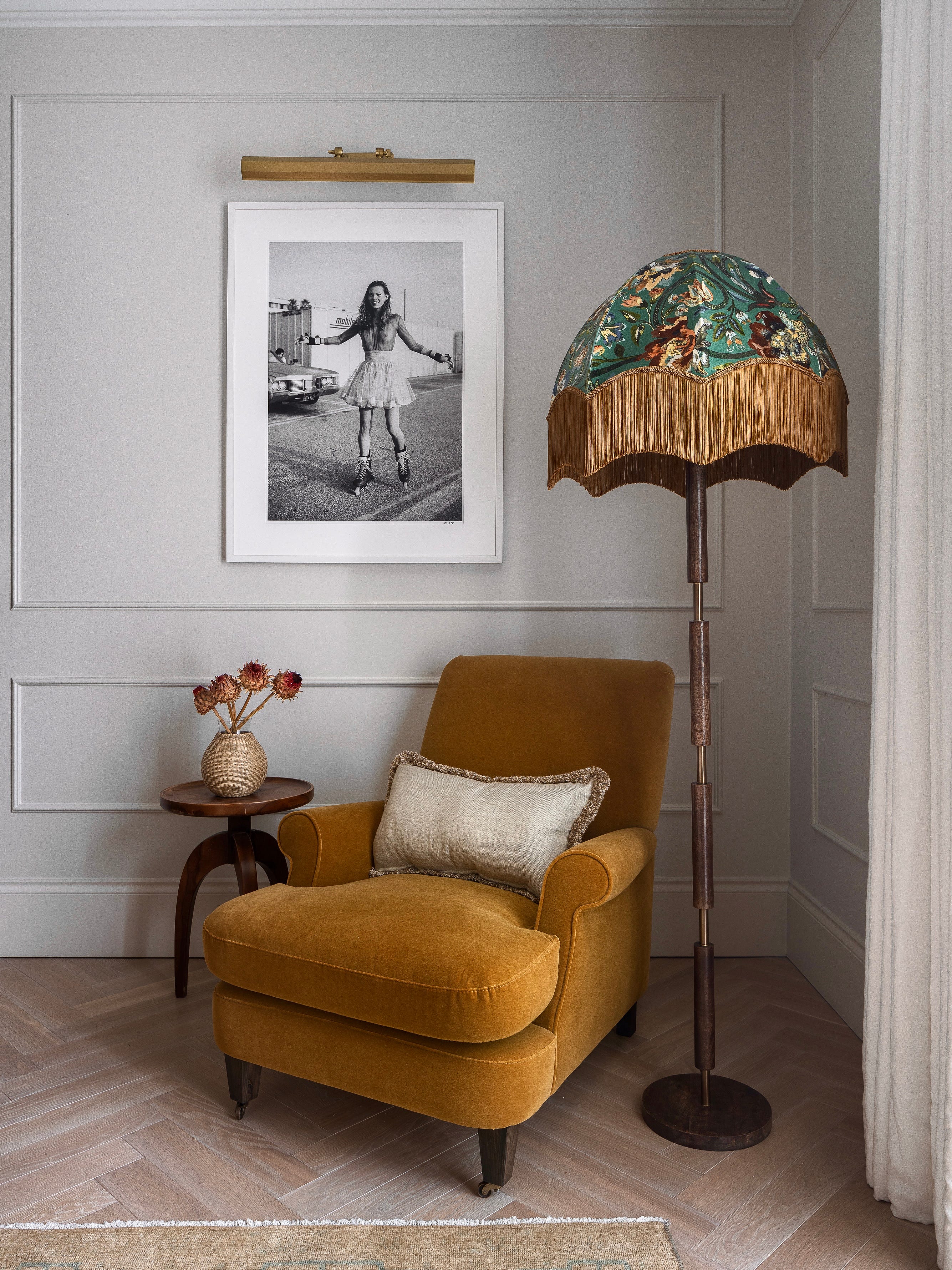
Pendants and chandeliers: the personality layer. These are the fittings that tell you something about the room before you’ve even noticed the furniture. A chandelier over a stair or a dining table isn’t there to illuminate. It’s there to give the eye somewhere to land, to set scale, to signal “this space matters.” Where a pendant appeared more than once in this house, it was almost always deliberate: a matched pair over a kitchen island, say, where symmetry is the whole point. But across the ground floor, room to room, barely a design repeated. Each one was chosen to match the proportions and mood of its specific room: a slim brass pendant over a narrow reading nook, a sculptural glass piece over a stair void with the height to actually show it off. Pendants want to be sized to the space, hung at the right height, and treated as furniture, not afterthoughts.
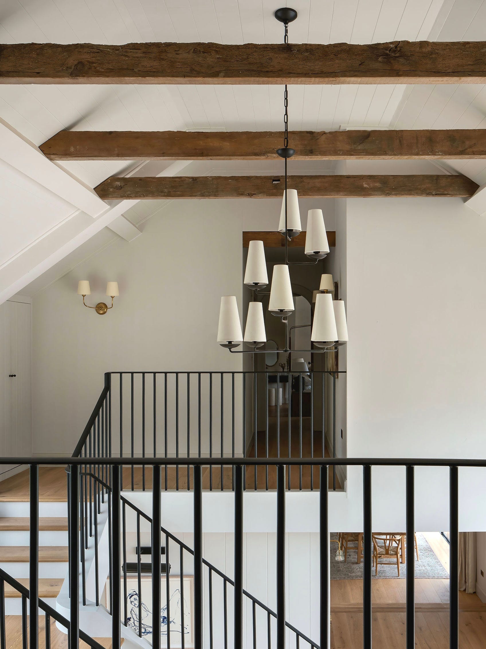

Wall lights: the layer everyone forgets. Wall lights are, fitting for fitting, the most underused tool in a house. A well-placed pair either side of a bed, in a hallway, or flanking a fireplace does more for the feel of a room at night than almost anything else, because they put light at eye level instead of dumping it from the ceiling. This is where swan neck versus upright actually matters as a decision rather than a style preference. A swan neck fitting throws light down and out in a soft, directional pool, beautiful over a console or a piece of art, forgiving of an uneven wall. An upright fitting throws light up, washing the ceiling and wall, which reads as more architectural, more considered, and works brilliantly beside a bed where you don’t want glare in your eyeline.
Picture lights: precision over volume. These get dismissed as decorative extras, but a good picture light is one of the most technical fittings in the house. Beam angle, colour temperature, and throw distance all have to be right or you either wash out the piece or barely touch it. We used these liberally through the house, not just over art, but over joinery details and textured wall finishes, because a picture light doesn’t just light the object, it tells you the object is worth looking at.
Comments
Nothing yet. Say the first thing.
Sign in to join the conversation.