
Welcome to Place Study — a series observing thoughtful spaces through design, sketching, photography, and the details worth noticing.
There are some works of art you’ve seen so many times in books, prints, and photographs that you feel like you already know them. Monet’s Water Lilies were like that for me.
But seeing them in real life was completely different.
I knew the paintings were large, but I didn’t realize just how large. Eight compositions stretch across two enormous oval rooms, wrapping almost continuously around the walls. You don’t really stand in front of a single painting. You enter into them.
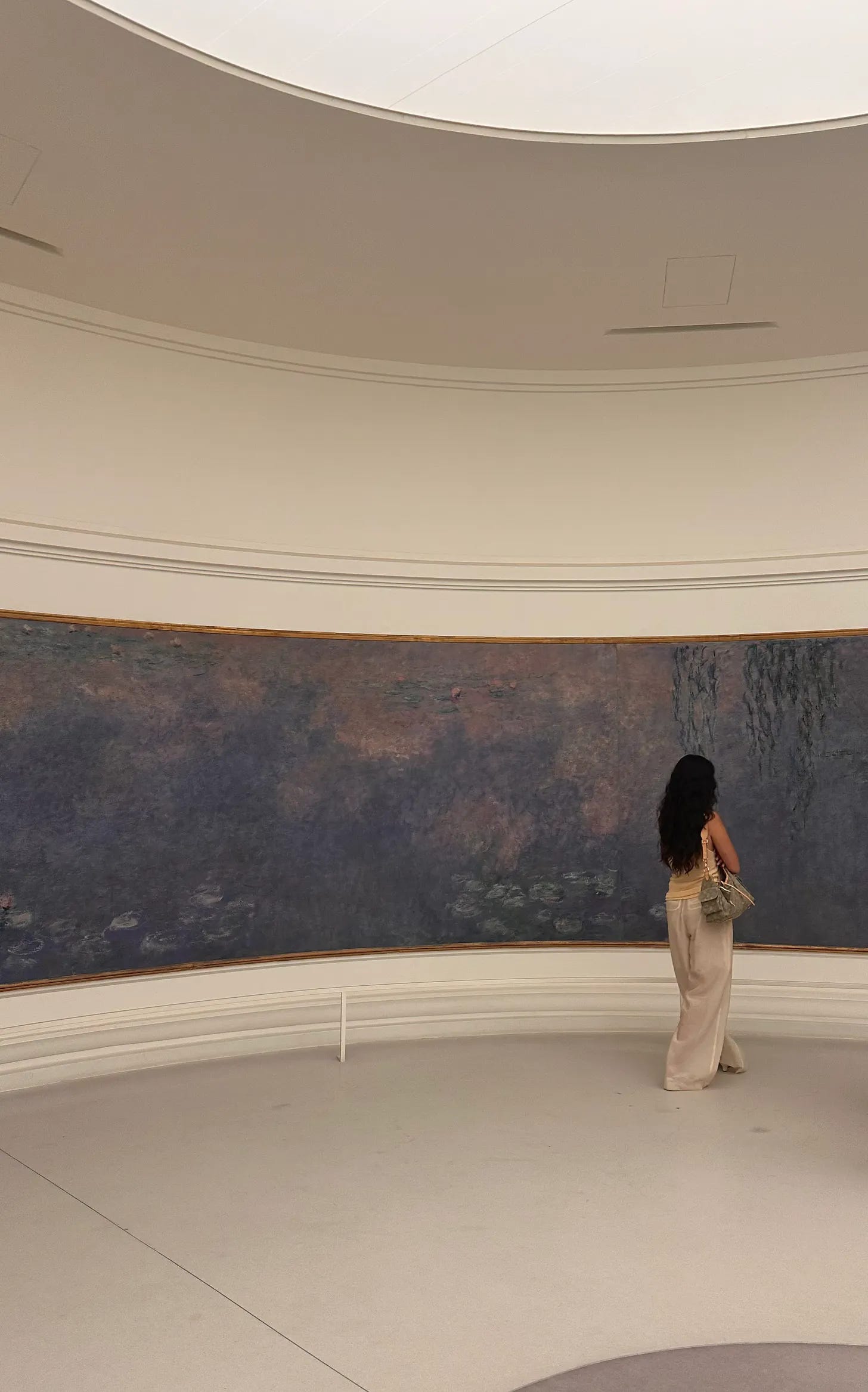
I never properly studied art. It wasn’t my major, and most of what I know has come through design, observation, and slowly teaching myself to draw and paint. But Monet is one of those artists whose work has always felt familiar to me.
Seeing the Water Lilies in person made me understand why
01. Room designed around the art
What surprised me most about the Musée de l’Orangerie wasn’t only the scale of the paintings. It was the architecture around them.
The Water Lilies are displayed across two connected oval rooms designed specifically for the works. Monet was involved in conceiving the installation, working with architect Camille Lefèvre to create a space where the paintings, architecture, and natural light could be experienced together.
Monet also required skylights for observing the paintings in natural light.
There is very little visual interruption. White curved walls follow the paintings. Natural light enters from above. A simple oval bench sits in the center of each room that blends with the shape of the room.
The architecture almost disappears. And maybe that is what makes it work so well. Rather than asking for your attention, the room gives it back to the paintings.
02. Experiencing scale
When we first entered, we did what I think most people naturally do: stopped in the first room.
It already felt like there was so much to look at.
Then my friend Peggy nudged us and said, there’s another room.
The second gallery was a bit quieter, and I had more space to actually walk and observe in detail.
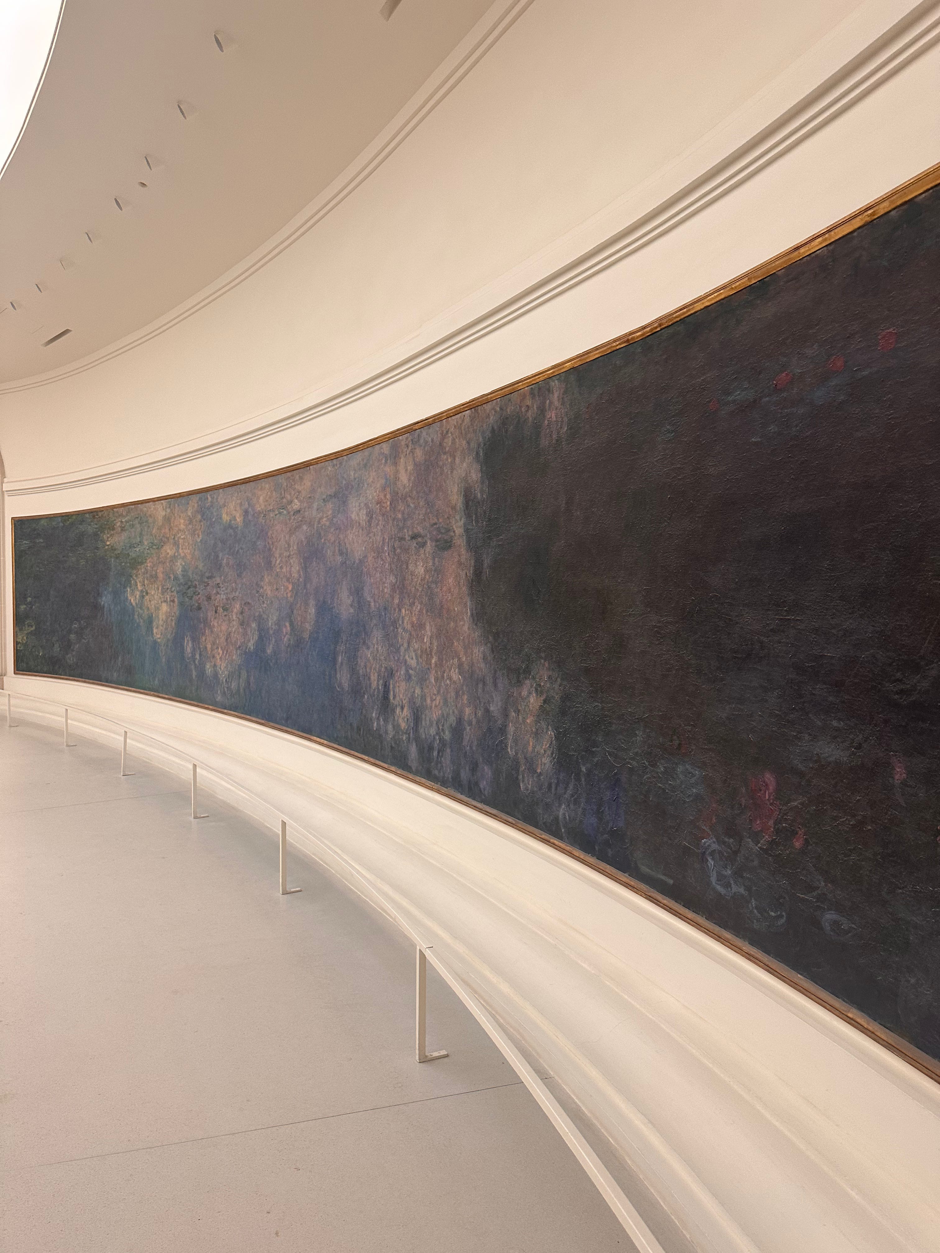
From far away, the paintings become these long landscapes of color stretching across the room. But as you move closer, they start to dissolve. Water lilies become brushstrokes. Reflections become layers of blue, green, violet, brown, and pink.
I kept moving between the two views: stepping back to understand the composition, then getting close enough to see the texture of the paint.
It made me realize how much scale changes the way we experience an artwork. These paintings don’t simply depict a landscape. At this size, they begin to create one around you.
03. Natural light without distraction
I kept looking up at the skylight.
As a designer, I’m always interested in where light comes from and how it changes a space. Here, the light feels incredibly soft and even.
There aren’t windows pulling your attention toward another view. Instead, daylight enters from above and falls across the paintings and white walls.
It makes the rooms feel calm and almost still.
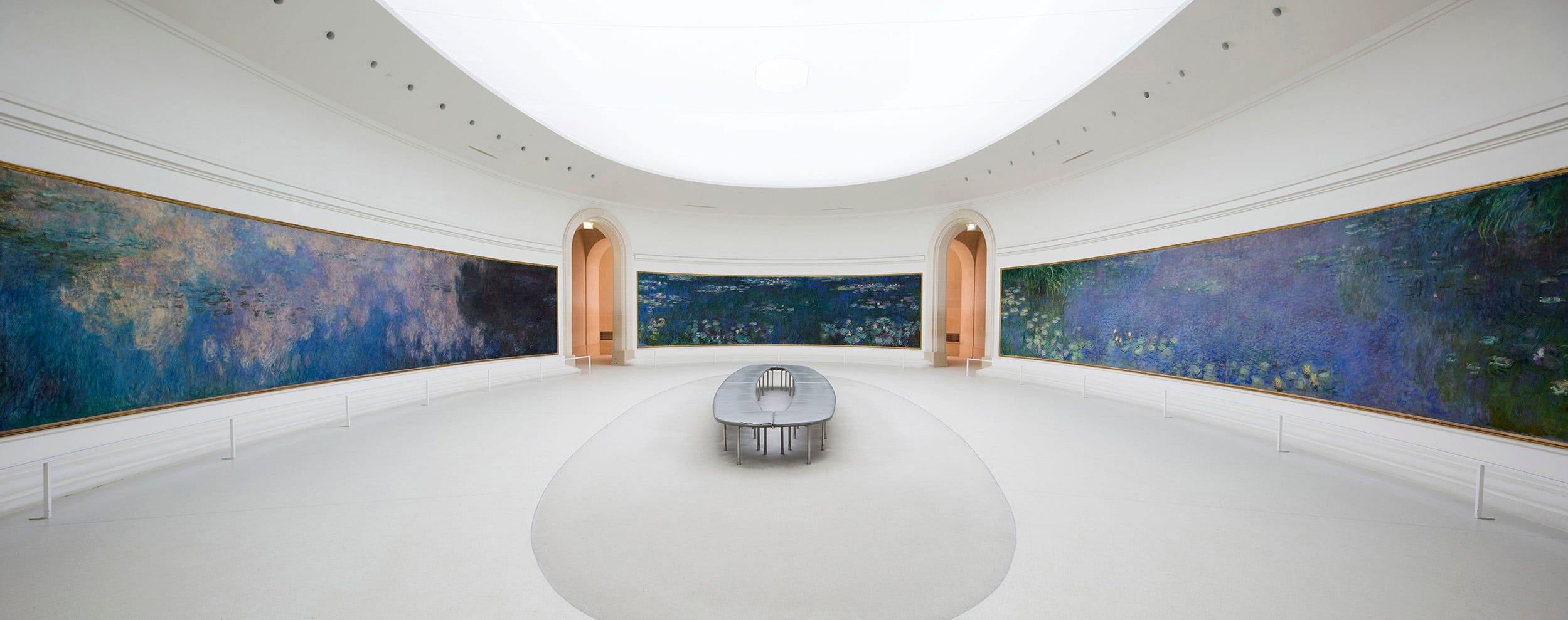
There is something interesting about designing a space with so little in it. No dramatic architecture competing with the work. No unnecessary focal point.
Just light, proportion, curved walls, a place to sit, and the art.
Sometimes good design isn’t about adding another element. It’s about knowing what can disappear.
04. Learning from monet’s color
I’ve been paying much more attention to color since I started sketching and painting, so I found myself looking at Monet differently this time.
What stood out to me was how dark some of the paintings actually are.
There are deep blues, murky greens, browns and shadows throughout the work. Yet the overall feeling never felt heavy to me.
It still felt calm, warm and inviting.
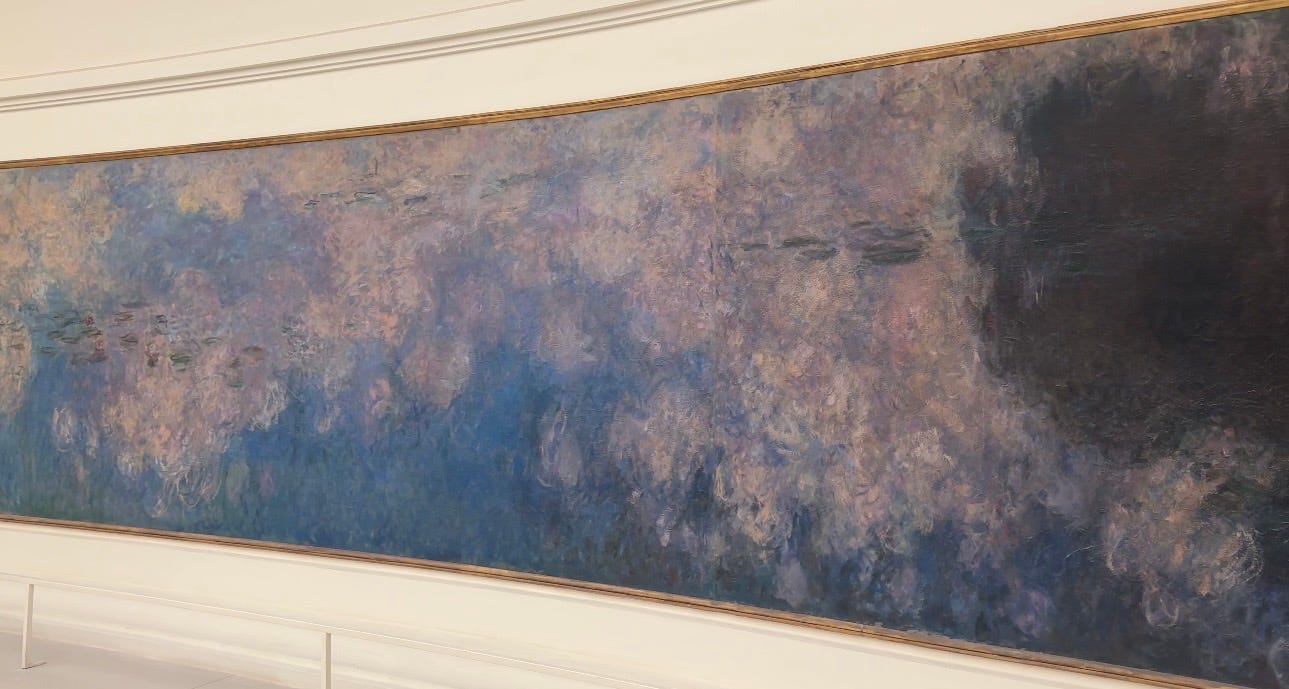
I think that contrast is what I want to study more (and why do all roads lead to oil painting).
I tend to associate light, happy work with light colors, but Monet’s paintings reminded me that mood is much more complicated than that. Darker tones can create depth and still exist alongside softness and light.
It’s something I’ve started noticing in artists I follow now too: how nature, texture and color can communicate an emotion without needing to explain it.
As I figure out my own way of painting, I want to understand that balance better.
Monumental scale of Monet’s Water Lilies
Oval rooms designed around the artwork
Soft natural light from the skylights
Dark tones that still feel calm + inviting
Color, texture + nature creating emotion
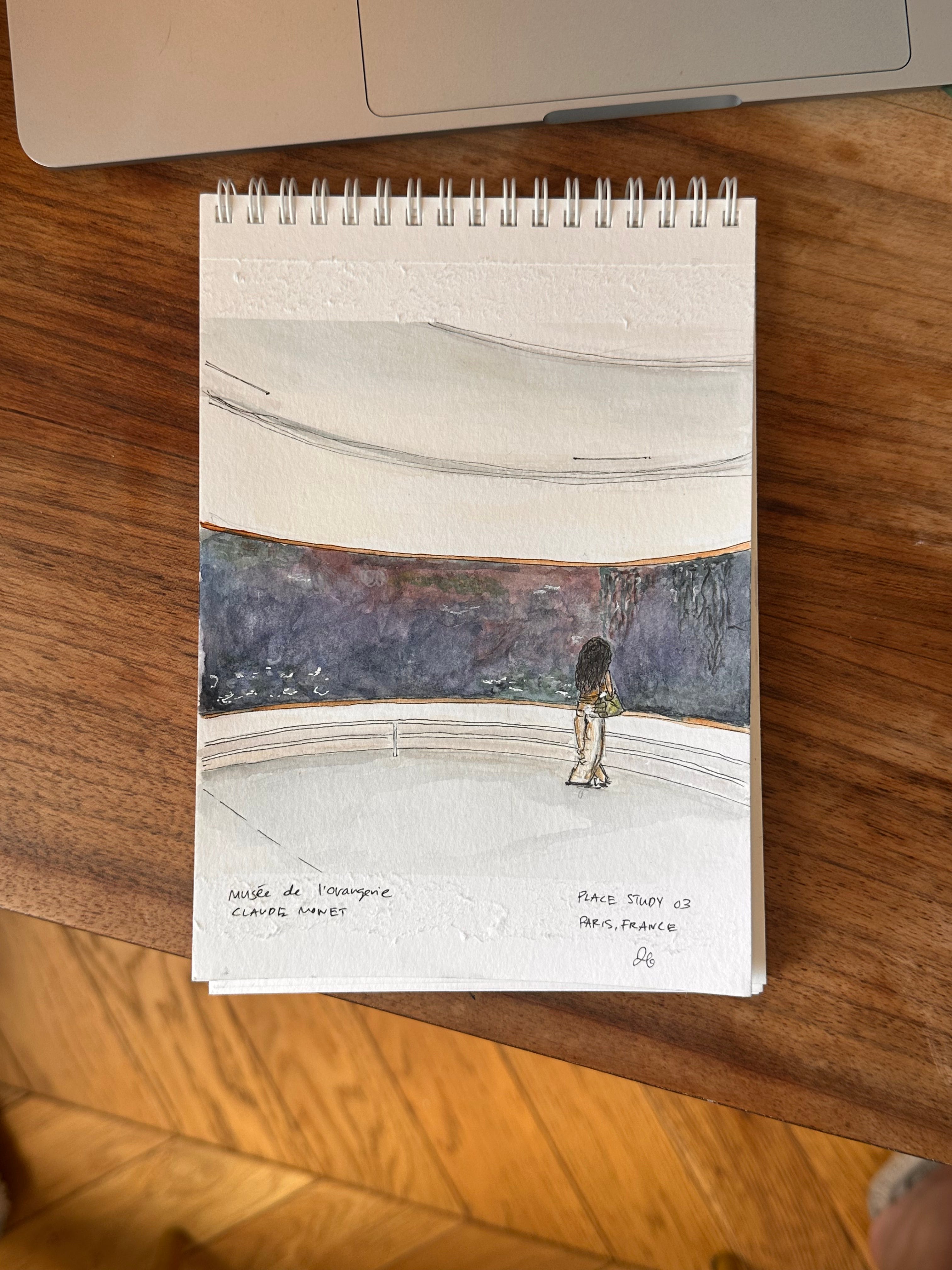
I came to the Musée de l’Orangerie expecting to study Monet.
I left thinking just as much about the rooms around him.
The paintings are extraordinary on their own, but the architecture changes how you encounter them. The oval walls remove a traditional beginning and end. The scale brings the landscape into your peripheral vision. The skylight gives the work natural illumination without introducing another view.
Everything is designed around one experience: looking.
And perhaps that’s what I’m taking from this place study.
Whether I’m designing a digital product, a room, or making something on paper, not every element needs to announce itself.
Sometimes the most thoughtful design is the part you barely notice. It simply creates the conditions for something else to be felt.
See you in the next note,
Janice
Continue reading
No posts
Comments
Nothing yet. Say the first thing.
Sign in to join the conversation.