

Feed Them to the Crows #1 is out in the world. I’ve received a few pictures of people with their books and they definitely brought a smile to my face. There’s excitement around the comic and we’re soldiering on with the next chapter.
But first, Clean Up Crew #1. I want to take a few minutes to talk about the design for this book. I love the artwork from Samir and the colors from Colin. They work together really well and they created the overall look of the comic. I needed to tie everything together and that’s where Darren Vogt came in.
I had the pleasure of working with Darren on “Personal Pan” one of the stories in Slice(s) of Life and it was an absolute joy. He’s such a professional and caring artist. This short remains one of my favorites that I’ve ever made. Since then, Darren and I have been searching for something else to work on. We’ve been bouncing ideas back and forth and we will find one that hits soon. In the meantime, knowing that Darren is an incredibly talented designer, I asked him to help with putting Clean Up Crew together and some back matter pages as well as a very important element: The Logo.
I talked to him about the idea, shared the script, and showed him the completed artwork and Darren came back with a few ideas that incorporated those initial thoughts and made them a million times better. What’s even more exciting is that he provided three separate versions to use depending on the needs.
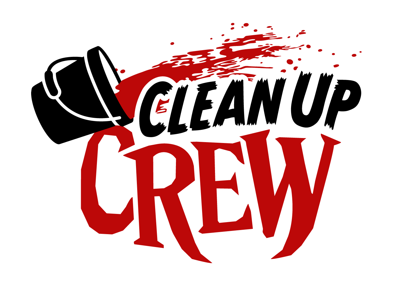
I wanted to incorporate the janitorial aspect of some of the main characters of Clean Up Crew while also highlighting the vampire and horror elements. This first one is a perfect example of that, with the longer tails for the R and W in “Crew” to bring in the vampire fang motif. The bucket of blood is a brilliant touch.
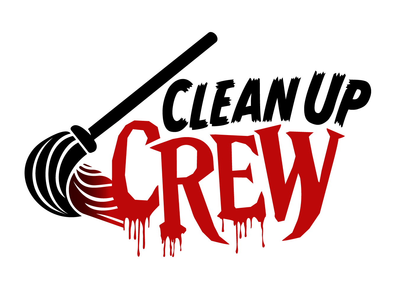
Similar setup with this one, making the word “Crew” bloody and bringing in the mop to help clean it up.
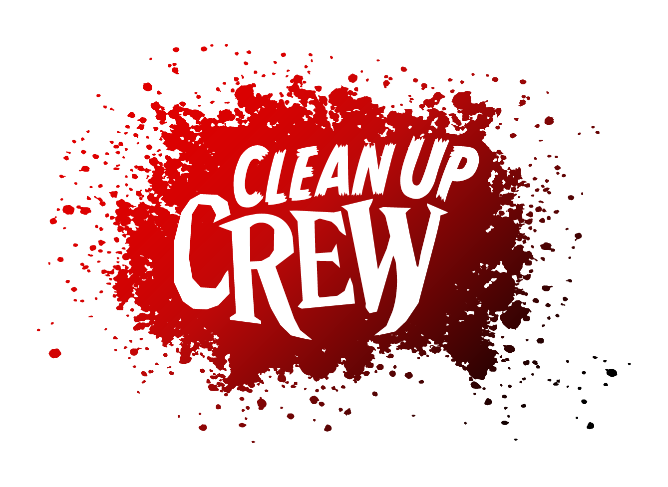
Finally, we’ve got a traditional blood splatter. It’s certainly a mess that would need cleaning up!
Darren provided alternate colors for these too, so we’ve got them in red and black. These offer a lot of flexibility in how we can put them on the covers. I get a big grin on my face every time I look at these. I like them so much that I want to try something I haven’t done before on Kickstarter, which is a sketch cover. I was hesitant about this at first because this is the first issue of a new series and it’s not an established creator or brand. It’s not like I’m launching a new Spider-Man or Batman book. Who would sketch on it?
Since we have multiple versions, we could do a different one for each issue of the series. So, if we move forward with a sketch cover for Clean Up Crew #1, which logo should we use for it? Vote in the poll below!
To pick up the sketch cover (and/or any of the other covers soon to be revealed), be sure to sign up to be notified when the Kickstarter campaign launches. You can do so by clicking the button below.

I’ve been on a manga kick lately, catching up on a few series. I just plowed through the second and final volume of Oldboy by Garon Tsuchiya and Nobuaki Minegishi. These new deluxe editions from Dark Horse Comics are beautiful.
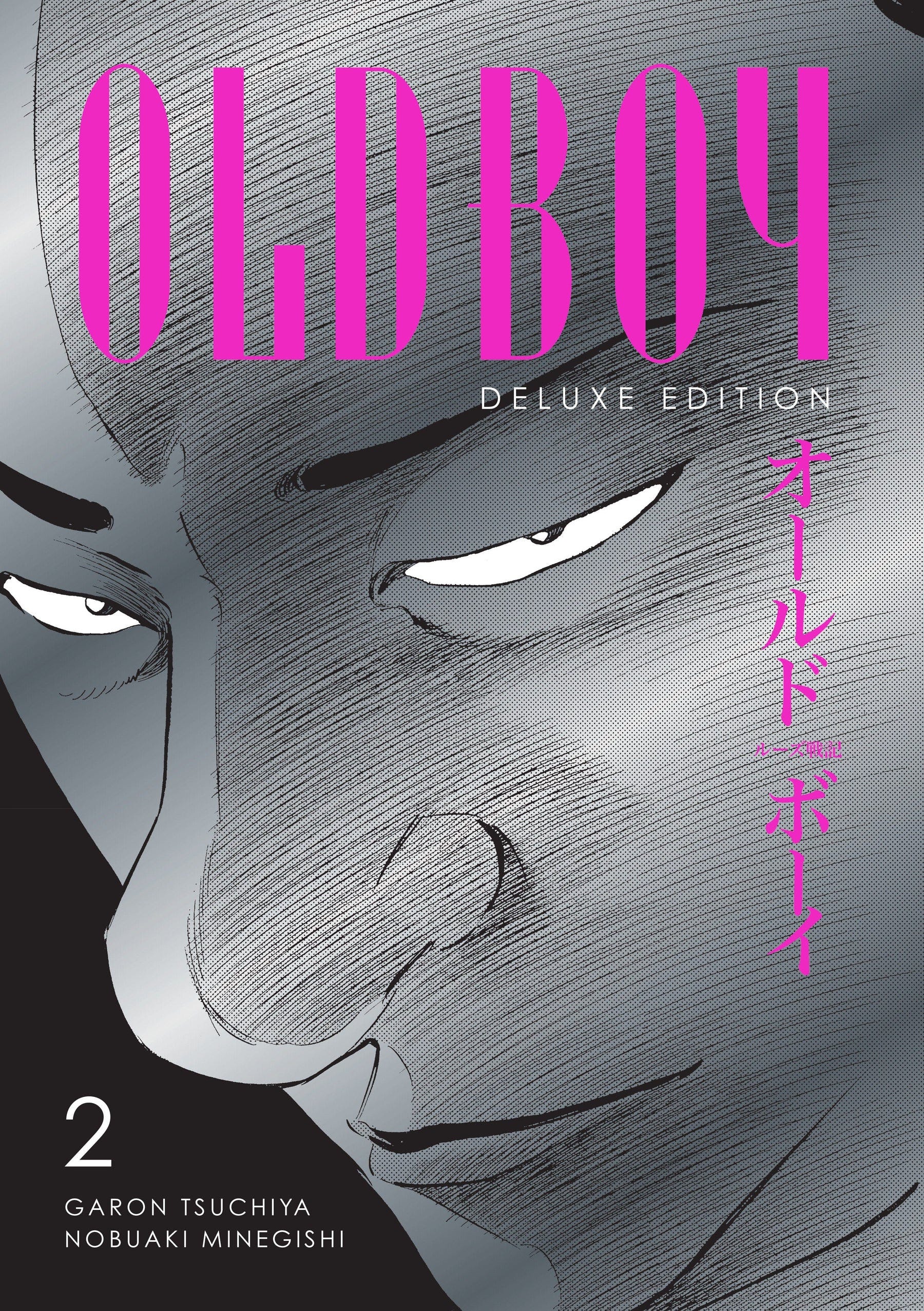
Danny Lore had shared on BlueSky how the creators use silent panels very effectively. I can confirm that 100%. There are so many and you could breeze past them, causing them to lose their impact, however if you take the time to soak them in, you’ll notice the tension rising steadily. Something as simple as a quick glance can send shivers up your spine.
I will admit that I can’t remember much from the film adaptation so I went into this pretty blind. The story follows a man named Goto who is released from a very private prison after ten years. He has no idea why he was stuck there or who put him there. Over the course of the series, he learns that someone named Alias Dojima hates him so much that he paid millions of dollars to keep him imprisoned for all that time. The problem is Goto has no idea who this guy is or what he did to piss him off.
So much of Oldboy is spent with Goto trying to figure this out. The tension builds so much that by the end, I was dying to find out what this big event was that would have set things down this path. While the build up was incredible, the big reveal was a letdown. It’s like a roller coaster that goes up and up and up for ages and when you finally go down the big drop, you go a few feet and glide back into the station.
In hindsight, I don’t know that anything would have been satisfactory. It’s the same case for TV shows that build up such a great journey, but can’t stick the landing. Think Lost or Game of Thrones. I didn’t dislike the book. I loved the journey. I just wanted maybe 2-3 more chapters to give me a bit more.
One quick aside, my buddy James Powell recently shared an excerpt from his upcoming book, Self-Editing for Comic Book Writers about the common mistake writers make by making things too easy for their protagonist.
I cannot think of a better example of the opposite of that than Oldboy. Seriously, every time I thought Goto was getting a leg up on Alias Dojima, he’d get slapped down. Absolutely nothing is easy for this guy.
I backed James’ Kickstarter campaign right away. I got an early look at the book and I feel like it was written specifically for me. I’m looking forward to getting a physical copy of it and referencing it regularly as I write. Click here to back the campaign today!
Thanks for reading James Ferg Comics! This post is public so feel free to share it.
No posts
Comments
Nothing yet. Say the first thing.
Sign in to join the conversation.