
Here we go again. Another year, another ‘hottest ever’ annual climate report from the Net Zero captured bods at the Met Office. Can’t we get Matthew Wielicki to write these reports from now on? The Trump administration just put him in charge of doing similar reports in the US. I’m sure he’ll do a much better, far more sober and balanced job in the US and certainly over here, given the opportunity. How about it Burnham? Fire the Met Office and put Dr. Wielicki in charge of preparing our annual state of the UK climate reports?

Dr. Matthew M. Wielicki@MatthewWielicki
“For too long, the USGCRP has been used as a vehicle for political agendas instead of sound science,” a White House spokesperson said in a statement. “We look forward to restoring the USGCRP and ensuring it fulfills its legal mandate.”
politico.com
The administration has a new climate change office. It’s headed by a climate critic.

1:19 PM · Jul 9, 2026 · 18.8K Views
17 Replies · 21 Reposts · 117 Likes
Because quite frankly I’m sick of reading nonsense like this from the Met Office:
This report provides a summary of the state of the UK’s climate in 2025. It is one of a series of annual reports published in the International Journal of Climatology (IJC) since 2018, with the series as a whole starting with a summary of 2014. It presents the latest assessment of UK climate trends, variations and extremes based on the most up to date observations. These observations represent ‘ground truth’, telling us what has already happened to our climate. As we enter the second quarter of the 21st Century, this report is an opportunity to take stock of the observational evidence of climate change in the UK.
The majority of observations presented are from the UK’s network of weather stations, managed by both the Met Office and a number of key partners and cooperating volunteers. They conform to current best-practice observational standards as defined by the World Meteorological Organization (WMO). They also pass through a range of quality assurance procedures at the Met Office before application for climate monitoring.
‘Ground truth.’ ‘Current best-practice observational standards.’ LOL. Ray Sanders, who has exposed the Met Office’s temperature measuring shenanigans and the risible quality of their national monitoring network, might have something to say about that!
The UK’s climate has warmed continuously from the 1980s onward at a rate of approximately 0.25°C per decade (1°C in 40 years), with the most recent decade 2016–2025 1.33°C warmer than 1961–1990. The last 4 years have all been within the top five warmest in the UK series—a statistic that would be virtually impossible without climate change, and all top 10 warmest years have occurred in the 21st Century so far (Figure 1). Human influence, particularly from greenhouse gas emissions, has been the dominant driver of this warming (Amos et al. 2026).
Amos et al is the usual ‘detection and attribution’ analysis applied to observed warming to supposedly assess how much is due to natural internal variability and external forcings and how much is due to anthropogenic forcings, chiefly greenhouse gas emissions. As usual, it fails miserably to model the magnitude and character of natural variability because it completely ignores the very significant structural uncertainties in simulating natural variability over the historic period.
By comparing the decadal trend to the models’ estimation of natural variability, we can assess whether the observed warming is consistent with natural fluctuations alone or whether external forcings are required to explain the changes. The natural variability estimate was derived using the following models: ACCESS-ESM1-5, CanESM5, CESM2, CNRM- CM6-1,and IPSL- CM6A-LR. For each model, the ensemble mean for each year under a particular forcing scenario was subtracted from the corresponding ensemble members to remove the forced signal, leaving only internal variability.
But they only do this for the UK time series dating back to 1885, even though the authors make a big deal about the long running high quality Central England time series, which dates back to 1659.
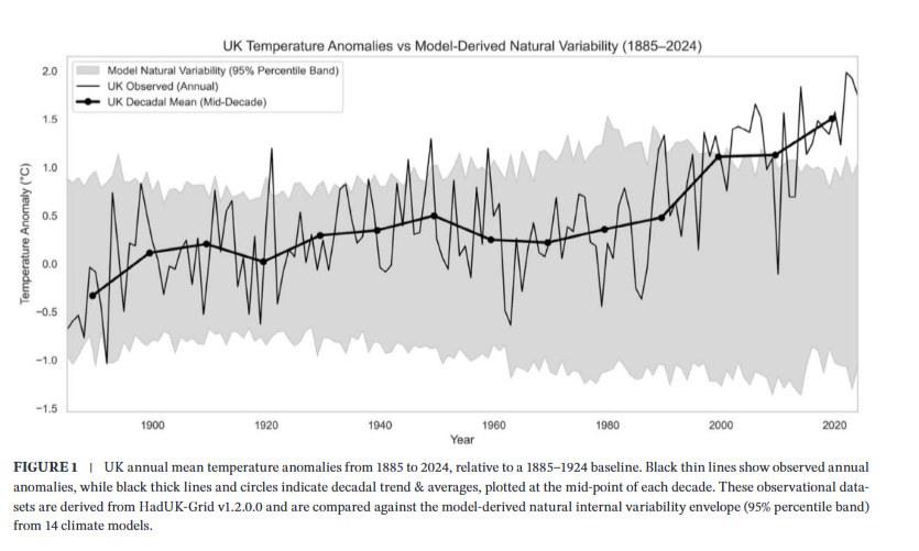
It’s strange how the uncertainty in modelled natural variability is least in the 1920s and greatest from 1980 onwards, when natural variability as simulated by the models starts to have a cooling influence, allegedly, just as the UK starts to warm rapidly. Hence observations and models diverge rapidly and it is assumed that this divergence can be explained by the influence of human activity. Very convenient. However the longer running graph of CET shows clearly that the post 1980s warming is significant, but not unprecedented and indeed the warming which occurred from about 1695 to 1730 (a very similar time period to the modern warming) was both faster and of greater magnitude than the late 20th/early 21st century warming. That wasn’t your car, or your gas boiler or cows farting, it was natural variability, variability which the authors of Amos et al, 2026 fail to explain or account for when they model natural variability from 1885 onwards.
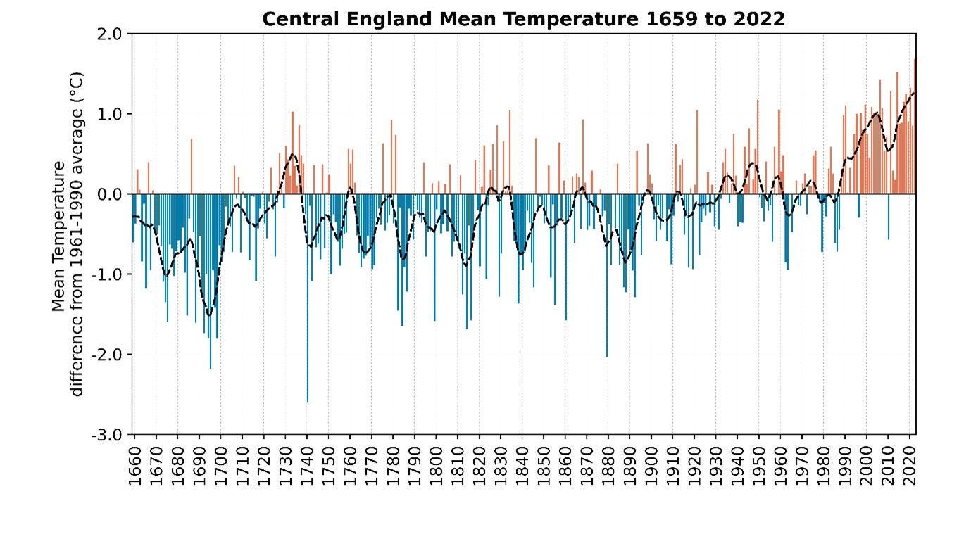
The Met Office claim that the CET supports their observations and conclusions from a ‘multi-century perspective’; it doesn’t.
The Central England Temperature (CET) findings support those for the UK with a multi-century perspective. The CET series shows that recent warmth has far exceeded any observed temperatures in at least 300 years. Recent changes in the frequency of UK daily maximum and minimum temperature extremes are supported by similar changes in the 250-year daily CET series.
So when the Met Office say that “human influence, particularly from greenhouse gas emissions, has been the dominant driver of this warming,” and claim that it is “unprecedented” they’re not telling you the truth, because good science, real science, and real data do not unequivocally support those statements. It’s propaganda essentially.
Extreme Weather Propaganda
The Met have decided to exploit the rich vein of ‘hottest ever’ temperatures coming from their risible weather station network, especially those extreme temperatures being recorded in an increasingly urbanised London and the South East.
Arguably, the way we experience the main effects of climate change in the UK is through the extremes; changes in averages alone (e.g., annual mean temperature or rainfall) fail to provide a sufficiently complete picture of the changing character of the UK’s climate. This report includes new analyses of trends in temperature and rainfall, providing a fresh perspective, particularly focussing on these extremes. For rainfall, any analysis is particularly challenging given the complexity of this variable due to large spatial and temporal variability.
The number of days over 30°C and nights over 18°C has more than quadrupled for Greater London for the most recent decade, 2016–2025, compared to 1961–1990.
The average hottest day of the year has warmed by over 4.5°C in a swathe from Kent to Lincolnshire for the most recent decade, 2016–2025, compared to1961–1990.
Figure 4 shows UK average daily Tmax and Tmin through 2025. A key feature was the persistent warmth through the year, with far more warm than cold days for the time of year—this is typical of recent years in the UK’s climate record. Daily values approached the high temperature extremes (red line) on several occasions and, in particular, daily Tmax values were at least 5°C above the daily 1991–2020 average (one grid line spacing) for 29 days between March and August—representing almost an entire month’s-worth—with very few days of below average Tmax throughout this period.
The acceleration in maximum daytime temperatures, even allowing for the risible quality of some of the weather stations recording the data, is probably real, over western Europe as a whole, and is not simulated by the all singing all dancing climate models, as I explained in my last post. But that doesn’t stop the Met Office and other climate change grifters from claiming it was ‘climate change wot dunnit’!
What Is Causing The Acceleration In Maximum Daytime Temperature?
The Met presents this graphic:
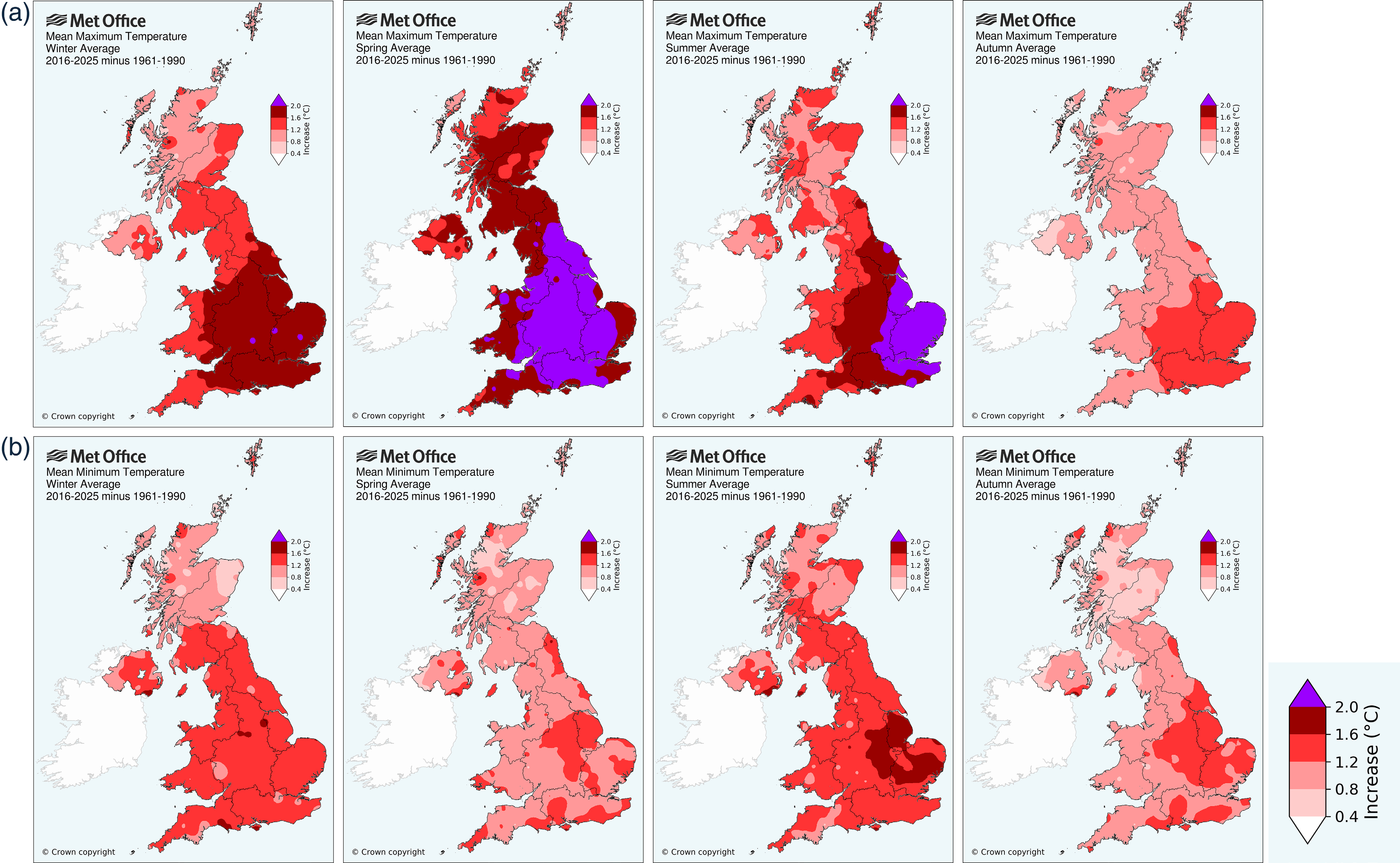
The most pronounced accelerations in mean maximum daytime temperature (purple) have occurred in spring and summer. But the regional patterns are very different. In spring, it’s a large area encompassing central and southern England. In summer, the acceleration covers an area of eastern England from the Humber to Kent and it drops off noticeably the further west you go. What does this suggest? My educated guess is that we are seeing the influence of continental air in summers increasingly dominated by ‘Spanish plume’ events. That is down to changes in atmospheric circulation, particularly during summer, which I highlighted in my previous post, not man-made greenhouse gases:
So what about spring?
It’s The Sun Stupid!
The Met Office report says:
The UK’s climate has become sunnier from the 1980s, primarily driven by increases in winter and spring sunshine.
2025 was the sunniest year in the UK series from 1910, with 1645 sunshine hours, 117% of the 1991–2020 average.
Spring 2025 was the sunniest spring in the UK series from 1910 and also sunnier than all but three summers: 1976,1995 and 1911.
The most recent decade 2016–2025 has been 4% sunnier than 1991–2020 and 10% sunnier than 1961–1990.
For the most recent decade 2016–2025, springs for England have been 9% sunnier than 1991–2020 and 21% sunnier than 1961–1990, the latter equivalent to almost 1 h per day.
Duh! I’m going to fire up muh dwindling brain cells here and guess that the reason maximum spring daytime temperatures in a large part of central and southern England have increased so remarkably in recent years is because there is a lot more sunshine! I don’t know if you’ve noticed but when you venture out in strong spring sunshine, it feels a lot warmer than it does on dull, overcast spring days - particularly noticeable in late April and May when the sun is climbing higher and higher in the sky, as it approaches the summer solstice on June 21st. Let’s test my revolutionary hypothesis by looking at the data for sunshine hours and mean maximum daytime temperature:
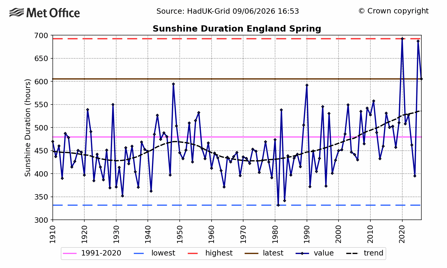
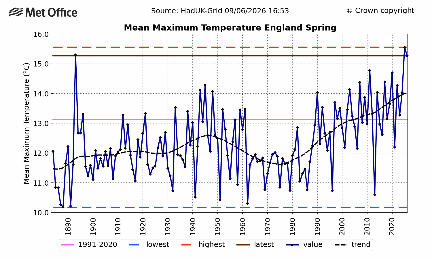
Gee whizz, looks like I might be right! The curves almost exactly mirror one another from 1910 onwards. The acceleration in both metrics from 1980 onwards is particularly noticeable. The Met Office attributes the increasing ‘extreme weather’ in spring to that nasty Industrial Revolution thingy (which us Brits invented) which burnt huge quantities of coal, oil and latterly, gas. I say it was the flipping sun putting his hat on!
Spread over the whole year, we can see that the mean maximum daytime temperature anomalies are greatest in spring and least in autumn and that the peak month is April:
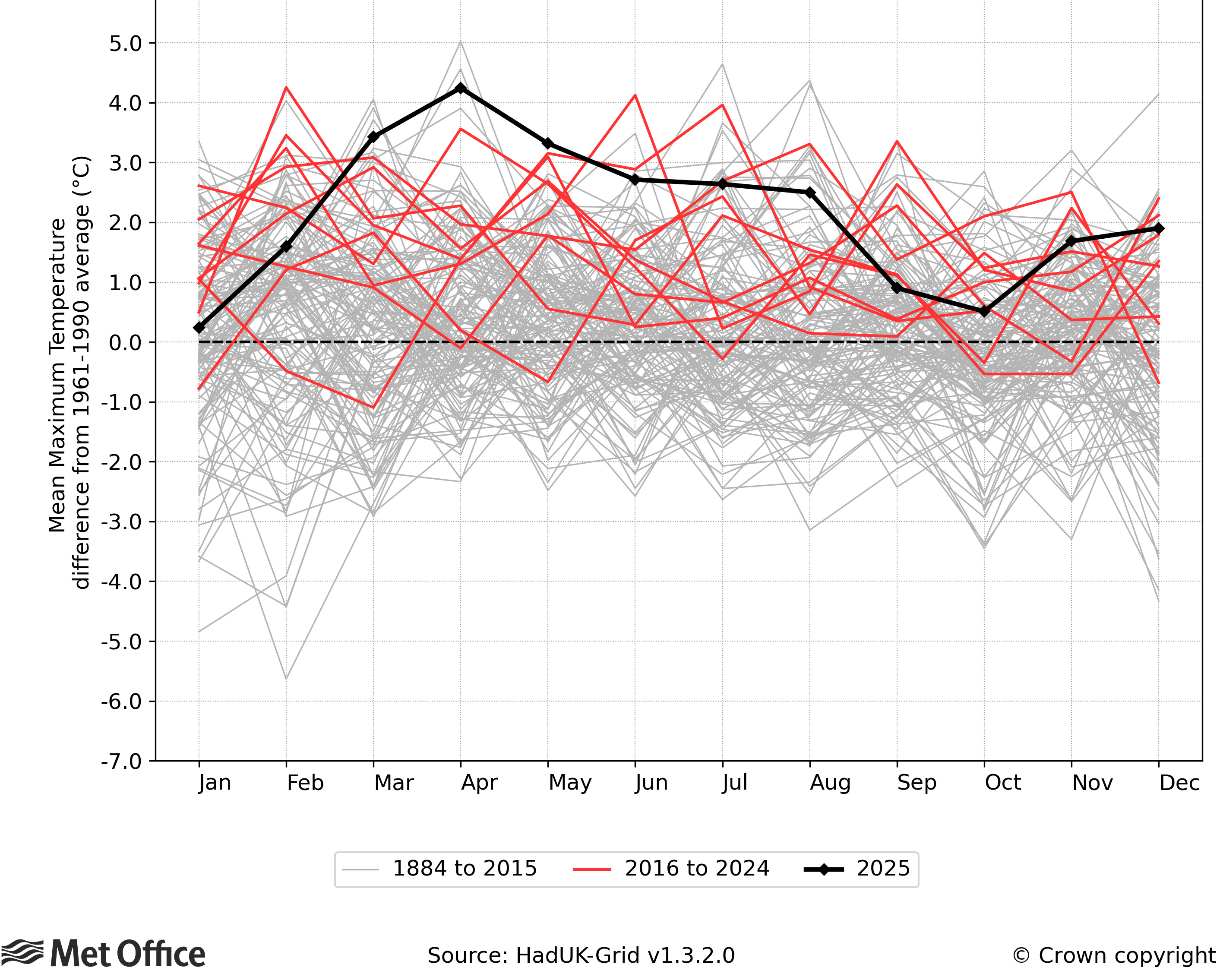
I can’t think why those nasty greenhouse gases would choose to superheat English air in April but take a break in September and October. Can you?
Central England Data - Have The Met Office Deliberately Massaged Their Own Graph?
Here’s the graph as presented in the report:

JaimeJessop@Janine511484078
Nobbled CET?

8:41 AM · Jul 16, 2026 · 3 Views
This is the graph as depicted on the Met Office’s own website:
Spot the difference? Somehow, the warming from 1695 to 1730 as presented in the latest Met Office state of the climate report looks smaller than the post 1980s warming, whereas in reality, it is much larger, according to the Met Office’s dedicated CET web page. Is that fraud?
In summary, the entire Met Office State of the UK Climate Report 2025 is a heap of data deliberately misrepresented as evidence for man-made global warming, with a particular focus on extremes, notably daytime temperature extremes. It’s an exercise in propaganda, funded by us taxpayers, to convince us taxpayers and bill payers that the Net Zero agenda is justified in order to avoid climate meltdown. In short, it’s total bollocks, bordering on scientific fraud.
No posts
Comments
Nothing yet. Say the first thing.
Sign in to join the conversation.