
About This Series
Taste Decoded is a collection of shorter notes exploring the colors, materials and aesthetics shaping contemporary interiors.
Each note looks at when a trend first emerged, why it resonates now, and the key variations through which it can be interpreted and applied in design.
Faster than my usual Travelling Taste articles, this series is made to be saved, shared, and used as a way to read beyond trend stereotypes.
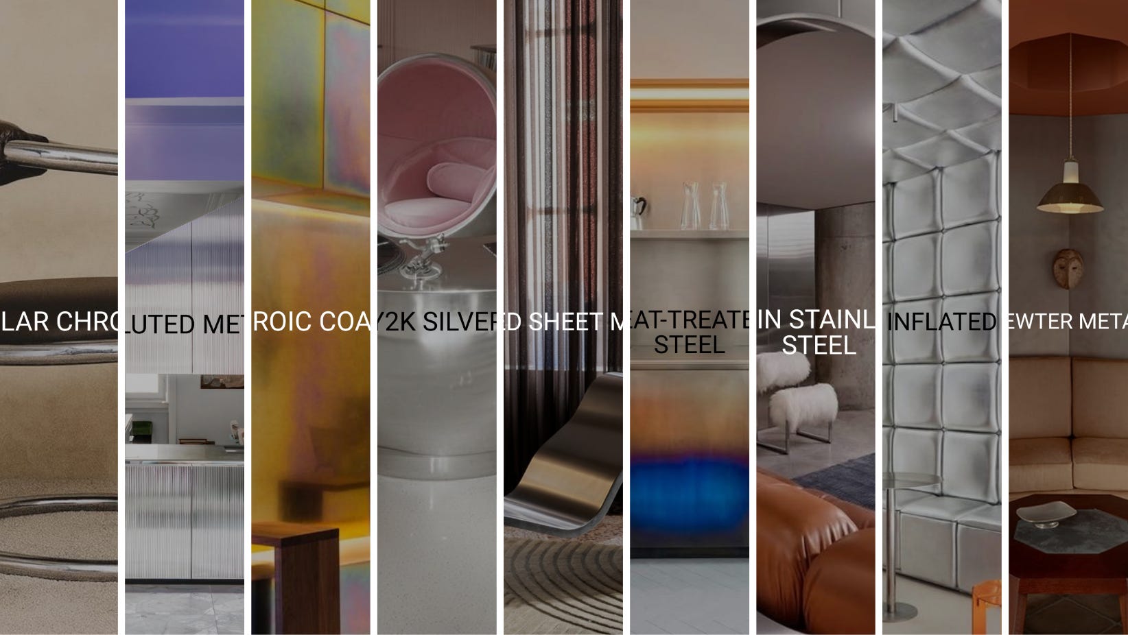
What do we really mean when we say “chrome is back”?
Chrome is technically a finish, not the whole silver-metal family. And this is exactly where the conversation becomes more interesting. Today, this shift is becoming almost mainstream here in Europe, strongly confirmed at the last Milan Design Week.
But the point is not only that metallic surfaces are back, but how they are coming back. Because a material trend is never just about the material itself. It changes meaning through finish, tone, scale, detailing and application.
Silver metal can feel cold and technical, but also nostalgic, atmospheric, glamorous or almost handcrafted. The material family may be the same…the feeling is not. So the real question is not only whether a material is back, but is, how do you want this space, object or material detail to make someone feel?
In this note I am giving you some interesting variations to get inspired for your projects and designs.
Get a strategic roadmap of the signals, colors, materials, spatial concepts and aesthetics emerging from Milano
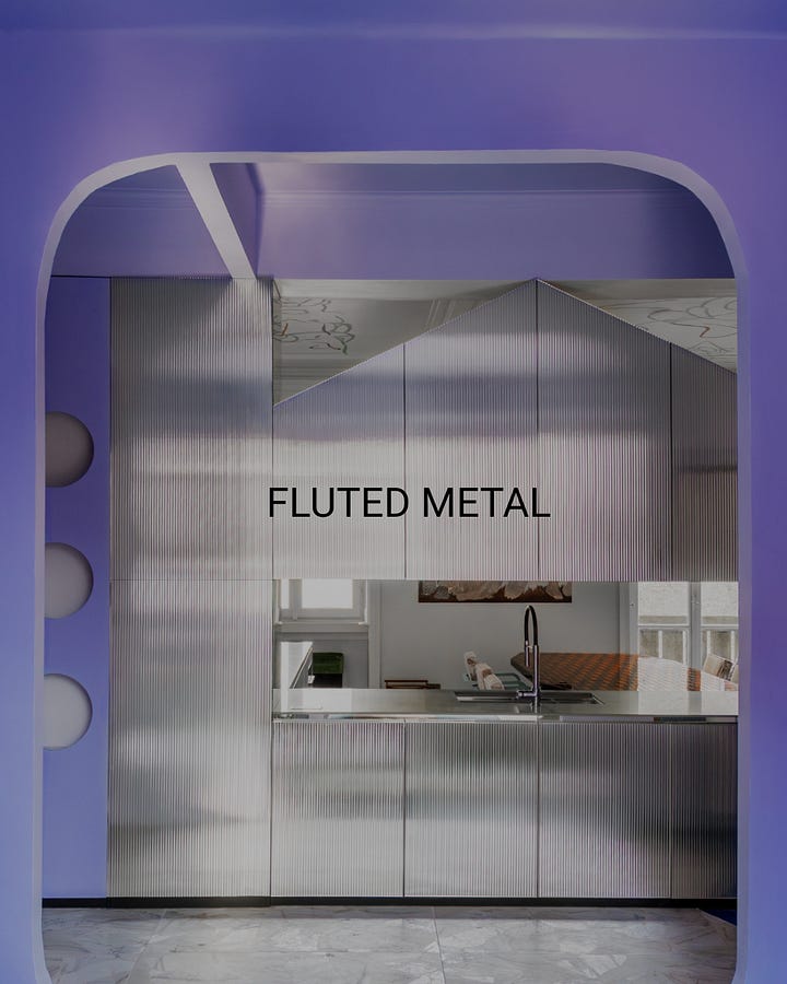
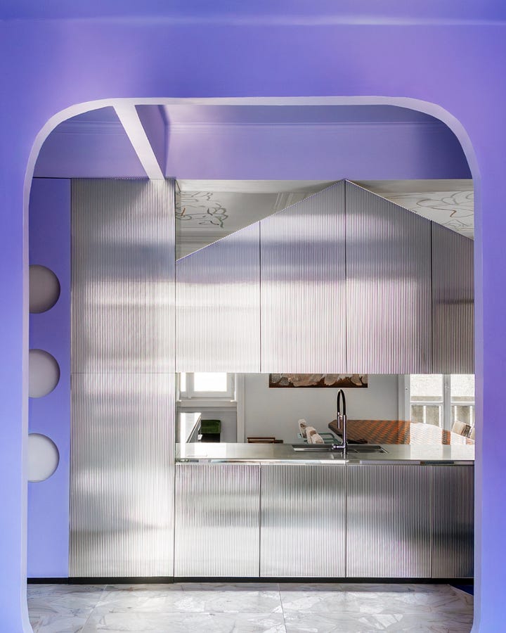
Fluted metal belongs to the meeting point between industrial precision and decorative softness. The ribbed surface breaks the reflection, making metal less mirror-like and more architectural. Instead of one flat, cold plane, it creates rhythm, depth and a blurred movement of light. This is why it works so well in interiors today: it keeps the technical character of stainless steel, but softens it through texture.
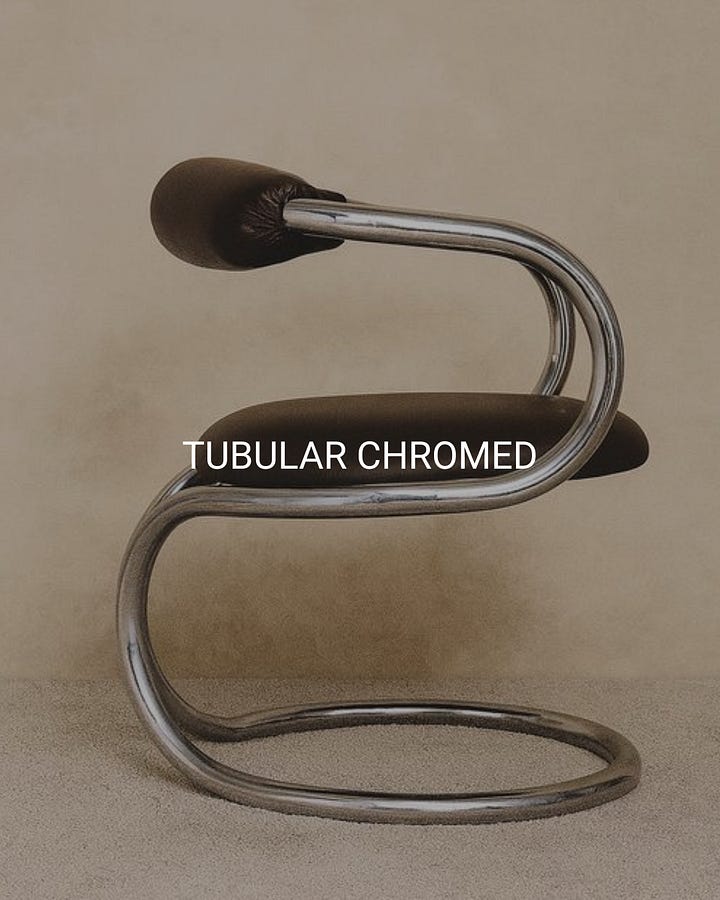
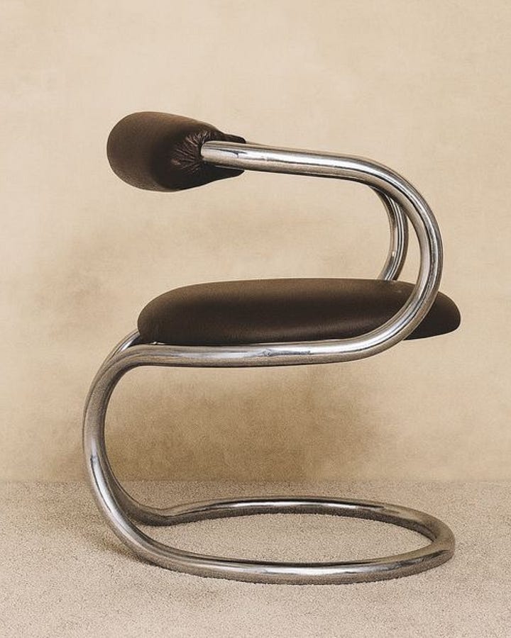
Tubular chrome is one of the most recognizable modernist metal languages. It recalls early 20th-century experiments with bent steel furniture, when metal was used to express lightness, structure and industrial progress. But today it is often read through a more nostalgic lens: somewhere between Bauhaus, 1970s revivals and collectible design. Its strength is the line: continuous, reflective, almost drawn in space.
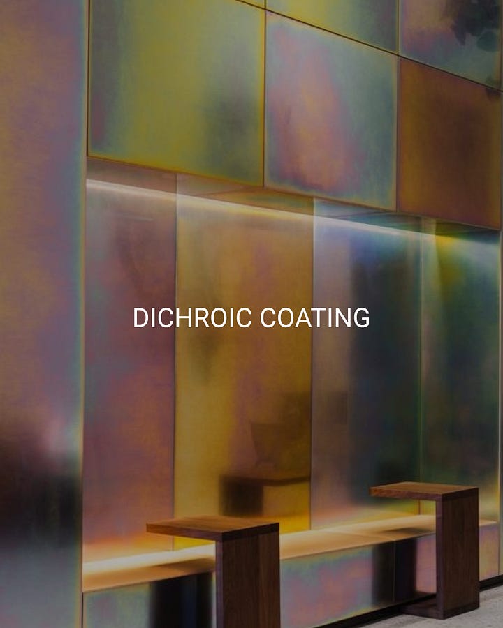
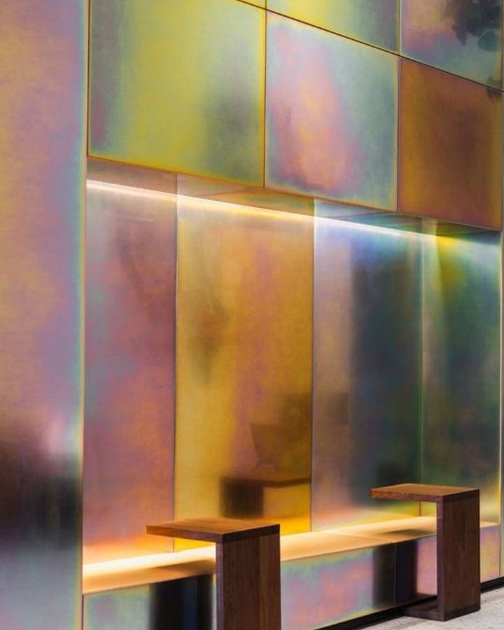
Dichroic coating pushes metal away from solidity and into perception. The surface changes depending on light, angle and movement, creating iridescent shifts that make the material feel almost unstable. It is less about metal as structure and more about metal as atmosphere. This variation connects to optical effects, digital colour, experiential interiors and a more sensory way of using reflective surfaces.
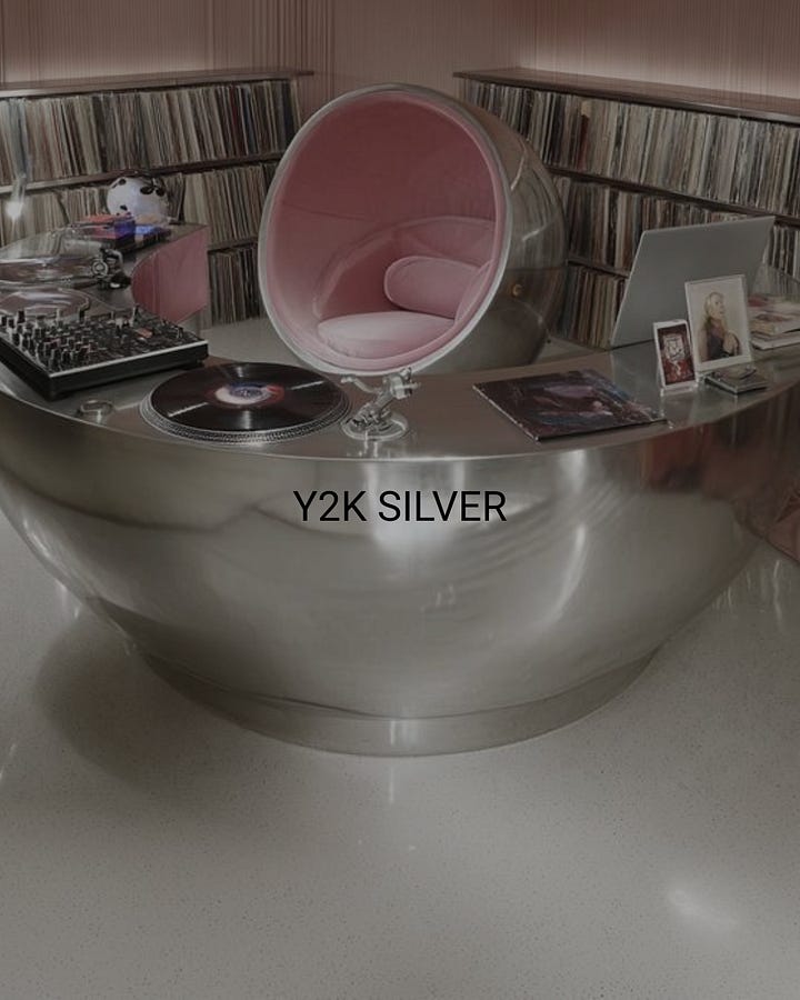
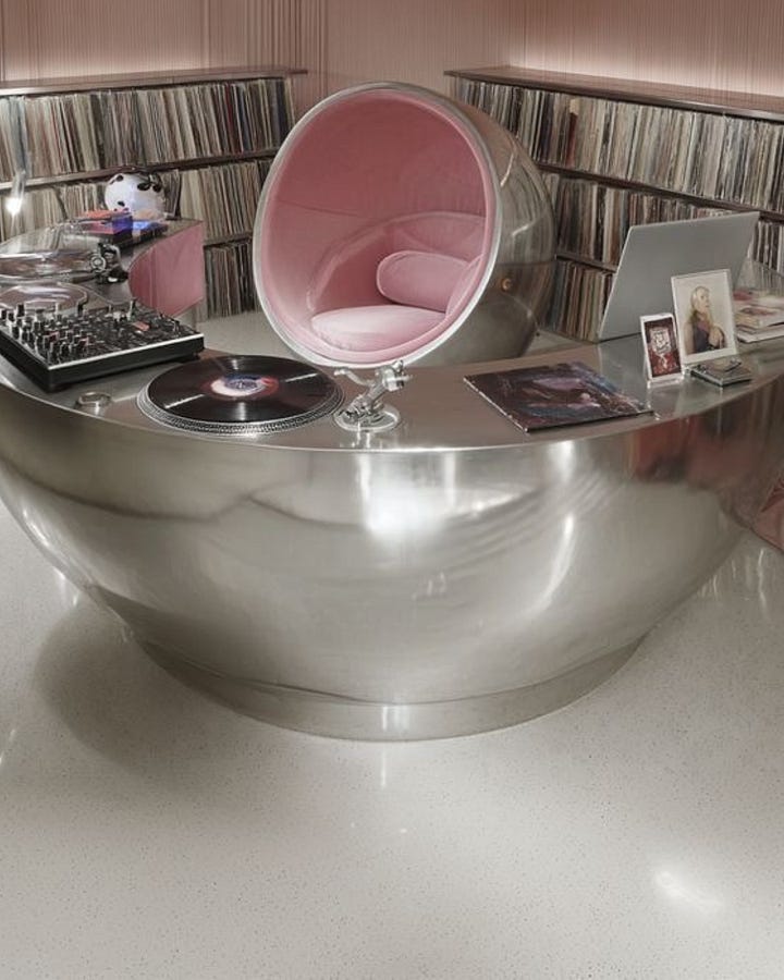
Y2K silver is not only a finish, but an aesthetic memory. It recalls the late 1990s and early 2000s fascination with technology, pop culture, inflatable forms, glossy plastics, futuristic interiors and synthetic glamour. The metal is often smooth, rounded, reflective and slightly artificial. It does not feel industrial in a strict sense; it feels digital, playful, nostalgic and a little hyper-real.
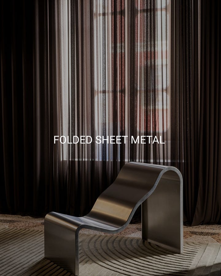
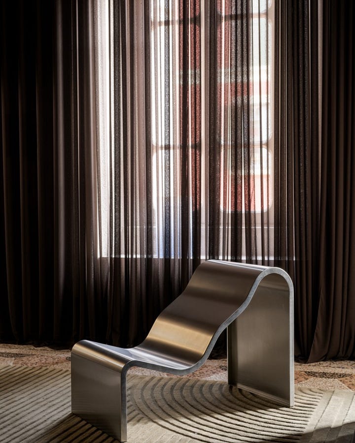
Folded sheet metal is metal treated almost like paper or fabric. Its visual language comes from bending, folding and shaping a flat sheet into a three-dimensional object. The result is minimal, but not neutral: the edges, curves and thickness become the design. It often carries a more sculptural and architectural feeling, where the beauty is not in decoration, but in how the material is manipulated.
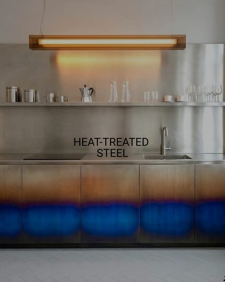
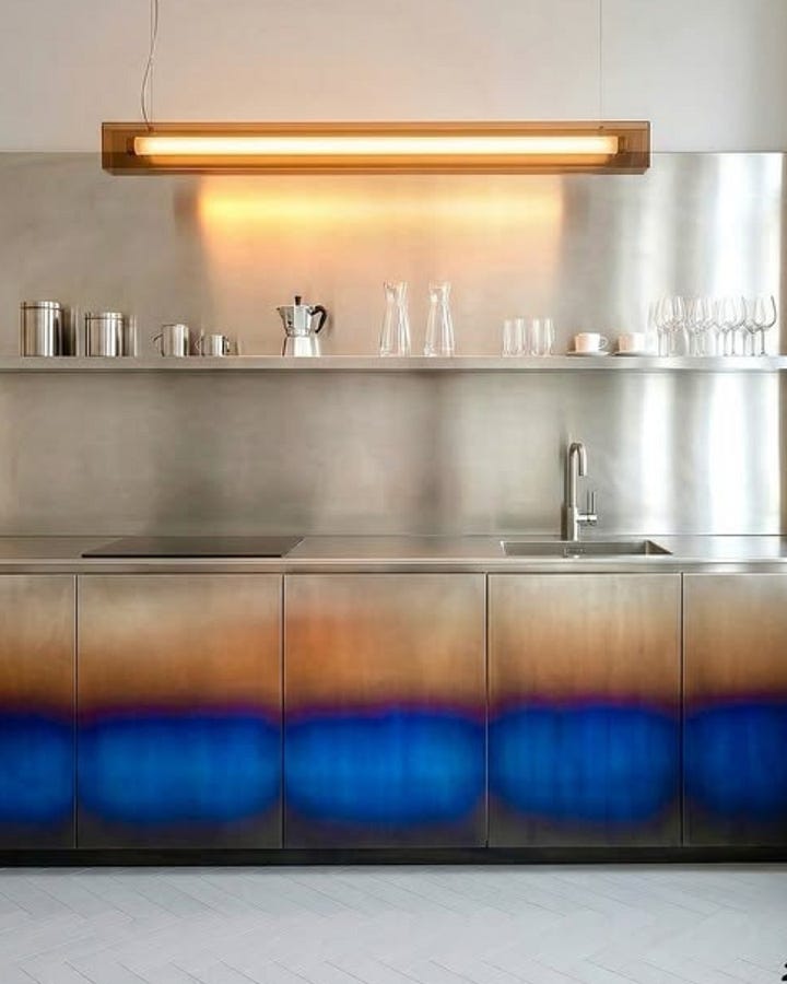
Heat-treated steel reveals metal as a reactive material, not just a neutral surface. Through heat, the steel develops chromatic oxidation effects: amber, bronze, violet, blue or smoky tones. This gives the material a more expressive and almost alchemical quality. It still belongs to the world of industry and fabrication, but the colour variation makes it feel more experimental, emotional and handcrafted.
Thanks for reading Travelling Taste by ITALIANBARK®! This post is public so feel free to share it.
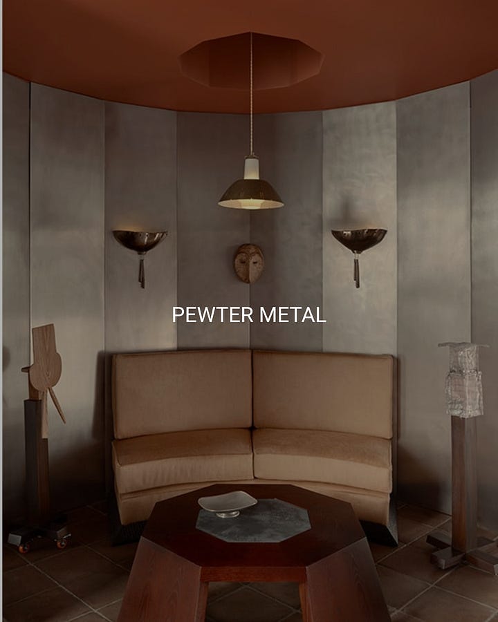
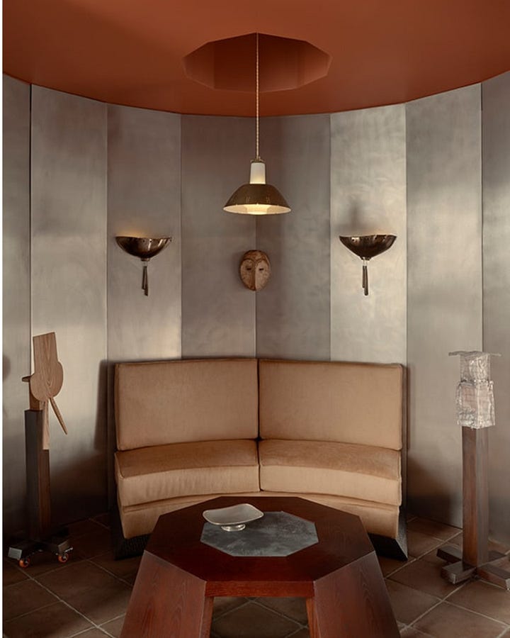
Pewter metal brings silver into a softer, warmer and more historical register. Unlike bright chrome or polished steel, it has a muted, greyed, slightly patinated quality. It feels less technological and more atmospheric, closer to craft, old interiors, decorative panels and aged objects. This is the variation that makes silver metal feel intimate rather than futuristic.
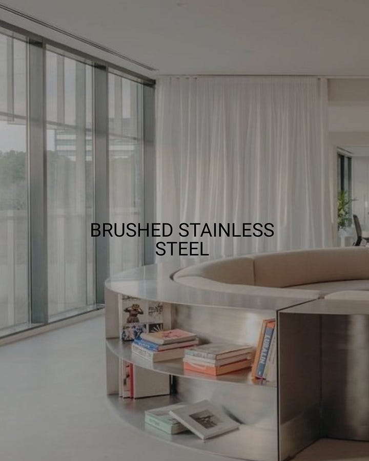
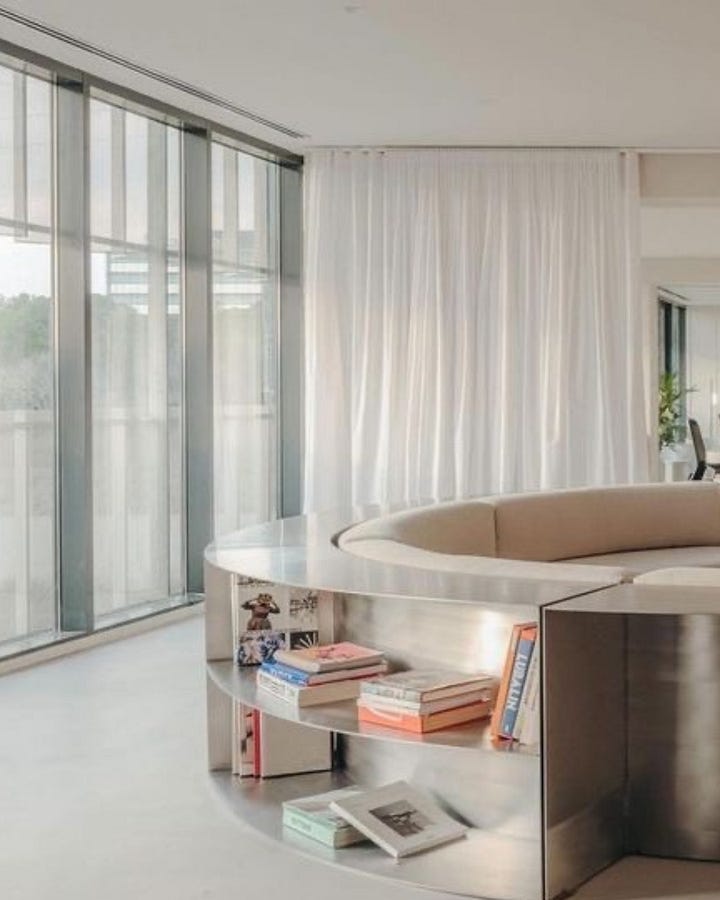
Brushed stainless steel is the functional, architectural side of silver metal. The directional brushing reduces reflectivity and gives the surface a more controlled, professional and durable character. It carries associations with kitchens, laboratories, industrial equipment and high-performance interiors. But when used with softer forms or warmer palettes, it can move from purely technical to quietly sophisticated.
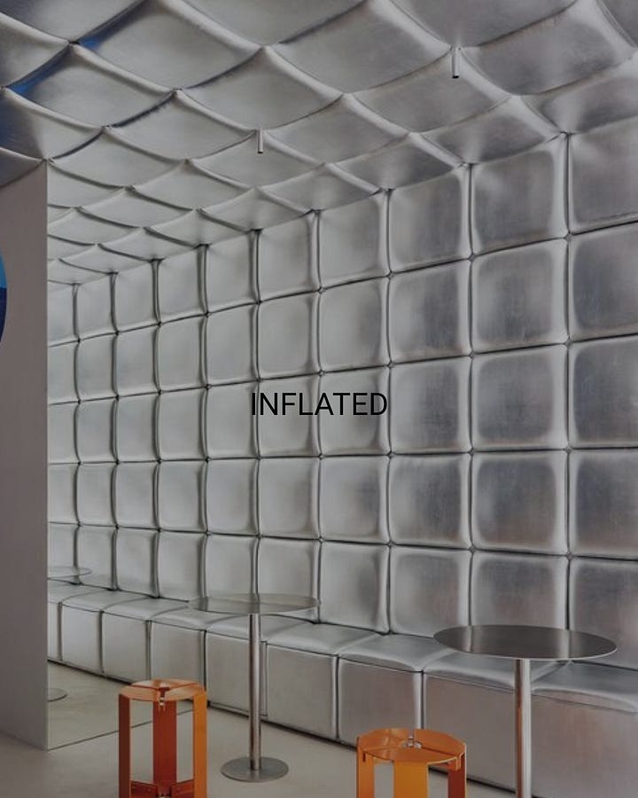
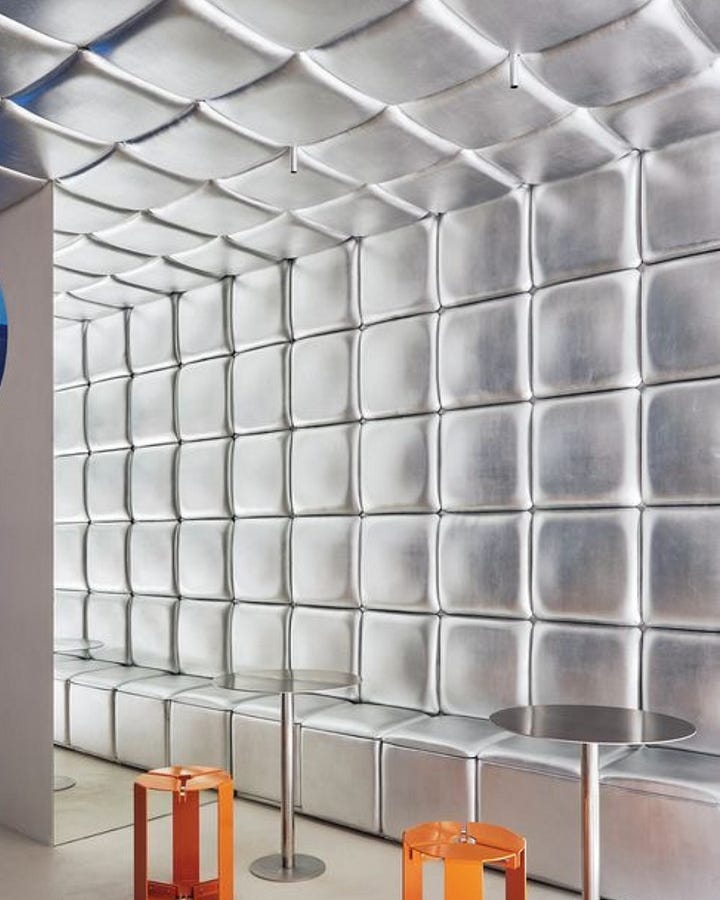
Inflated metal transforms the hard image of metal into something soft, padded and almost surreal. The surface appears swollen, cushioned or pressurized, creating a tension between material expectation and visual effect. It connects to Space Age interiors, synthetic softness, experimental retail and more playful architectural surfaces. The interest is in the contradiction: metal that looks almost like air-filled upholstery.
At TRENDBARK, I started observing the renewed interest in silver metals around three years ago: first through smaller reflective details and small funriture and decor pieces, experimental applications and isolated accents, and then as a much more visible direction across interiors, furniture and material design.
At Milan Design Week 2026, the trend became strongly consolidated. The useful question is therefore no longer whether metallic surfaces are visible again, but which silver-metal language is relevant for a specific project, and why.
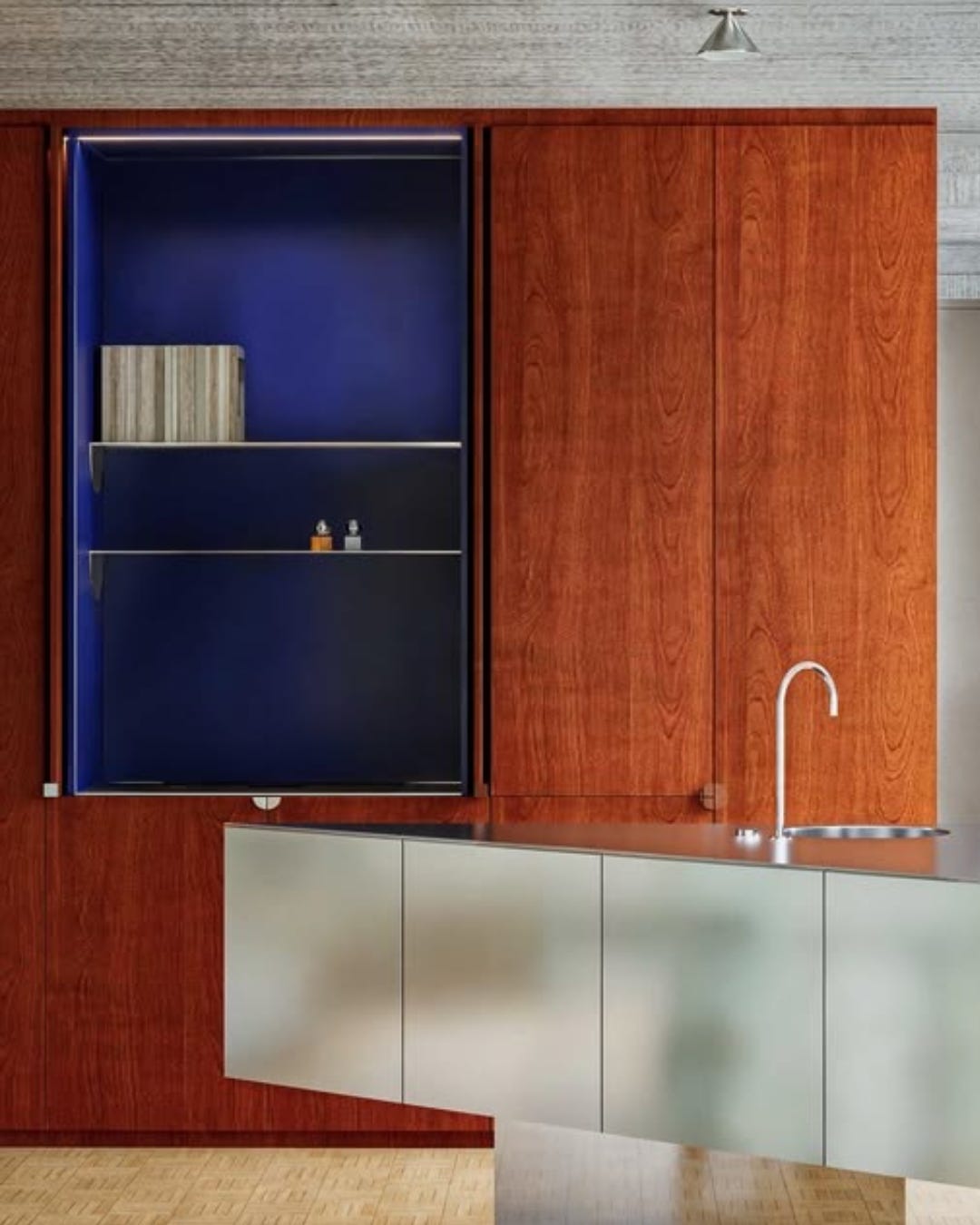
Silver metal is currently often reduced to one generic word: chrome. But chrome plating, polished stainless steel, brushed steel, aluminium, pewter-toned surfaces, iridescent treatments and sculptural metalwork do not communicate the same thing.
This is one of the biggest problems of trends and how they are communicated. To make things easier, they tend to be flattened plus since social emdia and media in general now totally rely on algorythms, catchy and clickable titles need to be easy and simple. So very often things gets oversimplyfied, deleting those complexities that make a trend direction interesting, and flattening also their adoption into projects that looks flat and very much the same. But the problem itself is not the trend, but poor work and communication on them..
With these variations coloumn in my Substack, my aim is to bring a wider knowledge about materials that are also happening to be on trend on a specific time, because at the end what makes things interesting is always how they are applied and adopted.
That’s how taste travels in time and in places…
If you enjoyed this note, this is the kind of lens I bring to all my trend work: reading early signals before they become obvious, understanding why they resonate, and translating them into useful design intelligence.
Inside TRENDBARK Studio, I share my Milan Design Week research, material and colour directions, trend reports, private seminars and practical reflections for designers, studios and brands who want to read beyond the surface.
The goal is to train your eye and mind in understanding what is changing, why it matters, and how it can become relevant in real projects, products and spaces.
You can find more information here:
No posts
Comments
Nothing yet. Say the first thing.
Sign in to join the conversation.