
This article came to me while I was having breakfast.
I came back from my trip to South Korea last November with a suitcase full of Korean snacks and sweets. I even created an Advent calendar out of them and basically forced my husband to eat a different treat every morning. (Poor him, it’s very clear he couldn’t care less, but to make me happy he tries all the absurd things I bring home from trips. He deserves a medal, honestly.)
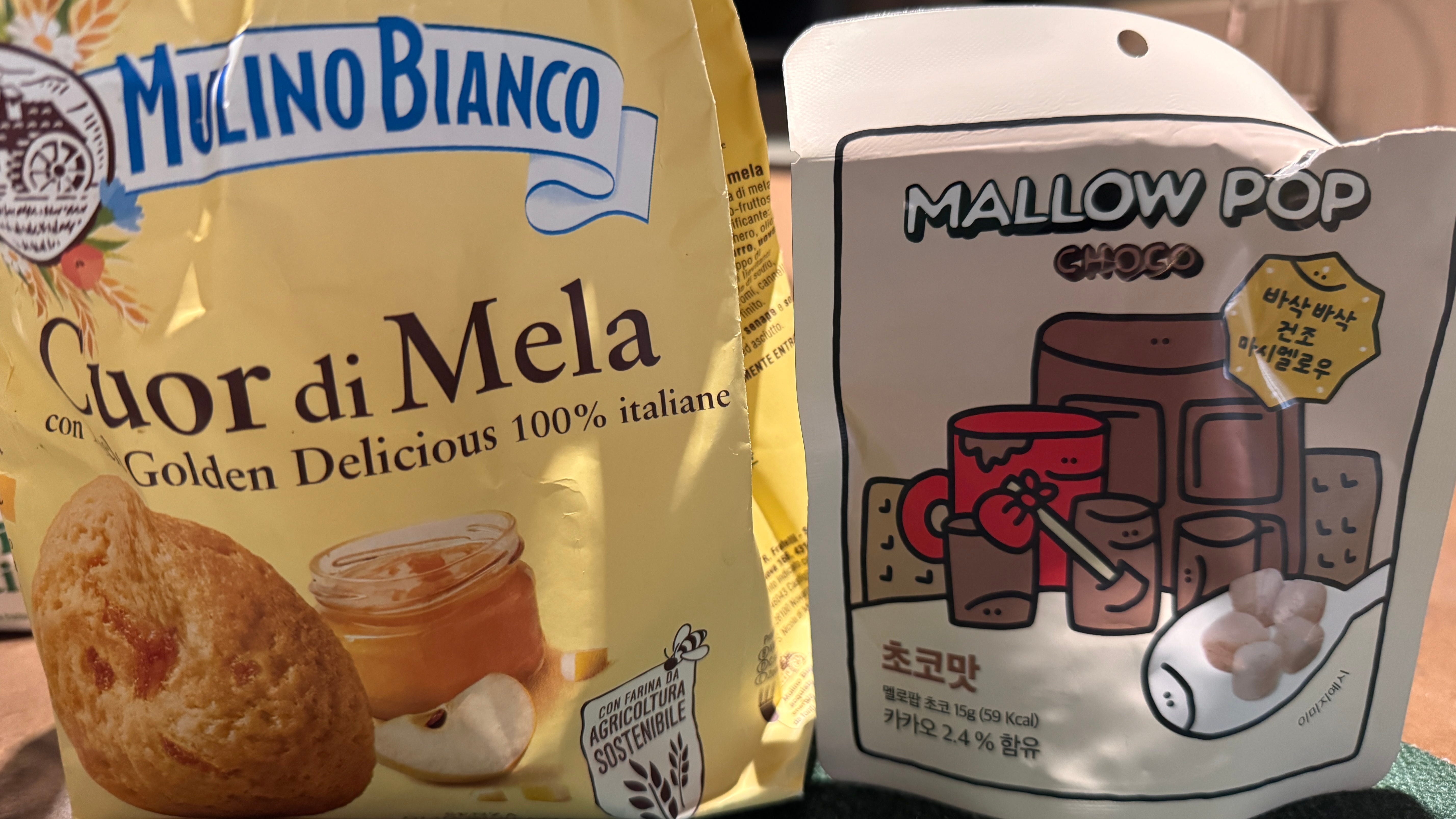
I still have some snacks left, and this morning I found myself at the kitchen table with our Italian biscuits on one side and these Korean sweets meant to be dipped in milk on the other. And I asked myself: why is our packaging always so sad? Why are there almost never little characters, smiley faces, cute illustrations?
The Italian biscuit stared at me seriously, as if apologizing for existing. The Korean snack had a tiny round face that seemed genuinely happy to see me at 7am. And I remembered that this difference is not random, as it might seem…it comes from somewhere deep.
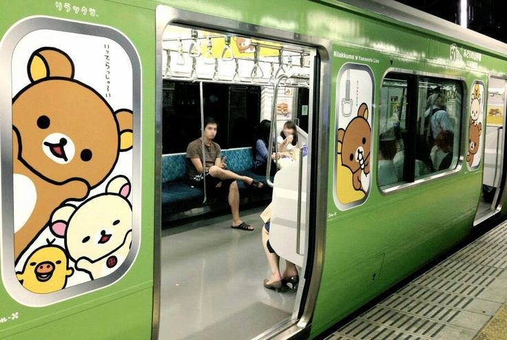
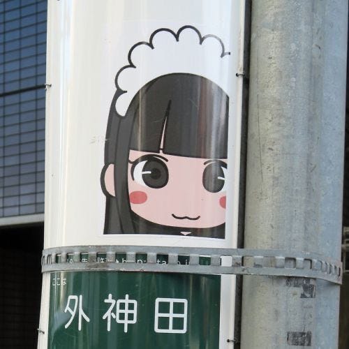
...you will have noticed how faces and little characters are everywhere. And by everywhere I mean not only on things that are supposed to be for kids, like it happens here. They are on packaging, on street signs, on TV, in supermarkets, on the ticket machines at the train station, on the instructions for the hand dryer in public bathrooms: it’s like you’re constantly immersed in something that feels a bit like a cartoon world. Everything looks just a little softer, a little kinder, and there is a word behind all of this, and it’s called Kawaii.
The word kawaii was born in Japan and is often translated quickly as “cute” or “adorable,” but its meaning is much deeper.
From a linguistic perspective, kawaii derives from an older term, kawayushi, which indicated something fragile, vulnerable, something that evokes protection. It wasn’t just an aesthetic quality, but an emotional reaction: something that makes you lower your defenses. Think about how you feel when you see a baby animal, or a round-faced drawing with big eyes. That involuntary softening, that’s exactly where the original energy of kawaii is.
Modern Kawaii was born somewhere between the 1960s and 1970s, initially among Japanese schoolgirls who began writing in rounded handwriting filled with hearts and small drawings. An act that seemed innocent, but that actually represented a soft rebellion against a rigid, hierarchical, adult system. Writing “cute” was a quiet refusal to be serious. A small, personal aesthetic revolution happening one notebook page at a time.
In the 1980s, Kawaii became mainstream thanks to brands like Sanrio (Hello Kitty was created in 1974), and from there it transformed into a true cultural language: not only a visual style, but a way of communicating, behaving, and even designing. (Yes: if you’re a Millennial, you’ll remember how Hello Kitty was a whole moment here in Europe around the early 2000s. I had the pencil case, the wallet… I’m not ashamed ahah)
What’s interesting is that Kawaii didn’t stay contained to children’s products. It moved into architecture, transportation design, food packaging, public institutions, and eventually fashion. By the time the internet arrived, it was already a global visual language: it just hadn’t been named yet by most of the world.
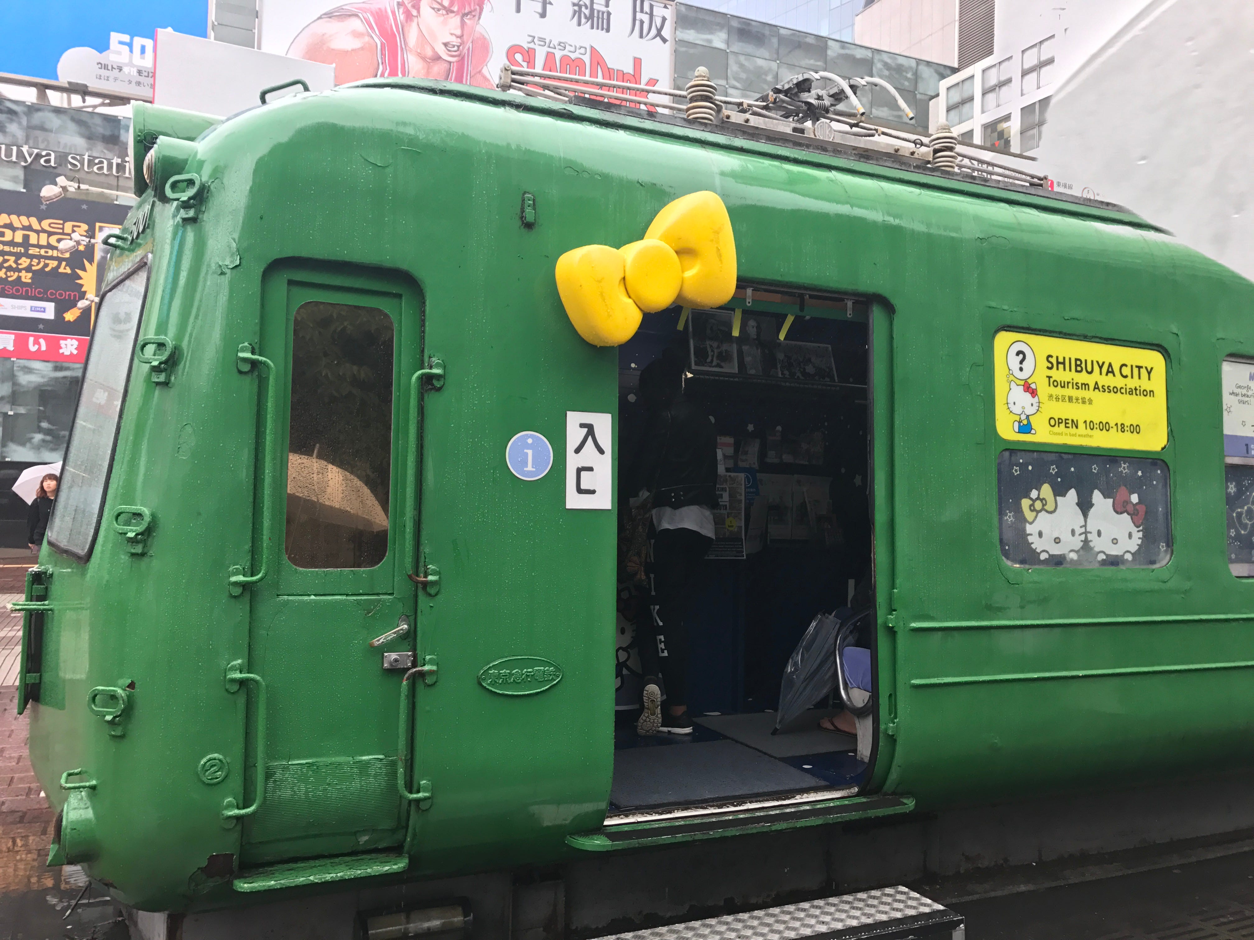
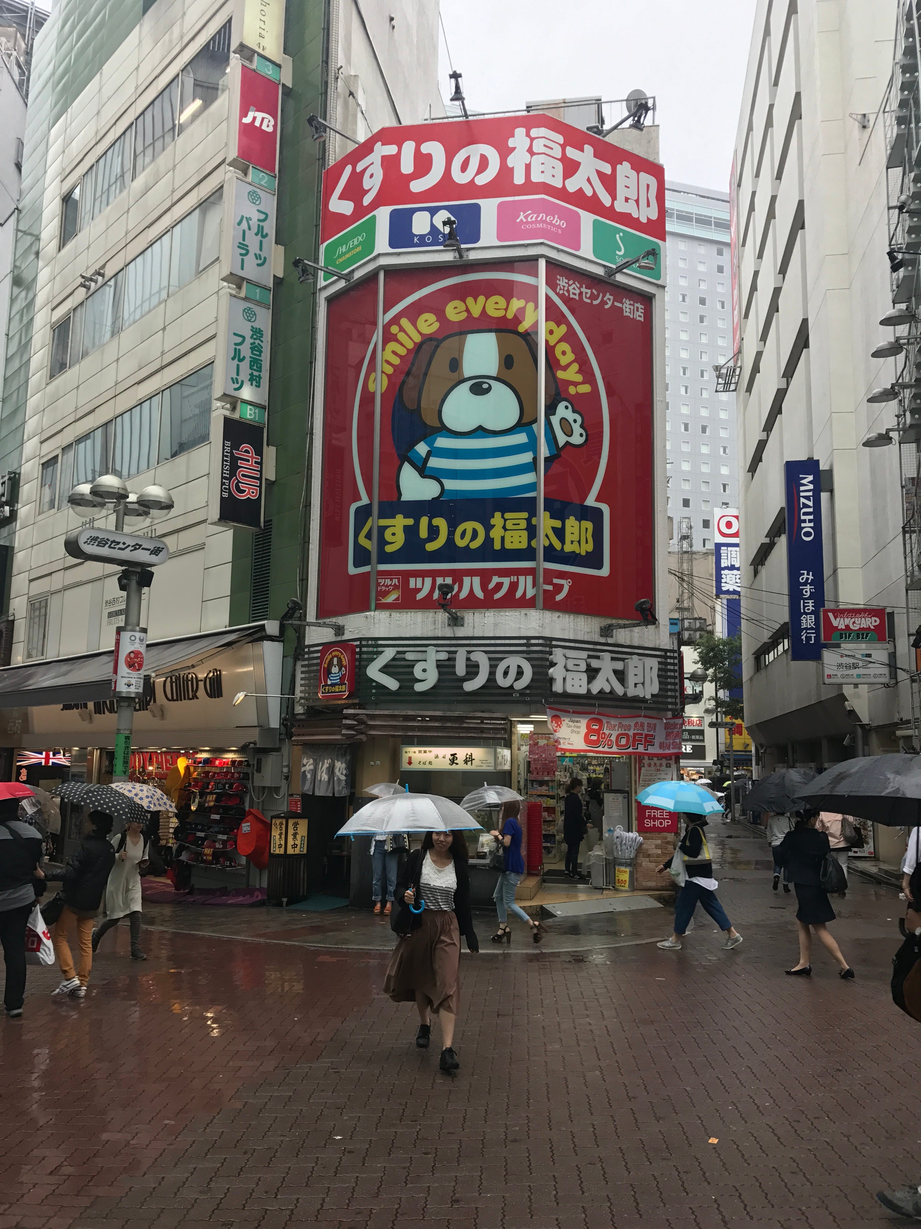
One of the most striking things when traveling in Japan or South Korea is that Kawaii is truly everywhere. You see it in road signs, public safety campaigns, city mascots, packaging, but also in manuals, on trains, in public bathrooms, in government communications. I could go on forever.
In Japan, every prefecture has an official mascot called a yuru-kyara , that literally means “loose character,” a kind of imperfect, slightly awkward little creature. These characters help with local marketing, of course, but they also make institutions and rules feel more human and less authoritarian. They say: we are still the government, but we promise we won’t bite. And they communicate with a broader part of the population, because children are citizens too, and they deserve to understand what’s being asked of them.
There’s something genuinely thoughtful about this. In a country where formality and hierarchy run deep, the yuru-kyara is a small, deliberate release valve. The serious adult world wearing a soft hat.
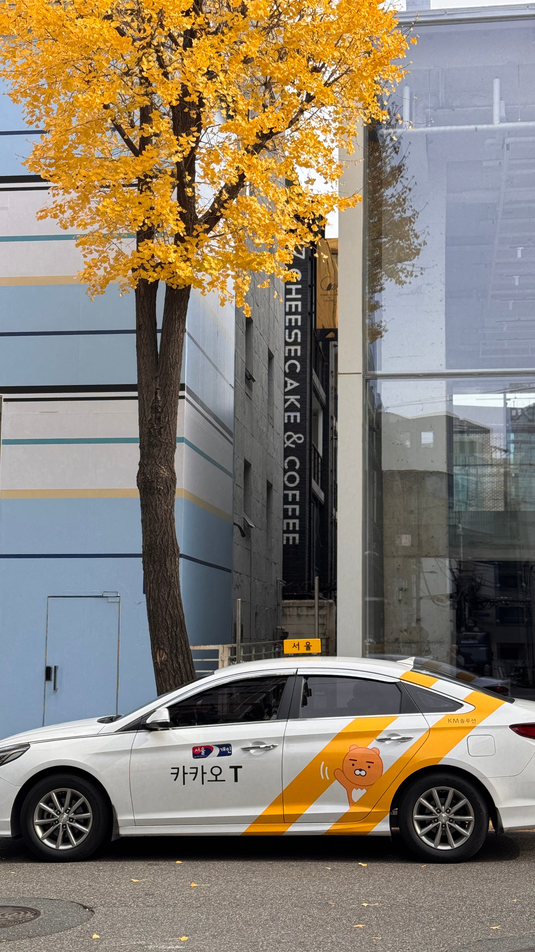
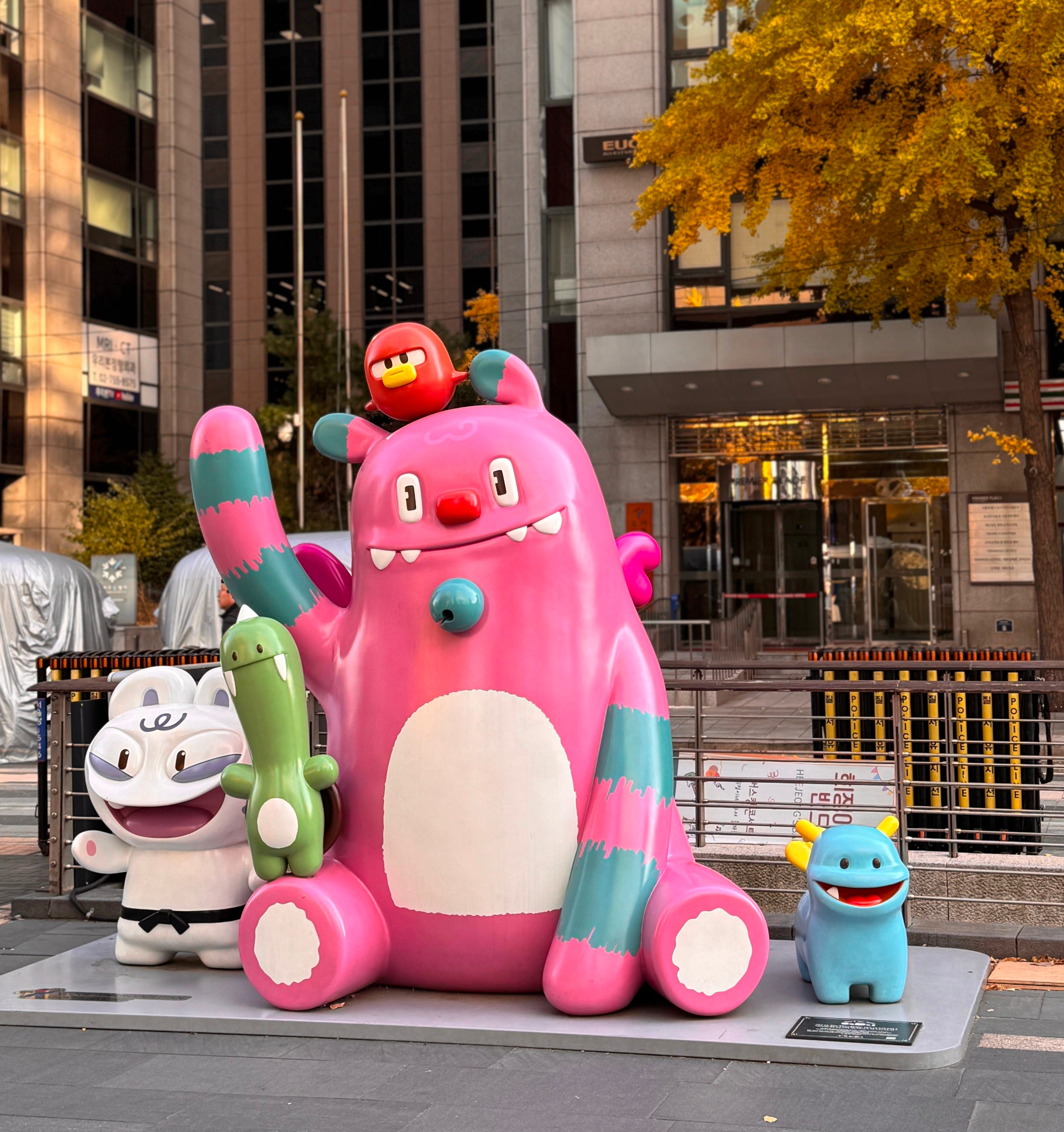
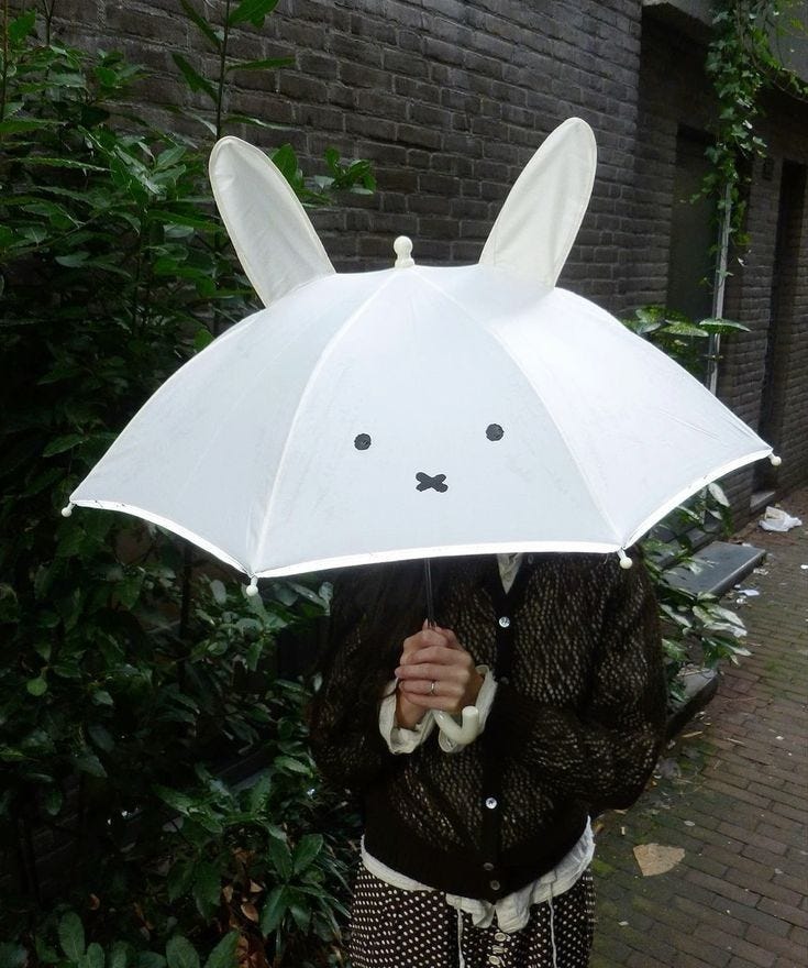
When we think of Kawaii, we immediately imagine characters and objects. There has been for a while a whole aesthetic inspired by this, sometimes referred to as “cutecore”,but the concept also enters designed spaces, and in more subtle ways than just adding lots of puppies and characters.
In interiors and public spaces, Kawaii can manifest through rounded forms, non-threatening proportions, soft or carefully controlled colors, and “gentle” signage. I noticed that many Japanese and Korean spaces seem designed not to intimidate, and even very functional places (train stations, clinics, public offices) introduce visual elements that lower stress levels. Rounded corners on furniture. Soft lighting. A small illustrated character pointing you toward the exit.
This becomes really interesting when compared to much of contemporary European design, which in recent years has leaned increasingly serious, minimal, conceptual,… and often emotionally distant. We talk so much about warm minimalism and neuroaesthetics, and yet if you actually look at most of the public spaces where we spend significant parts of our day, they feel cold. Functional, yes. Efficient, sometimes. But welcoming? Rarely.
In Korea, the closest cultural equivalent to Kawaii is Aegyo (애교). Aegyo indicates a tender, affectionate, intentionally “childlike” behavior, often expressed through gestures, tone of voice, and facial expressions. It’s the way someone might scrunch their nose and speak in a high, soft voice to express affection or ask for something sweetly.
Unlike Japanese Kawaii, which is very structured as a visual and design system, Aegyo is more relational. It’s something you do, not just something you see. And it’s a term that has no real equivalent in English, because it is so embedded in Korean culture that we simply don’t have the same concept. It’s not quite coquettish, not quite babyish, not quite sweet. It’s all three at once, wrapped in cultural context we don’t share.
What I find fascinating is that in Korea, Aegyo appears even in workplaces, in advertising, between adults, as a legitimate form of warmth. And you feel it everywhere, not just in behavior but in the spaces themselves.
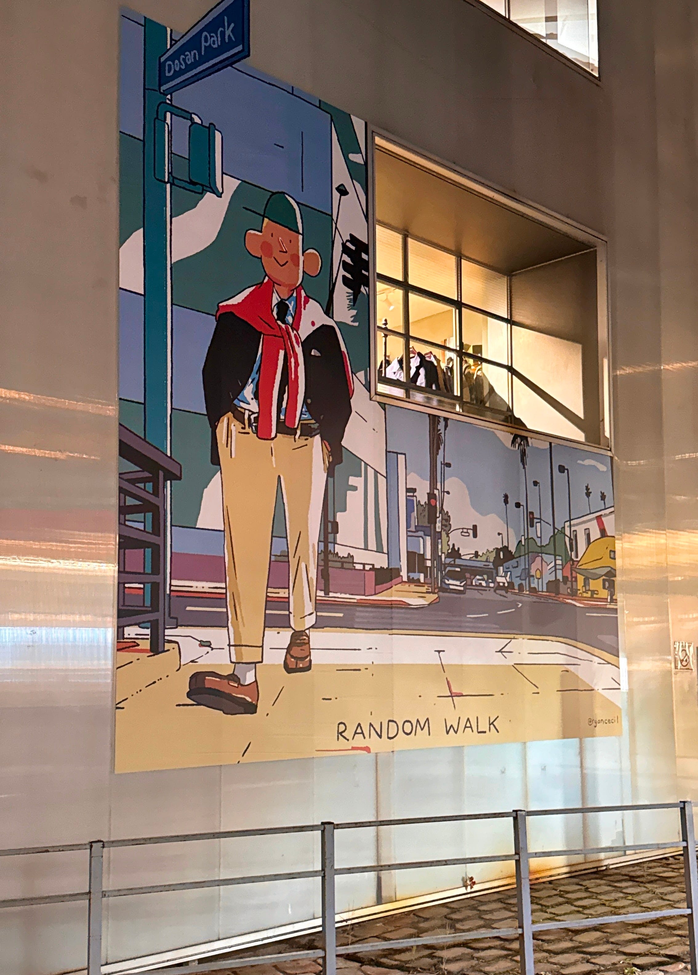
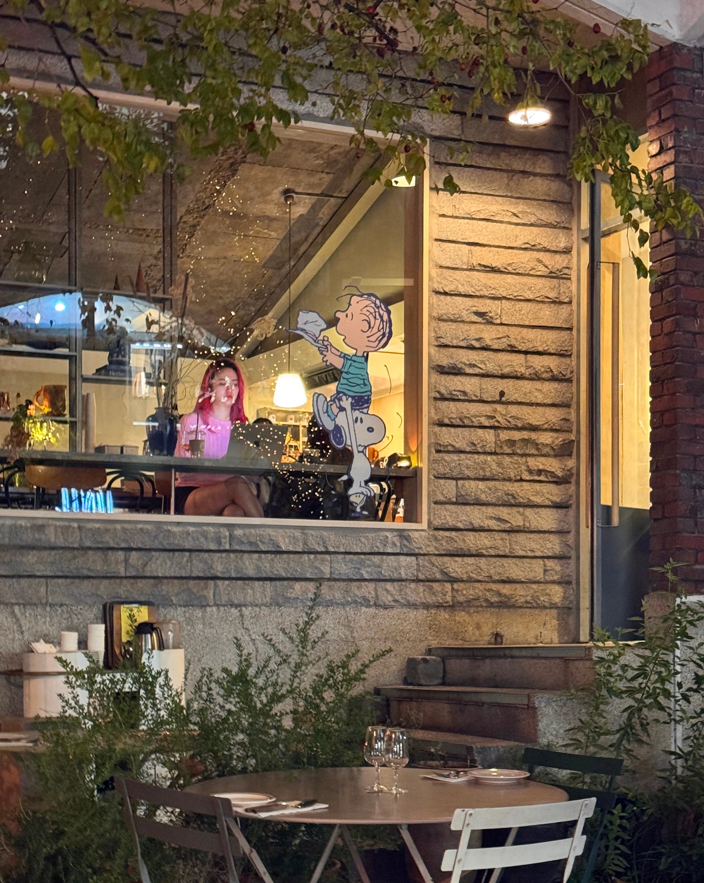
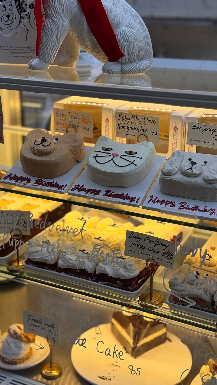
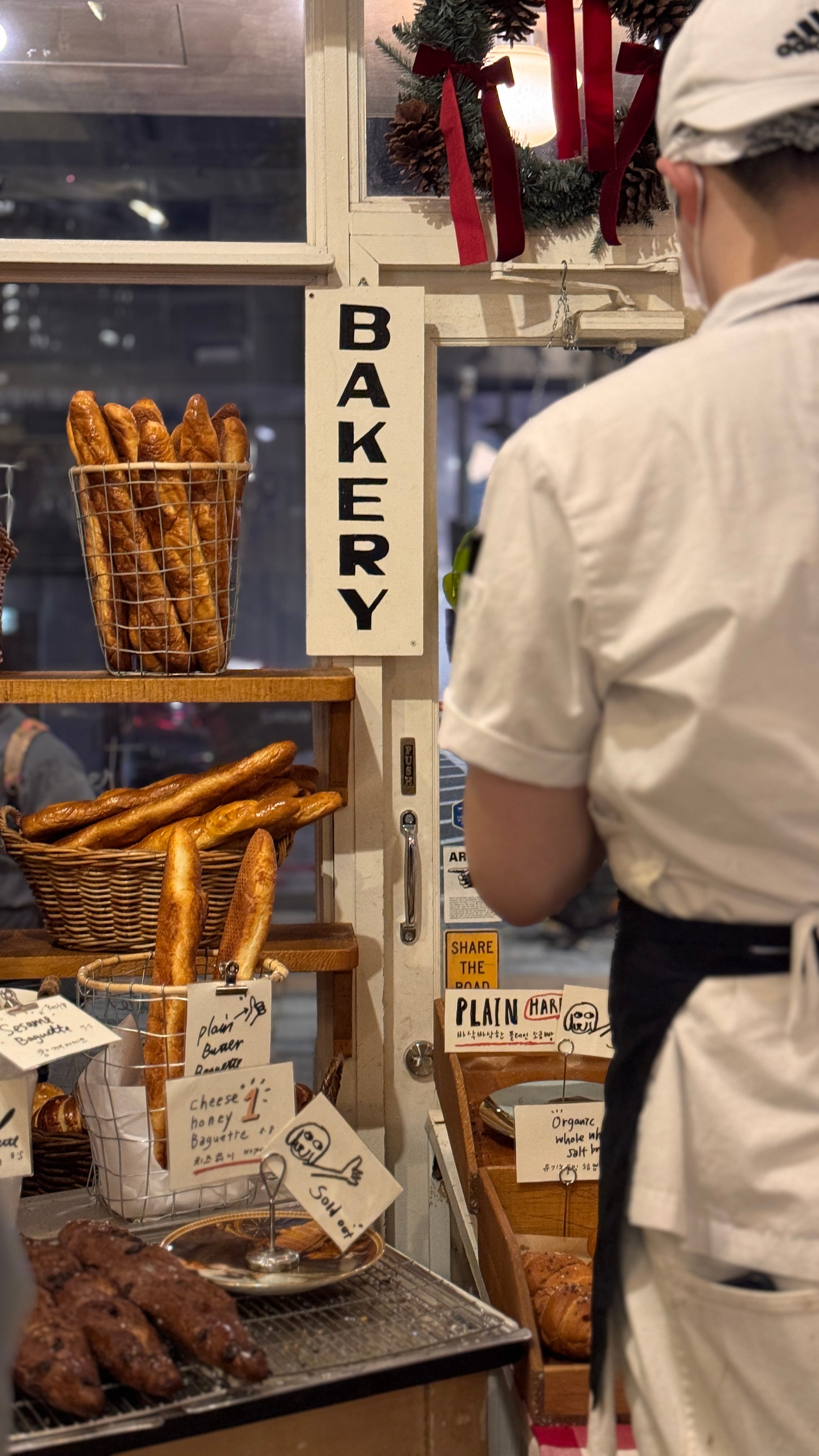
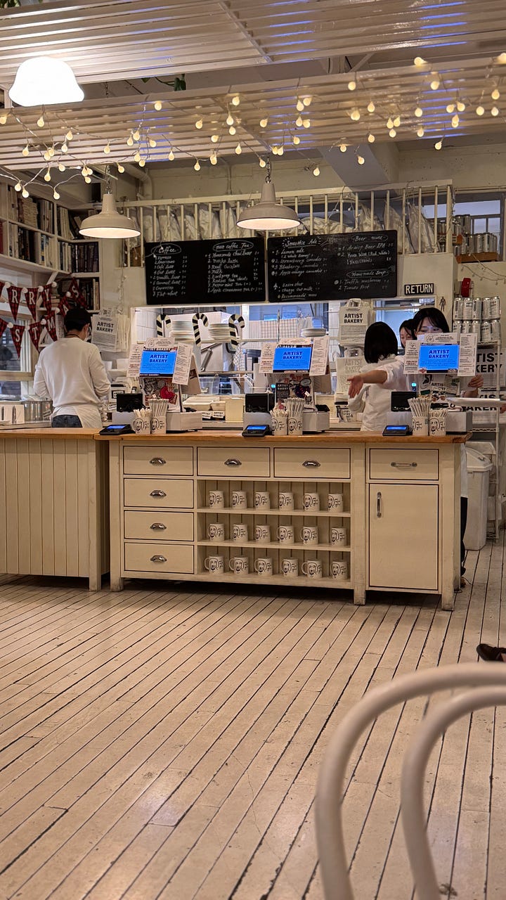
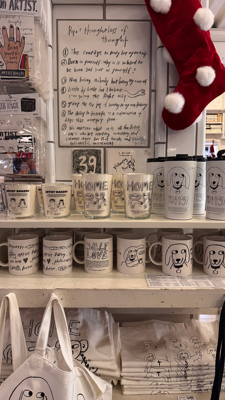
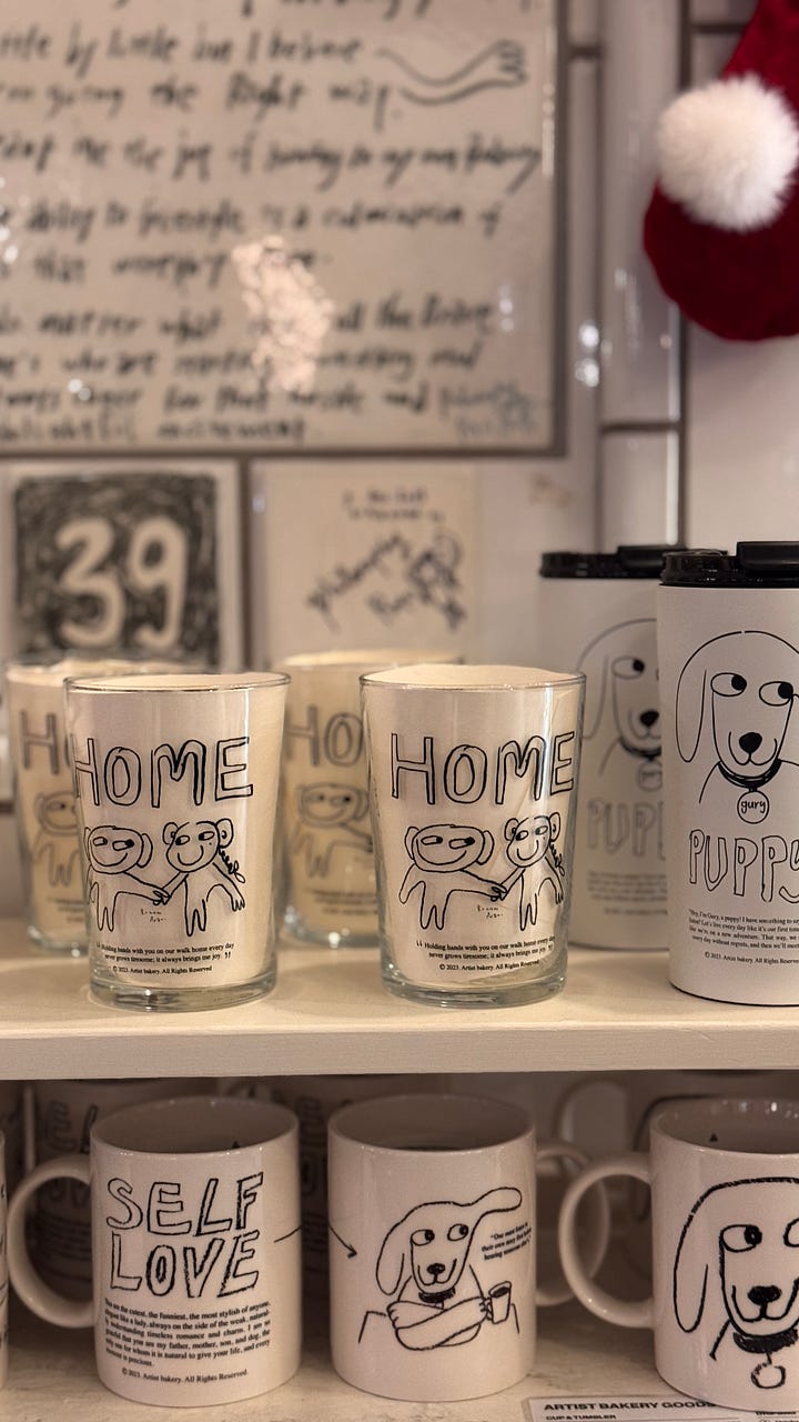
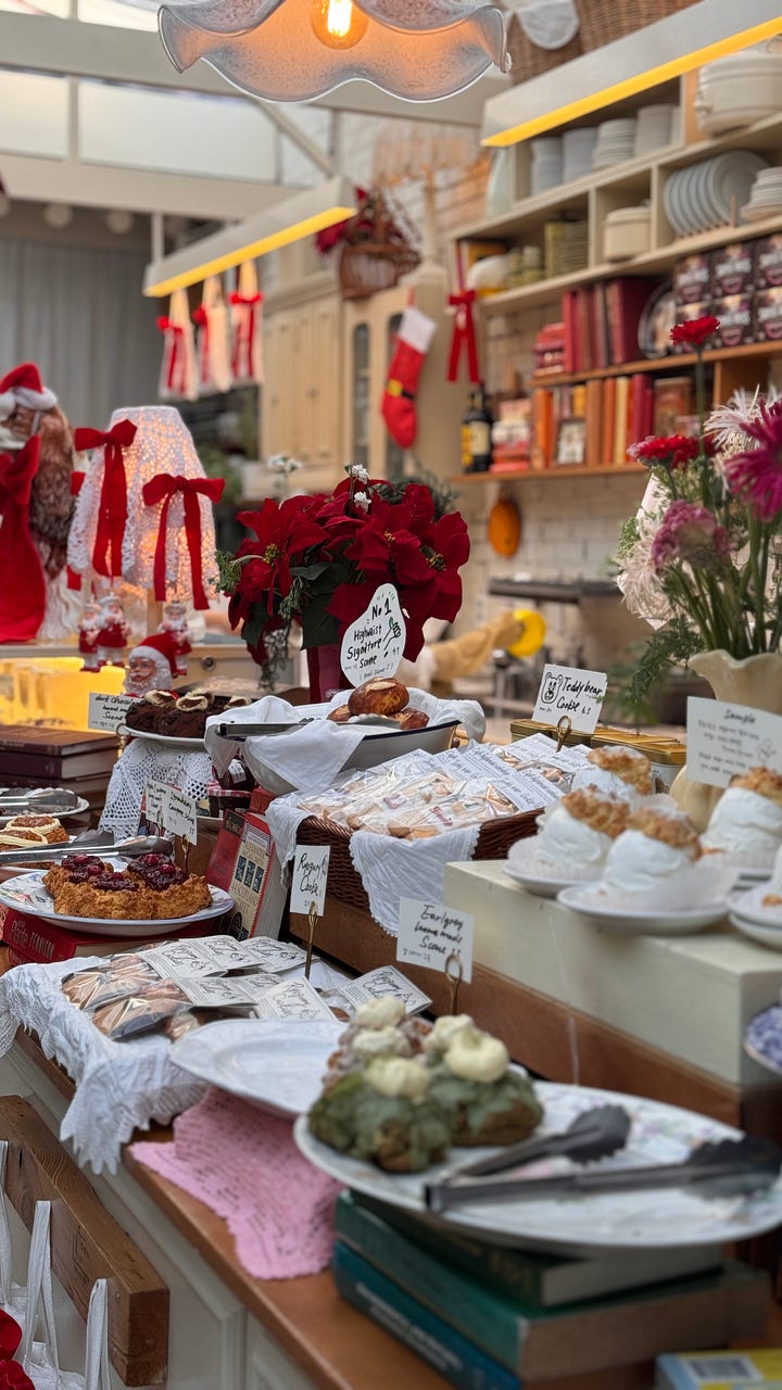
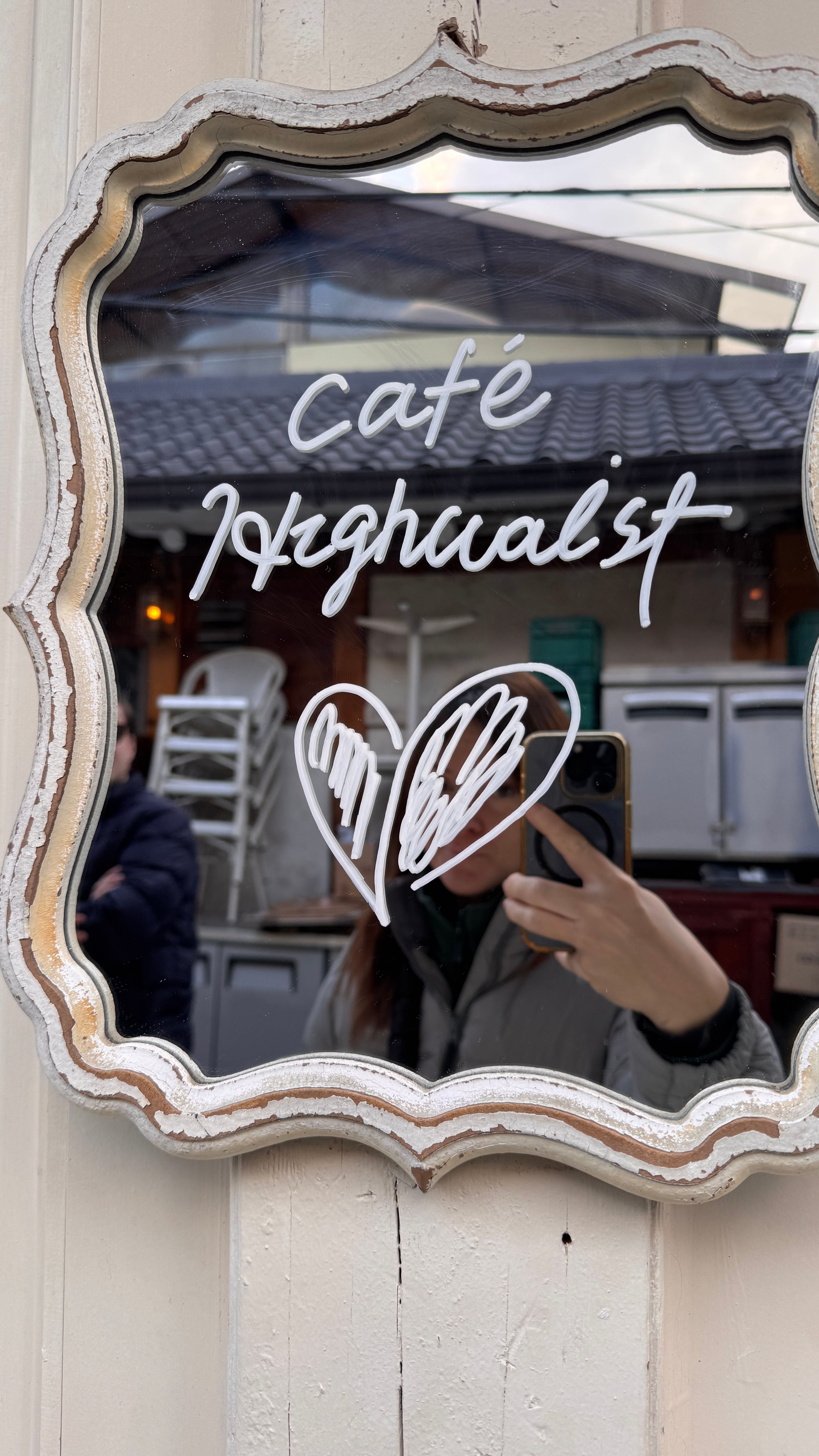
The cafés in Seoul are a perfect example. I’ve never seen anything like it anywhere else. The one that stayed with me most was Artist Bakery, a place that somehow manages to feel like a bakery, an art studio, a library, and someone’s very beloved living room, all at once. String lights across the ceiling, white painted wood everywhere, handwritten menus on blackboards. A counter lined with scones and cakes presented on lace cloth, each one labeled in the owner’s own handwriting, not printed, not typeset, handwritten, with tiny illustrated doodles next to the prices.
And then the merchandise!!: mugs, glasses, tote bags, all printed with the same wobbly hand-drawn characters: a little dog called Gury, figures holding hands under the word HOME, a mug that just says SELF LOVE in chunky letters. On the wall, a hand-lettered manifesto by the owner, Ryo, that starts with “The courage to truly live my own way.” It reads less like brand copy and more like a diary entry someone decided to frame and share.
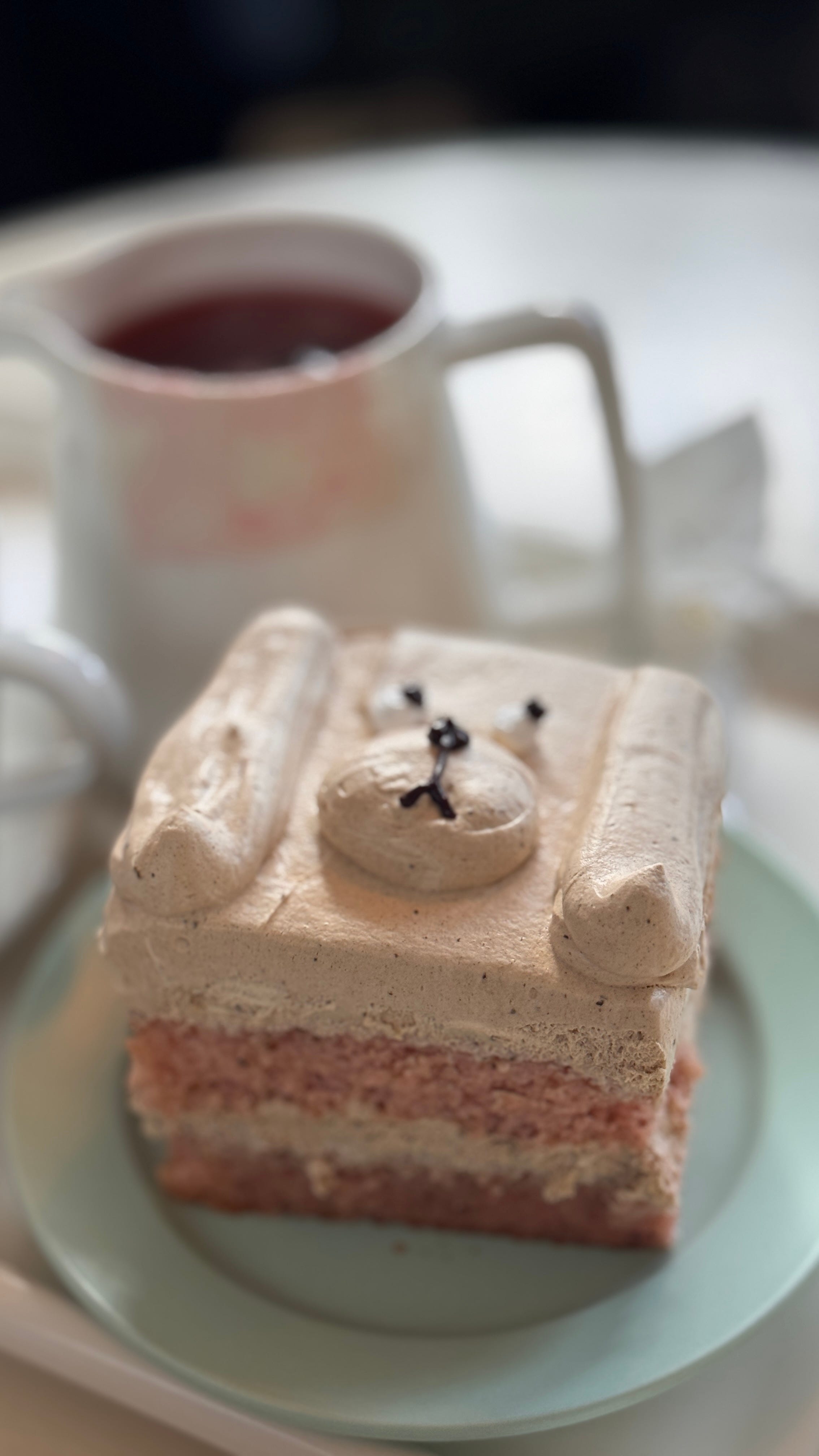
Not to mention the cakes, with all those cute faces formed just with eadible decoration. Such a cute ( and tasty!) experience, I could have spent hours inside this caé…and in fact during my trip to Seoul I tried lots of them, and the most unique and cuter kind of cakes and drinks.
These spaces reminded me of someone arranging their bedroom, making a space that feels like them, that feels safe, that quietly says: you are welcome here. Softness extended into physical space ( and designed for Instagram too, obviously. IG trends has such a huge impact on Seoul ).
Last week, while preparing my Color of the Month newsletter at ITALIANBARK, I discovered something I didn’t know: there is also a sad Kawaii.
If lately you’re a bit tired of everything, if seeing smiling little faces irritates you instead of comforting you, maybe this is the kind of Kawaii that suits you.
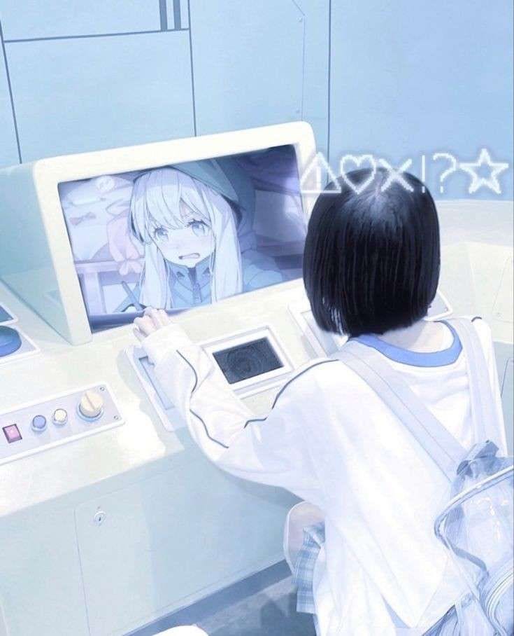
One of the most interesting examples is the Mizuiro aesthetic.
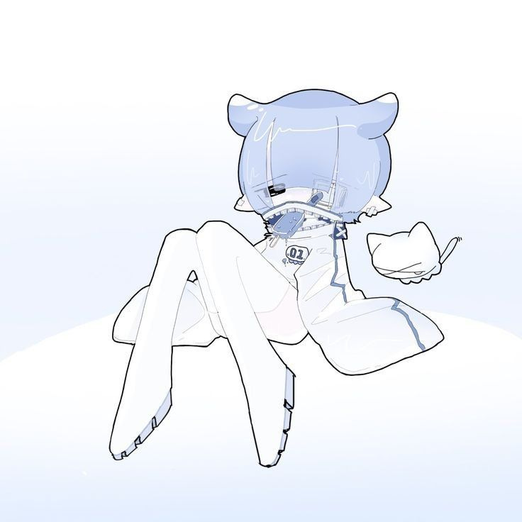
Mizuiro literally means “light blue.” It’s a Japanese aesthetic that emerged around 2010 and has resurfaced strongly in recent years as an evolution of Cyber and Y2K culture. The palette is all cornflower blues, white, silver, light greys. But unlike many pastel aesthetics, Mizuiro is not joyful. It is cold, melancholic, fragile. It evokes isolation, vulnerability, a sort of sad “technological purity.”
Images are often filtered with blue-grey tones, referencing early 2000s Webcore: old Windows interfaces, pixelated fonts, screensavers, blurry photographs taken on early digital cameras. An aesthetic suspended between digital nostalgia and contemporary alienation. It’s the feeling of looking at an old chat window. Of a phone that rang and went unanswered. Of a bedroom at 2am with just the screen glow.
Mizuiro is sometimes confused with Tenshi Kaiwai (the “Angel Neighborhood”), that is a more ethereal and futuristic variation, less dark, more atmospheric than emotional. Where Mizuiro feels lonely, Tenshi Kaiwai feels like floating.
What strikes me about both is that they’re not cynical. They don’t reject Kawaii , they just find a version of it that fits melancholy where the cute survives, but it carries weight.
Beyond specific aesthetics, what fascinates me lately is how deeply our taste is shaped by the environments we grow up in. Taste never emerges in isolation: it forms slowly, over years, within the culture we are immersed in,in such a subtle way that we rarely question it.
From a Western perspective, what is considered kawaii may feel very distant from our own standards of “good taste.” Excessive, maybe, a bit naïve. And in fact, we didn’t grow up having breakfast in front of packages filled with smiling characters. We grew up with oversized, hyper-real photographs of biscuits that turned out to be much smaller than advertised (and smaller every year, actually). Our aesthetic baseline was formed by different rituals, different images, different small repeated moments.
That matters a lot.
Because visual culture begins in the smallest, most ordinary rituals. On a kitchen table. In a lunchbox. In the stationery we choose at ten years old. In the cartoons that ran in the background while we ate dinner. In the shapes of the toys we touched before we could read.
It is not formed, not only, by reading thousands of articles, nor by scrolling endlessly through social media, nor even by reading the most extraordinary books. Those things may refine it. They may deepen it. They may give it language, but the foundation is older. Because there is an unconscious layer of taste inside each of us , that is powerful, persistent, and often impossible to fully trace. We carry it without knowing exactly where it began.
And that, to me, is one of the most fascinating things about design. It doesn’t start in studios or in mood boards. It starts at breakfast.
Anyway: say what you want, but I would still rather start my morning looking at a small smiling face than at an oversized, hyper-real photograph of a biscuit that turns out to be much smaller than the one promised on the box.
See you soon for a new (tasty) trip somewhere.
If you’re interested in how cultural aesthetics translate into design trend signals, I explore this kind of research more deeply inside TRENDBARK , my professional trend intelligence platform for designers and brands. The connection between cultural micro-movements like Kawaii and where interior design is heading is something I track closely, especially heading into the next design season.
The next field research is coming. Stay close.
No posts
Comments
Nothing yet. Say the first thing.
Sign in to join the conversation.