
This is being cross-posted with Spheres of Knowledge, the Substack for the School of Global Affairs at King’s College London.
This isn’t a clickbait title. I have worked in this area for two decades, and I simply do not trust the trends and international comparisons shown in official statistics on disability.
I don’t trust the official statistics on the ‘disability employment gap’ (which is my main focus here). I don’t trust the claims about how working-age disability has shown a staggering rise. And I don’t trust this week’s stories about the decline in ‘healthy life expectancy’ either.
In this blog post, I want to convince you that you shouldn’t trust these measures either. In doing this, I’ll draw heavily on an OECD working paper that Chris Prinz and I wrote at the end of last year, which goes into more of the technical detail than I can explain here.1
The main statistics on disability are all based on simple survey questions about longstanding activity restrictions – that is, whether you have health conditions that you expect to last 12mths (‘longstanding’), and whether these reduce your ability to carry out day-to-day activities (‘activity restrictions’).2 This is the way we do things in the UK, and internationally it’s similar to Eurostat disability measures (known as the Global Activity Limitation Indicator).
To understand why this is a problem, we have to be clear about what disability is. Before the 1970s, people mostly used a narrowly medical model of disability, where disability is about ‘what’s wrong with you’. But since then - and mostly due to advocacy work by disabled activists - we’ve understood that disability is about participation restrictions that result from the interaction of impairments and environments. That is: a given set of impairments might result in an inability to work in disabling workplaces/wider environments, but not in more inclusive workplaces/environments.
So when a conventional disability measure becomes more common, there’s at least three different things that can be happening:
Impairments have become more common (rising sickness/morbidity);
People are more likely to describe the barriers that they experience as being due to physical or mental health (rising medicalisation);
Environments create more barriers to participation (rising exclusion).
People nearly always interpret rising conventional disability measures as showing rising sickness/morbidity – but this isn’t a trustworthy interpretation. Conventional disability measures have a lot of value when comparing people at a given moment in time - we should definitely use these for showing the existence of disability-related inequalities, for example. But when looking at trends, conventional disability measures simply do not enable us to tell apart rising sickness vs. rising medicalisation vs. rising exclusion.
But it gets worse – because when we use conventional disability measures to estimate the disability employment gap (DEG), then they can make success look like failure. And this is the worst thing a policy-related statistic can do.
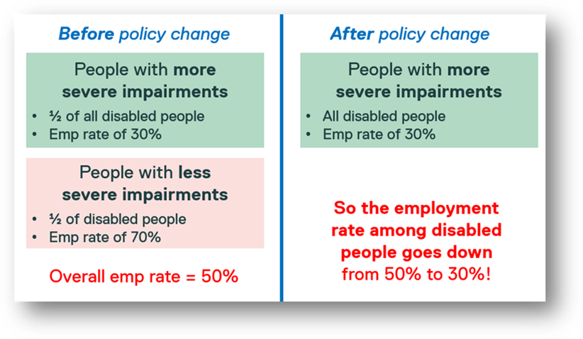
To explain this, let’s look at a very hypothetical scenario – this isn’t meant to reflect the true picture, it’s just a thought experiment to help understand what’s going on. Imagine that there’s two equally-sized groups of disabled people:
People with more severe3 impairments, with an employment rate of 30%, and
People with less severe impairments, with an employment rate of 70%.
Because these two groups are equally large, the overall employment rate for disabled people is halfway between them, at 50%.
Now imagine that there’s a brilliantly effective disability policy – more inclusive workplaces, more accessible homes, more accessible transport etc. – so that the people with less severe impairments no longer feel that their health conditions reduce their ability to carry out day-to-day activities. These people now no longer report a disability on the LLSI measure. This means that the only people that still report a disability are those with more severe impairments, who still have an employment rate of 30%.
In this (very hypothetical!) scenario, we have a brilliantly effective policy, but because of the problems with the conventional disability measure, the policy seems to reduce the employment rate of disabled people from 50% to 30%. (I’ve also tried to show this in the figure below). Success is made to look like failure.
Yesterday I presented this to a bunch of academics and DWP researchers, and one of the academics asked, “do people really change their reporting of activity restrictions based on how inclusive social environments are?” (The standard question asks about ‘day-to-day activities’, not work/wider environments4).
I think the conventional disability question really is that sensitive to social environments, because of three sets of evidence. Firstly, we know that people report similar questions (e.g. about general self-reported health, or whether disabilities affect their usual activities) partly based on whether they’re working or not.5 Secondly, we know that questions on disability are incredibly sensitive to how they’re asked.6 And third, we see huge changes over time in the UK in people reporting activity restrictions, and we also see huge differences between countries (both implied by the charts just below), which raise questions about whether we can trust the measures. At the very least, we need some pretty convincing evidence that changes in activity restriction really show differences in impairment, rather than just assuming that medicalisation or exclusion don’t affect them at all.
There is one thing that we can do that partly deals with this issue – we can use something called the ‘prevalence-adjusted disability employment gap’.
This couldn’t be easier to calculate: it’s simply the prevalence of disability multiplied by the DEG. And it has an intuitive interpretation: it shows the percentage of people prevented from working due to disability. (Or more accurately: it’s a crude proxy for this, if we assume that the DEG shows the causal effect of disability – which is often how it’s interpreted in policy debates).
The prevalence-adjusted DEG has a really helpful feature – let’s take the example above, and imagine a situation where people with less severe impairments have an employment rate equal to non-disabled people. In this situation the prevalence-adjusted DEG is unbiased, even though the conventional DEG is very biased. (The appendices to the OECD report show how to derive this result).
More commonly, the prevalence-adjusted DEG is a useful complement to the conventional DEG – if both the conventional DEG and prevalence-adjusted DEG show the same trend, then we can be pretty confident that things are genuinely getting better/worse. If the two measures show different things, then this tells us that our results might be biased, and we need to be really careful about what’s happening to disability reporting. Partly for this reason, the prevalence-adjusted DEG is recommended in the Disability Employment Charter.
If these two DEG measures show the same thing, then we can have more confidence in what’s going on. Unfortunately, though, these two DEG measures show wildly different results.
If we look at trends over time in the figure below, then the conventional DEG shows that things have continually gotten better over the last 25 years. In contrast, the prevalence-adjusted DEG shows that things got better until about 2010, but since Covid-19 they’ve got much, much worse – so that the situation now is even worse than it was in the late 1990s.
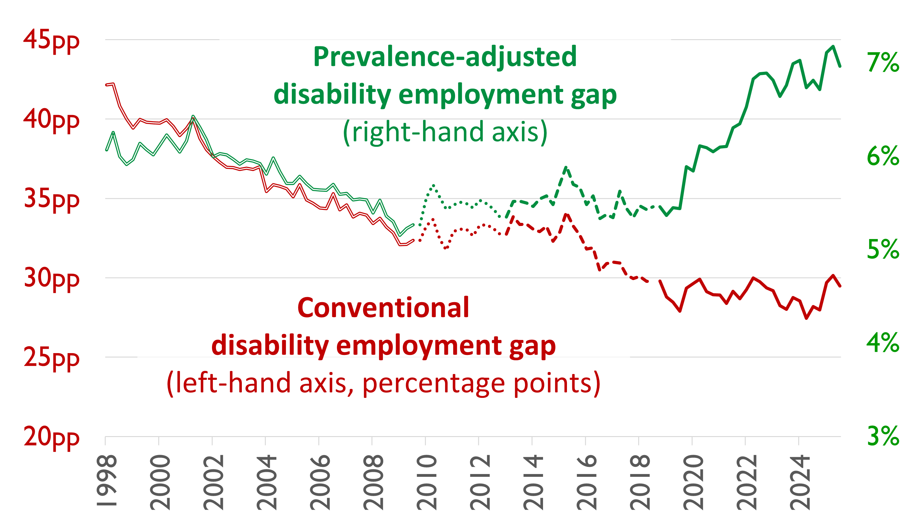
Source: my calculations based on published Labour Force Survey data.7
Similarly if we look across countries below, according to the conventional DEG (the red diamonds), the UK is middling compared to other OECD countries. If we use the prevalence-adjusted DEG, though, the UK (along with Czechia) does worse than every other country.
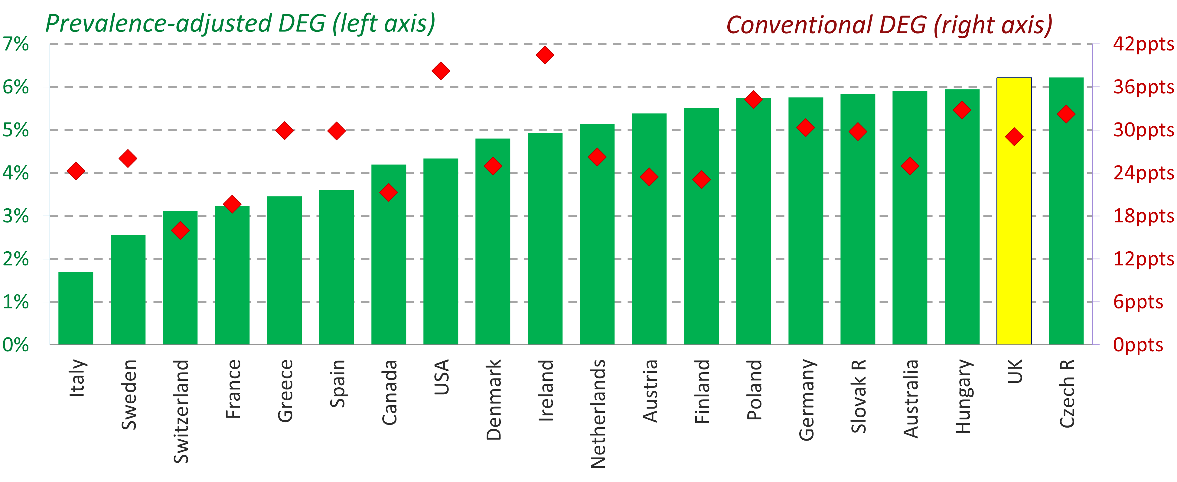
Source: Geiger & Murphy (July 2025), Figure 4 (redrawn)8
To be clear - I’m not saying that the prevalence-adjusted gap is correct (much as I think it’s more likely to be correct than the conventional measure). But the main point is that these two measures show wildly different results, and this means we don’t have a robust idea of what’s going on, either over time or across countries.
There is a way out of this problem – but it requires us to collect better data. In a follow-up post next week, I’ll explain what a more robust approach looks like, and how we could collect the new data to underpin it, while continuing to collect the simpler and still-valuable activity restrictions measure. [You can find the follow-up post here].
The full LFS questions are: “Do you have any physical or mental health conditions or illnesses lasting or expecting to last 12 months or more? [Yes / No]”, and for people who say ‘Yes’, then, “Does your condition or illness reduce your ability to carry out day-to-day activities?” Yes, a lot / Yes, a little / Not at all. This comes from two harmonised standard questions from the Government Analysis team, one on longstanding illness, the other on activity restrictions.
The word ‘severity’ is a difficult one - lots of disabled people don’t like it because it simplifies things too much, both in the sense that (i) participation restrictions depend on the environments that people are in, as I’ve said; and (ii) a linear idea of severity ignores the different skills and contributions that people can make, which can’t be ranked in this way. Notwithstanding both of these points, it’s still useful to talk about severity as long as we bear in mind that we’re talking about it in a given social environment, and in terms of the average employment rate in different groups - it’s not something that covers all the contributions that people could make or all of the different environments that could exist.
The harmonised standard clarifies that “Normal day-to-day activities can include: washing and dressing, household cleaning, cooking, shopping for essentials, using public or private transport, walking a defined distance, climbing stairs, remembering to pay bills, lifting objects from the ground or a work surface in the kitchen, moderate manual tasks such as gardening, gripping objects such as cutlery, hearing and speaking in a noisy room”. But as far as I can tell, these clarifications aren’t passed on to respondents to e.g. the LFS.
For example, in analyses I did in my thesis, 20% of respondents to one survey cited ‘work/being busy’ as the most important factor in deciding their own general self-reported health (1984/5 Health and Lifestyles Survey, unweighted data). I also did cognitive testing of the UK’s earlier limiting longstanding illness question in sixteen qualitative interviews in my PhD thesis, and when people explained what they thought the question was asking, several of them said things like, “Does the illness limit me in my ability to work? Does it limit me in the way that I’m perceived by other people? And I guess also, something we haven’t touched on it is, does it limit me in my relationships?” (Not all of them interpreted the question as being about work, but quite a few did). It would be useful to do this kind of thing for the current activity restrictions question too - it sounds like some cognitive testing has been done, it’s just never been published…
Perhaps the clearest example comes from a January 2010 discontinuity in LFS disability reporting, which was done by accident when adding a tiny bit of introductory wording to the disability section (without changing the question itself). But it’s a widely-accepted and often-demonstrated fact in disability research that different questions can produce a very different prevalence for disability.
These are official statistics for the working-age population (aged 16-59(f)/65(m) until 2009, and 16-64 from 2010-) from the Labour Force Survey. I use a chained series to account for discontinuities in the data (shown by different line patterns above). This is an updated version of Geiger & Prinz (2025) - the OECD report - from Figure 2.2; further details are in Appendix D3 to that report.
Apologies that this chart isn’t written in Datawrapper (which has much better accessibility) - Datawrapper doesn’t allow charts with two axes. I take their wider point, but I still think that the chart here is pretty clear, and is the best way of presenting this data.
I’ve taken the figure from the Resolution Foundation report I did with Louise Murphy, but actually the chart itself is redrawn from the OECD (2022) Disability, Work & Inclusion, Figures 2.8 and 2.5, mostly using EU-SILC data.
No posts
Comments
Nothing yet. Say the first thing.
Sign in to join the conversation.