
This is the second episode in a free 3-part series where we build a digital product from scratch, in Adobe Express, to generate leads or revenue.
💻 this is better on your desktop.
📥 to receive all episodes, make sure you’re registered.
In Episode 1 we picked the idea and found a template.
Now we make it look like it came from YOU
Clean and cohesive reads as “this person knows what they’re doing”
Clear headings, spacing, good colour contrast… that’s what lets someone read it on their phone or desktop
It makes everything you do next easier, because once your brand is set, every asset matches.
Think about the message you’re sharing. How do you want people to feel? Are you a friendly space? Do you want them to feel like they’re getting something academic? Do you love yellow and hate orange? Do you prefer minimal or bolder?
Do some research on what gets you and establish that!
Adobe itself has a guide on this and some examples
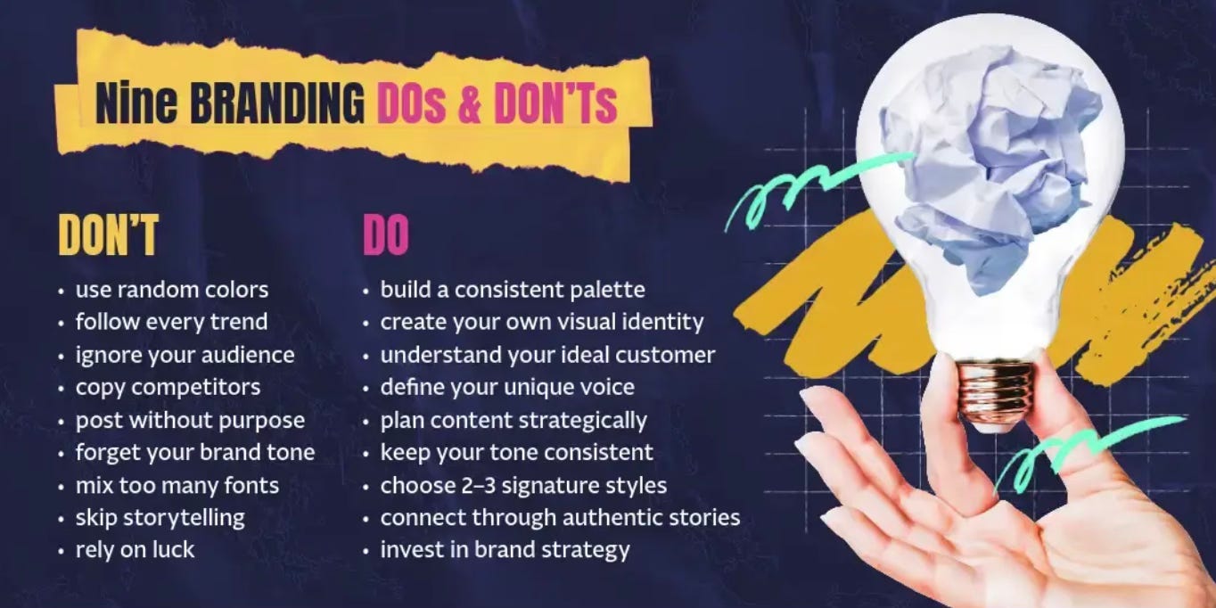
After I uploaded my Job Search Strategy Guide into Adobe Express’s Presentation Maker and asked it to build me a template, it gave me a draft.
But you must REVIEW IT, edit it and add links, because once you export as a PDF those links are LIVE.
FONTS
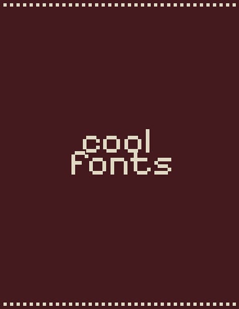
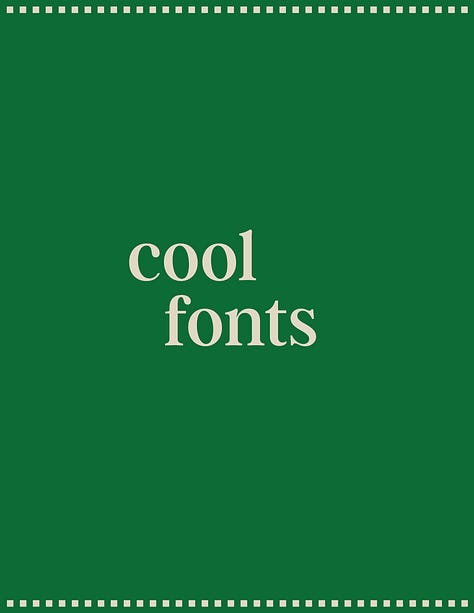
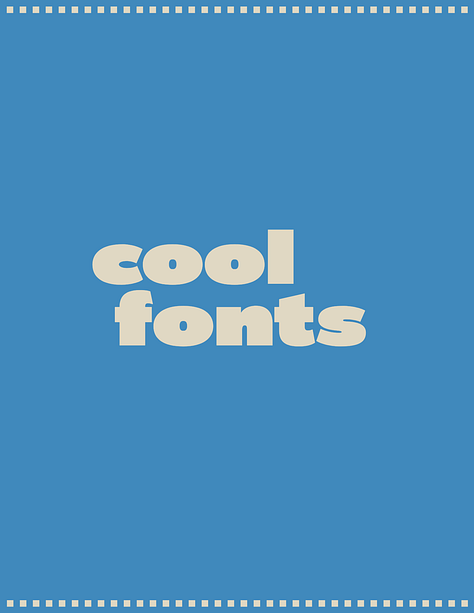
Pick two fonts: one title font, one body font. A third if you really need it.
Check out templates and brands you love for a feel of what makes sense for you. Adobe has TONS of fonts to explore.
COLORS
If you built your deck in the Presentation Maker, it hands you template colours. You are not stuck with them. In the brand kit you drop in your own colours, save them as swatches, and apply them across the WHOLE thing in one click.
I built a fresh palette by grabbing a colour combo off Pinterest, uploading the image into the brand kit, and letting Adobe pull the colours out automatically.
On Threads and socials you can also find palletes for inspiration.
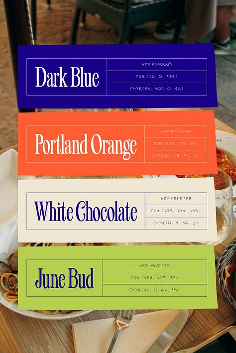
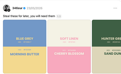
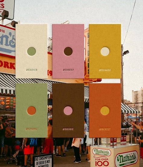
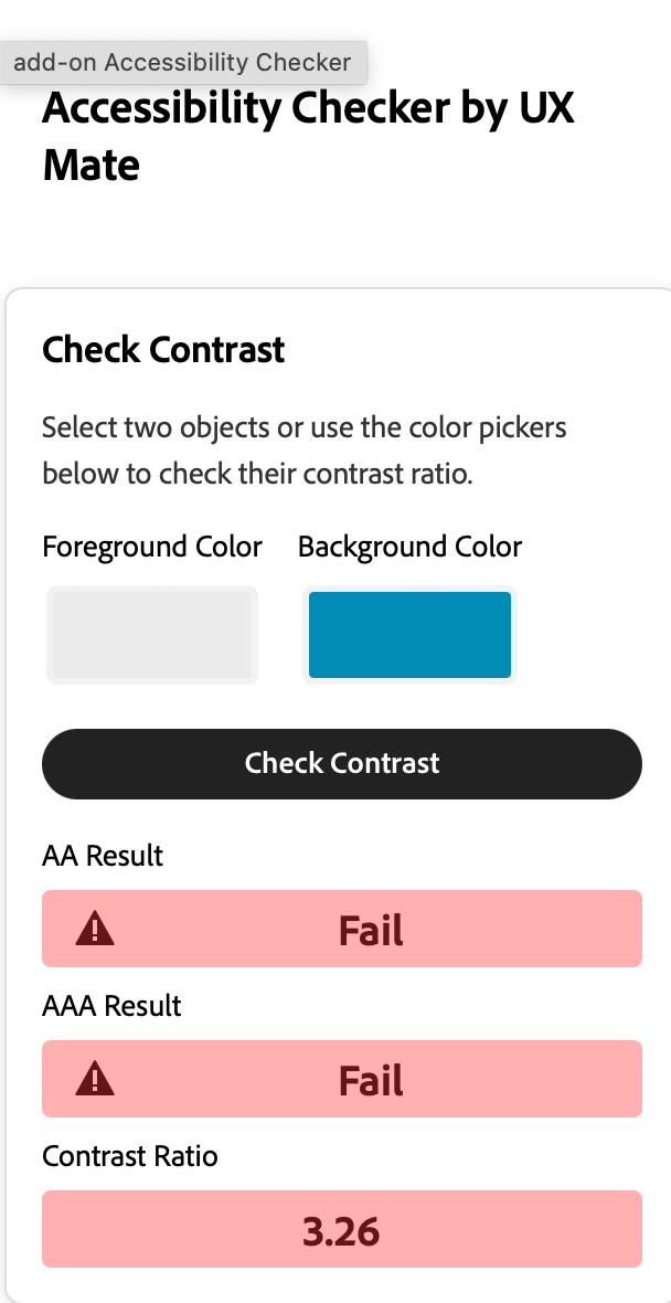
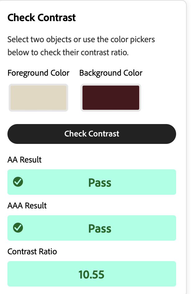
⚠️ LEGIBILITY. Whatever you fall for, there has to be real contrast between background and text. There’s an accessibility checker on Adobe Express when you go to Add-ons which can check it for you
RESIZE
Say the guide’s done and you go, “Isabel, love it, but I actually wanted a document, not a presentation.” Fine. Hit Resize, choose your format, duplicate and resize, keep the option that looks best.
When someone sees your post, clicks your email, and opens your PDF, it all feels like ONE thing.
✨ Building along with us? ✨
Drop a comment or question and tell us what your product is, so we can give you feedback.
Stay tuned for the next episode where we’ll Promote It & Sell It
Comments
Nothing yet. Say the first thing.
Sign in to join the conversation.