
Let’s design the Next President (NP). Current politics requires very specific political tailoring, merging many common denominators to achieve a majority, either electoral or popular. The next President needs to fit the suit, not the other way around. So we are going to use the commonly applied Elements and Principles of Design to design the Next President, the NP, to help evaluate each candidate.
First, we are designing a product, not a process — that’s another paper. However, all three design divisions apply; the NP must meet high standards in Functional, Structural, and Decorative design. Here, the main thing to realize is that these standards must be achieved in that order of importance. We’ll show how each is manifested in a person. Enough to say now that if Functional and Structural design are strong, only a nominal amount of Decorative is required to serve — beware, the reverse is disastrous.
Next, let’s look at illusions. We want a sturdy product that will perform well in the long run and not disappoint. To get that, we have to remain conscious of how easily our illusions form when we look at or listen to someone. Illusions come from perceptions and are composed of two parts, sensory and cognitive, which depend upon us, our cultural conditioning, and our learning. For the NP, we don’t want to perceive someone as 3-D when they’re only 2-D, so illusion-spotting is critical throughout our design.
In every design, there are big blocks of content that exist, either well executed or not, but they are always there, are not optional, and are perceived physically and psychologically depending on the product. The Elements are Line, Space, Shape and Form, Light, Color, Texture, and Pattern, and while some lend themselves to person-picking more than others, they are all perceived by each of us, often in a cross-sensory way — for instance, I ‘see’ a pattern of behavior about someone that is like a printed pattern on cloth, chaotic, tranquil, and so on.
We’re going to take each of these, add Principles, which is how the Elements are applied to solve a problem, to create an ideal NP, and then evaluate each candidate against the goal. We’ll have a human meta-form for the Presidency.
The NP should show a clear path, a line, in his, her, or their background that has authentically committed the NP to an espoused world view. A Line leads the ‘eye’ to where it is going, and its description “makes a statement” about its character — the NP’s character. Lines can be analyzed many different ways, length, thickness (i.e., depth of commitment), continuity, consistency — all may apply to our NP — but line ‘direction’ is the strongest indicator; consider the interpretations implicit in vertical vs horizontal or too many diagonals. The line indicates probable outcomes when intersecting with other ‘lines’ on the job. Visually, one can imagine the stonewalling at play when direct horizontals meet direct verticals. Diagonals give flexibility, rhythm, and the ability to compromise.
The Element of Space is easy. The question is: does the candidate allow others their space? Is the person conscious of spatial balance? It’s simple, negative space is listening, positive space is talking — a balance is critical to understanding, and the design satisfaction of our ideal NP — a person is essentially a work of art, designed by themselves.
As strange as it may seem, a quick indicator of a candidate’s display of their shape and form within the arena can often be understood by looking at their signature. It is a personally developed statement of self-identified shape and form preference, practiced, positioned, exhibited, and wielded under all circumstances. A classic example of such WYSIWYG (what you see is what you get) is a signature that is very close, tight, bold, and thorny. Governing requires buy-in and buy-in demands having few thorns, being someone everyone can work with, and remembering your shape and form in the room. Shape and form can also be represented by wealth, social status, and even clothing choices.
For an NP, Light is his or her vision. It is their beam that shines and sees ahead. In visual design, light refers to how an object is perceived under different illuminations and how ambient light is reflected from surfaces. The object is designed with consideration of the most likely illumination in the environment where it is used, and the kind of light that will ensure the most flattering and engaging view of the whole. Accordingly, the NP needs to see how decisions ‘look’ when examined at different scales, by different populations, in different natural environments, and over time, while still maintaining a visual beam or vision. Can the candidate envision? Does he or she have a mind that can imagine and see both flaws and the future?
All colors are decidedly impactful — even neutrals make statements. Aspiring NP’s show their ‘colors’ with their personality. Think of all those judgments you made about people you met, boring or bored, funny, exciting, interesting, scary, secretive — these colors deliver personality, which means, NP-wise, that one hopes that personal color does not cause reactions that make governing more difficult, that ’frightens the horses’ (us) or prevents realistic assessments. History illustrates the problem of being too colorful.
The successful design of texture in a piece is often expressed through a range of contrasts, from smooth and silky to rough and scratchy, and everything in between. If I asked, “What is the texture of your life?” what would you include? All the hard, rough patches, all the rosy, dreamy moments, would they be balanced or skewed in one direction? What if the whole path was hard or its opposite? Such an extremely textured NP could rightfully have formed what could be called obstacle-attitudes, which may be detrimental to matching our expectations of a President. Think Nixon, or . . .
It is the intersection of surface-defined visual parts. A rigid pattern might be black-and-white stripes; a free-form pattern might be floral. If we translate the Element of Pattern to human behavior in the office, we might sense rigidity in decisions, or repeated inability to ‘connect the dots’ to form a pattern, to understand how actions are related. We need to see whether and how the appearances (speeches, for instance) or the overall perception of the office holder reflect a comprehensible pattern. Those are the big Elements — the main players in any design.
Now we get to how the Principles of design hook these aspects together and, importantly, how a whole emerges that is legacy producing. That is, how the time in office defines new horizons, recognizes new realities, produces lasting systems and relationships within government that could basically save whole countries. Principles do two things: A principle manipulates an Element for a specific effect. This could be a candidate’s spin aimed at appealing to various ideologies. It also describes the visual and psychological effects of the successful application of an element. A good example is the principle of balance, in which we perceive the equal distribution of weight, the ‘weight’ of any of the elements. There are 3 types of principles: linear, indicating where we are being led in the design; highlighting, which focuses attention on particular points or issues; and synthesizing, which integrates the whole. They all apply to governance, and they all can be either functional, structural, or decorative.
Linear principles show us how the NP has or is using the Elements.
Repetition is a linear principle that shows us, through repeated instances, where the NP is going, such as repeated associations with people or groups.
Sequence shows us a sequence of behaviors that indicate what can be expected.
Transition is apparent when looking at how the NP candidates have moved from one phase of life or occupation to another — simply think ‘transition team’ and imagine the decision-making process.
Rhythm is the feeling of organized motion. How do all the parts flow together to produce a satisfying, logical way to view the NP’s characters or careers as they move through life?
Highlighting principles pinpoint concentration and attention.
An example of the misuse of this principle is the use of inflammatory language to deflect attention from more important issues or decisions. News cycles are often used to highlight something, which sometimes prevents a balanced or accurate view of larger issues. Does the candidate deliberately misfocus us?
This principle is most successful when it is used psychologically to harmonize opposition but not competitive conflict. It highlights differences without destroying unity — need I say more on why that’s a governing priority? One could go through each Element, apply contrast to it, and predict its success within the overall design of a successful administration. Highly contrasting characteristics in any of the Elements are jarring, unexpected, and unsettling to large numbers of constituents. Use of contrast is one of the greatest differences between Presidents.
Emphasis is the creation of a focal point in the context of dominance or subordination. America First is a broadly applied example. By focusing attention strongly on one place, other places are often ignored or devalued, and, in governing, placing too much emphasis on one direction could be cumulatively catastrophic in the long term. With this principle, culture and clan often play significant, demanding roles, making their misuse almost unavoidable at times; think of the different prioritization of aspects of gender and geographic differences in the NPs.
Synthesizing principles are like a map of the NP’s life and career. They illustrate what its highlights, contexts are, key decisions, and what their ’ brand ’ is, to use a campaign term.
Proportion is the relationship of the parts to the whole. In governing, for example, if a country or a leader is constantly occupied with war and national assets are deployed excessively to that end, it may be ‘out of proportion’ for an overall healthy national economy. Whether it is war, weather disasters, health scares, inflation, or any other national concern, the degree to which it is recognized as a large or small problem to long-term national impact determines whether the proportion of assets devoted to it is enough to maintain balance. Proportion is a powerful principle and can be applied to all the elements.
Scale is the next principle, and it involves what is scaled up or down in the national consciousness and how. At the moment, climate change is being scaled down, as are corporate and general business regulations. Scale, like proportion, highlights what we pay attention to and often leaves us with an innate sense of whether what is highlighted actually makes sense and is commonly experienced and acknowledged as the predominant national consensus. In this Internet age, it is easy to magnify an insignificant viewpoint or issue until it is out of proportion to the whole.
It is critical to our national sense of security and stability. For us, gravity-driven creatures, it is innate and can be sensed externally or internally. Politically, things can feel out of balance in employment or influence (East Coast vs. West Coast), or even the internal pressure of a stock market about to crash. Balance equalizes forces, tensions, weights, sizes, and even densities. We usually know when something seems unbalanced in the economy, in foreign relations, or even in personal temperament.
The last two remaining principles seem similar, but are best defined by contrasting them. Both pull the whole thing or persona together and convince us that we are looking at one complete product or process; they are what give us the identity of the whole. Harmony lets us name the whole and see it as a whole, and its strength depends on how many elements and principles are in strong play, how universally understood the prevailing identity is, and how well all three levels of design are used: functional, structural, and decorative. It must also ‘harmonize’ with the zeitgeist of our time, which is difficult to achieve politically, making it critically important. It is essential that this be defined, as it will shape the NP’s legacy.
Unity, which may seem almost a state of dreamy nirvana, is actual completeness in which every part agrees with and also needs every other part — it is wholeness. It incorporates a sense of a hierarchy of attention in which goals are clear, all the parts are there, and it feels natural and intrinsic, not practiced for effect. It generates a peace and a simplicity that synthesizes all the parts together into something that can be sensed as a successful outcome. Unity culminates the entire design as a fully satisfying effort, meeting the most realistic priority needs in the most harmonious way, with the most criteria in play in all three platforms — functional, structural, and decorative.
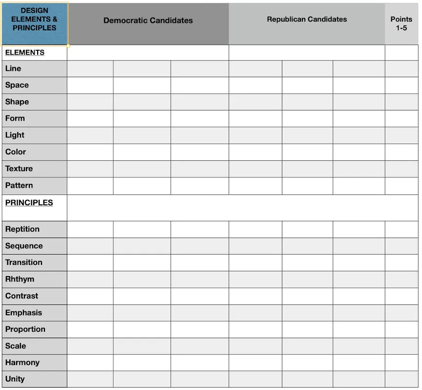
If we are to apply all the Elements and Principles of Design to design the next NP, we’ll need a weighted rating system on a 5-point scale, see below. To bring as much equity to the process as possible, we will need to use each candidate’s Wikipedia biographies and career highlights, matching that information to the elements and principles of design as directly as possible.
Below is a chart for comparing candidates, for both voters and candidates to assess their viability within our national design and function. Our margin for error is narrow now; we have to get it right.
Comments
Nothing yet. Say the first thing.
Sign in to join the conversation.