
Continuing from my last post looking at Beatles cover parodies from their early days through Sgt Peppers in 1967, here we pick up with 1968’s ‘White Album,’ officially titled The Beatles. Following is a gallery of album covers inspired by or similar to the later Beatles albums plus a few John, Ringo and George solo LPs representing the reverent, the irreverent and the bizarre alike.
One important note: I’ve attempted to credit the various designers, artists and photographers who created these masterpieces, however since I don’t own all of these records in some cases I’ve gleaned the credits information from Discogs or other sites on the web, so they may not all be 100% accurate. Corrections welcome!
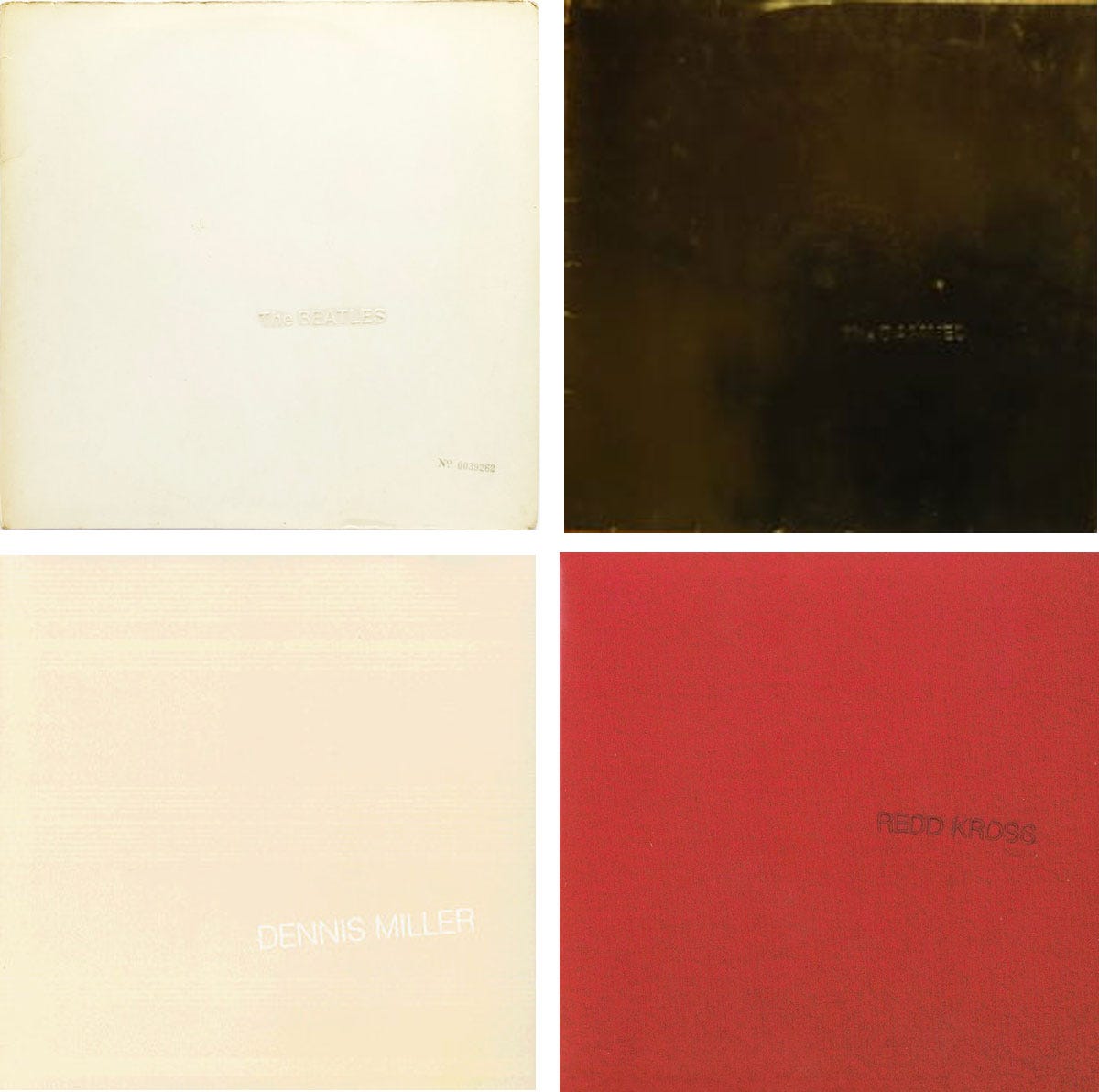
The Beatles The Beatles (Apple Records 1968) – Design Richard Hamilton
The Damned The Black Album (Big Beat Records 1985) – Design [concept] Dave Vanian, design [execution] H. Leadbitter
Dennis Miller The Off-White Album (Warner Bros. Records 1988) – Art direction Gabrielle Raumberger
Redd Kross Redd Kross (In The Red Recordings 2024) – Art direction Jeff, Steven McDonald; design & layout Jon Krop
The ‘White Album’s’ understated design is an easy target for parody, especially for a band on a budget. The original cover of the Damned album featured different artwork; the jacket pictured here was used on later reissues of the LP. The Damned also released an LP with cover art tributing A Hard Days Night (featured in Episode 1 of this series), and would seem to be Beatles fans at heart.
Dennis Miller’s tribute is obviously played for laughs, and the Redd Kross album is almost certainly a cheeky tribute to The Beatles, who are an obvious influence on this hard-rockin’ power pop band’s music. And if you’re going to name the album simply Redd Kross, it makes perfect sense to wrap it in a red version of the white album!

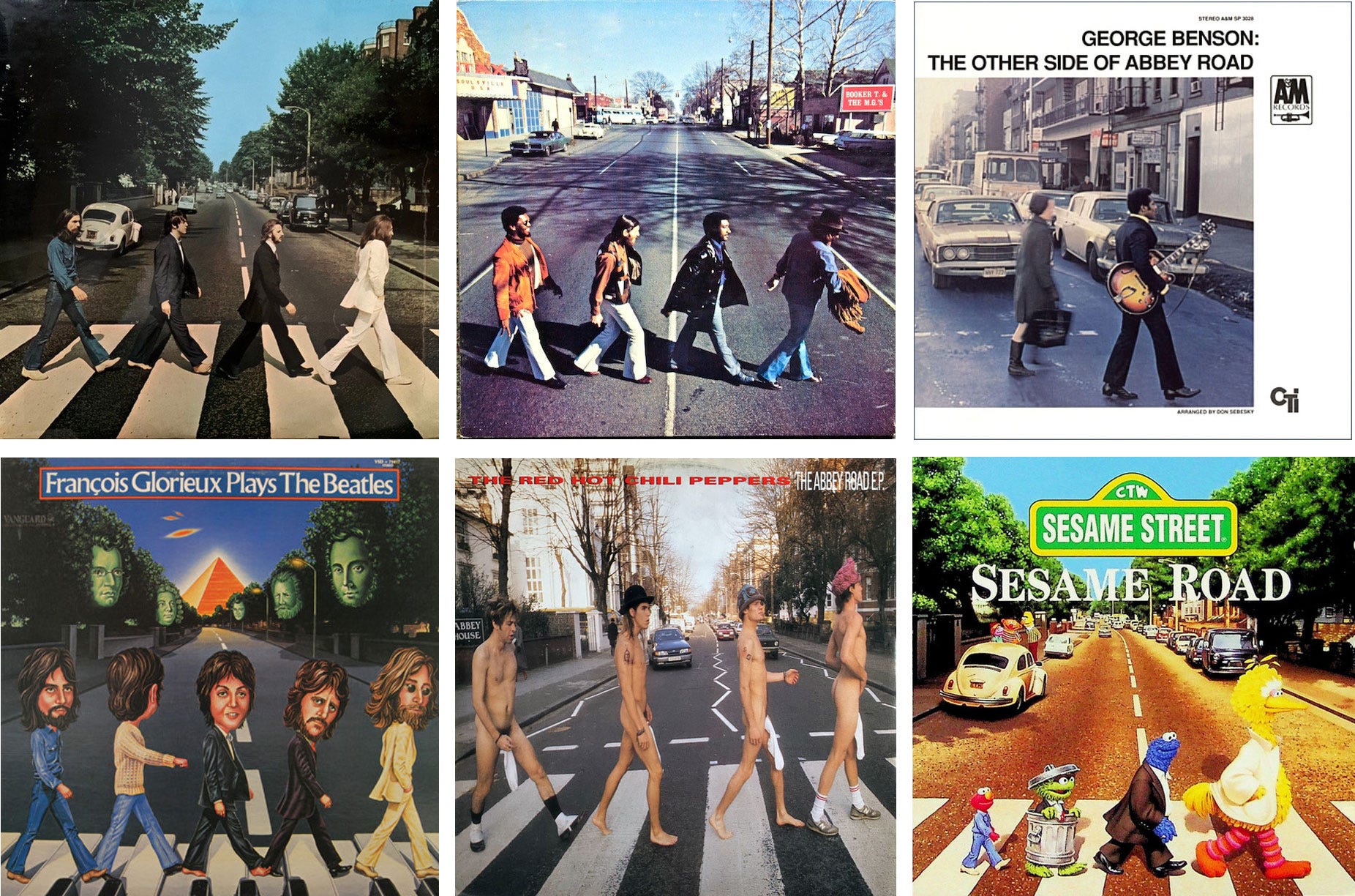
The Beatles Abbey Road (Apple Records 1969) – Photo by Iain Macmillan
Booker T and The MGs McElmore Avenue (Stax Records 1970) – Art direction David Krieger, The Graffiteria; art supervision Herb Kole; photography by Joel Brodsky
George Benson The Other Side of Abbey Road (A&M/CTI Records 1970) – Design Sam Antupit, photography Eric Meola
François Glorieux François Glorieux Plays The Beatles (Vanguard Records 1983) – Layout R. Valck
Red Hot Chili Peppers The Abbey Road E.P. (EMI/Manhattan Records 1988) – Design Abrahams Pants, photo by Chris Clunn
Sesame Street Sesame Road (Sony Wonder 1996) – Art direction [CTW] Mary Kramer and Jeannine Meredith [Sony Wonder], illustration by Wayne Watford
As with the ‘White Album,’ sometimes it’s the simplest designs that become the most iconic, and Abbey Road is in some ways the most iconic of all - and so easy to re-create, as any Beatles fan who has made the pilgrimage to that zebra-striped crossing will tell you.
The cover art on the first three of these albums both tribute the original and complement the new music within: Soul, jazz and classical interpretations of The Beatles performed not so much with reverence, but in acknowledgement of the depth and versatility of their material. The Francoise Glorieux album has an element of novelty to it in that the solo piano pieces are performed in the style of various classical masters, i.e. “Yesterday (Chopin),” “Ob-La-Di Ob-Li-Da (Mozart)” etc.
George Benson’s easy jazz takes are augmented with elaborate string and horn arrangements which don’t always work, but Booker T and The MG’s hit a home run with McElmore Avenue, a series of instrumental medleys of Abbey Road’s best songs, performed in their typically spare and soulful style.
Red Hot Chili Peppers score one of the funniest parodies ever – the compilation of previously released album tracks has nothing to do with the Beatles album but provided the perfect opportunity for their “socks on cocks” image to assist in selling the EP to fans who already owned their full catalog.
Sesame Street has produced a few different children’s albums with parody covers featuring famous songs adapted to their educational purposes. Elmo, Oscar, Cookie Monster and Big Bird stroll across the famous crossing to bring us songs like “Letter B” (as in “Let It Be”), Bert singing “I Want To Hold Your Ear,” and charmers like “A Little Yelp From My Friends” and “Hey Food.” Many of these were adapted or composed by Grammy winning composer/producer Christopher Cerf, son of Bennett Cerf, the famous publisher and co-founder of Random House.
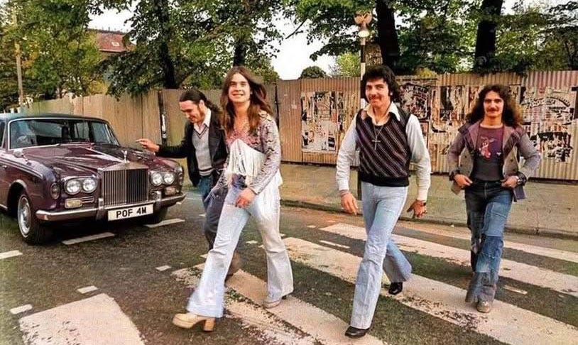
Below: Yours truly making the pilgrimage in 1994, and Black Sabbath nineteen years prior.


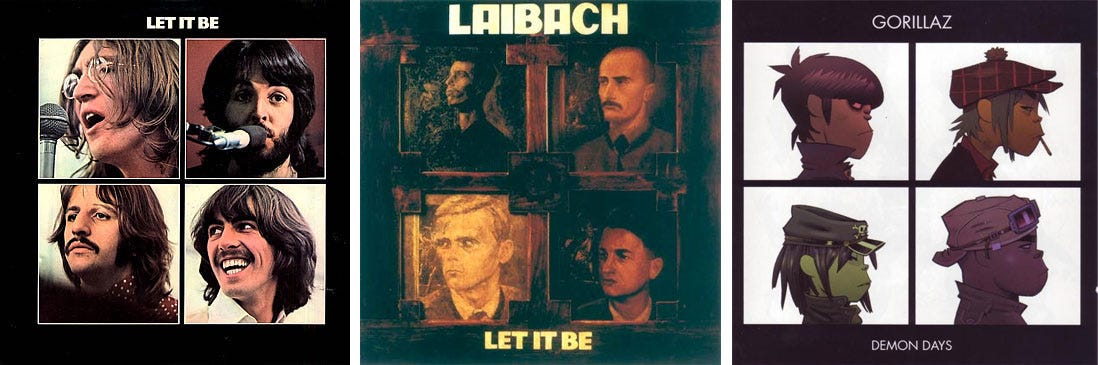
The Beatles Let It Be (Apple Records 1970) – Design John Kosh, photography Ethan Russell
Laibach Let It Be (Enigma Records 1988) – Design New Collectivism Studio, layout Slim Smith, painting Irwin
Gorillaz Demon Days (Virgin Records 2005) – Artwork & design J.C. Hewlett, Zombie Flesh Eaters
The cover of Let It Be is probably one of the few Beatle albums that the band themselves had little or no participation in designing. The music was famously taken out of their hands and mixed (or mucked up, depending on your point of view) by Phil Spector, and the jacket art was no doubt viewed by ABKCO as little more than a convenient way to promote the film.
Slovenian industrial band Laibach’s 1988 Let It Be is a fascinating re-creation of The Beatles album. Every song except the title track is covered and completely reinterpreted in style, ranging from stacked vocal choirs over buzzy electronics (“Across The Universe”) to Cookie Monster vocals over clanky industrial backing (“Get Back”). It’s a cool album, not necessarily up my alley musically but I’ll always show up to hear a Beatles cover – which would make Laibach a pretty savvy bunch since no doubt they knew that non-fans like me might pay attention.
Damon Albarn is the mastermind behind Gorrilaz, and a well-known Beatles fan who has openly celebrated their influence to the point where there are multiple YouTube videos and discussions on the internet comparing his work to the The Fabs. I’m not a big fan of his version of the Let It Be cover, but the tribute is obvious and seemingly sincere.

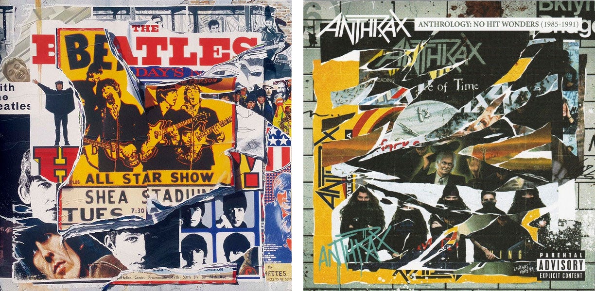
The Beatles Anthology [Vol. 2] (Capitol/Apple Records 1996) – Artwork [cover concept] Klaus Voormann; design, art direction Richard Ward, The Team; painting Alfons Kiefer, Klaus Voormann
Anthrax Anthrology: No Hit Wonders (1985-1991) (Island Records 2005) – Art direction Charlie B., design Asterik Studio, photography [Subway Studios] Kris McCaddon
The thing I like best about this parody is the title of the Anthrax compilation – Anthrology – brilliant! Of course Anthrax’ brand of thrash bears little resemblance to anything the Fab Four ever did – “Helter Skelter” sounds mild in comparison – but the title pun was obviously too good to resist and led to a brilliant parody of the jacket. Nice job, guys!

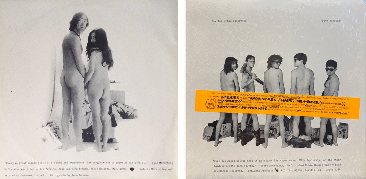
John Lennon and Yoko Ono Unfinished Music No. 1. Two Virgins (Tetragrammaton Records 1968) – Photography by John Lennon
The Squirrels [New Age Urban Squirrels] Five Virgins (Popllama Recods 1986) – Photography by Jerry Gay
I remember well when Two Virgins was released in 1968 and the entire world expressed some variation of “wtf??” While The Squirrel’s music is a far cry from the avant garde soundscape created by John and Yoko, I happen to know that everyone in the band was a huge Beatles fan and with Rob Morgan’s brilliantly twisted sense of humor this cover was a natural (and ‘au naturale’). And incidentally, the image I used here from Discogs shows the orange ‘modesty strip,’ which was a sticker on the shrink wrap of the original LP – the boys’ buttocks are gleefully uncensored on the actual jacket.
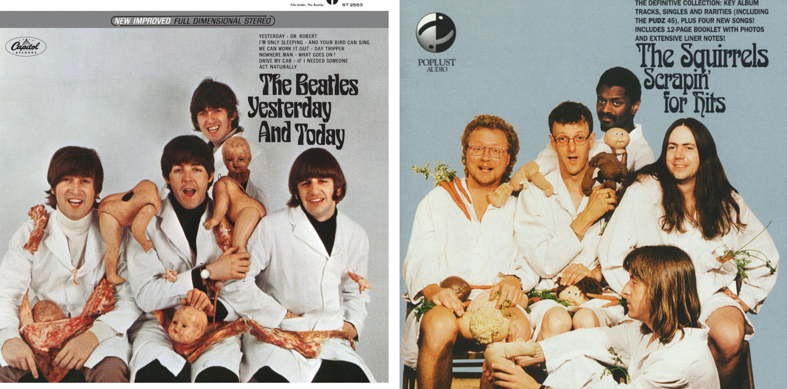
And never ones to let a good idea go un-overdone, in 1996 the fluffy-tailed rodents produced the compilation CD pictured below in homage to the Fab Four’s most famous misstep thirty years before.
The Beatles Yesterday. . . and Today (Capitol Records US 1966) – Art direction George Osaki, photography by Robert Whitaker
The Squirrels Scrapin’ For Hits (Poplust Audio 1986) – Design Ben Thompson, photography by Mike Murphy

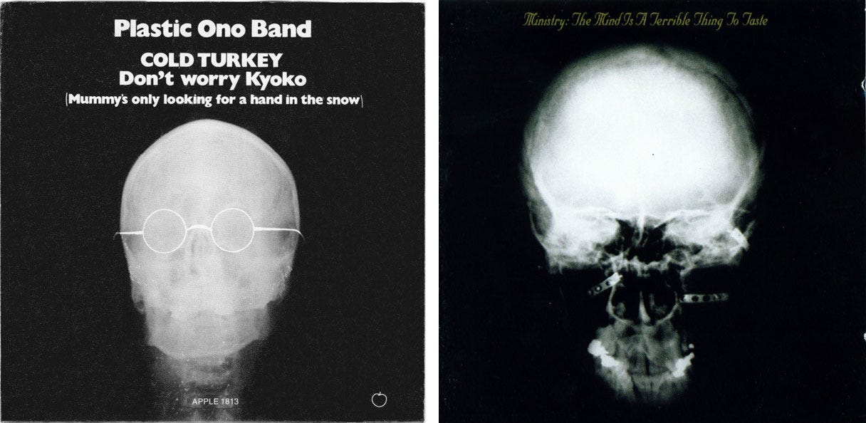
Plastic Ono Band Cold Turkey/Don’t Worry Kyoko (Apple Records 7-inch single 1969) – Design & art direction by Kosh
Ministry The Mind is A Terrible Thing To Taste (Sire/Warner Bros. Records 1989) – Design by Dog, III and Maura; photography by Tom Young
I’m calling this one a coincidence, Ministry’s cover is obviously related to the album’s title. The Plastic Ono Band’s image is of John Lennon’s noggin, and if the Ministry pic features Al Jourgensen (and I have no idea if it does or not), then there’s your connection.

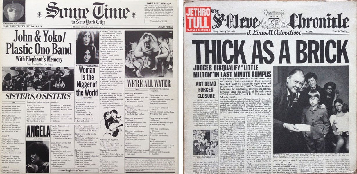
John & Yoko/Plastic Ono Band Sometime In New York City (Apple Records 1972) – Sleeve concept John & Yoko; design Al Steckler, Michael Gross
Jethro Tull Thick As a Brick (Reprise Records 1972) – Design by Roy Eldridge
Another coincidence. Both covers are conceptually linked to the album’s musical and lyrical contents, which are very different from each other. John and Yoko’s material was topical to the extreme, “ripped from the headlines,” as they used to say. Not their best effort musically, but a powerful antecedent to topical albums like Neil Young’s Living With War decades later.
Jethro Tull’s jacket unfolds into a full-sized, eight-page ‘newspaper,’ detailing the exploits of Gerald Bostock, the fictional character that Ian Anderson concocted for his high concept masterpiece Thick As A Brick.

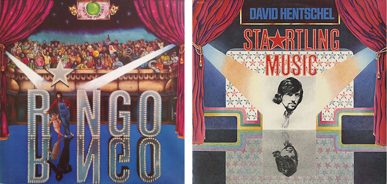
Ringo Starr Ringo (Apple Records 1973) – Art direction & photography Barry Feinstein, painting Tim Bruckner
David Hentschel Startling Music (Ring O’Records 1975) – Art direction Roy Kohara, design Charles Ames, Illustration Catherine Loeb, photographer Ron Cohen
This is an interesting story; Ring O’Records was a label created by Ringo Starr in 1974 to support upcoming artists as Apple Records was winding down. The name was allegedly suggested to him by John Lennon. Ringo never recorded for the label himself and like most vanity projects of this sort it was short-lived, but its inaugural release was this instrumental re-interpretation of Ringo’s hit 1973 solo album performed by keyboardist David Hentschel on ARP synthesizer, supported by Phil Collins on drums. An oddity for sure, and despite its familiar cover art and Beatles connection, it was an instant cutout then and a deep Beatles collectible today.

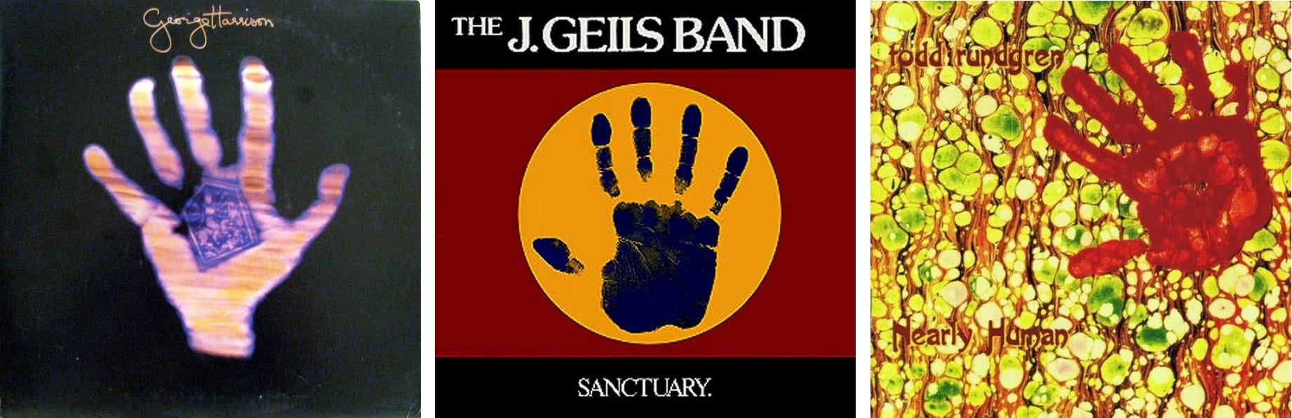
George Harrison Living In The Material World (Apple Records 1973) – Design Wilkes & Braun Inc., photography by Kendall L. Johnson
J. Geils Band Sanctuary (EMI America Records 1978) – Layout Paula Bisacca, photography Alen MacWeeney, Rob Van Petten
Todd Rundgren Nearly Human (Warner Bros. Records 1989) – Artwork by Todd Rundgren; typography & layout Lisa Osta, Todd
Finally, we have the handprint – in Hinduism symbolizing the divine impression of the Lord, which is no doubt where George was coming from – but also a more universal representation of spirituality across different theologies and cultures. I believe these three covers were created independently but all with some aspect of spirituality, sanctuary or humanity inferred. And purely by coincidence each of these records are high points in their respective artists’ careers.

No posts
Comments
Nothing yet. Say the first thing.
Sign in to join the conversation.