
Hello friends,
A month ago I described four problems with chat box-based conversational data analytics. Just because OpenAI gave us a chat box interface to its LLM, it shouldn’t have meant that AI analytics followed the same lead.
First, a promo for The AI Analyst on Wed 26 Aug.
I’ll be with Klaus and Merlijn from Infotopics, as they explain why they’re building Trulyp, bringing all their Tableau extensions into a new, AI-driven platform. Register here.

The four AI analytics UX problems I highlighted were:
Conversations with data aren’t linear
Single threads give you one answer at a time
There’s too much eye movement to different places
Data gets squished in conversation panes.
Since that post went out, I’ve spoken to several vendors and dug into a few more on my own. People are thinking hard about these problems, and there are novel ideas to solve the problems. While none have solved everything, the direction of travel is encouraging. Here’s what I’m seeing, organized by the four problems.
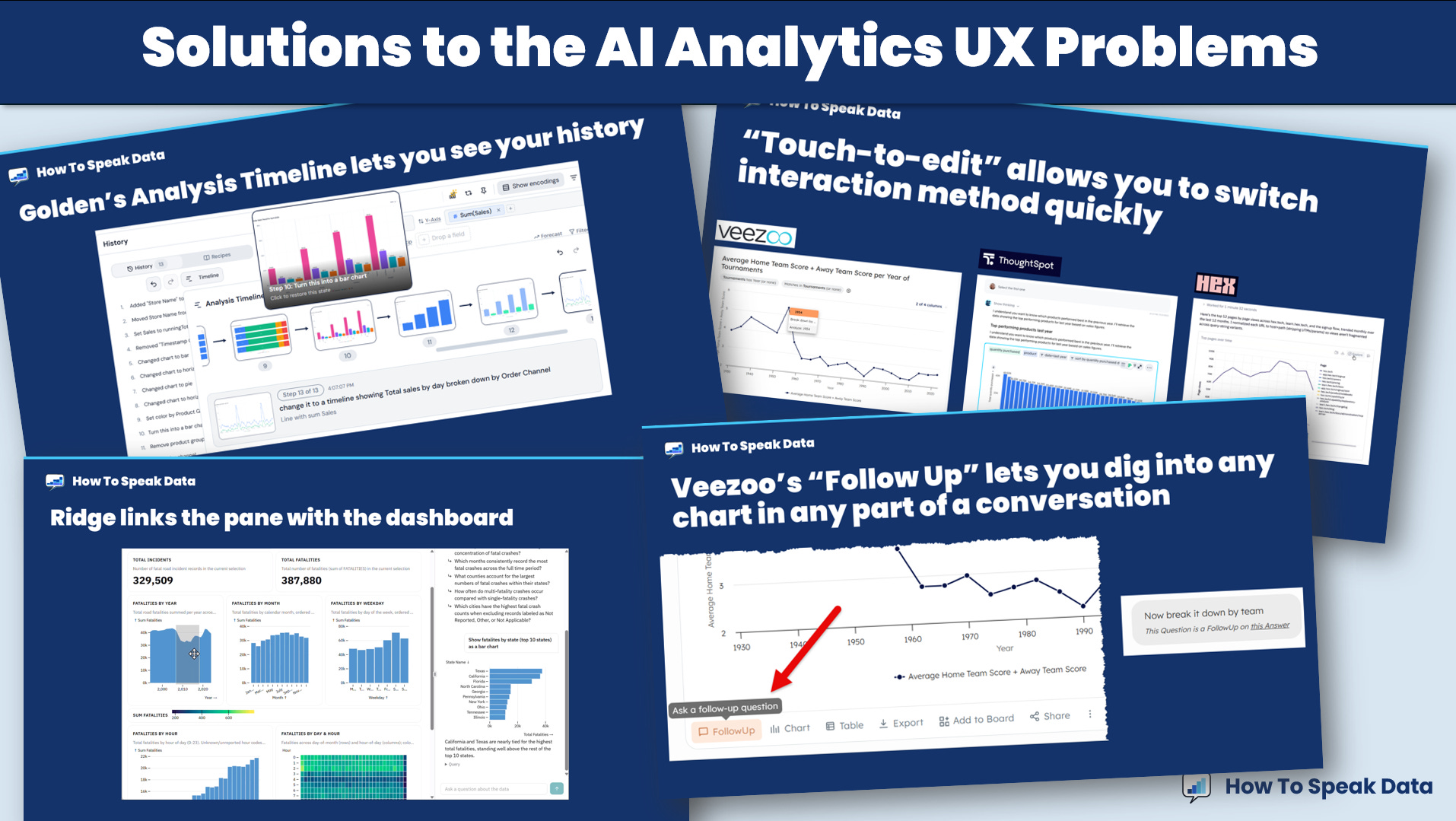
(Reminder: data exploration is “squiggly”; it is the ability to jump back and forth, up and down, in and out as you seek the best articulation of the data. Long, linear conversations are awful to navigate)
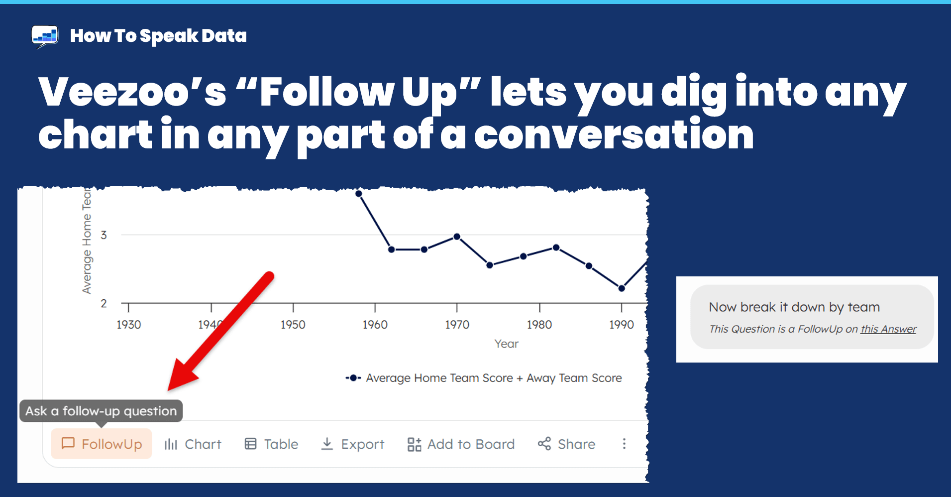
Veezoo’s “Follow Up” feature lets you ask a specific question about any chart anywhere in a conversation. The follow up then appears at the end of the main conversation flow. Instead of having to use text to refer to a previous interaction (“Can we go back to that chart about sales by country”) you can force a new “thread” directly from the chart.
Another solution is the ability to instantly switch from chat to direct interaction with a visual. At this point, if your AI platform does analytics and returns static images, you’re behind the curve. This is where the main LLM platforms (ChatGPT, Gemini, Mistral, etc) are: they mostly only return text summaries and static images. It’s like looking in a shop window but being unable to go in and browse.
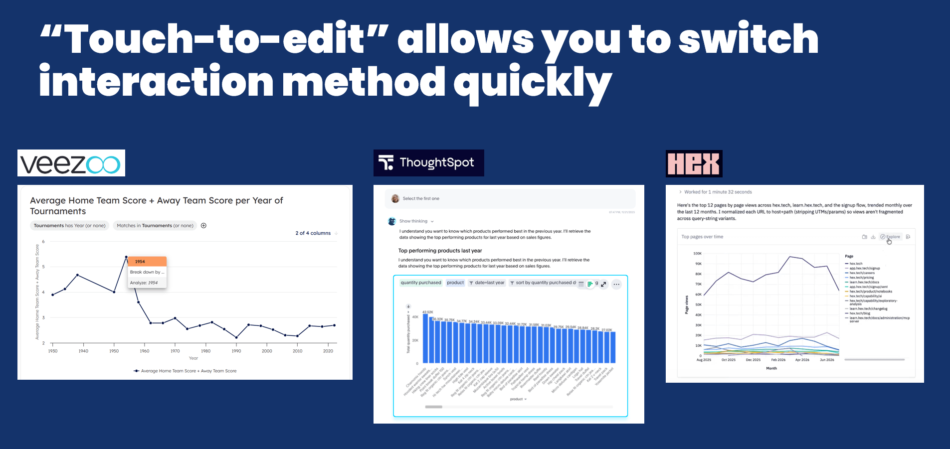
If you give me a chart inline in a conversation let me interact: filter, edit, switch, rearrange. Veezoo lets you change filters and ask follow ups, Thoughtspot’s Spotter lets you change the tokens and filters, Hex lets you expand a chart into a detailed explorer view.
This matters for non-linearity because you can examine the output without relying on the text box. You can stay in the flow, adjusting and exploring, in whatever way feels most appropriate.
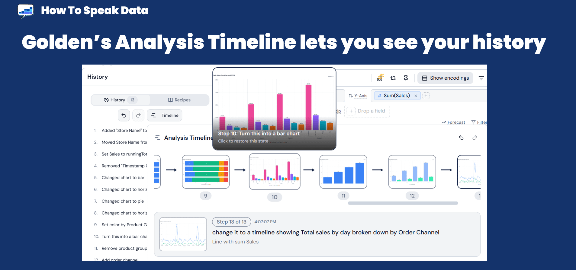
Golden Analytics has built a visual history timeline that lets you see your session history and jump back to any previous point with a click. It’s simple and well executed. This is a native part of the platform, i.e. not just when you use AI conversations, but it shows a way to skip forwards and backwards very quickly. It also aligns with Golden’s hybrid approach to AI: the “Slider of Autonomy”, more of which below.
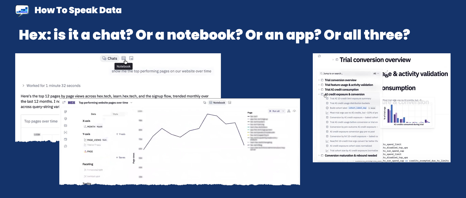
Hex has a different approach. Every conversation is also a Notebook. And an app. And it has a searchable table of contents. This is the most direct fix I’ve seen for the “scrolling back up to find that earlier thing” problem I described in Part 1.
For example, if you’ve done a long chat about, say, marketing campaigns, you can switch from chat to notebook and search all the cells for a particular moment in the conversation. That section can be repurposed and reused elsewhere.
(Reminder: an LLM could provide infinite answers. Most chat bot experiences provide one at a time)
I think this is one of the hardest to solve. Do we want threads? Do we want something akin to a chatroom with multiple responses to each question?
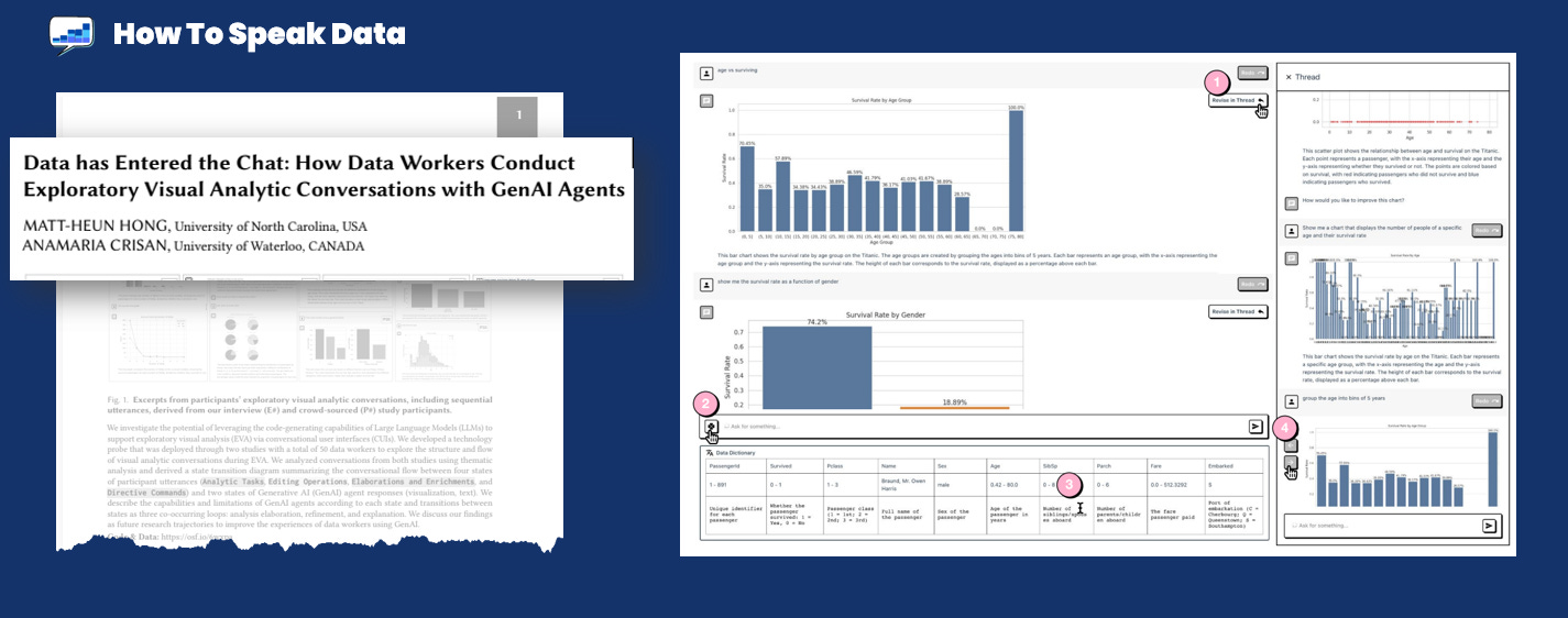
Researchers Matt Hong and Ana Crisan explored threaded exploratory data analytics as a design pattern. They designed a system that let users branch questions into individual threads. Their research found that users still ran into frustrations with this approach, which is worth knowing. They struggled with managing branches and global context. Threading feels like a promising approach; research shows it is not yet a silver bullet.
One of the most interesting innovations I’ve seen was the winning entry in Veezoo’s Analytics Cup this summer. Entrants were provided a comprehensive World Cup dataset.
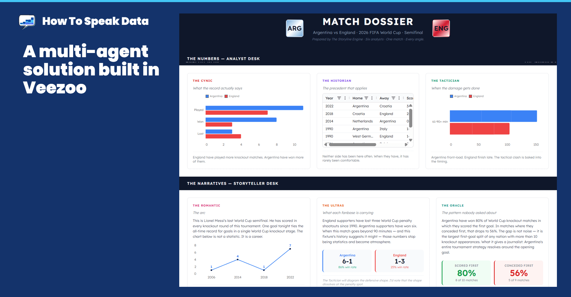
The winning entry by Oliver Yang solved this problem. He made a system of 6 different analytics agents who would investigate a given question. His agents were tuned as cynics, romantics, historians, tacticians, etc. For any given match, each agent would examine the data and return a story based on their configuration. I love this. Just like real life, one question generates a whole different set of valid opinions.
(Reminder: The sidebar AI paradigm (data on the left, chat on the right) forces your eyes to travel constantly. Eye movement is expensive: it flushes your short-term visual memory, and when you go back to your chart, you’ve already forgotten what it looked like before the change.)
The solutions here cluster around one principle: bring the AI closer to the data.
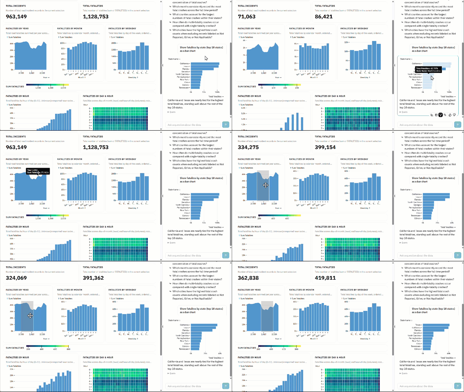
Ridge does have a side pane to let you “chat” alongside your dashboard. But they’ve done something cool: the chart and the dashboard connect and instantly update as you interact.
Whenever you interact with the dashboard or a chart in the conversation pane, all displays filter, immediately. Ellie Fields at Ridge describes it as “the best of dashboards and AI chat, together.” It’s a really fluid and intuitive approach to the challenge.
Do you use Microsoft Office? You know how the contextual tooltip bar appears whenever you select some text? It’s such a great little UX trick: you’ve just selected the text, so the app knows your eyes are literally looking at the selection. Therefore, why not show the most commonly used formatting options right there, rather than send the user’s eyes and mouse up to a toolbar? It’s one of my favourite UX features of all time.
And it’s one I called for when I spoke to the Tableau dev teams about the UX problems of AI Agents.
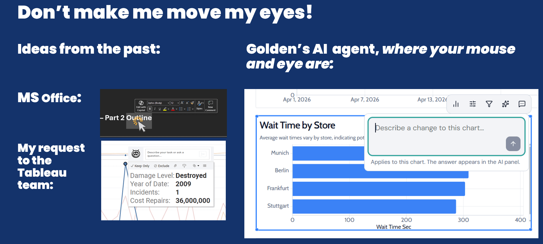
Golden has implemented the AI chat box directly adjacent to the relevant chart — not in a global sidebar, but right next to the data you’re asking about. You simply click on what you want to change and describe your intent. It’s exactly what I requested in my talks with the Tableau team back in 2024. I’m so happy to see this; I think it’s a great solution.
(Reminder: Narrow side panes for AI-driven data chats create unreadable charts)
This is my shortest section. Why? Because the solution is simple: give data more space.
You can make the AI agent the full focus. Thoughtspot and Veezoo have this approach. Just like ChatGPT, Claude or Gemini, the chat is the window.
Hex has a tabbed layout that lets you toggle between full-screen chat, or full-screen notebook with the chat in a collapsible panel. You’re never trying to do both things at once in half the space. You can choose and change as you wish.
Everything I’ve discussed so far assumes the chat box is here to stay and the challenge is to make it better. What if the chat box is just a bridge technology?
Golden’s Francois Ajenstat proposes a “Slider of Autonomy,” inspired by Andrej Karpathy. Instead of optimizing the chat UI, why not reduce our reliance on it? Francois argues that AI should be embedded behind buttons and interactions, allowing users to choose how and when to invoke it. If you want to click, drag, and drop, you should; if you need AI, it should be there, immediately, contextually ready.
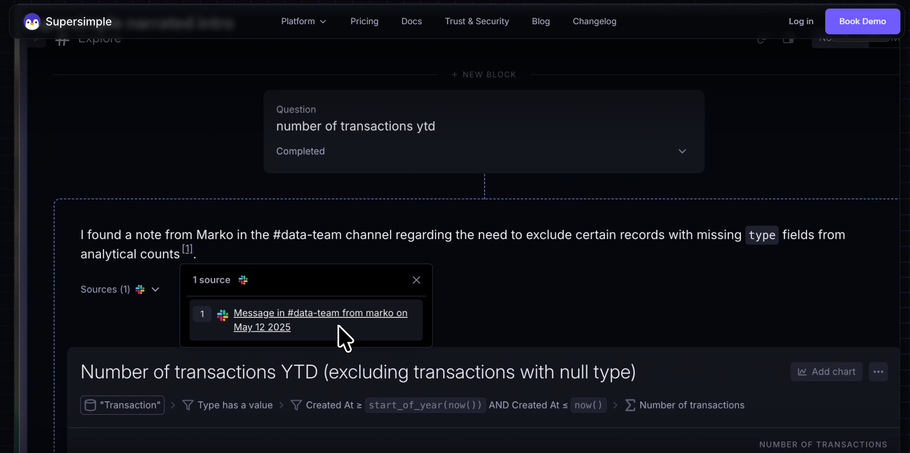
After publishing my first post on the UX problems of AI, Nikita from Supersimple got in touch. He showed me what they’re building. They’re moving past the chat concept entirely, opting for an infinite canvas of blocks (charts, tables, and variables) that function as a workspace. Here, the “conversation” isn’t a separate pane; it’s the record of changes you’ve made to the canvas.
No single vendor has cracked all the problems; we’re too early in this new world to have worked out all the solutions.
The innovation I see is mostly from startups, not incumbents. They’re the ones with the least amount of legacy code, giving them flexibility to adapt quickly as we all learn how to best bring AI and LLM technology to data analytics.
I’m excited to keep watching the industry. If you’re building something in this space and have an idea worth sharing, I’d love to hear from you.
Thanks to the teams at Veezoo, Hex, Ridge, Golden, Thoughtspot and Supersimple for sharing what they’re working on. And to scholars exploring this new frontier.
Finally, do join me on 26th Aug for my next episode of The AI Analyst as I talk with Klaus and Merlijn from Infotopics about their new Trulyp platform.
No posts
Comments
Nothing yet. Say the first thing.
Sign in to join the conversation.