
Starting the year with a half-built thing. I have been working on Papermaker, a generator that lets you create planner PDFs with hyper-links to navigate. It works well with Goodnotes, Notability, Apple Notes and devices like reMarkable.
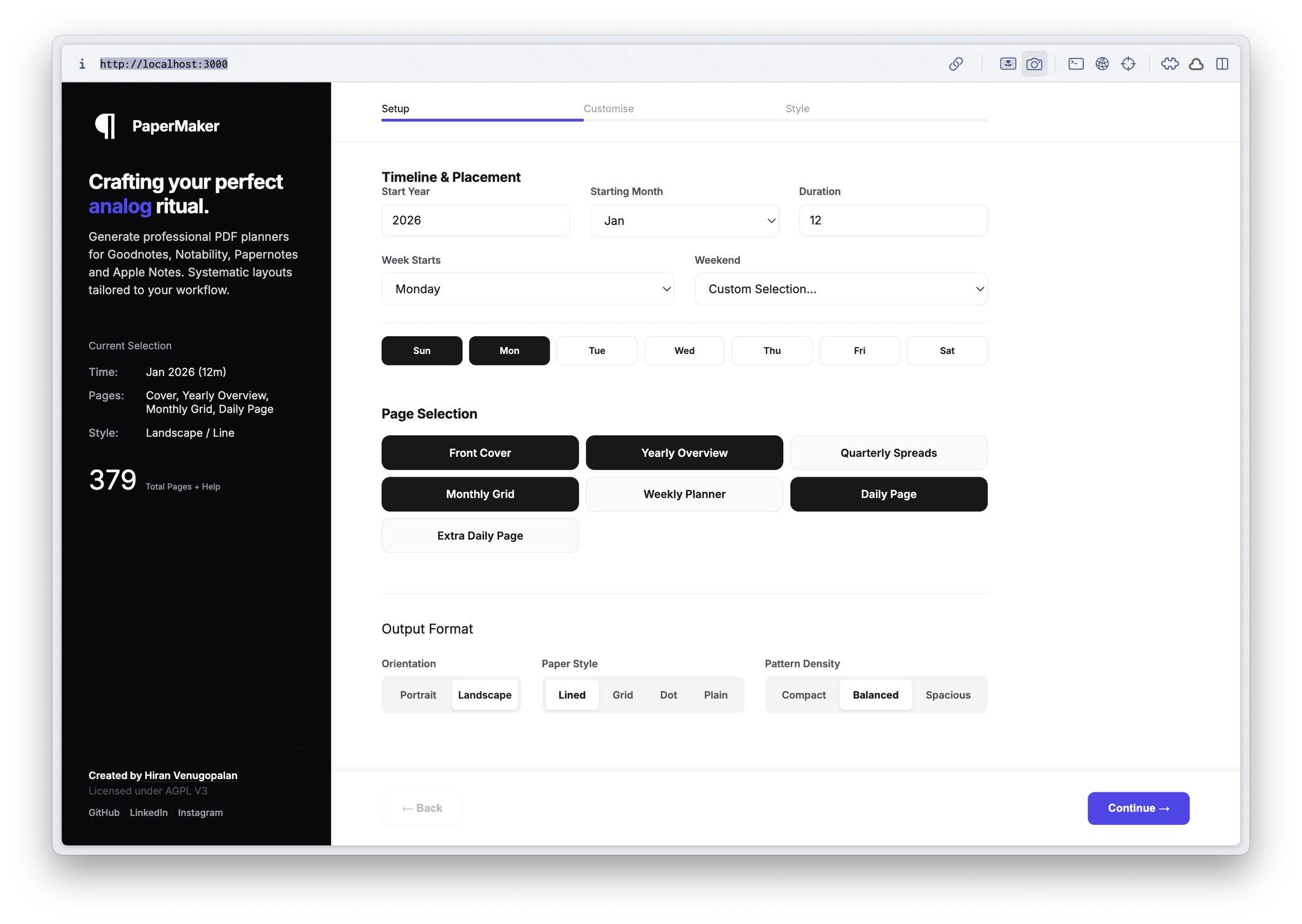
You can pick what you want, from pages and layout to colours and fonts, and it outputs a clean, linked planner that adapts to how you plan. It is built using Anti-Gravity and powered by Typst, which has been a joy to work with. The core is nearly done and fully free and open source. For now, the repo is on GitHub if you want to run it locally, and there are a few sample planners you can download and use as-is.
For decades, photography relied on the Shirley card , a reference image used to calibrate skin tones. The skin tone on the card was always white, and cameras, film stock, and processing pipelines learned that as correct, with everyone else treated as an adjustment. I went down a rabbit hole reading about this history and how imaging teams are now trying to undo that bias. Google’s Real Tone is one such effort. It is not loud or decorative, just careful and corrective. What stayed with me is how long these defaults last. A small reference card quietly shaped decades of images, aesthetics, and assumptions. (And this reminds me of ന്റ issue in Malayalam language!)
This year, I am not planning to buy any calendars or planners, but a few options stayed on my radar. Atelier Neorah has normal and petit planners with slightly complex templates (~₹499). Numic offers the colorful The ColorPad 2026 and a classic kraft Table Stand Calendar 2026 (₹499). Thanks to Anfaz, Roda is always in my list for its functional and minimalist wall calendar with ample space to write(₹495). Asif recommended Sachin Warrier’s Chunky Days 2026, which is ideal if you want to write on it, and is looking for a maximalist appeal. Solid Calendar 2026 makes a solid, wooden-frame-friendly calendar with classic vibes (₹3,000) (PS: Refill sheets are available for ₹799). Finally, Rescript remains a safe pick for its functional planner on recycled paper (₹499).
Found a website, turns playlists into old-school record-style asset labels, complete with covers, side A/B details, and lyrics if you feed it markdown.
A very old video on how to solve a problem like a designer. Still worth watching.
A video documenting Kerala-based lost-wax artisans working with bell metal. Process-heavy and grounding.
Reading again about political censorship in Indian cinema. The language changes, the pattern stays.
Exploring Google Sans as a variable type playground on design. Less about the font, more about the system.
A video on the making of Volvo’s interface typeface, alongside the EU’s push to bring back essential physical buttons in cars. Two ends of interface thinking worth viewing together.
Pressgusser, a game built around guessing years from historical newspaper front pages.
Must Read for Designers MCP for Designers: What It Actually Does (and Doesn’t)
No posts
Comments
Nothing yet. Say the first thing.
Sign in to join the conversation.