
I haven’t written about design / directly about product building in a while… and honestly I’ve missed it. So I wanted to take some time to talk about 3 design mistakes I’ve seen early stage folks making time and again.
This is obviously not an exhaustive list of design mistakes I see early stage companies making. But I think these 3 happen at such a common rate, it felt like a good exercise to write out my general advice I share with companies I work with.
This is a term that was coined within Eternal by one of our technical leads, Henry Boldizsar.
Many times when you’re building a feature, or when you’re truly in the 0-1 stage of a product so you’re trying to determine the initial set of features that make a sufficient experience, you are starting with some type of story.
That story is being pulled together by personal experience/desire, customer research/profiles, and a the company mission.
And as that story is getting pulled together you are defining what is actually going to get built. It’s function, feel, interface, even how it’ll be marketed to the end user. It is in this moment where we are beginning to set down a few thesis that will be market tested when we accomplish the building that’s ahead of the team.
But what isn’t getting discussed nearly enough, are the assumptions that got us to that point. The assumptions that silently underly our opinions on “interface feel” or “customer expectation”. You would be shocked how many half truths we have just laying about in our brains that go unchecked, and make it into the formal working process of a team → determining weeks of work and countless dollars.
Going through the hard work of mining out these assumptions is an incredibly useful exercise that saves time, money, and cycles of misses. Many folks in technology tend to stick with a “fuck it, ship it, and ship it fast” methodology of letting the market tell them where and ideally how they are wrong. I find this to be a bit reckless, and the best teams I see are the ones that can really spell out (even if the answer is just gut intuition) what the underlying assumptions are for their decisions… well beyond “well the data said X”.
So what is the assumption scaffolding. Anyone that has built anything knows that it’s not just 1 questions and one decision that goes into building a feature. There’s dozens of seemingly meaningless / tedious moments that help to construct something as small as a feedback button.
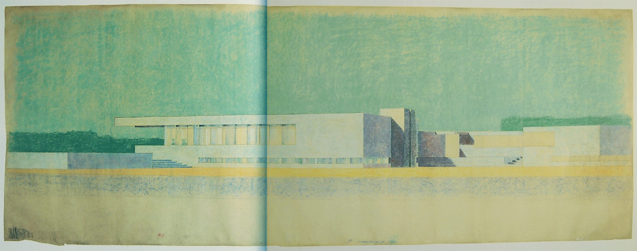
The assumption scaffolding is a recognition that if you build too much at once, without checking your assumptions, one faulty beam of an assumption from the beginning of the process can cause a building to collapse. And because we didn’t check through these assumption beams, we don’t even know what is going wrong with the product.
How do we combat this then?
The simple answer is - never let your building get too high without putting people in it.
A more robust answer is - hitting it with the simple stick. A concept I stole from “Insanely Simple”. Often times, we are subconsciously searching for complexity. The weird thing about complexity that no one tells you, is that it feels good. It feels like our brains are actually doing something. That all that schooling meant something. But simplicity is much harder. Dictating what the core assumption is → and if there’s a way outside of engineering to test that before dedicating even more resources towards it. And yes, even in this vibe coding era, you should search for other ways to test assumptions beyond handing someone a web page. You’d be surprised what you find.
I see a lot of companies showing products, before they have any meaningful users, where the product has so many parts and pages and animations… that I simply have to ask “how do you know if this is right?”
Their assumptions are a mile high… and I help them bring it back down to ground level. Which ultimately helps them move faster, ship better derisked features, and build insights at an actionable cadence vs all at once and tangled across different potential sources of influence.
This design flaw is the one that I was most guilty of committing.
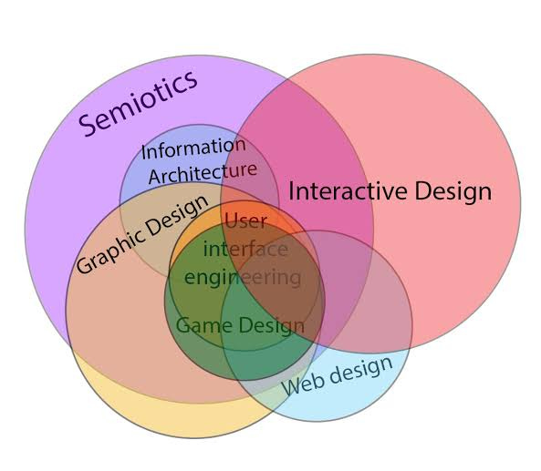
It goes like this: if you view everything as interface, the primary thing you believe you should be changing on your rode to PMF = interface. (this also is a major assumption within the scaffolding you’ll find yourself discovering as you apply that critique framework)
This is one of the flaws of our current design tooling. It makes it significantly easier to play with interface than to play with logic or assumptions, the white hot center of engineering functionality. There are so many ways to visually represent a single function, but often times it is not the interactive representation that needs adjustment → it’s the nature of the function itself. I refuse to insert that Steve quote here, but let it just come to mind for you in his voice right now.
For something like ChatGPT for example… the interface isn’t changing all that much. The design, truly, is the behavioral style and output of the model. In many ways the true designers of OpenAI are the researchers. (this gets into a whole side thesis that I believe the future of companies like OpenAI will only be researchers and designers, and the engineering in the middle -aka the application layer- will actually get squeezed away by AI)
The fix here is really quite simple.
Don’t run to solve something by opening Figma. In fact, as you think about the initial interface, make it decently flexible (while appropriately opinionated) enough to handle shifting underlying functionality.
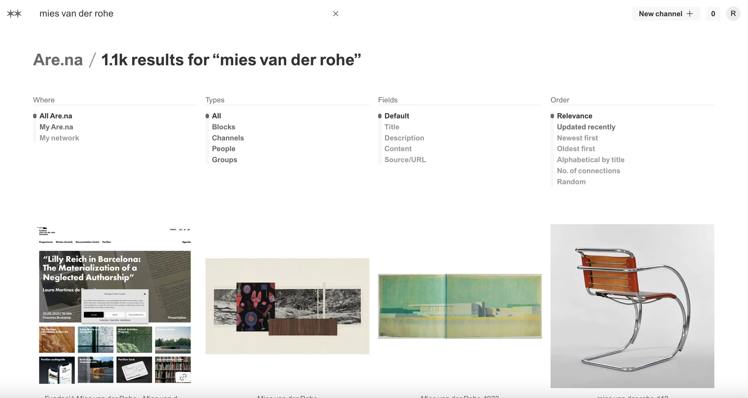
A good example of this is searching within Are.na.
The filtering is appropriately opinionated, but leaves significant flexibility to tweak the underlying filtering mechanisms. Listed qualities automatically updating the visual arrangement below.
Finally we come to the most damning, but probably the most common. Not doing the job that you claim to be stating.
There’s a lot of takes on “build something people want”. Which I think is an absolutely useless phrase. But my equally useless phrase is “do the job you said you’re doing.”
So often I’ll talk to a company that claims to be doing X, they show you the product, and you’re asking “where the hell is X.”
Somewhere between the expressed intention, and the work at hand, X gets lost. It seems silly, but happens more often than you think. It can be a mistake of focus. Trying to appease investors. Trying to take your teams’ opinions into account. Whatever it is, it happens.
The only thing that has helped me in this arena, which I may write about more, is a return to atomic units.
The atomic unit within design is what everything will center around. Where the stated values have to show up.
Using Twitter as an example, the atomic unit is the Tweet. Since the beginning, when the network was texting out updates to phone numbers and not even it’s own mobile app, the Tweet has remained functionally quite the same.
Identifying what the atomic unit of your design system will be, how it actually does the job, and how it will continually show up to create aliveness in the product has proven to solve many design woes I’ve seen.
I don’t do edits really, so excuse typos and things that don’t make sense.
Thanks so much for giving me your attention. I hope it was worth it, if not… unsubscribing will not hurt my feelings, and will give you back time you literally cannot have back.
Much love.
Live in the light
Comments
Nothing yet. Say the first thing.
Sign in to join the conversation.