
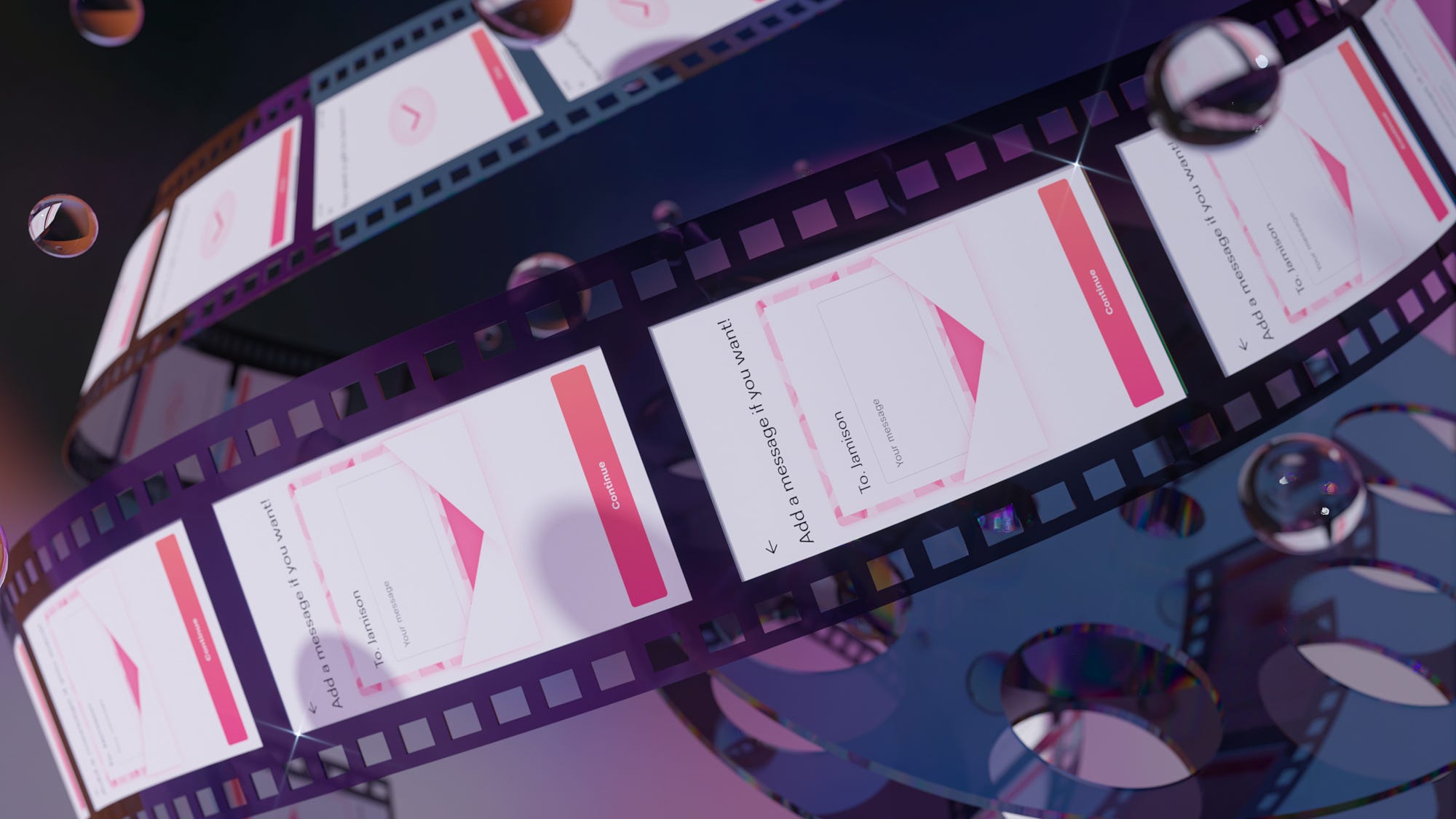
The history of software design is still relatively short. To find fresh inspirations or proven wisdom, we often have to look outside of our own discipline and turn to more established ones.
The film industry is a great source for lessons and inspiration. It’s because film as a medium dates back to the 1890s, and since then filmmakers have been working on the same things software designers strive to achieve: keeping the audience engaged, telling an enticing story, and creating something people love.
The technique and lessons for UI animation has long drawn from the techniques developed for TV and film. The most widely read resources for UI animation point to the 12 principles of animation laid out by Disney animators in the early 1980s. Designers created UI animation with AfterEffects, a software that’s intended mainly for motion graphics.
Most people who design UI animation know to pay attention to timing and easing. But there’s so much more to motion than durations and easing curves—for example, the art of editing.
One of the known values of UI animation is that it can communicate cause and effect. You can easily find examples of UI animation that aim to do this, by having an element travel from one place to another. Here are a few examples:
When you complete a lesson, Duolingo lets you know your progress towards the Daily Quests and Monthly Challenge. In this example, the +1 element follows a linear path down into the April Challenge row.
The duration of this animation is close to a second, and it plays every time you finish a lesson. It’s not skippable so you have to wait until the +1 travels to the Challenge section.
Chrome’s new tab animation takes a similar approach. When you open a new tab, a link object flies out of the link and gets tossed into the tab bar.
You see a similar animation when you download a file on the desktop app as well. (Except that this animation doesn’t actually start from the download button.)
So this type of animation is common, but do people like it? I was able to find some reactions online:
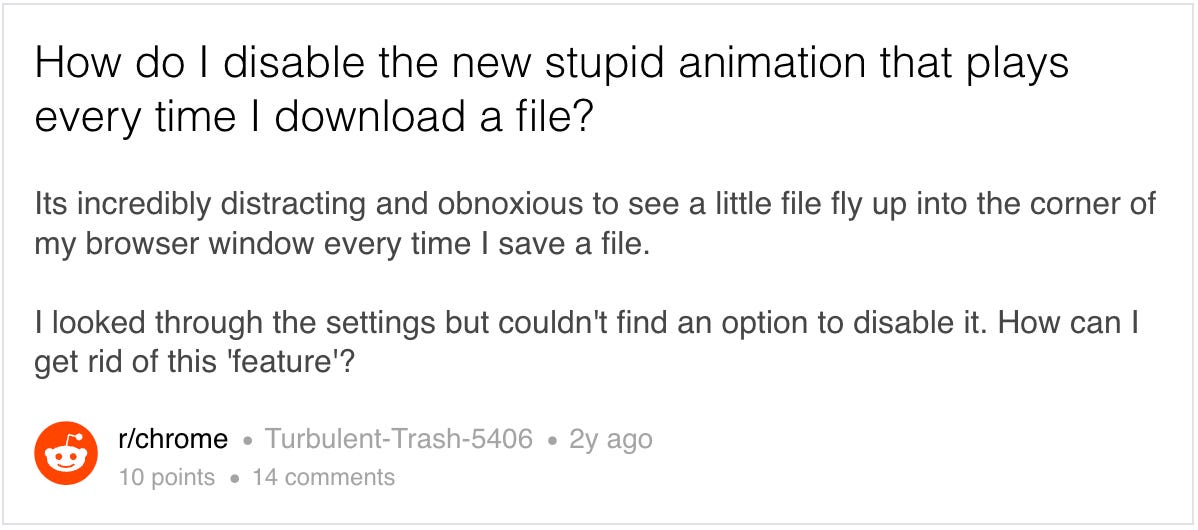
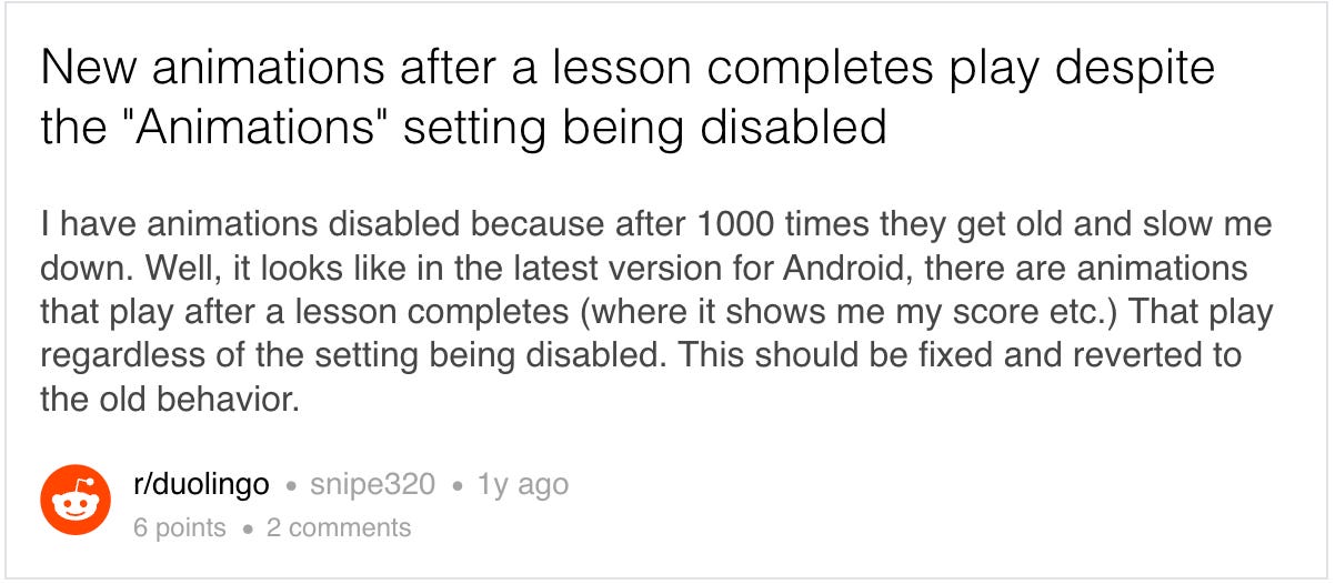
Why the negative reactions when we’ve heard so many times that microanimations add moments of delight?
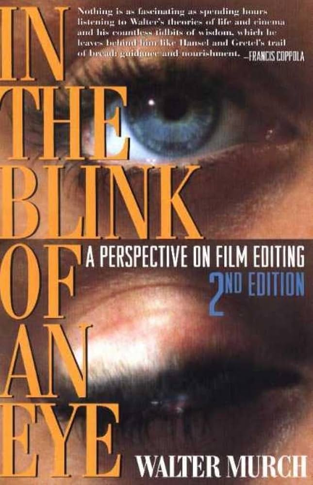
In The Blink of An Eye, written by Walter Murch, is one of the most widely read books in film editing. The author shares insights on what the editor should keep.
An ideal cut satisfies all the following six criteria:
Emotion: it is true to the emotion of the moment.
Story: it advances the story.
Rhythm: it occurs at a moment that is rhythmically interesting and “right”.
Eye-trace: It acknowledges the concern with the location and movement of the audience’s focus of interest within the frame.
Planarity: It respects the grammar of three dimensions transposed by photography to two.
Three-dimensional continuity: It respects the continuity of the actual space. (where people are in the room and in relation to one another)
So emotion, story, and rhythm are the most important criteria. Do the above animation examples meet them?
Emotion: Let’s go back to the Duolingo example. In this moment, the user would be excited about the lesson’s completion and might be eager to get to the next one.
Whan a user open a new tab in Chrome’s mobile browser, they would be quickly browsing the internet and would be curious to see what’s on the browser tab they just opened. When a user downloads a file on your desktop browser, they might be busy working on a task. In all three cases, having to wait for the animation to happen would feel slow and out of place.
Story: The common sentiment in the above two Reddit threads is that “it gets old after many times.” The user has already seen this animation. In other words, it doesn’t add anything to the story.
Rhythm: In the Duolingo example, the user would be in heightened gameplay mode. We could compare this to an action movie where the pace of editing is blazing fast. In that case, a long animation in the middle would feel out of place.
So should the designer cut this out? Maybe, but I still think UI animation is valuable as it provides character and dynamism to software. I just think it could use some editing. How do we edit this?
Do people need to see something go from point A to point B to understand that it traveled from A to B?
Imagine you’re watching a movie. The character moves from point A to point B. The camera shows the character get into a car, follow them while they drive the car from point A and point B, open the car door, and walk into the building. Most people would find this boring and might skip ahead.
That’s probably why we never see these approaches in TV shows or movies. Nearly all visual media is composed of shots joined together. When you see a character running in point A and then it cuts into them running in point B, your brain has no problem understanding that they moved from point A to B.
How are our brains capable of doing that, when our perceived reality always seems to be continuous? The book In The Blink of An Eye dives into this question.
Our brains are already pretty used to non-continuous visual information. Our dreams are full of jump cuts: you don’t know where this scene came from but your brain can process it just fine. So are your memories. Your memories are never continuous but rather snapshots of scenes. You also blink your eyes naturally when your brain switches context — dissecting the stream of visual input into cuts.
Example: Instagram’s Save animation
This is one of my favorite UI animation examples. Like the flying icon animations above, the Instagram app’s “save to collection” animation tries to communicate where the object goes after an action. But this one cut out the traveling part.
This animation is significantly shorter and feels lighter without sacrificing the desired effect. Notice how your brain has no trouble connecting the bookmarking action and the animation on the tab bar. In short, you don’t have to show the traveling to show something moved.
Film editors have been inventing and experimenting with transitions as long as film editing has been around. In software, the most widely used transitions would be push or slide. Push transitions can provide a sense of space and positions of the screens outside the device’s frame. Similarly, slide transitions can create a sense of depth in a two-dimensional screen.
Dissolve transition is also frequently used in software, although it doesn’t provide a sense of space and depth.
Example 3.1: Airbnb’s dissolve transition
Example 3.2: Fitbit’s dissolve transition
Dissolve transitions are also very common in designers’ prototypes or slide decks. This happens because modern UI design software’s auto-animate or smart animate options default layers without matching names to Dissolve.
But I almost never use Dissolve.
My case against Dissolve is that in between the transitions, you can see the frames where screens overlap.
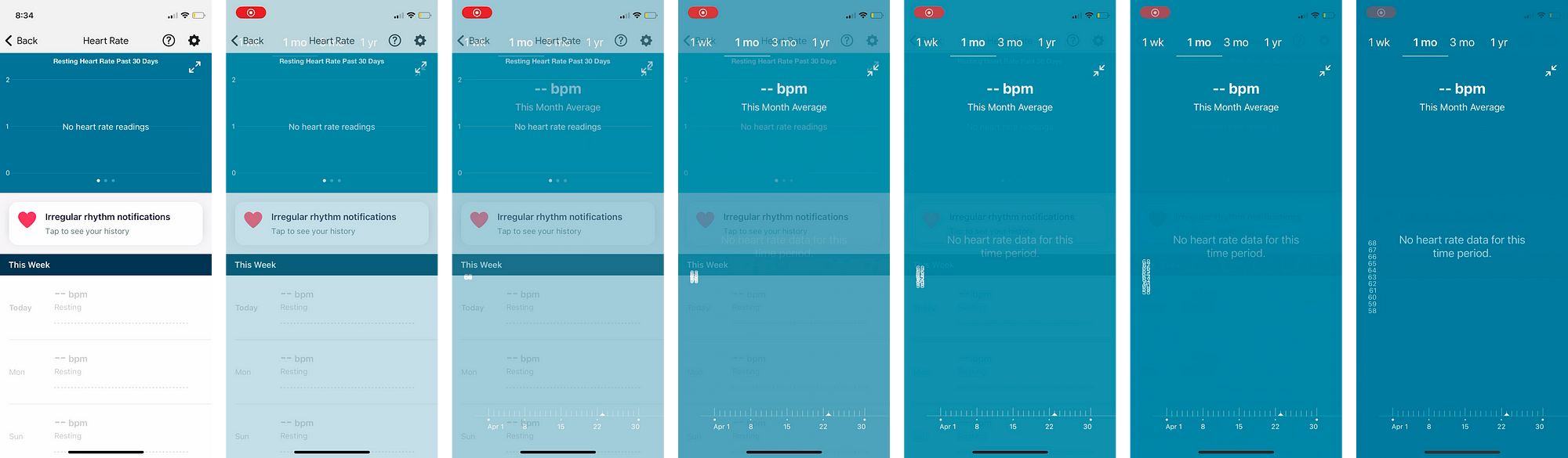
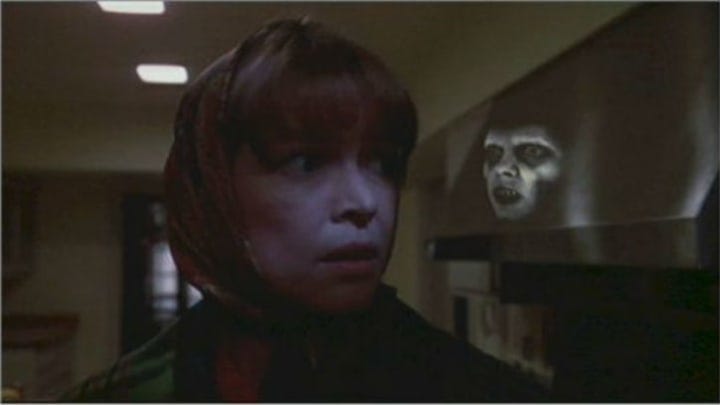
The human eye is very perceptive to anything that moves. If you have visually complex elements like text or images overlapping one another, it looks messy and jarring even if the transition is short. The human eye is also sensitive enough to feel the effect of what passed by quickly even if it can’t parse what it saw. The user will move on, slightly less trusting of the interface.
The Exorcist famously took advantage of this by inserting disturbing frames in the movie.
If you think about visual media, dissolve was very common until the 2000s along with wipe or iris transitions. But we rarely see them these days as they’re now seen as cheap or cheesy. When they’re used, they’re used sparingly in specific contexts.
So in what context is dissolve appropriate?
This video gives three reasons to use dissolve.
to show the passage of time
to get inside the character’s head
to match dissolve, to create “parallelism” — the use of similar or repeated elements to connect different parts of a film.
The video also notes that when you use dissolve, it catches attention so you have to be careful and intentional about using it. In the video, the narrator says: “In the hands of a lazy filmmaker, the dissolve can be a crutch.”
Another context where dissolve is appropriate is horror. Dissolves are great at communicating unease, confusion, and dread.
The use of dissolve in The Shining
Dissolves are very prominent in The Shining (1980) and are used as a stylistic choice to communicate horror.
UI transitions and film transitions aren’t in the same context, but we can borrow some of the intention that goes into choosing transition styles in film. Learning that a certain kind of transition is associated with passage of time or horror gives the designer a chance to ask: is that the impression I want to give to the viewer?

The software industry is sensing a transition. People question why today’s software looks bland and soulless, and designers now yearn to make something lovable instead of minimally viable. And what better way to breathe life into your creation than animating it? UI animation is now more relevant than ever, but I’m often left thinking about how little we know about animation and perception, when the film industry has accumulated a century of knowledge to share.
In In The Blink of An Eye, the author counts one of the central responsibilities of the editor as:
to establish an interesting, coherent rhythm of emotion and thought—on the tiniest and the largest scales—that allows the audience to trust, to give themselves to the film.
For designers who wish to achieve a similar goal with our own work, we have a lot to learn from this art.
No posts
Comments
Nothing yet. Say the first thing.
Sign in to join the conversation.