
I’m not a thumbnail designer.
But I occasionally do simple designs, like this one for Bryan Johnson:
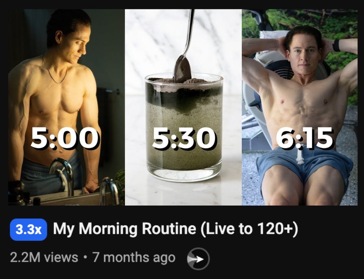
So I thought I’d walk you through my process, using this thumbnail I made recently for an episode of Making It (the podcast I co-host with George Blackman and Jamie Whiffen):

After a strategy session in London, George and I set ourselves a challenge.
We’d choose an episode each, and make a title and thumbnail for it in 20 minutes flat.
My episode was an analysis of three channels that had caught our eye recently: easy, actually, Fallow, and MikeShake.

We both had trains to catch – so the pressure was on.
1. Focus
I decided to focus exclusively on easy, actually for a couple of reasons:
It was the first channel we discussed in the episode, so we’d immediately “honour the click”.
easy, actually was the most ‘trending topic’ - they’d had explosive growth that month, creating a lot of buzz on YouTube strategy Twitter. I thought the title could be something like “How this channel got 300k+ subscribers in 2 months”
It seemed a simpler design job than trying to cram a visual representation of each channel into the thumbnail (e.g. MikeShake chopping something with a sword, the Fallow guys cooking, the stick figure from easy, actually). And probably a more effective one, as Fallow aren’t very visually recognisable.
2. Browsing photos for inspiration
I looked through our library of thumbnail template photos and found this one…
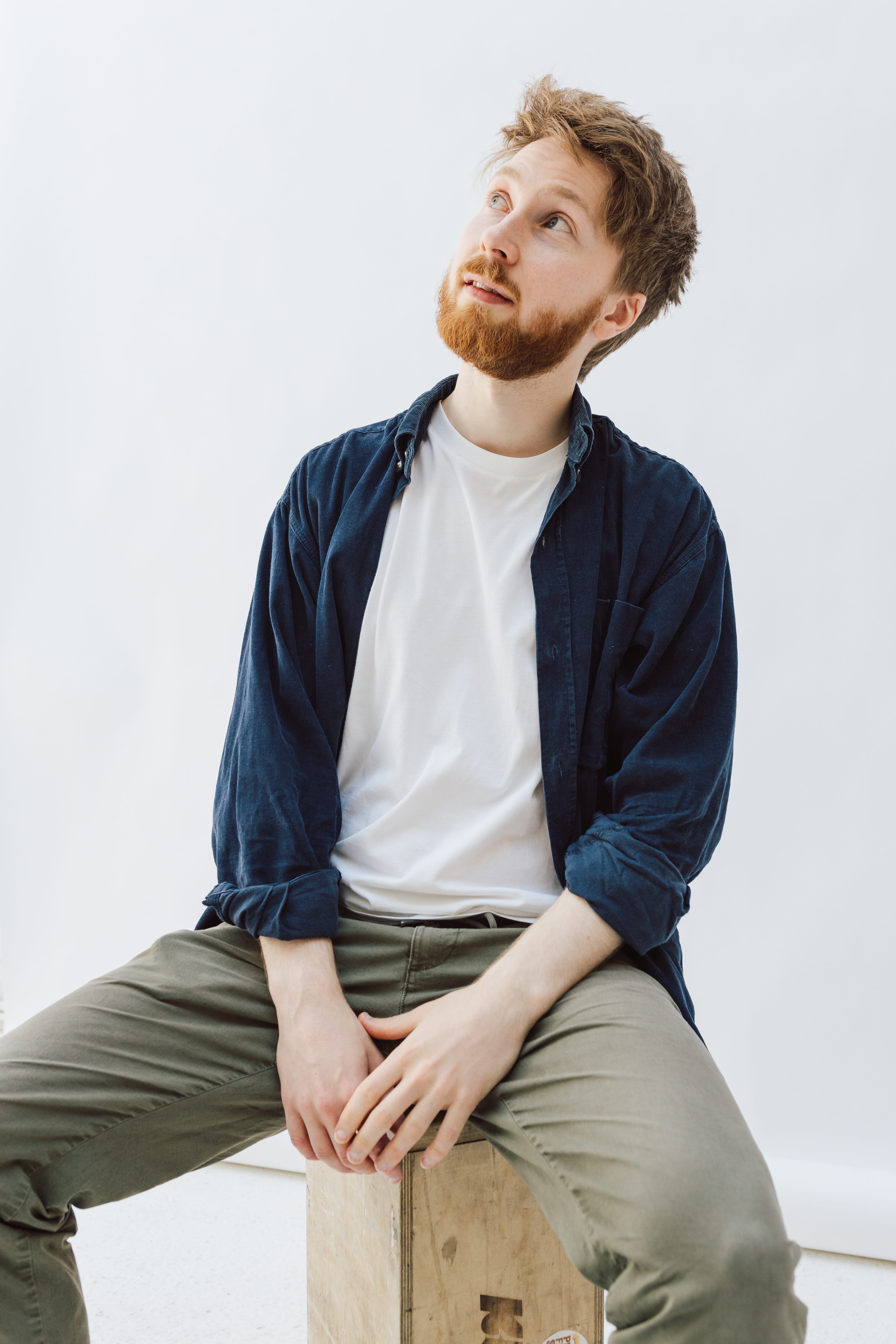
…which reminded me of an eye-catching Aprilynne Alter format that took off a few months ago.

Interesting.
Now I needed to make the photo look like I was analysing easy, actually.
We’d included other creators’ thumbnails in previous designs, like this:

So I combined that approach with Aprilynne’s composition, putting three easy, actually thumbnails above me in the thumbnail.

Hmm.
It didn’t look quite right.
I switched from our usual grid background to a gradient background like Aprilynne’s:
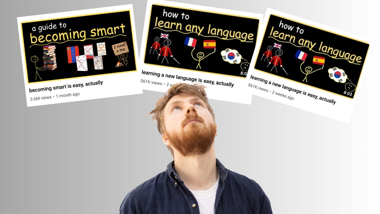
But something still felt off.
3. Troubleshooting
The thumbnails weren’t that visible, and the blank space around me looked too… blank.
I almost scrapped the idea.
Then I realised.
This design would only appeal to people who were already familiar with easy, actually.
How could I make this video compelling to the entirety of the podcast’s TAM (total addressable market)? That is, everyone interested in social media strategy – even if they’d never seen easy, actually?
View count seemed obvious: easy, actually had hit 5.6 million views in their first two months.
4. Adding text
So I shifted myself to the left, and added text saying ‘5.6 Million Views’.
And it looked…

…terrible.
There were three main problems with this composition:
It wasn’t clear where the viewer should look first
My eye-line was off
The easy, actually thumbnails were still hard to recognise
I liked the Roca One font though. Like a more restrained Cooper Black.
So I made three fixes:
Text to the top of the image
Removed one easy, actually thumbnail, and made the other two bigger
Found a more expressive photo, with my eye-line going straight at '5.63M’:


Much better!
I put myself to one side for an Option B:

But ultimately chose Option A for the symmetry + better eye-line.
5. Finishing touches
With the 20 minutes nearly up, I made two last changes to make the thumbnail ‘pop’:
Changing 5.63 Million to 5.6M
Underlining 5.6M, to draw the eye

It was time to get feedback.
6. Feedback
Jamie made some great suggestions which brought everything together:
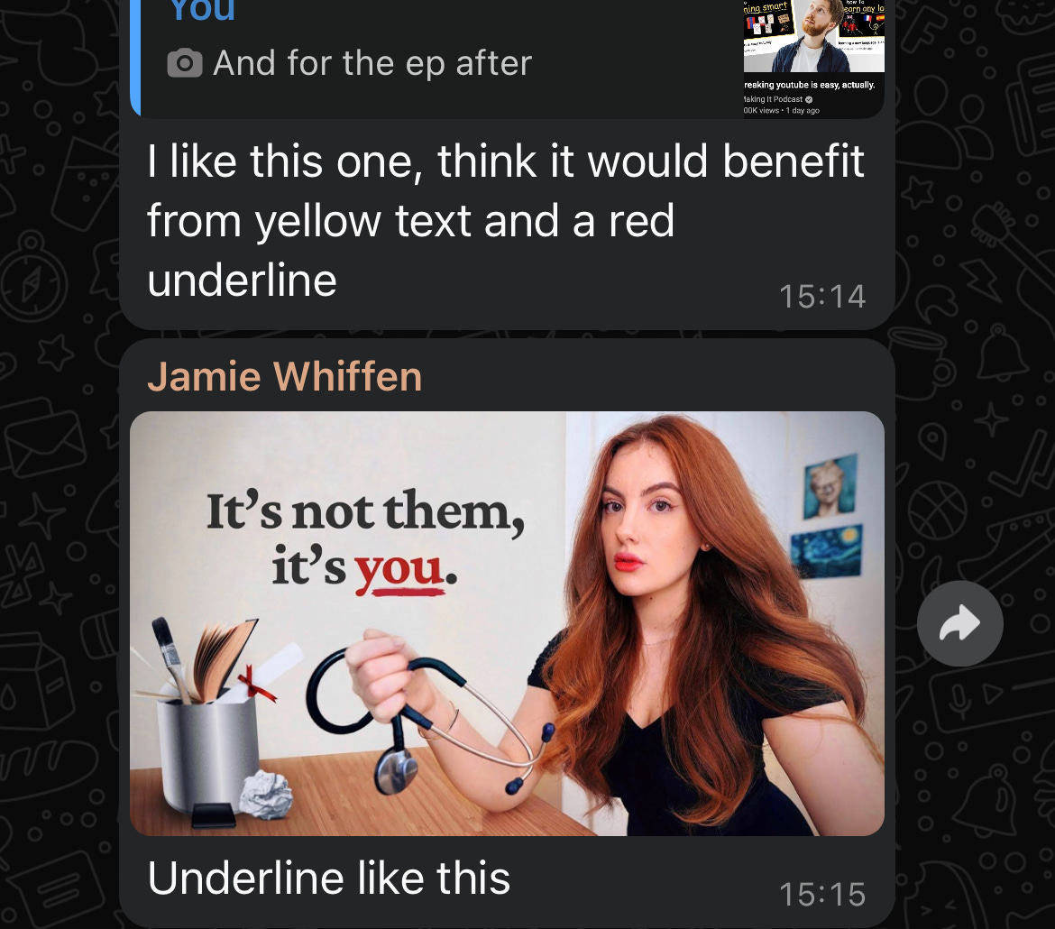
Make the 5.6M text yellow, and the underline red
Make the underline seem more hand-drawn, Elizabeth Filips style
Add drop shadows to text & thumbnails
I was initially sceptical about having both red and yellow in there.

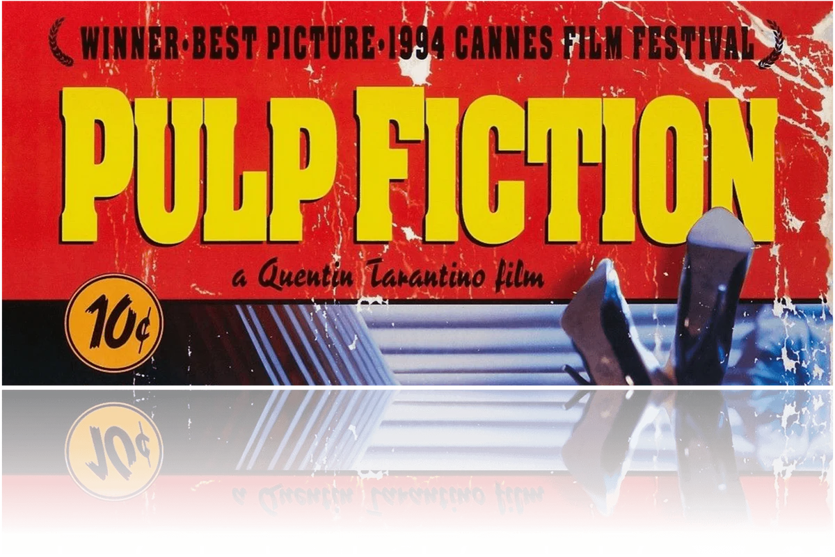
But it looked great! Very Quentin Tarantino.
Thumbnail wrapped.
Finally, we needed a good title.
I’d narrowed it down to three main options:
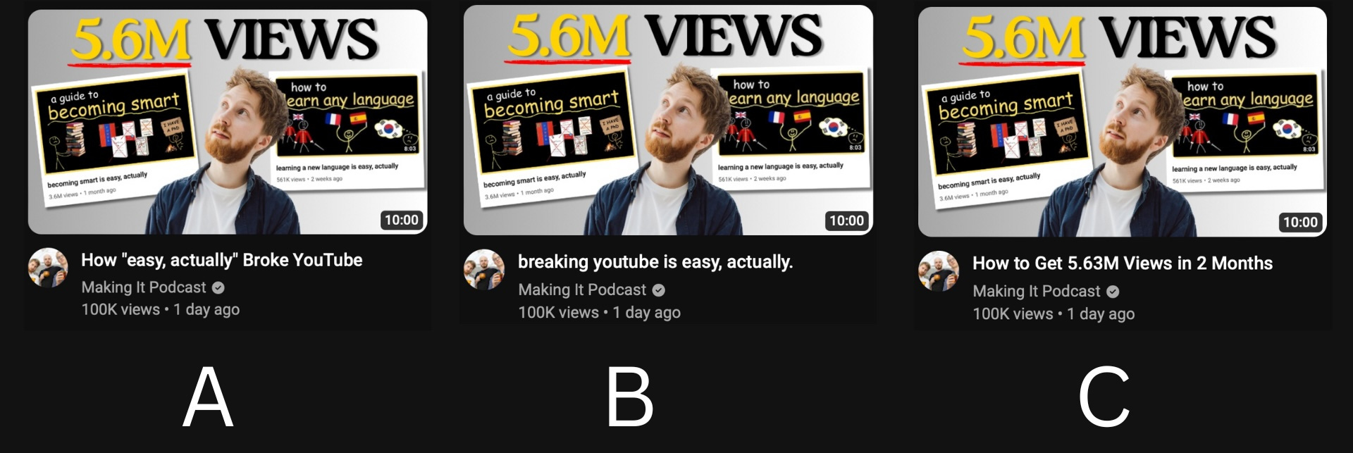
I wanted to go with “breaking youtube is easy, actually.”, combining two title formulas:
easy, actually’s: ‘X is easy, actually’
Paddy Galloway’s: ‘X broke YouTube’


But it felt a bit vague – ‘clever but not clear’, as Jamie said.
So we went with How to Get 5.6M Views in 2 Months. We’re still testing titles though.

The video did well by our standards: 1/10 in YouTube Studio, and with 200+ more views than usual after a couple of weeks. We also had a huge spike in watchtime.
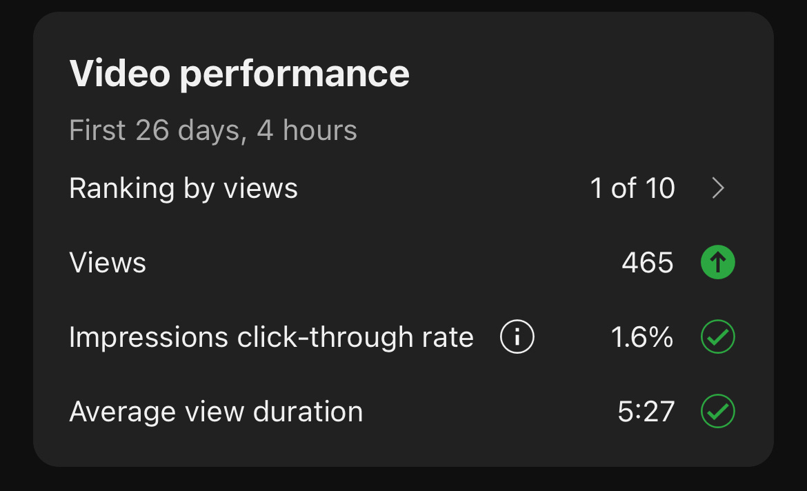
More importantly at this stage (the podcast only has 500 subs) – I like how the packaging looks!
See you next time 👋
Gwilym
How to Make a Cheap Camera Cinematic by Zachary Silva - Beautifully executed in just 5 minutes. This video nails the ‘authentic’, direct style that’s having a resurgence right now.
How to Master the Art of Filmmaking by Dan Mace - At first I thought this was a 10-min video about Dan’s work with MrBeast. Turns out it’s a THREE-HOUR filmmaking masterclass! This could easily be a full course.
No posts
Comments
Nothing yet. Say the first thing.
Sign in to join the conversation.