
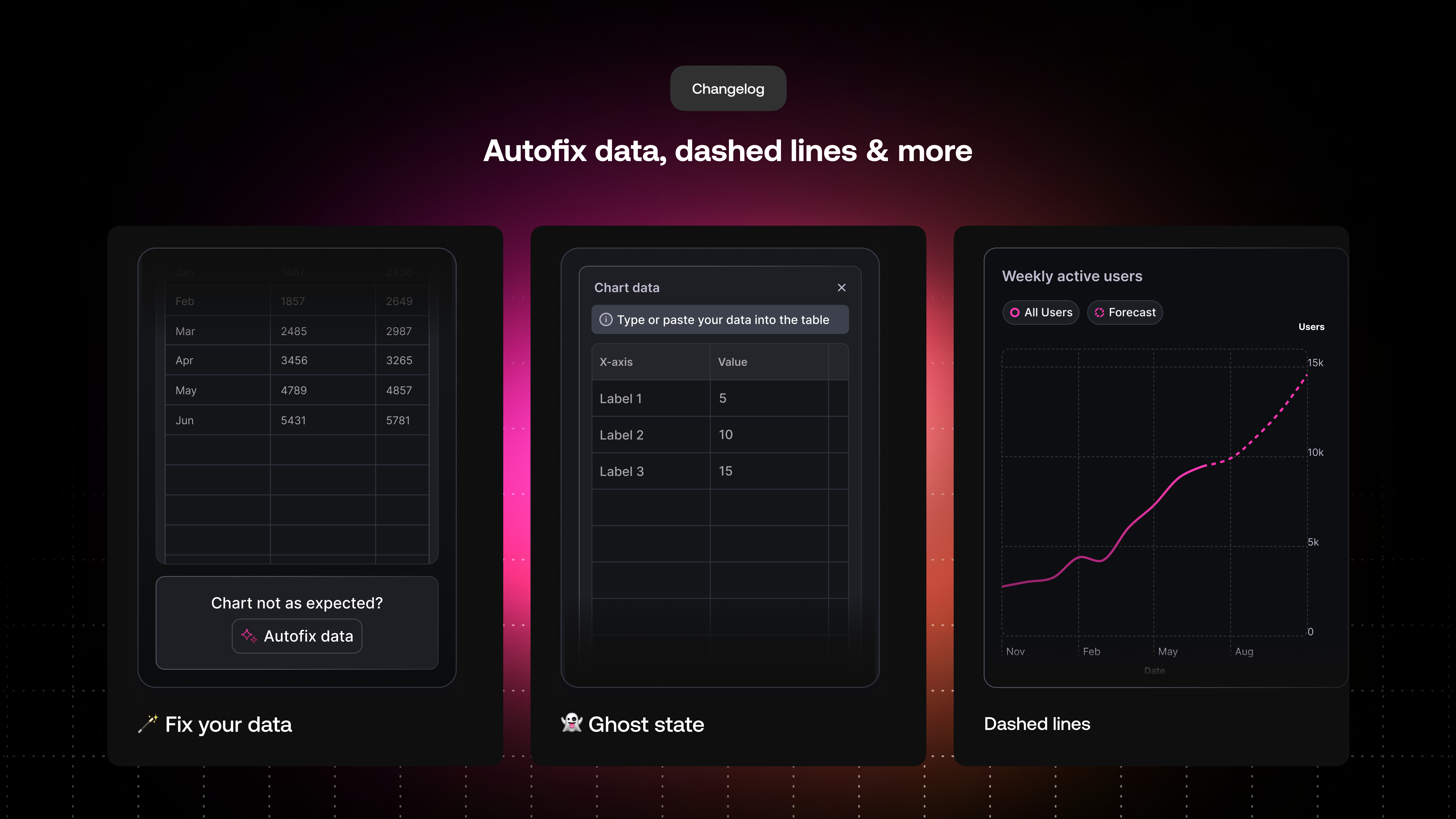
For this week’s changelog, we have some small but mighty upgrades 🏎️
Ever added some data, only to see no chart appear on the left. With our new ‘Autofix data’ feature, we will fix it for you so that you don’t need to spend far too much time trying to figure out how to.
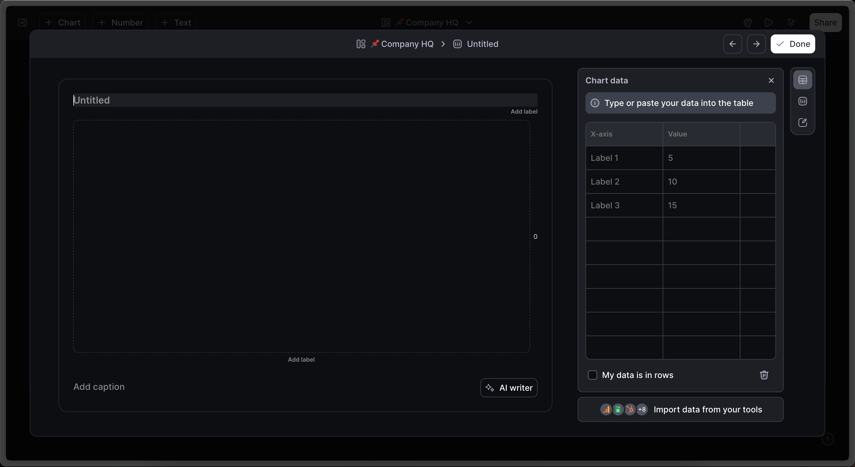
Sometimes getting started with an empty table can be confusing & overwhelming, even if you have created charts in the past.
Introducing a new ghost state to help you understand how to visualize your data.
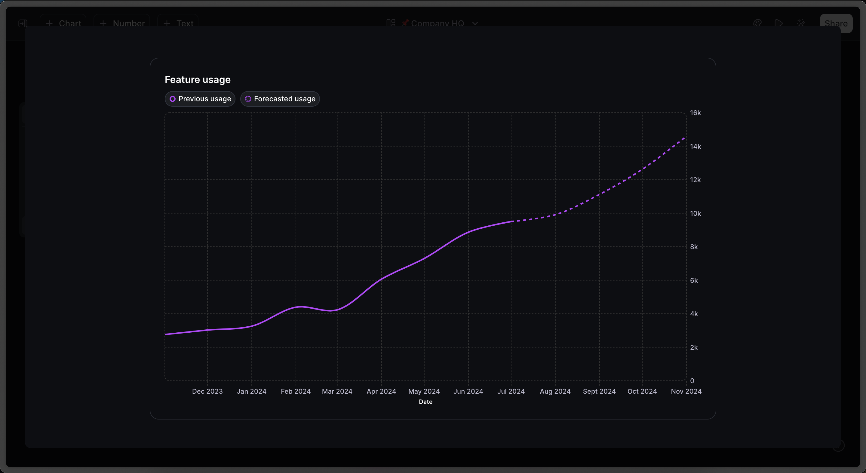
When it comes to telling clear stories with your data, dashed lines & hatched bars are a fantastic way to communicate data that is uncertain or has the potential to change.
Some examples include:
forecasting
reporting on a time period that is not yet complete
No posts
Comments
Nothing yet. Say the first thing.
Sign in to join the conversation.