There are few things as heady as being in New York City as a visitor. The cliches are true, from the palpable energy to the drama of its canyon-esque streets to how it often does feel like you’re in a movie. I had the recent fortune to experience it through the eyes of a friend visiting it for the first time, watching him cycle from overwhelmed to caught up to exhausted but utterly enthralled and already figuring out his next visits.
To deny New York City’s effect is to be a person I cannot trust.
I say all this to establish some sort of credibility as a non-hater when I say that arriving as a visitor is shit.
The airports—even with the makeovers—are terrible, outrageously inconvenient, filled with more than their fair share of miserable people, and prone to disaster after disaster.
But the most shameful part of New York City’s welcome to nonresidents has long been Penn Station. This abomination of hidden signage, chaos, low ceilings, filthy bathrooms, crowding, delays, hideous exterior, and more was often the perfect stand-in for everything that had gone wrong in the second half of the 20th century for American cities. (For Amtrak riders this has been slightly ameliorated by the Moynihan Station in the old post office across the street.)
This week, the Trump Administration announced it has picked the design for Penn Station’s complete overhaul, promising to deliver a station long dreamed of.
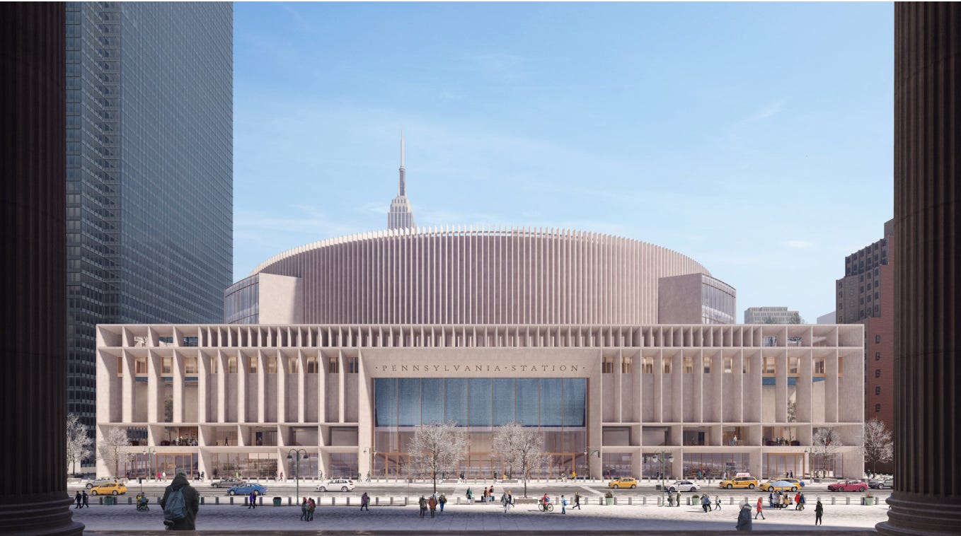
Put aside, for a second, the actual infrastructure promises and issues, from through-running, platform widths, whether NY and NJ can get along, and so on. I want to talk about the design. From what I can tell, while not finalized, it’s been assumed to be along the lines of what Halmar, one of the companies in the winning consortium, submitted a couple of years ago.
It is … fine—the architectural equivalent of Daniel Patrick Moynihan’s “defining deviancy down,” which is fitting given his name on the station across the street.
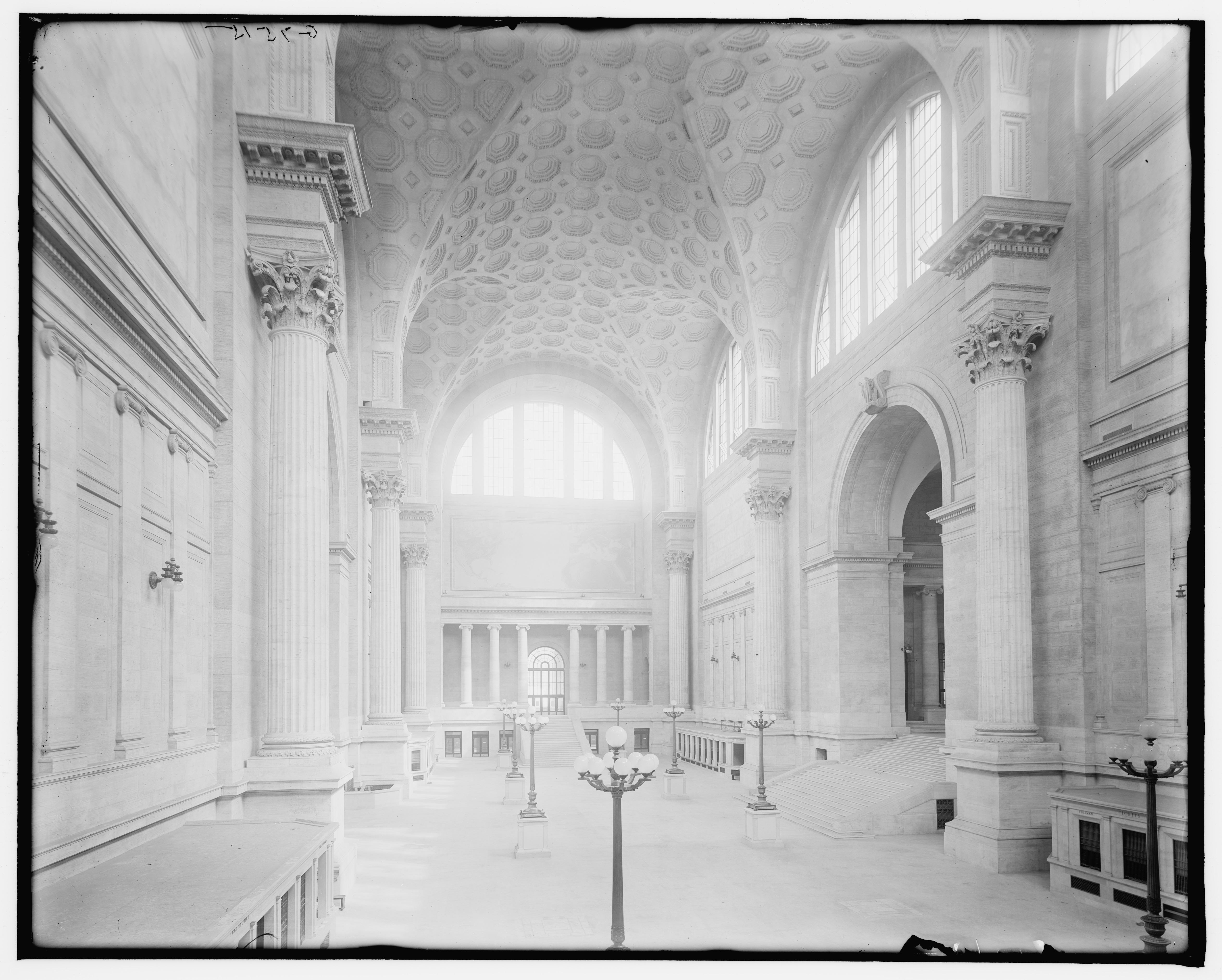
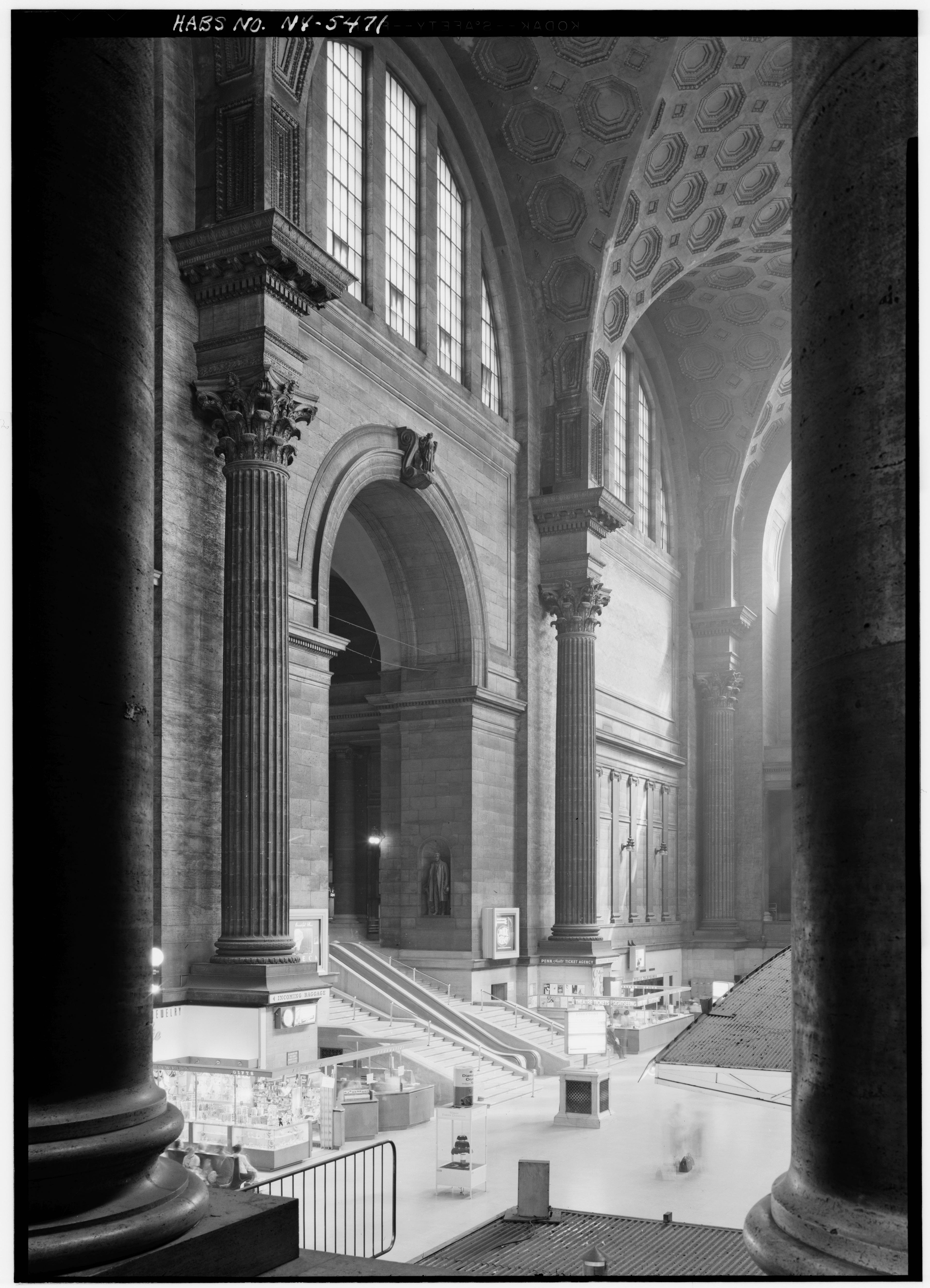
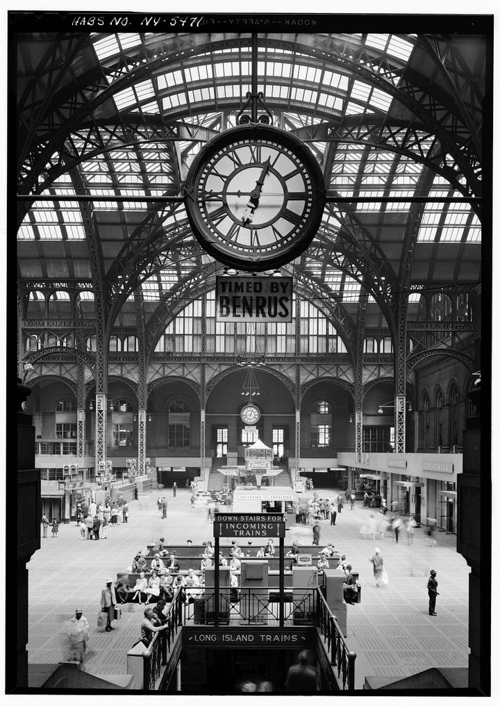
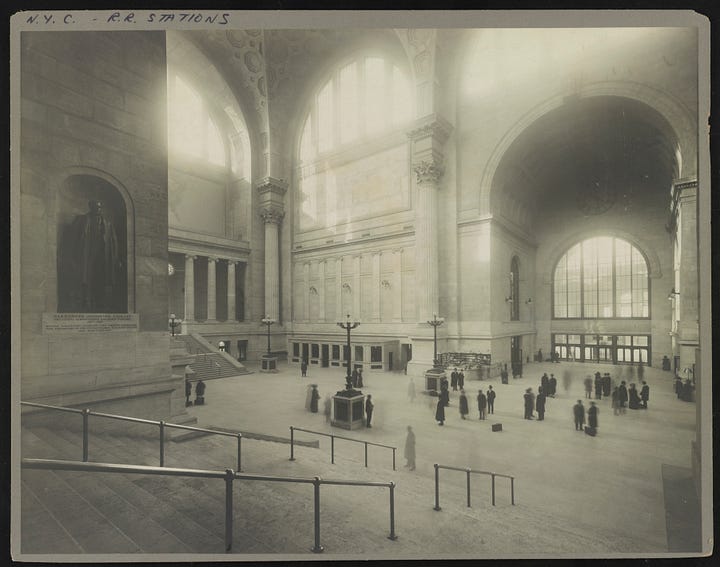
The old Penn Station
The problem for any new design of Penn Station is that we know what it once was. The best thing for any new design of Penn Station is that we know all too well what we have had to live with since.
As Vincent Scully once said: “One entered the city like a god; one scuttles in now like a rat.”
That, more than anything, shapes how I interpret the winning bid for its redesign.
It’s nowhere near as great as it could be, but a hell of a lot better than it is now.
“The modern historical preservation movement was in large part jump-started by the decision to build the current iteration of New York Penn Station, which replaced the previous classical structure,” notes Amtrak in its press release. “The new design takes inspiration from this lost architectural gem while fitting with the major structures there currently, particularly Madison Square Garden and Moynihan Train Hall.”
Now, New York City looooves to claim that so many movements started there, despite facts to the contrary. (The Newport Preservation Society, for instance, started in the 1940s to save Colonial architecture, long before the demolition of Penn Station.) One might argue that the movements only existed to them once they happened there, but I digress. But the loss of Penn Station was a wake-up call to many.
To say, though, that the new design takes inspiration from the old is a stretch anyway you look at it. The original Penn Station was designed by McKim, Mead, and White at the height of the firm’s powers and fame. It was the grandest synthesis ever of the inspirations that Beaux Arts architecture consistently turned to—the Baths of Caracalla, St. Peter’s, the Acropolis, 18th-century Neoclassicism, and more.
I look at old photographs of its interior and fantasize about walking alone in its empty halls. Doing so in the current Penn Station would be a nightmare. Doing so in the proposal by Halmar would just be unmemorable, despite how many times people keep mentioning the 55-foot-high ceilings in its sunken entrance hall. (As if 55 feet is so mind-blowing!)
The proposed subterranean entrance hall
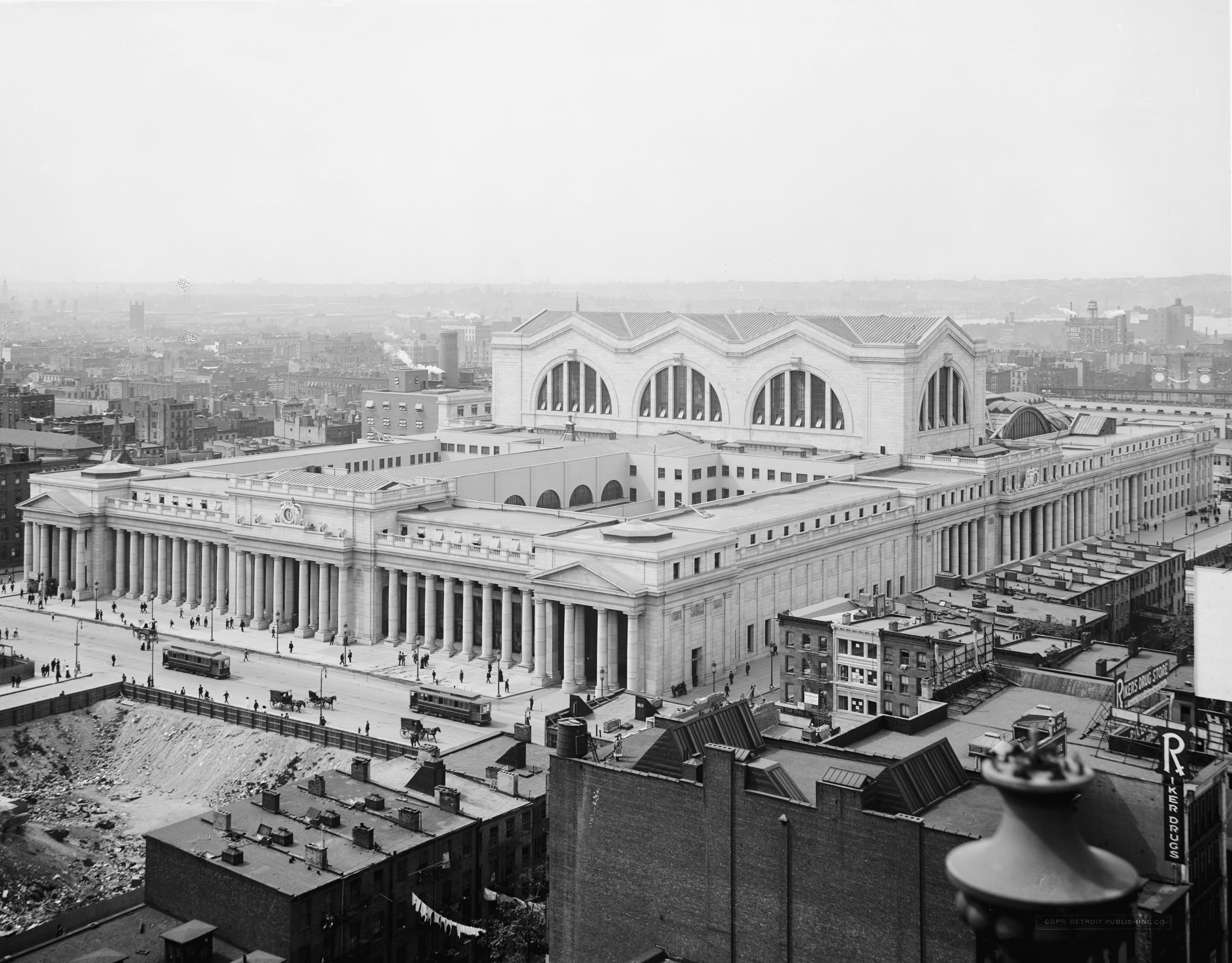
The McKim, Mead, and White exterior boggles the mind, taking up multiple acres in Manhattan and looking just as powerful and cohesive from the sky as from the street.
The old Penn Station from above
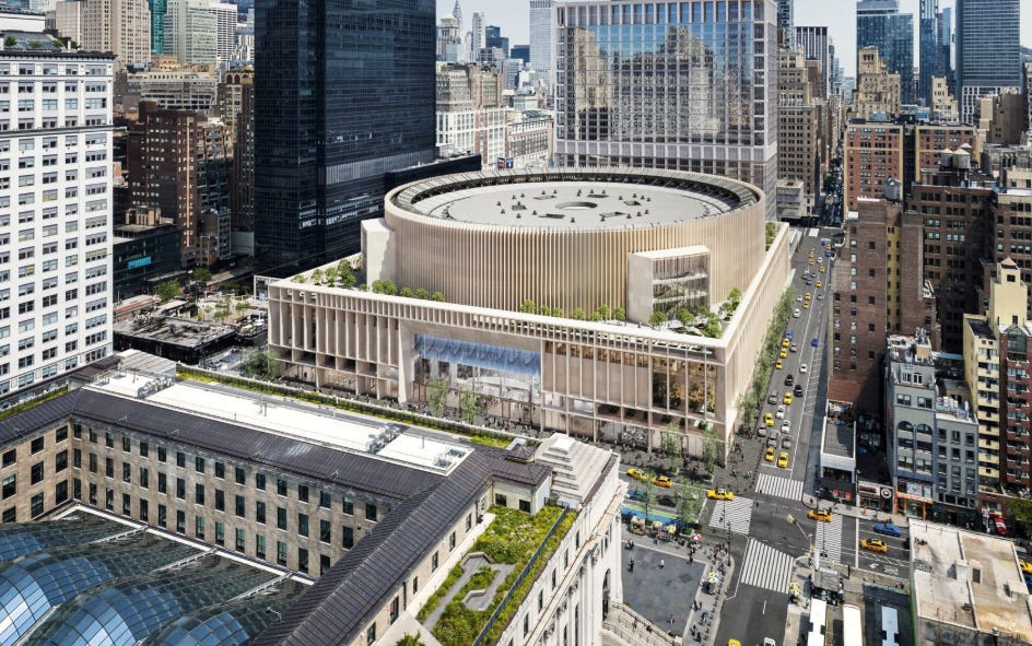
For the unfamiliar, this was all torn down, and in its place we got the oversized hockey puck that is Madison Square Garden. MSG, that round-cake-box-as-a-building, if one ordered a cake from a bakery with the ugliest cake boxes, will not be torn down, moved, or even redesigned in the Halmar proposal. Instead, it will be clad in fins of stone that make it resemble a rotary tray in a Kodak Carousel. Polishing a turd. Lipstick on a pig. Whatever you want to call it.
As for the proposal for the new station exterior, it is not some gilded neo-Grec derivative like many expected, but in that strange category of modern architecture that “nods” to the classic in the laziest or most confused way.
The materials are those beloved by traditionalists, as is some sense of shape, volume, and geometries involved. Often, though, this “style” delivers a hodgepodge of a somewhat-harmonious array of verticals and horizontals and oversized glass. The Penn Station proposal is precisely this, and it suffers from its attempt to please everyone. I would have far preferred something ambitiously modern or deep trad than this middling in between.
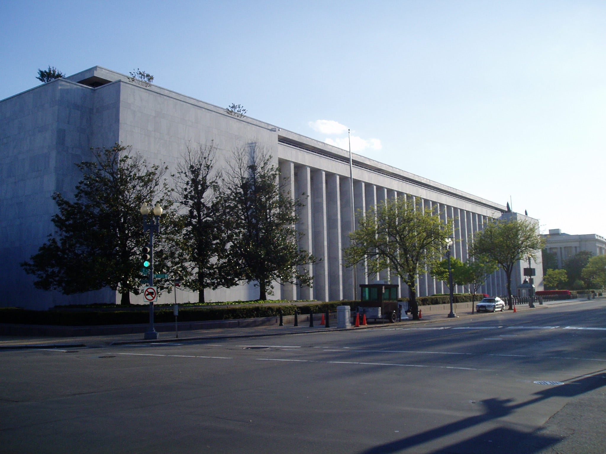
The best example of this style, and the building I immediately thought of, is the James Madison Building in D.C. The largest library building in the world, it’s the third and easily least magnificent of the edifices that make up the Library of Congress. An assortment of verticals and horizontals clad in marble with large glass elements, it was also designed to “nod” to its neoclassical neighbors but ended up just dismaying all.
I also thought of the Madison Building because libraries and train stations are part of a rarefied coterie of buildings that demand both utility and grandeur. And when they satisfy both, they are our most cherished spaces.
But the best that can be said—both for the Madison and the proposed redesign of Penn Station—is that they could be worse, and at least they don’t detract from their neighbors.
Our age of apathy and indifference strikes again.
The next trip you go on, consider going a day without taking any photos. I tried it recently when I was in New York City, and it was a struggle, which was illuminating. It’s a reflex now to see something pretty and fish out your phone to take a picture of it. But it is having a terrible effect on each of us individually, and also collectively. This Bloomberg piece does a great job of taking something we’ve always historically been after—seeing the highlights—and how selfie tourism has taken that to extremes.
One rule I’d like to implement? Stop taking pictures of yourself in front of pieces of art in museums. It’s one of the weirdest things I see on social media, and it’s either performative (oh look, I look at art!) or trying to draft off the aesthetic strength of the work (“today’s fit goes so well with The Scream!”).
A number of people sent me stories and social media posts about Louis Vuitton and The Frick Museum. The expensive French fashion brand announced a three-year sponsorship of the beloved art museum, and then staged a show in its galleries for Nicolas Ghesquière’s latest collection. Fashion brands utilizing museum spaces and museums doing deals with corporations aren’t new. But something about the headline involving The Frick, Louis Vuitton, and a collaboration with the estate of Keith Haring makes me feel that little has meaning anymore and anything is up for grabs.
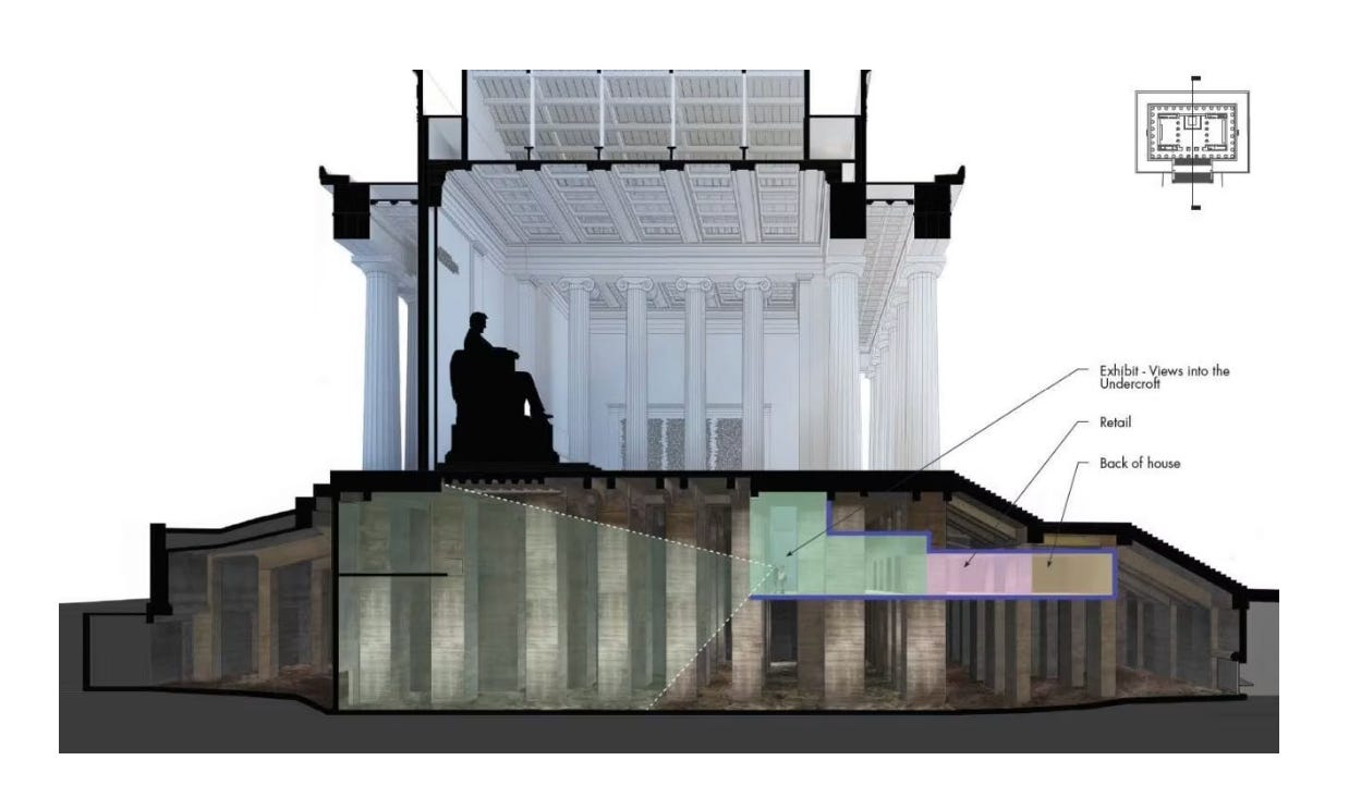
The number of things to do in D.C. only seems to grow and grow, and now on June 25 the undercroft of the Lincoln Memorial will open! There has been construction around the Memorial forever, but now, the NPS wrote, “a once-hidden space beneath the memorial [invites] visitors into a series of immersive exhibits. Here, history isn’t just something you read. The exhibits tell the story of how the memorial was built, how it has shaped Americans’ understanding of President Lincoln, and how its meaning has evolved for generations who have gathered there.”
I don’t want to bleat on about it, but want to emphasize for probably the 20th time that hotel rewards program are not terribly valuable. Even the program that used to be the exception—World of Hyatt—is now worse thanks to a recent overhaul, according to a report from Thrifty Traveler and The Points Guy.
The bifurcation of commercial air travel between the haves and have-nots continues apace. This time, Miami International Airport has announced an official opening date for its first private terminal—June 30. For about $1,300 extra, you can go to a separate terminal without the teeming masses, crowded lounges, with your own TSA agent, and be chauffeured directly to the plane.
British Airways was already one of the worst airlines when it came to fees on mile redemptions … and it just announced it’s hiking them even more…
I had no idea people hated Shibumis (those beach shade contraptions that look like fluttering flags). I’ve never used one, but have considered it because of how annoying umbrellas are when there’s even the slightest breeze.
Details are scarce, but the U.S. government is looking to scale back its proposed rule that visitors to the country applying for an ESTA will have to turn over five years’ worth of social media. However, it doesn’t look like a full pullback from the proposal.
Sometimes I really hate the timeline we’re on. One of the reasons is the incessant stream of terms marketers/media outlets/annoying people come up with to describe things people have always done. The latest offender? “Dusking.” Apparently, it’s “the trend encouraging people to slow down and watch the sunset.” Lol
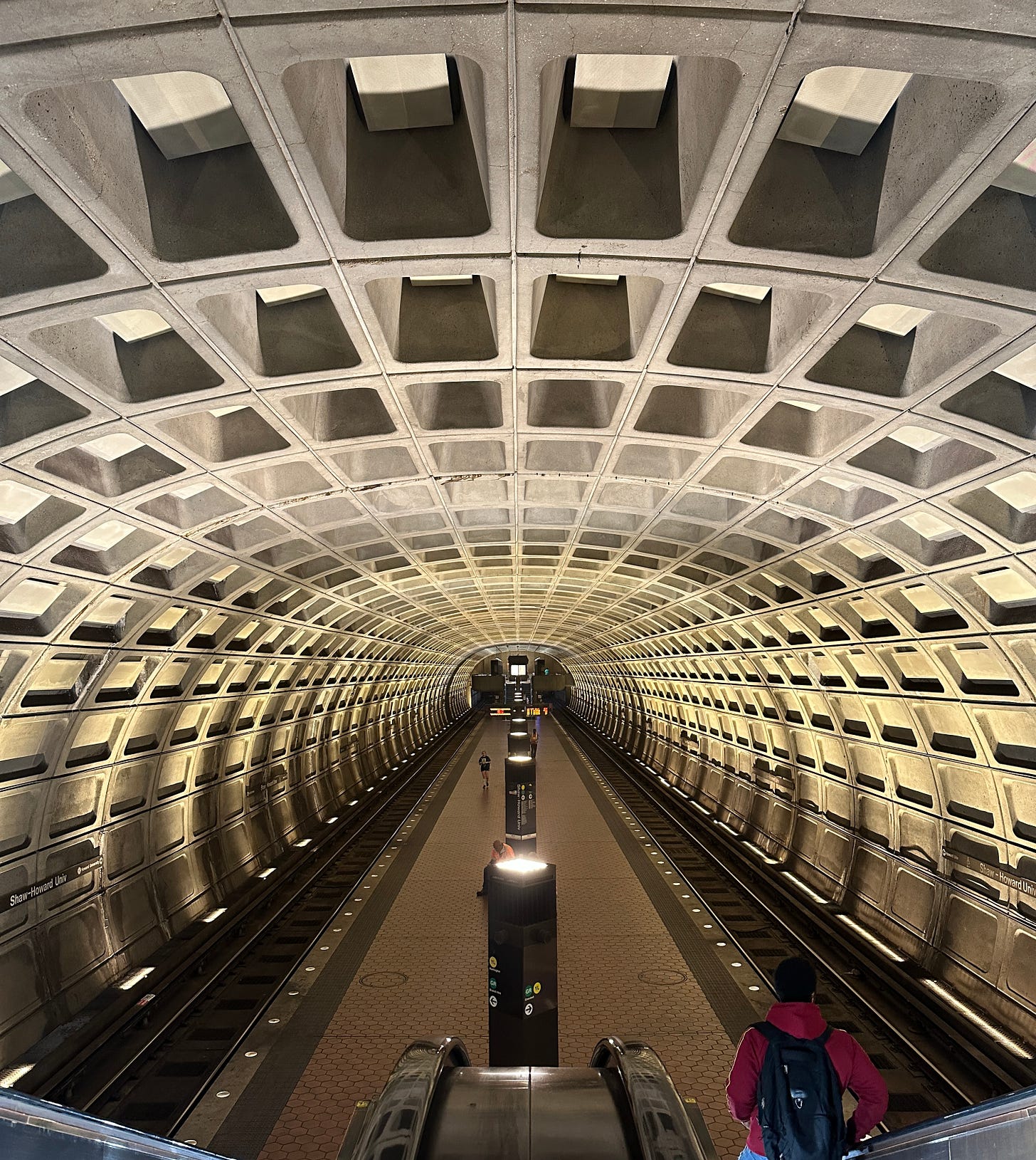
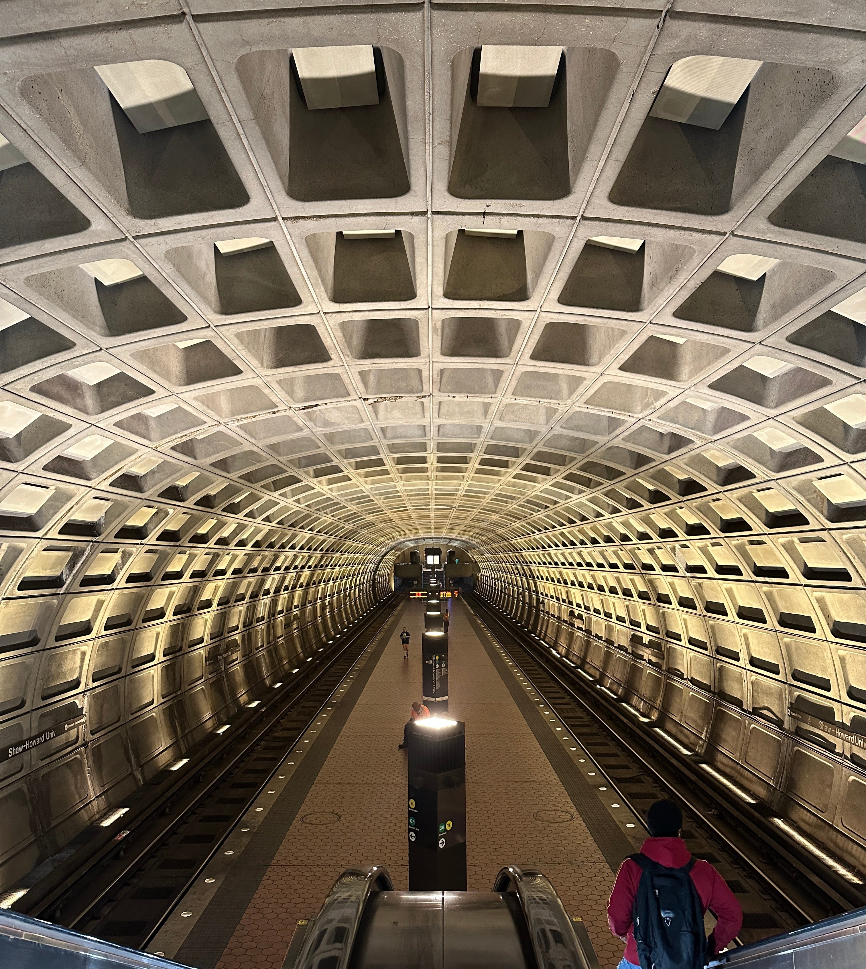
The Wall Street Journal of late has really impressed me with a number of pieces it’s run lately on Washington, D.C., especially considering the New York Times can often barely conceal its disdain. A year ago, it ran an ode to the C&O Canal, which I’d argue is one of the greatest urban amenities in the world. Earlier this year, it ran an op-ed titled: I left my heart in Washington, D.C. And now the paper is out with a FANTASTIC piece giving the Washington D.C. metro system long overdue plaudits for its incredible design. Its futurist stations were given the prestigious AIA 25 Year Award (a great measurement of a design standing the test of time) and are the coolest by far in the U.S. “The Washington Metro, a Wonder Underground,” is the title of the piece, and here are the incredible opening paragraphs by Nathan Eddy:
“Washington is a city obsessed with projecting power through stone, and littered with overinflated federal buildings of white marble dressed up with colonnades, pediments, and porticos. It’s an official architecture that often mistakes size for seriousness. The result, typically, is more pompous than practical.
Buried under the capital’s broad avenues, however, are a series of public spaces eschewing classical ornament yet achieving something rarer—a monumental and timeless civic dignity.
Welcome to the Washington Metro, home to the country’s most enthralling rapid transit stations, a Brutalist masterpiece with a design discipline so consistent it reads like an architectural civics lesson.”
I am the second-biggest Frank Furness stan I know (the biggest stan knows who they are). This Philadelphia architect was sort of the Heironymous Bosch of American architecture, with a style so unique and almost out of nowhere, it’s hard to place him in the evolution of our national aesthetic. Tracing his work is one of my favorite ways to see this great American city. So I was really happy to see CBS Sunday Morning (one of the last great TV shows) do a segment on him and his enduring legacy in the city! Also, Furness plays a key role in the unbelievable “family tree” of American Architecture, as he connects Richard Morris Hunt to Louis Sullivan.
“Sometimes, staff said, dishes that purportedly featured exotic fare would be composed of less glamorous, cheaper ingredients. A smoked creme fraiche that was sour cream. Sole that was billed as turbot. On a multicourse menu that highlighted seasonal gourmet cuisine, both from Florida and abroad, there were occasions when roughly half or more of the produce came from Walmart, five employees said.”
If the New York Times travel section, going forward, only did pieces giving honest reviews of luxury hotels as it did for Raffles at the OWO and the Chancery Rosewood, I would have my subscription on auto-renew forever. THIS is what publications with a budget and a reputation should be doing with hotel coverage because there is so much puff and flattery and disservice done to readers these days.
I don’t want to spoil it, but the author of that New York Times piece notes that one of the very expensive rooms is pretty unremarkable, which leads me to this Bloomberg piece titled: “Cheap Hotel or Luxury Stay? Why All Rooms Look the Same.” The piece is free with that link, and you really should read it because it has cool interactive quizzes built throughout so you really see just how bad it all has gotten. And it has a very good analysis of how this happened.


Comments
Nothing yet. Say the first thing.
Sign in to join the conversation.