
If you visit F&F studio's website, you'll find an unexpected hero image: a serene Hudson River Scene painting by John Frederick Kensett (1857), known for its meticulous detail and tranquil atmosphere, sharing space with molecular-like slope chart in vibrant oranges, blues, and pinks. It's a strange combination, I know. But there's something about that tension between contemplative nature and modern abstraction, between harmonious landscape and geometric science, that feels right to me, even if I can't always explain why.
In information design, we often talk about mastering tools and techniques (I know, I do). But lately, I've been thinking about something we rarely discuss: those moments when we feel like we're approaching things all wrong, and whether those might actually be pointing us in the right direction.
Back in my careers early days, working in a lab, I couldn't stop thinking about how to better communicate the science rather than just…doing the science. Then, in data visualization, I kept getting distracted by creative possibilities when convention demanded simple bar charts. Looking back, more recently I probably drove people crazy with endless questions about how humans actually process and understand visuals.
For years, I thought I needed to fix this tendency to work differently, to pick a lane and stay in it. I thought I had found my comfort zone in digital surrealist work and creative visualization, building a style that felt uniquely mine.
But last week, during our weekly call* with Dan Mall about defining our onlyness statement, I realized how much my thinking has shifted. Five years ago, I would have talked all about digital surrealist work and creative visualization. I still love this approach, still use collages. But as more talented designers have moved into this space, I found myself wrestling with a different question:
"How do we know if any of this is really working?"
So I tried writing a new onlyness statement, one that extends to Figures & Figures:
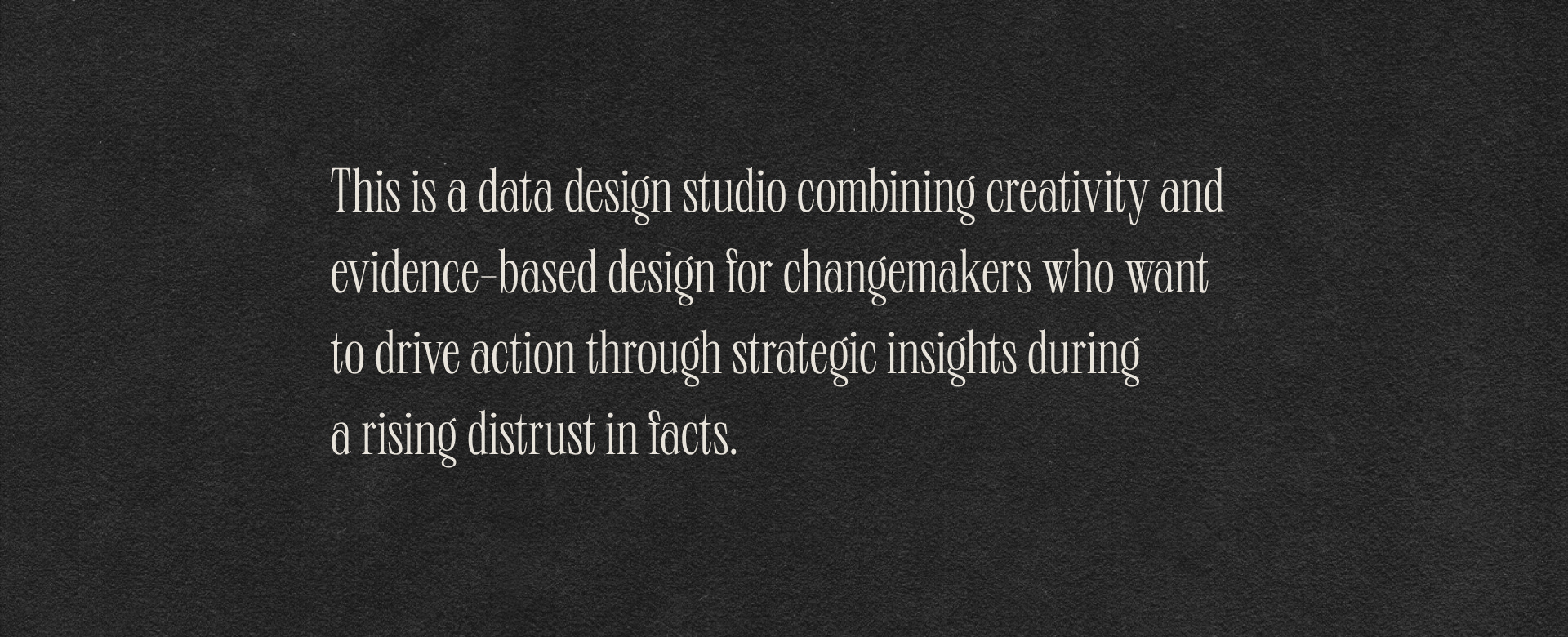
(Please ignore the grammar - this is very much a work in progress!)
This messy attempt at defining our work made me realize something crucial about information design: it's less about mastering one approach and more about finding the unique intersections where we can add value.
These days, my work lives at the intersection of many things: brand design, data visualization, product design, system thinking, analytics, design system, research and creativity.
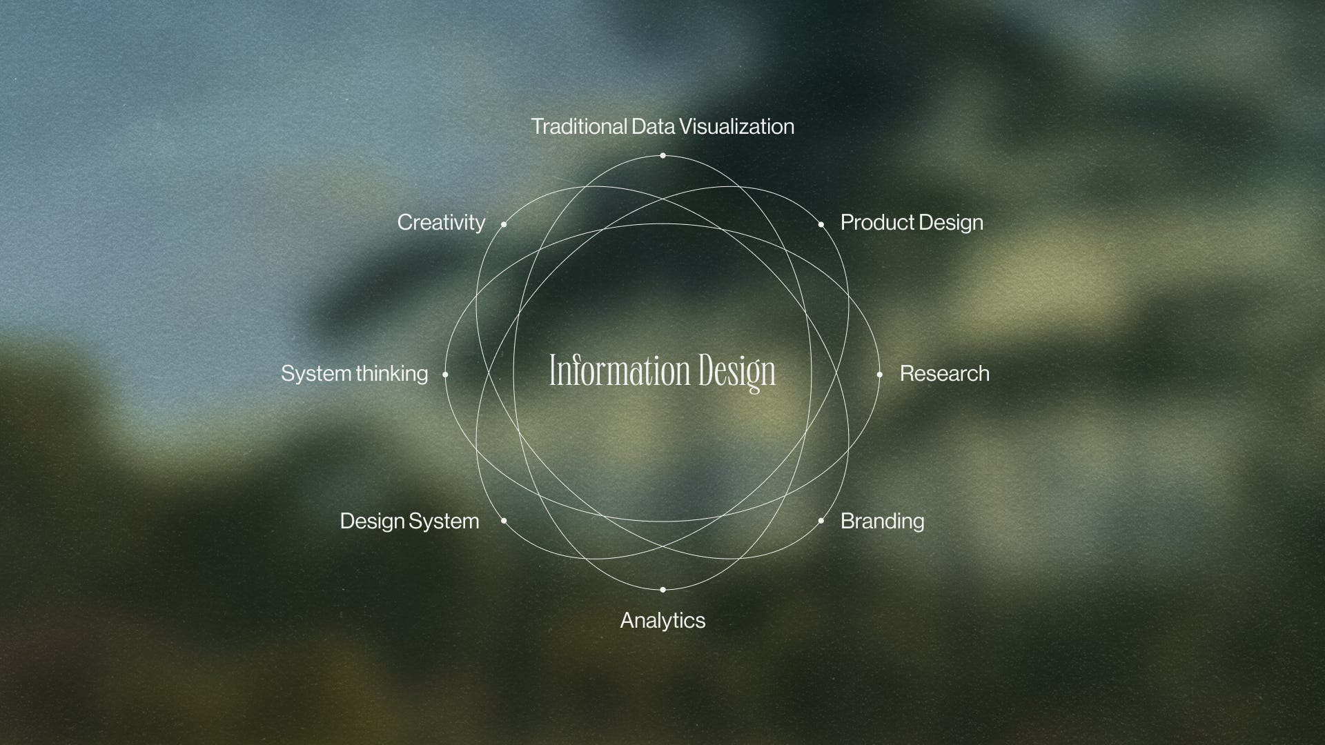
Today, each project lets me lean into different aspects of these overlapping worlds. Sometimes I'm deep in research papers, other times I'm crafting design systems, or diving into a new creative technique. To me, being a "generalist" in information design doesn't mean dabbling. It means building deep expertise in each area. It might be harder in many ways than specializing, but it opens up possibilities that might not exist otherwise.
Working across these intersections has gradually changed how I approach problems. I've started noticing connections I might have missed before. Sometimes it simply means asking: could this be better? Not because what exists isn't good, but because bringing different perspectives together can reveal new possibilities.
Ten years in, here's what I wish I'd known at the start: there's no wrong way to be an information designer. While specializing works for some, maybe your path like mine might be about finding ways to connect different worlds.
*I'm incredibly fortunate to be part of an early access group for his upcoming program. Follow him if you want to know more.
Comments
Nothing yet. Say the first thing.
Sign in to join the conversation.