
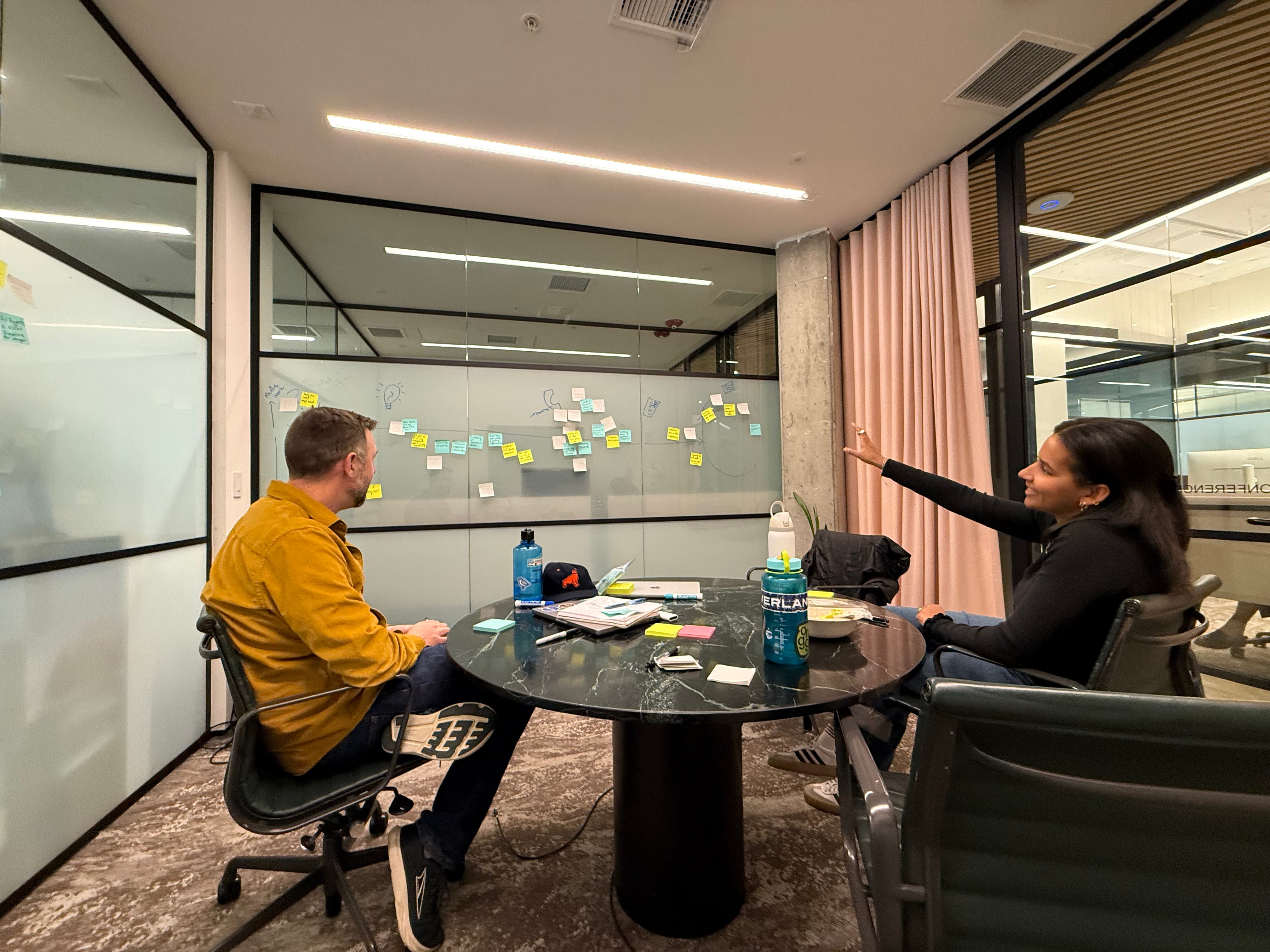
Brooke here. I’m a first-year MBA student at Stanford Graduate School of Business, and I’m wrapping up my MBA internship at Frontdoor Benefits this week. I’ve been sitting with something that started nagging at me around month two of the internship.
Before this, I worked as product lead at Ounce of Care, a startup focused on resident services in affordable housing, and before that worked at Bain & Company and Google. I came into Frontdoor Benefits with a fairly established set of assumptions about product design that had been reinforced through work, business school, and most of the product thinking I had been exposed to: make complexity invisible and help clients think less.
Those assumptions started breaking down as I ramped up at Frontdoor Benefits and dug into our post-application navigation, which is everything that happens after someone submits their SNAP application. Supporting the phone interview with the eligibility worker. Follow-up document requests. Interpreting government notices. The frequently tangled web of interviews, document requests, and follow-up that stands between a submitted application and an activated EBT card, where roughly half of SNAP applications are denied for avoidable procedural reasons.
Coming from my previous roles, I had assumed the benefits navigation challenge was the same one I had seen in most product work: how do we make the process feel seamless and reduce unnecessary friction?
The more time I spent speaking with clients, mapping the baseline SNAP enrollment process into an increasingly chaotic Figma chart (see below), and watching people try to navigate the process in real-time, the more I realized that was not quite the right question.

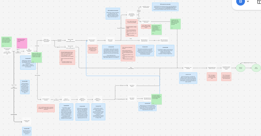
The product principle I kept bumping into most was the idea that good products make complexity invisible and help clients think less. But in benefits navigation, I kept encountering moments where hiding complexity leaves clients less prepared, not more.
Take the SNAP phone interview. At Frontdoor Benefits, we’ve found that the phone interview is the single most consequential step in the SNAP enrollment process, yet much of the interview’s complexity is outside our control. The initial call from the state often comes from a blocked or unknown number at an unpredictable time. The structure of the interview can vary depending on which of the 1,000+ state eligibility workers is processing the case. During the interview, clients can also be asked to provide additional verification documents that neither we nor the client expected — for instance, proof that they are no longer working a job they left several years ago.
In most consumer software, hiding complexity and helping people think less is almost always the right call. Good products remove unnecessary friction, reduce cognitive load, and help users move through workflows almost automatically. The best consumer experiences often feel effortless because the underlying complexity is invisible to the user.
But when we over-simplify in benefits navigation, that invisible complexity has a cost. If we design only around the clean version of the process that happens after we help the client submit their SNAP application form to the state, we leave people unprepared for what comes next. Clients submit their application form thinking they are done, then receive a verification request three weeks later. That surprise itself becomes part of the failure mode. Clients disengage or get denied not because they are ineligible, but because the process turned out to be longer, more complicated, and more unpredictable than they expected.
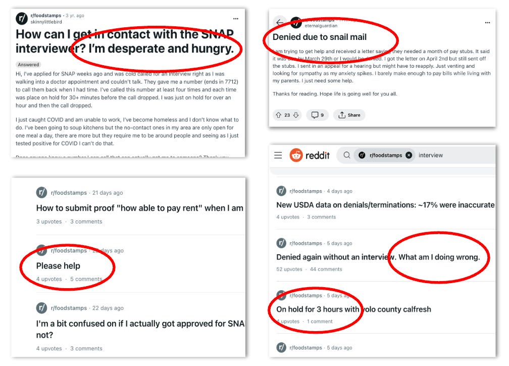
But at the same time, if we try to explain every possible path from application submission to an activated EBT card upfront, we overwhelm people before they have even started. We risk making the process feel too intimidating to begin at all, even for people who are eligible for benefits.
The product challenge becomes more complicated: how do we guide clients through the process while giving them the right information at the right moments?
I’m starting to think that principles like always reducing complexity and always helping users think less have a ceiling in benefits access that they do not have in consumer software.
In navigation technology, our job can be to help clients think more, about the right things, at the right moment. A client who understands why a document request is happening, or what to do when a denial feels unreasonable and should be appealed, is in a fundamentally better position than someone who is shielded from complexity.
So much of my product work at Frontdoor Benefits has come down to communication, timing, and judgment calls that do not have obvious right answers. Rewriting the same sentence fifteen times until it makes sense to someone reading it while stressed. Figuring out what to surface during interview preparation and what only creates more anxiety. Deciding whether another reminder text creates clarity or adds unnecessary pressure.
During my internship, I’ve learned to make strategic choices about when, in fact, we should make complexity visible. For instance, in building our interview guidance, we explain to clients that their interview may come from a blocked number at an unpredictable time. We guide clients through what kinds of additional verification documents eligibility workers may request during the interview so they are not caught off guard. We build different support flows depending on whether someone is waiting for an interview, responding to a document request, or trying to understand a denial notice.
I’ve also learned that there are moments where clients need to pause and think more, not less. We help clients understand how and when to advocate for themselves with eligibility workers during the interview. We encourage clients to consider whether a denial is actually because they are ineligible, or whether they simply missed a step in the process, like uploading a final paystub. In many cases, procedural denials can still be resolved if clients understand what went wrong and take the right next steps. And we try to prepare people for the reality that benefits enrollment is not just about filling out an application form, but navigating a 30-day process – one that we’re here to support, at every step of the way.
I came into this internship thinking about one product goal: how to make benefits access simpler. I’m leaving it asking a different question: how do we guide clients through a process that is genuinely hard, rather than convincing them it is easier than it is?
Too little information, and people get blindsided by the process. Too much, and the process can feel impossible before they have even begun.
That feels like a fundamentally different kind of product problem. It requires building for trust, not just efficiency, and helping people navigate systems that are unpredictable, manual, and often outside our control.
And honestly, that is probably the biggest thing I will carry with me from Frontdoor Benefits. It changed what I think the right product questions actually are in the benefits navigation space.
Comments
Nothing yet. Say the first thing.
Sign in to join the conversation.