
This is the practical week.
You read the signal. You watched the scenario play out. Now here is something you can actually run with a team, a set of artifacts designed to make the invisible visible. Not in a theoretical sense. In the sense that a product manager, a designer, a trust and safety lead, or a strategy director can sit down with these materials and have a harder conversation than they would have had otherwise.
The scenario is simple to describe and hard to manage. Products are getting easier to use on the surface while the real decision logic moves out of sight. Users see fewer controls, fewer settings, fewer explicit choices. Underneath, systems are predicting intent, ranking options, suppressing alternatives, and routing people through different paths without making any of those choices legible.
That is the core of this case. When the interface disappears, power does not disappear with it. It becomes harder to inspect.
That is why this artifact pack is not a mood board. It is a set of operating materials designed to force a conversation most product teams are not having yet.
Download the pack
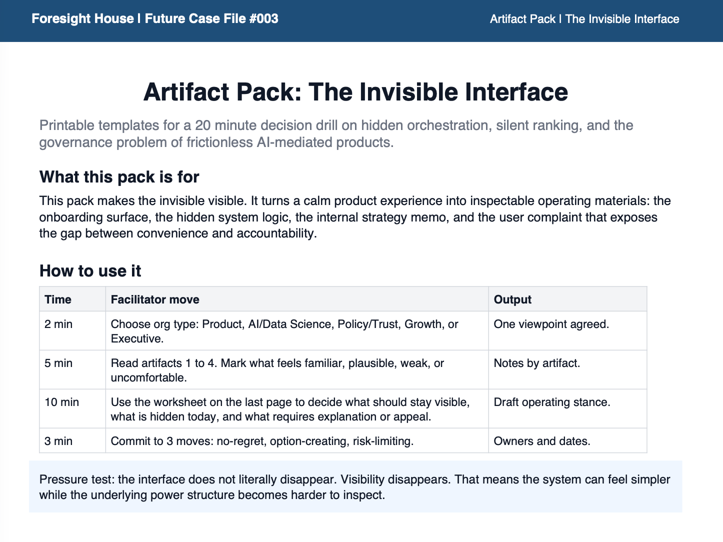
Foresight House — Artifact Pack: The Invisible Interface
Please feel free to print it if you can as this works better on paper than on a screen.
The pack includes four artifacts and one worksheet:
Artifact 1 — A frictionless onboarding flow showing what the user sees and what the user does not. Artifact 2 — A hidden orchestration logic map showing the decision layer underneath the clean surface. Artifact 3 — An internal product memo on reducing interface exposure, written from inside the commercial intent. Artifact 4 — A user escalation record about unexplained outcomes, written from the consequence end. Decision drill worksheet — One page, print and fill, designed to be completed in a single sitting.
That structure mirrors the case exactly: surface experience, hidden logic, strategic intent, and lived consequence. Running all four before the worksheet is the point. Each artifact exposes a different layer of the same system.
What this pack is for
Use it with product, design, AI, policy, trust, growth, or strategy teams. Anyone whose decisions affect what users see, what they are offered, and what they never encounter belongs in the room.
The point is to move past “is this a good user experience?” That question is too shallow for what this case is actually about. The real questions are harder.
Where is hidden orchestration already shaping outcomes in your product or workflow? Which decisions should remain visible to users regardless of how clean the experience looks? Where does convenience tip into concealment? And if two users get meaningfully different outcomes from the same interface, what explanation do they deserve?
Those are the questions the drill is built around.
How to run it in 20 minutes
Start by picking the org type closest to your team. That framing shapes how you read the artifacts.
Read all four artifacts before touching the worksheet. As you read, mark what feels familiar, what feels uncomfortable, what already exists in your product or workflow in some form, and what would be genuinely hard to explain publicly if someone asked.
Then work through four decisions as a team:
Where is invisible orchestration already happening in what you build or ship? Which decisions should stay visible to users even when removing them would make the experience smoother? Where is the line between convenience and concealment in your specific context? And what explanation do users deserve when their outcomes differ from someone else’s in ways they cannot see?
Close with three moves. One no-regret action you can take in the next 30 days. One option-creating move that keeps your design choices legible and reversible. One risk-limiting move that defines where hidden orchestration should never go in your product, regardless of the efficiency gains.
Why these artifacts and not something more abstract
As a recommendation for your workshops, this case should not be illustrated with generic futuristic imagery. The whole point is that the mechanism of power looks ordinary. It looks like a clean onboarding screen. It looks like an internal performance memo. It looks like a user complaint that went nowhere.
A polished onboarding flow, an internal logic map, a product memo, and an escalation record do more work than abstract commentary precisely because they expose the layers most teams keep separate. The interface users see. The system logic users never see. The commercial intent behind the simplification. The accountability gap that appears when something feels unfair but cannot be inspected or contested.
That is what makes this scenario usable in a workshop rather than just interesting in theory. The artifacts put all four layers in the same room at the same time.
If your team can look at all four and still feel comfortable with every design choice you are currently shipping, that is useful information. If they cannot, that is more useful still.
Next week is the final piece of this case file: signposts and a decision drill to carry the full scenario forward into your operating model.
Comments
Nothing yet. Say the first thing.
Sign in to join the conversation.