
To support clinical trial recruitment in the Cancer Consortium (Fred Hutch, UW, Seattle Children’s), we created a responsive site offering clinicians summaries of open-to-accrual interventional oncology trials and slot availability information.
We think the best products grow from a user-centered research and design process, and that’s the approach we took in creating this application. In this post we’ll tell you about the user research methods we used, the major findings and how they shaped the design of the system, and some lessons learned along the way.
The Cancer Consortium includes Fred Hutchinson Cancer Center, Seattle Children’s Hospital, and UW Medicine. Together, these institutions typically have more than 700 clinical trials open at any given time[i], and each trial has specific inclusion criteria that patients must fulfil to be eligible to participate. To ensure these trials meet their enrollment targets, healthcare providers need to be aware of trials that are open to recruitment. Tracking the pace of trials opening and recruiting across dozens of specialties and service lines can be difficult for providers. What they need is one centralized source of truth that offers brief, relevant, up-to-date overviews of trials.
We began with formative research to shape the general information architecture of the system and identify which features to include or exclude. Our formative research consisted of interviews with members of three user groups, concurrent with iterative wireframing and design. First, we spoke with research managers, clinical research nurses, and clinicians to understand their current processes for finding trials for patients, then showed them mockups illustrating different design approaches to elicit responses about our ideas for a potential UX and UI. We iterated on the mockups over the course of the interviews to illustrate new ideas, change things about the information presentation and architecture, and gradually add visual polish.
When we had a pretty good idea of what we were making, we fleshed out some details and did a usability study to evaluate how well users could perform key tasks on the system (e.g., find a trial given a particular patient scenario). We had four clinicians and a biologist test out our designs and made a few slight adjustments based on the findings.
An important consideration for our system was that some data entry was going to be manual. Although the data would all be stored in one central database, research staff would have to manually create brief trial overviews and maintain this information for the entire period the trial was open to accrual.
Some of the major findings that impacted our design were as follows:
Incorrect assumptions: Some individual research groups had attempted in the past to create a catalog of clinical trials as a mobile app. Because of this history, we assumed at the outset that we would be building a mobile-optimized website. Instead, our research showed that clinicians were as likely, or more likely, to be using the desktop version of the application when they were with patients, so we committed to a responsive site instead.
Navigation based on disease type is key, but not the same for everyone: Our participants found that finding trials based on disease type was generally the most intuitive way to look for trials for patients. However, while adult oncologists grouped diseases by general anatomical area (e.g., breast oncology), pediatric oncologists preferred a totally different organization (e.g., germ cell tumors). Our design had to accommodate both types of organization for different trial types and user groups.
Biomarkers need significant curation: Indexing trials by NCI-assigned biomarkers was seen as valuable, but trials often had many biomarkers attached to them. Users found the full list of biomarkers overwhelming. We reduced the noise by 1) limiting biomarkers to those associated with inclusion/exclusion criteria; 2) creating a two-level categorization system for biomarkers with categories and subcategories (e.g., “Molecular and Genetic Biomarkers” > “EGFR Status”), and ultimately removing the individual biomarkers themselves (e.g., “EGFR Exon 19 Deletion Mutation”).
Slot availability is really important: Clinicians needed to know not just what trials were generally recruiting, but which ones had slots currently available or becoming available soon. We created tags and filters for slot availability and made a place for detailed information on the trial descriptions. We also encouraged research staff to include a ‘last updated’ date with the slot information so users would know how recent the information was.
You can see our final system design in Figures 1-6 below:
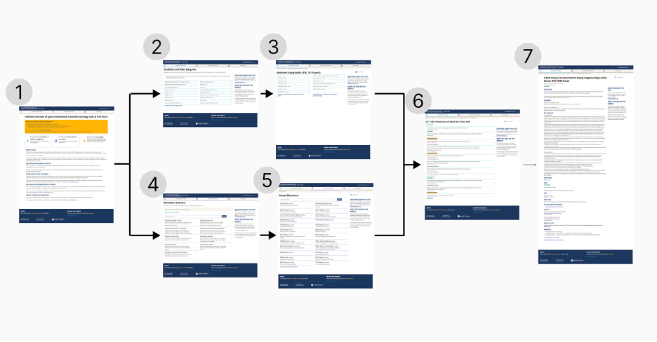
Fig. 1. A flowchart of the system. Landing page (1). From here users can go to the main page to find trials via Conditions and Other Categories (2) > subcategories within a condition (3), or to find trials by biomarkers (4) > biomarker subcategory (5). Either path takes users to a Trial List page (6), which leads to an About Trial page (7). Figures 2-6 show closeups of selected pages (1, 2, 5, 6, and 7).
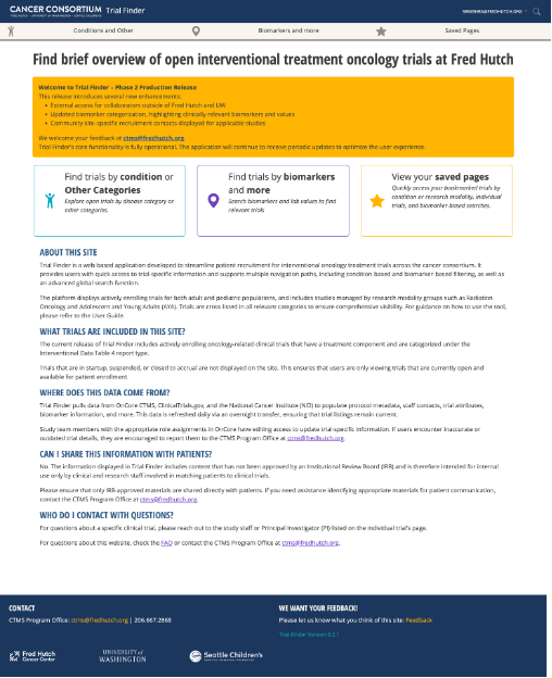
Fig. 2. The home/landing page. Feedback from providers is incorporated proactively, therefore application updates are featured prominently. Users can browse by conditions (mostly cancer and other disease types), or by biomarkers and lab values.
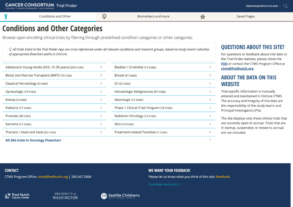
Fig. 3. The main page for finding trials by “Conditions and Other Categories.” If providers prefer not to drill down, we provide an “escape hatch” so they can view all available trials.
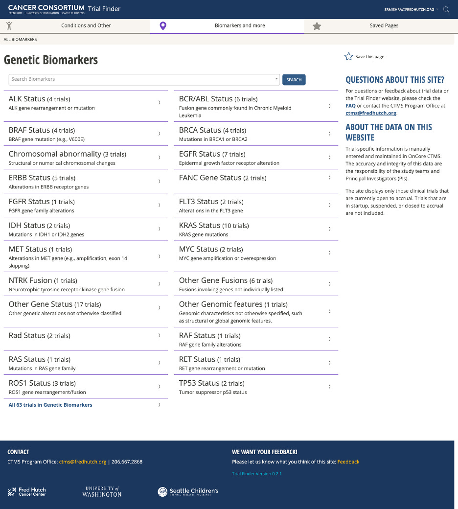
Fig. 4. An example of a biomarker subcategory page, listing and defining types of genetic biomarkers. Biomarkers are often part of clinical trial inclusion criteria.
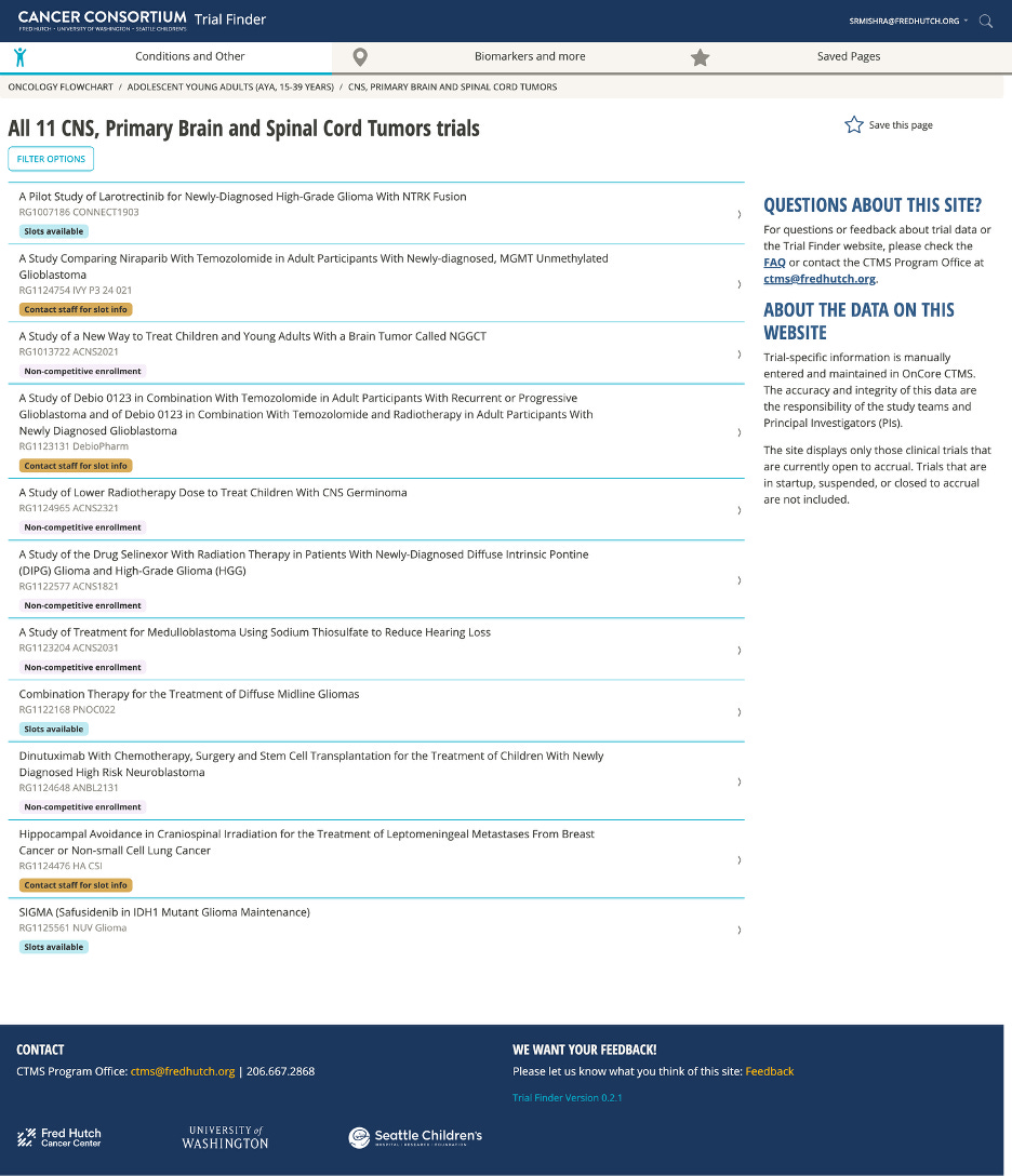
Fig. 5. An example of the ‘trial list’ page, listing trials within a specific category. Each trial is labelled with color-coded slot availability tags. Participants in our UX study emphasized the importance of slot availability being visible at-a-glance.
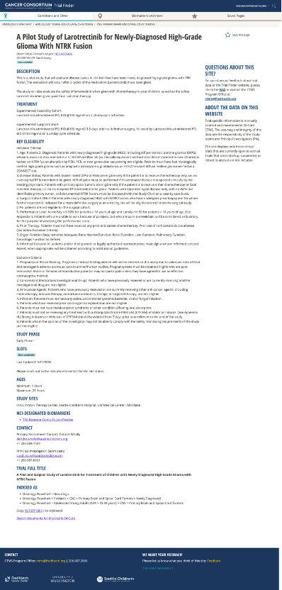
Fig. 6. An example of the ‘About trial’ page, describing a single trial. Inclusion and exclusion criteria are prioritized on the page, so providers can reference notes and the medical record while evaluating a patient’s potential eligibility. Participants in our UX study had been frustrated by outdated information in applications they previously used, so we display when the information for a trial was last updated. We included the “Indexed As” section to transparently show how trials are cross-listed in all applicable categories.
We took a few measures prior to, during, and after launch to enable improvement and impact evaluation for our system.
Baseline survey: Prior to launch we surveyed clinicians about the difficulty of finding trials for patients, using a modified NASA TLX survey. We will repeat this survey in future for a pre- and post- comparison.
Analytics: We set up analytics tracking in the application to 1) measure user adoption and retention and 2) complement future research into the use of different parts of the system. As of summer 2026, the system shows high retention. Additional qualitative work may be done in future to better understand use.
Beta launch and post-launch discussion: We launched our system in Fall 2025 as a Beta, before development was completed, to start soliciting feedback while we still had developer time to make changes. After launch, we held discussions with key user groups and sent out a survey to collect more feedback on potential trouble areas. These steps demonstrated to our users that we intend to continue to seek out their input to iteratively improve the system.
Ongoing data quality maintenance efforts: The CTMS office conducts frequent checks on data quality and completeness within the system, and they are very responsive to comments from PIs and users about data quality issues.
Although some work remains in our impact assessment plan, altogether these steps demonstrate that this product is an evolving system that will gradually improve over time.
Maintain an ongoing dialogue with users: Throughout the research and design process it was clear that we needed buy-in from our community. We needed buy-in from research staff to contribute and maintain data, and we needed buy-in from users to have faith in the quality of the data and make use of the system. Some of our participants, having seen similar systems fail at other institutions, were skeptical that this time would be different. To build buy-in and trust, we—including both DaSL and the CTMS office—approached our system as a living service that would require ongoing active dialogue with our user community. We devoted time and effort to the user research described above in developing the system; we launched the system first as a beta and invited feedback; and we set up workflows to have ongoing dialogue with PIs and research staff about data. We will continue to invite feedback and iterate on the system design and functionality as we are able, and we have made that intent clear to our users.
Expect differences between user groups: We spoke to several different user groups over the course of this research, including research managers, clinical research nurses, physicians, and biologists. Each group had a very different perspective on what content was needed in the system. Between physicians there were also differences, as physicians who worked in pediatric oncology had a very different mental model of disease than physicians who worked in adult oncology. To execute this project, we had to be thoughtful about this application’s primary users, and we had to accept when we could not meet all potential users’ needs equally given feasibility constraints.
Different institutions have different priorities: Our goal was to make clinical trial information available across all consortium partners, including Seattle Children’s. While some teams within SCH (the Adolescents and Young Adults team) were able to contribute data to the system that paralleled the information asked of Fred Hutch staff, other departments did not have the resources available to commit to maintaining the required data. Our CTMS partners worked with SCH to design a workaround: instead of asking research staff at SCH to manually input and maintain data about trials, our system would point users to the clinicaltrials.gov record for each trial. Based on this experience, we encourage anyone engaged in similar work to communicate with partner institutions openly and early about what kinds of resources they can devote to data quality, and to be prepared to adapt should any partner’s priorities change.
We used a user-centered research and design process to prototype and launch a web application to support clinical trial recruitment. We found that a disease type-based navigation resonated for most users, but that providers from different institutions had different mental models for how trials should be organized, which influenced how we structured site navigation. Further, we found that biomarkers were a useful way of indexing trials, but that they needed intensive curation and categorization to be useful. We also realized that slot availability information was one of the most critical pieces of information, and worth investing extra effort to achieve. Although our product has launched, we consider it a living service that demands ongoing maintenance and dialogue with the user community. If you have any questions or would like to talk to us about this project, please feel free to reach out to us.
Comments
Nothing yet. Say the first thing.
Sign in to join the conversation.