

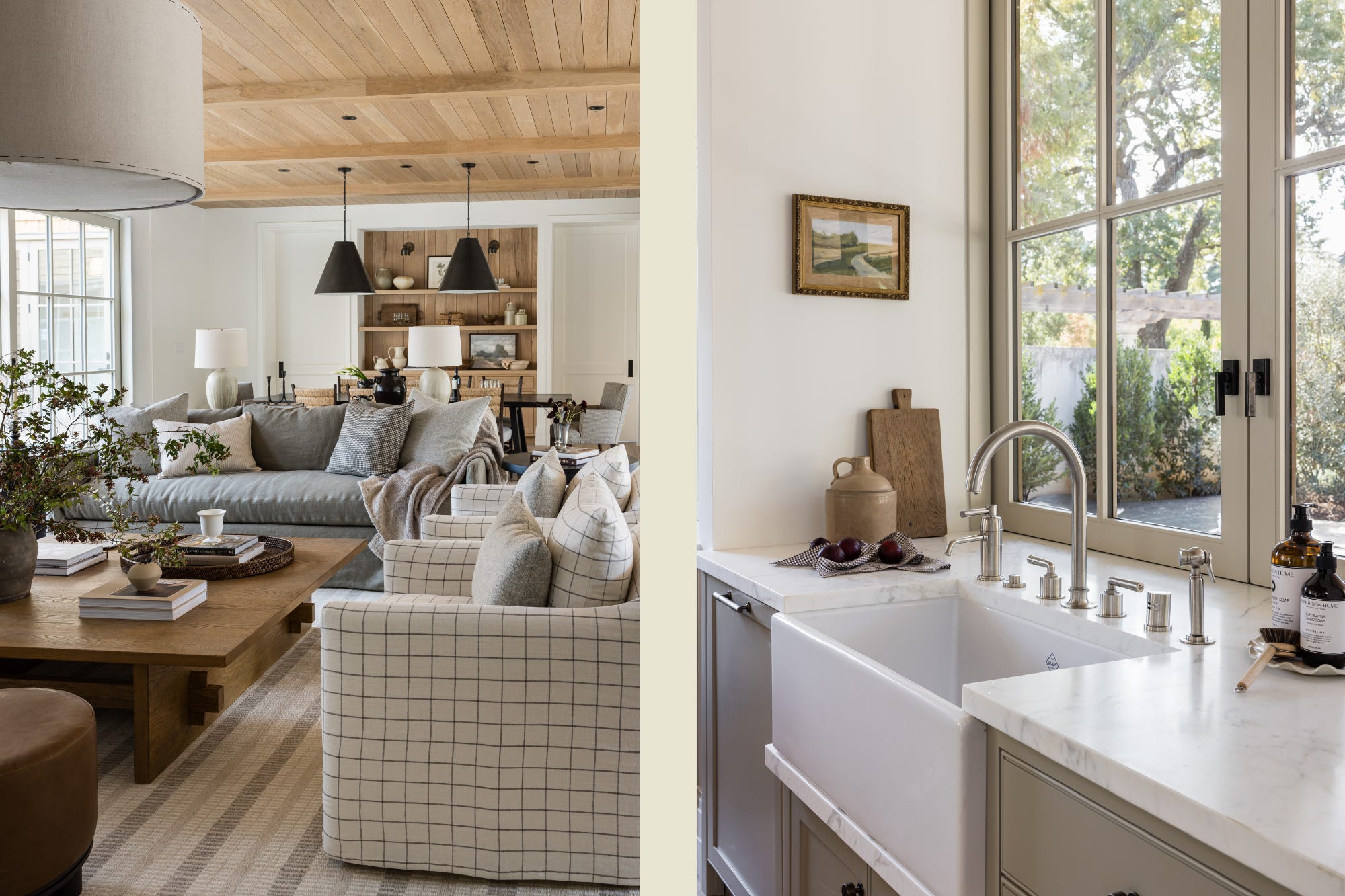
We’re continuing on our tour of our newest project today by showing you the Great Room, Kitchen, and Pantry… the main gathering areas of this beautiful home. Located in the heart of Menlo Park in the Bay Area, this home was over four years in the making, brought to life in collaboration with Kirby Lee Architects and with Wilkinson Construction — whose craftsmanship and vision are felt in every detail.
While the home is vast (over 9,500 square feet) it feels intimate and collected; it’s a large house that somehow doesn’t feel that way once you’re inside. Each room holds its own purpose and has its own identity… the house seems to expand and contract depending on what the moment calls for.
Join us today and follow along in the coming weeks where we’ll be revealing the remaining spaces… subscribe below to get the reveals sent straight to your inbox.
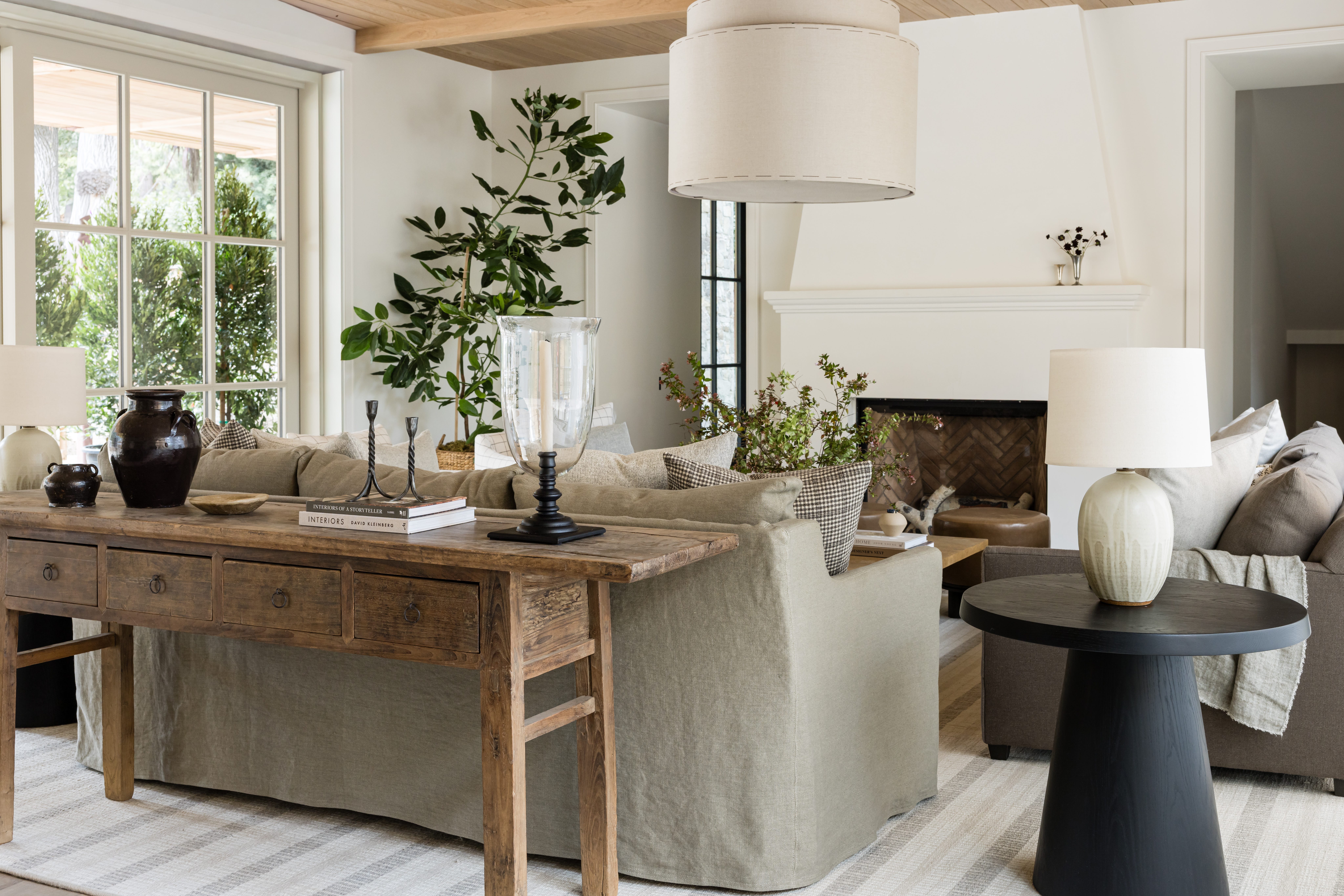
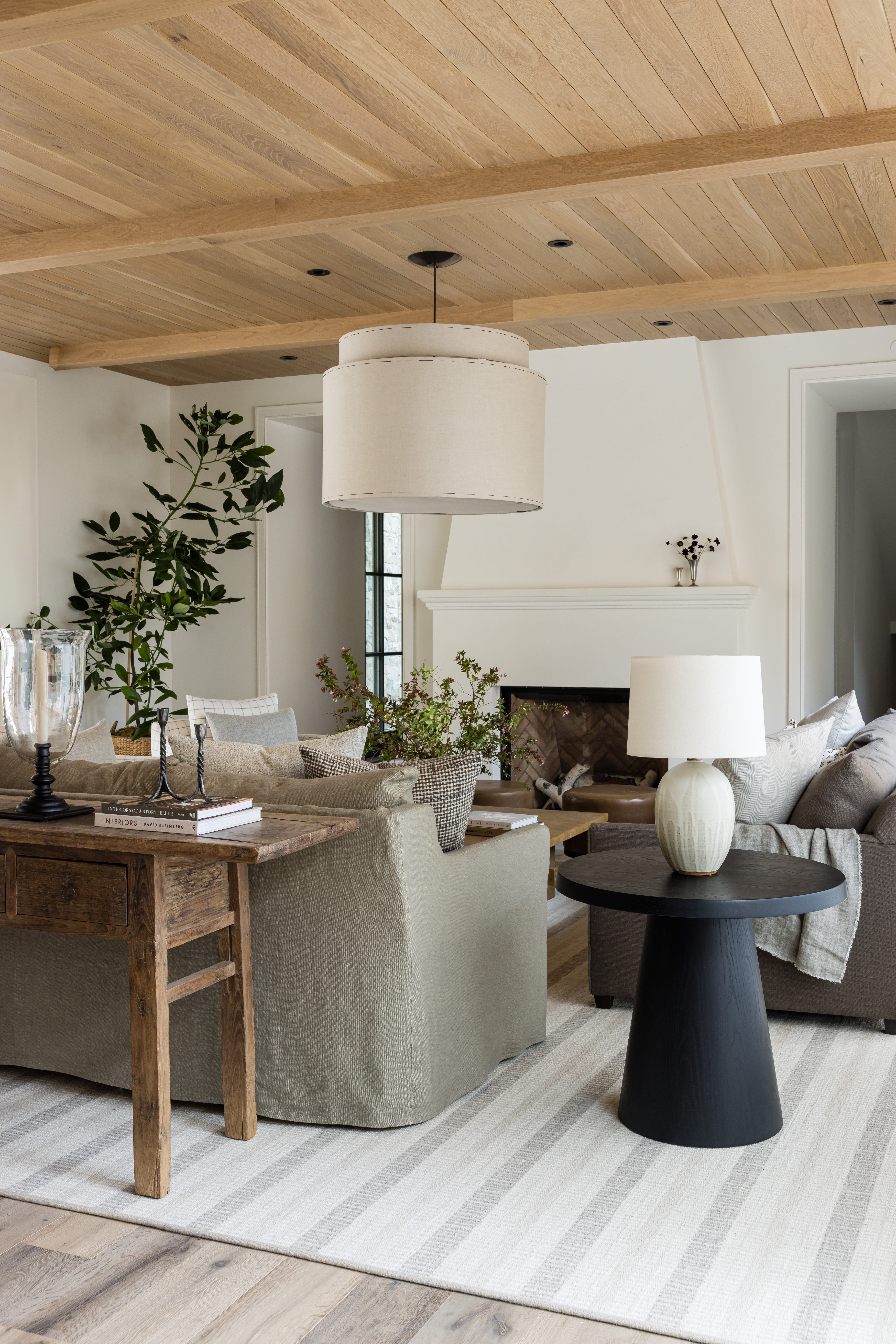
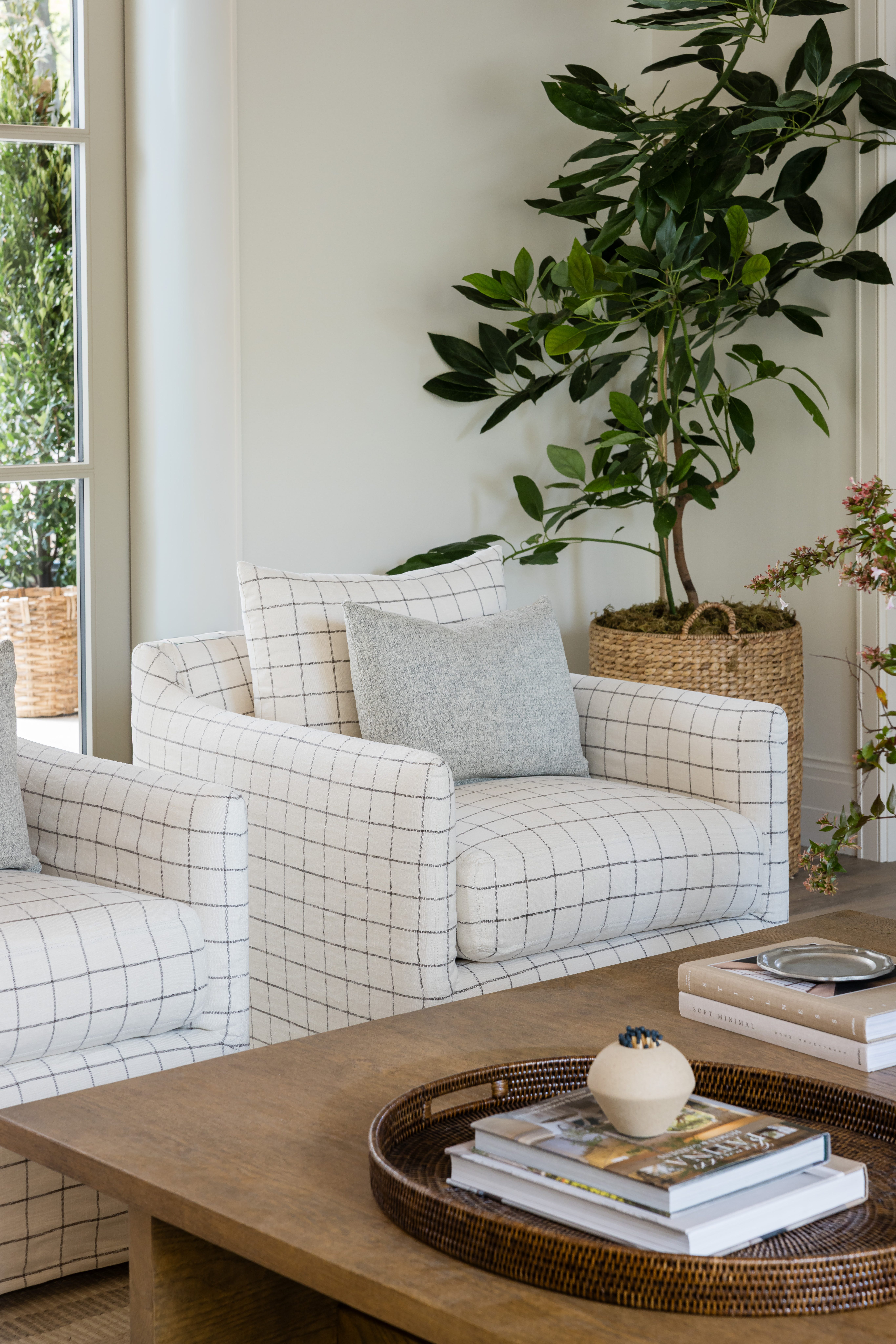
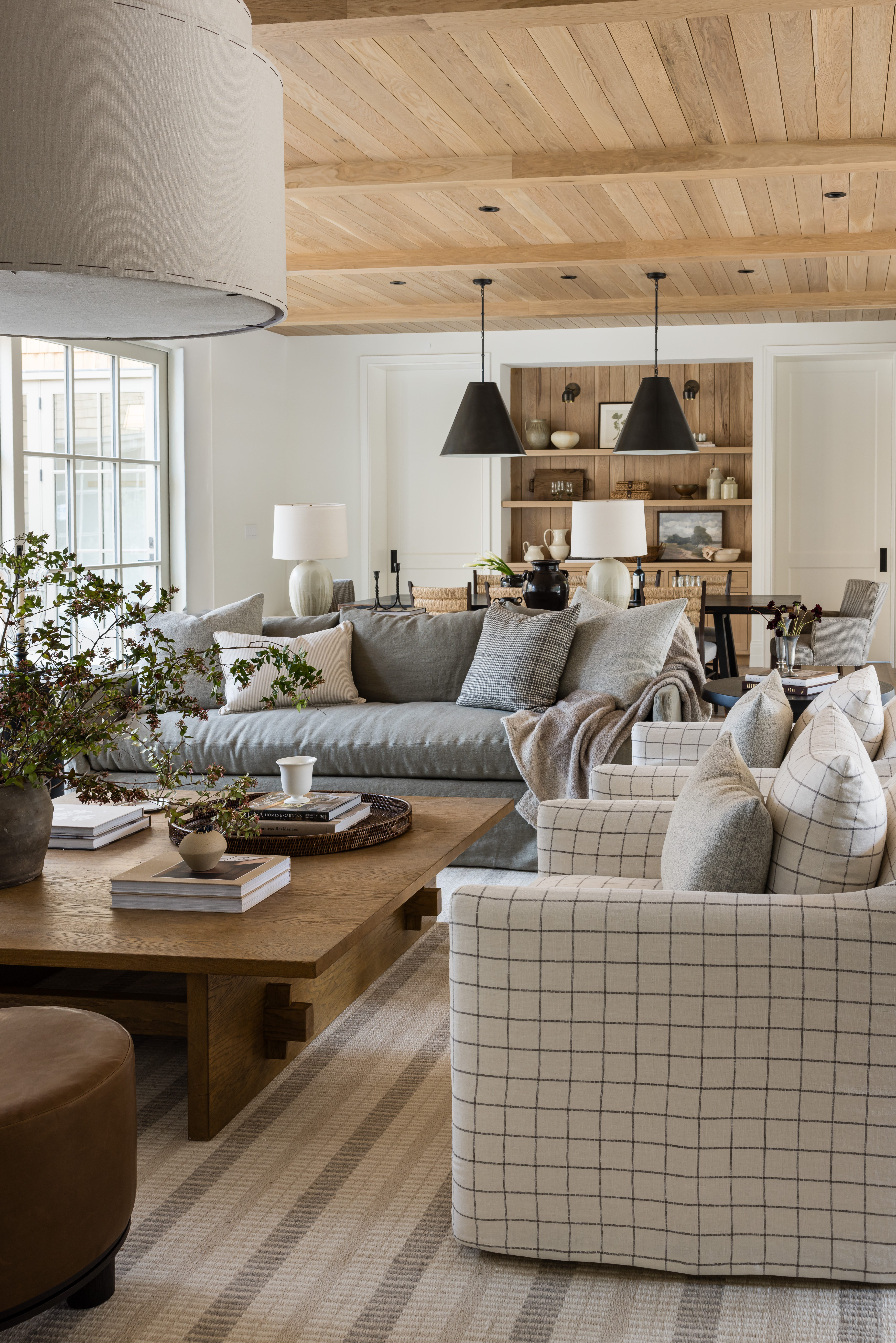
The heart of this home is undoubtedly the great room: a long, light-filled space that brings the living and dining areas together beneath a continuous oak ceiling with exposed beams. Designed around the interior courtyard, this room is framed by beautiful pocketed French doors that open to the landscape beyond, creating an effortless connection between indoors and out. Our clients wanted this to be a room centered around gathering rather than a television, so we kept the focal point a tapered plaster gas fireplace and a linen-wrapped drum pendant with contrast stitching; both allowing the room to feel warm and inviting. The furniture layout encourages conversation, with a linen slipcovered sofa and custom plaid linen swivel chairs placed on a 100% custom wool rug. The colors throughout the room take their cues from the surrounding landscape, while a mix of wood materials, clean pedestal side tables, and transitional accessories gives the room a collected quality. We took a less-is-more approach to styling, letting the architecture and natural materials do most of the work. It’s the kind of room where everyone naturally ends up — less focused on a screen and more on each other, just as the family wants it.
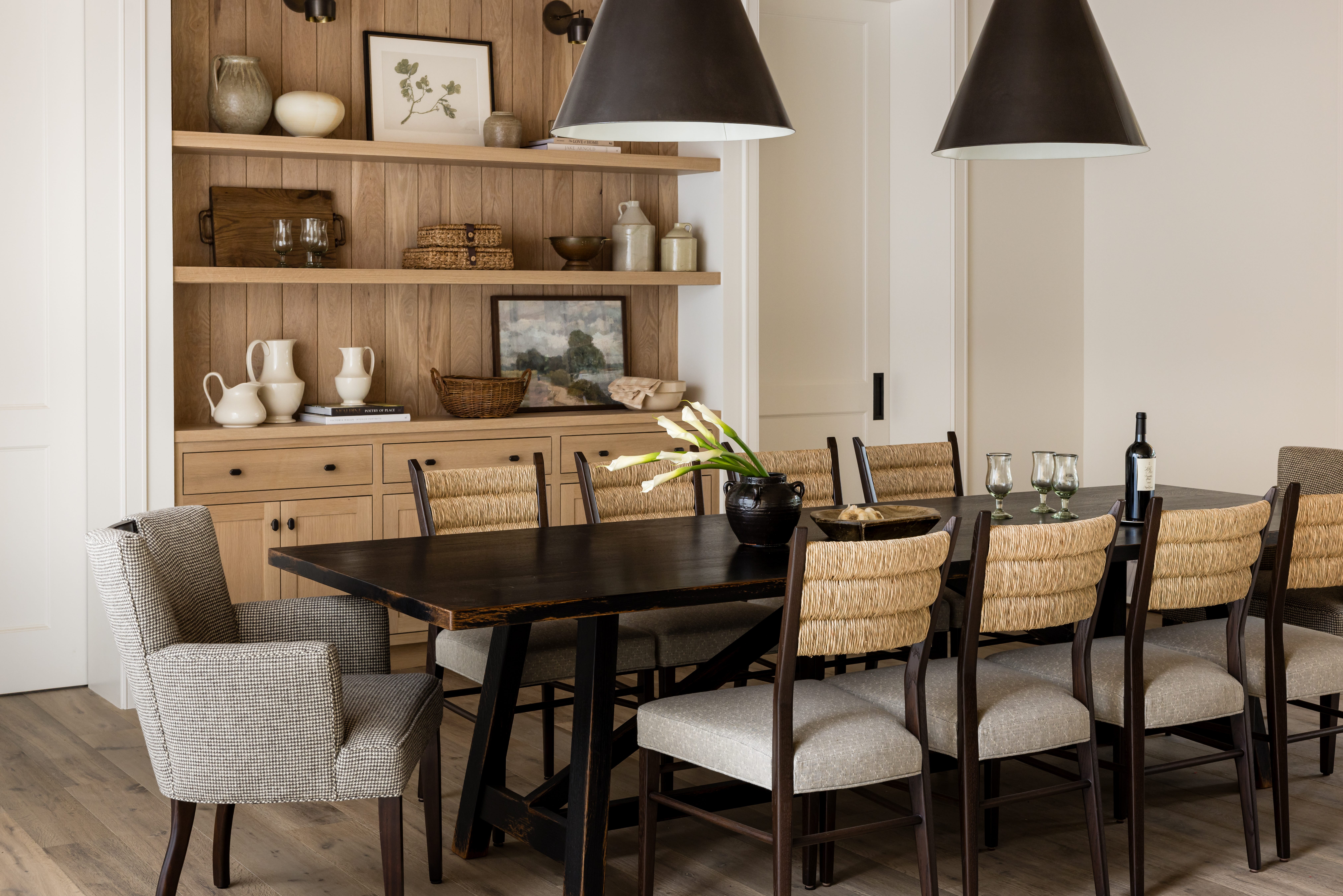
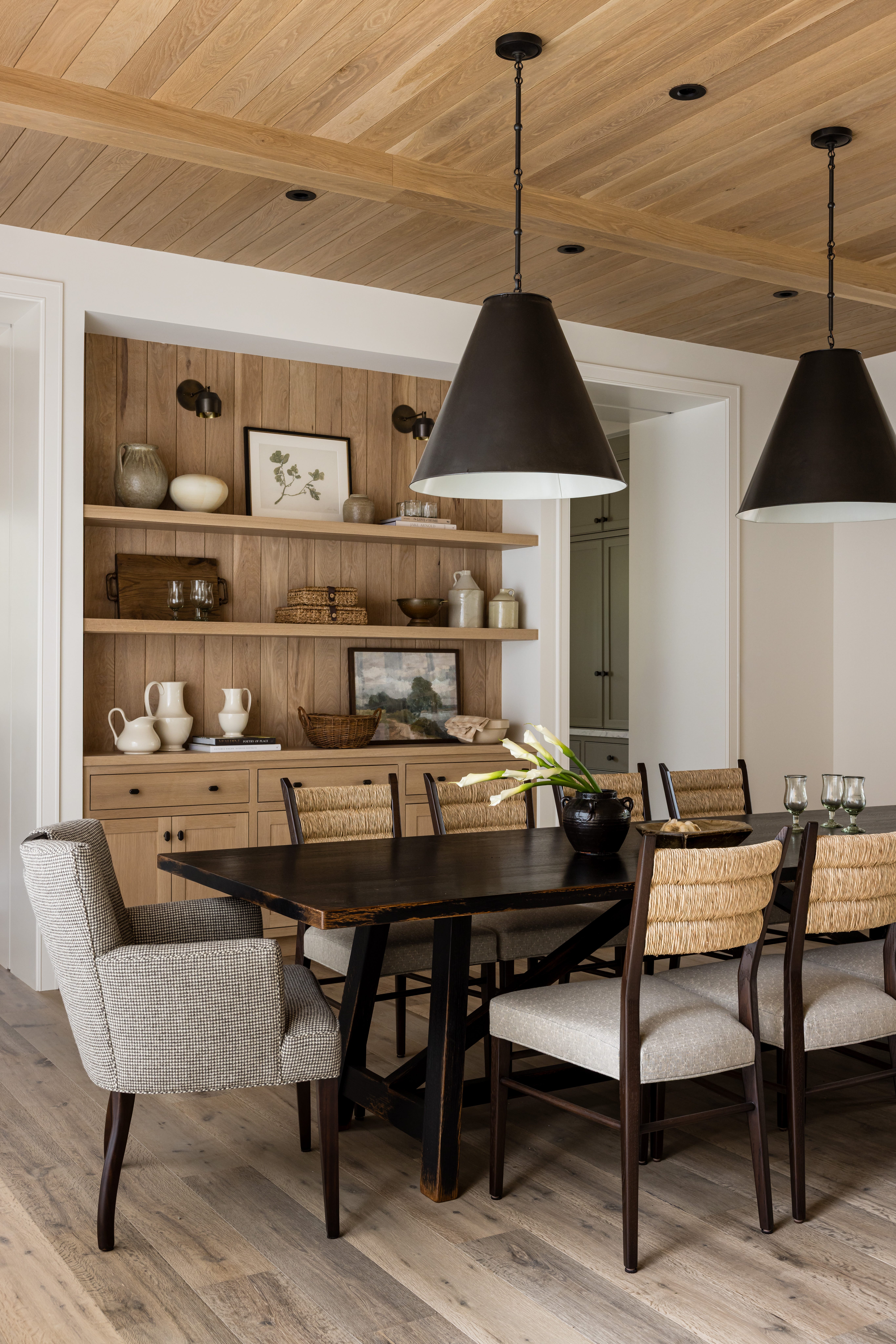
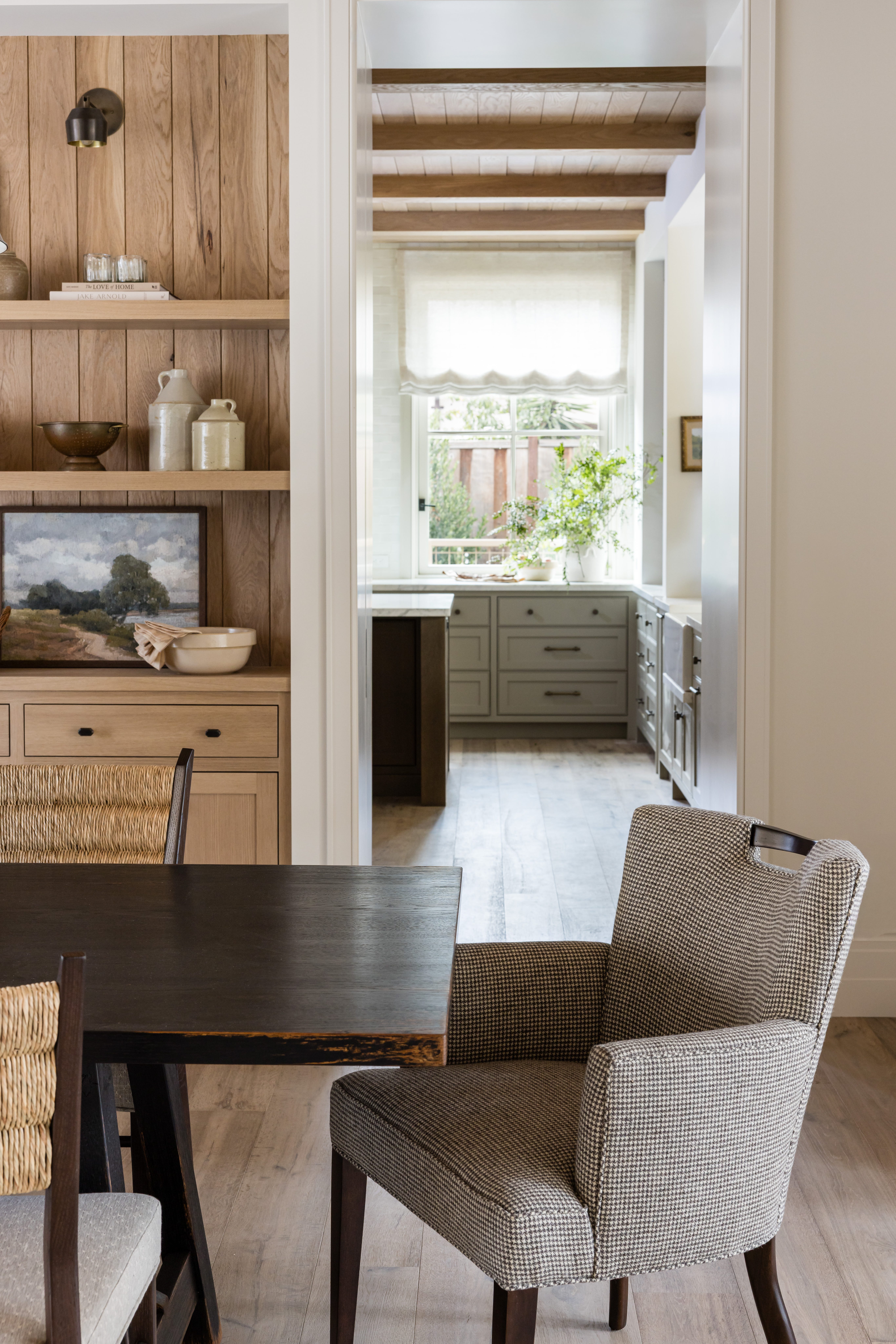
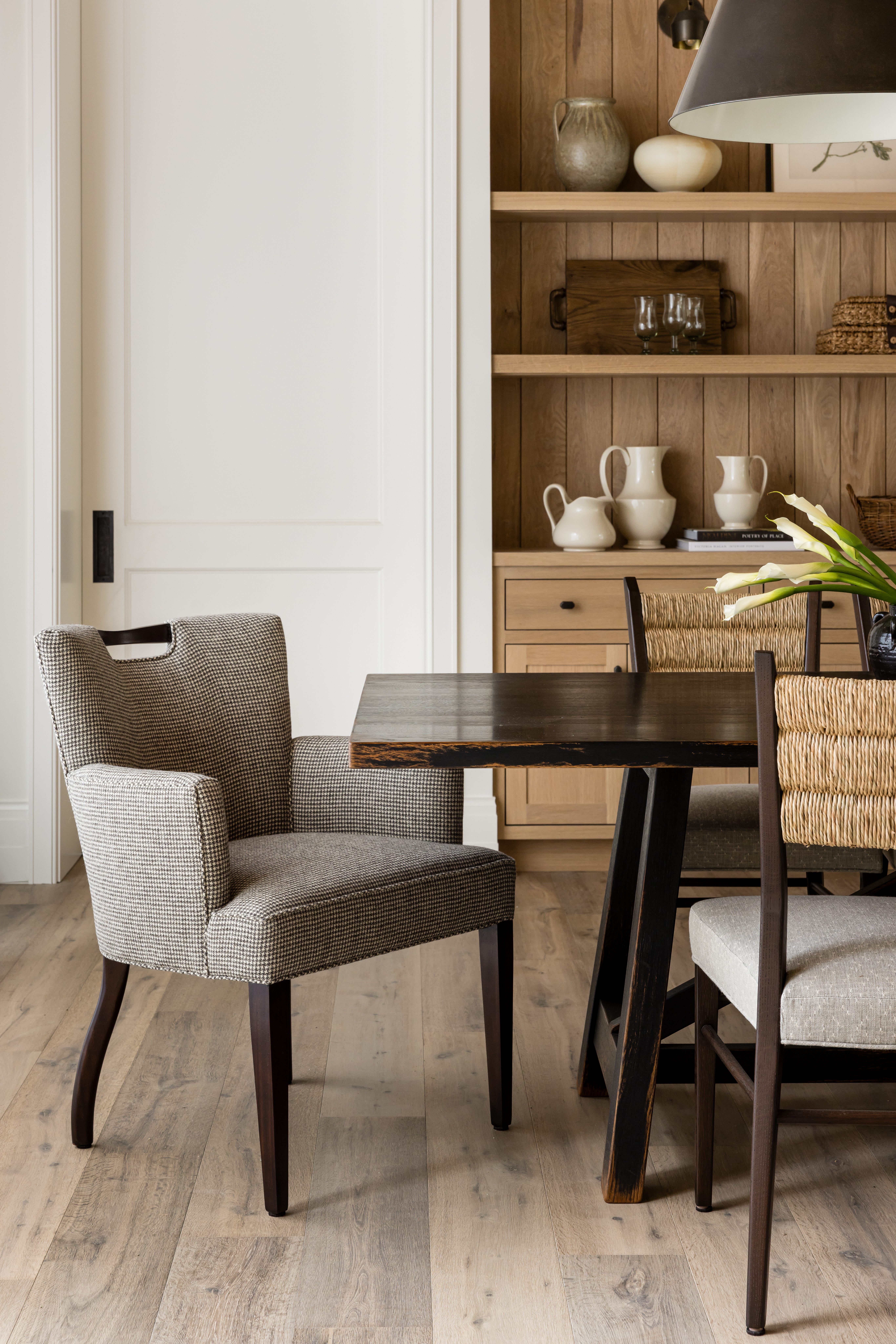
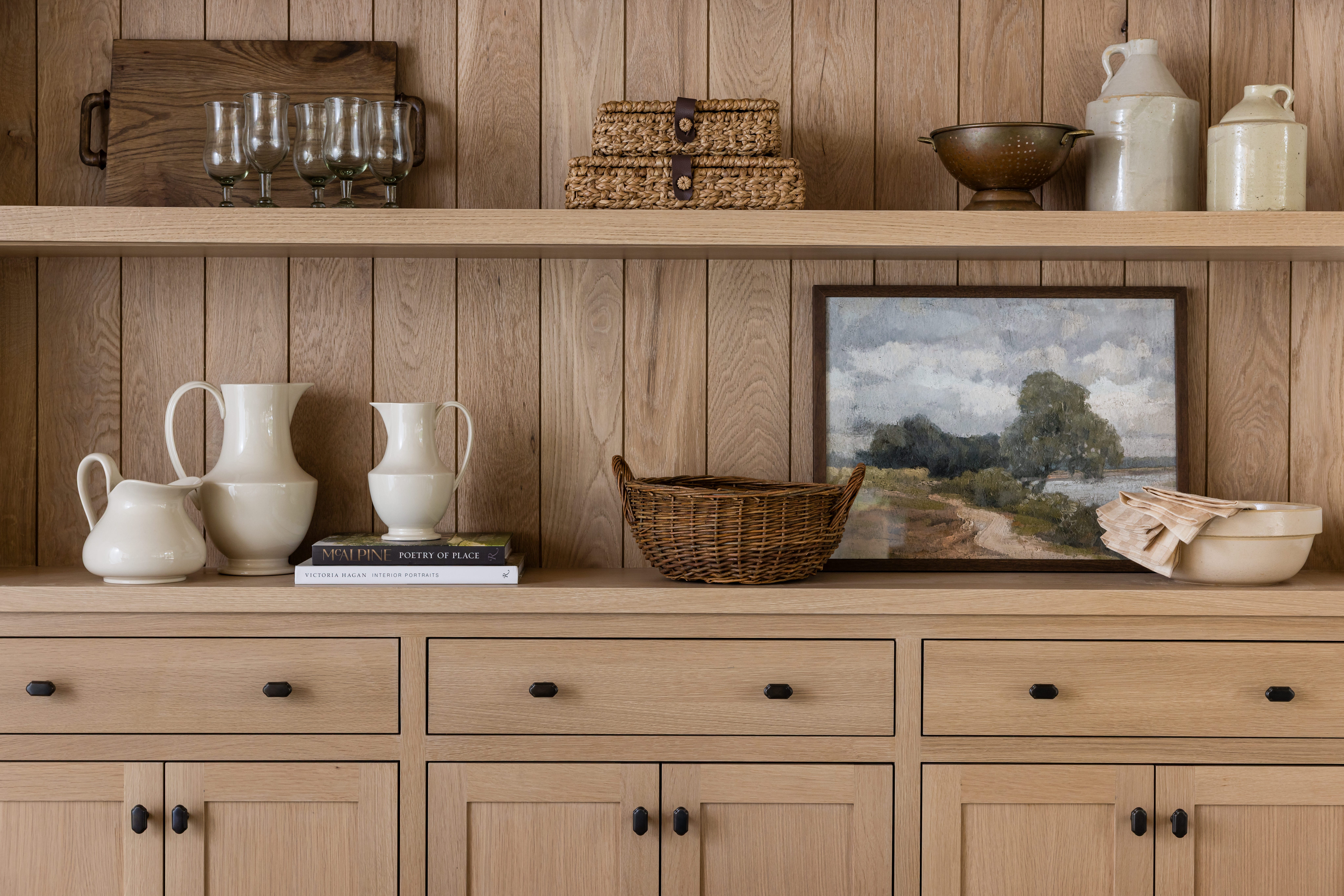
The dining area continues that same relaxed feeling, intentionally crafted to feel like an extension of the living room rather than a separate, formal space. Oak paneling from the ceiling carries down into the built-in, creating continuity and giving the room a sense of warmth and permanence. A pair of aged iron pendants hangs above a custom Matthew Cox dining table; an investment piece our clients fell in love with for its beautifully imperfect, one-of-a-kind finish. Hollywood at Home side chairs bring in another layer of texture with upholstered seats and a playful handle detail, finished in a plaid wool that echoes the pillows and chairs in the living room.
Because this is a larger great room with plenty of everyday foot traffic (and a space meant to be used by the whole family), we intentionally left the dining area without a rug. In a room like this, keeping the floor clear makes it easier to move chairs in and out and allows the beautiful oak table to remain part of the visual story.

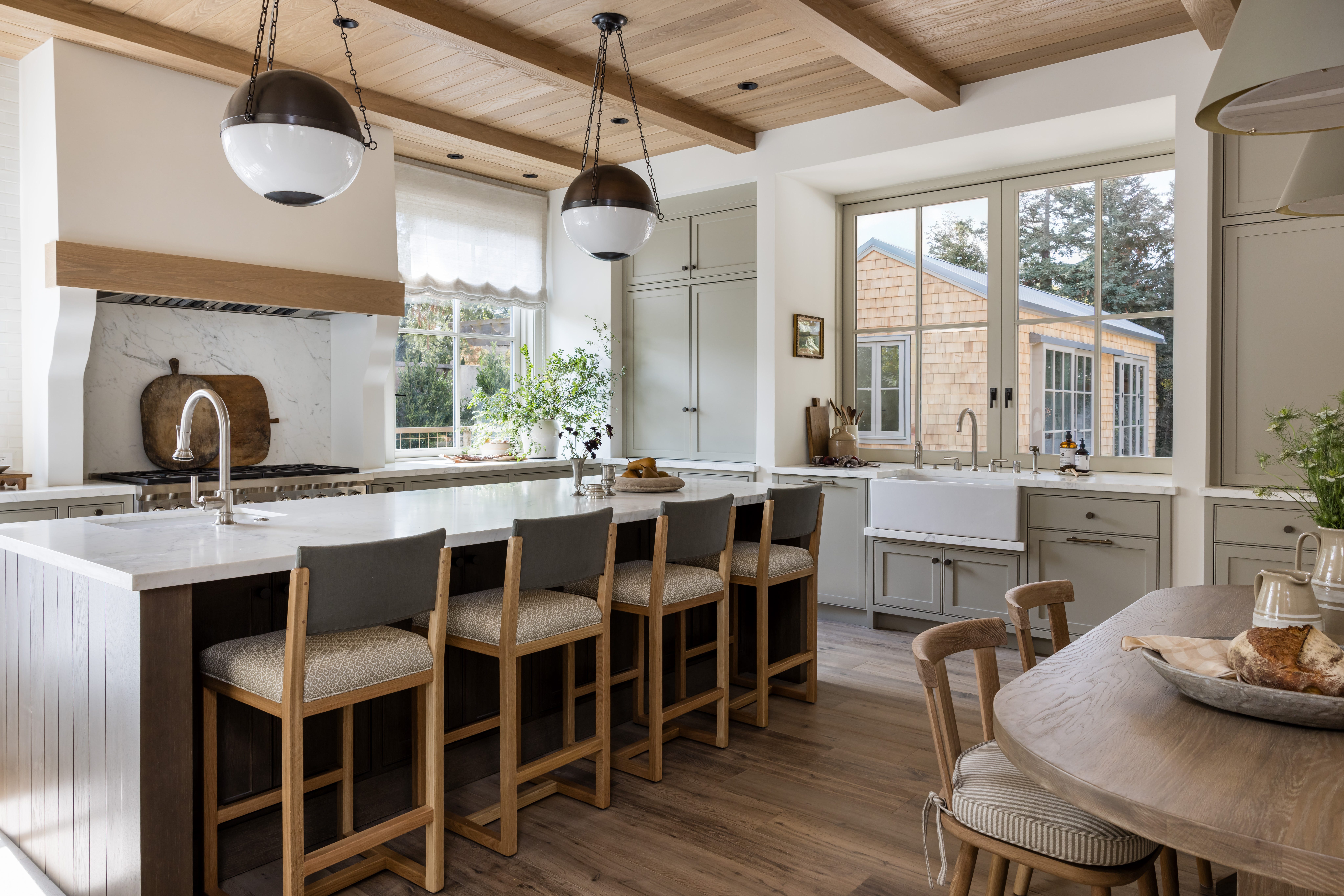
This kitchen was designed to feel expansive and hardworking, with plenty of storage woven into the room alongside moments that bring in softness and character. It incorporates so many of the things our clients are often hoping for: a big island with ample barstool seating, a sink positioned to take in a view of the yard, a dedicated breakfast nook, and an abundance of storage (including in-drawer storage that has become a high-priority wishlist item among most of our clients).
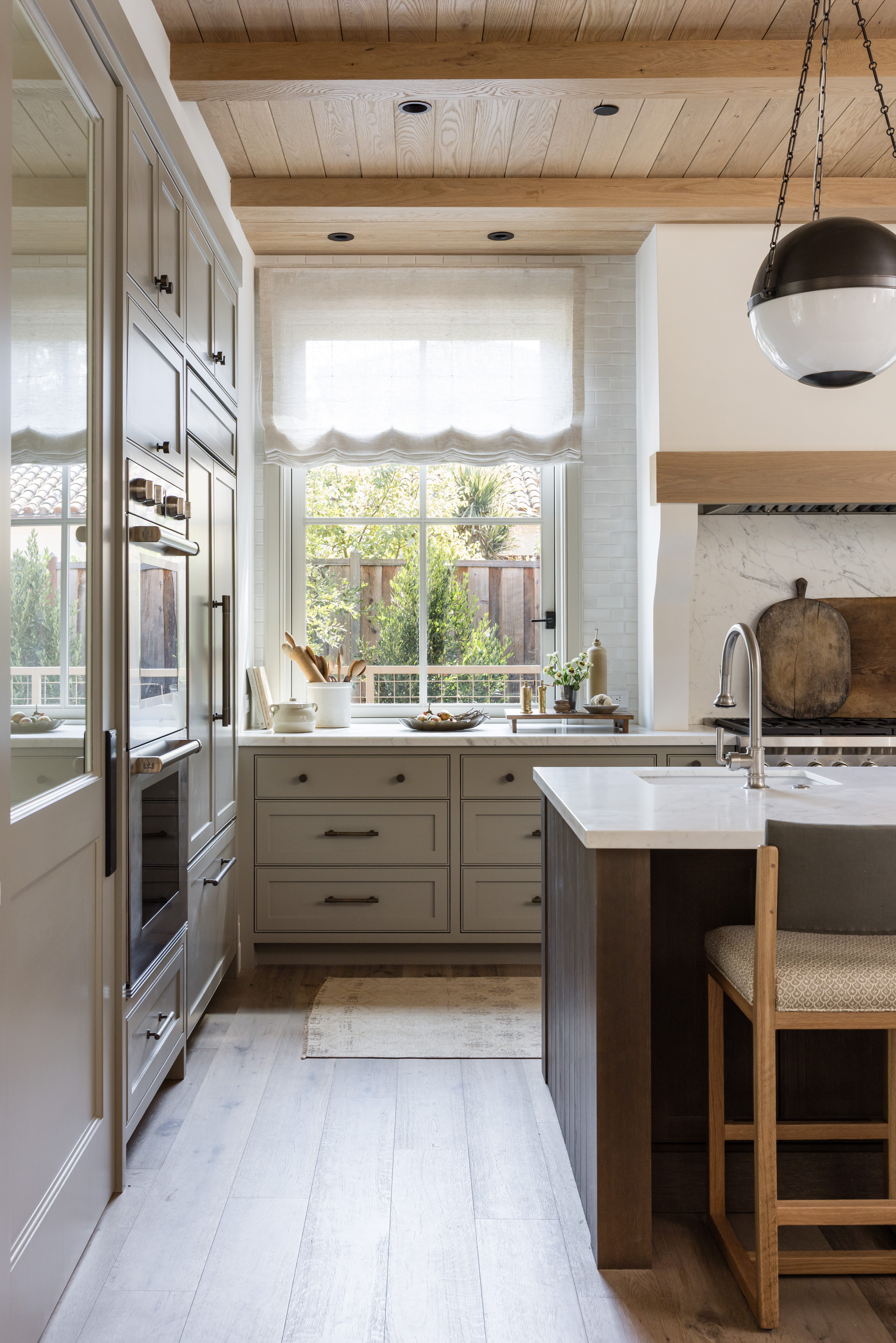
A secondary prep sink sits just off to the side of the island, giving the kitchen another station without interrupting the flow. The appliance suite is equally generous, with a 48-inch Wolf range, double wall ovens, and panel-ready integrated refrigerator and freezer, all positioned conveniently adjacent to the back pantry. We always want a large kitchen to feel beautiful, but the layout has to work first — making sure the sink, range, and appliances create an intuitive working triangle.
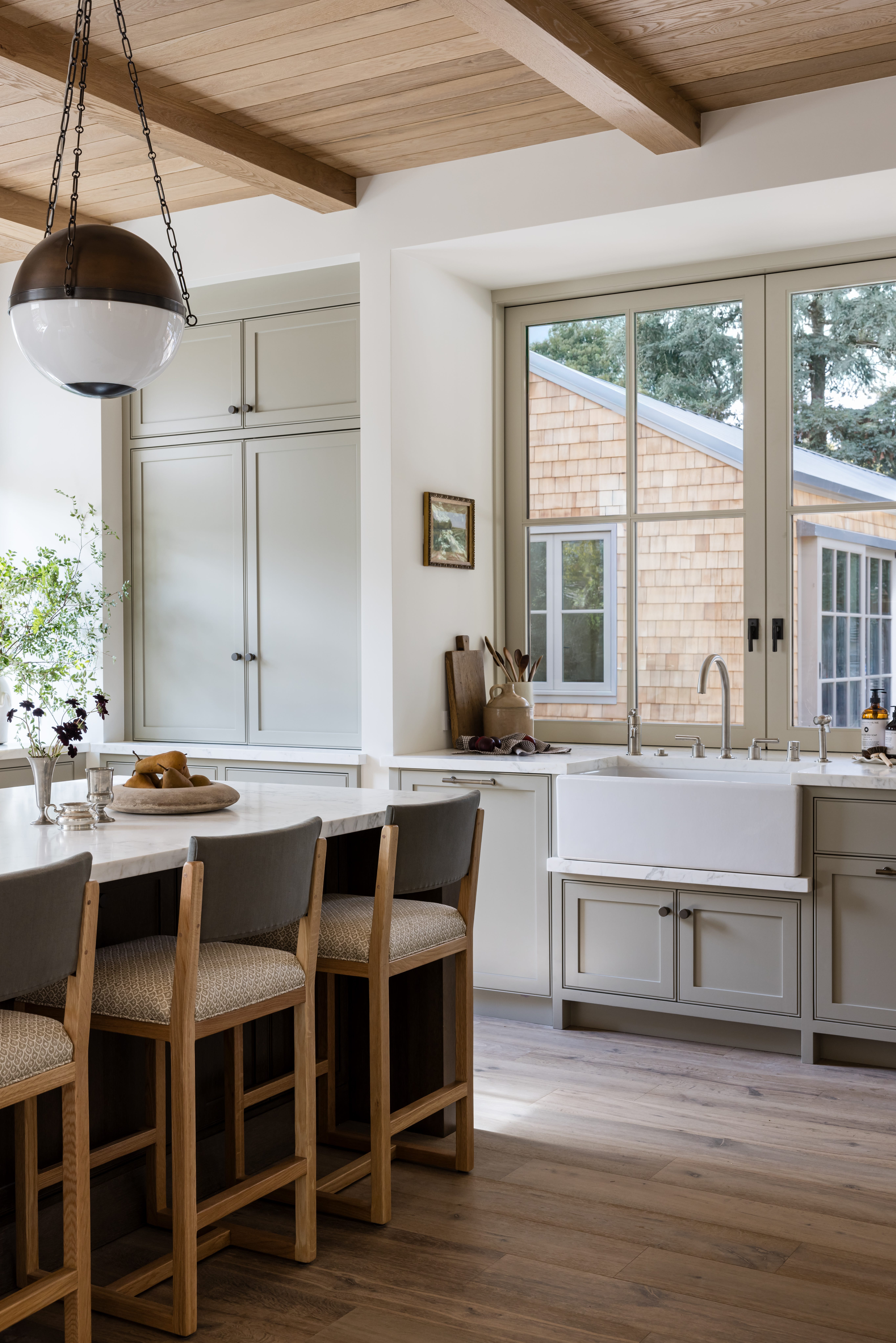
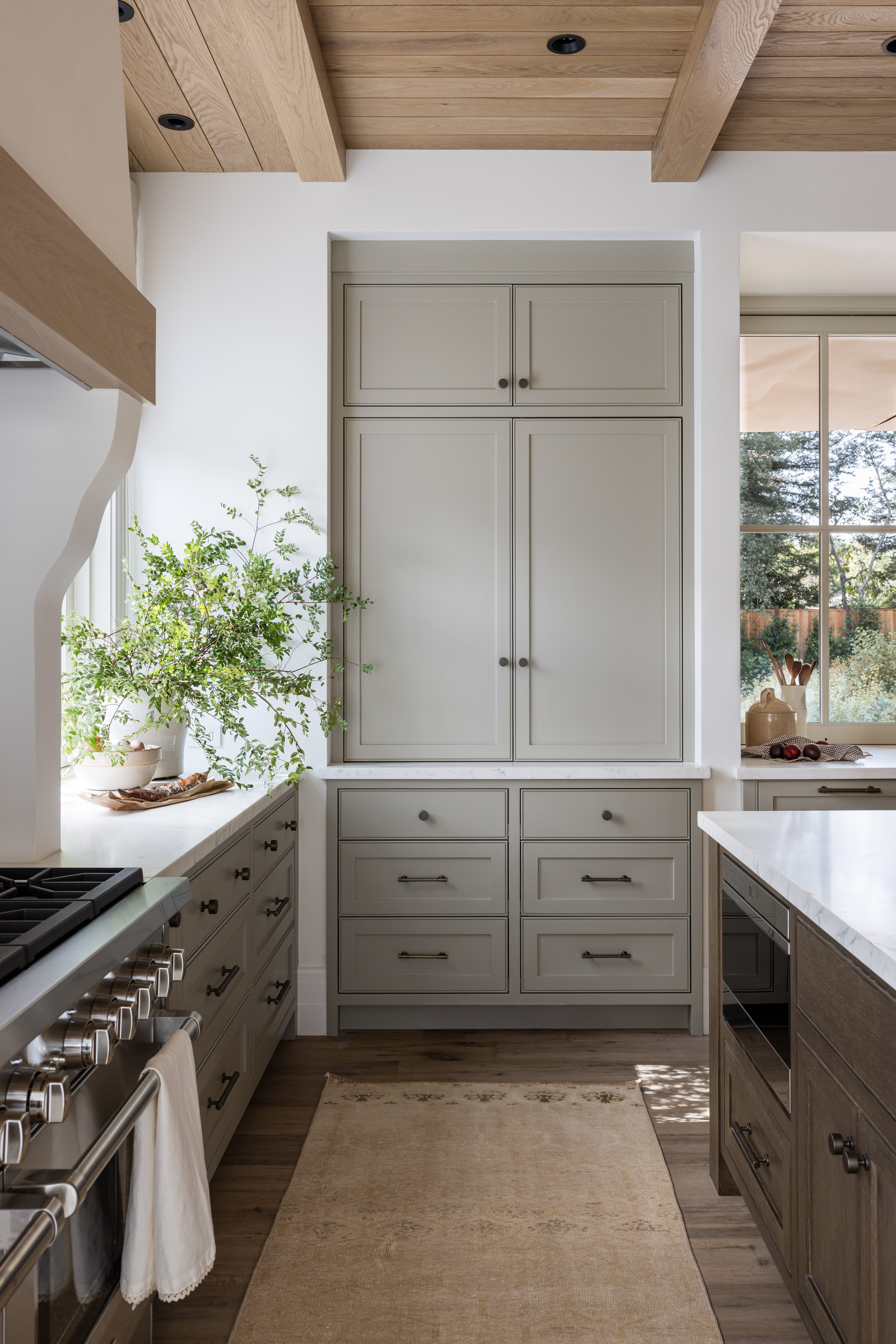
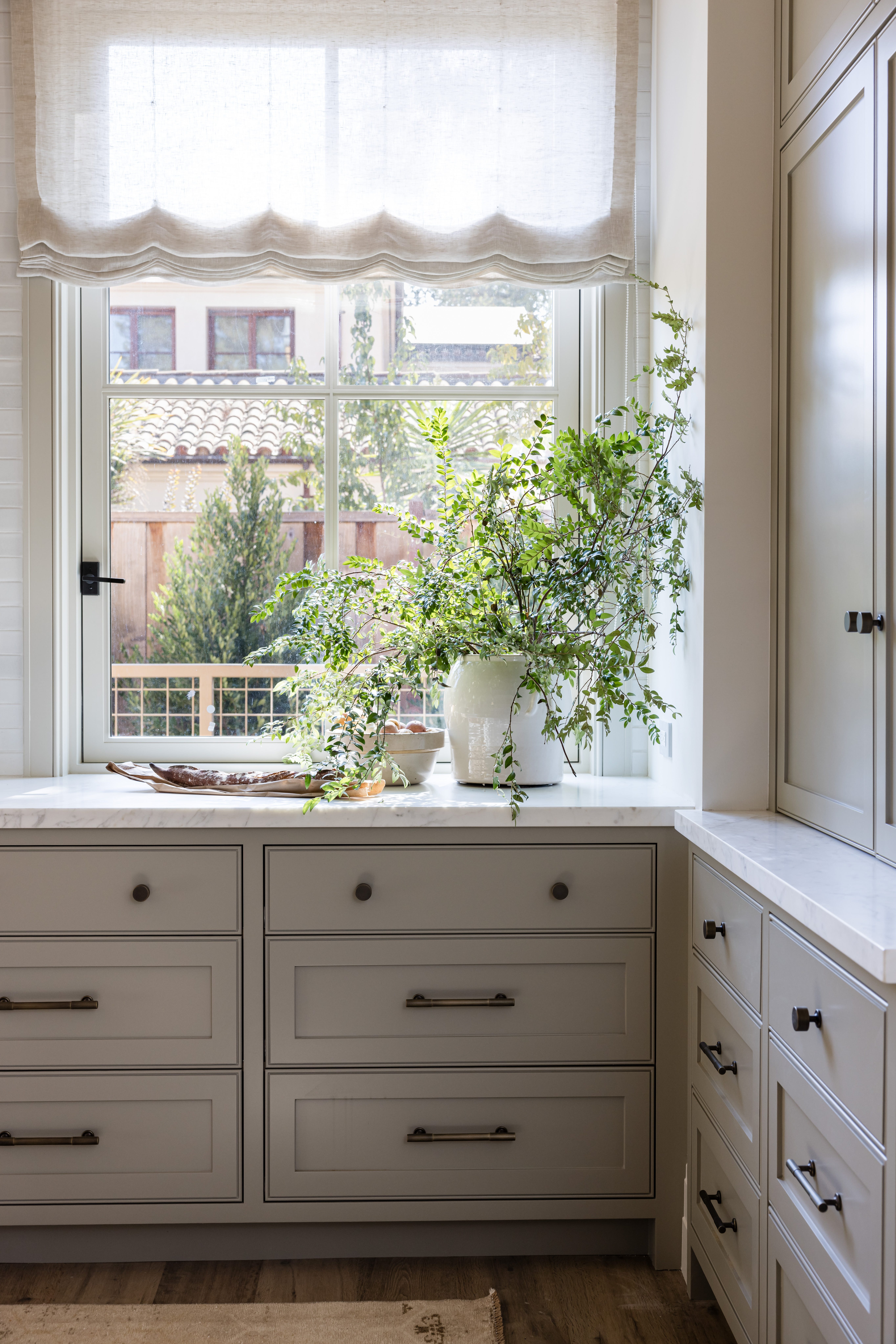
The design for this room began with the placement of the range, which became the anchor for a plaster hood that gives a large kitchen a surprisingly cozy moment. Flanked by necessary storage, it feels more architectural than utilitarian and creates a natural focal point without overwhelming the room. The cabinetry is painted in a soft gray-green hue and intentionally stops at a comfortable height rather than reaching all the way to the tall ceilings. One of the built-ins conceals an appliance garage, allowing everyday necessities to stay tucked away. Natural marble countertops continue up into a full slab backsplash, and a small marble drip ledge at the main sink is both beautiful and practical, catching water before it reaches the cabinetry. Waterworks plumbing in brushed nickel adds another layer of detail, while bronze decorative hardware and bronze pendants over the island bring warmth and contrast. The island itself is white oak stained a deep chocolate tone, grounding all of the softer finishes around it.
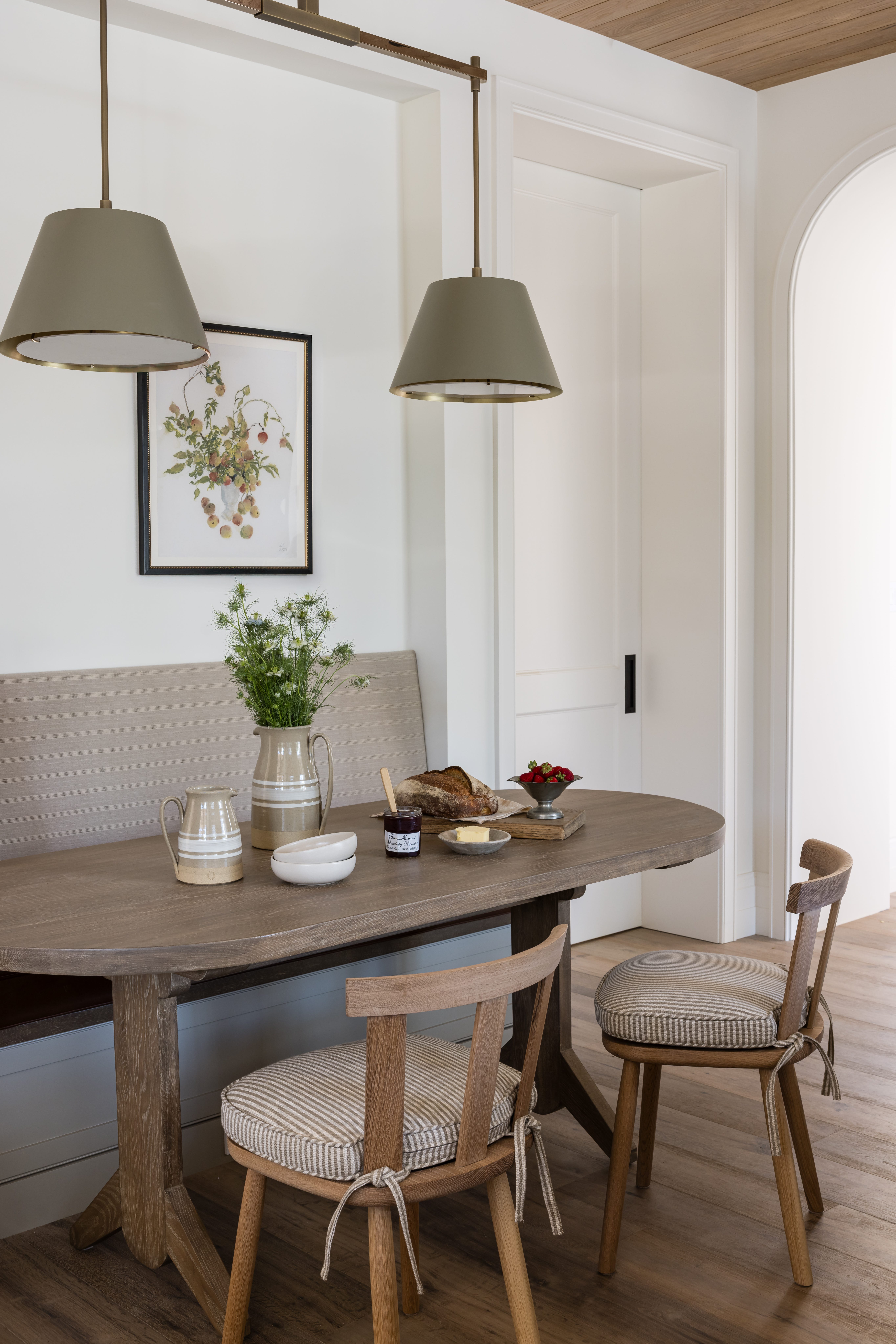
The windows are the perfect example of why we always believe in investing in window treatments. Soft, sheer linen shades filter the natural light and add an almost effortless softness to the harder materials throughout the kitchen, while the windows themselves open to a garden moment just beyond. In the breakfast nook, a simple built-in banquette with a leather seat and durable performance fabric on the back keeps the space practical for everyday family life. Above it, an Urban Electric fixture is finished with a custom-painted shade that matches the cabinetry, tying the little corner back into the larger kitchen. We softened the stone, oak, and cabinetry even further with runners, including a vintage runner that brings an aged, collected quality to the space. The result is a kitchen that has everything it needs to function beautifully, but still feels relaxed, warm, and lived-in.
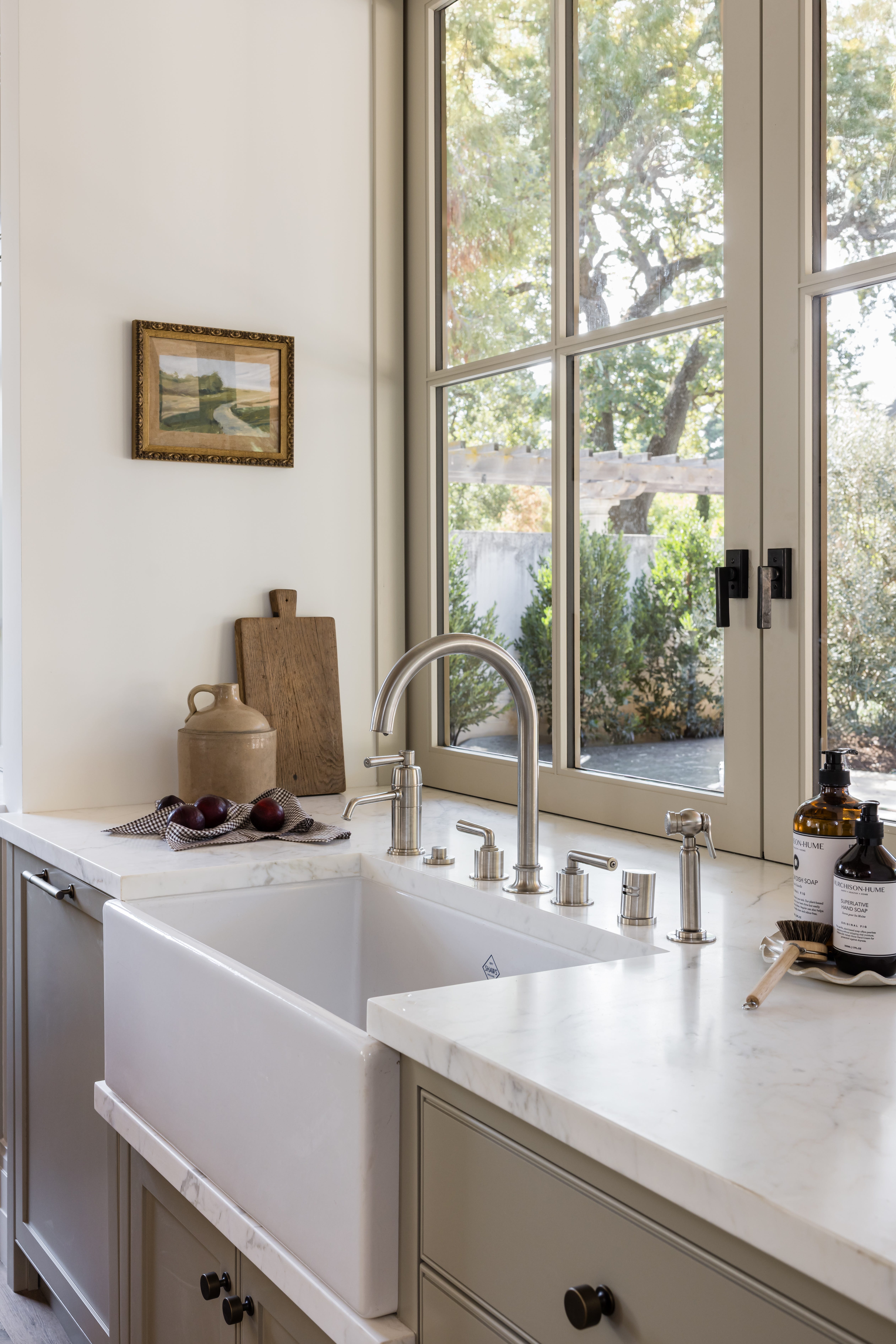
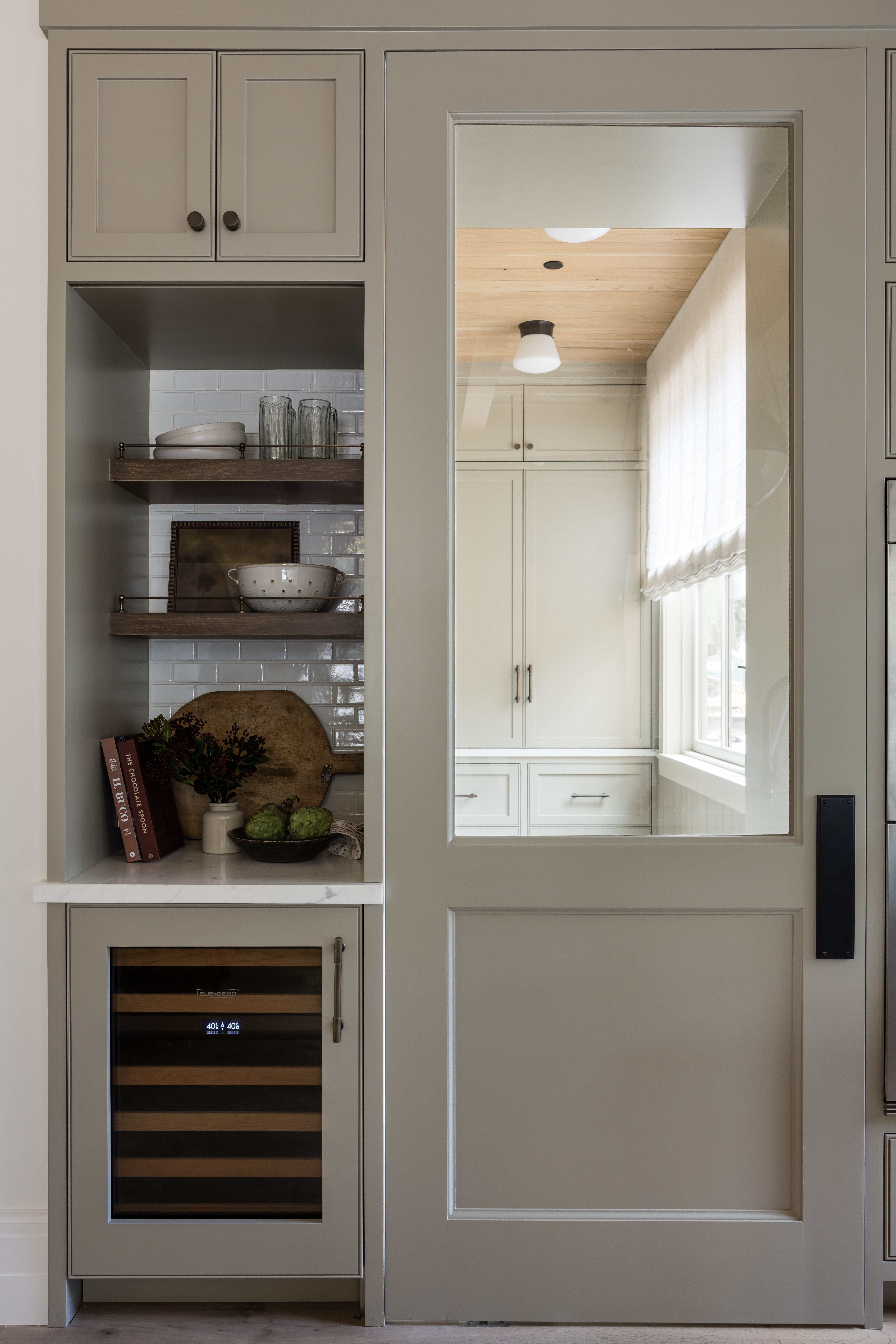
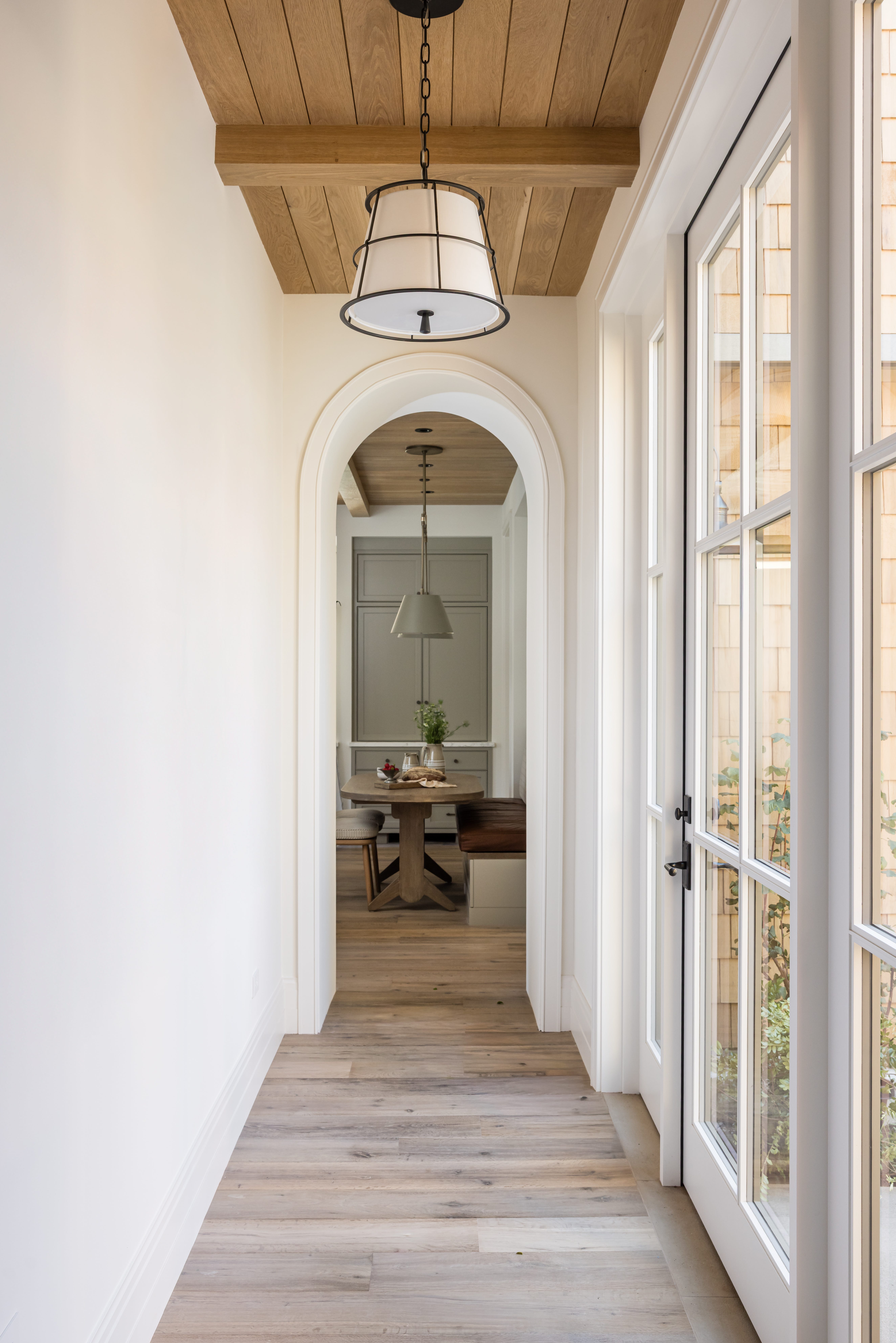
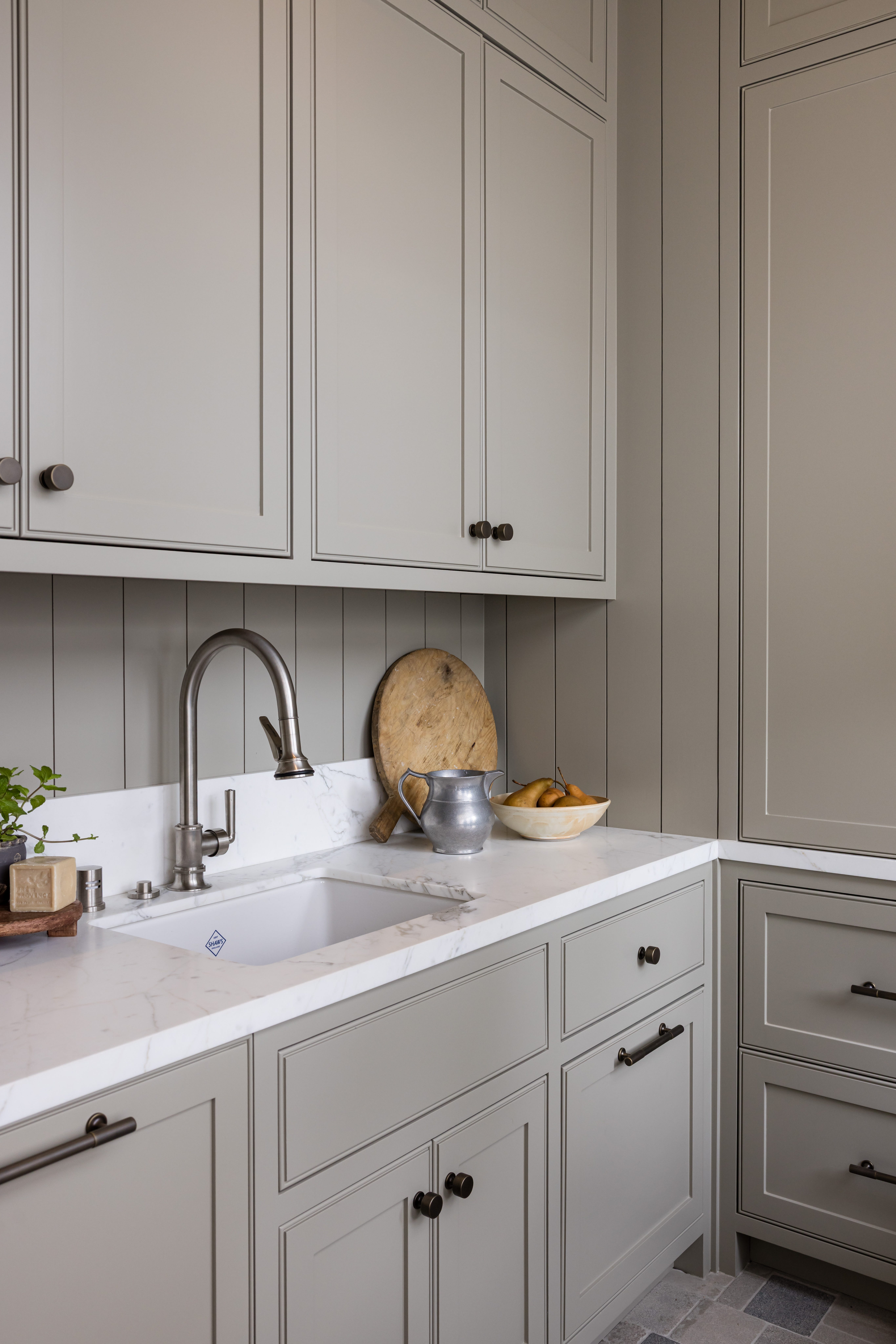
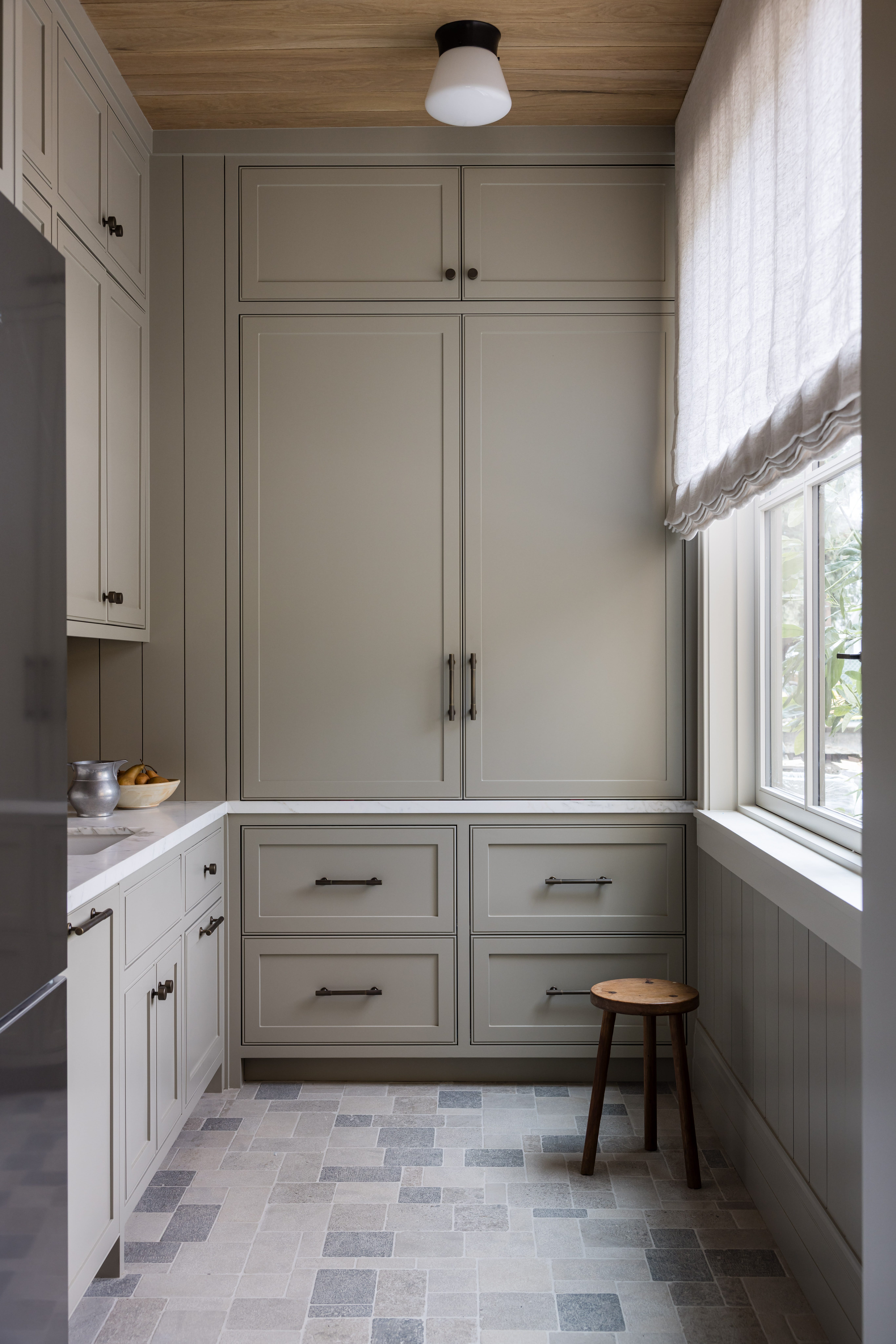
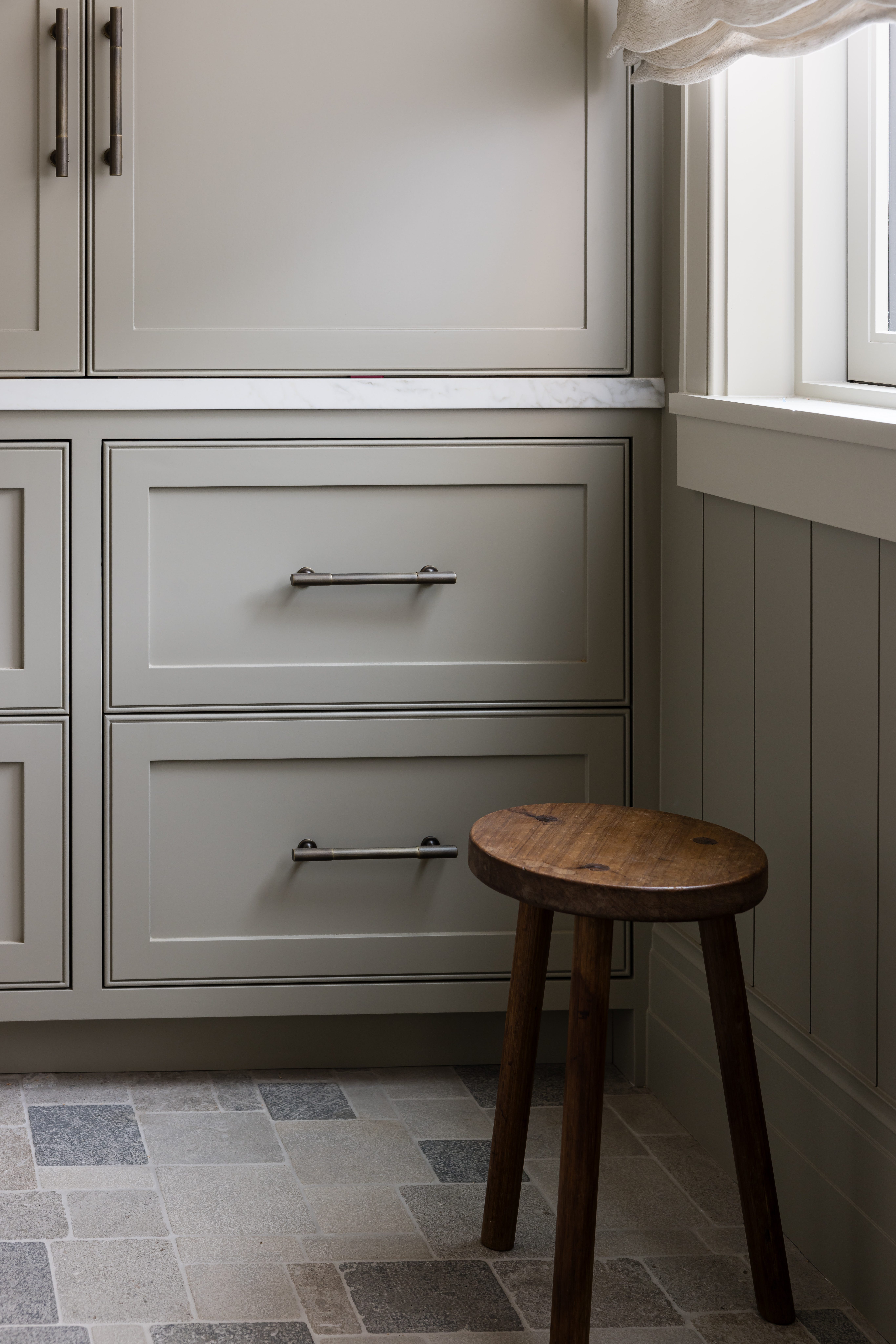
Just off the kitchen, the pantry feels like a natural extension of the space rather than a room tucked away behind it. A custom pivot door was designed specifically to offer a glimpse inside, with a simple glass panel that allows light to filter through and gives the pantry a sense of openness. Inside, soft handmade ceramic tile adds a subtle layer of texture, while the limestone flooring carries through from the entry, creating continuity throughout the home. We carried the kitchen’s cabinetry color into the pantry as well, along with the same marble countertops and bronze hardware, so the spaces feel connected even though the pantry is much more utilitarian by nature.
The pantry is designed around the everyday things that need a home: food storage, entertaining essentials, and the appliances that are better kept out of sight. A panel-ready dishwasher and Waterworks faucet in brushed nickel keep the room hardworking without sacrificing the softer aesthetic of the kitchen. Just beyond it, a wine fridge creates a convenient transition point between the kitchen and pantry, making it easy to grab a bottle when entertaining or tuck things away when the kitchen is in full use. The goal was really to make the pantry feel like part of the overall kitchen experience: highly functional, thoughtfully designed, and seamlessly connected to the rooms around it.
Photography by Vanessa Lentine
Thank you for following along… that’s all for now! Subscribe below to see the next part of the reveal, where we will show you the bedrooms and offices in the house. xx
No posts
Comments
Nothing yet. Say the first thing.
Sign in to join the conversation.