
To all the new readers, hi 👋, I am Fatema Raja. Layer by Layer is my weekly newsletter where I peel back the layers of brand, design, and culture, one story at a time.
I have spent the last three weeks away from this page, deep in a project I genuinely love: helping a protein and nutrition brand redefine its positioning and design strategy. Every time I work with a brand that has real reach and real potential for scale, I am reminded that design at scale goes beyond singular output. It becomes a system. A container that holds creativity, allows it to evolve, and still makes everything look coherent.
And it always, always takes me back to Gojek.
If you are not familiar, Gojek is a SuperApp built in Indonesia that offers 20+ products under one roof: ride-hailing, food delivery, at-home services, payments, and on-demand entertainment, the list goes on. Before SuperApp became a buzzword, Gojek was already living it. And before it became GoTo, it was just Gojek, one of the most loved brands in Southeast Asia, and the project that taught me everything I know about designing at scale.
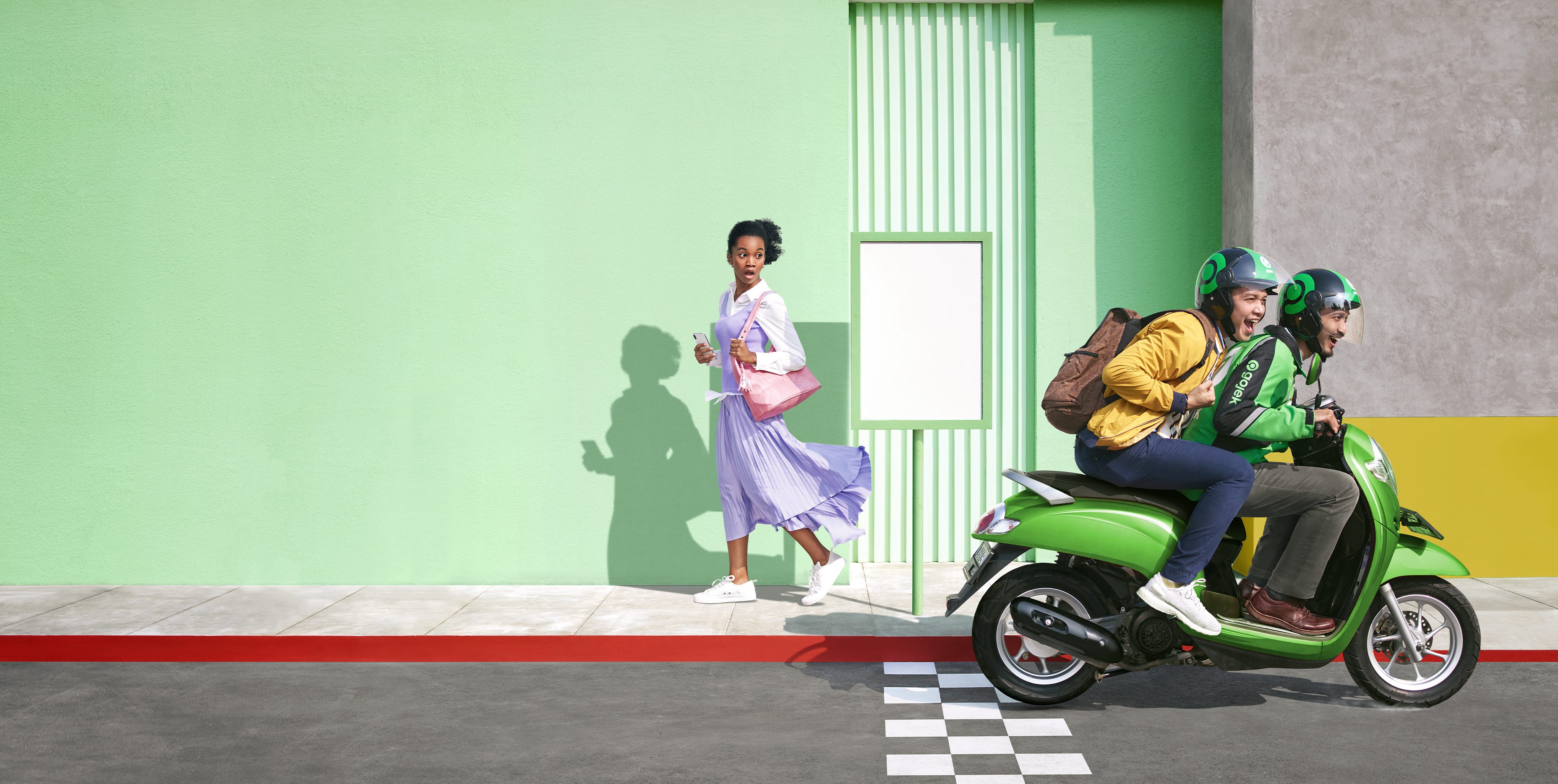
Back in 2018, I was part of one of the most exciting and terrifying things I’d ever worked on: rebranding Gojek, a unicorn and one of the most loved brands in Indonesia, completely from the ground up.
During my decade-long career in design and branding, I have worked with brands of various sizes, from co-founding a perfume brand from the ground up to designing brand systems for companies like Swiggy. It is always easier to build a small-scale brand with a lot of soul and character. It is equally easy to build a large corporation with a very consistent brand, where everything is precise but somehow feels sterile, almost emotionless. What is not easy is building something that is both soulful and scalable.
On July 19th, 2019, we launched the new Gojek to the world. From the outside, it probably looked like a big reveal. From the inside, it felt like the end of the longest, most exhilarating marathon I’d ever run.
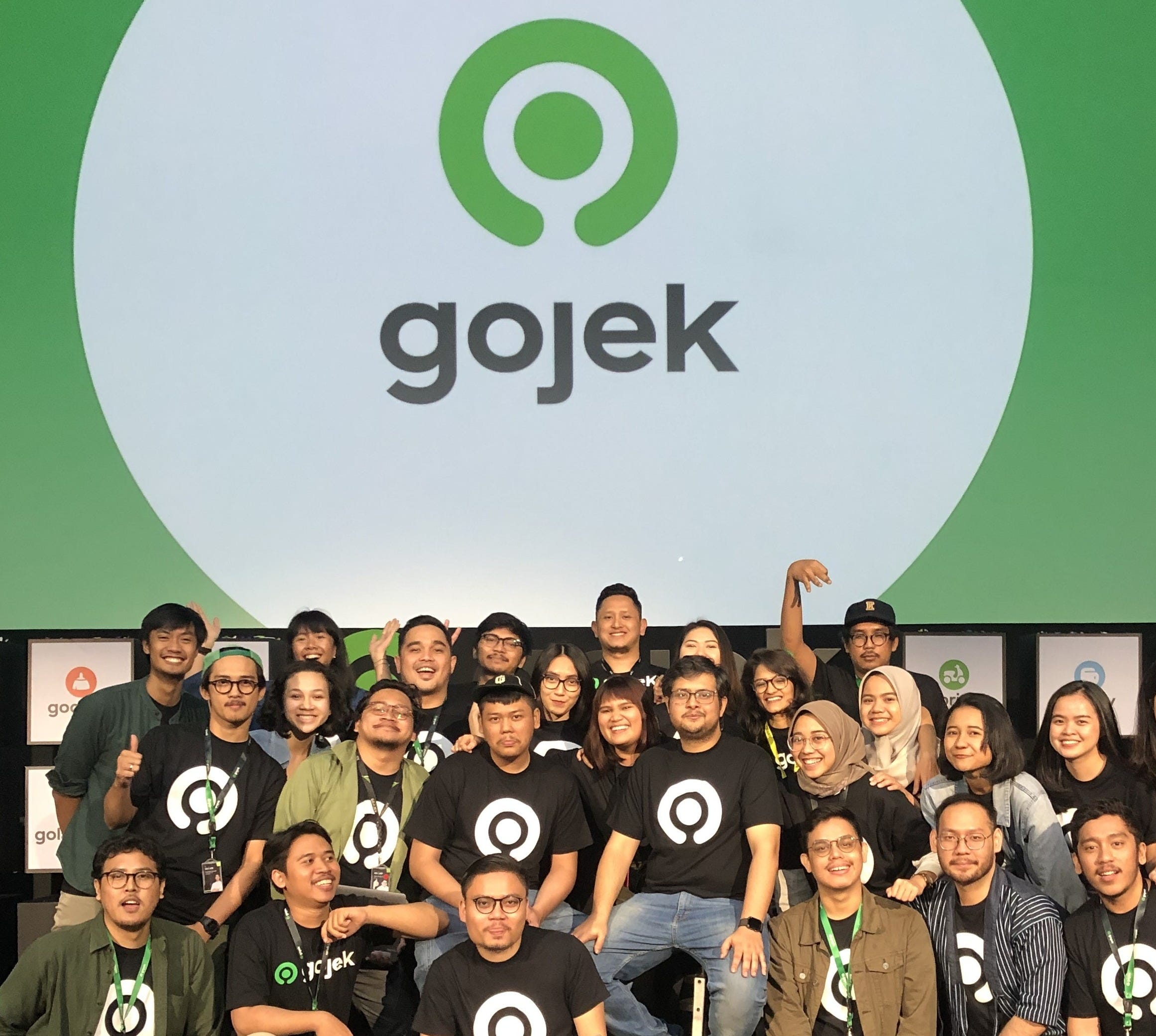
I wrote a short announcement piece about it at the time. But the real story, the one about what it actually takes to redesign identity for a company operating at that scale, across 20+ sub brands, multiple countries, and millions of daily users, deserved more room. One essay will never do justice to a year-long endeavour. But let me start here. This story is about how we made Gojek feel emotional across four countries and millions of its customers.
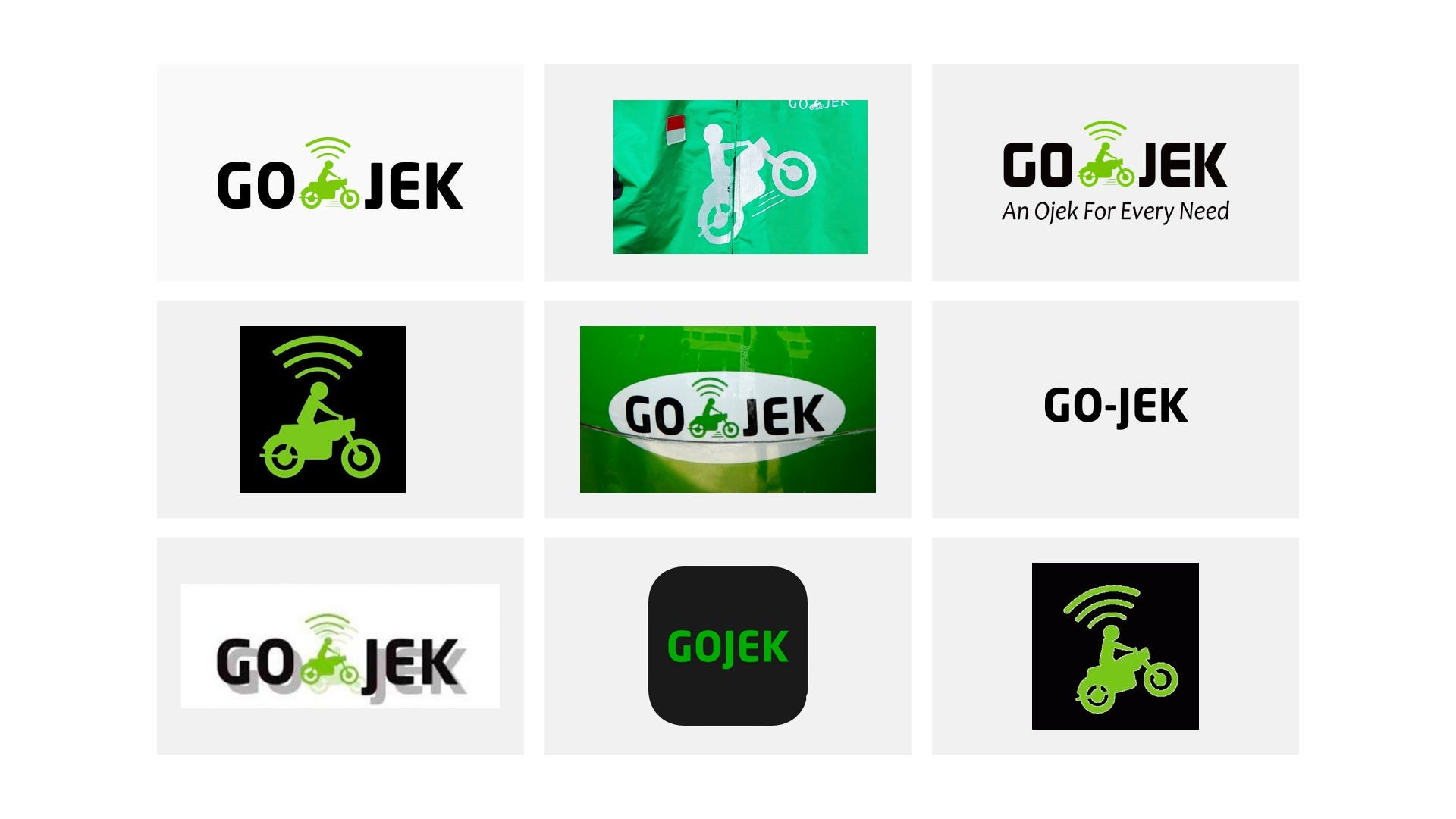
Gojek started in 2010 as a ride-hailing app in Indonesia. The original logo was born before the app even launched, conceptualised and finalised by one of the founders himself, drawn on a napkin at a restaurant. I suppose all good ideas are born like that. It symbolised a marriage between an ojek, the Bahasa Indonesia word for bike taxis, and technology, represented by a wifi symbol perched on top. After all, moving people about on ojeks was what we started with.
It was genuinely unique. Users loved it, and that love made it iconic in ways no brand consultant could have engineered. But here’s the trap that meaning-heavy logos set for themselves: they put an expiry date on your identity.
By the time we started this project, Gojek had grown into a SuperApp with more than 20 products and sub-brands, from food delivery and payments to logistics, healthcare, and entertainment. The list goes on. The logo told one story. We were living twenty. And the practical problems were just as serious as the strategic ones. The mark broke down at small sizes, it broke down in different materials, and it was almost impossible to reproduce consistently. You would find versions with skid marks, no marks, and hyphens in the wrong place. For a brand people interacted with every single day, that inconsistency was quietly corrosive.
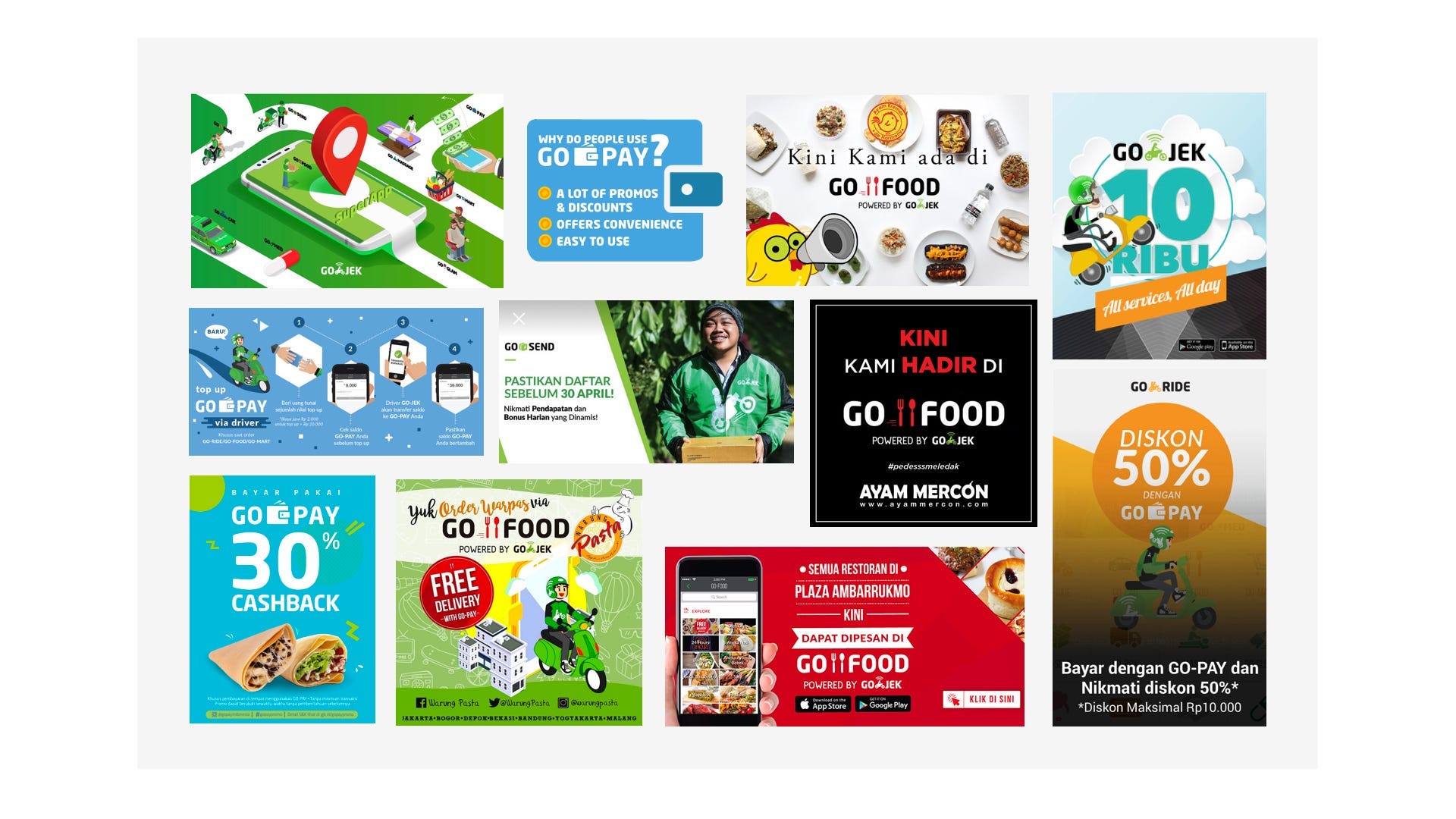
If the logo needed updation, the rest of our brand language needed a refresh, too. Gojek is an app of apps. A SuperApp. We have more than many products and services. So many that we were literally running out of colours to attribute to new products. Our colours needed a rethink. Our typeface looked dated, and struggled to provide enough variety with its limited range of weights. So did the illustration style, the tone of voice had never been documented, so every team wrote like themselves rather than like Gojek.
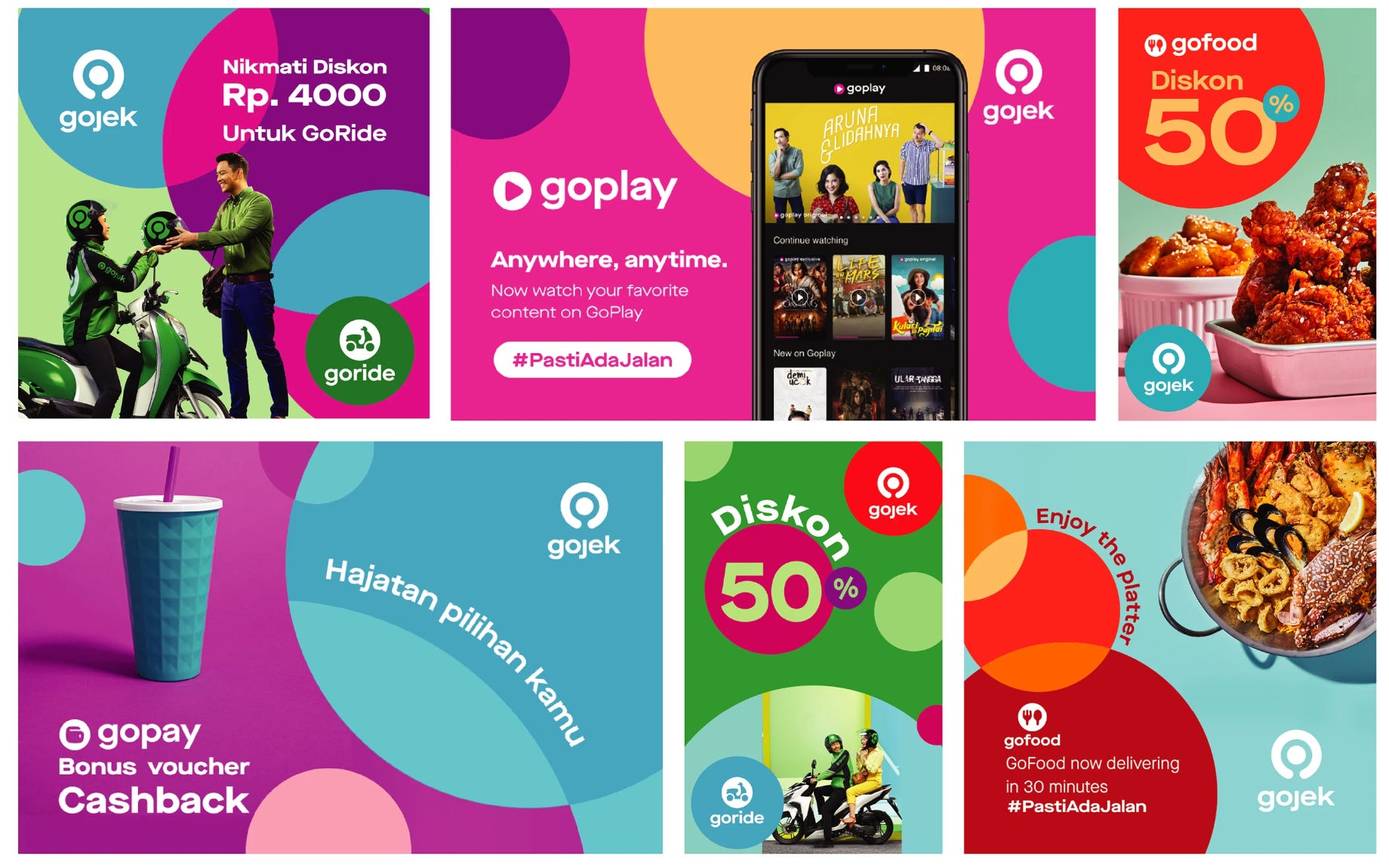
I’ll let images do the talking 👇
Bottom line, we needed to change. We needed a look that would reflect why we exist, what we believe in, and where we’re headed.
We were not just redesigning a logo. We were redesigning the architecture that held an entire brand ecosystem together. An ecosystem that had to accommodate a primary brand, 20+ sub-brands each with their own product identity, multiple countries with genuinely different cultural contexts, and a design team that needed to be able to evolve the system without breaking it for years to come.
There is something about design at scale that I find exhilarating. When you are building 0 to 1, there is an element of resourcefulness, jugaad as we call it, that gets things done fast and scrappy. But solving for scale means millions of people should be able to resonate with it, and thousands of people working on the inside should be able to replicate and produce from it. The system has to be simple enough to scale yet distinctive enough to be immediately recognised as Gojek.
We knew this was going to be hard.
We needed a complex brand architecture that would accommodate all our sub-brands and have room to spare.
As a design team, we had spent enough time inside Gojek to know that the harder problem was not building the system. It was ensuring the system could outlive the people who built it. A brand at this scale is never finished. Products get added, markets change, the company evolves, and the identity has to stretch with all of it without snapping. So we were not just designing for Gojek as it was in 2018. We were designing for the Gojek that did not exist yet.
We started where every design project at Gojek starts, with our users and drivers. After months of research, intense brainstorming, dozens of fully-built decks that were shelved at the last moment… we arrived at Solv — our new logomark. We call it our symbol of solutions.
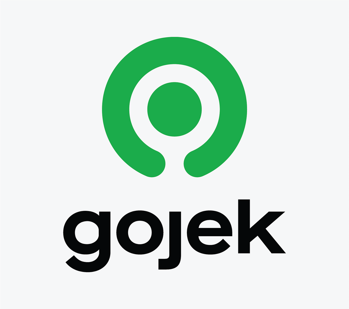
What I loved most about Solv was what it did not do: it did not arrive with a fixed meaning. It left room for one.
Some saw a power button in it, identifying with Gojek’s mission — to empower people to live a hassle-free life.
Some saw a search icon in it — Search for anything with Gojek.
Some saw a map pin — we’re there for you no matter where you are.
For some, it was a top-down view of a Gojek driver — a tribute to our heroes who help get things done.
This might ruffle a few feathers, but a logo does not need to represent what a company does. Not even a little. Apple does not sell fruit. Microsoft does not make coloured windows. The Mercedes three-pointed star started as a sketch Gottlieb Daimler drew above his house on a postcard to his wife. It meant nothing commercial. And yet it now means everything about luxury, precision, and engineering excellence. As designer Michael Bierut once said, a brand-new logo "seldom means a thing." What matters is what the company does with it after. The logo does not carry meaning. The brand earns it, over time, through every product, every interaction, every driver in a green jacket who showed up when you needed them to.
Solv did not need to explain Gojek. It needed to become Gojek.
But before it could become anything, it had to survive everything a brand at this scale would physically throw at it. App icons at 16 by 16 pixels. A billboard on the highway into Jakarta. Embroidery on a driver’s jacket, stitched by machine or by hand at varying thread counts. Stickers on helmets in the rain. Print on bags. Animation on a loading screen. We stress-tested obsessively. What does this look like tiny? Enormous? Reversed out white on green?
Solv survived all of it. Unique enough to own, simple enough for anyone to redraw from memory, and flexible enough to work at any size, in any material, anywhere. That was not luck. It was the selection criteria.
Before I tell you what came next, let me take you back to where we actually started. Because the process that led to Solv did not begin with sketches or moodboards. It began with a single question we made ourselves answer before we touched anything.
Most designers and agencies walk into a rebrand energised by possibility, immediately pulling things apart. But we were an in-house team. We knew the love the people of Indonesia felt for Gojek, something almost patriotic in its intensity. So before we designed anything, we asked: what needs to stay? What did people feel so connected to that we had to design within it, not against it?
The answer was obvious the moment you stepped outside in Jakarta. Green. Everywhere.
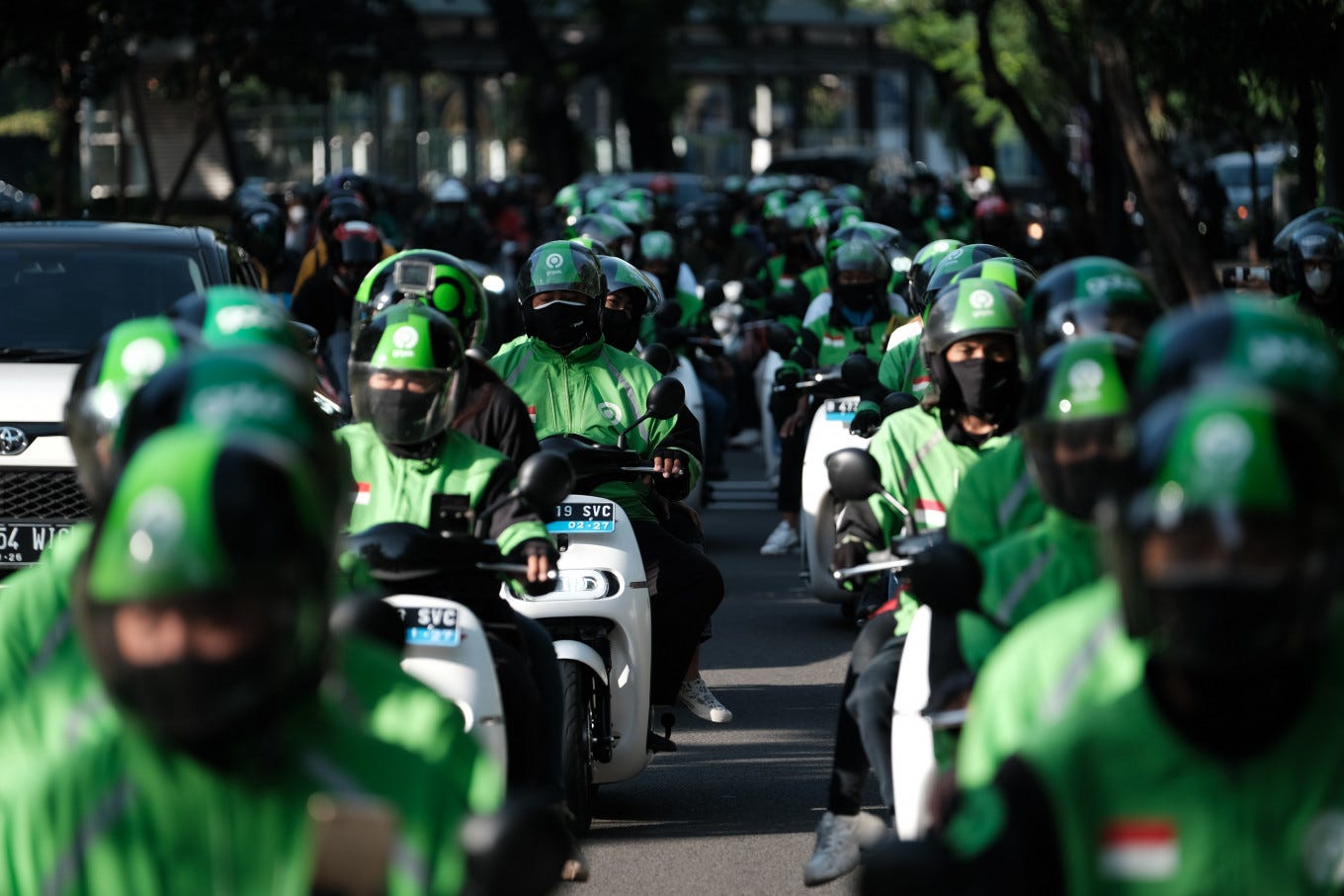
The sea of Gojek driver jackets had become part of the city’s visual fabric. The green app icon lived on 170 million phones. Green was the colour people associated with getting things done. Late for work, call a Gojek. Too sick to cook, call a Gojek. Package to send across the city in an hour, Gojek. That green was not a brand colour. It was practically a public utility.
So green became the one constraint we swore we would never violate. Everything else was on the table. But green stayed.
And from that single constraint, we moved on to the next big challenge — colours. Perhaps the most important aspect of any brand. And for Gojek we were running out of unique colours to associate with new products. From a confusing mishmash of multiple colours and products, we now have an altered palette of six.
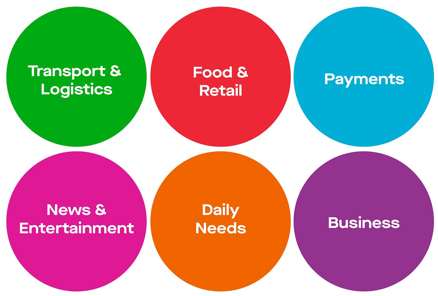
Six simple colours categorising our many product offerings. Green went to transport, everything that took you from point A to point B, the legacy product that started the whole Gojek journey. As the drivers wrapped themselves in the new green uniforms and moved through the city, green became the brand's primary colour all over again.
But colour at this scale is never just a creative decision. It is an engineering one too.
Rather than telling the team “use Gojek green” and hoping everyone interpreted that the same way, we moved to design tokens, a single source of truth for every colour decision across the system. A token stores the hex value once, and every product, every screen, every component references that token rather than a raw hex code. Which means when green needs to update, even slightly, you change it in one place, and it ripples across everything instantly and correctly, without a single Slack message asking “which green is the right green?” That is not a small thing when hundreds of designers and engineers are touching the brand every day.
Tokens encode accessibility, too. Each colour had to pass a 4.5:1 contrast ratio against text, as required by WCAG digital accessibility guidelines, because the brand does not just live on billboards. It lives inside an app used by people in all kinds of lighting conditions, including people with colour blindness or low vision. Each colour also had to hold up on screen, in print, and on fabric. Green on a driver jacket is a fashion decision. Green on a button inside an app is an accessibility decision.
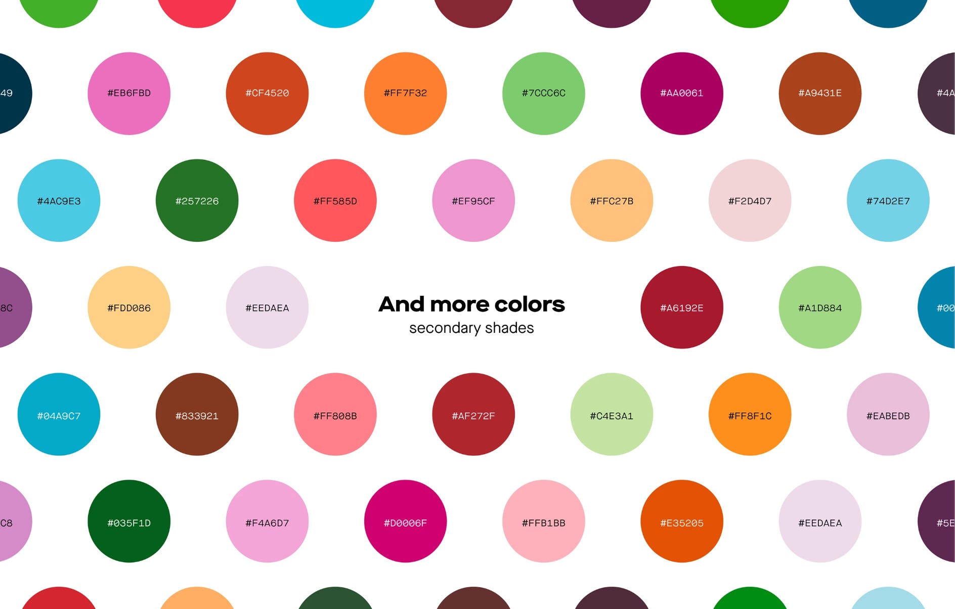
We built an entire universe of extended colours. We wanted Gojek to feel human, playful and magical, and our colours helped us build that world.
The logo and colour palette set the foundation. And it was time to move into the heart of the system. So naturally, our voice and type came next; our old typeface could not provide the variety a SuperApp needs. The same brand voice that writes "Your ride is here" on a push notification also has to carry a full-page outdoor ad, a 320-pixel mobile screen, and a marketing banner that a team in Singapore will build next quarter without asking anyone for help. We designed the type system to carry the tone of voice we had defined, warm, direct, a little playful, never corporate, at every size, in every language and in every context. On ad banners, the type had to match the energy of our illustration style: alive and characterful. On product screens, it had to respect hierarchy, support accessibility, and scale gracefully across screen sizes.
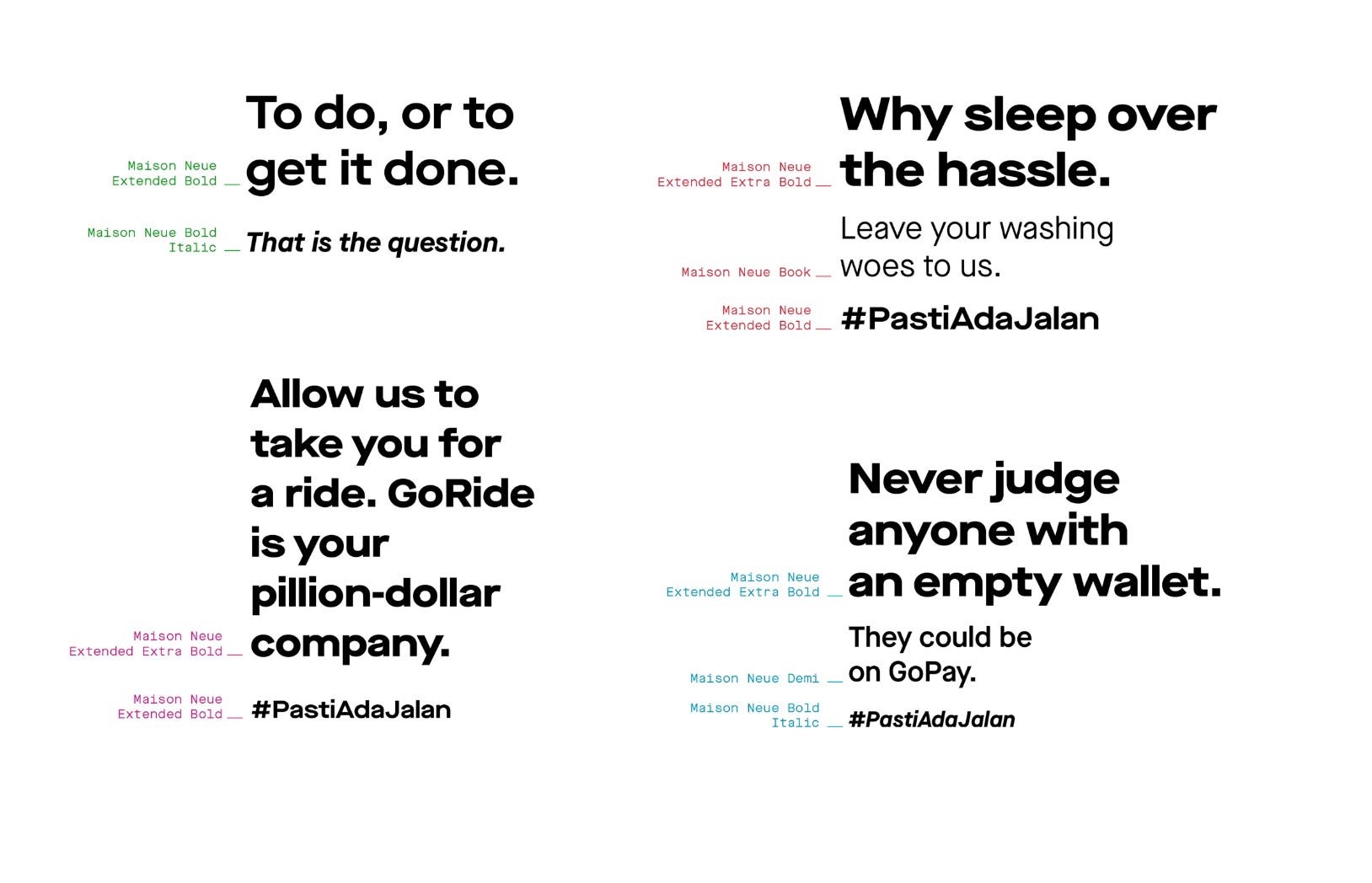
From type, we moved to illustrations, and this is where something unexpected happened. Our illustration system became, over time, our single most recognisable brand asset. But that only happened because we treated it as a system from the very beginning, not as a series of one-off artworks.
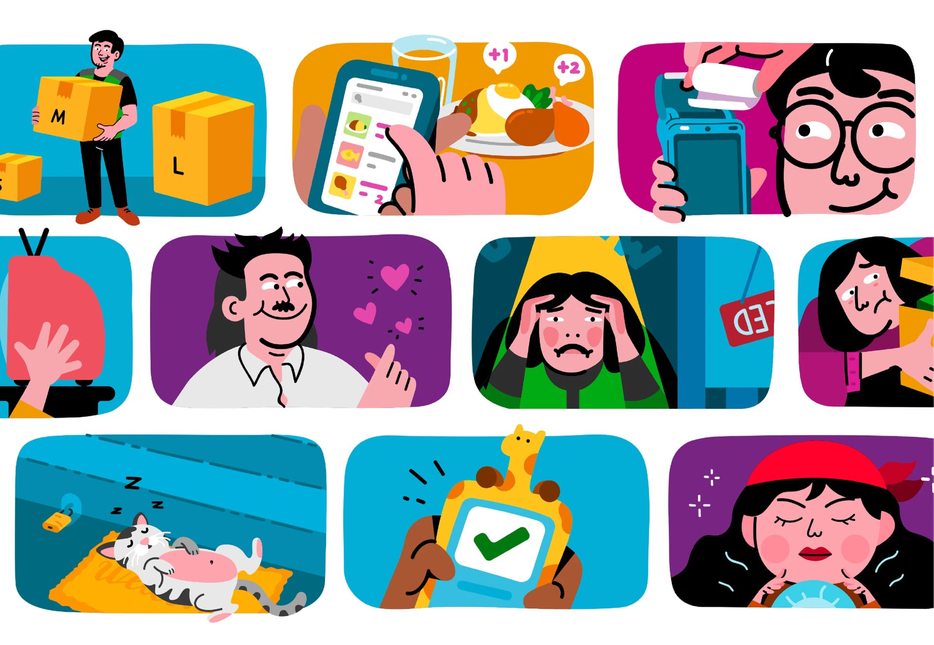
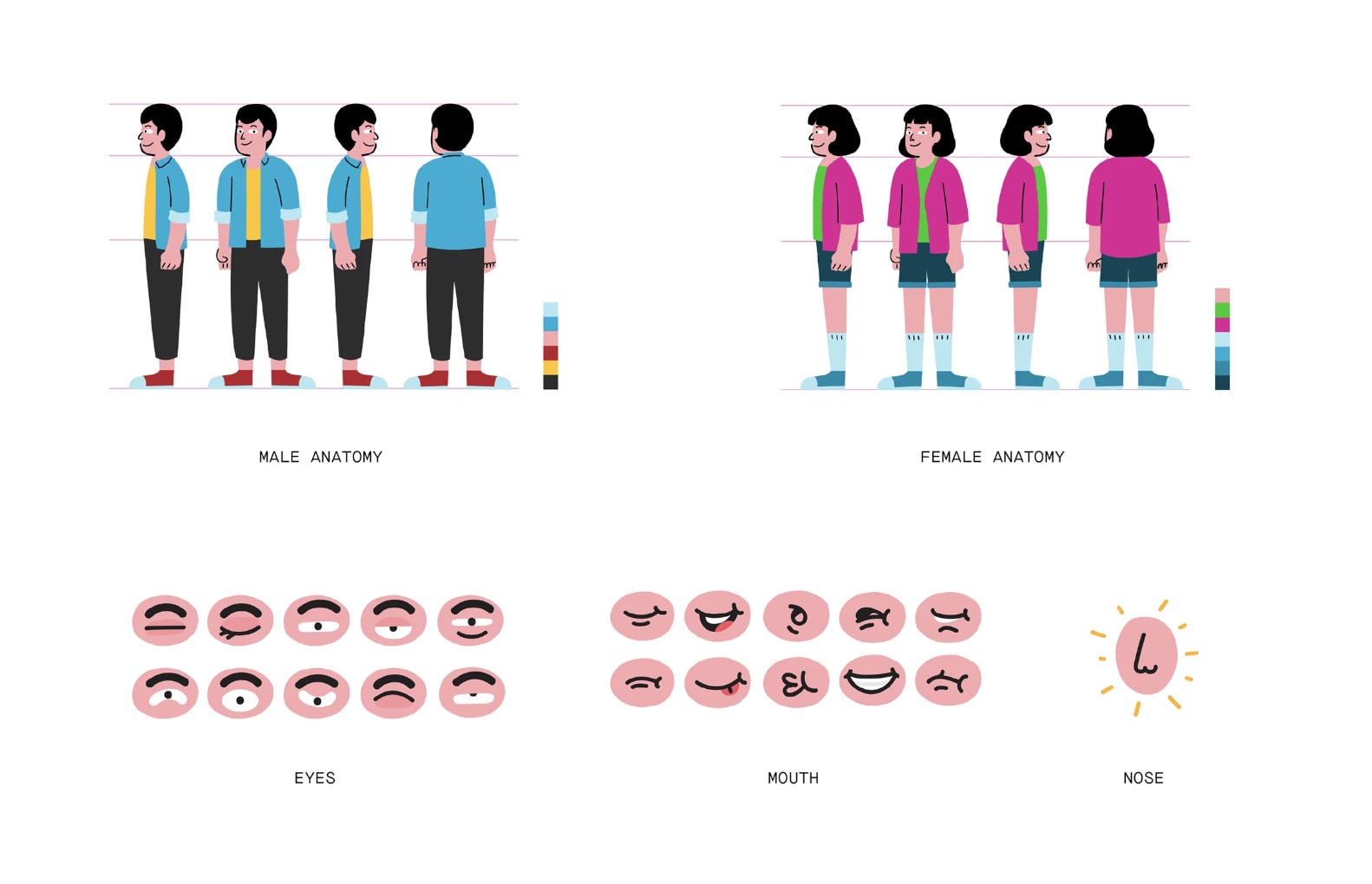
The characters matched the tone of voice: warm, relatable, slightly whimsical. The stories and people reflected everyday Indonesia. We built them to work seamlessly across commercial advertising and in-app UI. The same character that appeared on a billboard promoting GoFood could appear inside the app, confirming your order, without any visual dissonance. That coherence was intentional and hard-won. We built rules: character proportions, how colour worked within illustrations, how scenes were composed, and what expressions the characters could carry.
The circle at the heart of the logo mark became the compositional anchor for the entire visual language. Not as a container that trapped content inside it, but as a framing device, a way of directing the eye, of giving every design a sense of intention and structure. Combined with our colour palette and typography, it created a visual grammar that anyone could work with.
This is the part of a brand system that rarely gets talked about because it is hard to point to. It is not the logo. It is not the colour. It is the invisible logic underneath every design decision that makes a user pick up a piece of Gojek communication and know, before they have read a single word, that it is Gojek.
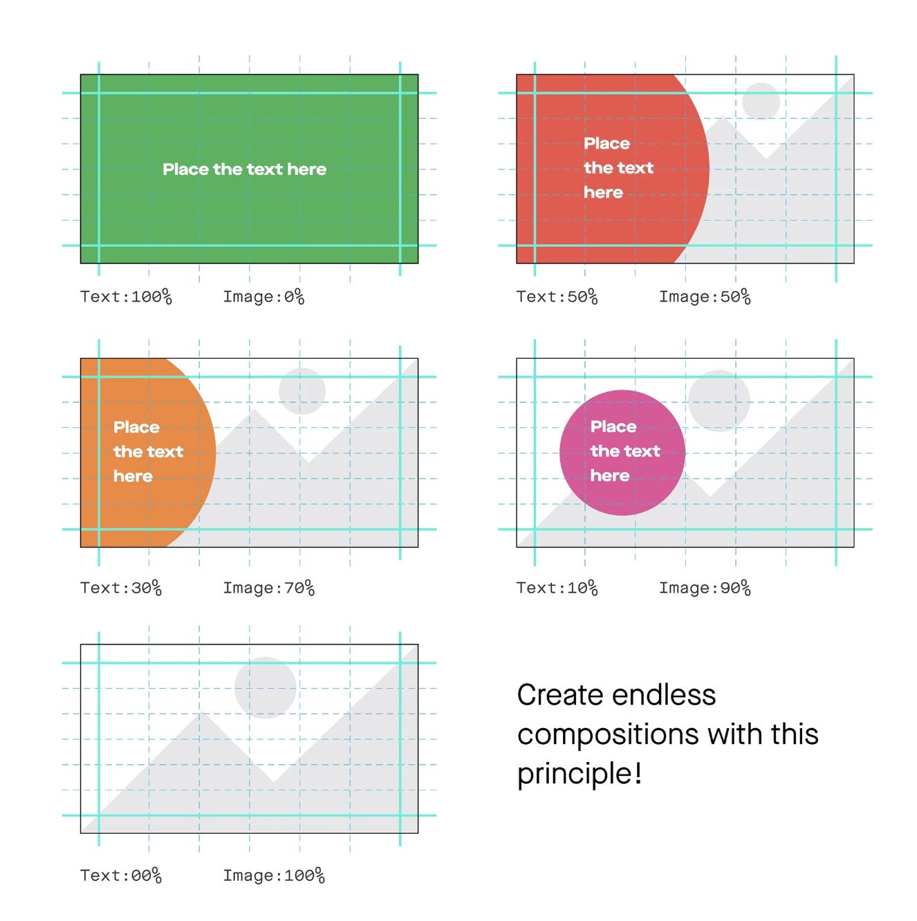
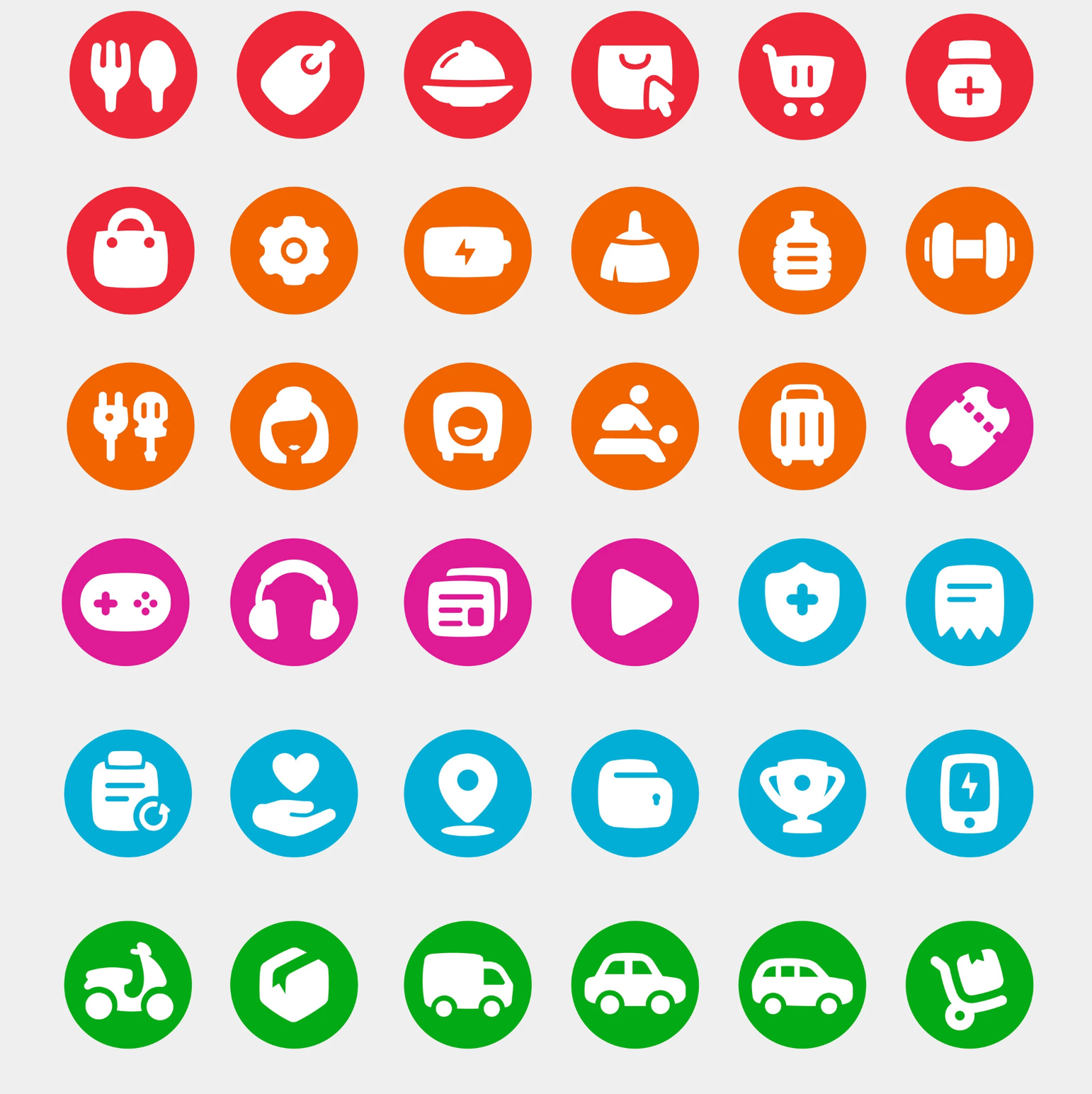
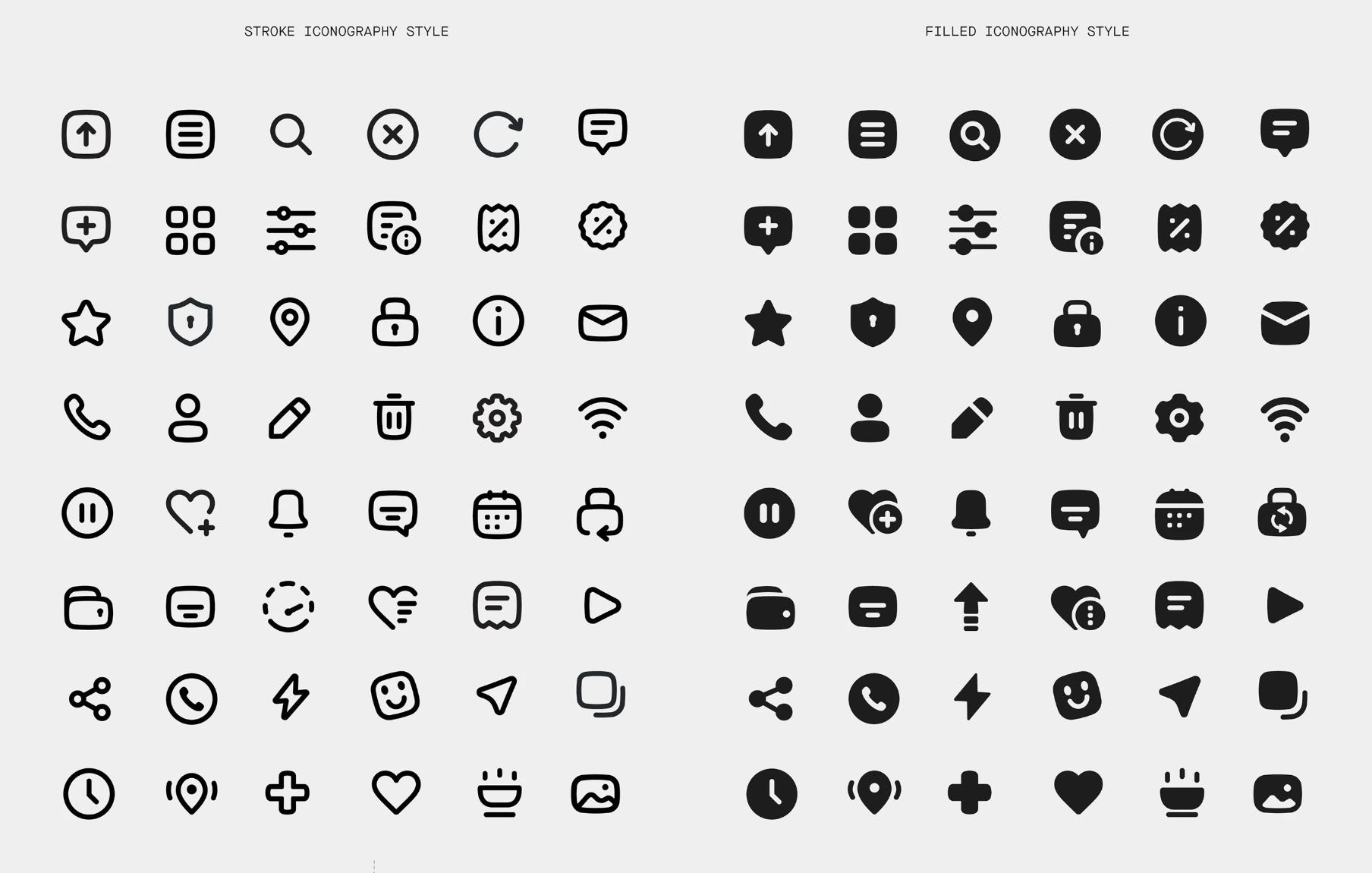
That is what visual language actually is. Not a set of pretty elements, but a very logical way of seeing. Our product logos came from the same circle as the logo mark. So did our icons.
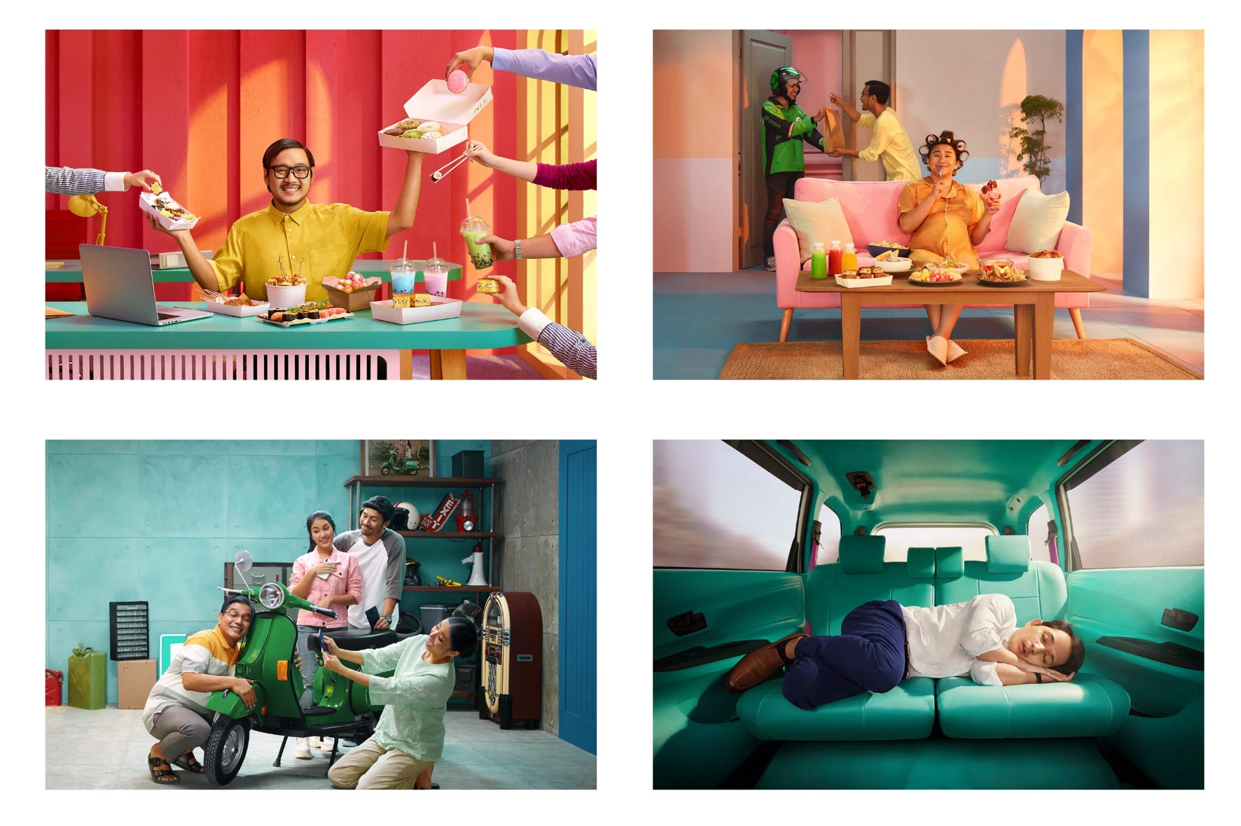
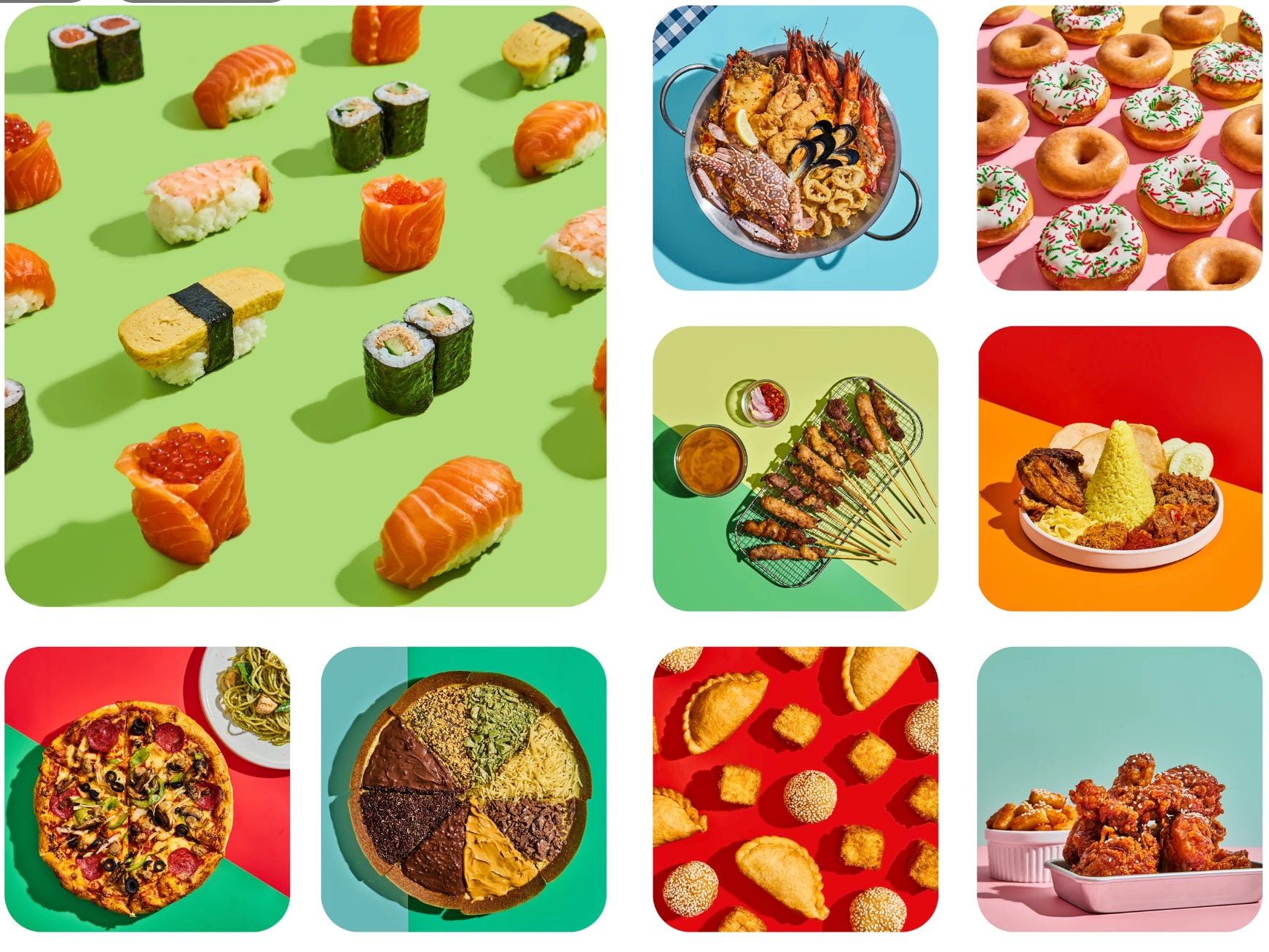
Photography is what a lot of brand systems miss. The logo is tight, the colours are defined, the illustrations are on-brand, and then someone briefs a photoshoot and suddenly everything feels like it was made by a different company.
We did not want that. Photography at Gojek had to carry the same warmth, the same playfulness, the same confidence that lived in every other part of the system. So we developed what we called the Color Block approach.
The idea was deliberately simple: a subject placed against a solid background, or a solid-coloured subject against a plain scene. Always bold. Always stripped of clutter. No busy environments competing for attention, no muted editorial tones trying to look sophisticated. Just colour, subject, and the story between them.
What made it work was how much personality and simplicity allowed. The colour did the emoting. The subject did the storytelling. Nothing got in the way of either.
All of this, the colour system, the logo, the typography, the illustration rules, the sub-brand architecture, the tone of voice, the photography style, the iconography, the sonic branding, eventually became a 400+ page brand book.
If you are anything like me and love a good brand book, here is the digital version. I can promise you that the entire document, no matter how technical the subject matter, reflects the same tone of playfulness and whimsy that ran through every part of the brand. It is genuinely a delight to read.
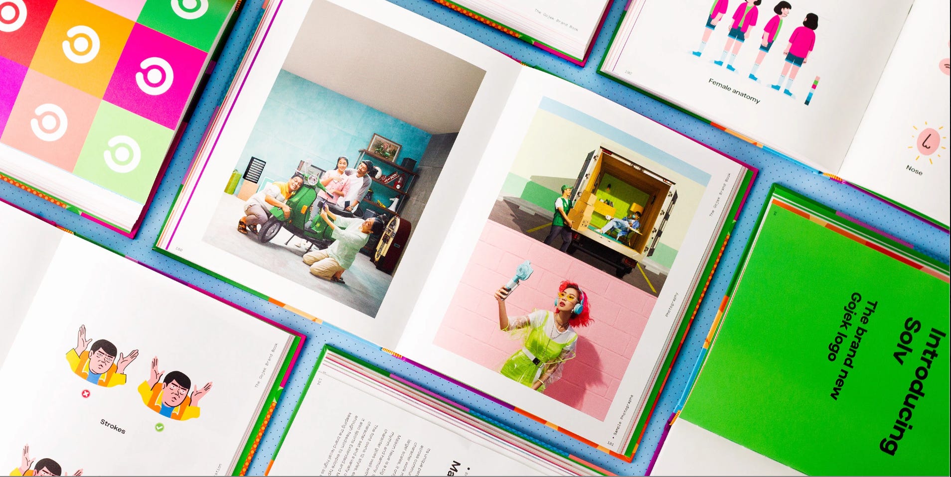
But the document was almost beside the point. A brand book is a living thing, and the moment it stops being updated, it becomes a historical artefact. The real output of all that work was something harder to put in a PDF: a way of thinking. A shared vocabulary. A set of decisions about how future decisions would be made.
Months later, we found out that our year-long endeavour had won one of the most prestigious design awards in the world. We cried a little. We deserved to.
Looking back, the work that made the biggest difference was not purely design work. It was the time we spent understanding what the business actually needed the brand to do, and why.
When you understand the business reasoning behind a brief, something shifts in how you design. Decisions that would otherwise feel like taste, like why this colour and not that one, why this typeface and not another, stop being aesthetic arguments and start being strategic ones. You are no longer defending a choice. You are explaining a consequence.
The shift also changes what you bring to a client or a stakeholder. You stop arriving with options, three routes, each with their own rationale, and you start arriving with a recommendation. One direction, clearly reasoned, tied directly to what the business needs to achieve. That is not arrogance. That is the difference between a designer who understands their craft and a designer who also understands the problem their craft is solving.
It took me longer than I would like to admit to learn this. But once you do, you cannot unlearn it. Every brief becomes a business question first and a design question second. And the work that comes out of that order of thinking is almost always better.
That lesson stayed with me long after July 19th, 2019. The day we launched, I felt about fifteen things at once. Pride. Relief. Nerves. The strange anticlimax of finally putting down something you have been carrying for months. But what I feel most now, looking back, is gratitude.
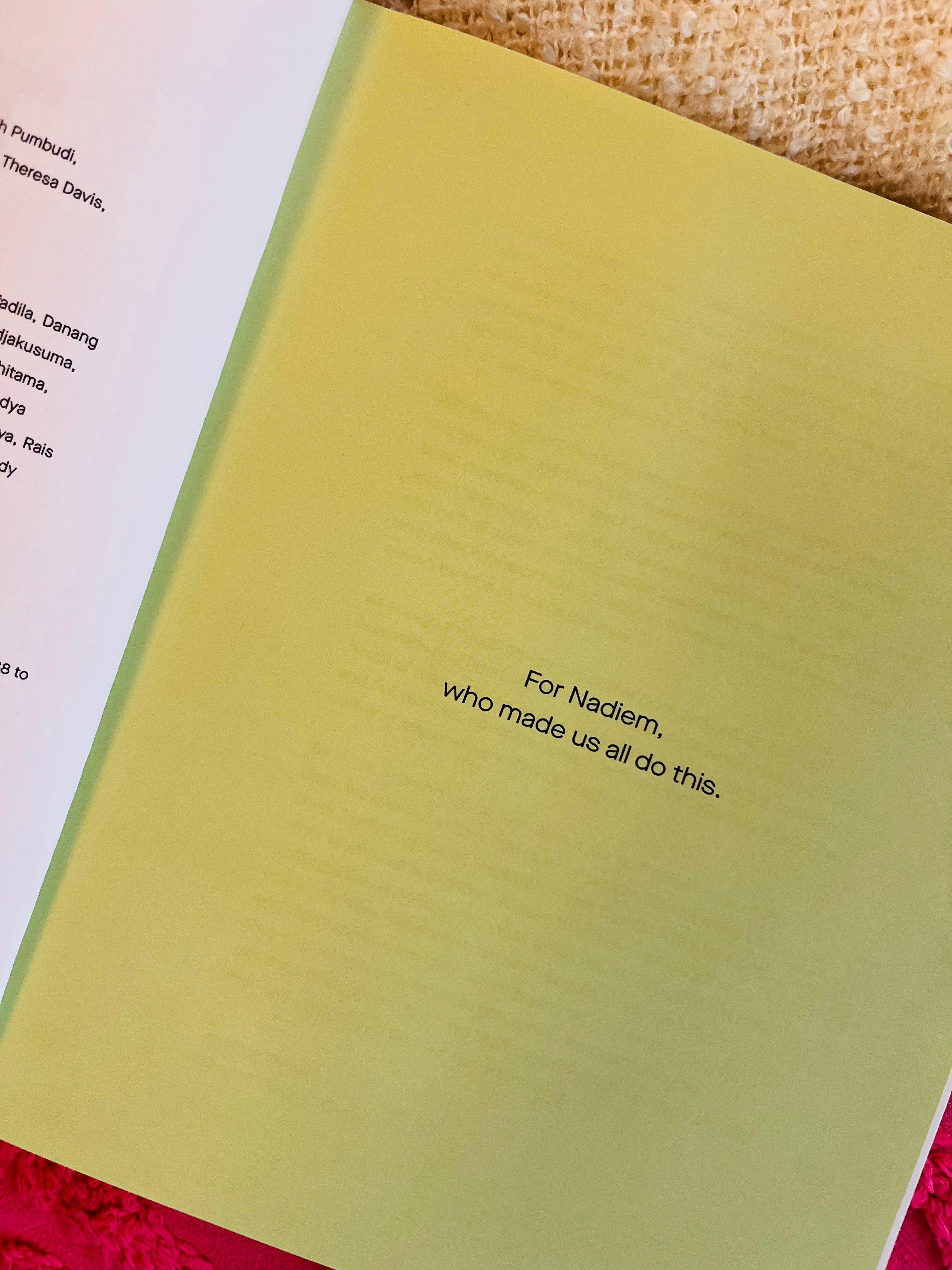
For Nadiem, the founder, who believed in us. And for every person who gave a part of themselves to bring this to life. 💚
If you enjoyed this, you are already in the right place. Layer by Layer is where I write about brand, design, and the thinking behind both, every week. I also work with consumer lifestyle and tech brands on design and creative direction. If that sounds like something you need, I would love to hear from you.
No posts
Comments
Nothing yet. Say the first thing.
Sign in to join the conversation.