
19 Feb 2026
Desktop environment with Quickshell
9 minutes reading time
Updated 02 Aug 2026
#Eww
It all started with waybar on Wayland a few years ago. Then a brief barless era while I was enjoying my new wallpapers. Then I switched to eww, and that was pretty fun: "lisping" GTK widgets, I got pretty close to what I wanted to achieve. A lot of things worked out of the box on FreeBSD, including system stats and the network stack. I still had to write a few scripts for things like the system tray, volume controls, service toggles, etc. But nothing special, mostly wrappers.
#Quickshell
For quite some time eww was enough for me. But the development slowed down, and GTK3 became a drag. I started thinking about the replacement and discovered Quickshell.
Well, this is another level. Qt to drive the whole desktop environment. And with simple QML syntax. Of course it could be pretty something sometimes (or more often), but definitely a breeze after XML. The current release version is 0.2.1, but I compile from my fork to get the network state, audio controls, system tray icons, and mango support .
#Library
I still need to work on these, though everything is pretty stable. No polling anywhere on this level. Some widgets in the bar do poll, but there is an option to turn them off (useful in low-power mode). Patches (network, sound, mango) can be cherry-picked on top of the fbsd branch of my quickshell fork with no conflicts (so far).
As of right now, Quickshell is barely buildable on FreeBSD, and the platform support practically does not exist within its modules. I tried to push some code to address this gap, but the workflow is too chaotic. After losing months of work, I decided to combine my patches into a dedicated library/plugin instead. Since then, TopBar is a standalone package. So far there are five modules: System, Network, Mango, OSS, and Devd which handles the events for Network and OSS. Bluetooth (needs netgraph patch) is in the works.
#Installation
TopBar consists of two parts that could be installed separately. The first part is the markup definitions set, which includes Quickshell configuration and TopBar components. The second part is the backend plugin. It could be installed as a standalone package to drive 3rd-party shells—TopBar does not conflict with external Quickshell configurations.
Ensure that the following dependencies are present:
- Clang
- Cmake
- Ninja
- Qt6
- Wayland protocols (Mango support)
Use -DMODULES=plugin flag to build only the plugin.
To install the package from source, clone the repository and use cmake to compile:
git clone https://codeberg.org/charlesrocket/topbar
cd topbar
cmake -B build -G Ninja -DCMAKE_BUILD_TYPE=Release
cmake --build build
doas cmake --install build#Configuration
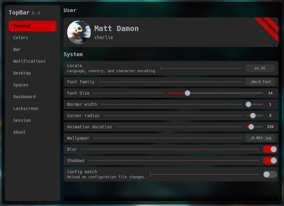
All TopBar settings are located in the settings.json file inside the ~/.config/topbar directory. The configuration window allows on-the-fly changes and can be called via IPC: qs -c topbar ipc call main settings.
#Internal systems
It is not just a bar anymore. TopBar can handle pretty much everything in the desktop environment, including the application launcher, lock screen, wallpaper, and whatever the desktop might need.
#The surface
Because this is Wayland, we cannot just slap a context menu onto the bar. The main window that holds the bar will clip everything that spills outside of its borders. To work around this, I used to rely on horizontal sliders to keep the UI elements within the bar's boundaries. This works very well with eww and quickshell, but a busy bar has a very limited amount of real estate to facilitate all the elements in these sliders, and reaching neighboring elements sometimes might be a bit awkward. With Quickshell, one could deploy the main window (PanelWindow) that spans across the whole desktop surface and set the bar as a small rectangle on the top (or any other location). The issue with this approach is that there is no way to interact with any other desktop element due to the bar's window covering the whole surface. To resolve this, we can use Region with the window's mask property:
PanelWindow {
    id: root

    // simple single screen option here
    property var screen: Quickshell.screens[0]

    anchors {
        top: true
        left: true
        right: true
    }

    mask: itemsRegions
    color: "transparent"
    implicitHeight: screen.height
    // this reserves the space for the bar
    exclusiveZone: bar.visible ? bar.height + Config.bar.padding : 0

    Rectangle {
        id: bar
        y: 0
        anchors.horizontalCenter: parent.horizontalCenter
        implicitWidth: root.screen.width
        implicitHeight: Config.bar.height
        border.width: Config.general.borderWidth
        border.color: Config.colors.border
        height: Config.bar.height
        color: Config.colors.bg
        radius: Config.general.cornerRadius

        // this offloads all bar components when deactivated
        // useful in some cases (full screen/game mode, etc)
        Loader {
            active: States.barEnabled
            visible: States.barEnabled
            Layout.alignment: Qt.AlignVCenter
            anchors.fill: parent
            anchors.leftMargin: 13
            anchors.rightMargin: 12

            sourceComponent: RowLayout {
                Bar.Left {
                    Layout.fillWidth: true
                    Layout.minimumWidth: 0
                    Layout.alignment: Qt.AlignLeft
                }

                Bar.Center {
                    Layout.fillWidth: false
                    Layout.preferredWidth: 400
                    Layout.alignment: Qt.AlignHCenter
                }

                Bar.Right {
                    Layout.fillWidth: true
                    Layout.minimumWidth: 0
                    Layout.alignment: Qt.AlignRight
                }
            }
        }
    }

    // iterates over all window components and
    // creates their regions
    Variants {
        id: regions
        model: root.contentItem.children

        delegate: Region {
            required property Item modelData
            item: modelData
        }
    }

    // regions for all window components
    Region {
        id: itemsRegions
        regions: regions.instances
    }
}
This deploys a transparent window that covers the whole desktop (via anchors). The main bar is a rectangle with some elements on top of that window (y: 0). itemsRegions masks all of the bar's elements, allowing clicks outside of their regions to pass through. Now we can interact with the bar and any other window on the desktop surface.
#Shapes
After converting some sliders into dropdown menus, I wanted to go further and blend these menus with the bar. QML has a neat Shape class that allows drawing 2D objects using the surface's coordinates. The concept is pretty simple: define a ShapePath and all the lines that it must include. So if I want a straight line from left to right, all I need is PathLine { x: 50; y: 0 }. This will draw a 50px-long line from the start coordinates to the right. x: -50 will do the same but in the opposite direction. For curved lines we can use PathArc which also takes x/y radius in addition to the coordinates.
Shape {
    preferredRendererType: Shape.CurveRenderer
    anchors.fill: parent

    ShapePath {
        strokeColor: Config.colors.border
        strokeWidth: Config.general.borderWidth > 0 ? Config.general.borderWidth : -1
        fillColor: States.ecoMode ? Config.colors.bge : Config.colors.bg

        // relative to 0:0
        // this would be the top left corner of the container

        // starting from the most-left position
        // which is the start of a ramp (-14)
        startX: -(Config.general.cornerRadius * 2)
        startY: 0

        // drawing the arc at the even radius
        PathArc {
            x: 0
            y: Config.general.cornerRadius * 2
            radiusX: Config.general.cornerRadius * 2
            radiusY: Config.general.cornerRadius * 2
        }

        // now we have reached the container
        // from here we just draw a regular rectangle
        // where the container borders would be
        PathLine {
            x: 0
            y: dropdown.height - Config.general.cornerRadius
        }

        // first round corner at the bottom
        PathArc {
            x: Config.general.cornerRadius
            y: dropdown.height
            direction: PathArc.Counterclockwise
            radiusX: Config.general.cornerRadius
            radiusY: Config.general.cornerRadius
        }

        // straight line at the bottom
        PathLine {
            x: dropdown.width - Config.general.cornerRadius
            y: dropdown.height
        }

        // another round corner
        PathArc {
            x: dropdown.width
            y: dropdown.height - Config.general.cornerRadius
            direction: PathArc.Counterclockwise
            radiusX: Config.general.cornerRadius
            radiusY: Config.general.cornerRadius
        }

        // all the way up to where we are going to
        // start drawing another ramp
        PathLine {
            x: dropdown.width
            y: Config.general.cornerRadius * 2
        }

        // another ramp completes the rectangle
        PathArc {
            x: dropdown.width + Config.general.cornerRadius * 2
            y: 0
            radiusX: Config.general.cornerRadius * 2
            radiusY: Config.general.cornerRadius * 2
        }
    }
}
This would produce a rectangle with curved "ramps" on its top sides. Since the ramps must be outside the main container, the start position is negative (-Config.general.cornerRadius * 2, and the value of cornerRadius here is 8).
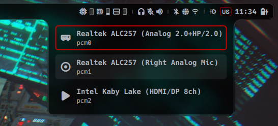
Now the hardest part—attaching this shape to a widget. I tried to pass the main bar object down to all the menu widgets, but since the bar is defined at the very top of the tree, passing it felt too inefficient. To resolve this, I had to refactor all the widgets with menus to align them on the same base height. Right-hand widgets were no issue since they are all just text icons with a wrapper. But the center widget was an issue—it has a different layout structure, so its menu was always a few pixels off the base height. Eventually I came up with a hybrid approach:
Item {
    id: root

    // manual vertical offset
    property int offset: 0
    // the source of the menu
    required property var boxParent
    // the content of the dropdown
    default property alias content: contentArea.data

    Item {
        id: dropdown

        visible: false
        width: contentArea.implicitWidth
        height: contentArea.implicitHeight

        x: {
            const mapped = root.boxParent.mapToItem(root.boxParent, 0, 0);
            return mapped.x + (root.boxParent.width / 2) - (dropdown.width / 2);
        }

        y: {
            if (root.offset > 0) {
                return root.offset;
            }

            let topItem = root.parent;
            while (topItem && topItem.parent) {
                topItem = topItem.parent;
            }

            if (topItem) {
                const boxToTop = root.boxParent.mapToItem(topItem, 0, 0);
                const parentToTop = root.parent.mapToItem(topItem, 0, 0);
                const result = boxToTop.y - parentToTop.y + root.boxParent.height + (Config.bar.padding) - 1;
                return result;
            }

            const mapped = root.boxParent.mapToItem(root.parent, 0, 0);
            const result = mapped.y + root.boxParent.height + (Config.bar.padding) - 1;
            return result;
        }

        Item {
            id: contentArea
            z: 0

            implicitWidth: children.length > 0 ? children[0].implicitWidth : 0
            implicitHeight: children.length > 0 ? children[0].implicitHeight : 0
        }

        HoverHandler {
            id: dropdownHover

            onHoveredChanged: {
                if (hovered) {
                    hideTimer.stop();
                } else {
                    hideTimer.start();
                }
            }
        }
    }

    Timer {
        id: hideTimer
        interval: 120
        repeat: false

        onTriggered: {
            if (!dropdownHover.hovered) {
                root.show = false;
                States.dropdownRevealed = false;
            }

            // right now only one menu can be opened
            // since they are triggered by hovers only
            if (States.dashboardPresent)
                States.dashboardPresent = false;
        }
    }
}
Dashboard dropdown:
Dropdown {
    id: dashboard
    boxParent: root

    Rectangle {
        color: "transparent"
        radius: Config.general.cornerRadius
        implicitWidth: layout.implicitWidth + 651
        implicitHeight: layout.implicitHeight + (Config.general.borderWidth > 0 ? 424 : 420)

        ColumnLayout {
            id: layout

            Item {
                Layout.fillHeight: true
                Layout.fillWidth: true

                Dashboard {}
            }
        }
    }
}

MouseArea {
    id: mouseArea
    anchors.fill: parent
    hoverEnabled: true

    onEntered: {
        dashboard.show = true;
        States.dashboardPresent = true;
    }

    onExited: {
        // do not close it right away
        dashboard.timer.start();
    }
}
Here I use a boxParent property that holds the parent container of the dropdown menu (a text icon in most cases) to calculate the position of the menu container. Horizontal position is simple—we just calculate the middle of a parent container. But things get complicated with vertical positions due to different layouts used by widget containers. So we have to traverse up to get the higher container that would have a more general base height that is not influenced by the size of text characters.
In the case of a bespoke widget, we can use an offset property to manually align the menu at the specific height.
#Borders
I am still not sure how I feel about borders but decided to give it a try nonetheless. At first, I kept dropdowns separate from the bar—this worked flawlessly for the borderless layout. But there is no way to have a clean connection between the dropdown strokes and the bar strokes. So my next move was to merge dropdowns with the bar, making the bar object fully dynamic. For this to work, I had to drop the bar's rectangle borders (setting them to 0) and manually draw a shape around that rectangle. With PathMove I managed to create a gap for the dropdown to allow seamless transition from the bar border to the dropdown.
Right now the dynamic border is turned off in favor of shadows, but I might revisit this in the future.
#Events via Devd
The Devd module was a bit challenging to nail. I wanted to extract devd logic into a separate instance to reuse in other modules. That way I only open the socket once, and all modules consume the events from that single source instead of connecting to the pipe on their own.
At first, everything worked fine, and all components were getting the events as expected. But after more debugging, I noticed that each component that uses this module spins its own Devd instance. It took me a while to figure out how to prevent this cloning from happening. I ended up using a static instance variable:
Devd *Devd::instance() {
    if (!dInstance) { dInstance = new Devd(); }
    return dInstance;
}
Just a simple check to ensure there is only one Devd instance. Though there is probably a more ergonomic way to do this.
#pragma once

#include <QObject>
#include <QQmlEngine>
#include <QSocketNotifier>
#include <QString>
#include <QTimer>
#include <cstring>

namespace topbar::devd {

// sbin/devd/devd.h
inline constexpr size_t devdMaxBuf = 8192;
inline constexpr int reconnectIntervalMs = 5000;
inline constexpr const char *devdPipe = "/var/run/devd.seqpacket.pipe";

class Devd : public QObject {
    Q_OBJECT;
    QML_ELEMENT;
    QML_SINGLETON;
    Q_PROPERTY(bool connected READ isConnected NOTIFY connectedChanged FINAL);

  public:
    static Devd *create(QQmlEngine *engine, QJSEngine *_) {
        Q_UNUSED(engine)
        return instance();
    }

    static Devd *instance();

    ~Devd() override;

    Devd(const Devd &) = delete;
    Devd &operator=(const Devd &) = delete;
    Devd(Devd &&) = delete;
    Devd &operator=(Devd &&) = delete;

    [[nodiscard]] bool isConnected() const;

  signals:
    void eventReceived(const QString &event);
    void connectedChanged();

  private slots:
    void attemptReconnect();
    void onSocketActivated();

  private:
    explicit Devd(QObject *parent = nullptr);

    static Devd *dInstance;

    void scheduleReconnect();
    void connectToDevd();
    void onDisconnected();
    void cleanup();

    int mFd = -1;
    QSocketNotifier *mNotifier = nullptr;
    bool mConnected = false;
    QTimer *mReconnectTimer = nullptr;
};

} // namespace topbar::devd#IPC
Some of the features could be called via external commands. To get the full list of all available commands, use quickshell -c topbar ipc call show:
target main
  function logout(): void
  function lock(): void
  function settings(): void
  function launcher(): void
target bar
  function reveal(): void
  function hide(): void
target audio
  function volumeDown(): void
  function toggleMute(): void
  function volumeUp(): void
These could be bound to custom key combinations or media keys in the compositor or called from the command line.
#Modules
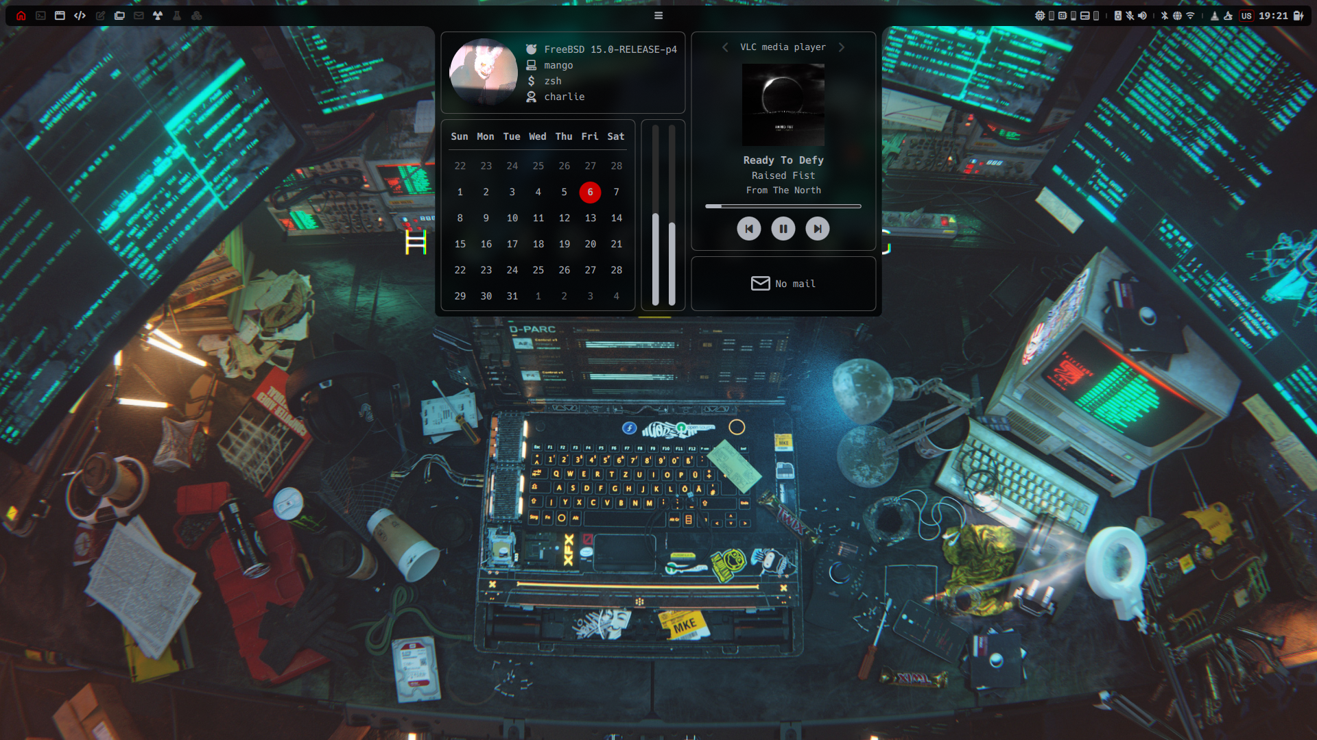
The bar alone can handle most of the tasks. It can control workspaces, media players (via dashboard), volume levels and audio devices, restart the network stack, and cycle power modes.
#Launcher
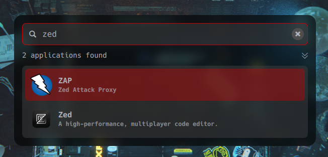
The launcher is a simple panel with a search bar and a list of applications matching the search request.
Loader {
    id: launcher
    active: States.launcherPresent && Config.desktop.launcher
    visible: launcher.active
    sourceComponent: Launcher {}
}#Session panel
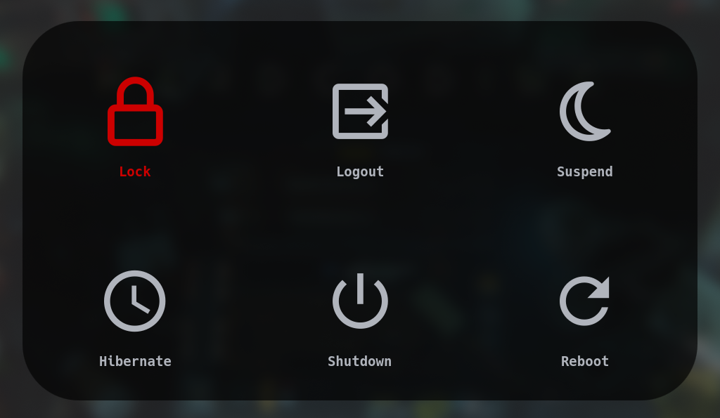
The session panel consists of six buttons that execute commands. Each button has a customizable command and a key bind. Pretty standard stuff:
Session {
    SessionButton {
        command: Config.session.commands.lock
        keybind: Qt.Key_K
        text: "Lock"
        icon: "🔒"
    }

    SessionButton {
        command: Config.session.commands.logout
        keybind: Qt.Key_E
        text: "Logout"
        icon: "🚪"
    }

    SessionButton {
        command: Config.session.commands.suspend
        keybind: Qt.Key_S
        text: "Suspend"
        icon: "💤"
    }

    SessionButton {
        command: Config.session.commands.hibernate
        keybind: Qt.Key_H
        text: "Hibernate"
        icon: "⌚"
    }

    SessionButton {
        command: Config.session.commands.shutdown
        keybind: Qt.Key_P
        text: "Shutdown"
        icon: "⏻"
    }

    SessionButton {
        command: Config.session.commands.reboot
        keybind: Qt.Key_R
        text: "Reboot"
        icon: "🗘"
    }
}#Lockscreen
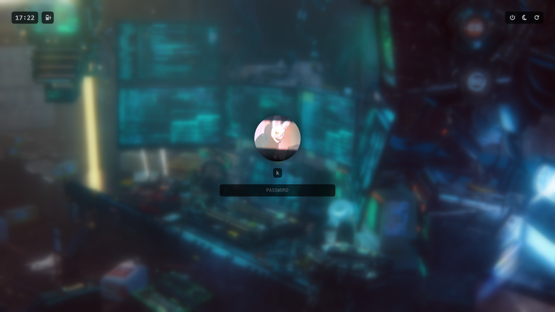
The lock screen is triggered by an idle timer or manually via IPC command. It has a secure password box that uses a flashing border as feedback, a clock and battery widget, and a few session buttons.
Process {
    id: dpmsOff

    command: switch (System.desktop) {
    case "mango":
        return ["mmsg", "-d", "disable_monitor"];
    case "hyprland":
        return ["hyprctl", "dispatch", "dpms", "off"];
    }
}

Process {
    id: dpmsOn

    command: switch (System.desktop) {
    case "mango":
        return ["mmsg", "-d", "enable_monitor"];
    case "hyprland":
        return ["hyprctl", "dispatch", "dpms", "on"];
    }
}

Process {
    id: suspendProcess
    command: Config.session.commands.suspend
}

// screen lock
IdleMonitor {
    timeout: 600
    enabled: !States.keepAwake

    onIsIdleChanged: {
        if (isIdle) {
            lock.locked = true;
        }
    }
}

// disable the display
IdleMonitor {
    timeout: 690
    enabled: !States.keepAwake

    onIsIdleChanged: {
        if (isIdle) {
            dpmsOff.running = true;
        } else {
            dpmsOn.running = true;
        }
    }
}

// suspend the machine
IdleMonitor {
    timeout: 3600
    enabled: !States.keepAwake

    onIsIdleChanged: {
        if (isIdle) {
            suspendProcess.running = true;
        }
    }
}

LockContext {
    id: lockContext

    onUnlocked: {
        States.barEnabled = true;
        lock.locked = false;
    }
}

WlSessionLock {
    id: lock

    WlSessionLockSurface {
        color: "transparent"

        LockScreen {
            anchors.fill: parent
            context: lockContext
        }
    }
}#Outro
This is the very beginning, but I am very happy with the results so far. QML is very easy to work with, and Quickshell already packs everything to deliver a full desktop environment.
Comments
Nothing yet. Say the first thing.
Sign in to join the conversation.