
I wouldn’t say this is a “best of” list, these are just my favorites according to my taste… and ones I’m extremely jealous I didn’t design myself.
Most of these were featured on Lithub’s stellar round up, or Print Mag’s monthly features. Check those out for more.
Disclaimer: I tried not to include covers from designers I know/work with personally, since I am biased there.
In no particular order:
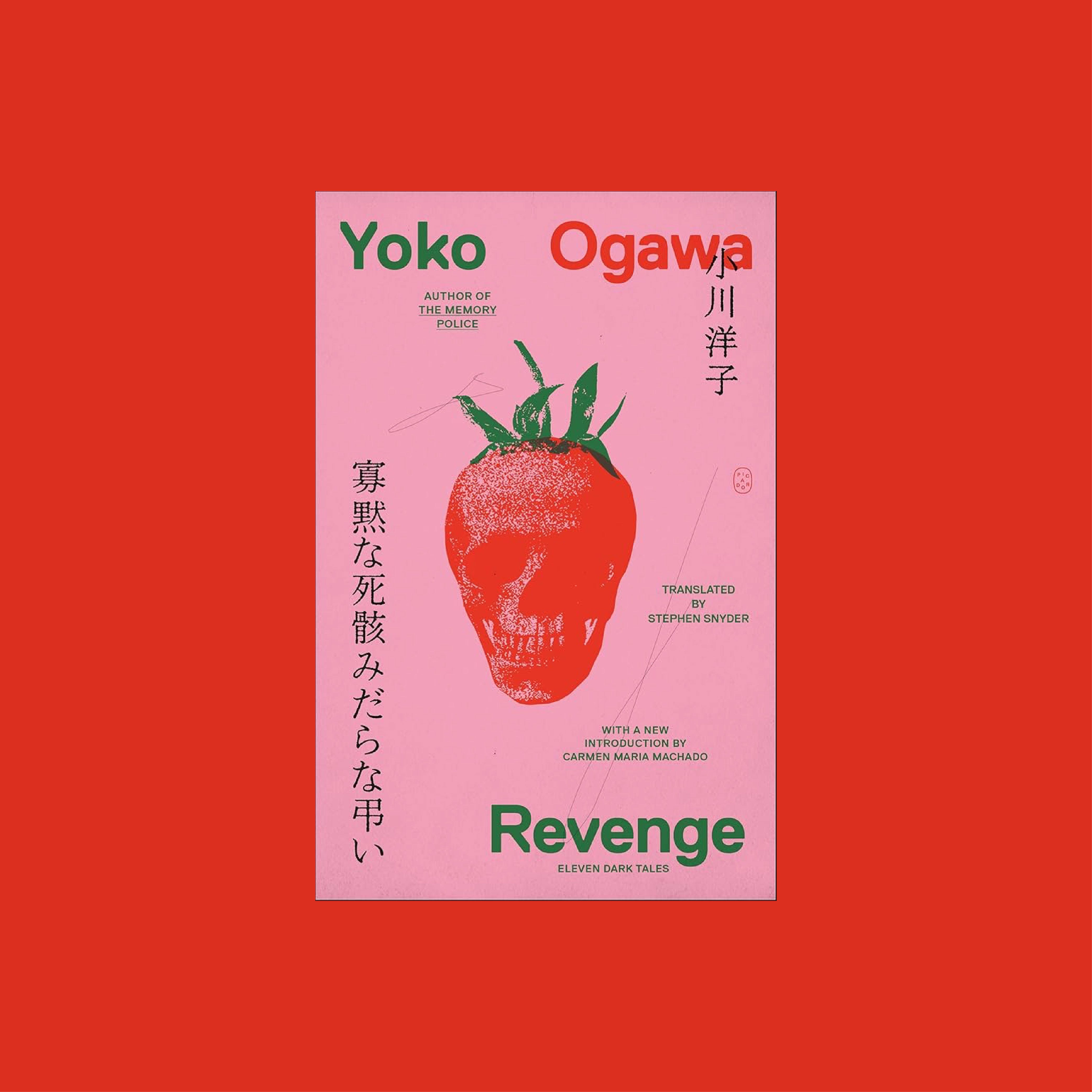
Ogawa has been gifted incredible designs for all her books (deservingly so). This new trade repackaging is fantastic.
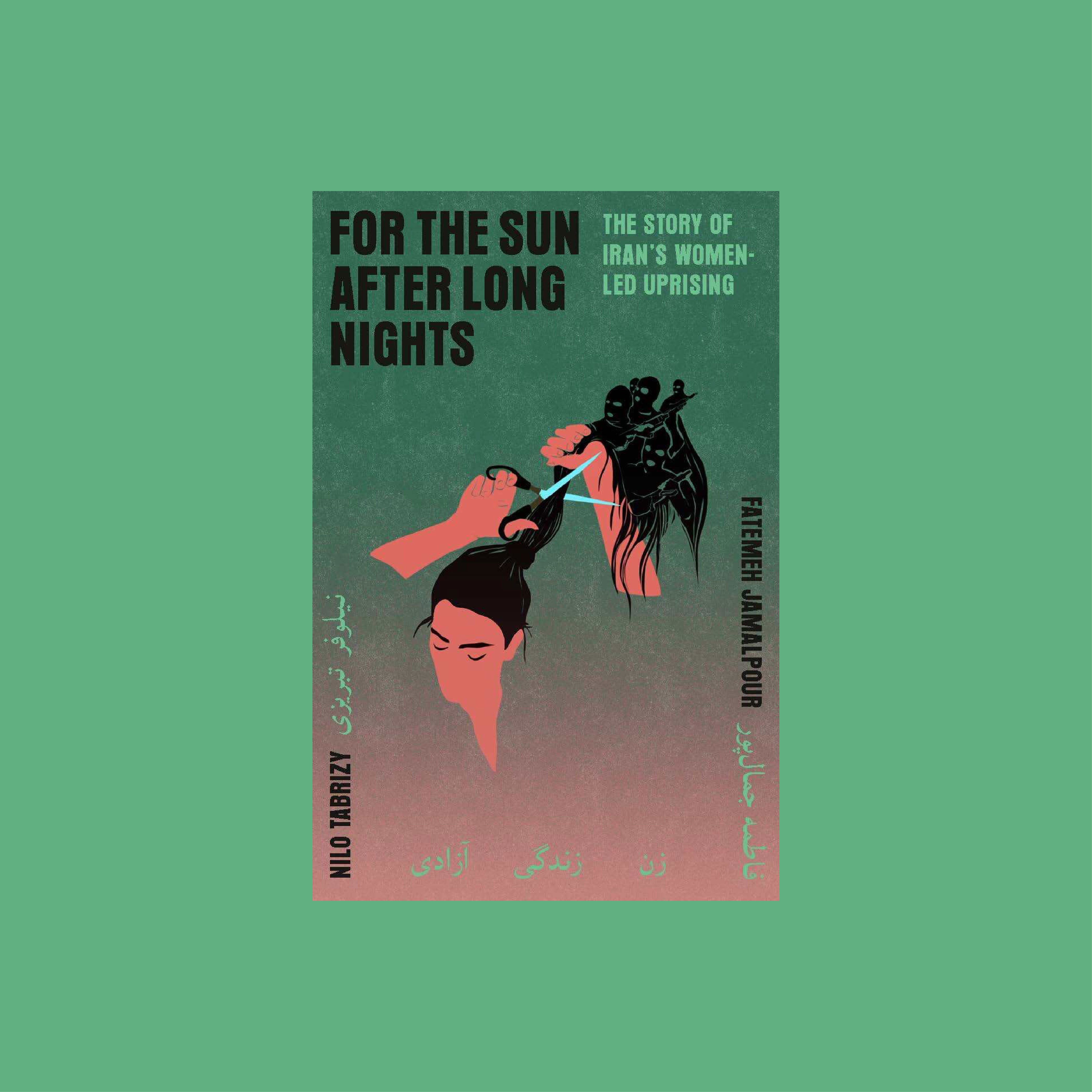
Sideways type. Floating body. Gradient. Retro display font. All of my favorite things.
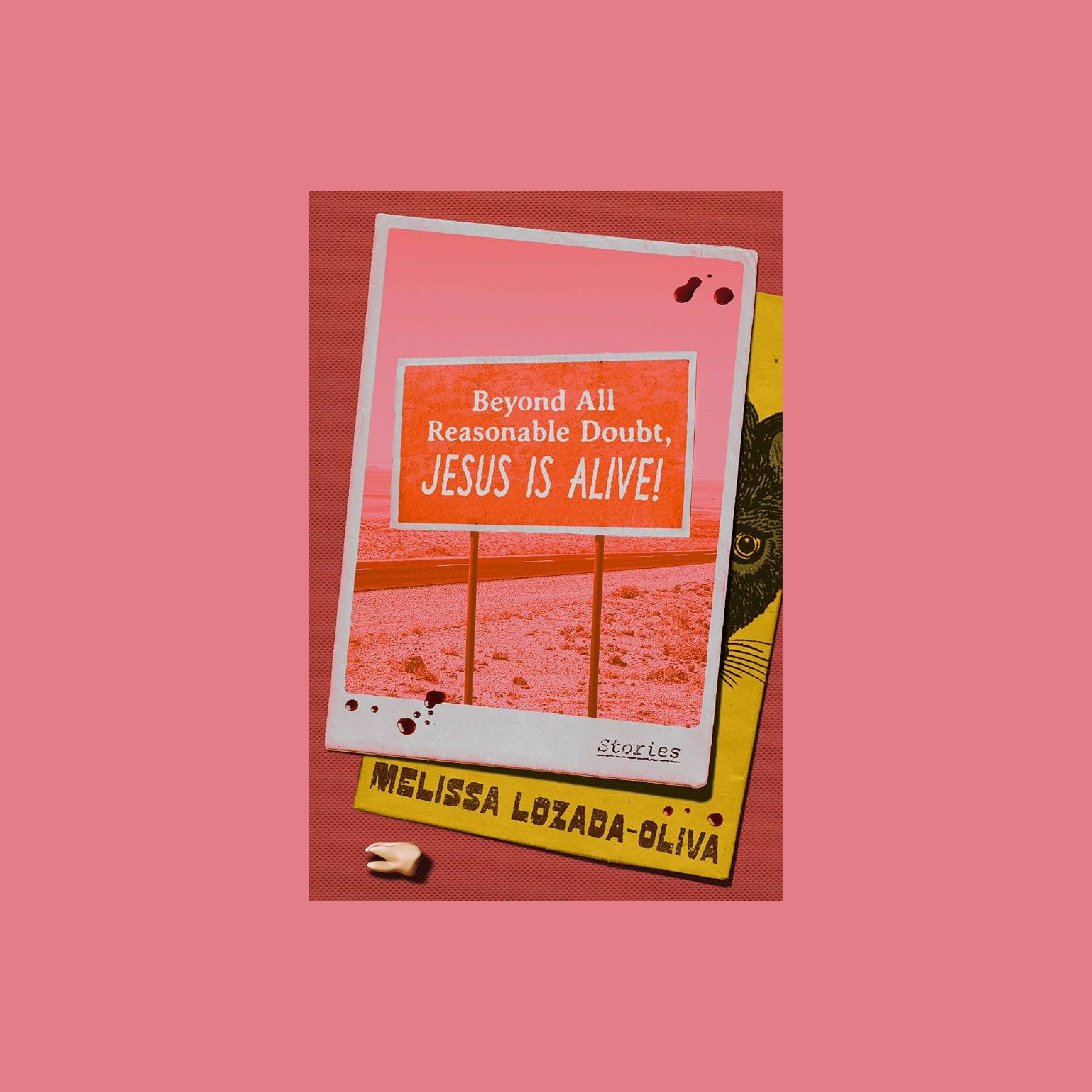
One of those that makes you want to read the book because of how specific the design elements are.
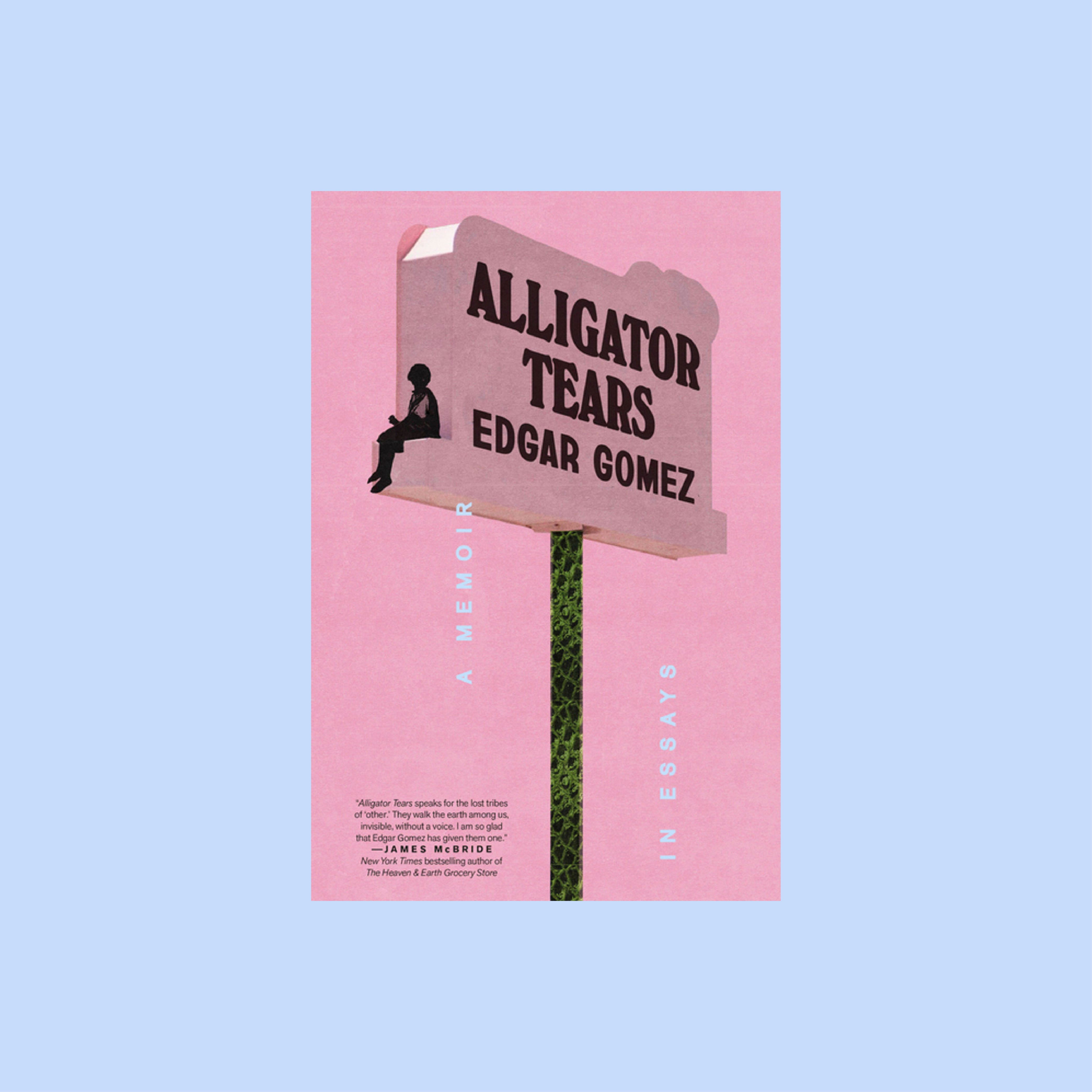
Pastel pink gets me every time. The pole being alligator skin is a lovely detail, as are the bylines being colored and falling as teardrops.
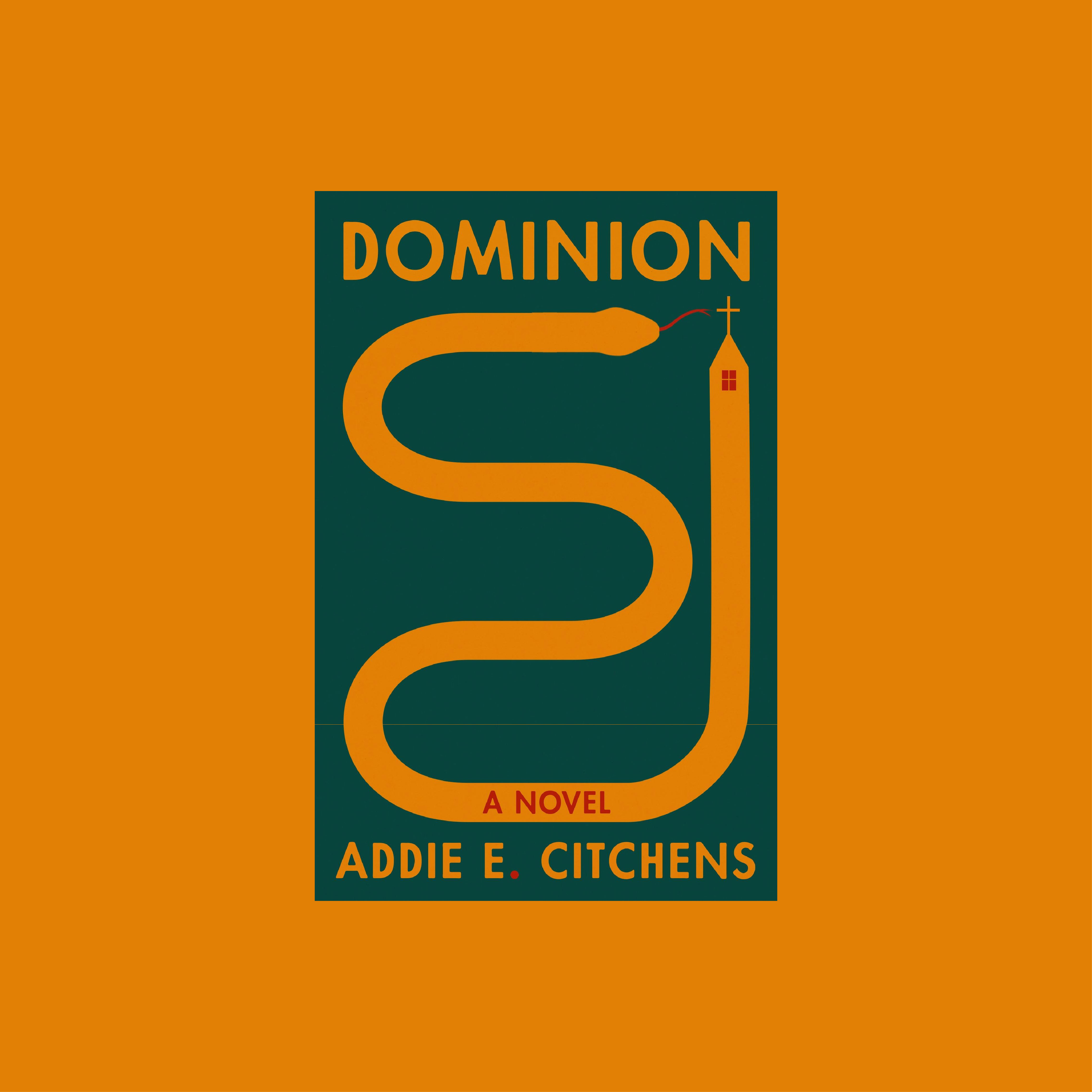
Perfectly simple, especially since I just watched Wake Up, Dead Man.
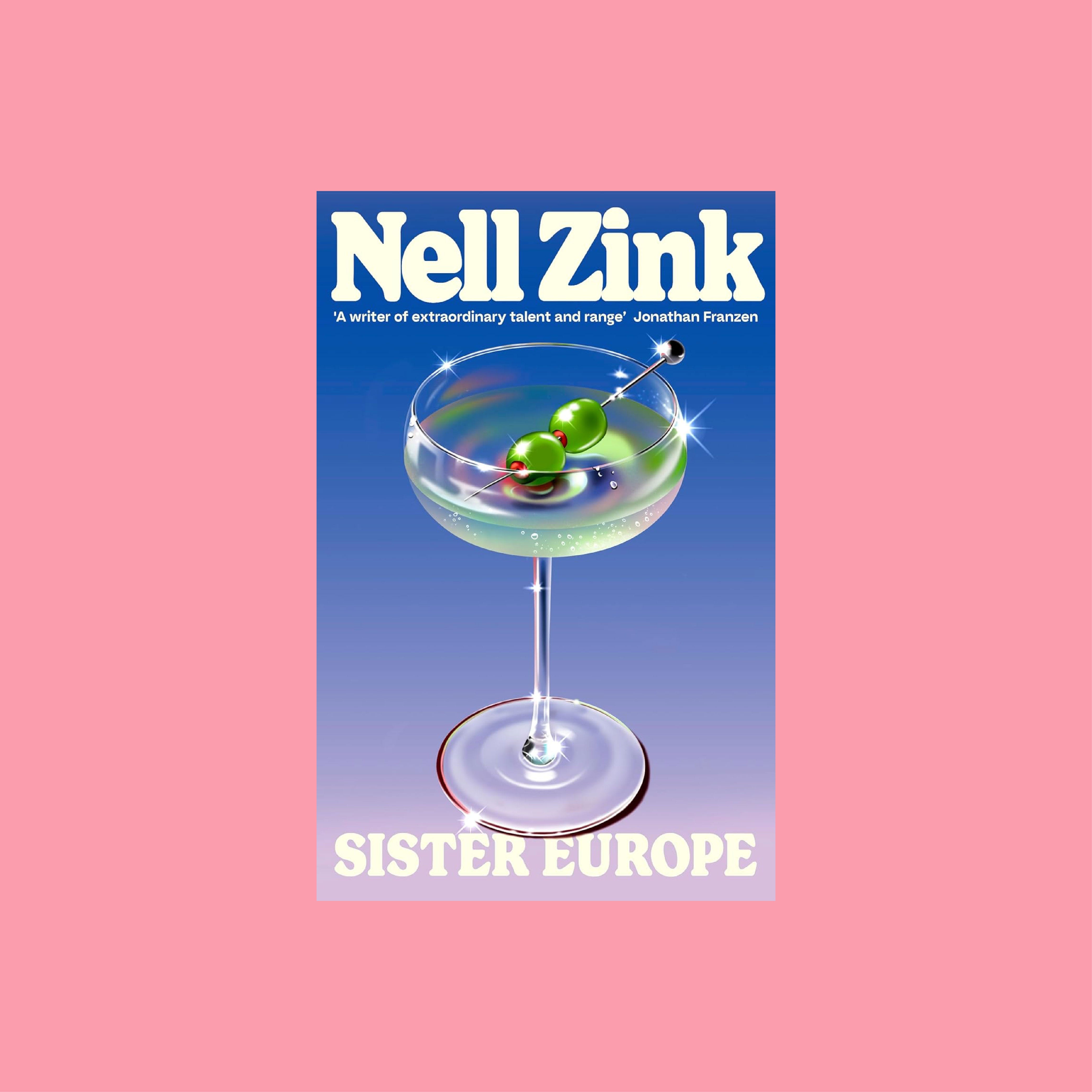
Hyperreal, jumps off the page in person.
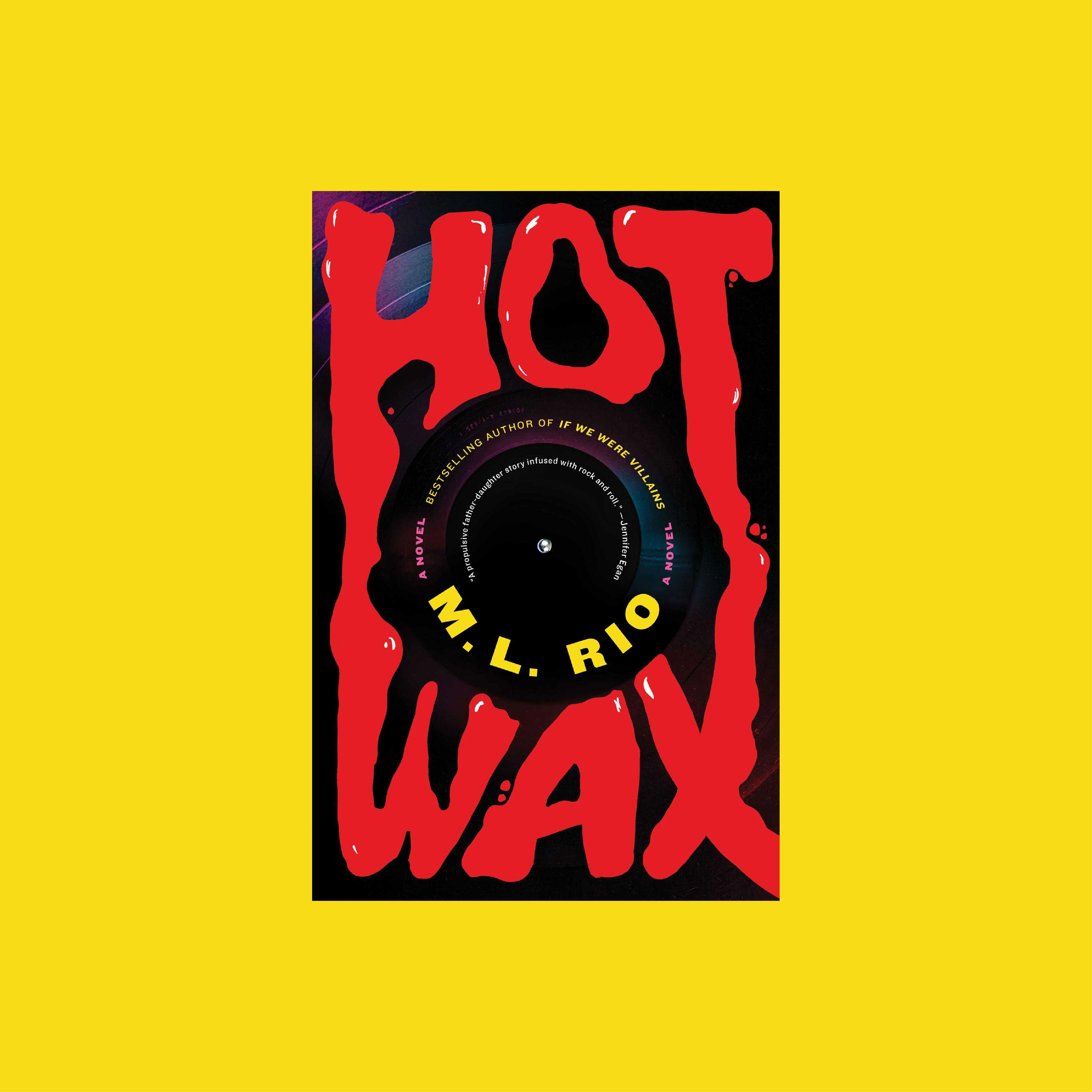
2 word title, 3 letters each. A designer’s dream.
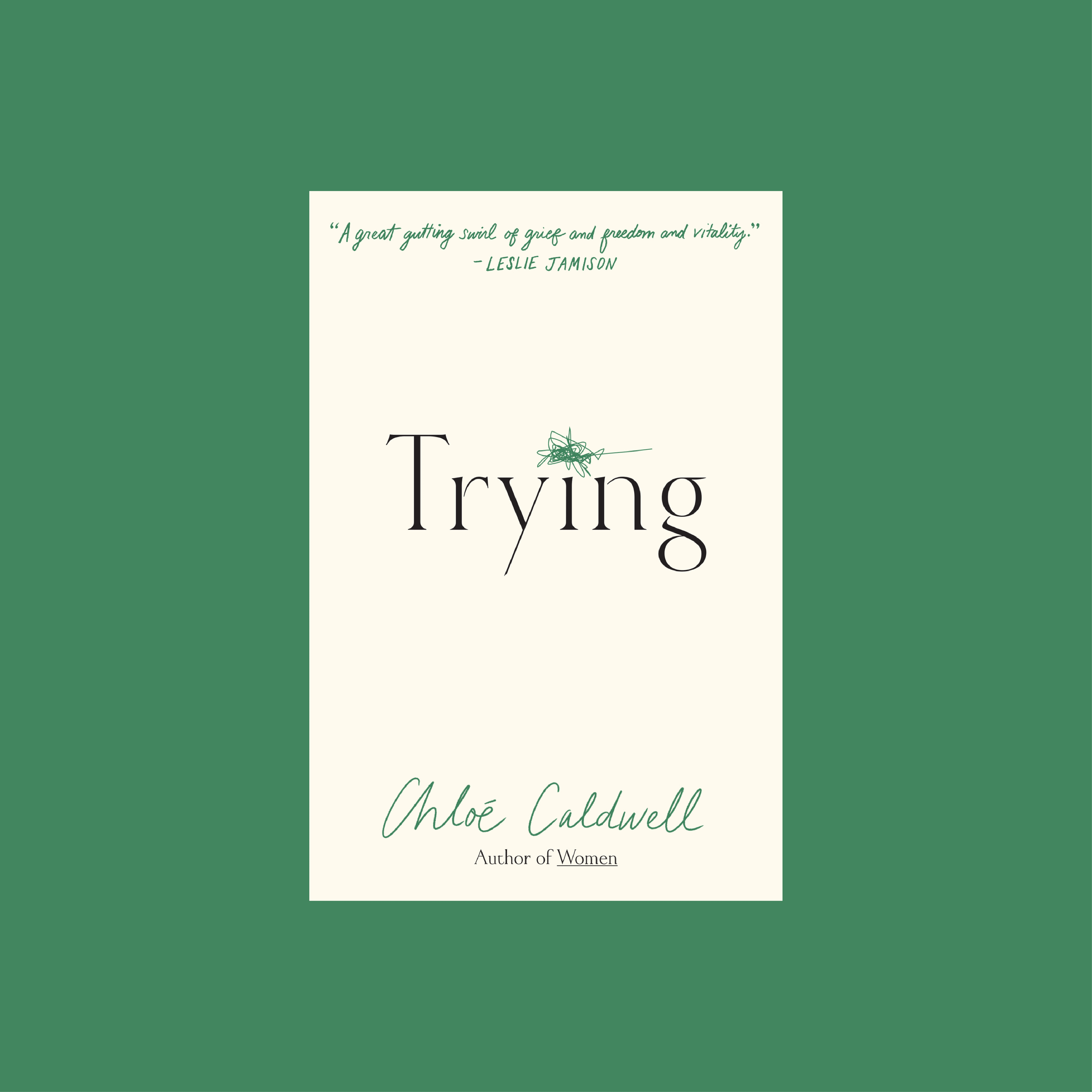
It’s simply too good (Tim Robinson voice).

2 letter author name stacked, once in a lifetime design opportunity.
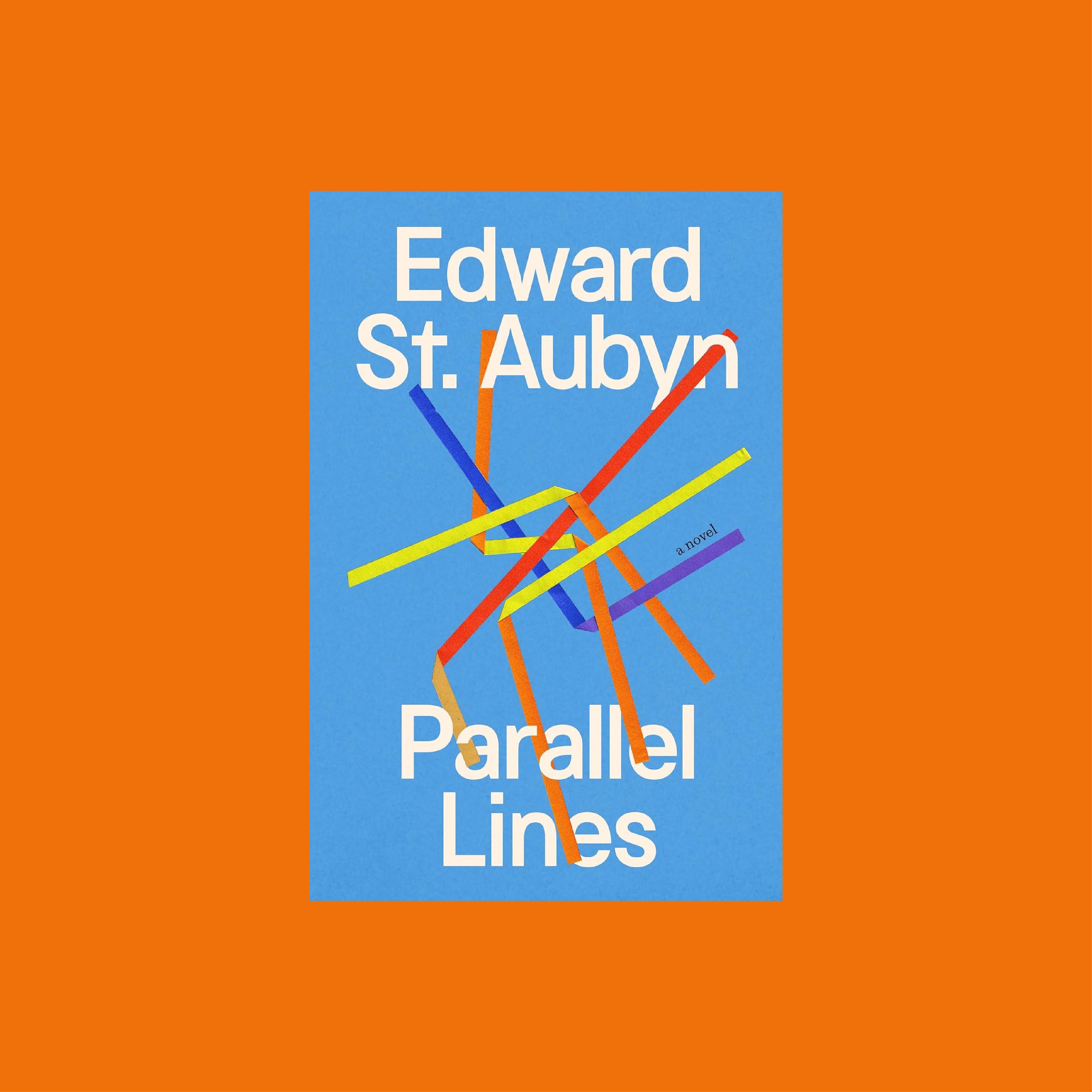
Sometimes all you need is a pretty font and color. Jack is on fire right now.
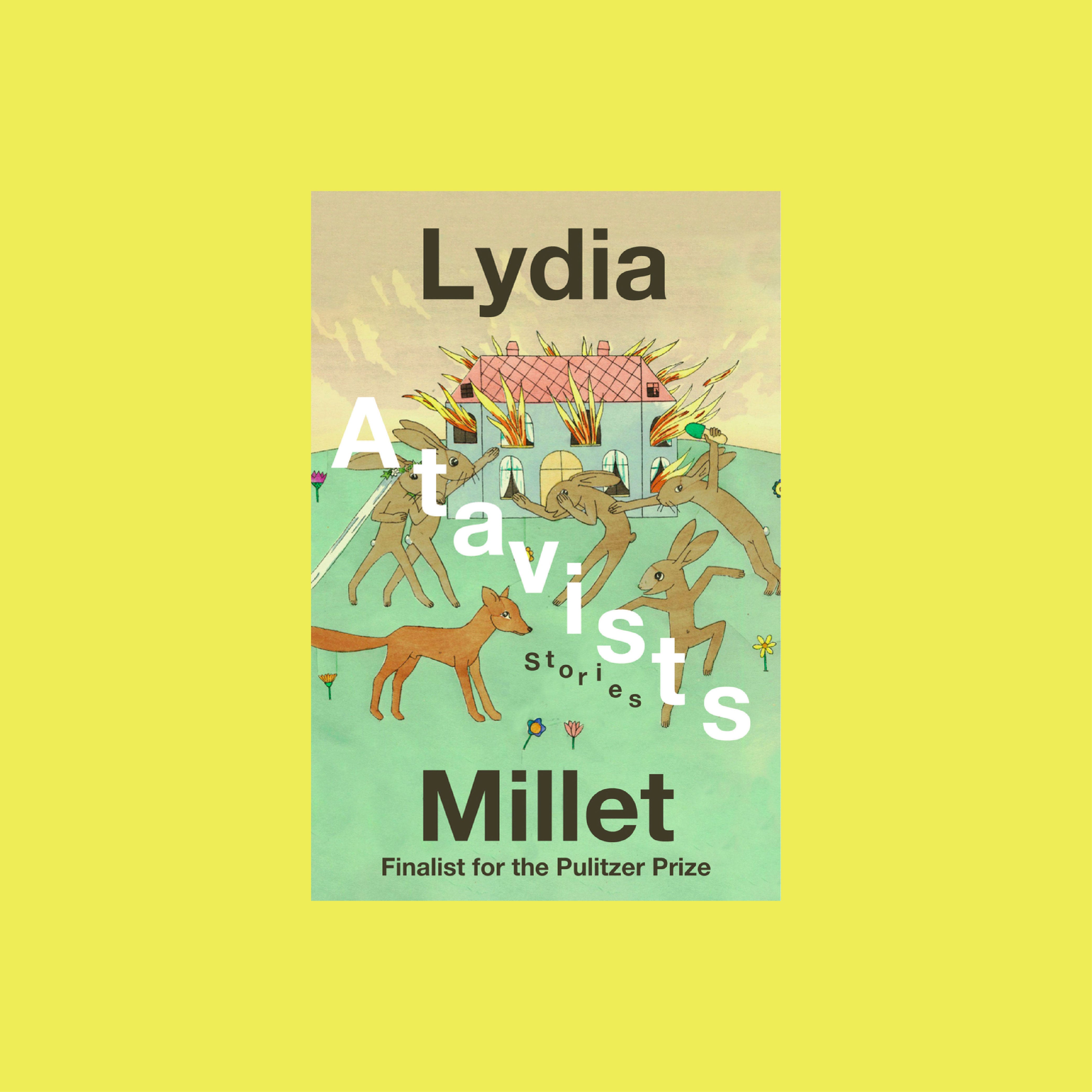
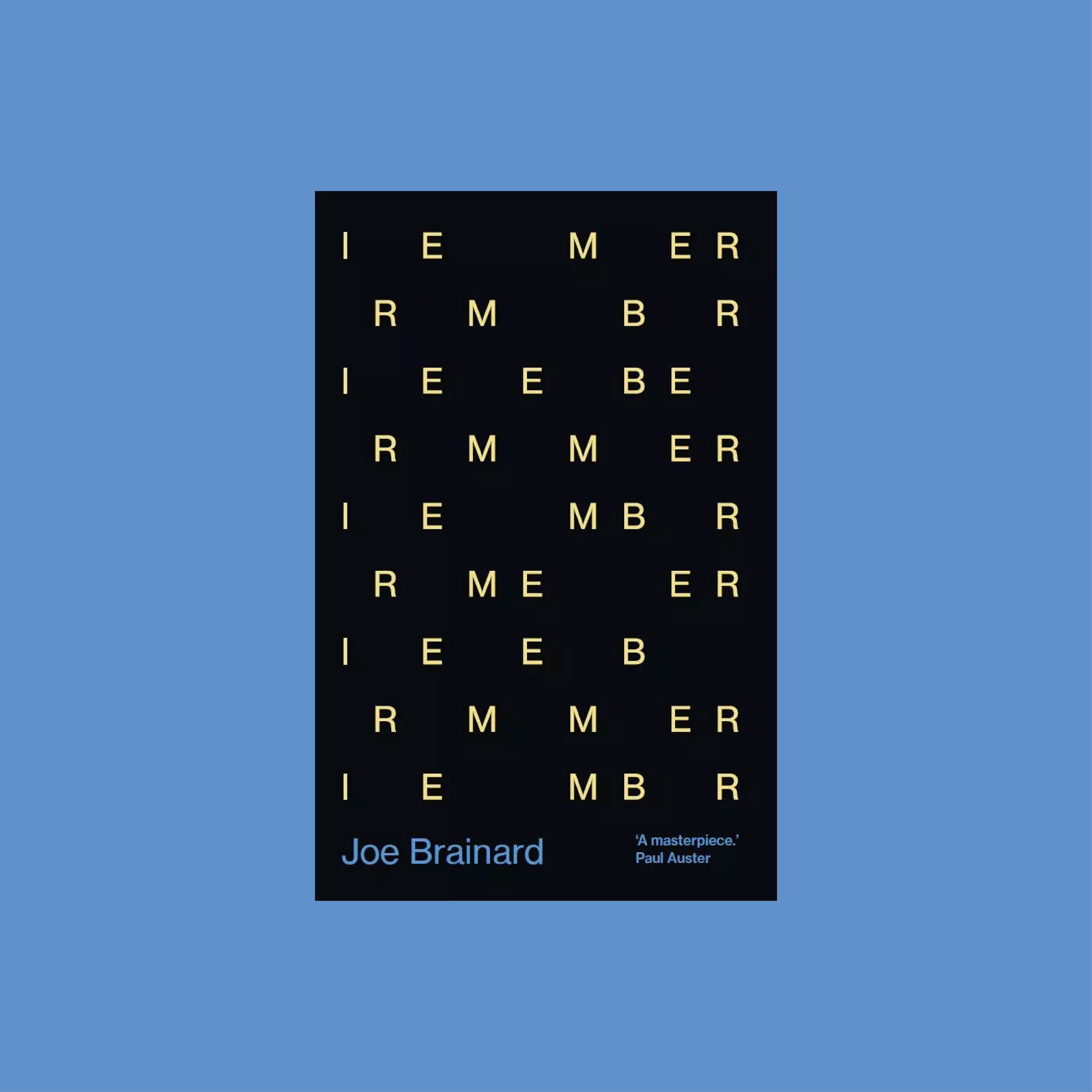
Title legibility is overrated. Split the author name too, who cares when it looks this good.
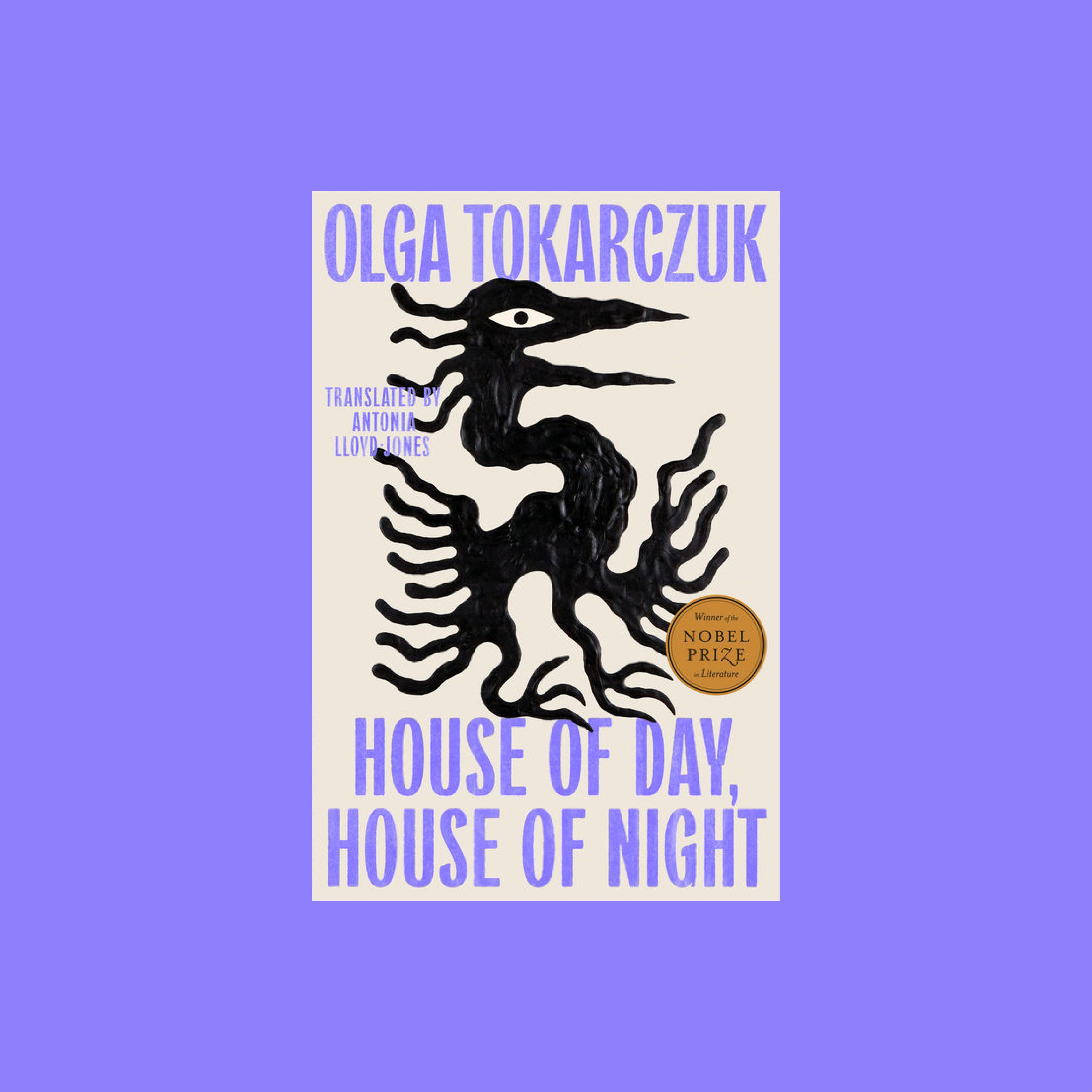
This and The Empusium look so good together.
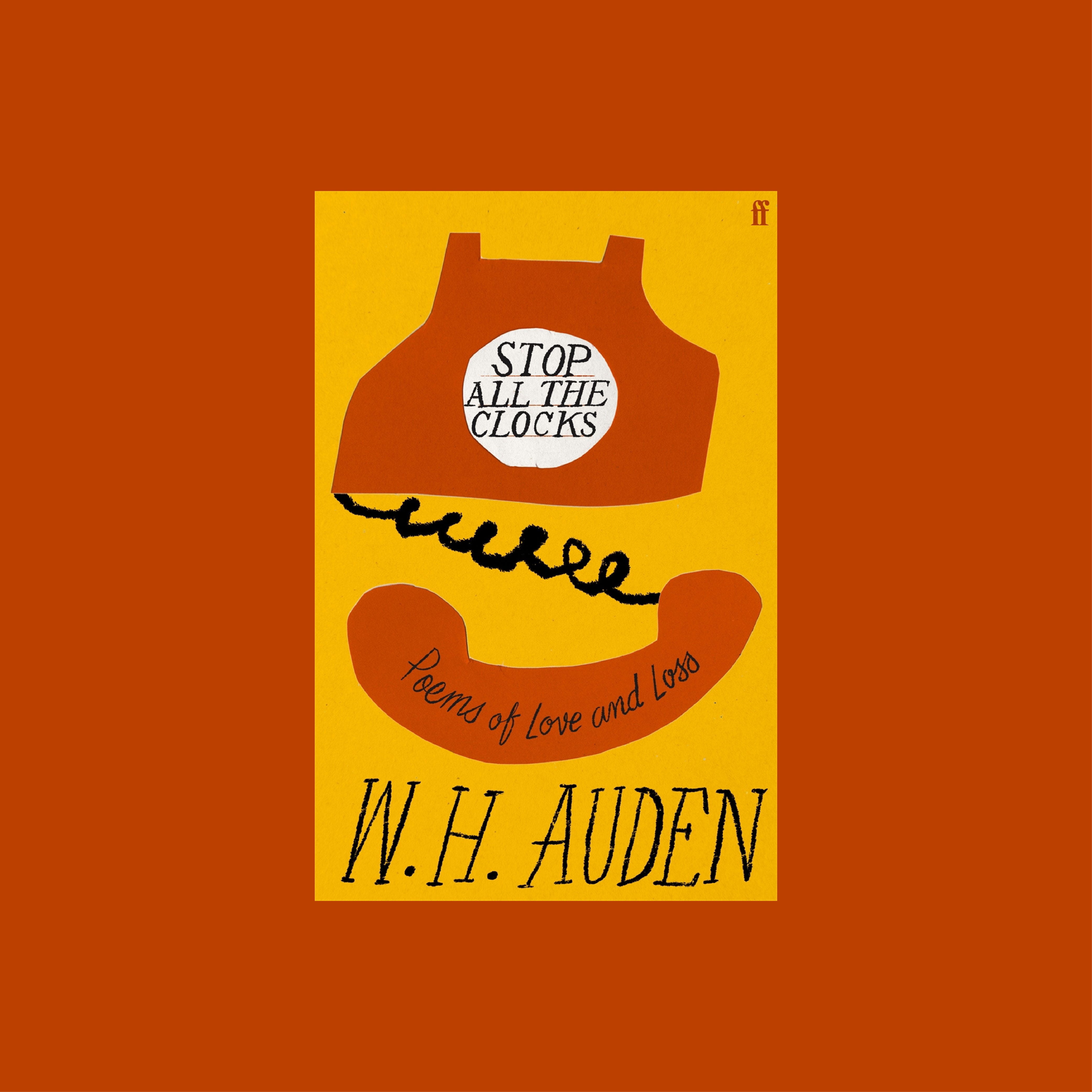
Poetry is fun because anything goes. Clocks being in the title? Telephone on the cover.
P R T
E F
E C
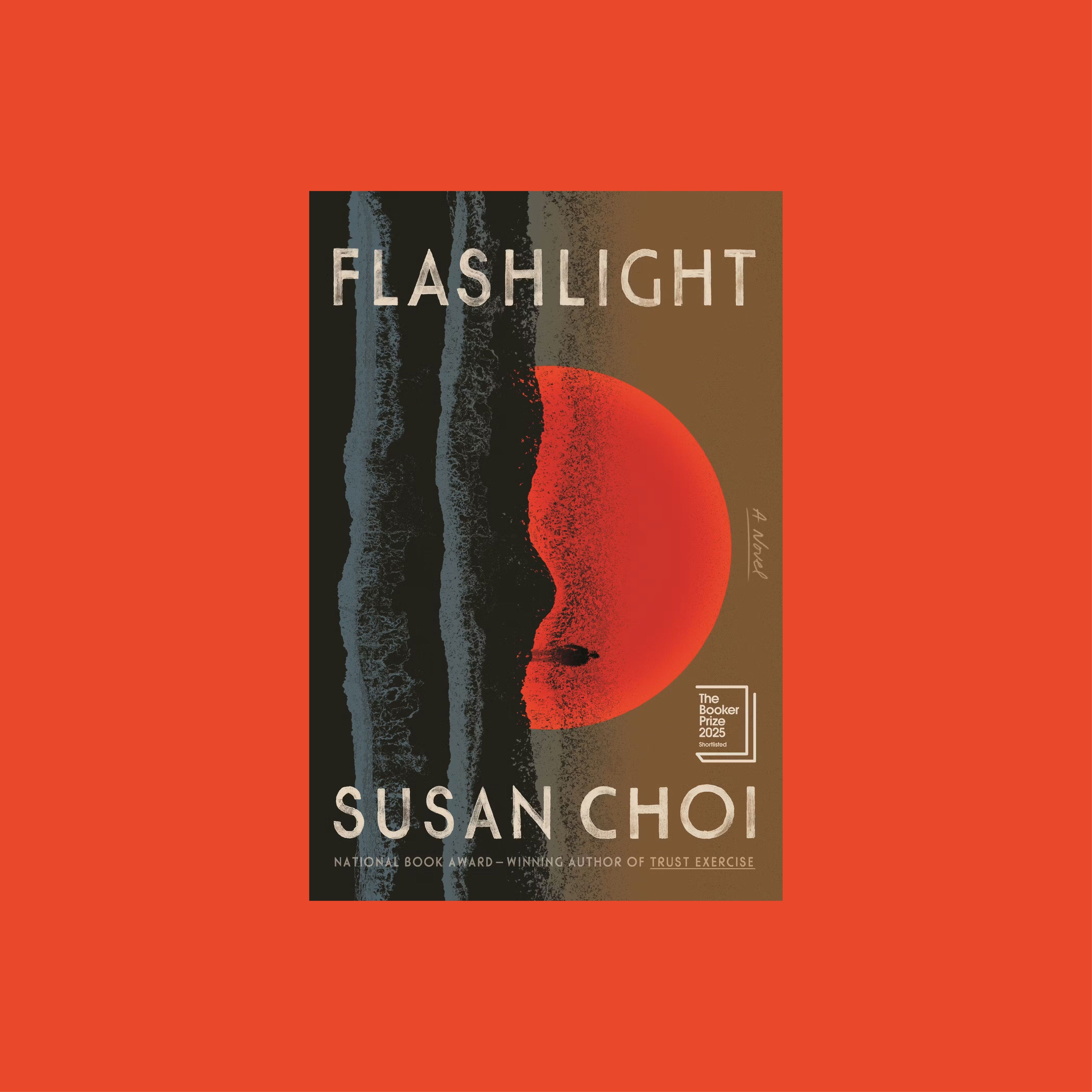
June Park designs for my specific reading niche and I’m very grateful for that.
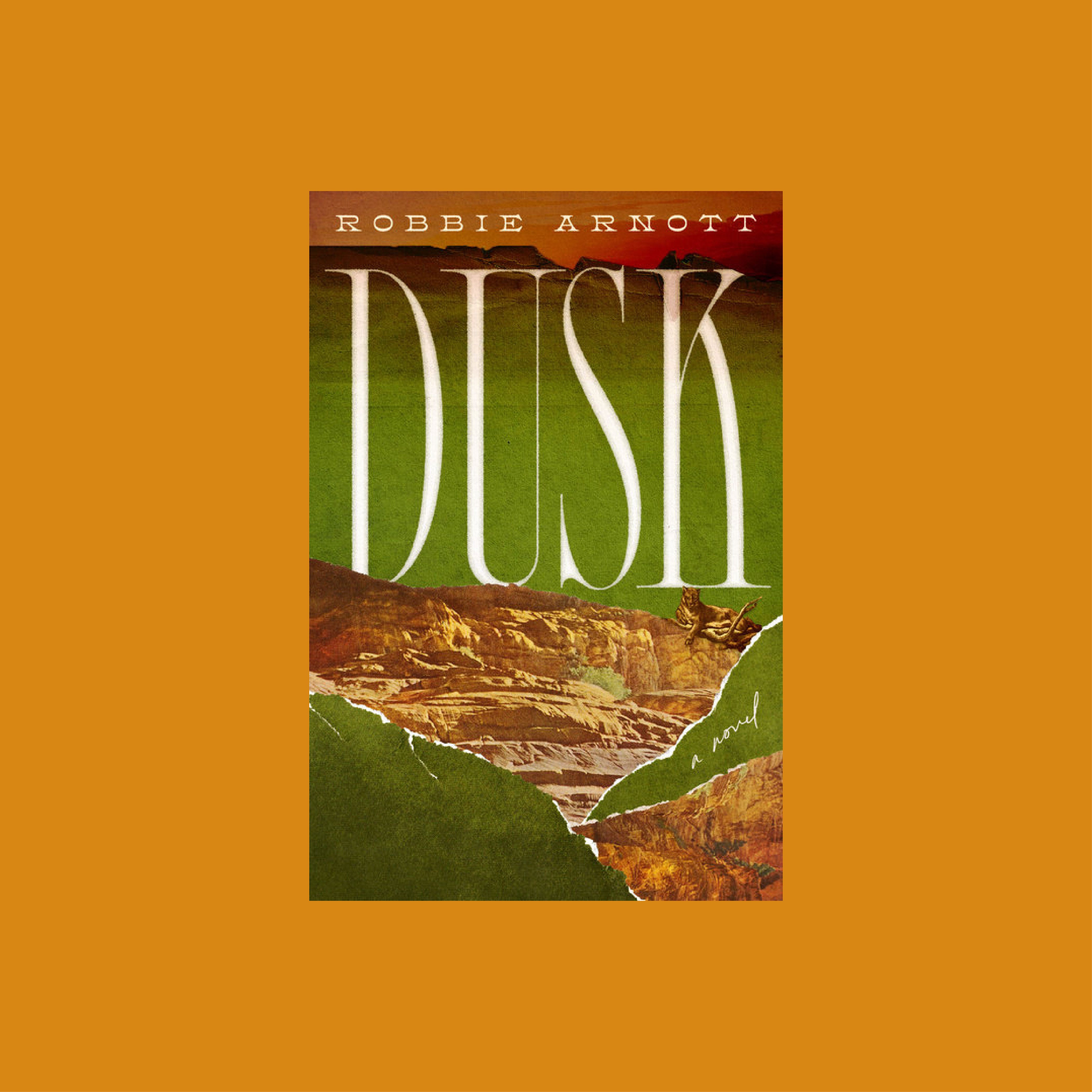
Retro western color palette and a collage? Say less.
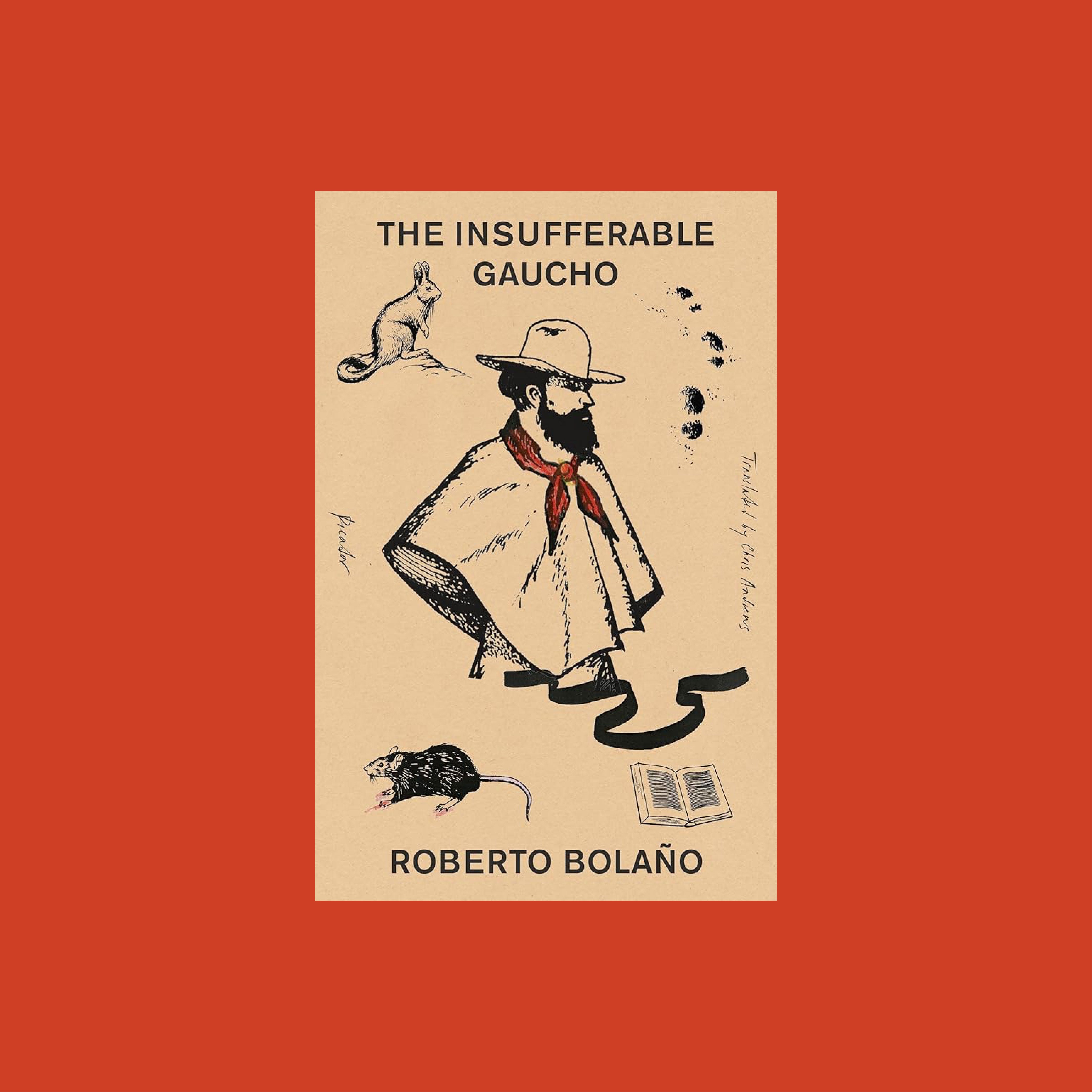
The whole series like this is outstanding.
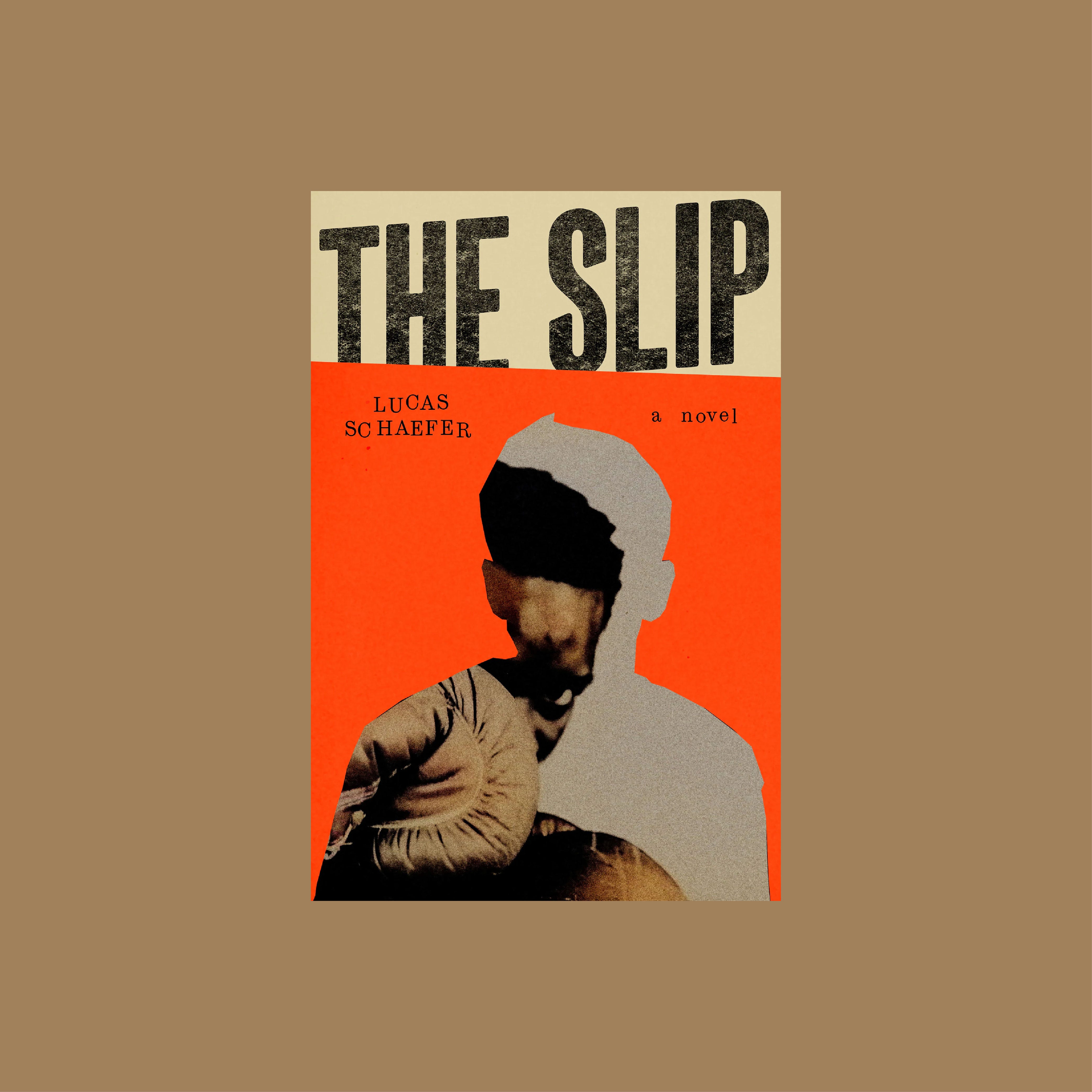
If you see this in a store pick it up to feel the texture.
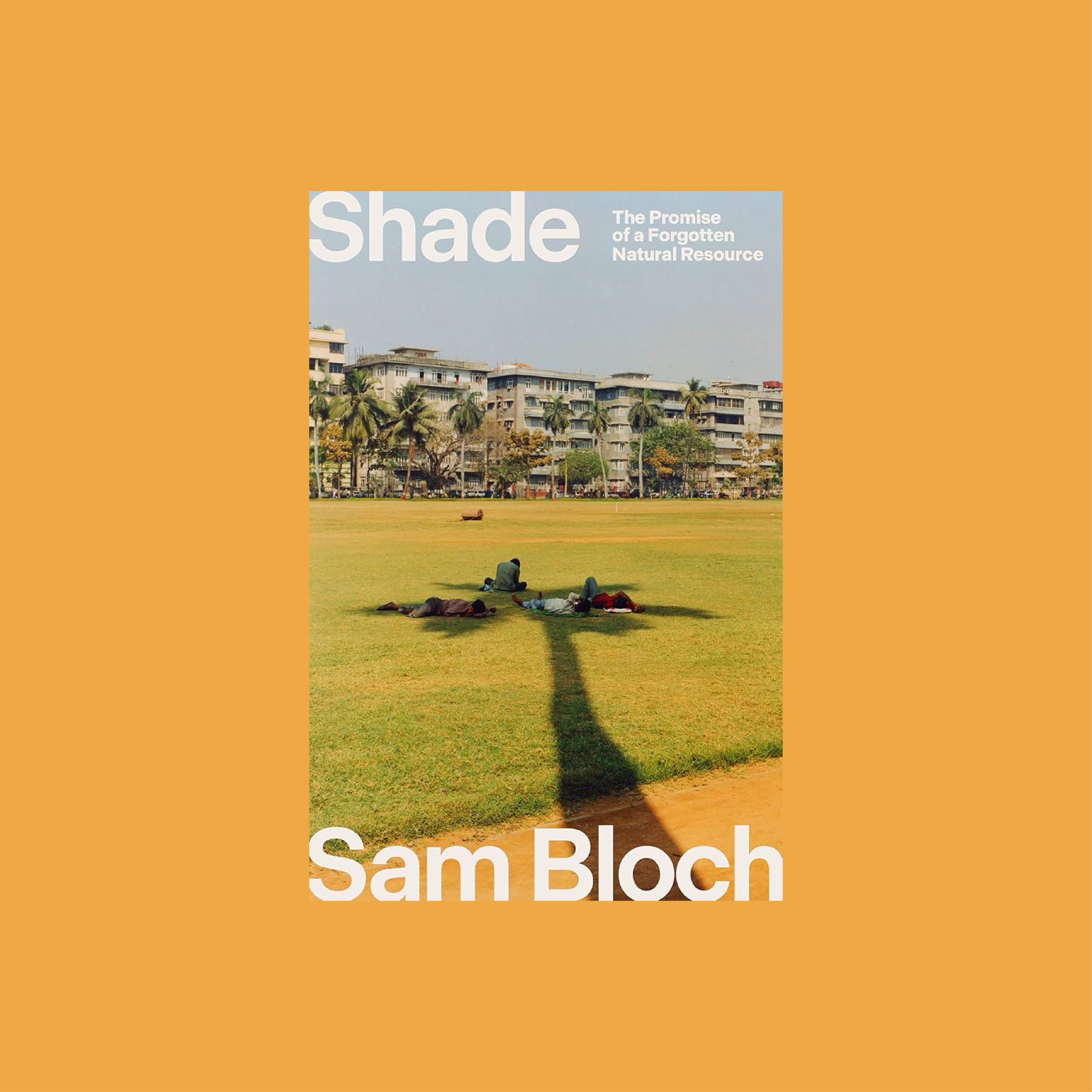
Chris is the king of clever imagery.

Could actually be from the 1970s.
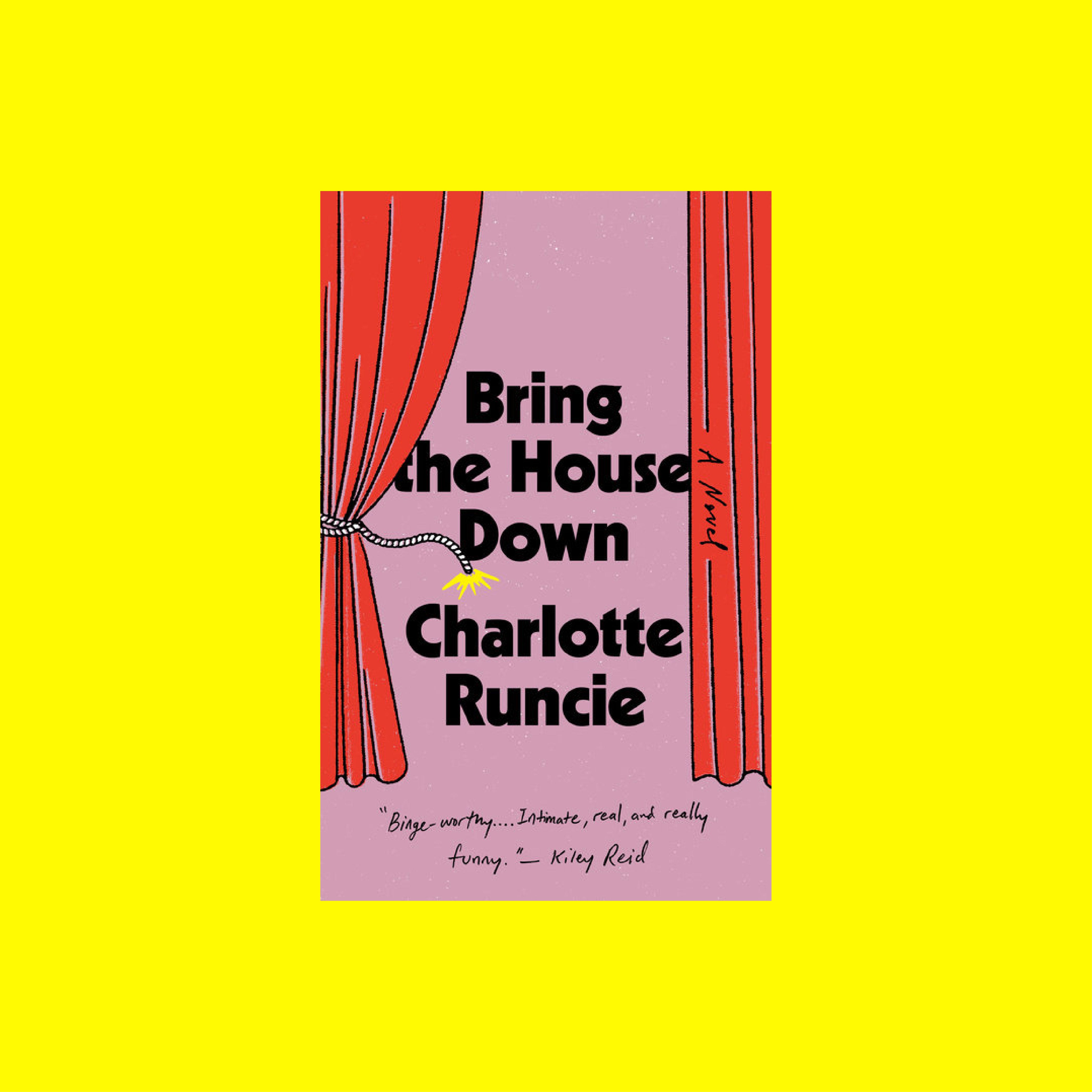
The string being dynamite!
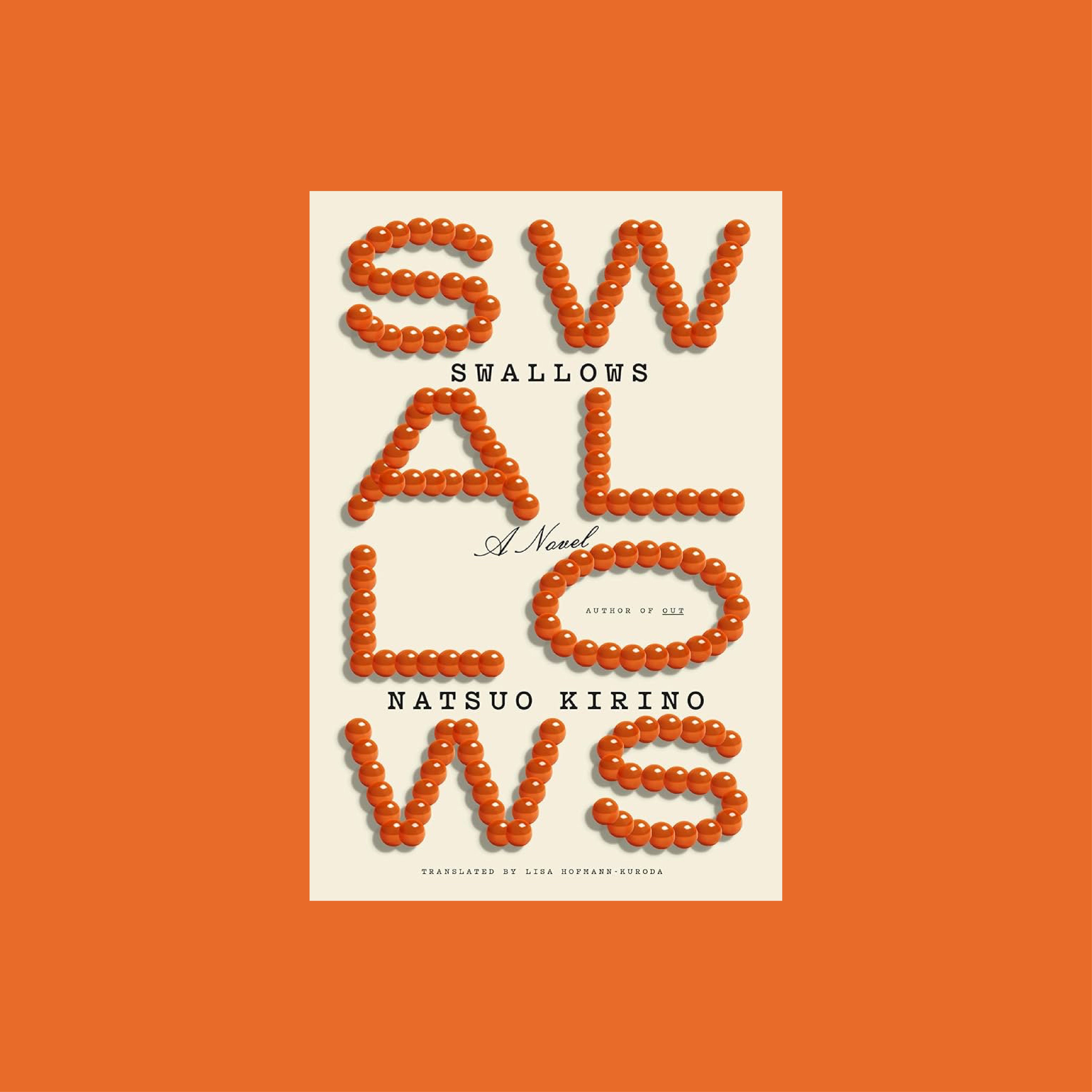
So simple, so nice to look at.
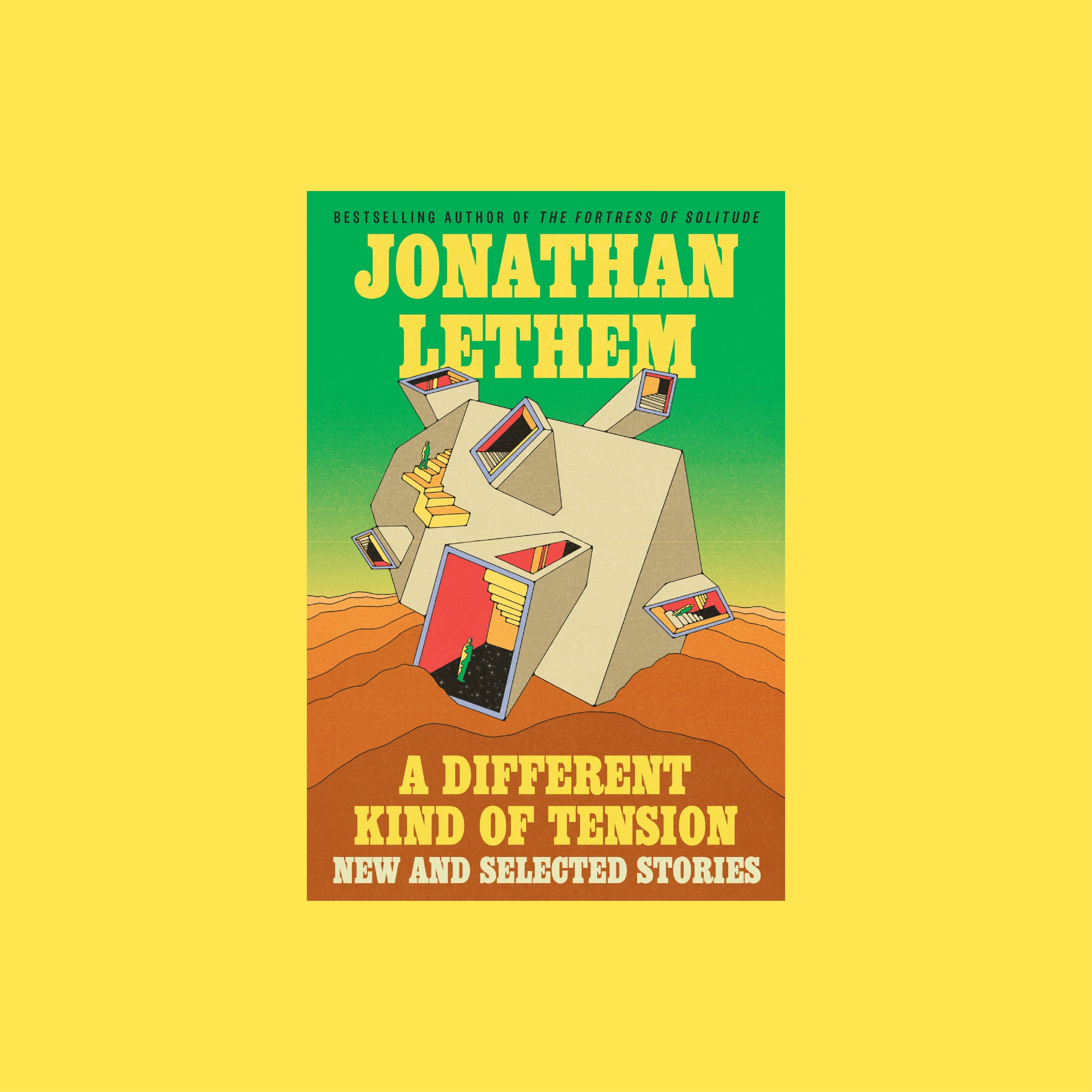
I would never be able to come up with this. Fantastic.
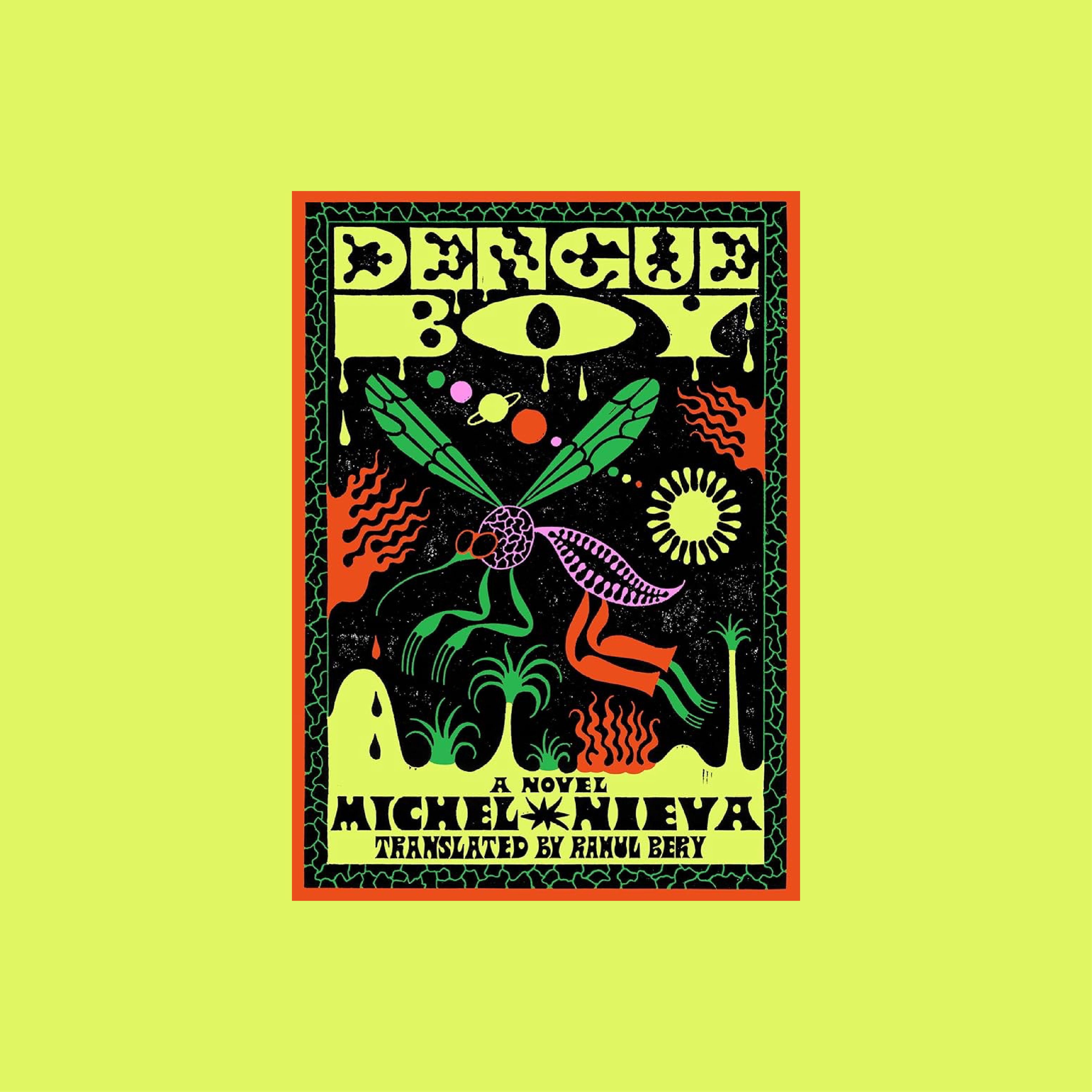
Another superb cover by the instantly recognizable Sophy Hollington.
No posts
Comments
Nothing yet. Say the first thing.
Sign in to join the conversation.