
Lately, I found myself making massive changes to my website again.
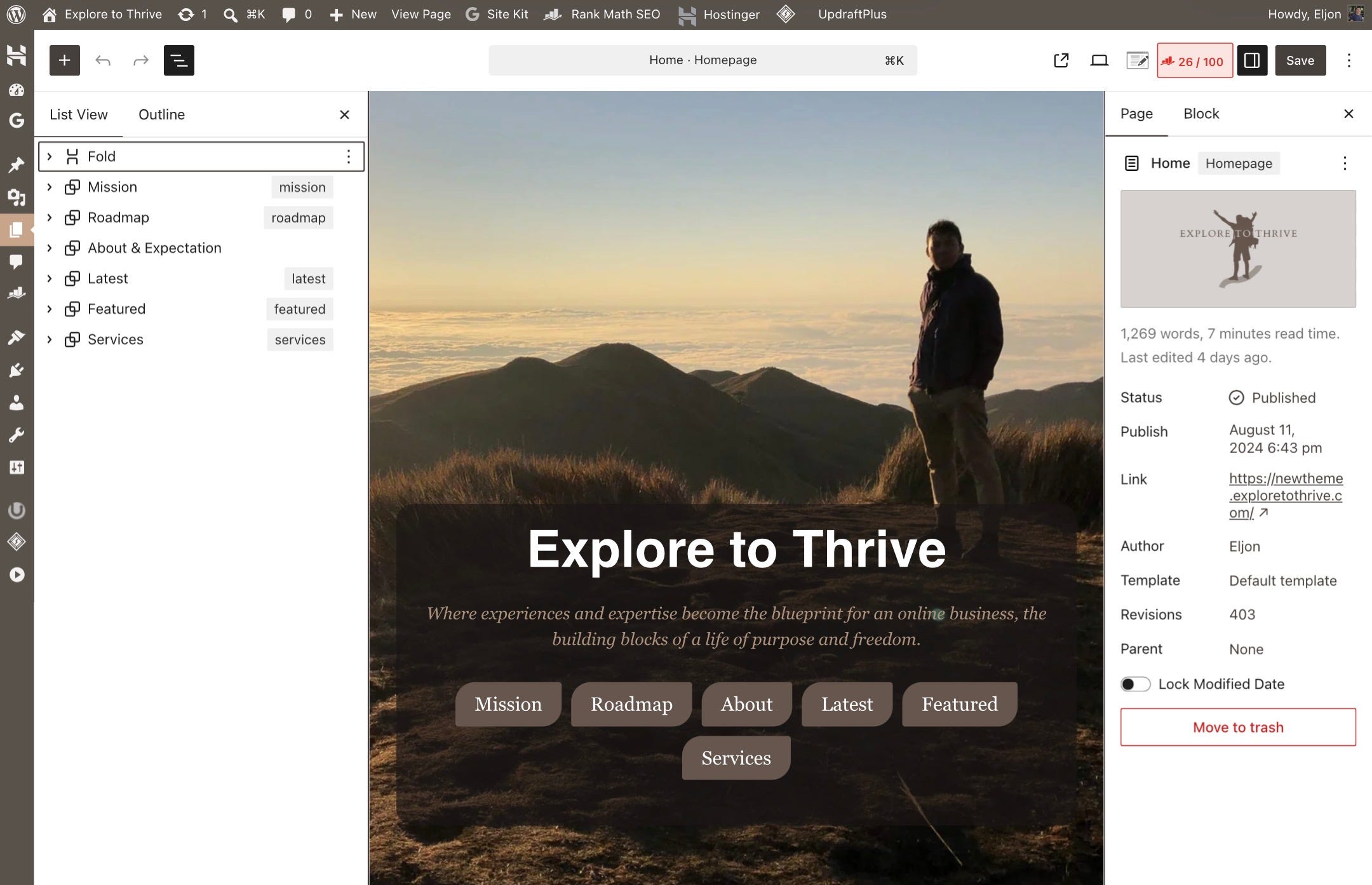
I am switching to a new theme! 😅 The current theme has user experience issues on mobile. I can’t tolerate it.
In WordPress, themes dictate the entire look and feel of your website. They control everything from your site’s overall layout to specific features, such as how your menus behave or how customizable your footer is.
In my current theme, there is a persistent blank space on the right side. It is initially hidden when a page or post loads. BUT if you scroll down with even a slight leftward motion, the entire page slides to the left. Very annoying for anyone trying to read!!!
And since I am a bit OC, it really bothers me every time I check a newly published post.
I tried to troubleshoot, but I could not find any option in the theme settings to adjust or remove that extra space.
I tried tweaking everything. Post width, header and footer paddings, margins, pattern sizes. Nothing solved the problem.
Since I had no other options, I ended up switching themes.
I need to update some visual elements like artsy dividers, font size, and background color anyway. Switching to another theme is probably a good call, I told myself.
In theory, switching themes is simple: a few clicks on the WordPress admin page. But in reality, it is far more complicated.
I was already well aware that theme migration is tedious work before I started this one. I have done it once for Explore to Thrive and a few times for my first blog, Engineering Travels.
But I did not expect this current migration to take days. Especially since my blog ONLY has fewer than 200 pages and posts combined.
I will share what theme migration actually looks like and why it is taking me longer to finish this one. But first, let me share an interesting realization I had last Sunday.
I was walking home from church, eager to return to my desk so I could finish the migration sooner. And as I thought about my next actions, it came to me that making a change is definitely not easy.
HOWEVER, change is an effective way to force yourself to learn new things, improve, or even find your true capabilities. It’s a walk outside of your comfort zone. The place where growth happens.
It became even more obvious as I journaled about this theme migration.
I was surprised to see myself improving. I believe I have become more systematic and organized than before. Mostly because I do not want to encounter the same problems with my site’s theme ever again.
What problem?
For example, that struggle troubleshooting, looking for what is wrong in the design. The layers and layers of nameless container elements and wrappers can be confusing to check one by one. You are one distraction away from losing your place in the task.
Because of this, I have started giving them labels or renaming the blocks. In the future, when I see something is off with the design, I will know exactly where to go and what to fix in the page editor right away.
If you are a creator managing a website, too, this practice will benefit you a lot in the future.
Apart from a boost in work efficiency, these website changes help me develop new habits. The design problems force me to work smarter. To be more resourceful.
The most notable problem is the massive incompatibility of the design customizations from my old theme.
When I made the switch, my website looked clunky and lost its unique appearance. Text and container elements lost their background colors. Even the buttons I customized to look like a leaf became plain, generic boxes.
In the beginning, I was editing the blocks and elements one by one to bring them back to their original appearance. But later on, I realized it was too tedious and absolutely time-consuming.
Told myself: “bruh, you cannot waste your time editing buttons one by one. Remember, you are paid for the value you provide, not the time you spend. You need to find a SMARTER solution.”
That’s when I remembered the Global CSS settings I noticed while browsing the theme’s options after installation.
(Global CSS is a single stylesheet applied across an entire website to set universal styles like fonts, colors, and layout defaults for every page.)
So, I also told myself: “Why not give it a shot? I could insert a few lines of code and handle the entire design problems in an instant!”
And that’s exactly how it went down.
With the help of AI, things went even faster. I fed the tool a sample of my button HTML and described the exact look I wanted. Copied the CSS, pasted it into the theme settings, and voila!!!
A task that could have taken hours wrapped up in less than a minute.
Honestly, it’s a reminder that we shouldn’t always rush to tackle problems head-on. Taking a moment to assess the situation and strategize is always the better move. It saves time and lowers stress.
Ultimately, it allows for more focus on the activities that move the needle for your business.
With that said, making a change in an online business is often met with resistance. Rebranding, for example. It can confuse your audience.
It also creates a lot of extra work on top of your daily tasks. For example, instead of focusing on creating a new digital product that deliver value to your audience, you also have to write additional message about the rebranding to keep your audience with you.
To be honest, any migration can feel like a bad idea… platform transfers or even this theme migration I am working on.
It means no new blog posts get published. No new ways to establish authority and expertise. No new opportunities to promote products and earn money.
I even have a new project on hold because I have to finish this migration first.
While change can bring new problems, slow things down, and add tasks to the to-do list, it doesn’t mean we should avoid it entirely. It doesn’t mean what we build in the beginning must stay exactly the same forever.
Change can be powerful as long as it represents a positive step forward.
An investment.
The long-term value we receive down the road simply needs to outweigh the effort we pour into the transition today.
This theme migration and all the visual upgrades I am working on right now? They won’t produce noticeable or tangible results anytime soon.
BUT imagine the compounding returns down the road. Every time a reader gets the impression that my blog is professional and polished instead of sketchy, building trust becomes much easier.
Remember, trust is the foundation of a sustainable business.
Ultimately, change is inevitable on our journey through business and personal life. Knowing when to welcome change, when to make a change, and how to deal with the change we cannot control is what makes all the difference.
Either way, they are opportunities for growth. They challenge us.
Through them, we learn and gain wisdom. We become better versions of ourselves, and that is what matters most.
Explore to Thrive Newsletter is part of my personal mission to walk alongside fellow creatives and show that it’s possible to build a sustainable online business from your lived experiences and passion. It’s completely free and open to everyone.
If it resonates with you and you feel inspired to support it, I would be very grateful for a tip. Your support helps me build Explore to Thrive, a community and resource I dream of creating where no creator feels alone and where we can grow, learn, and truly thrive together.
First time here? Come join my newsletter and stay in the loop.
I share honest insights from building an online business with a blog from the ground up, lessons from my mistakes so you can avoid wasting time, discoveries that lead to wins, and methods that support long term success as a creator.
This section is where I share what I’ve been working on with Explore to Thrive Blog since the last newsletter. My goal is to be transparent about the process. And also to give a real sense of what building a creator business actually looks like.
Read along for blogging tips!
After I sent my last newsletter, I immediately went back to updating the Travel Planning Pages.
These updates are similar to what I did for the other pages. Think copy improvements and clearer calls to action. For example, I changed “below are trusted partners” to “tap/click the icons/buttons below to reserve a room.”
Aside from those, I updated the download pages where visitors get Google Drive links for my info products. And on these pages, I embedded related articles and downloads. This helps readers discover other helpful content and showcases the value of the blog.
I also placed promotions relevant to the downloaded product between the download button and those related posts. You know, we have to keep things practical.
After editing those pages, I added a no-index tag to posts that do not need to appear in search engine results. I used the RankMath plugin for this. It makes sense because these articles are personal, reflective, and tailored for social media. I even de-indexed posts under the business category.
What’s the reason? Even though they provide value, they are not ready to compete in search results. I need to add more proof of expertise first. Things like case studies to make them truly helpful and competitive. Ultimately, this boosts my site’s SEO because search engines (esp. Google) will only check my posts with real EEAT (Experience, Expertise, Authority, and Trust).
De-indexing was the final step of my content audit. Once that was wrapped up, I backed up the entire site with a free plugin called Updraft Plus to save my progress. This served as preparation for the WordPress update and theme migration. Now, my site runs on WordPress 7.0.1.
The next step was creating a staging environment. Basically a duplicate copy of my website. A safe space to play, edit, and experiment with the design and functionality of the new theme. All without any disruption to the user experience.
Right now, I am still working on the theme migration from Astra to Kadence. I chose Kadence because it is fast, free, and allows more customization than other themes like Generate Press. I love the back to top button that hovers on the lower part of the screen.
Once I finished the theme’s basic settings like fonts, colors, content width, and the header, footer, and menu, I focused on minor improvements. Like a brighter background color for better text contrast; text that is 1 or 2 pixels larger… simple adjustments to improve the overall reading experience.
The most tedious tasks came next: adjusting all the pages to fit the new theme. As mentioned earlier, most of them look the same now that the adjustments are complete. This includes pages for partners, the newsletter, about, downloads, the pre-publish checklist, terms of use, privacy policy, all travel planning and hotel pages, and other pages with affiliate links.
My homepage, however, got a new look. At least the above the fold section.
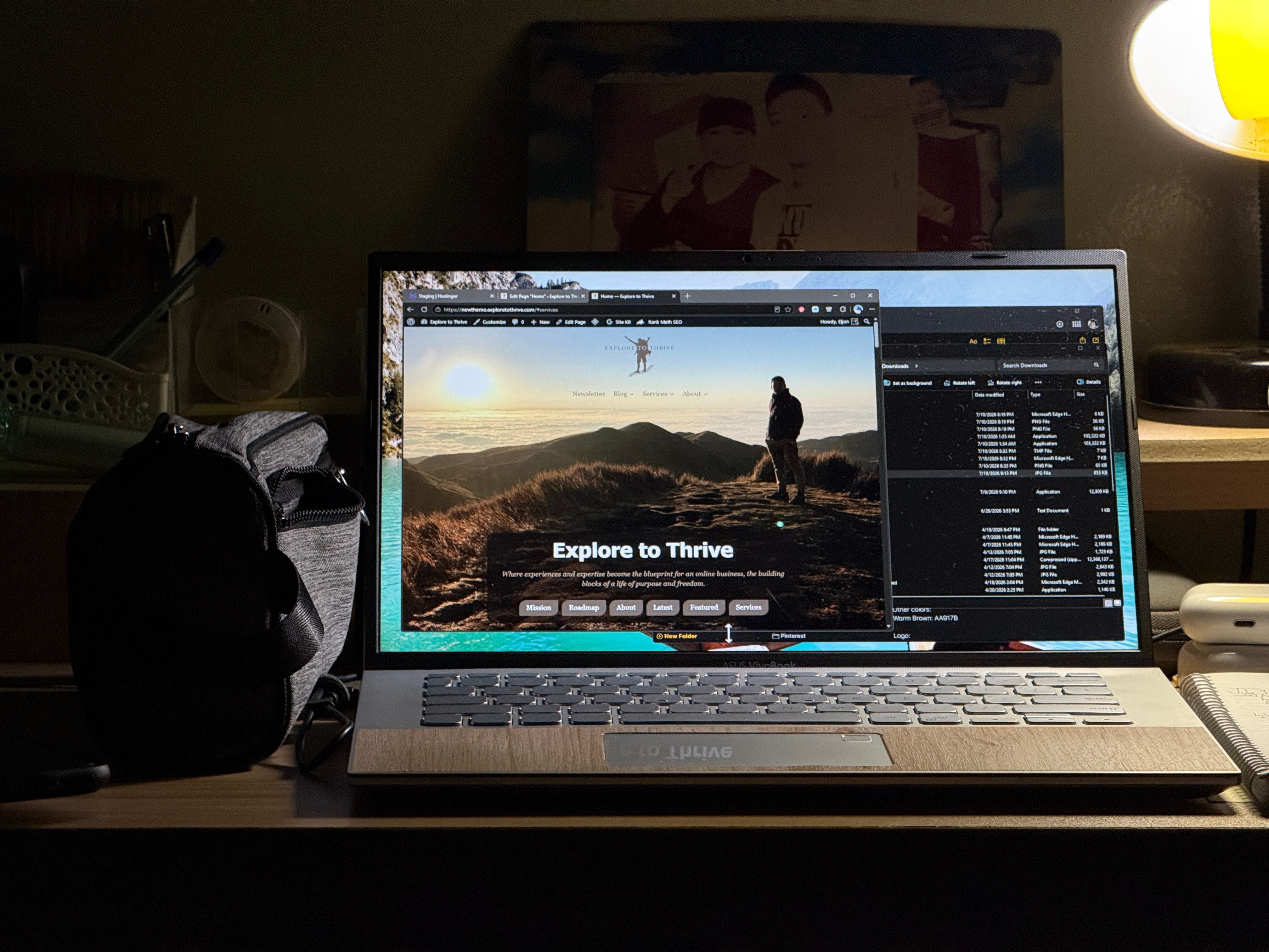
I changed the appearance of the homepage to build a stronger first impression, improve navigation, and make the logo stand out clearly. When it came to this part, the best feature of the Kadence theme was the option for a transparent header. A small detail that really makes the homepage look sleek and modern.
I spent three days working on the adjustments for those pages. Yes, I even worked on Sunday during coffee with my family. Now that the pages are finished, I am moving on to adjusting the posts.
For posts, I created a new frame or divider for photos. Mostly for aesthetic purposes. Gotta admit, it took me two hours to do that! I had to try different designs to make sure it was not too distracting with too much color and not too plain to help with the branding.
I also added new visuals like scribble style dividers to emphasize calls to action and separate sections. I placed them there because I believe they help show a unique identity to readers.
Even though they do not give much value, this extra creativity gives the impression that my site is made out of passion. This gives readers hints that it is a blog they can trust.
NOTE: All these changes are still on the staging site. Not live yet. If you want to see them, I will keep the excitement going for now. Most likely, I will share them in the next newsletter.
Aside from using Global CSS which I shared earlier, another interesting thing I did was adding widgets on travel planning pages.
These are for promoting travel experiences where I do not have photos to use. Not only do the widgets provide visuals for these pages, but they also act as affiliate links. That accomplishes two things at once.
The downside in using widgets is that the images they show depend on the website they are associated with.
For example, the widgets I use are from GetYourGuide. They can change what appears in the widget, although that rarely happens. Usually only when a promoted tour becomes unavailable.
Because of that, I need to check these pages occasionally to ensure the widgets show the right content.
Aside from the theme customization incompatibilities mentioned earlier in this newsletter, there is not much else worth mentioning.
When I started writing this letter, I paused my work on the blog posts to do the necessary adjustments for this theme migration. Most posts are only text and images, so there is not much to do. Only syncing the patterns in the middle and at the end of each post.
A few posts with wrapper elements need design tweaks, though. Like the interactive checklist for planning a trip to Cebu and the navigation style table of contents in one of the Cebu Travel posts.
For the upcoming days, this is my first focus. I will go through each blog post to update visual elements and the synchronized patterns. At the same time, I will check quickly for content updates to ensure the information is up to date.
I’m supposed to do a quarterly retrospection. But since I’m already behind on my publishing goals, I might postpone it. I can do it later with the third quarter introspection instead.
I aim to kick off my next project before I send my next letter. I’ll try my best.
That is all for now. Thank you for reading and I hope you found this helpful!
See you next week.
Ciao!
Comments
Nothing yet. Say the first thing.
Sign in to join the conversation.