
Climate data visualization faces a fundamental challenge: making decades of complex scientific data accessible without overwhelming users or their browsers. In our recent experience building the E3CI Datastation and ASSAClimate Index platforms, we encountered this challenge at scale—processing gigabytes of raw climate data spanning over 40 years, covering everything from European heat waves to South African droughts.
The numbers tell their own story. E3CI handles over 280,000 preprocessed JSON and GeoJSON files totaling 3GB of optimized data. ASSA stores all client-delivered data into a 32GB MySQL database containing over 200 million rows. Both platforms needed to deliver sub-second loading times while maintaining scientific accuracy across multiple climate indicators.
These projects presented fundamentally different technical challenges, though. E3CI required us to download raw climate reanalysis data and perform complex statistical calculations to generate visualizations. ASSA, on the other hand, ingested pre-calculated data but demanded real-time database queries against massive time-series datasets. The solutions we developed taught us important lessons about architecting data-heavy applications for different use cases.
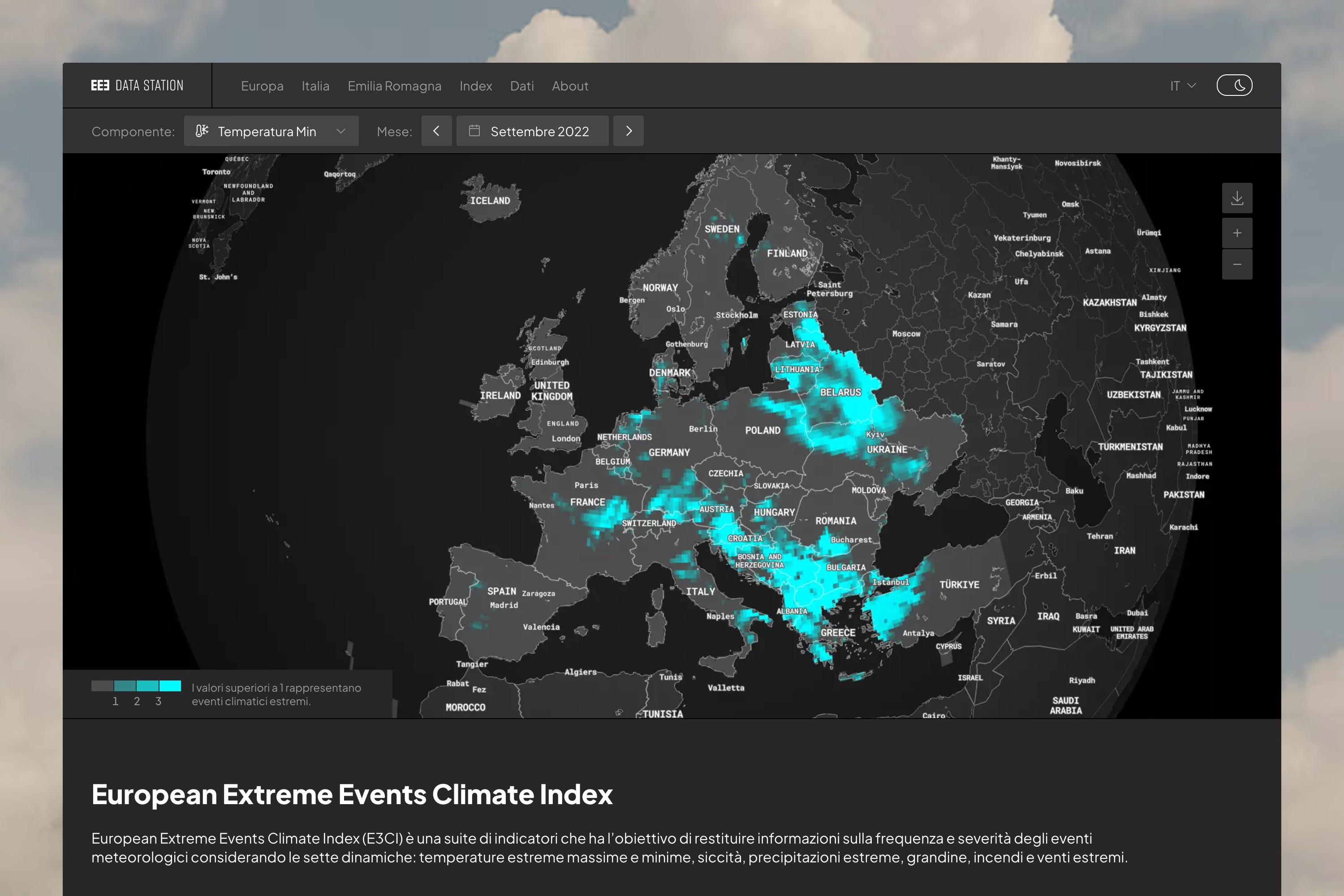
E3CI tracks seven climate indicators—extreme temperatures, drought, precipitation, hail, fires, and wind—across European countries with monthly granularity since the 1980s. ASSA monitors five similar indicators across South Africa’s provinces and districts using both AgERA5 and CHIRPS datasets. The dataset used for grid visualizations has a resolution of about 20x20Km.
The scale becomes a bit more clear by doing some quick math: that’s one non-integer number per 20Km², per indicator, per 480 months. Climate scientists really work with data that would push traditional web applications to their breaking point.
We faced three core technical problems across both projects: data ingestion at scale, storage optimization for fast retrieval, and visualization performance in the browser. Each project demanded different solutions based on its specific constraints and requirements.
Our approach diverged significantly between projects, driven by different data sources and client capabilities. E3CI follows a static file generation strategy, while ASSA implements a dynamic database-driven architecture.
E3CI’s backend regularly monitors an S3 bucket for new climate data uploads. When new data arrives, a Python processing pipeline downloads everything and begins the computationally intensive work of generating climate indices. The system produces hundreds of JSON and GeoJSON files for every update, each structured exactly as the frontend expects.
This approach eliminates runtime processing entirely. When a user requests data for Italian heat waves in July 2023, the browser downloads a pre-calculated JSON file containing exactly that information. No database queries, no server-side computation—just fast file transfer limited only by network speed and our CDN configuration.
The first tradeoff is processing time: updates can take hours as Python has to generate optimized GeoJSON files across the entire European dataset. The second tradeoff is flexibility: while 3GB of preprocessed and super-compressed files represent a great optimization of storage costs, it effectively prevents making traditional queries over that data. Instead of simply replacing numbers, an update to the whole dataset would require rebuilding all files.
For ASSA we took the opposite approach. A Chokidar-based file watcher monitors FTP uploads, immediately processing incoming JSON files and storing structured data in MySQL via Drizzle ORM. The frontend requests data through Nuxt server APIs that query the database in real-time.
The database approach provides flexibility that E3CI lacks. New data becomes available immediately after ingestion, without waiting for complete reprocessing cycles. However, it demands careful query optimization and database design to maintain performance at scale, plus more complex caching strategies to handle growing data volumes.
ASSA’s database architecture demonstrates how thoughtful schema design can handle massive time-series datasets efficiently. The grid_monthly table holds 142 million rows, yet query times consistently stay below 300ms, with many sub-100ms responses when displaying focused regional datasets. The system organizes climate data across multiple temporal and spatial dimensions using a structured table hierarchy that mirrors South Africa’s administrative geography.
The core design separates data by geographic scope (country, provinces, districts, grid) and temporal aggregation (monthly, seasonal, annual, 5-year, 10-year spans). This creates 20 distinct data tables, each optimized for specific query patterns:
Geographic Levels:
├── country_* (national aggregates)
├── provinces_* (9 provincial divisions)
├── districts_* (52 district subdivisions)
└── grid_* (high-resolution spatial data)
Temporal Aggregations:
├── *_monthly (483 months of data)
├── *_seasonal (161 seasons across 40+ years)
├── *_annual (40+ individual years)
├── *_yearly_5 (8 five-year periods)
└── *_yearly_10 (4 ten-year periods)
Each table follows the same structural pattern: climate values linked to models (AgERA5, CHIRPS), components (temperature, precipitation, drought indicators), and temporal/spatial identifiers. The grid_monthly table—containing 142 million rows—stores individual coordinate points with precise latitude/longitude values for choropleth rendering.
The indexing strategy prioritizes the most common query patterns. Every table includes composite indexes on temporal fields (year, month, season) combined with model and component identifiers. This allows the database to efficiently locate specific climate indicators for any time period. Unique constraints on these same field combinations prevent duplicate data during bulk imports.
For the high-volume grid_monthly table, additional spatial indexes on latitude and longitude enable fast geographic filtering when users zoom into specific regions. The combination of temporal and spatial indexing keeps query times consistently below 300ms, even when processing millions of grid points for choropleth visualization.
Both projects required aggressive optimization to deliver acceptable performance. Our solutions reveal patterns applicable to other data-heavy visualization projects.
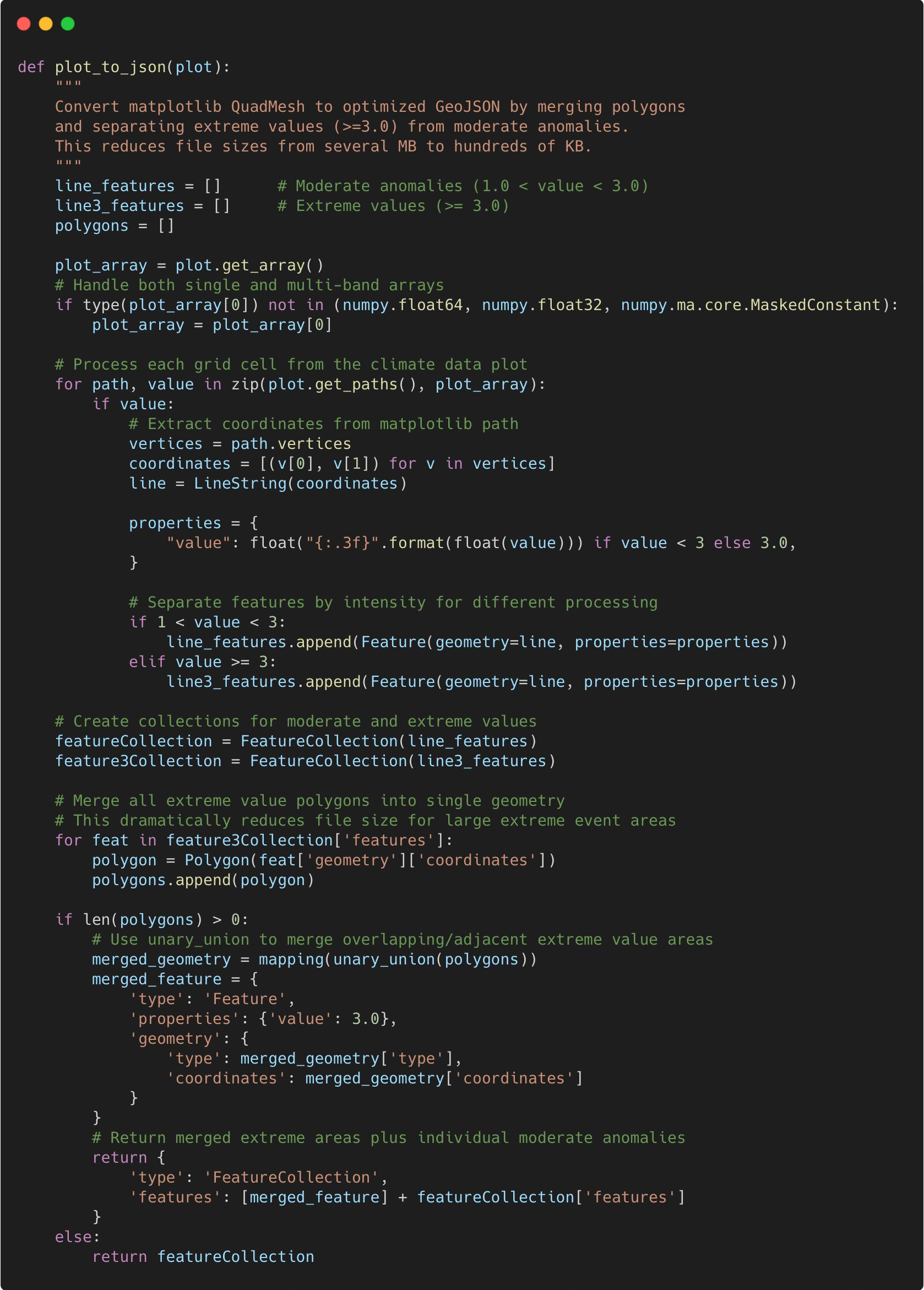
E3CI’s most significant optimization involved GeoJSON file size reduction. Initial European overview maps weighed several megabytes—painfully slow for homepage loading. We developed a multi-step compression strategy that reduced file sizes by 60-80% while preserving scientific accuracy.
First, we merged adjacent grid squares sharing the same color value into single polygons, dramatically reducing vertex count. Since climate index values below 1.0 display as gray (indicating normal conditions), we extracted these areas into a single “base” GeoJSON covering each country’s shape. The actual data GeoJSON only contains anomalous values above the threshold, which are far fewer cells.
The polygon merging algorithm was essential for European-scale visualizations. By merging adjacent extreme value areas and separating them from moderate anomalies, we preserved all meaningful climate information while making the data practical to serve over the web.
Another E3CI’s significant performance optimization involved eliminating redundant map instantiation across page navigation. Rather than creating new Mapbox instances for each country or region view—the typical approach that causes loading delays and API quota consumption—we architected a single persistent map component at the layout level.
The implementation leverages Nuxt 3’s layout system to maintain map state across route changes:
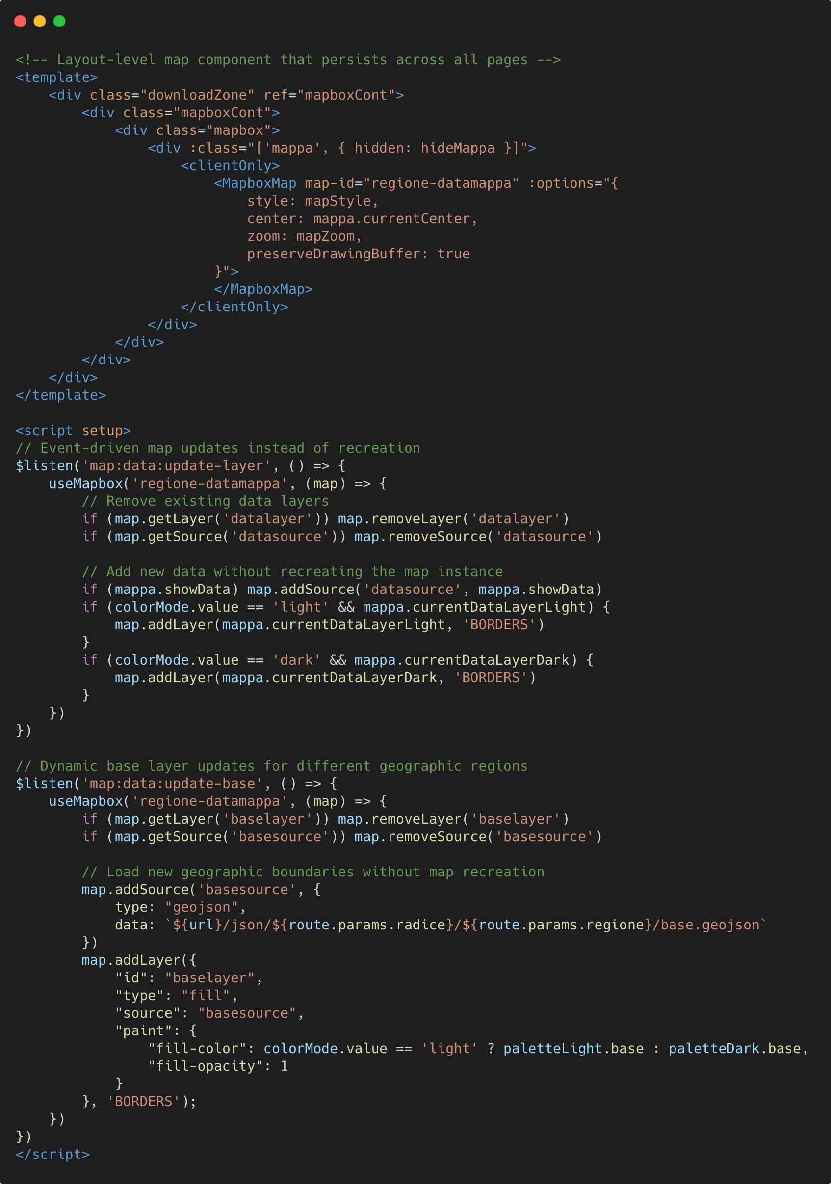
This architecture delivers substantial performance improvements. When users navigate from Italy to France, or from country-level to regional views, the map instance persists while only the data layers change. The system avoids the typical 2-3 second loading delay of map initialization, providing immediate visual feedback as new climate data loads. We measured approximately 60% reduction in data transfer during typical browsing sessions since base geographic data is reused across page views.
The event-driven update system enables seamless transitions between different geographic scopes and climate indicators. Rather than recreating map components, the application dynamically swaps GeoJSON sources and layer configurations, maintaining zoom levels, user interactions, and visual continuity across navigation.
ASSA’s 200+ million row database demanded different optimization strategies. We structured data to minimize join operations and maximize index effectiveness. Grid values are pre-calculated and stored with spatial indices, allowing fast queries by geographic region and time period.
The key insight was avoiding complex aggregations at query time. Instead of calculating climate indices during user requests, we pre-compute and store results during ingestion. This shifts computational cost from user-facing queries to background processing, maintaining the sub-300ms response times that make the interface feel responsive even as the dataset grows.
We also implemented connection pooling and query result caching at the ORM level, which prevents repeated execution of common queries for popular climate indicators and time periods.
ASSA’s choropleth maps required a novel approach to geographic visualization. Instead of overlaying data on Mapbox or SVG maps—both of which performed poorly with dense grid data—we developed a canvas-based rendering system.
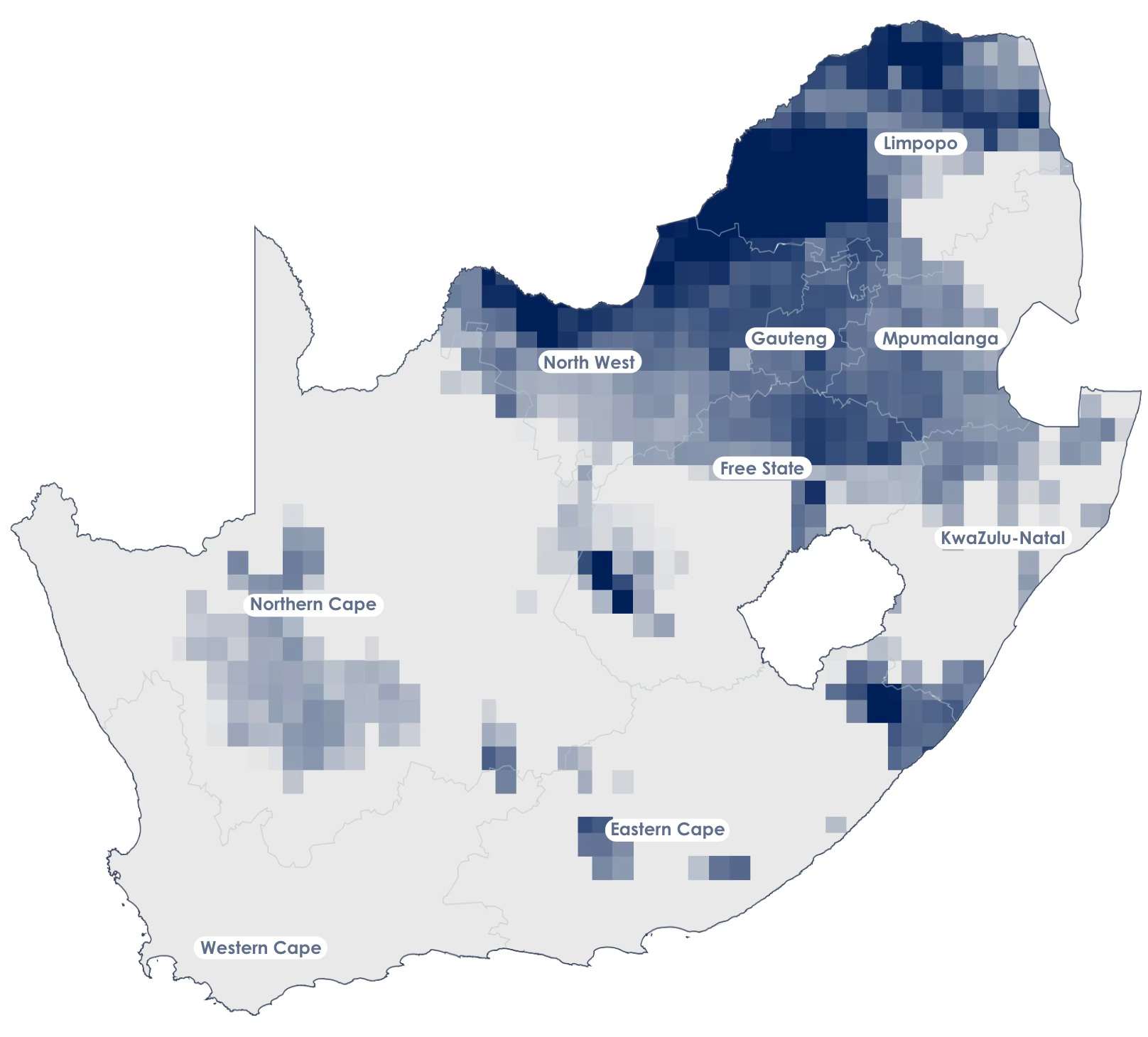
Performance gains were substantial. Initial SVG overlay attempts caused browser freezing with large datasets. The canvas approach renders smoothly even with thousands of data points, while maintaining the visual quality needed for scientific accuracy. We also gained complete control over color interpolation and the ability to implement custom legend systems that matched our exact design requirements.
The rendering process begins with coordinate transformation, converting latitude/longitude pairs to canvas pixel positions. The system calculates an optimal projection scale that fits South Africa’s geographic bounds within the available canvas space:
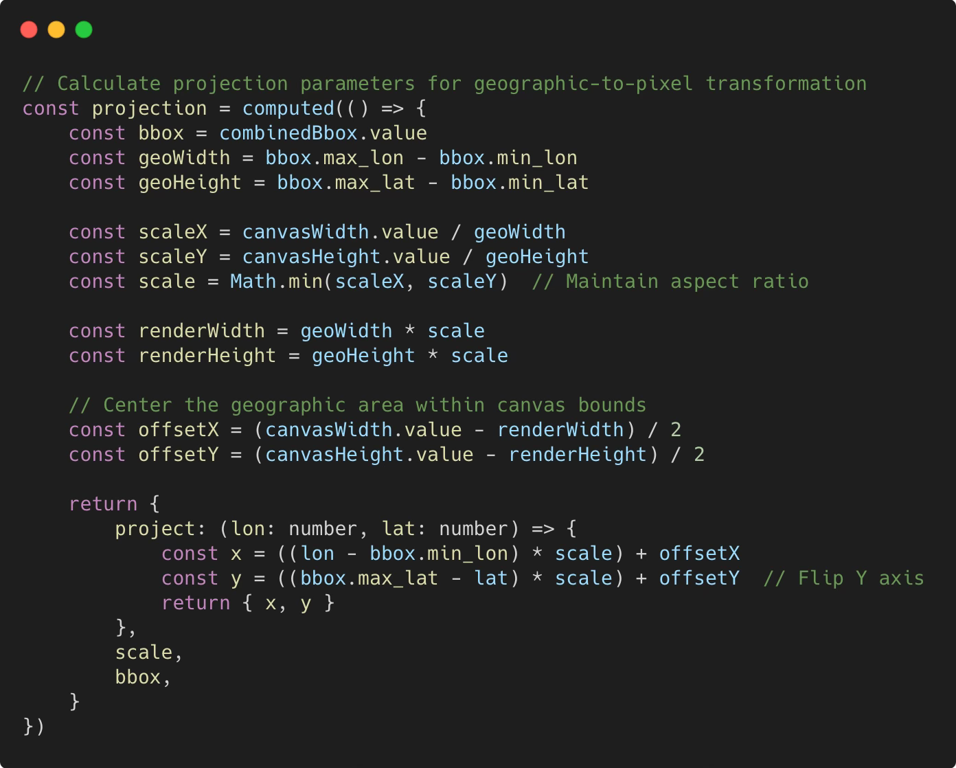
One critical challenge involved ensuring visual consistency across different zoom levels and data densities. Climate grid data arrives with precise decimal coordinates, but canvas rendering requires pixel-perfect alignment to avoid gaps or overlaps between adjacent cells.
Our solution implements a grid snapping system that aligns all coordinates to a standardized resolution grid before rendering:
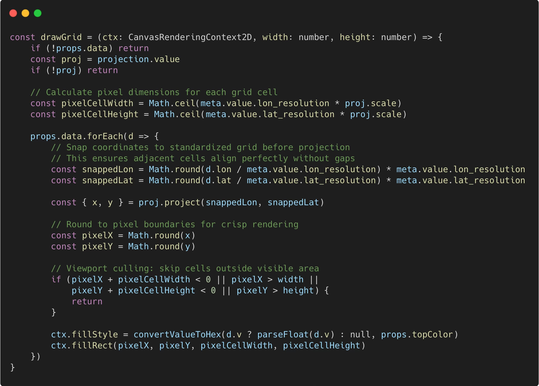
The system also implements viewport culling, skipping the rendering of grid cells that fall outside the visible canvas area. Before rendering climate data, it creates a clipping path from the country’s GeoJSON boundaries, ensuring that grid squares only appear within South Africa’s actual borders, not in the surrounding ocean or neighboring countries.
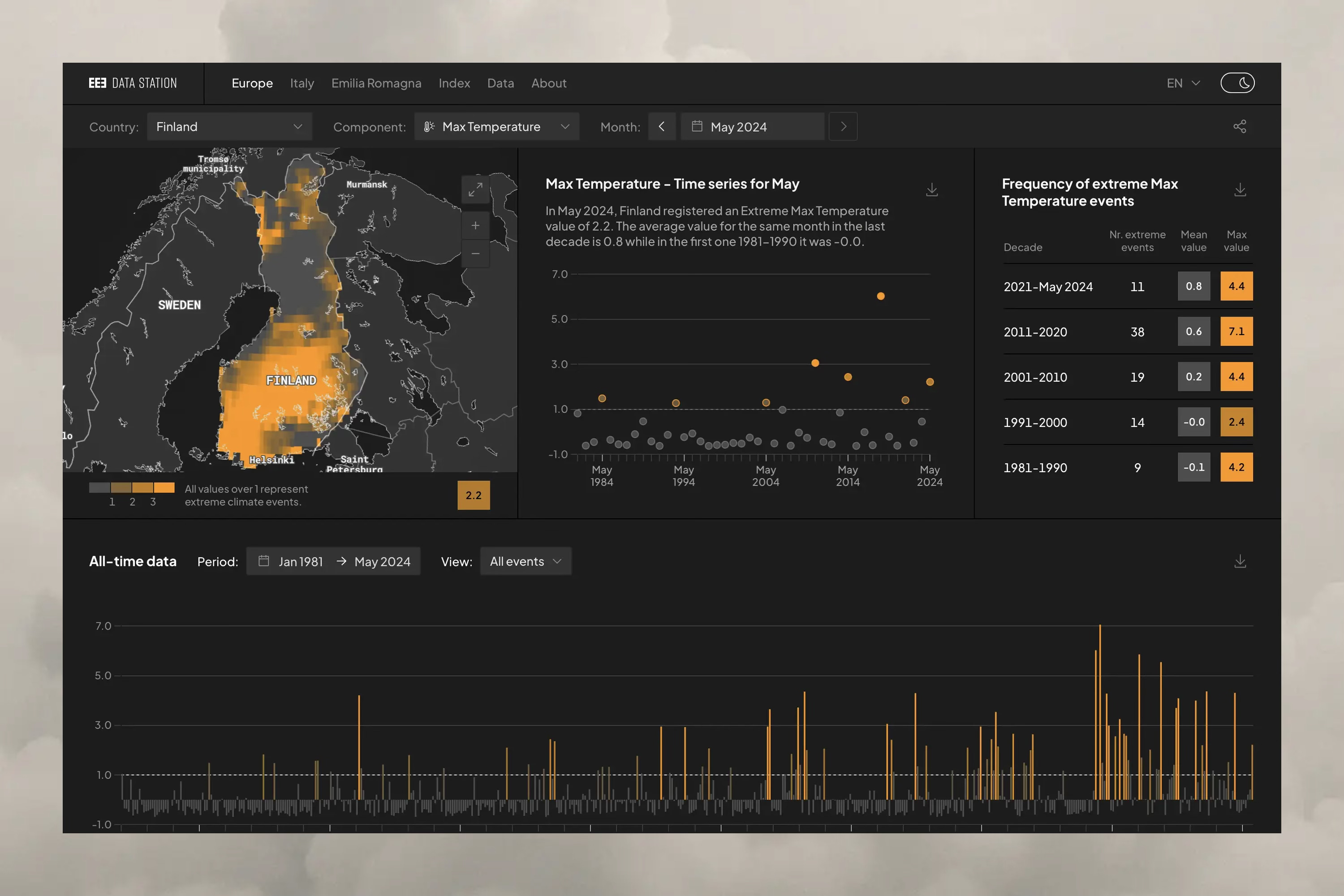
Beyond geographic visualization, both platforms required sophisticated charting capabilities to display temporal climate data. We implemented Chart.js through vue-chartjs, creating responsive visualizations that adapt to different data patterns and screen sizes.
E3CI uses Chart.js for two distinct visualization types: time series bar charts showing monthly climate index values, and heatmaps displaying the average of all extreme climate events across years and months. The time series charts help users identify seasonal patterns and long-term trends, while heatmaps reveal correlations between different types of extreme events.
ASSA focuses on time series visualization, using Chart.js exclusively for monthly bar charts that show climate indicator values over time. The simpler chart requirements aligned with ASSA’s streamlined interface design, where geographic visualization takes precedence.
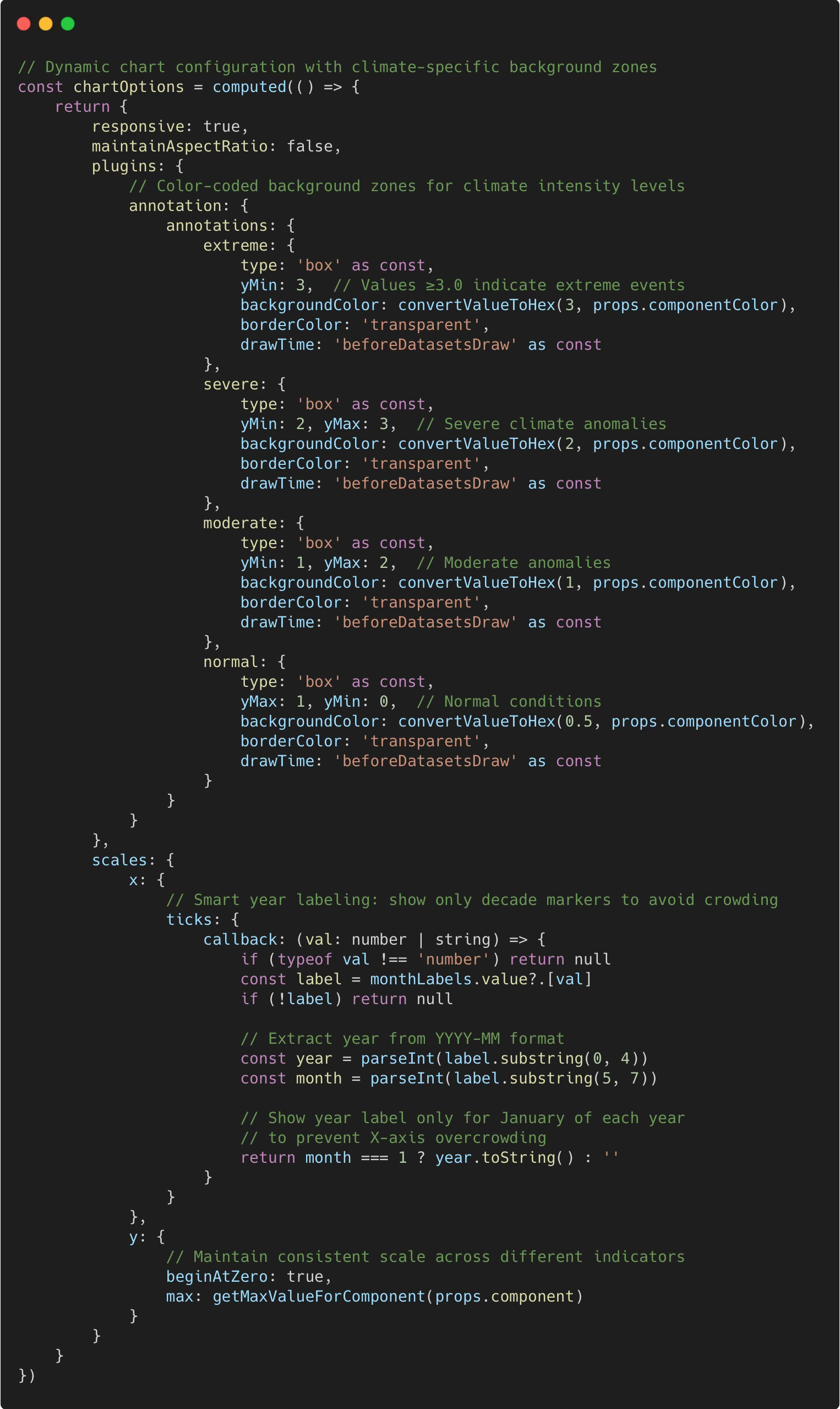
The key technical challenge involved making charts responsive across the eight different climate indicators in E3CI and five in ASSA. Each indicator requires different scales, color schemes, and threshold values. We developed a centralized configuration system that dynamically adjusts chart parameters based on the selected climate indicator and data range.
Chart performance became critical when displaying 40+ years of monthly data. We implemented lazy loading for chart data, similar to our geographic optimization strategies. Charts only request data for visible time periods, with smooth transitions when users navigate to different decades or expand time ranges.
The implementation reveals several patterns for handling climate data visualization at scale. Dynamic chart configuration adapts to different climate indicators automatically, while custom annotation layers provide immediate visual context about climate thresholds:
Working on both projects revealed patterns that extend beyond climate visualization to any application handling large-scale time-series data.
The choice between static pre-computation and dynamic querying depends heavily on update frequency and computational complexity. E3CI’s approach works well when updates are infrequent and processing is computationally expensive. ASSA’s database architecture suits scenarios requiring immediate data availability with simpler calculations. The choice fundamentally shapes every other technical decision in the project.
Geographic data optimization requires domain-specific strategies. Our GeoJSON compression techniques work specifically for grid-based climate data where adjacent cells often share values. Different geographic datasets might benefit from alternative approaches like spatial indexing or vector tile serving. There’s no one-size-fits-all solution.
Canvas-based rendering opened new possibilities for custom geographic visualization. Looking ahead, we’d likely abandon both SVG and Mapbox for similar projects, implementing fully custom canvas rendering with optimized data storage. This approach provides maximum performance and flexibility while reducing dependency on external mapping libraries, though it requires more upfront development investment.
The database performances achieved in ASSA demonstrate the value of thoughtful schema design for time-series data. Pre-computing aggregations and maintaining proper indices can make massive datasets surprisingly responsive. The key is shifting computational work away from user-facing requests.
In the end, both E3CI and ASSA succeed in making complex climate data accessible to scientists, policymakers, and researchers. For organizations facing similar challenges with large-scale data visualization, the key insight is matching architectural approach to data characteristics.
See the full E3CI web development case study on our website. Both websites discussed in the article are available online: E3CI Datastation and ASSA Climate Index.
Comments
Nothing yet. Say the first thing.
Sign in to join the conversation.